- WPF - Home
- WPF - Overview
- WPF - Environment Setup
- WPF - Hello World
- WPF - XAML Overview
- WPF - Elements Tree
- WPF - Dependency Properties
- WPF - Routed Events
- WPF - Controls
- WPF - Layouts
- WPF - Nesting Of Layout
- WPF - Input
- WPF - Command Line
- WPF - Data Binding
- WPF - Resources
- WPF - Templates
- WPF - Styles
- WPF - Triggers
- WPF - Debugging
- WPF - Custom Controls
- WPF - Exception Handling
- WPF - Localization
- WPF - Interaction
- WPF - 2D Graphics
- WPF - 3D Graphics
- WPF - Multimedia
WPF - Calendar
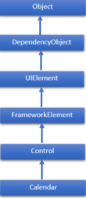
Calendar is a control that enables a user to select a date by using a visual calendar display. It provides some basic navigation using either the mouse or keyboard. The hierarchical inheritance of Calendar class is as follows −
Commonly Used Properties of Calendar Class
| Sr. No. | Properties & Description |
|---|---|
| 1 | BlackoutDates Gets a collection of dates that are marked as not selectable. |
| 2 | CalendarButtonStyle Gets or sets the Style associated with the control's internal CalendarButton object. |
| 3 | CalendarDayButtonStyle Gets or sets the Style associated with the control's internal CalendarDayButton object. |
| 4 | CalendarItemStyle Gets or sets the Style associated with the control's internal CalendarItem object. |
| 5 | DisplayDate Gets or sets the date to display. |
| 6 | DisplayDateEnd Gets or sets the last date in the date range that is available in the calendar. |
| 7 | DisplayDateStart Gets or sets the first date that is available in the calendar. |
| 8 | DisplayMode Gets or sets a value that indicates whether the calendar displays a month, year, or decade. |
| 9 | FirstDayOfWeek Gets or sets the day that is considered the beginning of the week. |
| 10 | IsTodayHighlighted Gets or sets a value that indicates whether the current date is highlighted. |
| 11 | SelectedDate Gets or sets the currently selected date. |
| 12 | SelectedDates Gets a collection of selected dates. |
| 13 | SelectionMode Gets or sets a value that indicates what kind of selections are allowed. |
Commonly Used Methods of Calendar Class
| Sr. No. | Method & Description |
|---|---|
| 1 | OnApplyTemplate Builds the visual tree for the Calendar control when a new template is applied. (Overrides FrameworkElement.OnApplyTemplate().) |
| 2 | ToString Provides a text representation of the selected date. (Overrides Control.ToString().) |
Commonly Used Events of Calendar Class
| Sr. No. | Events & Description |
|---|---|
| 1 | DisplayDateChanged Occurs when the DisplayDate property is changed. |
| 2 | DisplayModeChanged Occurs when the DisplayMode property is changed. |
| 3 | SelectedDatesChanged Occurs when the collection returned by the SelectedDates property is changed. |
| 4 | SelectionModeChanged Occurs when the SelectionMode changes. |
Example
Lets create a new WPF project with WPFCalenderControl name.
Drag the calendar control from a toolbox and change the background color in the properties window.
Now switch to XAML window in which you will see the XAML tags for calendar and its background.
Add some more properties to set the blackouts dates and selection event, as shown in the following XAML code.
<Window x:Class = "WPFCalenderControl.MainWindow"
   xmlns = "http://schemas.microsoft.com/winfx/2006/xaml/presentation"
   xmlns:x = "http://schemas.microsoft.com/winfx/2006/xaml"
   xmlns:d = "http://schemas.microsoft.com/expression/blend/2008"
   xmlns:mc = "http://schemas.openxmlformats.org/markup-compatibility/2006"
   xmlns:local = "clr-namespace:WPFCalenderControl"
   mc:Ignorable = "d" Title = "MainWindow" Height = "350" Width = "604">

   <Grid>
      <Calendar Margin = "20" SelectionMode = "MultipleRange"
         IsTodayHighlighted = "false" DisplayDate = "1/1/2015"
         DisplayDateEnd = "1/31/2015" SelectedDatesChanged = "Calendar_SelectedDatesChanged"
         xmlns:sys = "clr-namespace:System;assembly = mscorlib">

         <Calendar.BlackoutDates>
            <CalendarDateRange Start = "1/2/2015" End = "1/4/2015"/>
            <CalendarDateRange Start = "1/9/2015" End = "1/9/2015"/>
            <CalendarDateRange Start = "1/16/2015" End = "1/16/2015"/>
            <CalendarDateRange Start = "1/23/2015" End = "1/25/2015"/>
            <CalendarDateRange Start = "1/30/2015" End = "1/30/2015"/>
         </Calendar.BlackoutDates>

         <Calendar.SelectedDates>
            <sys:DateTime>1/5/2015</sys:DateTime>
            <sys:DateTime>1/12/2015</sys:DateTime>
            <sys:DateTime>1/14/2015</sys:DateTime>
            <sys:DateTime>1/13/2015</sys:DateTime>
            <sys:DateTime>1/15/2015</sys:DateTime>
            <sys:DateTime>1/27/2015</sys:DateTime>
            <sys:DateTime>4/2/2015</sys:DateTime>
         </Calendar.SelectedDates>

         <Calendar.Background>
            <LinearGradientBrush EndPoint = "0.5,1" StartPoint = "0.5,0">
               <GradientStop Color = "#FFE4EAF0" Offset = "0" />
               <GradientStop Color = "#FFECF0F4" Offset = "0.16" />
               <GradientStop Color = "#FFFCFCFD" Offset = "0.16" />
               <GradientStop Color = "#FFD80320" Offset = "1" />
            </LinearGradientBrush>
         </Calendar.Background>

      </Calendar>

   </Grid>

</Window>
The select event implementation in C# is as follows −
using System;
using System.Windows;
using System.Windows.Controls;

namespace WPFCalenderControl {
   /// <summary>
      /// Interaction logic for MainWindow.xaml
   /// </summary>

   public partial class MainWindow : Window {

      public MainWindow() {
         InitializeComponent();
      }

      private void Calendar_SelectedDatesChanged(object sender, SelectionChangedEventArgs e) {
         var calendar = sender as Calendar;

         if (calendar.SelectedDate.HasValue) {
            DateTime date = calendar.SelectedDate.Value;
            this.Title = date.ToShortDateString();
         }
      }

   }
}
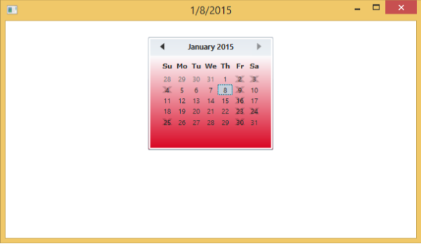
When you compile and execute the above code, it will produce the following window which shows some of the dates are selected while some are blacked out.
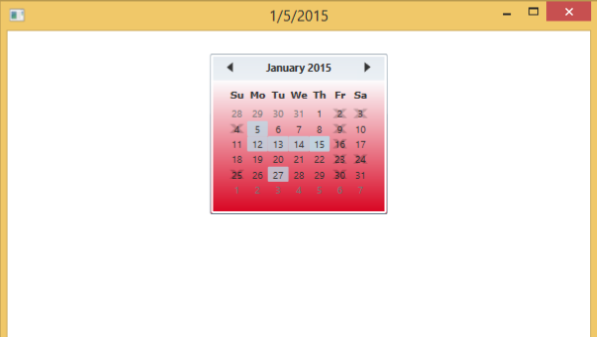
If you select another date, then it will be shown on the title of this window.
We recommend that you execute the above example code and try its other properties and events.
