- WPF - Home
- WPF - Overview
- WPF - Environment Setup
- WPF - Hello World
- WPF - XAML Overview
- WPF - Elements Tree
- WPF - Dependency Properties
- WPF - Routed Events
- WPF - Controls
- WPF - Layouts
- WPF - Nesting Of Layout
- WPF - Input
- WPF - Command Line
- WPF - Data Binding
- WPF - Resources
- WPF - Templates
- WPF - Styles
- WPF - Triggers
- WPF - Debugging
- WPF - Custom Controls
- WPF - Exception Handling
- WPF - Localization
- WPF - Interaction
- WPF - 2D Graphics
- WPF - 3D Graphics
- WPF - Multimedia
WPF - GridPanel
A Grid Panel provides a flexible area which consists of rows and columns. In a Grid, child elements can be arranged in tabular form. Elements can be added to any specific row and column by using Grid.Row and Grid.Column properties
By default, a Grid panel is created with one row and one column. Multiple rows and columns are created by RowDefinitions and ColumnDefinitions properties. The height of rows and the width of columns can be defined in the following three ways −
Fixed value − To assign a fixed size of logical units (1/96 inch)
Auto − It will take space which are required for the controls in that specific row/column.
Star (*) − It will take the remaining space when Auto and fixed sized are filled.
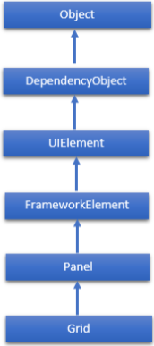
The hierarchical inheritance of Canvas class is as follows.
Commonly Used Properties of Grid Class
| Sr. No. | Property & Description |
|---|---|
| 1 | Background Gets or sets a Brush that fills the panel content area. (Inherited from Panel) |
| 2 | Children Gets a UIElementCollection of child elements of this Panel. (Inherited from Panel.) |
| 3 | ColumnDefinitions Gets a list of ColumnDefinition objects defined on this instance of Grid. |
| 4 | Height Gets or sets the suggested height of the element. (Inherited from FrameworkElement.) |
| 5 | ItemHeight Gets or sets a value that specifies the height of all items that are contained within a WrapPanel. |
| 6 | ItemWidth Gets or sets a value that specifies the width of all items that are contained within a WrapPanel. |
| 7 | Margin Gets or sets the outer margin of an element. (Inherited from FrameworkElement.) |
| 8 | Name Gets or sets the identifying name of the element. The name provides a reference so that code-behind, such as event handler code, can refer to a markup element after it is constructed during processing by a XAML processor. (Inherited from FrameworkElement.) |
| 9 | Orientation Gets or sets a value that specifies the dimension in which child content is arranged. |
| 10 | Parent Gets the logical parent element of this element. (Inherited from FrameworkElement.) |
| 11 | Resources Gets or sets the locally-defined resource dictionary. (Inherited from FrameworkElement.) |
| 12 | RowDefinitions Gets a list of RowDefinition objects defined on this instance of Grid. |
| 13 | Style Gets or sets the style used by this element when it is rendered. (Inherited from FrameworkElement.) |
| 14 | Width Gets or sets the width of the element. (Inherited from FrameworkElement.) |
Commonly Used Methods of Grid Class
| Sr. No. | Methods & Description |
|---|---|
| 1 | GetColumn Gets the value of the Grid.Column XAML attached property from the specified FrameworkElement. |
| 2 | GetColumnSpan Gets the value of the Grid.ColumnSpan XAML attached property from the specified FrameworkElement. |
| 3 | GetRow Gets the value of the Grid.Row XAML attached property from the specified FrameworkElement. |
| 4 | SetColumn Sets the value of the Grid.Column XAML attached property on the specified FrameworkElement. |
| 5 | SetRow Sets the value of the Grid.Row XAML attached property on the specified FrameworkElement. |
| 6 | SetRowSpan Sets the value of the Grid.RowSpan XAML attached property on the specified FrameworkElement. |
Example
The following example shows how to add child elements into a Grid to specify it in a tabular form. In the following XAML implementation, Text Blocks are added in the first column and Text Boxes are added in the second column of the Grid.
<Window x:Class = "WPFGrid.MainWindow"
   xmlns = "http://schemas.microsoft.com/winfx/2006/xaml/presentation"
   xmlns:x = "http://schemas.microsoft.com/winfx/2006/xaml"
   xmlns:d = "http://schemas.microsoft.com/expression/blend/2008"
   xmlns:mc = "http://schemas.openxmlformats.org/markup-compatibility/2006"
   xmlns:local = "clr-namespace:WPFGrid"
   mc:Ignorable = "d" Title = "MainWindow" Height = "350" Width = "604">

   <Grid x:Name = "FormLayoutGrid" Background = "AliceBlue">
      <Grid.ColumnDefinitions>
         <ColumnDefinition Width = "Auto" />
         <ColumnDefinition />
      </Grid.ColumnDefinitions>

      <Grid.RowDefinitions>
         <RowDefinition Height = "*" />
         <RowDefinition Height = "*" />
         <RowDefinition Height = "*" />
      </Grid.RowDefinitions>

      <TextBlock Grid.Row = "0" Grid.Column = "0" Text = "Name" Margin = "10"
         HorizontalAlignment = "Left" VerticalAlignment = "Center" Width = "100" />
      <TextBox Grid.Row = "0" Grid.Column = "1" Margin = "10" />
      <TextBlock Grid.Row = "1" Grid.Column = "0" Text = "ID" Margin = "10"
         HorizontalAlignment = "Left" VerticalAlignment = "Center" Width = "100" />
      <TextBox Grid.Row = "1" Grid.Column = "1" Margin = "10" />
      <TextBlock Grid.Row = "2" Grid.Column = "0" Text = "Age" Margin = "10"
         HorizontalAlignment = "Left" VerticalAlignment = "Center" Width = "100" />
      <TextBox Grid.Row = "2" Grid.Column = "1" Margin = "10" />
   </Grid>

</Window>
When you compile and execute the above code, it will produce the following window.
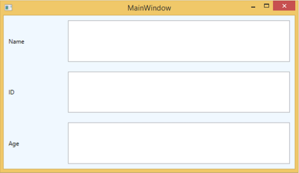
We recommend that you execute the above example code and try some of the other properties of this class as well.