- WPF - Home
- WPF - Overview
- WPF - Environment Setup
- WPF - Hello World
- WPF - XAML Overview
- WPF - Elements Tree
- WPF - Dependency Properties
- WPF - Routed Events
- WPF - Controls
- WPF - Layouts
- WPF - Nesting Of Layout
- WPF - Input
- WPF - Command Line
- WPF - Data Binding
- WPF - Resources
- WPF - Templates
- WPF - Styles
- WPF - Triggers
- WPF - Debugging
- WPF - Custom Controls
- WPF - Exception Handling
- WPF - Localization
- WPF - Interaction
- WPF - 2D Graphics
- WPF - 3D Graphics
- WPF - Multimedia
Selected Reading
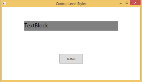
WPF - Control Level
Defining a style on control level can only be applied to that particular control. Given below is an example of a control level where the button and TextBlock have their own style.
<Window x:Class = "XAMLControlLevelStyle.MainWindow"
   xmlns = "http://schemas.microsoft.com/winfx/2006/xaml/presentation"
   xmlns:x = "http://schemas.microsoft.com/winfx/2006/xaml"
   Title = "Control Level Styles" Height = "350" Width = "604">

   <StackPanel Margin = "10" VerticalAlignment = "Top">

      <TextBlock Text = "TextBlock">
         <TextBlock.Style>
            <Style>
               <Setter Property = "TextBlock.FontSize" Value = "24" />
               <Setter Property = "TextBlock.Width" Value = "400" />
               <Setter Property = "TextBlock.Height" Value = "40" />
               <Setter Property = "TextBlock.Background" Value = "Gray" />
               <Setter Property = "TextBlock.Margin" Value = "50" />
            </Style>
         </TextBlock.Style>
      </TextBlock>

      <Button Content = "Button">
         <Button.Style>
            <Style>
               <Setter Property = "TextBlock.Width" Value = "100" />
               <Setter Property = "TextBlock.Height" Value = "40" />
               <Setter Property = "TextBlock.Margin" Value = "50" />
            </Style>
         </Button.Style>
      </Button>

   </StackPanel>

</Window>
When the above code is compiled and executed, it will produce the following window −
wpf_styles.htm

Advertisements