- WPF - Home
- WPF - Overview
- WPF - Environment Setup
- WPF - Hello World
- WPF - XAML Overview
- WPF - Elements Tree
- WPF - Dependency Properties
- WPF - Routed Events
- WPF - Controls
- WPF - Layouts
- WPF - Nesting Of Layout
- WPF - Input
- WPF - Command Line
- WPF - Data Binding
- WPF - Resources
- WPF - Templates
- WPF - Styles
- WPF - Triggers
- WPF - Debugging
- WPF - Custom Controls
- WPF - Exception Handling
- WPF - Localization
- WPF - Interaction
- WPF - 2D Graphics
- WPF - 3D Graphics
- WPF - Multimedia
WPF - Buttons
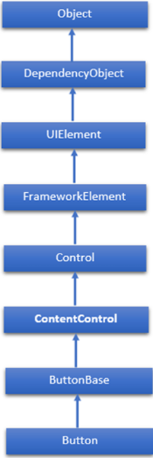
The Button class represents the most basic type of button control. The hierarchical inheritance of Button class is as follows −
Commonly Used Properties of Button Class
| Sr. No. | Property & Description |
|---|---|
| 1 | Background Gets or sets a brush that provides the background of the control. (Inherited from Control) |
| 2 | BorderBrush Gets or sets a brush that describes the border fill of a control. (Inherited from Control) |
| 3 | BorderThickness Gets or sets the border thickness of a control. (Inherited from Control) |
| 4 | Content Gets or sets the content of a ContentControl. (Inherited from ContentControl) |
| 5 | ClickMode Gets or sets a value that indicates when the Click event occurs, in terms of device behavior. (Inherited from ButtonBase) |
| 6 | ContentTemplate Gets or sets the data template that is used to display the content of the ContentControl. (Inherited from ContentControl) |
| 7 | FontFamily Gets or sets the font used to display text in the control. (Inherited from Control) |
| 8 | FontSize Gets or sets the size of the text in this control. (Inherited from Control) |
| 9 | FontStyle Gets or sets the style in which the text is rendered. (Inherited from Control) |
| 10 | FontWeight Gets or sets the thickness of the specified font. (Inherited from Control) |
| 11 | Foreground Gets or sets a brush that describes the foreground color. (Inherited from Control) |
| 12 | Height Gets or sets the suggested height of a FrameworkElement. (Inherited from FrameworkElement) |
| 13 | HorizontalAlignment Gets or sets the horizontal alignment characteristics that are applied to a FrameworkElement when it is composed in a layout parent, such as a panel or items control. (Inherited from FrameworkElement) |
| 14 | IsEnabled Gets or sets a value indicating whether the user can interact with the control. (Inherited from Control) |
| 15 | IsPressed Gets a value that indicates whether a ButtonBase is currently in a pressed state. (Inherited from ButtonBase) |
| 16 | Margin Gets or sets the outer margin of a FrameworkElement. (Inherited from FrameworkElement) |
| 17 | Name Gets or sets the identifying name of the object. When a XAML processor creates the object tree from XAML markup, run-time code can refer to the XAML-declared object by this name. (Inherited from FrameworkElement) |
| 18 | Opacity Gets or sets the degree of the object's opacity. (Inherited from UIElement) |
| 19 | Resources Gets the locally defined resource dictionary. In XAML, you can establish resource items as child object elements of a frameworkElement. Resources property element, through XAML implicit collection syntax. (Inherited from FrameworkElement) |
| 20 | Style Gets or sets an instance Style that is applied for this object during layout and rendering. (Inherited from FrameworkElement) |
| 21 | Template Gets or sets a control template. The control template defines the visual appearance of a control in UI, and is defined in XAML markup. (Inherited from Control) |
| 22 | VerticalAlignment Gets or sets the vertical alignment characteristics that are applied to a FrameworkElement when it is composed in a parent object such as a panel or items control. (Inherited from FrameworkElement) |
| 23 | Visibility Gets or sets the visibility of a UIElement. A UIElement that is not visible is not rendered and does not communicate its desired size to layout. (Inherited from UIElement) |
| 24 | Width Gets or sets the width of a FrameworkElement. (Inherited from FrameworkElement) |
Commonly Used Methods of Button Class
| Sr. No. | Method & Description |
|---|---|
| 1 | ClearValue Clears the local value of a dependency property. (Inherited from DependencyObject) |
| 2 | FindName Retrieves an object that has the specified identifier name. (Inherited from FrameworkElement) |
| 3 | OnApplyTemplate Invoked whenever application code or internal processes (such as a rebuilding layout pass) call ApplyTemplate. In simplest terms, this means the method is called just before a UI element displays in your app. Override this method to influence the default post-template logic of a class. (Inherited from FrameworkElement) |
| 4 | OnContentChanged Invoked when the value of the Content property changes. (Inherited from ContentControl) |
| 5 | OnDragEnter Called before the DragEnter event occurs. (Inherited from Control) |
| 6 | OnDragLeave Called before the DragLeave event occurs. (Inherited from Control) |
| 7 | OnDragOver Called before the DragOver event occurs. (Inherited from Control) |
| 8 | OnDrop Called before the Drop event occurs. (Inherited from Control) |
| 9 | OnGotFocus Called before the GotFocus event occurs. (Inherited from Control) |
| 10 | OnKeyDown Called before the KeyDown event occurs. (Inherited from Control) |
| 11 | OnKeyUp Called before the KeyUp event occurs. (Inherited from Control) |
| 12 | OnLostFocus Called before the LostFocus event occurs. (Inherited from Control) |
| 13 | SetBinding Attaches a binding to a FrameworkElement, using the provided binding object. (Inherited from FrameworkElement) |
Commonly Used Events of Button Class
| Sr. No. | Event & Description |
|---|---|
| 1 | Click Occurs when a button control is clicked. (Inherited from ButtonBase) |
| 2 | DataContextChanged Occurs when the value of the FrameworkElement. DataContext property changes. (Inherited from FrameworkElement) |
| 3 | DragEnter Occurs when the input system reports an underlying drag event with this element as the target. (Inherited from UIElement) |
| 4 | DragLeave Occurs when the input system reports an underlying drag event with this element as the origin. (Inherited from UIElement) |
| 5 | DragOver Occurs when the input system reports an underlying drag event with this element as the potential drop target. (Inherited from UIElement) |
| 6 | DragStarting Occurs when a drag operation is initiated. (Inherited from UIElement) |
| 7 | GotFocus Occurs when a UIElement receives focus. (Inherited from UIElement) |
| 8 | Holding Occurs when an otherwise unhandled Hold interaction occurs over the hit test area of this element. (Inherited from UIElement) |
| 9 | IsEnabledChanged Occurs when the IsEnabled property changes. (Inherited from Control) |
| 10 | KeyDown Occurs when a keyboard key is pressed while the UIElement has focus. (Inherited from UIElement) |
| 11 | KeyUp Occurs when a keyboard key is released while the UIElement has focus. (Inherited from UIElement) |
| 12 | LostFocus Occurs when a UIElement loses focus. (Inherited from UIElement) |
| 13 | SizeChanged Occurs when either the ActualHeight or the ActualWidth property changes value on a FrameworkElement. (Inherited from FrameworkElement) |
Example
Lets take a simple example to understand the concepts better. Follow the steps given below −
Open Visual Studio and then Click File > New > Project menu option.
In the New Project dialog box, in the Templates pane, click on Visual C# and in middle pane, select WPF Application.
In the Name box, type WPFButtonControl, and then click OK.
A new WPF project is created.
Drag a Button control from the Toolbox to the WPF design window.
Now click the button and go to the Properties window and set the following properties of the button.
| Property | Value |
|---|---|
| Content | Click Me |
| Margin | 200 |
| Height | 20 |
| Width | 75 |
If you look at the XAML window, you will see the following code which is generated by Visual Studio.
<Window x:Class = "WPFButtonControl.MainWindow"
   xmlns = "http://schemas.microsoft.com/winfx/2006/xaml/presentation"
   xmlns:x = "http://schemas.microsoft.com/winfx/2006/xaml"
   xmlns:d = "http://schemas.microsoft.com/expression/blend/2008"
   xmlns:mc = "http://schemas.openxmlformats.org/markup-compatibility/2006"
   xmlns:local = "clr-namespace:WPFButtonControl"
   mc:Ignorable = "d" Title = "MainWindow" Height = "350" Width = "525">

   <Grid>
      <Button x:Name = "button" Content = "Click Me"
         HorizontalAlignment = "Left" Margin = "194,150,0,0"
         VerticalAlignment = "Top" Width = "75"/>
   </Grid>

</Window>
Lets now go to the design window and double-click on the button which will open the MainWindow.xaml.cs file.
We will write the following C# code to display a message when the user clicks the button.
using System.Windows;

namespace WPFButtonControl {
   /// <summary>
      /// Interaction logic for MainWindow.xaml
   /// </summary>

   public partial class MainWindow : Window {

      public MainWindow() {
         InitializeComponent();
      }

      private void button_Click(object sender, RoutedEventArgs e) {
         MessageBox.Show("You have clicked the button");
      }

   }
}
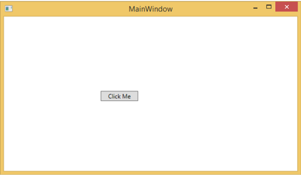
When you compile and execute the above code, it will produce the following output −
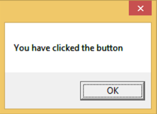
When you click the button, it will display the following message −
We recommend that you execute the above example code and experiment with some other properties and events.
