- WPF - Home
- WPF - Overview
- WPF - Environment Setup
- WPF - Hello World
- WPF - XAML Overview
- WPF - Elements Tree
- WPF - Dependency Properties
- WPF - Routed Events
- WPF - Controls
- WPF - Layouts
- WPF - Nesting Of Layout
- WPF - Input
- WPF - Command Line
- WPF - Data Binding
- WPF - Resources
- WPF - Templates
- WPF - Styles
- WPF - Triggers
- WPF - Debugging
- WPF - Custom Controls
- WPF - Exception Handling
- WPF - Localization
- WPF - Interaction
- WPF - 2D Graphics
- WPF - 3D Graphics
- WPF - Multimedia
WPF - CanvasPanel
Canvas panel is the basic layout Panel in which the child elements can be positioned explicitly using coordinates that are relative to the Canvas any side such as left, right, top and bottom.
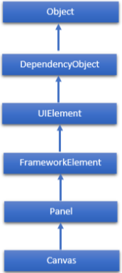
Typically, a Canvas is used for 2D graphic elements (such as Ellipse, Rectangle etc.), but not for UI elements because specifying absolute coordinates create trouble while resizing, localizing or scaling your XAML application. The hierarchical inheritance of Canvas class is as follows −
Commonly Used Properties of Canvas Class
| Sr. No. | Property & Description |
|---|---|
| 1 | Background Gets or sets a Brush that fills the panel content area. (Inherited from Panel) |
| 2 | Children Gets a UIElementCollection of child elements of this Panel. (Inherited from Panel.) |
| 3 | Height Gets or sets the suggested height of the element. (Inherited from FrameworkElement.) |
| 4 | ItemHeight Gets or sets a value that specifies the height of all items that are contained within a WrapPanel. |
| 5 | ItemWidth Gets or sets a value that specifies the width of all items that are contained within a WrapPanel. |
| 6 | LogicalChildren Gets an enumerator that can iterate the logical child elements of this Panel element. (Inherited from Panel.) |
| 7 | LogicalOrientation The Orientation of the panel, if the panel supports layout in only a single dimension. (Inherited from Panel.) |
| 8 | LeftProperty Identifies the Canvas.Left XAML attached property. |
| 9 | Margin Gets or sets the outer margin of an element. (Inherited from FrameworkElement.) |
| 10 | Name Gets or sets the identifying name of the element. The name provides a reference so that code-behind, such as event handler code, can refer to a markup element after it is constructed during processing by a XAML processor. (Inherited from FrameworkElement.) |
| 11 | Orientation Gets or sets a value that specifies the dimension in which child content is arranged. |
| 12 | Parent Gets the logical parent element of this element. (Inherited from FrameworkElement.) |
| 13 | Resources Gets or sets the locally-defined resource dictionary. (Inherited from FrameworkElement.) |
| 14 | Style Gets or sets the style used by this element when it is rendered. (Inherited from FrameworkElement.) |
| 15 | TopProperty Identifies the Canvas.Top XAML attached property. |
| 16 | Width Gets or sets the width of the element. (Inherited from FrameworkElement.) |
| 17 | ZIndexProperty Identifies the Canvas.ZIndex XAML attached property. |
Commonly Used Methods of Canvas
| Sr. No. | Methods & Description |
|---|---|
| 1 | GetLeft Gets the value of the Canvas.Left XAML attached property for the target element. |
| 2 | GetTop Gets the value of the Canvas.Top XAML attached property for the target element. |
| 3 | GetZIndex Gets the value of the Canvas.ZIndex XAML attached property for the target element. |
| 4 | SetLeft Sets the value of the Canvas.Left XAML attached property for a target element. |
| 5 | SetTop Sets the value of the Canvas.Top XAML attached property for a target element. |
| 6 | SetZIndex Sets the value of the Canvas.ZIndex XAML attached property for a target element. |
Example
The following example shows how to add child elements into a Canvas. The following XAML implementation creates ellipses inside a Canvas with different offset properties.
<Window x:Class = "WPFConvas.MainWindow"
   xmlns = "http://schemas.microsoft.com/winfx/2006/xaml/presentation"
   xmlns:x = "http://schemas.microsoft.com/winfx/2006/xaml"
   xmlns:d = "http://schemas.microsoft.com/expression/blend/2008"
   xmlns:mc = "http://schemas.openxmlformats.org/markup-compatibility/2006"
   xmlns:local = "clr-namespace:WPFConvas"
   mc:Ignorable = "d" Title = "MainWindow" Height = "400" Width = "604">

   <Grid>
      <Canvas Width = "580" Height = "360" >
         <Ellipse Canvas.Left = "30" Canvas.Top = "30"
            Fill = "Gray" Width = "200" Height = "120" />
         <Ellipse Canvas.Right = "30" Canvas.Top = "30"
            Fill = "Aqua" Width = "200" Height = "120" />
         <Ellipse Canvas.Left = "30" Canvas.Bottom = "30"
            Fill = "Gainsboro" Width = "200" Height = "120" />
         <Ellipse Canvas.Right = "30" Canvas.Bottom = "30"
            Fill = "LightCyan" Width = "200" Height = "120" />
      </Canvas>
   </Grid>

</Window>
When you compile and execute the above code, it will produce the following output −
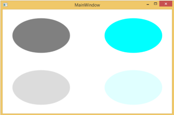
We recommend that you execute the above example code and try the other properties of this class as well.
