- Splunk - Home
- Splunk - Overview
- Splunk - Environment
- Splunk - Interfaces
- Splunk - Data Ingestion
- Splunk - Source Types
- Splunk - Basic Searching
- Splunk - Field Searching
- Splunk - Time Range Search
- Splunk - Sharing and Exporting
- Splunk - Search Language
- Splunk - Search Optimization
- Splunk - Transforming commands
- Splunk - Reports
- Splunk - Dashboards
- Splunk - Pivot & Datasets
- Splunk - Lookups
- Splunk - Schedules and Alerts
- Splunk - Knowledge Management
- Splunk - Subseraching
- Splunk - Search Macros
- Splunk - Event Types
- Splunk - Basic Chart
- Splunk - Overlay chart
- Splunk - Sparklines
- Splunk - Managing Indexes
- Splunk - Calculated Fields
- Splunk - Tags
- Splunk - Apps
- Splunk - Removing Data
- Splunk - Custom Chart
- Splunk - Monitoring Files
- Splunk - Sort Command
- Splunk - Top Command
- Splunk - Stats Command
- Splunk Useful Resources
- Splunk - Quick Guide
- Splunk - Useful Resources
- Splunk - Discussion
Splunk - Overlay Chart
Many times, we need to put one chart over another to compare or see the trend of the two charts. Splunk supports this feature through the chart overlay feature available in its visualization tab. To create such a chart, we need to first make a chart with two variables and then add a third variable which can create the overlay chart.
Chart Scenario
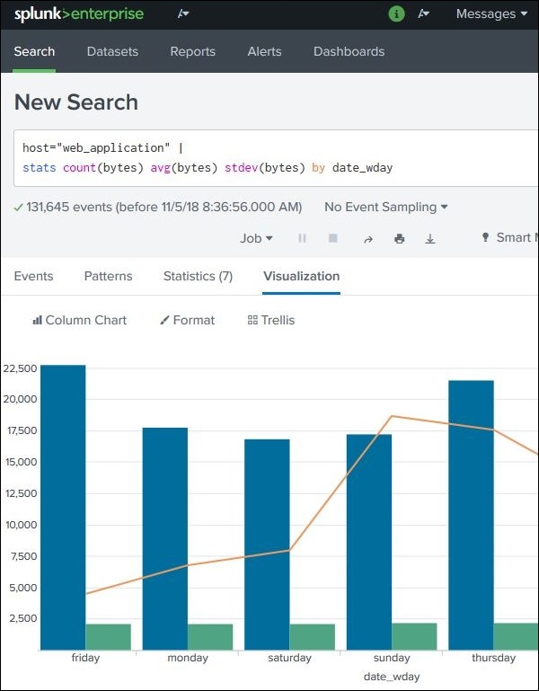
Continuing the examples from previous chapter, we find out the byte size of the files on different week days and then also add the average byte size for those days. The below image shows the chart showing the byte size versus average byte size of files on different days of the week.
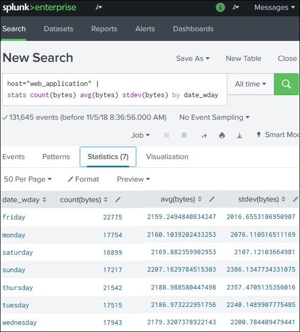
Next, we are going to add the statistical function called standard deviation to the above search query. This will bring the additional variable needed to create the chart overlay. The below image shows the statistics of the query result which will be used in the visualization.
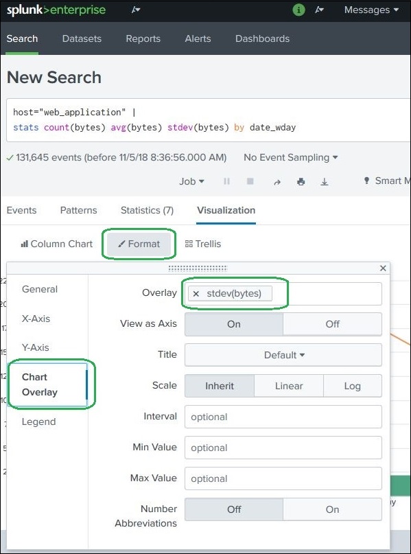
Creating Chart Overlay
To create the chart overlay, we follow Visualization → Format → Chart Overlay
This brings up a pop-up window where we need to choose the field which will be the overlay chart. In this case, we choose stdev(bytes) as the field as shown in the image below. We can also fill in other values: title, scale and their intervals, minimum values, maximum values, etc. For our example, we choose the default values after selecting the field for the overlay option.
After selecting the above options, we can close the chart overlay pop-up window and see the final chart as shown below −