- Splunk - Home
- Splunk - Overview
- Splunk - Environment
- Splunk - Interfaces
- Splunk - Data Ingestion
- Splunk - Source Types
- Splunk - Basic Searching
- Splunk - Field Searching
- Splunk - Time Range Search
- Splunk - Sharing and Exporting
- Splunk - Search Language
- Splunk - Search Optimization
- Splunk - Transforming commands
- Splunk - Reports
- Splunk - Dashboards
- Splunk - Pivot & Datasets
- Splunk - Lookups
- Splunk - Schedules and Alerts
- Splunk - Knowledge Management
- Splunk - Subseraching
- Splunk - Search Macros
- Splunk - Event Types
- Splunk - Basic Chart
- Splunk - Overlay chart
- Splunk - Sparklines
- Splunk - Managing Indexes
- Splunk - Calculated Fields
- Splunk - Tags
- Splunk - Apps
- Splunk - Removing Data
- Splunk - Custom Chart
- Splunk - Monitoring Files
- Splunk - Sort Command
- Splunk - Top Command
- Splunk - Stats Command
- Splunk Useful Resources
- Splunk - Quick Guide
- Splunk - Useful Resources
- Splunk - Discussion
Splunk - Basic Chart
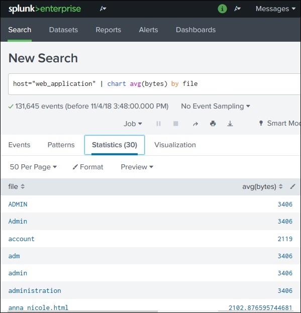
Splunk has great visualization features which shows a variety of charts. These charts are created from the results of a search query where appropriate functions are used to give numerical outputs.
For example, if we look for the average file size in bytes from the data set named web_applications, we can see the result in the statistics tab as shown below −
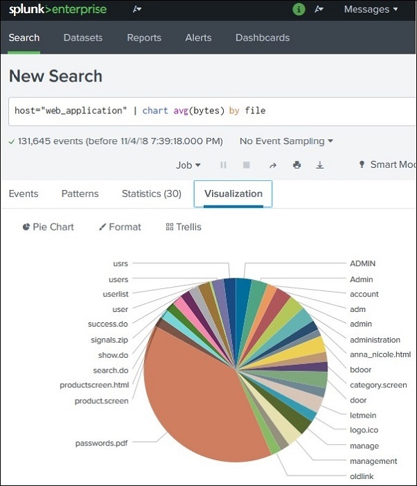
Creating Charts
In order to create a basic chart, we first ensure that the data is visible in the statistics tab as shown above. Then we click on the Visualization tab to get the corresponding chart. The above data produces a pie chart by default as shown below.
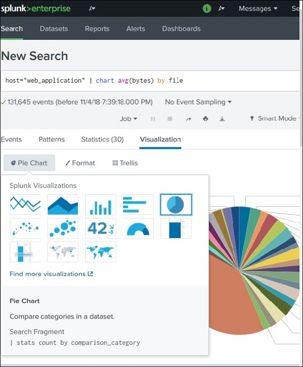
Changing the Chart Type
We can change the chart type by selecting a different chart option from the chart name. Clicking on one of these options will produce the chart for that type of graph.
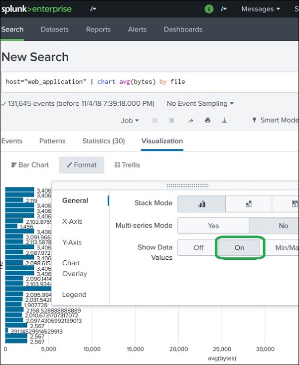
Formatting a Chart
The charts can also be formatted by using the Format option. This option allows to set the values for the axes, set the legends or show the data values in the chart. In the below example, we have chosen the horizontal chart and selected the option to show the data values as a Format option.