- SAP BO Analysis - Home
- SAP BO Analysis - Overview
- SAP BO Analysis - User Interface
- Create a Workspace
- SAP BO Analysis - Analyses
- SAP BO Analysis - Crosstabs
- SAP BO Analysis - Charts
- Chart Types & Styles
- Sub Analysis
- SAP BO Analysis - Using Filters
- SAP BO Analysis - Sorting
- Conditional Formatting
- SAP BO Analysis - Calculations
- SAP BO Analysis - Aggregations
- SAP BO Analysis - Hierarchies
- SAP BO Analysis - Sheets
- Sharing Workspaces
- SAP BO Analysis - Export Options
- Connecting to SAP BW
SAP BO Analysis - Charts
To show the trend in your data, you can add charts to make the analysis more interactive. Charts are used for graphical representation of data. You can emphasize on the business performance indicators of your data.
- Stacked Bar
- 3D Column Charts
- Multiline Charts
- Scatter Charts
- Bubble Charts
- Radar Charts
- Stacked Bar Charts
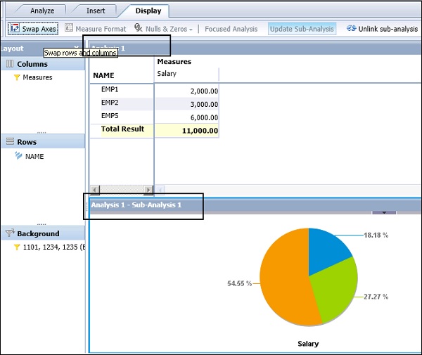
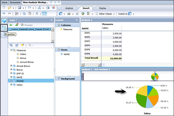
Crosstabs and charts are linked in the form of analysis and sub-analysis. First a crosstab is added in the form of a new analysis in the workspace and the chart is added as a subanalysis to the main analysis. When the data is changed, both the analysis and subanalysis gets changed with data.
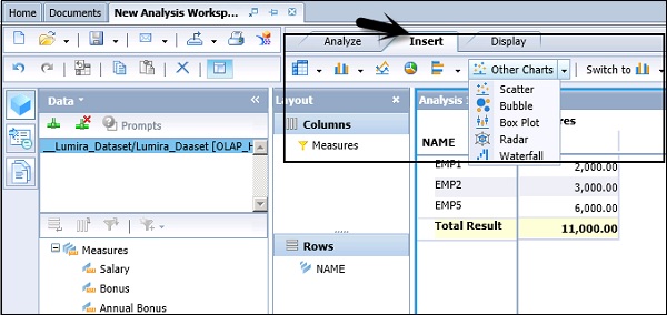
To add a chart to your analysis, navigate to the Insert tab at the top of the screen and select the required chart type in the workspace.
Adding Data to a Chart
When you select a chart, it is added to the right or below the existing component. It is also possible to add multiple charts in a single analysis that can focus on multiple areas.
Example
You use a crosstab for main analysis and chart for the sub-analysis to focus on certain points.
Note − It is also possible to unlink or disconnect a chart sub-analysis from its current analysis, converting it to a new, separate analysis.
It is also possible to change the chart type and customize the charts as per requirement. Chart appearance can be changed and you can also swap the chart axes to improve the chart presentation.
To swap the axes, you have to navigate to Display tab → Swap Axes.
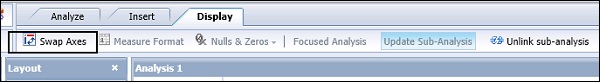
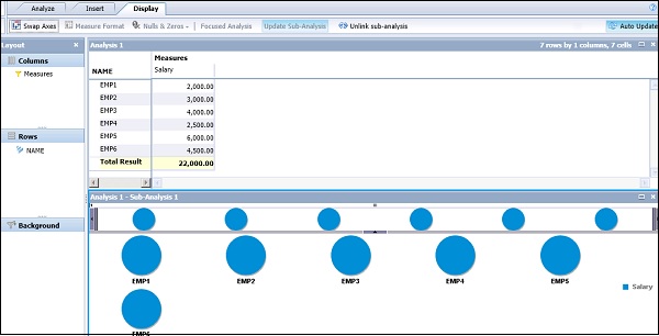
Chart Family
You can see a family of charts under each chart category. To see all the charts available under the Chart category, click the dropdown arrow button.
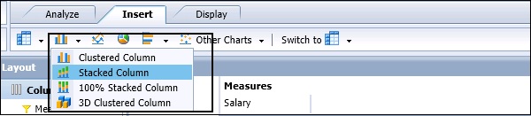
Under Column Charts, following chart types are available −
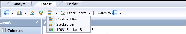
Under Bar charts, following chart types are available −
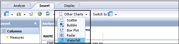
Under Other Charts, following chart types are available −
How to Change the Chart Type?
You can also change the chart type in your analysis. If you have selected a pie chart and you want to change it to a Bar or a Column chart, navigate to Insert button → Switch To.
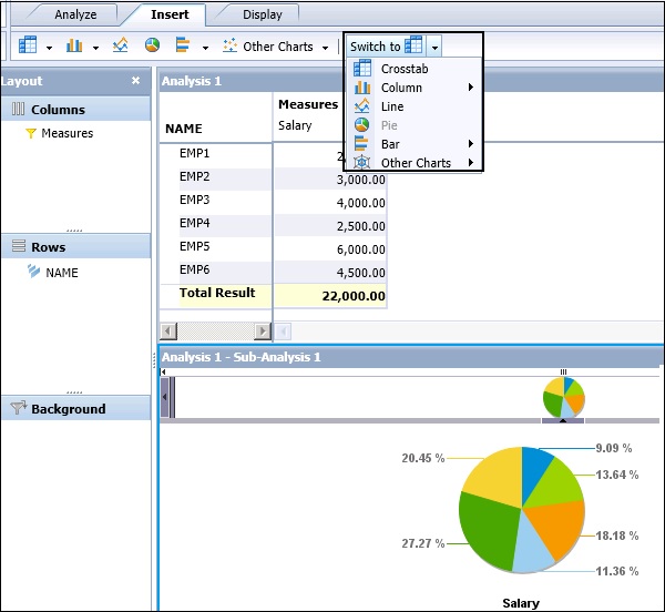
Chart Properties
You can also define the display properties of the chart. To define the name and description of the chart, navigate to Chart Properties in the Task Panel.
In the Chart Properties window, you have the following options −
- Chart Type
- Chart Name
- Last Refreshed At
- Description
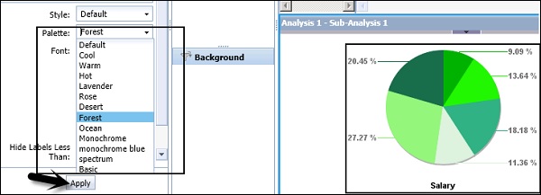
- Style
- Pallete
- Font
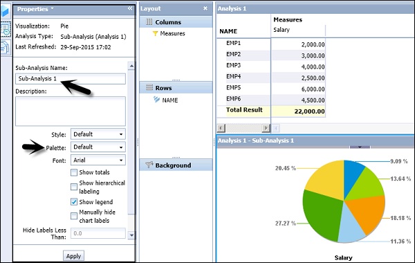
You can also change the palette color of the chart and the character fonts used in the chart. Select Palette and click Apply. The changes will be reflected in the chart area.