- CSS Tutorial
- CSS - Home
- CSS - Introduction
- CSS - Syntax
- CSS - Selectors
- CSS - Inclusion
- CSS - Measurement Units
- CSS - Colors
- CSS - Backgrounds
- CSS - Fonts
- CSS - Text
- CSS - Images
- CSS - Links
- CSS - Tables
- CSS - Borders
- CSS - Border Block
- CSS - Border Inline
- CSS - Margins
- CSS - Lists
- CSS - Padding
- CSS - Cursor
- CSS - Outlines
- CSS - Dimension
- CSS - Scrollbars
- CSS - Inline Block
- CSS - Dropdowns
- CSS - Visibility
- CSS - Overflow
- CSS - Clearfix
- CSS - Float
- CSS - Arrows
- CSS - Resize
- CSS - Quotes
- CSS - Order
- CSS - Position
- CSS - Hyphens
- CSS - Hover
- CSS - Display
- CSS - Focus
- CSS - Zoom
- CSS - Translate
- CSS - Height
- CSS - Hyphenate Character
- CSS - Width
- CSS - Opacity
- CSS - Z-Index
- CSS - Bottom
- CSS - Navbar
- CSS - Overlay
- CSS - Forms
- CSS - Align
- CSS - Icons
- CSS - Image Gallery
- CSS - Comments
- CSS - Loaders
- CSS - Attr Selectors
- CSS - Combinators
- CSS - Root
- CSS - Box Model
- CSS - Counters
- CSS - Clip
- CSS - Writing Mode
- CSS - Unicode-bidi
- CSS - min-content
- CSS - All
- CSS - Inset
- CSS - Isolation
- CSS - Overscroll
- CSS - Justify Items
- CSS - Justify Self
- CSS - Tab Size
- CSS - Pointer Events
- CSS - Place Content
- CSS - Place Items
- CSS - Place Self
- CSS - Max Block Size
- CSS - Min Block Size
- CSS - Mix Blend Mode
- CSS - Max Inline Size
- CSS - Min Inline Size
- CSS - Offset
- CSS - Accent Color
- CSS - User Select
- CSS Advanced
- CSS - Grid
- CSS - Grid Layout
- CSS - Flexbox
- CSS - Visibility
- CSS - Positioning
- CSS - Layers
- CSS - Pseudo Classes
- CSS - Pseudo Elements
- CSS - @ Rules
- CSS - Text Effects
- CSS - Paged Media
- CSS - Printing
- CSS - Layouts
- CSS - Validations
- CSS - Image Sprites
- CSS - Important
- CSS - Data Types
- CSS3 Tutorial
- CSS3 - Tutorial
- CSS - Rounded Corner
- CSS - Border Images
- CSS - Multi Background
- CSS - Color
- CSS - Gradients
- CSS - Box Shadow
- CSS - Box Decoration Break
- CSS - Caret Color
- CSS - Text Shadow
- CSS - Text
- CSS - 2d transform
- CSS - 3d transform
- CSS - Transition
- CSS - Animation
- CSS - Multi columns
- CSS - Box Sizing
- CSS - Tooltips
- CSS - Buttons
- CSS - Pagination
- CSS - Variables
- CSS - Media Queries
- CSS - Functions
- CSS - Math Functions
- CSS - Masking
- CSS - Shapes
- CSS - Style Images
- CSS - Specificity
- CSS - Custom Properties
- CSS Responsive
- CSS RWD - Introduction
- CSS RWD - Viewport
- CSS RWD - Grid View
- CSS RWD - Media Queries
- CSS RWD - Images
- CSS RWD - Videos
- CSS RWD - Frameworks
- CSS References
- CSS - Questions and Answers
- CSS - Quick Guide
- CSS - References
- CSS - Color References
- CSS - Web browser References
- CSS - Web safe fonts
- CSS - Units
- CSS - Animation
- CSS Resources
- CSS - Useful Resources
- CSS - Discussion
CSS - Quick Guide
What is CSS?
Superior styles to HTML − CSS has a much wider array of attributes than HTML, so you can give a far better look to your HTML page in comparison to HTML attributes.
Multiple Device Compatibility − Style sheets allow content to be optimized for more than one type of device. By using the same HTML document, different versions of a website can be presented for handheld devices such as PDAs and cell phones or for printing.
Global web standards − Now HTML attributes are being deprecated and it is being recommended to use CSS. So its a good idea to start using CSS in all the HTML pages to make them compatible to future browsers.
Who Creates and Maintains CSS?
CSS is created and maintained through a group of people within the W3C called the CSS Working Group. The CSS Working Group creates documents called specifications. When a specification has been discussed and officially ratified by the W3C members, it becomes a recommendation.
These ratified specifications are called recommendations because the W3C has no control over the actual implementation of the language. Independent companies and organizations create that software.
NOTE − The World Wide Web Consortium, or W3C is a group that makes recommendations about how the Internet works and how it should evolve.
CSS Versions
Cascading Style Sheets level 1 (CSS1) came out of W3C as a recommendation in December 1996. This version describes the CSS language as well as a simple visual formatting model for all the HTML tags.
CSS2 became a W3C recommendation in May 1998 and builds on CSS1. This version adds support for media-specific style sheets e.g. printers and aural devices, downloadable fonts, element positioning and tables.
CSS - Syntax
selector { property: value }
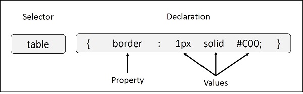
Example − You can define a table border as follows −
table{ border :1px solid #C00; }
Here table is a selector and border is a property and given value 1px solid #C00 is the value of that property.
You can define selectors in various simple ways based on your comfort. Let me put these selectors one by one.
The Type Selectors
This is the same selector we have seen above. Again, one more example to give a color to all level 1 headings −
h1 {
   color: #36CFFF;
}
The Universal Selectors
Rather than selecting elements of a specific type, the universal selector quite simply matches the name of any element type −
* {
   color: #000000;
}
This rule renders the content of every element in our document in black.
The Descendant Selectors
Suppose you want to apply a style rule to a particular element only when it lies inside a particular element. As given in the following example, style rule will apply to <em> element only when it lies inside <ul> tag.
ul em {
   color: #000000;
}
The Class Selectors
You can define style rules based on the class attribute of the elements. All the elements having that class will be formatted according to the defined rule.
.black {
   color: #000000;
}
This rule renders the content in black for every element with class attribute set to black in our document. You can make it a bit more particular. For example −
h1.black {
   color: #000000;
}
This rule renders the content in black for only <h1> elements with class attribute set to black.
You can apply more than one class selectors to given element. Consider the following example −
<p class = "center bold">
   This para will be styled by the classes center and bold.
</p>
The ID Selectors
You can define style rules based on the id attribute of the elements. All the elements having that id will be formatted according to the defined rule.
#black {
   color: #000000;
}
This rule renders the content in black for every element with id attribute set to black in our document. You can make it a bit more particular. For example −
h1#black {
   color: #000000;
}
This rule renders the content in black for only <h1> elements with id attribute set to black.
The true power of id selectors is when they are used as the foundation for descendant selectors, For example −
#black h2 {
   color: #000000;
}
In this example all level 2 headings will be displayed in black color when those headings will lie with in tags having id attribute set to black.
The Child Selectors
You have seen the descendant selectors. There is one more type of selector, which is very similar to descendants but have different functionality. Consider the following example −
body > p {
   color: #000000;
}
This rule will render all the paragraphs in black if they are direct child of <body> element. Other paragraphs put inside other elements like <div> or <td> would not have any effect of this rule.
The Attribute Selectors
You can also apply styles to HTML elements with particular attributes. The style rule below will match all the input elements having a type attribute with a value of text −
input[type = "text"] {
   color: #000000;
}
The advantage to this method is that the <input type = "submit" /> element is unaffected, and the color applied only to the desired text fields.
There are following rules applied to attribute selector.
p[lang] − Selects all paragraph elements with a lang attribute.
p[lang="fr"] − Selects all paragraph elements whose lang attribute has a value of exactly "fr".
p[lang~="fr"] − Selects all paragraph elements whose lang attribute contains the word "fr".
p[lang|="en"] − Selects all paragraph elements whose lang attribute contains values that are exactly "en", or begin with "en-".
Multiple Style Rules
You may need to define multiple style rules for a single element. You can define these rules to combine multiple properties and corresponding values into a single block as defined in the following example −
h1 {
   color: #36C;
   font-weight: normal;
   letter-spacing: .4em;
   margin-bottom: 1em;
   text-transform: lowercase;
}
Here all the property and value pairs are separated by a semicolon (;). You can keep them in a single line or multiple lines. For better readability, we keep them in separate lines.
For a while, don't bother about the properties mentioned in the above block. These properties will be explained in the coming chapters and you can find complete detail about properties in CSS References
Grouping Selectors
You can apply a style to many selectors if you like. Just separate the selectors with a comma, as given in the following example −
h1, h2, h3 {
   color: #36C;
   font-weight: normal;
   letter-spacing: .4em;
   margin-bottom: 1em;
   text-transform: lowercase;
}
This define style rule will be applicable to h1, h2 and h3 element as well. The order of the list is irrelevant. All the elements in the selector will have the corresponding declarations applied to them.
You can combine the various id selectors together as shown below −
#content, #footer, #supplement {
   position: absolute;
   left: 510px;
   width: 200px;
}
CSS - Inclusion
<head> <style type = "text/css" media = "all"> body { background-color: linen; } h1 { color: maroon; margin-left: 40px; } </style> </head> <body> <h1>This is a heading</h1> <p>This is a paragraph.</p> </body> </html>It will produce the following result −
Attributes
Attributes associated with <style> elements are −
| Attribute | Value | Description |
|---|---|---|
| type | text/css | Specifies the style sheet language as a content-type (MIME type). This is required attribute. |
| media | screen tty tv projection handheld braille aural all |
Specifies the device the document will be displayed on. Default value is all. This is an optional attribute. |
Inline CSS - The style Attribute
You can use style attribute of any HTML element to define style rules. These rules will be applied to that element only. Here is the generic syntax −
<element style = "...style rules....">
Attributes
| Attribute | Value | Description |
|---|---|---|
| style | style rules | The value of style attribute is a combination of style declarations separated by semicolon (;). |
Example
Following is the example of inline CSS based on the above syntax −
Live Demo
<html>
   <head>
   </head>

   <body>
      <h1 style = "color:#36C;">
         This is inline CSS
      </h1>
   </body>
</html>
It will produce the following result −
External CSS - The <link> Element
The <link> element can be used to include an external stylesheet file in your HTML document.
An external style sheet is a separate text file with .css extension. You define all the Style rules within this text file and then you can include this file in any HTML document using <link> element.
Here is the generic syntax of including external CSS file −
<head>
   <link type = "text/css" href = "..." media = "..." />
</head>
Attributes
Attributes associated with <style> elements are −
| Attribute | Value | Description |
|---|---|---|
| type | text css | Specifies the style sheet language as a content-type (MIME type). This attribute is required. |
| href | URL | Specifies the style sheet file having Style rules. This attribute is a required. |
| media |
screen tty tv projection handheld braille aural all |
Specifies the device the document will be displayed on. Default value is all. This is optional attribute. |
Example
Consider a simple style sheet file with a name mystyle.css having the following rules −
h1, h2, h3 {
   color: #36C;
   font-weight: normal;
   letter-spacing: .4em;
   margin-bottom: 1em;
   text-transform: lowercase;
}
Now you can include this file mystyle.css in any HTML document as follows −
<head>
   <link type = "text/css" href = "mystyle.css" media = " all" />
</head>
Imported CSS - @import Rule
@import is used to import an external stylesheet in a manner similar to the <link> element. Here is the generic syntax of @import rule.
<head>
   @import "URL";
</head>
Here URL is the URL of the style sheet file having style rules. You can use another syntax as well −
<head>
   @import url("URL");
</head>
Example
Following is the example showing you how to import a style sheet file into HTML document −
<head>
   @import "mystyle.css";
</head>
CSS Rules Overriding
We have discussed four ways to include style sheet rules in a an HTML document. Here is the rule to override any Style Sheet Rule.
Any inline style sheet takes highest priority. So, it will override any rule defined in <style>...</style> tags or rules defined in any external style sheet file.
Any rule defined in <style>...</style> tags will override rules defined in any external style sheet file.
Any rule defined in external style sheet file takes lowest priority, and rules defined in this file will be applied only when above two rules are not applicable.
Handling old Browsers
There are still many old browsers who do not support CSS. So, we should take care while writing our Embedded CSS in an HTML document. The following snippet shows how you can use comment tags to hide CSS from older browsers −
<style type = "text/css">
   <!--
      body, td {
         color: blue;
      }
   -->
</style>
CSS Comments
Many times, you may need to put additional comments in your style sheet blocks. So, it is very easy to comment any part in style sheet. You can simple put your comments inside /*.....this is a comment in style sheet.....*/.
You can use /* ....*/ to comment multi-line blocks in similar way you do in C and C++ programming languages.
Example
Live Demo
<!DOCTYPE html>
<html>
   <head>
      <style>
         p {
            color: red;
            /* This is a single-line comment */
            text-align: center;
         }
         /* This is a multi-line comment */
      </style>
   </head>

   <body>
      <p>Hello World!</p>
   </body>
</html>
It will produce the following result −
CSS - Measurement Units
| % | Defines a measurement as a percentage relative to another value, typically an enclosing element. | p {font-size: 16pt; line-height: 125%;} |
| cm | Defines a measurement in centimeters. | div {margin-bottom: 2cm;} |
| em | A relative measurement for the height of a font in em spaces. Because an em unit is equivalent to the size of a given font, if you assign a font to 12pt, each "em" unit would be 12pt; thus, 2em would be 24pt. | p {letter-spacing: 7em;} |
| ex | This value defines a measurement relative to a font's x-height. The x-height is determined by the height of the font's lowercase letter x. | p {font-size: 24pt; line-height: 3ex;} |
| in | Defines a measurement in inches. | p {word-spacing: .15in;} |
| mm | Defines a measurement in millimeters. | p {word-spacing: 15mm;} |
| pc | Defines a measurement in picas. A pica is equivalent to 12 points; thus, there are 6 picas per inch. | p {font-size: 20pc;} |
| pt | Defines a measurement in points. A point is defined as 1/72nd of an inch. | body {font-size: 18pt;} |
| px | Defines a measurement in screen pixels. | p {padding: 25px;} |
CSS - Colors
| Hex Code | #RRGGBB | p{color:#FF0000;} |
| Short Hex Code | #RGB | p{color:#6A7;} |
| RGB % | rgb(rrr%,ggg%,bbb%) | p{color:rgb(50%,50%,50%);} |
| RGB Absolute | rgb(rrr,ggg,bbb) | p{color:rgb(0,0,255);} |
| keyword | aqua, black, etc. | p{color:teal;} |
These formats are explained in more detail in the following sections −
CSS Colors - Hex Codes
A hexadecimal is a 6 digit representation of a color. The first two digits(RR) represent a red value, the next two are a green value(GG), and the last are the blue value(BB).
A hexadecimal is a 6 digit representation of a color. The first two digits(RR) represent a red value, the next two are a green value(GG), and the last are the blue value(BB).
A hexadecimal value can be taken from any graphics software like Adobe Photoshop, Jasc Paintshop Pro, or even using Advanced Paint Brush.
Each hexadecimal code will be preceded by a pound or hash sign '#'. Following are the examples to use Hexadecimal notation.
| Color | Color HEX |
|---|---|
| #000000 | |
| #FF0000 | |
| #00FF00 | |
| #0000FF | |
| #FFFF00 | |
| #00FFFF | |
| #FF00FF | |
| #C0C0C0 | |
| #FFFFFF |
CSS Colors - Short Hex Codes
This is a shorter form of the six-digit notation. In this format, each digit is replicated to arrive at an equivalent six-digit value. For example: #6A7 becomes #66AA77.
A hexadecimal value can be taken from any graphics software like Adobe Photoshop, Jasc Paintshop Pro, or even using Advanced Paint Brush.
Each hexadecimal code will be preceded by a pound or hash sign '#'. Following are the examples to use Hexadecimal notation.
| Color | Color HEX |
|---|---|
| #000 | |
| #F00 | |
| #0F0 | |
| #0FF | |
| #FF0 | |
| #0FF | |
| #F0F | |
| #FFF |
CSS Colors - RGB Values
This color value is specified using the rgb( ) property. This property takes three values, one each for red, green, and blue. The value can be an integer between 0 and 255 or a percentage.
NOTE − All the browsers does not support rgb() property of color so it is recommended not to use it.
Following is the example to show few colors using RGB values.
| Color | Color RGB |
|---|---|
| rgb(0,0,0) | |
| rgb(255,0,0) | |
| rgb(0,255,0) | |
| rgb(0,0,255) | |
| rgb(255,255,0) | |
| rgb(0,255,255) | |
| rgb(255,0,255) | |
| rgb(192,192,192) | |
| rgb(255,255,255) |
Building Color Codes
You can build millions of color codes using our Color Code Builder. Check our HTML Color Code Builder. To use this tool, you would need a Java Enabled Browser.
Browser Safe Colors
Here is the list of 216 colors which are supposed to be most safe and computer independent colors. These colors vary from hexa code 000000 to FFFFFF. These colors are safe to use because they ensure that all computers would display the colors correctly when running a 256 color palette −
| 000000 | 000033 | 000066 | 000099 | 0000CC | 0000FF |
| 003300 | 003333 | 003366 | 003399 | 0033CC | 0033FF |
| 006600 | 006633 | 006666 | 006699 | 0066CC | 0066FF |
| 009900 | 009933 | 009966 | 009999 | 0099CC | 0099FF |
| 00CC00 | 00CC33 | 00CC66 | 00CC99 | 00CCCC | 00CCFF |
| 00FF00 | 00FF33 | 00FF66 | 00FF99 | 00FFCC | 00FFFF |
| 330000 | 330033 | 330066 | 330099 | 3300CC | 3300FF |
| 333300 | 333333 | 333366 | 333399 | 3333CC | 3333FF |
| 336600 | 336633 | 336666 | 336699 | 3366CC | 3366FF |
| 339900 | 339933 | 339966 | 339999 | 3399CC | 3399FF |
| 33CC00 | 33CC33 | 33CC66 | 33CC99 | 33CCCC | 33CCFF |
| 33FF00 | 33FF33 | 33FF66 | 33FF99 | 33FFCC | 33FFFF |
| 660000 | 660033 | 660066 | 660099 | 6600CC | 6600FF |
| 663300 | 663333 | 663366 | 663399 | 6633CC | 6633FF |
| 666600 | 666633 | 666666 | 666699 | 6666CC | 6666FF |
| 669900 | 669933 | 669966 | 669999 | 6699CC | 6699FF |
| 66CC00 | 66CC33 | 66CC66 | 66CC99 | 66CCCC | 66CCFF |
| 66FF00 | 66FF33 | 66FF66 | 66FF99 | 66FFCC | 66FFFF |
| 990000 | 990033 | 990066 | 990099 | 9900CC | 9900FF |
| 993300 | 993333 | 993366 | 993399 | 9933CC | 9933FF |
| 996600 | 996633 | 996666 | 996699 | 9966CC | 9966FF |
| 999900 | 999933 | 999966 | 999999 | 9999CC | 9999FF |
| 99CC00 | 99CC33 | 99CC66 | 99CC99 | 99CCCC | 99CCFF |
| 99FF00 | 99FF33 | 99FF66 | 99FF99 | 99FFCC | 99FFFF |
| CC0000 | CC0033 | CC0066 | CC0099 | CC00CC | CC00FF |
| CC3300 | CC3333 | CC3366 | CC3399 | CC33CC | CC33FF |
| CC6600 | CC6633 | CC6666 | CC6699 | CC66CC | CC66FF |
| CC9900 | CC9933 | CC9966 | CC9999 | CC99CC | CC99FF |
| CCCC00 | CCCC33 | CCCC66 | CCCC99 | CCCCCC | CCCCFF |
| CCFF00 | CCFF33 | CCFF66 | CCFF99 | CCFFCC | CCFFFF |
| FF0000 | FF0033 | FF0066 | FF0099 | FF00CC | FF00FF |
| FF3300 | FF3333 | FF3366 | FF3399 | FF33CC | FF33FF |
| FF6600 | FF6633 | FF6666 | FF6699 | FF66CC | FF66FF |
| FF9900 | FF9933 | FF9966 | FF9999 | FF99CC | FF99FF |
| FFCC00 | FFCC33 | FFCC66 | FFCC99 | FFCCCC | FFCCFF |
| FFFF00 | FFFF33 | FFFF66 | FFFF99 | FFFFCC | FFFFFF |
CSS - Backgrounds
Set the Background Color
Following is the example which demonstrates how to set the background color for an element.
Live Demo
<html>
   <head>
   </head>

   <body>
      <p style = "background-color:yellow;">
         This text has a yellow background color.
      </p>
   </body>
</html>
This will produce following result −
Set the Background Image
We can set the background image by calling local stored images as shown below −
Live Demo
<html>
   <head>
      <style>
         body  {
            background-image: url("/css/images/css.jpg");
            background-color: #cccccc;
         }
      </style>
   </head>

   <body>
      <h1>Hello World!</h1>
   </body>
<html>
It will produce the following result −
Repeat the Background Image
The following example demonstrates how to repeat the background image if an image is small. You can use no-repeat value for background-repeat property if you don't want to repeat an image, in this case image will display only once.
By default background-repeat property will have repeat value.
Live Demo
<html>
   <head>
      <style>
         body {
            background-image: url("/css/images/css.jpg");
            background-repeat: repeat;
         }
      </style>
   </head>

   <body>
      <p>Tutorials point</p>
   </body>
</html>
It will produce the following result −
The following example which demonstrates how to repeat the background image vertically.
Live Demo
<html>
   <head>
      <style>
         body {
            background-image: url("/css/images/css.jpg");
            background-repeat: repeat-y;
         }
      </style>
   </head>

   <body>
      <p>Tutorials point</p>
   </body>
</html>
It will produce the following result −
The following example demonstrates how to repeat the background image horizontally.
Live Demo
<html>
   <head>
      <style>
         body {
            background-image: url("/css/images/css.jpg");
            background-repeat: repeat-x;
         }
      </style>
   </head>

   <body>
      <p>Tutorials point</p>
   </body>
</html>
It will produce the following result −
Set the Background Image Position
The following example demonstrates how to set the background image position 100 pixels away from the left side.
Live Demo
<html>
   <head>
      <style>
         body {
            background-image: url("/css/images/css.jpg");
            background-position:100px;
         }
      </style>
   </head>

   <body>
      <p>Tutorials point</p>
   </body>
</html>
It will produce the following result −
The following example demonstrates how to set the background image position 100 pixels away from the left side and 200 pixels down from the top.
Live Demo
<html>
   <head>
      <style>
         body {
            background-image: url("/css/images/css.jpg");
            background-position:100px 200px;
         }
      </style>
   </head>

   <body>
      <p>Tutorials point</p>
   </body>
</html>
It will produce the following result −
Set the Background Attachment
Background attachment determines whether a background image is fixed or scrolls with the rest of the page.
The following example demonstrates how to set the fixed background image.
Live Demo
<!DOCTYPE html>
<html>
   <head>
      <style>
         body {
            background-image: url('/css/images/css.jpg');
            background-repeat: no-repeat;
            background-attachment: fixed;
         }
      </style>
   </head>

   <body>
      <p>The background-image is fixed. Try to scroll down the page.</p>
      <p>The background-image is fixed. Try to scroll down the page.</p>
      <p>The background-image is fixed. Try to scroll down the page.</p>
      <p>The background-image is fixed. Try to scroll down the page.</p>
      <p>The background-image is fixed. Try to scroll down the page.</p>
      <p>The background-image is fixed. Try to scroll down the page.</p>
      <p>The background-image is fixed. Try to scroll down the page.</p>
      <p>The background-image is fixed. Try to scroll down the page.</p>
      <p>The background-image is fixed. Try to scroll down the page.</p>
   </body>
</html>
It will produce the following result −
The following example demonstrates how to set the scrolling background image.
Live Demo
<!DOCTYPE html>
<html>
   <head>
      <style>
         body {
            background-image: url('/css/images/css.jpg');
            background-repeat: no-repeat;
            background-attachment: fixed;
            background-attachment:scroll;
         }
      </style>
   </head>

   <body>
      <p>The background-image is fixed. Try to scroll down the page.</p>
      <p>The background-image is fixed. Try to scroll down the page.</p>
      <p>The background-image is fixed. Try to scroll down the page.</p>
      <p>The background-image is fixed. Try to scroll down the page.</p>
      <p>The background-image is fixed. Try to scroll down the page.</p>
      <p>The background-image is fixed. Try to scroll down the page.</p>
      <p>The background-image is fixed. Try to scroll down the page.</p>
      <p>The background-image is fixed. Try to scroll down the page.</p>
      <p>The background-image is fixed. Try to scroll down the page.</p>
   </body>
</html>
It will produce the following result −
Shorthand Property
You can use the background property to set all the background properties at once. For example −
<p style = "background:url(/images/pattern1.gif) repeat fixed;">
   This parapgraph has fixed repeated background image.
</p>
CSS - Fonts
Set the Font Family
Following is the example, which demonstrates how to set the font family of an element. Possible value could be any font family name.
Live Demo
<html>
   <head>
   </head>

   <body>
      <p style = "font-family:georgia,garamond,serif;">
         This text is rendered in either georgia, garamond, or the
         default serif font depending on which font  you have at your system.
      </p>
   </body>
</html>
This will produce following result −
Set the Font Style
Following is the example, which demonstrates how to set the font style of an element. Possible values are normal, italic and oblique.
Live Demo
<html>
   <head>
   </head>

   <body>
      <p style = "font-style:italic;">
         This text will be rendered in italic style
      </p>
   </body>
</html>
This will produce following result −
Set the Font Variant
The following example demonstrates how to set the font variant of an element. Possible values are normal and small-caps.
Live Demo
<html>
   <head>
   </head>

   <body>
      <p style = "font-variant:small-caps;">
         This text will be rendered as small caps
      </p>
   </body>
</html>
This will produce following result −
Set the Font Weight
The following example demonstrates how to set the font weight of an element. The font-weight property provides the functionality to specify how bold a font is. Possible values could be normal, bold, bolder, lighter, 100, 200, 300, 400, 500, 600, 700, 800, 900.
Live Demo
<html>
   <head>
   </head>

   <body>
      <p style = "font-weight:bold;">
         This font is bold.
      </p>

      <p style = "font-weight:bolder;">
         This font is bolder.
      </p>

      <p style = "font-weight:500;">
         This font is 500 weight.
      </p>
   </body>
</html>
This will produce following result −
Set the Font Size
The following example demonstrates how to set the font size of an element. The font-size property is used to control the size of fonts. Possible values could be xx-small, x-small, small, medium, large, x-large, xx-large, smaller, larger, size in pixels or in %.
Live Demo
<html>
   <head>
   </head>

   <body>
      <p style = "font-size:20px;">
         This font size is 20 pixels
      </p>

      <p style = "font-size:small;">
         This font size is small
      </p>

      <p style = "font-size:large;">
         This font size is large
      </p>
   </body>
</html>
This will produce following result −
Set the Font Size Adjust
The following example demonstrates how to set the font size adjust of an element. This property enables you to adjust the x-height to make fonts more legible. Possible value could be any number.
Live Demo
<html>
   <head>
   </head>

   <body>
      <p style = "font-size-adjust:0.61;">
         This text is using a font-size-adjust value.
      </p>
   </body>
</html>
This will produce following result −
Set the Font Stretch
The following example demonstrates how to set the font stretch of an element. This property relies on the user's computer to have an expanded or condensed version of the font being used.
Possible values could be normal, wider, narrower, ultra-condensed, extra-condensed, condensed, semi-condensed, semi-expanded, expanded, extra-expanded, ultra-expanded.
Live Demo
<html>
   <head>
   </head>

   <body>
      <p style = "font-stretch:ultra-expanded;">
         If this doesn't appear to work, it is likely that your computer
         doesn't have a <br>condensed or expanded version of the font being used.
      </p>
   </body>
</html>
This will produce following result −
Shorthand Property
You can use the font property to set all the font properties at once. For example −
Live Demo
<html>
   <head>
   </head>

   <body>
      <p style = "font:italic small-caps bold 15px georgia;">
         Applying all the properties on the text at once.
      </p>
   </body>
</html>
This will produce following result −
CSS - Text
The text-decoration property is used to underline, overline, and strikethrough text.
The text-transform property is used to capitalize text or convert text to uppercase or lowercase letters.
The white-space property is used to control the flow and formatting of text.
The text-shadow property is used to set the text shadow around a text.
Set the Text Color
The following example demonstrates how to set the text color. Possible value could be any color name in any valid format.
Live Demo
<html>
   <head>
   </head>

   <body>
      <p style = "color:red;">
         This text will be written in red.
      </p>
   </body>
</html>
It will produce the following result −
Set the Text Direction
The following example demonstrates how to set the direction of a text. Possible values are ltr or rtl.
Live Demo
<html>
   <head>
   </head>

   <body>
      <p style = "direction:rtl;">
         This text will be rendered from right to left
      </p>
   </body>
</html>
It will produce the following result −
Set the Space between Characters
The following example demonstrates how to set the space between characters. Possible values are normal or a number specifying space..
Live Demo
<html>
   <head>
   </head>

   <body>
      <p style = "letter-spacing:5px;">
         This text is having space between letters.
      </p>
   </body>
</html>
It will produce the following result −
Set the Space between Words
The following example demonstrates how to set the space between words. Possible values are normal or a number specifying space.
Live Demo
<html>
   <head>
   </head>

   <body>
      <p style = "word-spacing:5px;">
         This text is having space between words.
      </p>
   </body>
</html>
This will produce following result −
Set the Text Indent
The following example demonstrates how to indent the first line of a paragraph. Possible values are % or a number specifying indent space.
Live Demo
<html>
   <head>
   </head>

   <body>
      <p style = "text-indent:1cm;">
         This text will have first line indented by 1cm and this line will remain at
         its actual position this is done by CSS text-indent property.
      </p>
   </body>
</html>
It will produce the following result −
Set the Text Alignment
The following example demonstrates how to align a text. Possible values are left, right, center, justify.
Live Demo
<html>
   <head>
   </head>

   <body>
      <p style = "text-align:right;">
         This will be right aligned.
      </p>

      <p style = "text-align:center;">
         This will be center aligned.
      </p>

      <p style = "text-align:left;">
         This will be left aligned.
      </p>
   </body>
</html>
This will produce following result −
Decorating the Text
The following example demonstrates how to decorate a text. Possible values are none, underline, overline, line-through, blink.
Live Demo
<html>
   <head>
   </head>

   <body>
      <p style = "text-decoration:underline;">
         This will be underlined
      </p>

      <p style = "text-decoration:line-through;">
         This will be striked through.
      </p>

      <p style = "text-decoration:overline;">
         This will have a over line.
      </p>

      <p style = "text-decoration:blink;">
         This text will have blinking effect
      </p>
   </body>
</html>
This will produce following result −
Set the Text Cases
The following example demonstrates how to set the cases for a text. Possible values are none, capitalize, uppercase, lowercase.
Live Demo
<html>
   <head>
   </head>

   <body>
      <p style = "text-transform:capitalize;">
         This will be capitalized
      </p>

      <p style = "text-transform:uppercase;">
         This will be in uppercase
      </p>

      <p style = "text-transform:lowercase;">
         This will be in lowercase
      </p>
   </body>
</html>
This will produce following result −
Set the White Space between Text
The following example demonstrates how white space inside an element is handled. Possible values are normal, pre, nowrap.
Live Demo
<html>
   <head>
   </head>

   <body>
      <p style = "white-space:pre;">
         This text has a line break and the white-space pre setting
         tells the browser to honor it just like the HTML pre tag.
      </p>
   </body>
</html>
This will produce following result −
Set the Text Shadow
The following example demonstrates how to set the shadow around a text. This may not be supported by all the browsers.
Live Demo
<html>
   <head>
   </head>

   <body>
      <p style = "text-shadow:4px 4px 8px blue;">
         If your browser supports the CSS text-shadow property,
         this text will have a  blue shadow.
      </p>
   </body>
</html>
It will produce the following result −
CSS - Using Images
The Image Border Property
The border property of an image is used to set the width of an image border. This property can have a value in length or in %.
A width of zero pixels means no border.
Here is the example −
Live Demo
<html>
   <head>
   </head>

   <body>
      <img style = "border:0px;" src = "/css/images/logo.png" />
      <br />
      <img style = "border:3px dashed red;" src = "/css/images/logo.png" />
   </body>
</html>
It will produce the following result −
The Image Height Property
The height property of an image is used to set the height of an image. This property can have a value in length or in %. While giving value in %, it applies it in respect of the box in which an image is available.
Here is an example −
Live Demo
<html>
   <head>
   </head>

   <body>
      <img style = "border:1px solid red; height:100px;" src = "/css/images/logo.png" />
      <br />
      <img style = "border:1px solid red; height:50%;" src = "/css/images/logo.png" />
   </body>
</html>
It will produce the following result −
The Image Width Property
The width property of an image is used to set the width of an image. This property can have a value in length or in %. While giving value in %, it applies it in respect of the box in which an image is available.
Here is an example −
Live Demo
<html>
   <head>
   </head>

   <body>
      <img style = "border:1px solid red; width:150px;" src = "/css/images/logo.png" />
      <br />
      <img style = "border:1px solid red; width:100%;" src = "/css/images/logo.png" />
   </body>
</html>
It will produce the following result −
The -moz-opacity Property
The -moz-opacity property of an image is used to set the opacity of an image. This property is used to create a transparent image in Mozilla. IE uses filter:alpha(opacity=x) to create transparent images.
In Mozilla (-moz-opacity:x) x can be a value from 0.0 - 1.0. A lower value makes the element more transparent (The same things goes for the CSS3-valid syntax opacity:x).
In IE (filter:alpha(opacity=x)) x can be a value from 0 - 100. A lower value makes the element more transparent.
Here is an example −
Live Demo
<html>
   <head>
   </head>

   <body>
      <img style = "border:1px solid red; -moz-opacity:0.4; filter:alpha(opacity=40);" src = "/css/images/logo.png" />
   </body>
</html>
It will produce the following result −
CSS - Links
Usually, all these properties are kept in the header part of the HTML document.
Remember a:hover MUST come after a:link and a:visited in the CSS definition in order to be effective. Also, a:active MUST come after a:hover in the CSS definition as follows −
<style type = "text/css">
   a:link {color: #000000}
   a:visited {color: #006600}
   a:hover {color: #FFCC00}
   a:active {color: #FF00CC}
</style>
Now, we will see how to use these properties to give different effects to hyperlinks.
Set the Color of Links
The following example demonstrates how to set the link color. Possible values could be any color name in any valid format.
Live Demo
<html>
   <head>
      <style type = "text/css">
         a:link {color:#000000}
     </style>
   </head>

   <body>
      <a href = "">Link</a>
   </body>
</html>
It will produce the following black link −
Set the Color of Visited Links
The following example demonstrates how to set the color of visited links. Possible values could be any color name in any valid format.
Live Demo
<html>
   <head>
      <style type = "text/css">
         a:visited {color: #006600}
      </style>
   </head>

   <body>
      <a href = ""> link</a>
   </body>
</html>
It will produce the following link. Once you will click this link, it will change its color to green.
Change the Color of Links when Mouse is Over
The following example demonstrates how to change the color of links when we bring a mouse pointer over that link. Possible values could be any color name in any valid format.
Live Demo
<html>
   <head>
      <style type = "text/css">
         a:hover {color: #FFCC00}
      </style>
   </head>

   <body>
      <a href = "">Link</a>
   </body>
</html>
It will produce the following link. Now, you bring your mouse over this link and you will see that it changes its color to yellow.
Change the Color of Active Links
The following example demonstrates how to change the color of active links. Possible values could be any color name in any valid format.
Live Demo
<html>
   <head>
      <style type = "text/css">
         a:active {color: #FF00CC}
      </style>
   </head>

   <body>
      <a href = "">Link</a>
   </body>
</html>
It will produce the following link. It will change its color to pink when the user clicks it.
CSS - Tables
Now, we will see how to use these properties with examples.
The border-collapse Property
This property can have two values collapse and separate. The following example uses both the values −
Live Demo
<html>
   <head>
      <style type = "text/css">
         table.one {border-collapse:collapse;}
         table.two {border-collapse:separate;}

         td.a {
            border-style:dotted;
            border-width:3px;
            border-color:#000000;
            padding: 10px;
         }
         td.b {
            border-style:solid;
            border-width:3px;
            border-color:#333333;
            padding:10px;
         }
      </style>
   </head>

   <body>
      <table class = "one">
         <caption>Collapse Border Example</caption>
         <tr><td class = "a"> Cell A Collapse Example</td></tr>
         <tr><td class = "b"> Cell B Collapse Example</td></tr>
      </table>
      <br />

      <table class = "two">
         <caption>Separate Border Example</caption>
         <tr><td class = "a"> Cell A Separate Example</td></tr>
         <tr><td class = "b"> Cell B Separate Example</td></tr>
      </table>
   </body>
</html>
It will produce the following result −
The border-spacing Property
The border-spacing property specifies the distance that separates adjacent cells'. borders. It can take either one or two values; these should be units of length.
If you provide one value, it will applies to both vertical and horizontal borders. Or you can specify two values, in which case, the first refers to the horizontal spacing and the second to the vertical spacing −
NOTE − Unfortunately, this property does not work in Netscape 7 or IE 6.
<style type="text/css">
   /* If you provide one value */
   table.example {border-spacing:10px;}
   /* This is how you can provide two values */
   table.example {border-spacing:10px; 15px;}
</style>
Now let's modify the previous example and see the effect −
Live Demo
<html>
   <head>
      <style type = "text/css">
         table.one {
            border-collapse:separate;
            width:400px;
            border-spacing:10px;
         }
         table.two {
            border-collapse:separate;
            width:400px;
            border-spacing:10px 50px;
         }
      </style>
   </head>

   <body>

      <table class = "one" border = "1">
         <caption>Separate Border Example with border-spacing</caption>
         <tr><td> Cell A Collapse Example</td></tr>
         <tr><td> Cell B Collapse Example</td></tr>
      </table>
      <br />

      <table class = "two" border = "1">
         <caption>Separate Border Example with border-spacing</caption>
         <tr><td> Cell A Separate Example</td></tr>
         <tr><td> Cell B Separate Example</td></tr>
      </table>

   </body>
</html>
It will produce the following result −
The caption-side Property
The caption-side property allows you to specify where the content of a <caption> element should be placed in relationship to the table. The table that follows lists the possible values.
This property can have one of the four values top, bottom, left or right. The following example uses each value.
NOTE − These properties may not work with your IE Browser.
Live Demo
<html>
   <head>
      <style type = "text/css">
         caption.top {caption-side:top}
         caption.bottom {caption-side:bottom}
         caption.left {caption-side:left}
         caption.right {caption-side:right}
      </style>
   </head>

   <body>

      <table style = "width:400px; border:1px solid black;">
         <caption class = "top">
            This caption will appear at the top
         </caption>
         <tr><td > Cell A</td></tr>
         <tr><td > Cell B</td></tr>
      </table>
      <br />

      <table style = "width:400px; border:1px solid black;">
         <caption class = "bottom">
            This caption will appear at the bottom
         </caption>
         <tr><td > Cell A</td></tr>
         <tr><td > Cell B</td></tr>
      </table>
      <br />

      <table style = "width:400px; border:1px solid black;">
         <caption class = "left">
            This caption will appear at the left
         </caption>
         <tr><td > Cell A</td></tr>
         <tr><td > Cell B</td></tr>
      </table>
      <br />

      <table style = "width:400px; border:1px solid black;">
         <caption class = "right">
            This caption will appear at the right
         </caption>
         <tr><td > Cell A</td></tr>
         <tr><td > Cell B</td></tr>
      </table>

   </body>
</html>
It will produce the following result −
The empty-cells Property
The empty-cells property indicates whether a cell without any content should have a border displayed.
This property can have one of the three values - show, hide or inherit.
Here is the empty-cells property used to hide borders of empty cells in the <table> element.
Live Demo
<html>
   <head>
      <style type = "text/css">
         table.empty {
            width:350px;
            border-collapse:separate;
            empty-cells:hide;
         }
         td.empty {
            padding:5px;
            border-style:solid;
            border-width:1px;
            border-color:#999999;
         }
      </style>
   </head>

   <body>

      <table class = "empty">
         <tr>
            <th></th>
            <th>Title one</th>
            <th>Title two</th>
         </tr>

         <tr>
            <th>Row Title</th>
            <td class = "empty">value</td>
            <td class = "empty">value</td>
         </tr>

         <tr>
            <th>Row Title</th>
            <td class = "empty">value</td>
            <td class = "empty"></td>
         </tr>
      </table>

   </body>
</html>
It will produce the following result −
The table-layout Property
The table-layout property is supposed to help you control how a browser should render or lay out a table.
This property can have one of the three values: fixed, auto or inherit.
The following example shows the difference between these properties.
NOTE − This property is not supported by many browsers so do not rely on this property.
Live Demo
<html>
   <head>
      <style type = "text/css">
         table.auto {
            table-layout: auto
         }
         table.fixed {
            table-layout: fixed
         }
      </style>
   </head>

   <body>

      <table class = "auto" border = "1" width = "100%">
         <tr>
            <td width = "20%">1000000000000000000000000000</td>
            <td width = "40%">10000000</td>
            <td width = "40%">100</td>
         </tr>
      </table>
      <br />

      <table class = "fixed" border = "1" width = "100%">
         <tr>
            <td width = "20%">1000000000000000000000000000</td>
            <td width = "40%">10000000</td>
            <td width = "40%">100</td>
         </tr>
      </table>

   </body>
</html>
It will produce the following result −
CSS - Borders
The border-color property allows you to change the color of the border surrounding an element. You can individually change the color of the bottom, left, top and right sides of an element's border using the properties −
border-bottom-color changes the color of bottom border.
border-top-color changes the color of top border.
border-left-color changes the color of left border.
border-right-color changes the color of right border.
The following example shows the effect of all these properties −
Live Demo
<html>
   <head>
      <style type = "text/css">
         p.example1 {
            border:1px solid;
            border-bottom-color:#009900; /* Green */
            border-top-color:#FF0000;    /* Red */
            border-left-color:#330000;   /* Black */
            border-right-color:#0000CC;  /* Blue */
         }
         p.example2 {
            border:1px solid;
            border-color:#009900;        /* Green */
         }
      </style>
   </head>

   <body>
      <p class = "example1">
         This example is showing all borders in different colors.
      </p>

      <p class = "example2">
         This example is showing all borders in green color only.
      </p>
   </body>
</html>
It will produce the following result −
The border-style Property
The border-style property allows you to select one of the following styles of border −
none − No border. (Equivalent of border-width:0;)
solid − Border is a single solid line.
dotted − Border is a series of dots.
dashed − Border is a series of short lines.
double − Border is two solid lines.
groove − Border looks as though it is carved into the page.
ridge − Border looks the opposite of groove.
inset − Border makes the box look like it is embedded in the page.
outset − Border makes the box look like it is coming out of the canvas.
hidden − Same as none, except in terms of border-conflict resolution for table elements.
You can individually change the style of the bottom, left, top, and right borders of an element using the following properties −
border-bottom-style changes the style of bottom border.
border-top-style changes the style of top border.
border-left-style changes the style of left border.
border-right-style changes the style of right border.
The following example shows all these border styles −
Live Demo
<html>
   <head>
   </head>

   <body>
      <p style = "border-width:4px; border-style:none;">
         This is a border with none width.
      </p>

      <p style = "border-width:4px; border-style:solid;">
         This is a solid border.
      </p>

      <p style = "border-width:4px; border-style:dashed;">
         This is a dashed border.
      </p>

      <p style = "border-width:4px; border-style:double;">
         This is a double border.
      </p>

      <p style = "border-width:4px; border-style:groove;">
         This is a groove border.
      </p>

      <p style = "border-width:4px; border-style:ridge">
         This is a ridge  border.
      </p>

      <p style = "border-width:4px; border-style:inset;">
         This is a inset border.
      </p>

      <p style = "border-width:4px; border-style:outset;">
         This is a outset border.
      </p>

      <p style = "border-width:4px; border-style:hidden;">
         This is a hidden border.
      </p>

      <p style = "border-width:4px;
         border-top-style:solid;
         border-bottom-style:dashed;
         border-left-style:groove;
         border-right-style:double;">
         This is a a border with four different styles.
      </p>
   </body>
</html>
It will produce the following result −
The border-width Property
The border-width property allows you to set the width of an element borders. The value of this property could be either a length in px, pt or cm or it should be set to thin, medium or thick.
You can individually change the width of the bottom, top, left, and right borders of an element using the following properties −
border-bottom-width changes the width of bottom border.
border-top-width changes the width of top border.
border-left-width changes the width of left border.
border-right-width changes the width of right border.
The following example shows all these border width −
Live Demo
<html>
   <head>
   </head>

   <body>
      <p style = "border-width:4px; border-style:solid;">
         This is a solid border whose width is 4px.
      </p>

      <p style = "border-width:4pt; border-style:solid;">
         This is a solid border whose width is 4pt.
      </p>

      <p style = "border-width:thin; border-style:solid;">
         This is a solid border whose width is thin.
      </p>

      <p style = "border-width:medium; border-style:solid;">
         This is a solid border whose width is medium;
      </p>

      <p style = "border-width:thick; border-style:solid;">
         This is a solid border whose width is thick.
      </p>

      <p style = "border-bottom-width:4px;border-top-width:10px;
         border-left-width: 2px;border-right-width:15px;border-style:solid;">
         This is a a border with four different width.
      </p>
   </body>
</html>
It will produce the following result −
Border Properties Using Shorthand
The border property allows you to specify color, style, and width of lines in one property −
The following example shows how to use all the three properties into a single property. This is the most frequently used property to set border around any element.
Live Demo
<html>
   <head>
   </head>

   <body>
      <p style = "border:4px solid red;">
         This example is showing shorthand property for border.
      </p>
   </body>
</html>
It will produce the following result −
CSS - Margins
The margin-right specifies the right margin of an element.
Now, we will see how to use these properties with examples.
The Margin Property
The margin property allows you set all of the properties for the four margins in one declaration. Here is the syntax to set margin around a paragraph −
Here is an example −
Live Demo
<html>
   <head>
   </head>

   <body>
      <p style = "margin: 15px; border:1px solid black;">
         all four margins will be 15px
      </p>

      <p style = "margin:10px 2%; border:1px solid black;">
         top and bottom margin will be 10px, left and right margin will be 2%
         of the total width of the document.
      </p>

      <p style = "margin: 10px 2% -10px; border:1px solid black;">
         top margin will be 10px, left and right margin will be 2% of the
         total width of the document, bottom margin will be -10px
      </p>

      <p style = "margin: 10px 2% -10px auto; border:1px solid black;">
         top margin will be 10px, right margin will be 2% of the total
         width of the document, bottom margin will be -10px, left margin
         will be set by the browser
      </p>
   </body>
</html>
It will produce the following result −
The margin-bottom Property
The margin-bottom property allows you set bottom margin of an element. It can have a value in length, % or auto.
Here is an example −
Live Demo
<html>
   <head>
   </head>

   <body>
      <p style = "margin-bottom: 15px; border:1px solid black;">
         This is a paragraph with a specified bottom margin
      </p>

      <p style = "margin-bottom: 5%; border:1px solid black;">
         This is another paragraph with a specified bottom margin in percent
      </p>
   </body>
</html>
It will produce the following result −
The margin-top Property
The margin-top property allows you set top margin of an element. It can have a value in length, % or auto.
Here is an example −
Live Demo
<html>
   <head>
   </head>

   <body>
      <p style = "margin-top: 15px; border:1px solid black;">
         This is a paragraph with a specified top margin
      </p>

      <p style = "margin-top: 5%; border:1px solid black;">
         This is another paragraph with a specified top margin in percent
      </p>
   </body>
</html>
It will produce the following result −
The margin-left Property
The margin-left property allows you set left margin of an element. It can have a value in length, % or auto.
Here is an example −
Live Demo
<html>
   <head>
   </head>

   <body>
      <p style = "margin-left: 15px; border:1px solid black;">
         This is a paragraph with a specified left margin
      </p>

      <p style = "margin-left: 5%; border:1px solid black;">
         This is another paragraph with a specified top margin in percent
      </p>
   </body>
</html>
It will produce the following result −
The margin-right Property
The margin-right property allows you set right margin of an element. It can have a value in length, % or auto.
Here is an example −
Live Demo
<html>
   <head>
   </head>

   <body>
      <p style = "margin-right: 15px; border:1px solid black;">
         This is a paragraph with a specified right margin
      </p>
      <p style = "margin-right: 5%; border:1px solid black;">
         This is another paragraph with a specified right margin in percent
      </p>
   </body>
</html>
It will produce the following result −
CSS - Lists
Now, we will see how to use these properties with examples.
The list-style-type Property
The list-style-type property allows you to control the shape or style of bullet point (also known as a marker) in the case of unordered lists and the style of numbering characters in ordered lists.
Here are the values which can be used for an unordered list −
| Sr.No. | Value & Description |
|---|---|
| 1 | none NA |
| 2 | disc (default) A filled-in circle |
| 3 | circle An empty circle |
| 4 | square A filled-in square |
Here are the values, which can be used for an ordered list −
| Value | Description | Example |
|---|---|---|
| decimal | Number | 1,2,3,4,5 |
| decimal-leading-zero | 0 before the number | 01, 02, 03, 04, 05 |
| lower-alpha | Lowercase alphanumeric characters | a, b, c, d, e |
| upper-alpha | Uppercase alphanumeric characters | A, B, C, D, E |
| lower-roman | Lowercase Roman numerals | i, ii, iii, iv, v |
| upper-roman | Uppercase Roman numerals | I, II, III, IV, V |
| lower-greek | The marker is lower-greek | alpha, beta, gamma |
| lower-latin | The marker is lower-latin | a, b, c, d, e |
| upper-latin | The marker is upper-latin | A, B, C, D, E |
| hebrew | The marker is traditional Hebrew numbering | |
| armenian | The marker is traditional Armenian numbering | |
| georgian | The marker is traditional Georgian numbering | |
| cjk-ideographic | The marker is plain ideographic numbers | |
| hiragana | The marker is hiragana | a, i, u, e, o, ka, ki |
| katakana | The marker is katakana | A, I, U, E, O, KA, KI |
| hiragana-iroha | The marker is hiragana-iroha | i, ro, ha, ni, ho, he, to |
| katakana-iroha | The marker is katakana-iroha | I, RO, HA, NI, HO, HE, TO |
Here is an example −
Live Demo
<html>
   <head>
   </head>

   <body>
      <ul style = "list-style-type:circle;">
         <li>Maths</li>
         <li>Social Science</li>
         <li>Physics</li>
      </ul>

      <ul style = "list-style-type:square;">
         <li>Maths</li>
         <li>Social Science</li>
         <li>Physics</li>
      </ul>

      <ol style = "list-style-type:decimal;">
         <li>Maths</li>
         <li>Social Science</li>
         <li>Physics</li>
      </ol>

      <ol style = "list-style-type:lower-alpha;">
         <li>Maths</li>
         <li>Social Science</li>
         <li>Physics</li>
      </ol>

      <ol style = "list-style-type:lower-roman;">
         <li>Maths</li>
         <li>Social Science</li>
         <li>Physics</li>
      </ol>
   </body>
</html>
It will produce the following result −
The list-style-position Property
The list-style-position property indicates whether the marker should appear inside or outside of the box containing the bullet points. It can have one the two values −
| Sr.No. | Value & Description |
|---|---|
| 1 | none NA |
| 2 | inside If the text goes onto a second line, the text will wrap underneath the marker. It will also appear indented to where the text would have started if the list had a value of outside. |
| 3 | outside If the text goes onto a second line, the text will be aligned with the start of the first line (to the right of the bullet). |
Here is an example −
Live Demo
<html>
   <head>
   </head>

   <body>
      <ul style = "list-style-type:circle; list-stlye-position:outside;">
         <li>Maths</li>
         <li>Social Science</li>
         <li>Physics</li>
      </ul>

      <ul style = "list-style-type:square;list-style-position:inside;">
         <li>Maths</li>
         <li>Social Science</li>
         <li>Physics</li>
      </ul>

      <ol style = "list-style-type:decimal;list-stlye-position:outside;">
         <li>Maths</li>
         <li>Social Science</li>
         <li>Physics</li>
      </ol>

      <ol style = "list-style-type:lower-alpha;list-style-position:inside;">
         <li>Maths</li>
         <li>Social Science</li>
         <li>Physics</li>
      </ol>
   </body>
</html>
It will produce the following result −
The list-style-image Property
The list-style-image allows you to specify an image so that you can use your own bullet style. The syntax is similar to the background-image property with the letters url starting the value of the property followed by the URL in brackets. If it does not find the given image then default bullets are used.
Here is an example −
Live Demo
<html>
   <head>
   </head>

   <body>
      <ul>
         <li style = "list-style-image: url(/images/bullet.gif);">Maths</li>
         <li>Social Science</li>
         <li>Physics</li>
      </ul>

      <ol>
         <li style = "list-style-image: url(/images/bullet.gif);">Maths</li>
         <li>Social Science</li>
         <li>Physics</li>
      </ol>
   </body>
</html>
It will produce the following result −
The list-style Property
The list-style allows you to specify all the list properties into a single expression. These properties can appear in any order.
Here is an example −
Live Demo
<html>
   <head>
   </head>

   <body>
      <ul style = "list-style: inside square;">
         <li>Maths</li>
         <li>Social Science</li>
         <li>Physics</li>
      </ul>

      <ol style = "list-style: outside upper-alpha;">
         <li>Maths</li>
         <li>Social Science</li>
         <li>Physics</li>
      </ol>
   </body>
</html>
It will produce the following result −
The marker-offset Property
The marker-offset property allows you to specify the distance between the marker and the text relating to that marker. Its value should be a length as shown in the following example −
Unfortunately, this property is not supported in IE 6 or Netscape 7.
Here is an example −
Live Demo
<html>
   <head>
   </head>

   <body>
      <ul style = "list-style: inside square; marker-offset:2em;">
         <li>Maths</li>
         <li>Social Science</li>
         <li>Physics</li>
      </ul>

      <ol style = "list-style: outside upper-alpha; marker-offset:2cm;">
         <li>Maths</li>
         <li>Social Science</li>
         <li>Physics</li>
      </ol>
   </body>
</html>
It will produce the following result −
CSS - Paddings
The padding serves as shorthand for the preceding properties.
Now, we will see how to use these properties with examples.
The padding-bottom Property
The padding-bottom property sets the bottom padding (space) of an element. This can take a value in terms of length of %.
Here is an example −
Live Demo
<html>
   <head>
   </head>

   <body>
      <p style = "padding-bottom: 15px; border:1px solid black;">
         This is a paragraph with a specified bottom padding
      </p>

      <p style = "padding-bottom: 5%; border:1px solid black;">
         This is another paragraph with a specified bottom padding in percent
      </p>
   </body>
</html>
It will produce the following result −
The padding-top Property
The padding-top property sets the top padding (space) of an element. This can take a value in terms of length of %.
Here is an example −
Live Demo
<html>
   <head>
   </head>

   <body>
      <p style = "padding-top: 15px; border:1px solid black;">
         This is a paragraph with a specified top padding
      </p>

      <p style = "padding-top: 5%; border:1px solid black;">
         This is another paragraph with a specified top padding in percent
      </p>
   </body>
</html>
It will produce the following result −
The padding-left Property
The padding-left property sets the left padding (space) of an element. This can take a value in terms of length of %.
Here is an example −
Live Demo
<html>
   <head>
   </head>

   <body>
      <p style = "padding-left: 15px; border:1px solid black;">
         This is a paragraph with a specified left padding
      </p>

      <p style = "padding-left: 15%; border:1px solid black;">
         This is another paragraph with a specified left padding in percent
      </p>
   </body>
</html>
It will produce the following result −
The padding-right Property
The padding-right property sets the right padding (space) of an element. This can take a value in terms of length of %.
Here is an example −
Live Demo
<html>
   <head>
   </head>

   <body>
      <p style = "padding-right: 15px; border:1px solid black;">
         This is a paragraph with a specified right padding
      </p>

      <p style = "padding-right: 5%; border:1px solid black;">
         This is another paragraph with a specified right padding in percent
      </p>
   </body>
</html>
It will produce the following result −
The Padding Property
The padding property sets the left, right, top and bottom padding (space) of an element. This can take a value in terms of length of %.
Here is an example −
Live Demo
<html>
   <head>
   </head>

   <body>
      <p style = "padding: 15px; border:1px solid black;">
         all four padding will be 15px
      </p>

      <p style = "padding:10px 2%; border:1px solid black;">
         top and bottom padding will be 10px, left and right
         padding will be 2% of the total width of the document.
      </p>

      <p style = "padding: 10px 2% 10px; border:1px solid black;">
         top padding will be 10px, left and right padding will
         be 2% of the total width of the document, bottom padding will be 10px
      </p>

      <p style = "padding: 10px 2% 10px 10px; border:1px solid black;">
         top padding will be 10px, right padding will be 2% of
         the total width of the document, bottom padding and top padding will be 10px
      </p>
   </body>
</html>
It will produce the following result −
CSS - Cursors
| 1 | auto Shape of the cursor depends on the context area it is over. For example an I over text, a hand over a link, and so on... |
| 2 | crosshair A crosshair or plus sign |
| 3 | default An arrow |
| 4 | pointer A pointing hand (in IE 4 this value is hand) |
| 5 | move The I bar |
| 6 | e-resize The cursor indicates that an edge of a box is to be moved right (east) |
| 7 | ne-resize The cursor indicates that an edge of a box is to be moved up and right (north/east) |
| 8 | nw-resize The cursor indicates that an edge of a box is to be moved up and left (north/west) |
| 9 | n-resize The cursor indicates that an edge of a box is to be moved up (north) |
| 10 | se-resize The cursor indicates that an edge of a box is to be moved down and right (south/east) |
| 11 | sw-resize The cursor indicates that an edge of a box is to be moved down and left (south/west) |
| 12 | s-resize The cursor indicates that an edge of a box is to be moved down (south) |
| 13 | w-resize The cursor indicates that an edge of a box is to be moved left (west) |
| 14 | text The I bar |
| 15 | wait An hour glass |
| 16 | help A question mark or balloon, ideal for use over help buttons |
| 17 | <url> The source of a cursor image file |
NOTE − You should try to use only these values to add helpful information for users, and in places, they would expect to see that cursor. For example, using the crosshair when someone hovers over a link can confuse visitors.
Here is an example −
Live Demo
<html>
   <head>
   </head>

   <body>
      <p>Move the mouse over the words to see the cursor change:</p>

      <div style = "cursor:auto">Auto</div>
      <div style = "cursor:crosshair">Crosshair</div>
      <div style = "cursor:default">Default</div>

      <div style = "cursor:pointer">Pointer</div>
      <div style = "cursor:move">Move</div>
      <div style = "cursor:e-resize">e-resize</div>
      <div style = "cursor:ne-resize">ne-resize</div>
      <div style = "cursor:nw-resize">nw-resize</div>

      <div style = "cursor:n-resize">n-resize</div>
      <div style = "cursor:se-resize">se-resize</div>
      <div style = "cursor:sw-resize">sw-resize</div>
      <div style = "cursor:s-resize">s-resize</div>
      <div style = "cursor:w-resize">w-resize</div>

      <div style = "cursor:text">text</div>
      <div style = "cursor:wait">wait</div>
      <div style = "cursor:help">help</div>
   </body>
</html>
It will produce the following result −
CSS - Outlines
The outline-width property is used to set the width of the outline.
The outline-style property is used to set the line style for the outline.
The outline-color property is used to set the color of the outline.
The outline property is used to set all the above three properties in a single statement.
The outline-width Property
The outline-width property specifies the width of the outline to be added to the box. Its value should be a length or one of the values thin, medium, or thick, just like the border-width attribute.
A width of zero pixels means no outline.
Here is an example −
Live Demo
<html>
   <head>
   </head>

   <body>
      <p style = "outline-width:thin; outline-style:solid;">
         This text is having thin outline.
      </p>
      <br />

      <p style = "outline-width:thick; outline-style:solid;">
         This text is having thick outline.
      </p>
      <br />

      <p style = "outline-width:5px; outline-style:solid;">
         This text is having 5x outline.
      </p>
   </body>
</html>
It will produce the following result −
The outline-style Property
The outline-style property specifies the style for the line (solid, dotted, or dashed) that goes around an element. It can take one of the following values −
none − No border. (Equivalent of outline-width:0;)
solid − Outline is a single solid line.
dotted − Outline is a series of dots.
dashed − Outline is a series of short lines.
double − Outline is two solid lines.
groove − Outline looks as though it is carved into the page.
ridge − Outline looks the opposite of groove.
inset − Outline makes the box look like it is embedded in the page.
outset − Outline makes the box look like it is coming out of the canvas.
hidden − Same as none.
Here is an example −
Live Demo
<html>
   <head>
   </head>

   <body>
      <p style = "outline-width:thin; outline-style:solid;">
         This text is having thin solid  outline.
      </p>
      <br />

      <p style = "outline-width:thick; outline-style:dashed;">
         This text is having thick dashed outline.
      </p>
      <br />

      <p style = "outline-width:5px;outline-style:dotted;">
         This text is having 5x dotted outline.
      </p>
   </body>
</html>
It will produce the following result −
The outline-color Property
The outline-color property allows you to specify the color of the outline. Its value should either be a color name, a hex color, or an RGB value, as with the color and border-color properties.
Here is an example −
Live Demo
<html>
   <head>
   </head>

   <body>
      <p style = "outline-width:thin; outline-style:solid;outline-color:red">
         This text is having thin solid red  outline.
      </p>
      <br />

      <p style = "outline-width:thick; outline-style:dashed;outline-color:#009900">
         This text is having thick dashed green outline.
      </p>
      <br />

      <p style = "outline-width:5px;outline-style:dotted;outline-color:rgb(13,33,232)">
         This text is having 5x dotted blue outline.
      </p>
   </body>
</html>
It will produce the following result −
The outline Property
The outline property is a shorthand property that allows you to specify values for any of the three properties discussed previously in any order but in a single statement.
Here is an example −
Live Demo
<html>
   <head>
   </head>

   <body>
      <p style = "outline:thin solid red;">
         This text is having thin solid red outline.
      </p>
      <br />

      <p style = "outline:thick dashed #009900;">
         This text is having thick dashed green outline.
      </p>
      <br />

      <p style = "outline:5px dotted rgb(13,33,232);">
         This text is having 5x dotted blue outline.
      </p>
   </body>
</html>
It will produce the following result −
CSS - Dimension
The max-width property is used to set the maximum width that a box can be.
The min-width property is used to set the minimum width that a box can be.
The Height and Width Properties
The height and width properties allow you to set the height and width for boxes. They can take values of a length, a percentage, or the keyword auto.
Here is an example −
Live Demo
<html>
   <head>
   </head>

   <body>
      <p style = "width:400px; height:100px; border:1px solid red; padding:5px; margin:10px;">
         This paragraph is 400pixels wide and 100 pixels high
      </p>
   </body>
</html>
It will produce the following result −
The line-height Property
The line-height property allows you to increase the space between lines of text. The value of the line-height property can be a number, a length, or a percentage.
Here is an example −
Live Demo
<html>
   <head>
   </head>

   <body>
      <p style = "width:400px; height:100px; border:1px solid red; padding:5px; margin:10px; line-height:30px;">
         This paragraph is 400pixels wide and 100 pixels high and here line height is 30pixels.
         This paragraph is 400 pixels wide and 100 pixels high and here line height is 30pixels.
      </p>
   </body>
</html>
It will produce the following result −
The max-height Property
The max-height property allows you to specify maximum height of a box. The value of the max-height property can be a number, a length, or a percentage.
NOTE − This property does not work in either Netscape 7 or IE 6.
Here is an example −
Live Demo
<html>
   <head>
   </head>
   <body>
      <p style = "width:400px; max-height:10px; border:1px solid red; padding:5px; margin:10px;">
         This paragraph is 400px wide and max height is 10px
         This paragraph is 400px wide and max height is 10px
         This paragraph is 400px wide and max height is 10px
         This paragraph is 400px wide and max height is 10px
      </p>
      <br>
      <br>
      <br>
      <img alt = "logo" src = "/css/images/logo.png" width = "195" height = "84" />
   </body>
</html>
It will produce the following result −
The min-height Property
The min-height property allows you to specify minimum height of a box. The value of the min-height property can be a number, a length, or a percentage.
NOTE − This property does not work in either Netscape 7 or IE 6.
Here is an example −
Live Demo
<html>
   <head>
   </head>

   <body>
      <p style = "width:400px; min-height:200px; border:1px solid red; padding:5px; margin:10px;">
         This paragraph is 400px wide and min height is 200px
         This paragraph is 400px wide and min height is 200px
         This paragraph is 400px wide and min height is 200px
         This paragraph is 400px wide and min height is 200px
      </p>
      <img alt = "logo" src = "/css/images/logo.png" width = "95" height = "84" />
   </body>
</html>
It will produce the following result −
The max-width Property
The max-width property allows you to specify maximum width of a box. The value of the max-width property can be a number, a length, or a percentage.
NOTE − This property does not work in either Netscape 7 or IE 6.
Here is an example −
Live Demo
<html>
   <head>
   </head>

   <body>
      <p style = "max-width:100px; height:200px; border:1px solid red; padding:5px; margin:10px;">
         This paragraph is 200px high and max width is 100px
         This paragraph is 200px high and max width is 100px
         This paragraph is 200px high and max width is 100px
         This paragraph is 200px high and max width is 100px
         This paragraph is 200px high and max width is 100px
      </p>
      <img alt = "logo" src = "/images/css.gif" width = "95" height = "84" />
   </body>
</html>
This will produce following result −
The min-width Property
The min-width property allows you to specify minimum width of a box. The value of the min-width property can be a number, a length, or a percentage.
NOTE − This property does not work in either Netscape 7 or IE 6.
Here is an example −
Live Demo
<html>
   <head>
   </head>

   <body>
      <p style = "min-width:400px; height:100px; border:1px solid red; padding:5px; margin:10px;">
         This paragraph is 100px high and min width is 400px
         This paragraph is 100px high and min width is 400px
      </p>
      <img alt = "logo" src = "/css/images/css.gif" width = "95" height = "84" />
   </body>
</html>
It will produce the following result −
CSS - Scrollbars
| 1 | visible Allows the content to overflow the borders of its containing element. |
| 2 | hidden The content of the nested element is simply cut off at the border of the containing element and no scrollbars is visible. |
| 3 | scroll The size of the containing element does not change, but the scrollbars are added to allow the user to scroll to see the content. |
| 4 | auto The purpose is the same as scroll, but the scrollbar will be shown only if the content does overflow. |
Here is an example −
Live Demo
<html>
   <head>
      <style type = "text/css">
         .scroll {
            display:block;
            border: 1px solid red;
            padding:5px;
            margin-top:5px;
            width:300px;
            height:50px;
            overflow:scroll;
         }
         .auto {
            display:block;
            border: 1px solid red;
            padding:5px;
            margin-top:5px;
            width:300px;
            height:50px;
            overflow:auto;
         }
      </style>
   </head>

   <body>
      <p>Example of scroll value:</p>
      <div class = "scroll">
         I am going to keep lot of content here just to show you how
         scrollbars works if there is an overflow in an element box.
         This provides your horizontal as well as vertical scrollbars.
      </div>
      <br />

      <p>Example of auto value:</p>

      <div class = "auto">
         I am going to keep lot of content here just to show you how
         scrollbars works if there is an overflow in an element box.
         This provides your horizontal as well as vertical scrollbars.
      </div>
   </body>
</html>
It will produce the following result −
CSS - Visibility
| 1 | visible The box and its contents are shown to the user. |
| 2 | hidden The box and its content are made invisible, although they still affect the layout of the page. |
| 3 | collapse This is for use only with dynamic table columns and row effects. |
Here is an example −
Live Demo
<html>
   <head>
   </head>

   <body>
      <p>
         This paragraph should be visible in normal way.
      </p>

      <p style = "visibility:hidden;">
         This paragraph should not be visible.
      </p>
   </body>
</html>
It will produce the following result −
CSS - Positioning
- Move Up - Use a negative value for top.
- Move Down - Use a positive value for top.
NOTE − You can use bottom or right values as well in the same way as top and left.
Here is the example −
Live Demo
<html>
   <head>
   </head>

   <body>
      <div style = "position:relative; left:80px; top:2px; background-color:yellow;">
         This div has relative positioning.
      </div>
   </body>
</html>
It will produce the following result −
Absolute Positioning
An element with position: absolute is positioned at the specified coordinates relative to your screen top-left corner.
You can use two values top and left along with the position property to move an HTML element anywhere in the HTML document.
- Move Left - Use a negative value for left.
- Move Right - Use a positive value for left.
- Move Up - Use a negative value for top.
- Move Down - Use a positive value for top.
NOTE − You can use bottom or right values as well in the same way as top and left.
Here is an example −
Live Demo
<html>
   <head>
   </head>

   <body>
      <div style = "position:absolute; left:80px; top:20px; background-color:yellow;">
         This div has absolute positioning.
      </div>
   </body>
</html>
Fixed Positioning
Fixed positioning allows you to fix the position of an element to a particular spot on the page, regardless of scrolling. Specified coordinates will be relative to the browser window.
You can use two values top and left along with the position property to move an HTML element anywhere in the HTML document.
- Move Left - Use a negative value for left.
- Move Right - Use a positive value for left.
- Move Up - Use a negative value for top.
- Move Down - Use a positive value for top.
NOTE − You can use bottom or right values as well in the same way as top and left.
Here is an example −
Live Demo
<html>
   <head>
   </head>

   <body>
      <div style = "position:fixed; left:80px; top:20px; background-color:yellow;">
         This div has fixed positioning.
      </div>
   </body>
</html>
CSS - Layers
<body>
   <div style = "background-color:red;
      width:300px;
      height:100px;
      position:relative;
      top:10px;
      left:80px;
      z-index:2">
   </div>

   <div style = "background-color:yellow;
      width:300px;
      height:100px;
      position:relative;
      top:-60px;
      left:35px;
      z-index:1;">
   </div>

   <div style = "background-color:green;
      width:300px;
      height:100px;
      position:relative;
      top:-220px;
      left:120px;
      z-index:3;">
   </div>
</body>
It will produce the following result −
CSS - Pseudo Classes
The most commonly used pseudo-classes are as follows −
| Sr.No. | Value & Description |
|---|---|
| 1 | :link Use this class to add special style to an unvisited link. |
| 2 | :visited Use this class to add special style to a visited link. |
| 3 | :hover Use this class to add special style to an element when you mouse over it. |
| 4 | :active Use this class to add special style to an active element. |
| 5 | :focus Use this class to add special style to an element while the element has focus. |
| 6 | :first-child Use this class to add special style to an element that is the first child of some other element. |
| 7 | :lang Use this class to specify a language to use in a specified element. |
While defining pseudo-classes in a <style>...</style> block, following points should be noted −
a:hover MUST come after a:link and a:visited in the CSS definition in order to be effective.
a:active MUST come after a:hover in the CSS definition in order to be effective.
Pseudo-class names are not case-sensitive.
Pseudo-class are different from CSS classes but they can be combined.
The :link pseudo-class
The following example demonstrates how to use the :link class to set the link color. Possible values could be any color name in any valid format.
Live Demo
<html>
   <head>
      <style type = "text/css">
         a:link {color:#000000}
      </style>
   </head>

   <body>
      <a href = "">Black Link</a>
   </body>
</html>
It will produce the following black link −
The :visited pseudo-class
The following is the example which demonstrates how to use the :visited class to set the color of visited links. Possible values could be any color name in any valid format.
Live Demo
<html>
   <head>
      <style type = "text/css">
         a:visited {color: #006600}
      </style>
   </head>

   <body>
      <a href = "">Click this link</a>
   </body>
</html>
This will produce following link. Once you will click this link, it will change its color to green.
The :hover pseudo-class
The following example demonstrates how to use the :hover class to change the color of links when we bring a mouse pointer over that link. Possible values could be any color name in any valid format.
Live Demo
<html>
   <head>
      <style type = "text/css">
         a:hover {color: #FFCC00}
      </style>
   </head>

   <body>
      <a href = "">Bring Mouse Here</a>
   </body>
</html>
It will produce the following link. Now you bring your mouse over this link and you will see that it changes its color to yellow.
The :active pseudo-class
The following example demonstrates how to use the :active class to change the color of active links. Possible values could be any color name in any valid format.
Live Demo
<html>
   <head>
      <style type = "text/css">
         a:active {color: #FF00CC}
      </style>
   </head>

   <body>
      <a href = "">Click This Link</a>
   </body>
</html>
It will produce the following link. When a user clicks it, the color changes to pink.
The :focus pseudo-class
The following example demonstrates how to use the :focus class to change the color of focused links. Possible values could be any color name in any valid format.
Live Demo
<html>
   <head>
      <style type = "text/css">
         a:focus {color: #0000FF}
      </style>
   </head>

   <body>
      <a href = "">Click this Link</a>
   </body>
</html>
It will produce the following link. When this link gets focused, its color changes to orange. The color changes back when it loses focus.
The :first-child pseudo-class
The :first-child pseudo-class matches a specified element that is the first child of another element and adds special style to that element that is the first child of some other element.
To make :first-child work in IE <!DOCTYPE> must be declared at the top of document.
For example, to indent the first paragraph of all <div> elements, you could use this definition −
Live Demo
<html>
   <head>
      <style type = "text/css">
         div > p:first-child {
            text-indent: 25px;
         }
      </style>
   </head>

   <body>

      <div>
         <p>First paragraph in div. This paragraph will be indented</p>
         <p>Second paragraph in div. This paragraph will not be indented</p>
      </div>
      <p>But it will not match the paragraph in this HTML:</p>

      <div>
         <h3>Heading</h3>
         <p>The first paragraph inside the div. This paragraph will not be effected.</p>
      </div>

   </body>
</html>
It will produce the following result −
The :lang pseudo-class
The language pseudo-class :lang, allows constructing selectors based on the language setting for specific tags.
This class is useful in documents that must appeal to multiple languages that have different conventions for certain language constructs. For example, the French language typically uses angle brackets (< and >) for quoting purposes, while the English language uses quote marks (' and ').
In a document that needs to address this difference, you can use the :lang pseudo-class to change the quote marks appropriately. The following code changes the <blockquote> tag appropriately for the language being used −
Live Demo
<html>
   <head>
      <style type = "text/css">

         /* Two levels of quotes for two languages*/
         :lang(en) { quotes: '"' '"'  "'"  "'"; }
         :lang(fr) { quotes: "<<" ">>" "<" ">"; }
      </style>
   </head>

   <body>
      <p>...<q lang = "fr">A quote in a paragraph</q>...</p>
   </body>
</html>
The :lang selectors will apply to all the elements in the document. However, not all elements make use of the quotes property, so the effect will be transparent for most elements.
It will produce the following result −
CSS - Pseudo Elements
The most commonly used pseudo-elements are as follows −
| Sr.No. | Value & Description |
|---|---|
| 1 | :first-line Use this element to add special styles to the first line of the text in a selector. |
| 2 | :first-letter Use this element to add special style to the first letter of the text in a selector. |
| 3 | :before Use this element to insert some content before an element. |
| 4 | :after Use this element to insert some content after an element. |
The :first-line pseudo-element
The following example demonstrates how to use the :first-line element to add special effects to the first line of elements in the document.
Live Demo
<html>
   <head>
      <style type = "text/css">
         p:first-line { text-decoration: underline; }
         p.noline:first-line { text-decoration: none; }
      </style>
   </head>

   <body>
      <p class = "noline">
         This line would not have any underline because this belongs to nline class.
      </p>

      <p>
         The first line of this paragraph will be underlined as defined in the
         CSS rule above. Rest of the lines in this paragraph will remain normal.
         This example shows how to use :first-line pseduo element to give effect
         to the first line of any HTML element.
      </p>
   </body>
</html>
It will produce the following link −
The :first-letter pseudo-element
The following example demonstrates how to use the :first-letter element to add special effects to the first letter of elements in the document.
Live Demo
<html>
   <head>
      <style type = "text/css">
         p:first-letter { font-size: 5em; }
         p.normal:first-letter { font-size: 10px; }
      </style>
   </head>

   <body>
      <p class = "normal">
         First character of this paragraph will be normal and will have font size 10 px;
      </p>

      <p>
         The first character of this paragraph will be 5em big as defined in the
         CSS rule above. Rest of the characters in this paragraph will remain
         normal. This example shows how to use :first-letter pseduo element
         to give effect to the first characters  of any HTML element.
      </p>
   </body>
</html>
It will produce the following black link −
The :before pseudo-element
The following example demonstrates how to use the :before element to add some content before any element.
Live Demo
<html>
   <head>
      <style type = "text/css">
         p:before {
            content: url(/images/bullet.gif)
         }
      </style>
   </head>

   <body>
      <p> This line will be preceded by a bullet.</p>
      <p> This line will be preceded by a bullet.</p>
      <p> This line will be preceded by a bullet.</p>
   </body>
</html>
It will produce the following black link −
The :after pseudo-element
The following example demonstrates how to use the :after element to add some content after any element.
Live Demo
<html>
   <head>
      <style type = "text/css">
         p:after {
            content: url(/images/bullet.gif)
         }
      </style>
   </head>

   <body>
      <p> This line will be succeeded by a bullet.</p>
      <p> This line will be succeeded by a bullet.</p>
      <p> This line will be succeeded by a bullet.</p>
   </body>
</html>
It will produce the following black link −
CSS - @ Rules
The @import rule
The @import rule allows you to import styles from another style sheet. It should appear right at the start of the style sheet before any of the rules, and its value is a URL.
It can be written in one of the two following ways −
<style type = "text/css">
   <!--
      @import "mystyle.css";
      or
      @import url("mystyle.css");
      .......other CSS rules .....
   -->
</style>
The significance of the @import rule is that it allows you to develop your style sheets with a modular approach. You can create various style sheets and then include them wherever you need them.
The @charset Rule
If you are writing your document using a character set other than ASCII or ISO-8859-1 you might want to set the @charset rule at the top of your style sheet to indicate what character set the style sheet is written in.
The @charset rule must be written right at the beginning of the style sheet without even a space before it. The value is held in quotes and should be one of the standard character-sets. For example −
<style type = "text/css">
   <!--
      @charset "iso-8859-1"
      .......other CSS rules .....
   -->
</style>
The @font-face Rule
The @font-face rule is used to exhaustively describe a font face for use in a document. @font-face may also be used to define the location of a font for download, although this may run into implementation-specific limits.
In general, @font-face is extremely complicated, and its use is not recommended for any except those who are expert in font metrics.
Here is an example −
<style type = "text/css">
   <!--
      @font-face {
         font-family: "Scarborough Light";
         src: url("http://www.font.site/s/scarbo-lt");
      }
      @font-face {
         font-family: Santiago;
         src: local ("Santiago"),
         url("http://www.font.site/s/santiago.tt")
         format("truetype");
         unicode-range: U+??,U+100-220;
         font-size: all;
         font-family: sans-serif;
      }
   -->
</style>
The !important Rule
Cascading Style Sheets cascade. It means that the styles are applied in the same order as they are read by the browser. The first style is applied and then the second and so on.
The !important rule provides a way to make your CSS cascade. It also includes the rules that are to be applied always. A rule having a !important property will always be applied, no matter where that rule appears in the CSS document.
For example, in the following style sheet, the paragraph text will be black, even though the first style property applied is red:
<style type = "text/css">
   <!--
      p { color: #ff0000; }
      p { color: #000000; }
   -->
</style>
So, if you wanted to make sure that a property always applied, you would add the !important property to the tag. So, to make the paragraph text always red, you should write it as follows −
Live Demo
<html>
   <head>
      <style type = "text/css">
         p { color: #ff0000 !important; }
         p { color: #000000; }
      </style>
   </head>

   <body>
      <p>Tutorialspoint.com</p>
   </body>
</html>
Here you have made p { color: #ff0000 !important; } mandatory, now this rule will always apply even you have defined another rule p { color: #000000; }
It will produce the following result −
CSS Filters - Text and Image Effects
| 1 | opacity Level of the opacity. 0 is fully transparent, 100 is fully opaque. |
| 2 | finishopacity Level of the opacity at the other end of the object. |
| 3 | style The shape of the opacity gradient. 0 = uniform 1 = linear 2 = radial 3 = rectangular |
| 4 | startX X coordinate for opacity gradient to begin. |
| 5 | startY Y coordinate for opacity gradient to begin. |
| 6 | finishX X coordinate for opacity gradient to end. |
| 7 | finishY Y coordinate for opacity gradient to end. |
Example
Live Demo
<html>
   <head>
   </head>

   <body>
      <p>Image Example:</p>

      <img src = "/css/images/logo.png" alt = "CSS Logo"
         style = "Filter: Alpha(Opacity=100,
         FinishOpacity = 0,
         Style = 2,
         StartX = 20,
         StartY = 40,
         FinishX = 0,
         FinishY = 0)" />
      <p>Text Example:</p>

      <div style = "width: 357;
         height: 50;
         font-size: 30pt;
         font-family: Arial Black;
         color: blue;
         Filter: Alpha(Opacity=100, FinishOpacity=0, Style=1, StartX=0, StartY=0, FinishX=580, FinishY=0)">CSS Tutorials</div>
   </body>
</html>
It will produce the following result −
Motion Blur
Motion Blur is used to create blurred pictures or text with the direction and strength. The following parameters can be used in this filter −
| Sr.No. | Parameter & Description |
|---|---|
| 1 | add True or false. If true, the image is added to the blurred image; and if false, the image is not added to the blurred image. |
| 2 | direction The direction of the blur, going clockwise, rounded to 45-degree increments. The default value is 270 (left). 0 = Top 45 = Top right 90 = Right 135 = Bottom right 180 = Bottom 225 = Bottom left 270 = Left 315 = Top left |
| 3 | strength The number of pixels the blur will extend. The default is 5 pixels. |
Example
Live Demo
<html>
   <head>
   </head>

   <body>
      <p>Image Example:</p>

      <img src = "/css/images/logo.png" alt = "CSS Logo"
         style = "Filter: Blur(Add = 0, Direction = 225, Strength = 10)">

      <p>Text Example:</p>

      <div style = "width: 357;
         height: 50;
         font-size: 30pt;
         font-family: Arial Black;
         color: blue;
         Filter: Blur(Add = 1, Direction = 225, Strength = 10)">CSS Tutorials
      </div>
   </body>
</html>
It will produce the following result −
Chroma Filter
Chroma Filter is used to make any particular color transparent and usually it is used with images. You can use it with scrollbars also. The following parameter can be used in this filter −
| Sr.No. | Parameter & Description |
|---|---|
| 1 | color The color that you'd like to be transparent. |
Example
Live Demo
<html>
   <head>
   </head>

   <body>
      <p>Image Example:</p>

      <img src = "/images/css.gif"
         alt = "CSS Logo" style = "Filter: Chroma(Color = #FFFFFF)">

      <p>Text Example:</p>

      <div style = "width: 580;
         height: 50;
         font-size: 30pt;
         font-family: Arial Black;
         color: #3300FF;
         Filter: Chroma(Color = #3300FF)">CSS Tutorials</div>
   </body>
</html>
It will produce the following result −
Drop Shadow Effect
Drop Shadow is used to create a shadow of your object at the specified X (horizontal) and Y (vertical) offset and color.
The following parameters can be used in this filter −
| Sr.No. | Parameter & Description |
|---|---|
| 1 | color The color, in #RRGGBB format, of the dropshadow. |
| 2 | offX Number of pixels the drop shadow is offset from the visual object, along the x-axis. Positive integers move the drop shadow to the right, negative integers move the drop shadow to the left. |
| 3 | offY Number of pixels the drop shadow is offset from the visual object, along the y-axis. Positive integers move the drop shadow down, negative integers move the drop shadow up. |
| 4 | positive If true, all opaque pixels of the object have a dropshadow. If false, all transparent pixels have a dropshadow. The default is true. |
Example
Live Demo
<html>
   <head>
   </head>

   <body>
      <p>Image Example:</p>

      <img src = "/css/images/logo.png"
         alt = "CSS Logo"
         style = "filter:drop-shadow(2px 2px 1px #FF0000);">

      <p>Text Example:</p>

      <div style = "width: 357;
         height: 50;
         font-size: 30pt;
         font-family: Arial Black;
         color: red;
         filter:drop-shadow(3px 3px 2px #000000);">CSS Tutorials</div>
   </body>
</html>
It will produce the following result −
Flip Effect
Flip effect is used to create a mirror image of the object. The following parameters can be used in this filter −
| Sr.No. | Parameter & Description |
|---|---|
| 1 | FlipH Creates a horizontal mirror image |
| 2 | FlipV Creates a vertical mirror image |
Example
Live Demo
<html>
   <head>
   </head>

   <body>
      <p>Image Example:</p>

      <img src = "/css/images/logo.png"
         alt = "CSS Logo"
         style = "filter: FlipH">

      <img src = "/css/images/logo.png" alt = "CSS Logo" style = "filter: FlipV">

      <p>Text Example:</p>

      <div style = "width: 300;
         height: 50;
         font-size: 30pt;
         font-family: Arial Black;
         color: red;
         filter: FlipV">CSS Tutorials</div>
   </body>
</html>
It will produce the following result −
Glow Effect
Glow effect is used to create a glow around the object. If it is a transparent image, then glow is created around the opaque pixels of it. The following parameters can be used in this filter −
| Sr.No. | Parameter & Description |
|---|---|
| 1 | color The color you want the glow to be. |
| 2 | strength The intensity of the glow (from 1 to 255). |
Example
Live Demo
<html>
   <head>
   </head>

   <body>
      <p>Image Example:</p>

      <img src = "/css/images/logo.png"
         alt = "CSS Logo"
         style = "filter: Chroma(Color = #000000) Glow(Color=#00FF00, Strength=20)">

      <p>Text Example:</p>

      <div style = "width: 357;
         height: 50;
         font-size: 30pt;
         font-family: Arial Black;
         color: red;
         filter: Glow(Color=#00FF00, Strength=20)">CSS Tutorials</div>
   </body>
</html>
It will produce the following result −
Grayscale Effect
Grayscale effect is used to convert the colors of the object to 256 shades of gray. The following parameter is used in this filter −
| Sr.No. | Parameter & Description |
|---|---|
| 1 | grayscale Converts the colors of the object to 256 shades of gray. |
Example
Live Demo
<html>
   <head>
   </head>

   <body>
      <p>Image Example:</p>

      <img src = "/css/images/logo.png"
         alt = "CSS Logo"
         style = "filter: grayscale(50%)">

      <p>Text Example:</p>

      <div style = "width: 357;
         height: 50;
         font-size: 30pt;
         font-family: Arial Black;
         color: red;
         filter: grayscale(50%)">CSS Tutorials</div>
   </body>
</html>
It will produce the following result −
Invert Effect
Invert effect is used to map the colors of the object to their opposite values in the color spectrum, i.e., to create a negative image. The following parameter is used in this filter −
| Sr.No. | Parameter & Description |
|---|---|
| 1 | Invert Maps the colors of the object to their opposite value in the color spectrum. |
Example
Live Demo
<html>
   <head>
   </head>

   <body>
      <p>Image Example:</p>

      <img src = "/css/images/logo.png"
         alt = "CSS Logo"
         style = "filter: invert(100%)">

      <p>Text Example:</p>

      <div style = "width: 357;
         height: 50;
         font-size: 30pt;
         font-family: Arial Black;
         color: red;
         filter: invert(100%)">CSS Tutorials</div>
   </body>
</html>
It will produce the following result −
Mask Effect
Mask effect is used to turn transparent pixels to a specified color and makes opaque pixels transparent. The following parameter is used in this filter −
| Sr.No. | Parameter & Description |
|---|---|
| 1 | color The color that the transparent areas will become. |
Example
Live Demo
<html>
   <head>
   </head>

   <body>
      <p>Image Example:</p>

      <img src = "/css/images/logo.png"
         alt = "CSS Logo"
         style = "filter: Chroma(Color = #000000) Mask(Color=#00FF00)">

      <p>Text Example:</p>

      <div style = "width: 357;
         height: 50;
         font-size: 30pt;
         font-family: Arial Black;
         color: red;
         filter: Mask(Color=#00FF00)">CSS Tutorials
      </div>
   </body>
</html>
It will produce the following result −
Shadow Filter
Shadow filter is used to create an attenuated shadow in the direction and color specified. This is a filter that lies in between Dropshadow and Glow. The following parameters can be used in this filter −
| Sr.No. | Parameter & Description |
|---|---|
| 1 | color The color that you want the shadow to be. |
| 2 | direction The direction of the blur, going clockwise, rounded to 45-degree increments. The default value is 270 (left). 0 = Top 45 = Top right 90 = Right 135 = Bottom right 180 = Bottom 225 = Bottom left 270 = Left 315 = Top left |
Example
Live Demo
<html>
   <head>
   </head>

   <body>
      <p>Image Example:</p>

      <img src = "/css/images/logo.png"
         alt = "CSS Logo"
         style = "filter: Chroma(Color = #000000) Shadow(Color=#00FF00, Direction=225)">

      <p>Text Example:</p>

      <div style = "width: 357;
         height: 50;
         font-size: 30pt;
         font-family:
         Arial Black;
         color: red;
         filter: Shadow(Color=#0000FF, Direction=225)">CSS Tutorials
      </div>
   </body>
</html>
It will produce the following result −
Wave Effect
Wave effect is used to give the object a sine wave distortion to make it look wavy. The following parameters can be used in this filter −
| Sr.No. | Parameter & Description |
|---|---|
| 1 | add A value of 1 adds the original image to the waved image, 0 does not. |
| 2 | freq The number of waves. |
| 3 | light The strength of the light on the wave (from 0 to 100). |
| 4 | phase At what degree the sine wave should start (from 0 to 100). |
| 5 | strength The intensity of the wave effect. |
Example
Live Demo
<html>
   <head>
   </head>

   <body>
      <p>Image Example:</p>

      <img src = "/css/images/logo.png"
         alt = "CSS Logo"
         style = "filter: Chroma(Color = #000000)
         Wave(Add=0, Freq=1, LightStrength=10, Phase=220, Strength=10)">

      <p>Text Example:</p>

      <div style = "width: 357;
         height: 50;
         font-size: 30pt;
         font-family: Arial Black;
         color: red;
         filter: Wave(Add=0, Freq=1, LightStrength=10, Phase=20, Strength=20)">CSS Tutorials
      </div>
   </body>
</html>
It will produce the following result −
X-Ray Effect
X-Ray effect grayscales and flattens the color depth. The following parameter is used in this filter:
| Sr.No. | Parameter & Description |
|---|---|
| 1 | xray Grayscales and flattens the color depth. |
Example
Live Demo
<html>
   <head>
   </head>

   <body>
      <p>Image Example:</p>

      <img src = "/css/images/logo.png"
         alt = "CSS Logo"
         style = "filter: Xray">

      <p>Text Example:</p>

      <div style = "width: 357;
         height: 50;
         font-size: 30pt;
         font-family: Arial Black;
         color: red;
         filter: Xray">CSS Tutorials
      </div>
   </body>
</html>
It will produce the following result −
CSS - Media Types
Given below is an example −
<style tyle = "text/css">
   <!--
      @media print {
         body { font-size: 10pt }
      }

      @media screen {
         body { font-size: 12pt }
      }
      @media screen, print {
         body { line-height: 1.2 }
      }
   -->
</style>
The Document Language
In HTML 4.0, the media attribute on the LINK element specifies the target media of an external style sheet −
Following is an example −
<style tyle = "text/css">
   <!--
      <!doctype html public "-//w3c//dtd html 4.0//en">
      <html>
         <head>
            <title>link to a target medium</title>
            <link rel = "stylesheet" type = "text/css" media = "print,
               handheld" href = "foo.css">
         </head>

         <body>
            <p>the body...
         </body>
      </html>
   -->
</style>
Recognized Media Types
The names chosen for CSS media types reflect target devices for which the relevant properties make sense. They give a sense of what device the media type is meant to refer to. Given below is a list of various media types −
| Sr.No. | Value & Description |
|---|---|
| 1 | all Suitable for all devices. |
| 2 | aural Intended for speech synthesizers. |
| 3 | braille Intended for braille tactile feedback devices. |
| 4 | embossed Intended for paged braille printers. |
| 5 | handheld Intended for handheld devices (typically small screen, monochrome, limited bandwidth). |
| 6 | Intended for paged, opaque material and for documents viewed on screen in print preview mode. Please consult the section on paged media. |
| 7 | projection Intended for projected presentations, for example projectors or print to transparencies. Please consult the section on paged media. |
| 8 | screen Intended primarily for color computer screens. |
| 9 | tty Intended for media using a fixed-pitch character grid, such as teletypes, terminals, or portable devices with limited display capabilities. |
| 10 | tv Intended for television-type devices. |
NOTE − Media type names are case-insensitive.
CSS Paged Media - @page Rule
The CSS2 defines a "page box", a box of finite dimensions in which content is rendered. The page box is a rectangular region that contains two areas −
The page area − The page area includes the boxes laid out on that page. The edges of the page area act as the initial containing block for layout that occurs between page breaks.
The margin area − It surrounds the page area.
You can specify the dimensions, orientation, margins, etc., of a page box within an @page rule. The dimensions of the page box are set with the 'size' property. The dimensions of the page area are the dimensions of the page box minus the margin area.
For example, the following @page rule sets the page box size to 8.5 × 11 inches and creates '2cm' margin on all sides between the page box edge and the page area −
<style type = "text/css">
   <!--
      @page { size:8.5in 11in; margin: 2cm }
   -->
</style>
You can use the margin, margin-top, margin-bottom, margin-left, and margin-right properties within the @page rule to set margins for your page.
Finally, the marks property is used within the @page rule to create crop and registration marks outside the page box on the target sheet. By default, no marks are printed. You may use one or both of the crop and cross keywords to create crop marks and registration marks, respectively, on the target print page.
Setting Page Size
The size property specifies the size and orientation of a page box. There are four values which can be used for page size −
auto − The page box will be set to the size and orientation of the target sheet.
landscape − Overrides the target's orientation. The page box is the same size as the target, and the longer sides are horizontal.
portrait − Overrides the target's orientation. The page box is the same size as the target, and the shorter sides are horizontal.
length − Length values for the 'size' property create an absolute page box. If only one length value is specified, it sets both the width and height of the page box. Percentage values are not allowed for the 'size' property.
In the following example, the outer edges of the page box will align with the target. The percentage value on the 'margin' property is relative to the target size so if the target sheet dimensions are 21.0cm × 29.7cm (i.e., A4), the margins are 2.10cm and 2.97cm.
<style type = "text/css">
   <!--
      @page {
         size: auto;   /* auto is the initial value */
         margin: 10%;
      }
   -->
</style>
The following example sets the width of the page box to be 8.5 inches and the height to be 11 inches. The page box in this example requires a target sheet size of 8.5" × 11" or larger.
<style type = "text/css">
   <!--
      @page {
         size: 8.5in 11in;  /* width height */
      }
   -->
</style>
Once you create a named page layout, you can use it in your document by adding the page property to a style that is later applied to an element in your document. For example, this style renders all the tables in your document on landscape pages −
<style type = "text/css">
   <!--
      @page { size : portrait }
      @page rotated { size : landscape }
      table { page : rotated }
   -->
</style>
Due to the above rule, while printing, if the browser encounters a <table> element in your document and the current page layout is the default portrait layout, it starts a new page and prints the table on a landscape page.
Left, Right, and First pages
When printing double-sided documents, the page boxes on left and right pages should be different. It can be expressed through two CSS pseudo-classes as follows −
<style type = "text/css">
   <!--
      @page :left {
         margin-left: 4cm;
         margin-right: 3cm;
      }

      @page :right {
         margin-left: 3cm;
         margin-right: 4cm;
      }
   -->
</style>
You can specify the style for the first page of a document with the :first pseudo-class −
<style type = "text/css">
   <!--
      @page { margin: 2cm } /* All margins set to 2cm */

      @page :first {
         margin-top: 10cm    /* Top margin on first page 10cm */
      }
   -->
</style>
Controlling Pagination
Unless you specify otherwise, page breaks occur only when the page format changes or when the content overflows the current page box. To otherwise force or suppress page breaks, use the page-break-before, page-break-after, and page-break-inside properties.
Both the page-break-before and page-break-after accept the auto, always, avoid, left, and right keywords.
The keyword auto is the default, it lets the browser generate page breaks as needed. The keyword always forces a page break before or after the element, while avoid suppresses a page break immediately before or after the element. The left and right keywords force one or two page breaks, so that the element is rendered on a left-hand or right-hand page.
Using pagination properties is quite straightforward. Suppose your document has level-1 headers start new chapters with level-2 headers to denote sections. You'd like each chapter to start on a new, right-hand page, but you don't want section headers to be split across a page break from the subsequent content. You can achieve this using following rule −
<style type = "text/css">
   <!--
      h1 { page-break-before : right }
      h2 { page-break-after : avoid }
   -->
</style>
Use only the auto and avoid values with the page-break-inside property. If you prefer that your tables not be broken across pages if possible, you would write the rule −
<style type = "text/css">
   <!--
      table { page-break-inside : avoid }
   -->
</style>
Controlling Widows and Orphans
In typographic lingo, orphans are those lines of a paragraph stranded at the bottom of a page due to a page break, while widows are those lines remaining at the top of a page following a page break. Generally, printed pages do not look attractive with single lines of text stranded at the top or bottom. Most printers try to leave at least two or more lines of text at the top or bottom of each page.
The orphans property specifies the minimum number of lines of a paragraph that must be left at the bottom of a page.
The widows property specifies the minimum number of lines of a paragraph that must be left at the top of a page.
Here is the example to create 4 lines at the bottom and 3 lines at the top of each page −
<style type = "text/css">
   <!--
      @page{orphans:4; widows:2;}
   -->
</style>
CSS - Aural Media
- Medical documentation
When using aural properties, the canvas consists of a three-dimensional physical space (sound surrounds) and a temporal space (one may specify sounds before, during, and after other sounds).
The CSS properties also allow you to vary the quality of synthesized speech (voice type, frequency, inflection, etc.).
Here is an example −
<html>
   <head>
      <style type = "text/css">
         h1, h2, h3, h4, h5, h6 {
            voice-family: paul;
            stress: 20;
            richness: 90;
            cue-before: url("../audio/pop.au");
         }
         p {
            azimuth:center-right;
         }
      </style>
   </head>

   <body>

      <h1>Tutorialspoint.com</h1>
      <h2>Tutorialspoint.com</h2>
      <h3>Tutorialspoint.com</h3>
      <h4>Tutorialspoint.com</h4>
      <h5>Tutorialspoint.com</h5>
      <h6>Tutorialspoint.com</h6>
      <p>Tutorialspoint.com</p>

   </body>
</html>
It will produce the following result −
It will direct the speech synthesizer to speak headers in a voice (a kind of audio font) called "paul", on a flat tone, but in a very rich voice. Before speaking the headers, a sound sample will be played from the given URL.
Paragraphs with class ‘heidi’ will appear to come from front left (if the sound system is capable of spatial audio), and paragraphs of class ‘peter’ from the right.
Now we will see the various properties related to aural media.
The azimuth property sets, where the sound should come from horizontally.
The elevation property sets, where the sound should come from vertically.
The cue-after specifies a sound to be played after speaking an element's content to delimit it from other.
The cue-before specifies a sound to be played before speaking an element's content to delimit it from other.
The cue is a shorthand for setting cue-before and cue-after.
The pause-after specifies a pause to be observed after speaking an element's content.
The pause-before specifies a pause to be observed before speaking an element's content.
The pause is a shorthand for setting pause-before and pause-after.
The pitch specifies the average pitch (a frequency) of the speaking voice.
The pitch-range specifies variation in average pitch.
The play-during specifies a sound to be played as a background while an element's content is spoken.
The richness specifies the richness, or brightness, of the speaking voice.
The speak specifies whether text will be rendered aurally and if so, in what manner.
The speak-numeral controls how numerals are spoken.
The speak-punctuation specifies how punctuation is spoken.
The speech-rate specifies the speaking rate.
The stress specifies the height of "local peaks" in the intonation contour of a voice.
The voice-family specifies the prioritized list of voice family names.
The volume refers to the median volume of the voice.
The azimuth Property
The azimuth property sets where the sound should come from horizontally. The possible values are listed below −
angle − Position is described in terms of an angle within the range -360deg to 360deg. The value 0deg means directly ahead in the center of the sound stage. 90deg is to the right, 180deg behind, and 270deg (or, equivalently and more conveniently, -90deg) to the left.
left-side − Same as '270deg'. With 'behind', '270deg'.
far-left − Same as '300deg'. With 'behind', '240deg'.
left − Same as '320deg'. With 'behind', '220deg'.
center-left − Same as '340deg'. With 'behind', '200deg'.
center − Same as '0deg'. With 'behind', '180deg'.
center-right − Same as '20deg'. With 'behind', '160deg'.
right − Same as '40deg'. With 'behind', '140deg'.
far-right − Same as '60deg'. With 'behind', '120deg'.
right-side − Same as '90deg'. With 'behind', '90deg'.
leftwards − Moves the sound to the left and relative to the current angle. More precisely, subtracts 20 degrees.
rightwards − Moves the sound to the right, relative to the current angle. More precisely, adds 20 degrees.
Here is an example −
<style type = "text/css">
   <!--
      h1   { azimuth: 30deg }
      td.a { azimuth: far-right }          /*  60deg */
      #12  { azimuth: behind far-right }   /* 120deg */
      p.comment { azimuth: behind }        /* 180deg */
   -->
</style>
The elevation Property
The elevation property sets where the sound should come from vertically. The possible values are as follows −
angle − Specifies the elevation as an angle, between -90deg and 90deg. 0deg means on the forward horizon, which loosely means level with the listener. 90deg means directly overhead and -90deg means directly below.
below − Same as '-90deg'.
level − Same as '0deg'.
above − Same as '90deg'.
higher − Adds 10 degrees to the current elevation.
lower − Subtracts 10 degrees from the current elevation.
Here is an example −
<style type = "text/css">
   <!--
      h1   { elevation: above }
      tr.a { elevation: 60deg }
      tr.b { elevation: 30deg }
      tr.c { elevation: level }
   -->
</style>
The cue-after Property
The cue-after property specifies a sound to be played after speaking an element's content to delimit it from other. The possible values include −
url − The URL of a sound file to be played.
none − Nothing has to be played.
Here is an example −
<style type = "text/css">
   <!--
      a {cue-after: url("dong.wav");}
      h1 {cue-after: url("pop.au"); }
   -->
</style>
The cue-before Property
This property specifies a sound to be played before speaking an element's content to delimit it from other. The possible values are −
url − The URL of a sound file to be played.
none − Nothing has to be played.
Here is an example −
<style type = "text/css">
   <!--
      a {cue-before: url("bell.aiff");}
      h1 {cue-before: url("pop.au"); }
   -->
</style>
The cue Property
The cue property is a shorthand for setting cue-before and cue-after. If two values are given, the first value is cue-before and the second is cue-after. If only one value is given, it applies to both properties.
For example, the following two rules are equivalent −
<style type = "text/css">
   <!--
      h1 {cue-before: url("pop.au"); cue-after: url("pop.au") }
      h1 {cue: url("pop.au") }
   -->
</style>
The pause-after Property
This property specifies a pause to be observed after speaking an element's content. The possible values are −
time − Expresses the pause in absolute time units (seconds and milliseconds).
percentage − Refers to the inverse of the value of the speech-rate property. For example, if the speech-rate is 120 words per minute (i.e. a word takes half a second, or 500ms), then a pause-after of 100% means a pause of 500 ms and a pause-after of 20% means 100ms.
The pause-before Property
This property specifies a pause to be observed before speaking an element's content. The possible values are −
time − Expresses the pause in absolute time units (seconds and milliseconds).
percentage − Refers to the inverse of the value of the speech-rate property. For example, if the speech-rate is 120 words per minute (i.e. a word takes half a second, or 500ms), then a pause-before of 100% means a pause of 500 ms and a pause-before of 20% means 100ms.
The pause Property
This property is a shorthand for setting pause-before and pause-after. If two values are given, the first value is pause-before and the second is pause-after.
Here is an example −
<style type = "text/css">
   <!--
      /* pause-before: 20ms; pause-after: 20ms */
      h1 { pause : 20ms }

      /* pause-before: 30ms; pause-after: 40ms */
      h2{ pause : 30ms 40ms }

      /* pause-before: ?; pause-after: 10ms */
      h3 { pause-after : 10ms }
   -->
</style>
The pitch Property
This property specifies the average pitch (a frequency) of the speaking voice. The average pitch of a voice depends on the voice family. For example, the average pitch for a standard male voice is around 120Hz, but for a female voice, it's around 210Hz. The possible values are −
frequency − Specifies the average pitch of the speaking voice in hertz (Hz).
x-low, low, medium, high, x-high − These values do not map to absolute frequencies since these values depend on the voice family.
The pitch-range Property
This property specifies variation in average pitch. The possible values are −
number − A value between '0' and '100'. A pitch range of '0' produces a flat, monotonic voice. A pitch range of 50 produces normal inflection. Pitch ranges greater than 50 produce animated voices.
The play-during Property
This property specifies a sound to be played as a background while an element's content is spoken. Possible values could be any of the followings −
URI − The sound designated by this <uri> is played as a background while the element's content is spoken.
mix − When present, this keyword means that the sound inherited from the parent element's play-during property continues to play and the sound designated by the uri is mixed with it. If mix is not specified, the element's background sound replaces the parent's.
repeat − When present, this keyword means that the sound will repeat if it is too short to fill the entire duration of the element. Otherwise, the sound plays once and then stops.
auto − The sound of the parent element continues to play.
none − This keyword means that there is silence.
Here is an example −
<style type = "text/css">
   <!--
      blockquote.sad { play-during: url("violins.aiff") }
      blockquote q   { play-during: url("harp.wav") mix }
      span.quiet     { play-during: none }
   -->
</style>
The richness Property
This property specifies the richness or brightness of the speaking voice. The possible values are −
number − A value between '0' and '100'. The higher the value, the more the voice will carry. A lower value will produce a soft, mellifluous voice.
The speak Property
This property specifies whether text will be rendered aurally and if so, in what manner. The possible values are −
none − Suppresses aural rendering so that the element requires no time to render.
normal − Uses language-dependent pronunciation rules for rendering an element and its children.
spell-out − Spells the text one letter at a time.
Note the difference between an element whose 'volume' property has a value of 'silent' and an element whose 'speak' property has the value 'none'. The former takes up the same time as if it had been spoken, including any pause before and after the element, but no sound is generated. The latter requires no time and is not rendered.
The speak-numeral Property
This property controls how numerals are spoken. The possible values are −
digits − Speak the numeral as individual digits. Thus, "237" is spoken "Two Three Seven".
continuous − Speak the numeral as a full number. Thus, "237" is spoken "Two hundred thirty seven". Word representations are language-dependent.
The speak-punctuation Property
This property specifies how punctuation is spoken. The possible values are −
code − Punctuation such as semicolons, braces, and so on are to be spoken literally.
none − Punctuation is not to be spoken, but instead rendered naturally as various pauses.
The speech-rate property
This property specifies the speaking rate. Note that both absolute and relative keyword values are allowed. The possible values are −
number − Specifies the speaking rate in words per minute.
x-slow − Same as 80 words per minute.
slow − Same as 120 words per minute.
medium − Same as 180 - 200 words per minute.
fast − Same as 300 words per minute.
x-fast − Same as 500 words per minute.
faster − Adds 40 words per minute to the current speech rate.
slower − Subtracts 40 words per minutes from the current speech rate.
The stress Property
This property specifies the height of "local peaks" in the intonation contour of a voice. English is a stressed language, and different parts of a sentence are assigned primary, secondary, or tertiary stress. The possible values are −
number − A value between '0' and '100'. The meaning of values depends on the language being spoken. For example, a level of '50' for a standard, English-speaking male voice (average pitch = 122Hz), speaking with normal intonation and emphasis would have a different meaning than '50' for an Italian voice.
The voice-family Property
The value is a comma-separated, prioritized list of voice family names. It can have following values −
generic-voice − Values are voice families. Possible values are 'male', 'female', and 'child'.
specific-voice − Values are specific instances (e.g., comedian, trinoids, carlos, lani).
Here is an example −
<style type = "text/css">
   <!--
      h1 { voice-family: announcer, male }
      p.part.romeo  { voice-family: romeo, male }
      p.part.juliet { voice-family: juliet, female }
   -->
</style>
The volume Property
Volume refers to the median volume of the voice. It can have following values −
numbers − Any number between '0' and '100'. '0' represents the minimum audible volume level and 100 corresponds to the maximum comfortable level.
percentage − These values are calculated relative to the inherited value, and are then clipped to the range '0' to '100'.
silent − No sound at all. The value '0' does not mean the same as 'silent'.
x-soft − Same as '0'.
soft − Same as '25'.
medium − Same as '50'.
loud − Same as '75'.
x-loud − Same as '100'.
Here is an example −
<style type = "text/css">
   <!--
      P.goat  { volume: x-soft }
   -->
</style>
Paragraphs with class goat will be very soft.
CSS Printing - @media Rule
@media print {
   p.bodyText {font-family:georgia, times, serif;}
}
@media screen, print {
   p.bodyText {font-size:10pt}
}
If you are defining your style sheet in a separate file, then you can also use the media attribute when linking to an external style sheet −
<link rel = "stylesheet" type = "text/css" media = "print" href = "mystyle.css">
CSS - Layouts
CSS is pivotal to the future of Web documents and will be supported by most browsers.
CSS is more exact than tables, allowing your document to be viewed as you intended, regardless of the browser window.
Keeping track of nested tables can be a real pain. CSS rules tend to be well organized, easily read, and easily changed.
Finally, we would suggest you to use whichever technology makes sense to you and use what you know or what presents your documents in the best way.
CSS also provides table-layout property to make your tables load much faster. Following is an example −
<table style = "table-layout:fixed;width:600px;">
   <tr height = "30">
      <td width = "150">CSS table layout cell 1</td>
      <td width = "200">CSS table layout cell 2</td>
      <td width = "250">CSS table layout cell 3</td>
   </tr>
</table>
You will notice the benefits more on large tables. With traditional HTML, the browser had to calculate every cell before finally rendering the table. When you set the table-layout algorithm to fixed, however, it only needs to look at the first row before rendering the whole table. It means your table will need to have fixed column widths and row heights.
Sample Column Layout
Here are the steps to create a simple Column Layout using CSS −
Set the margin and padding of the complete document as follows −
<style style = "text/css">
   <!--
      body {
         margin:9px 9px 0 9px;
         padding:0;
         background:#FFF;
      }
   -->
</style>
Now, we will define a column with yellow color and later, we will attach this rule to a <div> −
<style style = "text/css">
   <!--
      #level0 {
         background:#FC0;
      }
   -->
</style>
Upto this point, we will have a document with yellow body, so let us now define another division inside level0 −
<style style = "text/css">
   <!--
      #level1 {
         margin-left:143px;
         padding-left:9px;
         background:#FFF;
      }
   -->
</style>
Now, we will nest one more division inside level1, and we will change just background color −
<style style = "text/css">
   <!--
      #level2 {
         background:#FFF3AC;
      }
   -->
</style>
Finally, we will use the same technique, nest a level3 division inside level2 to get the visual layout for the right column −
<style style = "text/css">
   <!--
      #level3 {
         margin-right:143px;
         padding-right:9px;
         background:#FFF;
      }
      #main {
         background:#CCC;
      }
   -->
</style>
Complete the source code as follows −
Live Demo
<style style = "text/css">
   body {
      margin:9px 9px 0 9px;
      padding:0;
      background:#FFF;
   }

   #level0 {background:#FC0;}

   #level1 {
      margin-left:143px;
      padding-left:9px;
      background:#FFF;
   }

   #level2 {background:#FFF3AC;}

   #level3 {
      margin-right:143px;
      padding-right:9px;
      background:#FFF;
   }

   #main {background:#CCC;}
</style>
<body>
   <div id = "level0">
      <div id = "level1">
         <div id = "level2">
            <div id = "level3">
               <div id = "main">
                  Final Content goes here...
               </div>
            </div>
         </div>
      </div>
   </div>
</body>
Similarly, you can add a top navigation bar or an ad bar at the top of the page.
It will produce the following result −
CSS - Validations
A CSS validator checks your Cascading Style Sheets to make sure that they comply with the CSS standards set by the W3 Consortium. There are a few validators which will also tell you which CSS features are supported by which browsers (since not all browsers are equal in their CSS implementation).
Why Validate Your HTML Code?
There are a number of reasons why you should validate your code. But major ones are −
It Helps Cross-Browser, Cross-Platform, and Future Compatibility.
A good quality website increases search engine visibility.
Professionalism: As a web developer, your code should not raise errors while seen by the visitors.
CSS3 - Tutorial
CSS3 is collaboration of CSS2 specifications and new specifications, we can called this collaboration is module. Some of the modules are shown below −
- Selectors
- Box Model
- Backgrounds
- Image Values and Replaced Content
- Text Effects
- 2D Transformations
- 3D Transformations
- Animations
- Multiple Column Layout
- User Interface
CSS3 - Rounded Corners
}The following table shows the possible values for Rounded corners as follows −
| Sr.No. | Value & Description |
|---|---|
| 1 | border-radius Use this element for setting four boarder radius property |
| 2 | border-top-left-radius Use this element for setting the boarder of top left corner |
| 3 | border-top-right-radius Use this element for setting the boarder of top right corner |
| 4 | border-bottom-right-radius Use this element for setting the boarder of bottom right corner |
| 5 | border-bottom-left-radius Use this element for setting the boarder of bottom left corner |
Example
This property can have three values. The following example uses both the values −
Live Demo
<html>
   <head>
      <style>
         #rcorners1 {
            border-radius: 25px;
            background: #8AC007;
            padding: 20px;
            width: 200px;
            height: 150px;
         }
         #rcorners2 {
            border-radius: 25px;
            border: 2px solid #8AC007;
            padding: 20px;
            width: 200px;
            height: 150px;
         }
         #rcorners3 {
            border-radius: 25px;
            background: url(/css/images/logo.png);
            background-position: left top;
            background-repeat: repeat;
            padding: 20px;
            width: 200px;
            height: 150px;
         }
      </style>
   </head>

   <body>
      <p id = "rcorners1">Rounded corners!</p>
      <p id = "rcorners2">Rounded corners!</p>
      <p id = "rcorners3">Rounded corners!</p>
   </body>
</html>
It will produce the following result −
Each Corner property
We can specify the each corner property as shown below example −
Live Demo
<html>
   <head>
      <style>
         #rcorners1 {
            border-radius: 15px 50px 30px 5px;
            background: #a44170;
            padding: 20px;
            width: 100px;
            height: 100px;
         }
         #rcorners2 {
            border-radius: 15px 50px 30px;
            background: #a44170;
            padding: 20px;
            width: 100px;
            height: 100px;
         }
         #rcorners3 {
            border-radius: 15px 50px;
            background: #a44170;
            padding: 20px;
            width: 100px;
            height: 100px;
         }
      </style>
   </head>

   <body>
      <p id = "rcorners1"></p>
      <p id = "rcorners2"></p>
      <p id = "rcorners3"></p>
   </body>
<body>
It will produce the following result −
CSS3 - Border Image
| Sr.No. | Value & Description |
|---|---|
| 1 | border-image-source Used to set the image path |
| 2 | border-image-slice Used to slice the boarder image |
| 3 | border-image-width Used to set the boarder image width |
| 4 | border-image-repeat Used to set the boarder image as rounded, repeated and stretched |
Example
Following is the example which demonstrates to set image as a border for elements.
Live Demo
<html>
   <head>
      <style>
         #borderimg1 {
            border: 10px solid transparent;
            padding: 15px;
            border-image-source: url(/css/images/border.png);
            border-image-repeat: round;
            border-image-slice: 30;
            border-image-width: 10px;
         }
         #borderimg2 {
            border: 10px solid transparent;
            padding: 15px;
            border-image-source: url(/css/images/border.png);
            border-image-repeat: round;
            border-image-slice: 30;
            border-image-width: 20px;
         }
         #borderimg3 {
            border: 10px solid transparent;
            padding: 15px;
            border-image-source: url(/css/images/border.png);
            border-image-repeat: round;
            border-image-slice: 30;
            border-image-width: 30px;
         }
      </style>
   </head>

   <body>
      <p id = "borderimg1">This is image boarder example.</p>
      <p id = "borderimg2">This is image boarder example.</p>
      <p id = "borderimg3">This is image boarder example.</p>
   </body>
</html>
It will produce the following result −
CSS3 - Multi Background
The most commonly used values are shown below −
| Sr.No. | Value & Description |
|---|---|
| 1 | background Used to setting all the background image properties in one section |
| 2 | background-clip Used to declare the painting area of the background |
| 3 | background-image Used to specify the background image |
| 4 | background-origin Used to specify position of the background images |
| 5 | background-size Used to specify size of the background images |
Example
Following is the example which demonstrate the multi background images.
Live Demo
<html>
   <head>
      <style>
         #multibackground {
            background-image: url(/css/images/logo.png), url(/css/images/border.png);
            background-position: left top, left top;
            background-repeat: no-repeat, repeat;
            padding: 75px;
         }
      </style>
   </head>

   <body>

      <div id = "multibackground">
         <h1>www.tutorialspoint.com</h1>
         <p>
            Tutorials Point originated from the idea that there exists a class of
            readers who respond better to online content and prefer to learn new
            skills at their own pace from the comforts of their drawing rooms.
            The journey commenced with a single tutorial on HTML in  2006 and elated
            by the response it generated, we worked our way to adding fresh tutorials
            to our repository which now proudly flaunts a wealth of tutorials and
            allied articles on topics ranging from programming languages to web designing
            to academics and much more..
         </p>
      </div>

   </body>
</html>
It will produce the following result −
Size of Multi background
Multi background property is accepted to add different sizes for different images.A sample syntax is as shown below −
#multibackground {
   background: url(/css/imalges/logo.png) left top no-repeat, url(/css/images/boarder.png) right bottom no-repeat, url(/css/images/css.gif) left top repeat;
   background-size: 50px, 130px, auto;
}
As shown above an example, each image is having specific sizes as 50px, 130px and auto size.
CSS3 - Colors
#d1 {background-color: rgba(255, 0, 0, 0.5);}
#d2 {background-color: rgba(0, 255, 0, 0.5);}
#d3 {background-color: rgba(0, 0, 255, 0.5);}
HSL stands for hue, saturation, lightness.Here Huge is a degree on the color wheel, saturation and lightness are percentage values between 0 to 100%. A Sample syntax of HSL as shown below −
#g1 {background-color: hsl(120, 100%, 50%);}
#g2 {background-color: hsl(120, 100%, 75%);}
#g3 {background-color: hsl(120, 100%, 25%);}
HSLA stands for hue, saturation, lightness and alpha. Alpha value specifies the opacity as shown RGBA. A Sample syntax of HSLA as shown below −
#g1 {background-color: hsla(120, 100%, 50%, 0.3);}
#g2 {background-color: hsla(120, 100%, 75%, 0.3);}
#g3 {background-color: hsla(120, 100%, 25%, 0.3);}
opacity is a thinner paints need black added to increase opacity. A sample syntax of opacity is as shown below −
#g1 {background-color:rgb(255,0,0);opacity:0.6;}
#g2 {background-color:rgb(0,255,0);opacity:0.6;}
#g3 {background-color:rgb(0,0,255);opacity:0.6;}
The following example shows rgba color property.
Live Demo
<html>
   <head>
      <style>
         #p1 {background-color:rgba(255,0,0,0.3);}
         #p2 {background-color:rgba(0,255,0,0.3);}
         #p3 {background-color:rgba(0,0,255,0.3);}
      </style>
   </head>

   <body>
      <p>RGBA colors:</p>
      <p id = "p1">Red</p>
      <p id = "p2">Green</p>
      <p id = "p3">Blue</p>
   </body>
</html>
It will produce the following result −
The following example shows HSL color property.
Live Demo
<html>
   <head>
      <style>
         #g1 {background-color:hsl(120, 100%, 50%);}
         #g2 {background-color:hsl(120,100%,75%);}
         #g3 {background-color:hsl(120,100%,25%);}
      </style>
   </head>

   <body>
      <p>HSL colors:</p>
      <p id = "g1">Green</p>
      <p id = "g2">Normal Green</p>
      <p id = "g3">Dark Green</p>
   </body>
</html>
It will produce the following result −
The following example shows HSLA color property.
Live Demo
<html>
   <head>
      <style>
         #d1 {background-color:hsla(120,100%,50%,0.3);}
         #d2 {background-color:hsla(120,100%,75%,0.3);}
         #d3 {background-color:hsla(120,100%,25%,0.3);}
      </style>
   </head>

   <body>
      <p>HSLA colors:</p>
      <p id = "d1">Less opacity green</p>
      <p id = "d2">Green</p>
      <p id = "d3">Green</p>
   </body>
</html>
It will produce the following result −
The following example shows Opacity property.
Live Demo
<html>
   <head>
      <style>
         #m1 {background-color:rgb(255,0,0);opacity:0.6;}
         #m2 {background-color:rgb(0,255,0);opacity:0.6;}
         #m3 {background-color:rgb(0,0,255);opacity:0.6;}
      </style>
   </head>

   <body>
      <p>HSLA colors:</p>
      <p id = "m1">Red</p>
      <p id = "m2">Green</p>
      <p id = "m3">Blue</p>
   </body>
</html>
It will produce the following result −
CSS3 - Gradients
Linear gradients
Linear gradients are used to arrange two or more colors in linear formats like top to bottom.
Top to bottom
Live Demo
<html>
   <head>
      <style>
         #grad1 {
            height: 100px;
            background: -webkit-linear-gradient(pink,green);
            background: -o-linear-gradient(pink,green);
            background: -moz-linear-gradient(pink,green);
            background: linear-gradient(pink,green);
         }
      </style>
   </head>

   <body>
      <div id = "grad1"></div>
   </body>
</html>
It will produce the following result −
Left to right
Live Demo
<html>
   <head>
      <style>
         #grad1 {
            height: 100px;
            background: -webkit-linear-gradient(left, red , blue);
            background: -o-linear-gradient(right, red, blue);
            background: -moz-linear-gradient(right, red, blue);
            background: linear-gradient(to right, red , blue);
         }
      </style>
   </head>

   <body>
      <div id = "grad1"></div>
   </body>
</html>
It will produce the following result −
Diagonal
Diagonal starts at top left and right button.
Live Demo
<html>
   <head>
      <style>
         #grad1 {
            height: 100px;
            background: -webkit-linear-gradient(left top, red , blue);
            background: -o-linear-gradient(bottom right, red, blue);
            background: -moz-linear-gradient(bottom right, red, blue);
            background: linear-gradient(to bottom right, red , blue);
         }
      </style>
   </head>

   <body>
      <div id = "grad1"></div>
   </body>
</html>
It will produce the following result −
Multi color
Live Demo
<html>
   <head>
      <style>
         #grad2 {
            height: 100px;
            background: -webkit-linear-gradient(red, orange, yellow, red, blue, green,pink);
            background: -o-linear-gradient(red, orange, yellow, red, blue, green,pink);
            background: -moz-linear-gradient(red, orange, yellow, red, blue, green,pink);
            background: linear-gradient(red, orange, yellow, red, blue, green,pink);
         }
      </style>
   </head>

   <body>
      <div id = "grad2"></div>
   </body>
</html>
It will produce the following result −
CSS3 Radial Gradients
Radial gradients appears at center.
Live Demo
<html>
   <head>
      <style>
         #grad1 {
            height: 100px;
            width: 550px;
            background: -webkit-radial-gradient(red 5%, green 15%, pink 60%);
            background: -o-radial-gradient(red 5%, green 15%, pink 60%);
            background: -moz-radial-gradient(red 5%, green 15%, pink 60%);
            background: radial-gradient(red 5%, green 15%, pink 60%);
         }
      </style>
   </head>

   <body>
      <div id = "grad1"></div>
   </body>
</html>
It will produce the following result −
CSS3 Repeat Radial Gradients
Live Demo
<html>
   <head>
      <style>
         #grad1 {
            height: 100px;
            width: 550px;
            background: -webkit-repeating-radial-gradient(blue, yellow 10%, green 15%);
            background: -o-repeating-radial-gradient(blue, yellow 10%, green 15%);
            background: -moz-repeating-radial-gradient(blue, yellow 10%, green 15%);
            background: repeating-radial-gradient(blue, yellow 10%, green 15%);
         }
      </style>
   </head>

   <body>
      <div id = "grad1"></div>
   </body>
</html>
It will produce the following result −
CSS3 - Shadow
<html>
   <head>
      <style>
         h1 {
            text-shadow: 2px 2px;
         }
         h2 {
            text-shadow: 2px 2px red;
         }
         h3 {
            text-shadow: 2px 2px 5px red;
         }
         h4 {
            color: white;
            text-shadow: 2px 2px 4px #000000;
         }
         h5 {
            text-shadow: 0 0 3px #FF0000;
         }
         h6 {
            text-shadow: 0 0 3px #FF0000, 0 0 5px #0000FF;
         }
         p {
            color: white;
            text-shadow: 1px 1px 2px black, 0 0 25px blue, 0 0 5px darkblue;
         }
      </style>
   </head>

   <body>
      <h1>Tutorialspoint.com</h1>
      <h2>Tutorialspoint.com</h2>
      <h3>Tutorialspoint.com</h3>
      <h4>Tutorialspoint.com</h4>
      <h5>Tutorialspoint.com</h5>
      <h6>Tutorialspoint.com</h6>
      <p>Tutorialspoint.com</p>
   </body>
</html>
It will produce the following result −
box shadow
Used to add shadow effects to elements, Following is the example to add shadow effects to element.
Live Demo
<html>
   <head>
      <style>
         div {
            width: 300px;
            height: 100px;
            padding: 15px;
            background-color: red;
            box-shadow: 10px 10px;
         }
      </style>
   </head>

   <body>
      <div>This is a div element with a box-shadow</div>
   </body>
</html>
It will produce the following result −
CSS3 - Text
| Sr.No. | Value & Description |
|---|---|
| 1 | text-align-last Used to align the last line of the text |
| 2 | text-emphasis Used to emphasis text and color |
| 3 | text-overflow used to determines how overflowed content that is not displayed is signaled to users |
| 4 | word-break Used to break the line based on word |
| 5 | word-wrap Used to break the line and wrap onto next line |
Text-overflow
The text-overflow property determines how overflowed content that is not displayed is signaled to users. the sample example of text overflow is shown as follows −
Live Demo
<html>
   <head>
      <style>
         p.text1 {
            white-space: nowrap;
            width: 500px;
            border: 1px solid #000000;
            overflow: hidden;
            text-overflow: clip;
         }
         p.text2 {
            white-space: nowrap;
            width: 500px;
            border: 1px solid #000000;
            overflow: hidden;
            text-overflow: ellipsis;
         }
      </style>
   </head>

   <body>

      <b>Original Text:</b>

      <p>
         Tutorials Point originated from the idea that there exists a class of
         readers who respond better to online content and prefer to learn new
         skills at their own pace from the comforts of their drawing rooms.
      </p>

      <b>Text overflow:clip:</b>

      <p class = "text1">
         Tutorials Point originated from the idea that there exists
         a class of readers who respond better to online content and prefer
         to learn new skills at their own pace from the comforts of their
         drawing rooms.
      </p>

      <b>Text overflow:ellipsis</b>

      <p class = "text2">
         Tutorials Point originated from the idea that there exists
         a class of readers who respond better to online content and
         prefer to learn new skills at their own pace from the comforts
         of their drawing rooms.
      </p>

   </body>
</html>
It will produce the following result −
CSS3 Word Breaking
Used to break the line, following code shows the sample code of word breaking.
Live Demo
<html>
   <head>
      <style>
         p.text1 {
            width: 140px;
            border: 1px solid #000000;
            word-break: keep-all;
         }
         p.text2 {
            width: 140px;
            border: 1px solid #000000;
            word-break: break-all;
         }
      </style>
   </head>

   <body>

      <b>line break at hyphens:</b>
      <p class = "text1">
         Tutorials Point originated from the idea that there exists a
         class of readers who respond better to online content and prefer
         to learn new skills at their own pace from the comforts of
         their drawing rooms.
      </p>

      <b>line break at any character</b>

      <p class = "text2">
         Tutorials Point originated from the idea that there exists a
         class of readers who respond better to online content and
         prefer to learn new skills at their own pace from the comforts
         of their drawing rooms.
      </p>

   </body>
</html>
It will produce the following result −
CSS word wrapping
Word wrapping is used to break the line and wrap onto next line.the following code will have sample syntax −
p {
   word-wrap: break-word;
}
CSS3 - Web Fonts
| 1 | TrueType Fonts (TTF) TrueType is an outline font standard developed by Apple and Microsoft in the late 1980s, It became most common fonts for both windows and MAC operating systems. |
| 2 | OpenType Fonts (OTF) OpenType is a format for scalable computer fonts and developed by Microsoft |
| 3 | The Web Open Font Format (WOFF) WOFF is used for develop web page and developed in the year of 2009. Now it is using by W3C recommendation. |
| 4 | SVG Fonts/Shapes SVG allow SVG fonts within SVG documentation. We can also apply CSS to SVG with font face property. |
| 5 | Embedded OpenType Fonts (EOT) EOT is used to develop the web pages and it has embedded in webpages so no need to allow 3rd party fonts |
Following code shows the sample code of font face −
Live Demo
<html>
   <head>
      <style>
         @font-face {
            font-family: myFirstFont;
            src: url(/css/font/SansationLight.woff);
         }
         div {
            font-family: myFirstFont;
         }
      </Style>
   </head>

   <body>
      <div>This is the example of font face with CSS3.</div>
      <p><b>Original Text :</b>This is the example of font face with CSS3.</p>
   </body>
</html>
It will produce the following result −
Fonts description
The following list contained all the fonts description which are placed in the @font-face rule −
| Sr.No. | Value & Description |
|---|---|
| 1 | font-family Used to defines the name of font |
| 2 | src Used to defines the URL |
| 3 | font-stretch Used to find, how font should be stretched |
| 4 | font-style Used to defines the fonts style |
| 5 | font-weight Used to defines the font weight(boldness) |
CSS3 - 2d Transforms
| 1 | matrix(n,n,n,n,n,n) Used to defines matrix transforms with six values |
| 2 | translate(x,y) Used to transforms the element along with x-axis and y-axis |
| 3 | translateX(n) Used to transforms the element along with x-axis |
| 4 | translateY(n) Used to transforms the element along with y-axis |
| 5 | scale(x,y) Used to change the width and height of element |
| 6 | scaleX(n) Used to change the width of element |
| 7 | scaleY(n) Used to change the height of element |
| 8 | rotate(angle) Used to rotate the element based on an angle |
| 9 | skewX(angle) Used to defines skew transforms along with x axis |
| 10 | skewY(angle) Used to defines skew transforms along with y axis |
The following examples are shown the sample of all above properties.
Rotate 20 degrees
Box rotation with 20 degrees angle as shown below −
Live Demo
<html>
   <head>
      <style>
         div {
            width: 300px;
            height: 100px;
            background-color: pink;
            border: 1px solid black;
         }
         div#myDiv {
            /* IE 9 */
            -ms-transform: rotate(20deg);

            /* Safari */
            -webkit-transform: rotate(20deg);

            /* Standard syntax */
            transform: rotate(20deg);
         }
      </style>
   </head>

   <body>
      <div>
         Tutorials point.com.
      </div>

      <div id = "myDiv">
         Tutorials point.com
      </div>
   </body>
</html>
It will produce the following result −
Rotate -20 degrees
Box rotation with -20 degrees angle as shown below −
Live Demo
<html>
   <head>
      <style>
         div {
            width: 300px;
            height: 100px;
            background-color: pink;
            border: 1px solid black;
         }
         div#myDiv {
            /* IE 9 */
            -ms-transform: rotate(-20deg);

            /* Safari */
            -webkit-transform: rotate(-20deg);

            /* Standard syntax */
            transform: rotate(-20deg);
         }
      </style>
   </head>

   <body>
      <div>
         Tutorials point.com.
      </div>

      <div id = "myDiv">
         Tutorials point.com
      </div>
   </body>
</html>
It will produce the following result −
Skew X axis
Box rotation with skew x-axis as shown below −
Live Demo
<html>
   <head>
      <style>
         div {
            width: 300px;
            height: 100px;
            background-color: pink;
            border: 1px solid black;
         }
         div#skewDiv {
            /* IE 9 */
            -ms-transform: skewX(20deg);

            /* Safari */
            -webkit-transform: skewX(20deg);

            /* Standard syntax */
            transform: skewX(20deg);
         }
      </style>
   </head>

   <body>
      <div>
         Tutorials point.com.
      </div>

      <div id = "skewDiv">
         Tutorials point.com
      </div>
   </body>
</html>
It will produce the following result −
Skew Y axis
Box rotation with skew y-axis as shown below −
Live Demo
<html>
   <head>
      <style>
         div {
            width: 300px;
            height: 100px;
            background-color: pink;
            border: 1px solid black;
         }
         div#skewDiv {
            /* IE 9 */
            -ms-transform: skewY(20deg);

            /* Safari */
            -webkit-transform: skewY(20deg);

            /* Standard syntax */
            transform: skewY(20deg);
         }
      </style>
   </head>

   <body>
      <div>
         Tutorials point.com.
      </div>

      <div id = "skewDiv">
         Tutorials point.com
      </div>
   </body>
</html>
It will produce the following result −
Matrix transform
Box rotation with Matrix transforms as shown below −
Live Demo
<html>
   <head>
      <style>
         div {
            width: 300px;
            height: 100px;
            background-color: pink;
            border: 1px solid black;
         }
         div#myDiv1 {
            /* IE 9 */
            -ms-transform: matrix(1, -0.3, 0, 1, 0, 0);

            /* Safari */
            -webkit-transform: matrix(1, -0.3, 0, 1, 0, 0);

            /* Standard syntax */
            transform: matrix(1, -0.3, 0, 1, 0, 0);
         }
      </style>
   </head>

   <body>
      <div>
         Tutorials point.com.
      </div>

      <div id = "myDiv1">
         Tutorials point.com
      </div>
   </body>
</html>
It will produce the following result −
Matrix transforms with another direction.
Live Demo
<html>
   <head>
      <style>
         div {
            width: 300px;
            height: 100px;
            background-color: pink;
            border: 1px solid black;
         }
         div#myDiv2 {
            /* IE 9 */
            -ms-transform: matrix(1, 0, 0.5, 1, 150, 0);

            /* Safari */
            -webkit-transform: matrix(1, 0, 0.5, 1, 150, 0);

            /* Standard syntax */
            transform: matrix(1, 0, 0.5, 1, 150, 0);
         }
      </style>
   </head>

   <body>
      <div>
         Tutorials point.com.
      </div>

      <div id = "myDiv2">
         Tutorials point.com
      </div>
   </body>
</html>
It will produce the following result −
CSS3 - 3D Transforms
| 1 | matrix3d(n,n,n,n,n,n,n,n,n,n,n,n,n,n,n,n) Used to transforms the element by using 16 values of matrix |
| 2 | translate3d(x,y,z) Used to transforms the element by using x-axis,y-axis and z-axis |
| 3 | translateX(x) Used to transforms the element by using x-axis |
| 4 | translateY(y) Used to transforms the element by using y-axis |
| 5 | translateZ(z) Used to transforms the element by using y-axis |
| 6 | scaleX(x) Used to scale transforms the element by using x-axis |
| 7 | scaleY(y) Used to scale transforms the element by using y-axis |
| 8 | scaleY(y) Used to transforms the element by using z-axis |
| 9 | rotateX(angle) Used to rotate transforms the element by using x-axis |
| 10 | rotateY(angle) Used to rotate transforms the element by using y-axis |
| 11 | rotateZ(angle) Used to rotate transforms the element by using z-axis |
X-axis 3D transforms
The following an example shows the x-axis 3D transforms.
Live Demo
<html>
   <head>
      <style>
         div {
            width: 200px;
            height: 100px;
            background-color: pink;
            border: 1px solid black;
         }
         div#myDiv {
            -webkit-transform: rotateX(150deg);

            /* Safari */
            transform: rotateX(150deg);

            /* Standard syntax */
         }
      </style>
   </head>

   <body>

      <div>
         tutorials point.com
      </div>

      <p>Rotate X-axis</p>

      <div id = "myDiv">
         tutorials point.com.
      </div>

   </body>
</html>
It will produce the following result −
Y-axis 3D transforms
The following an example shows the y-axis 3D transforms −
Live Demo
<html>
   <head>
      <style>
         div {
            width: 200px;
            height: 100px;
            background-color: pink;
            border: 1px solid black;
         }
         div#yDiv {
            -webkit-transform: rotateY(150deg);

            /* Safari */
            transform: rotateY(150deg);

            /* Standard syntax */
         }
      </style>
   </head>

   <body>

      <div>
         tutorials point.com
      </div>

      <p>Rotate Y axis</p>

      <div id = "yDiv">
         tutorials point.com.
      </div>

   </body>
</html>
It will produce the following result −
Z-axis 3D transforms
The following an example shows the Z-axis 3D transforms −
Live Demo
<html>
   <head>
      <style>
         div {
            width: 200px;
            height: 100px;
            background-color: pink;
            border: 1px solid black;
         }
         div#zDiv {
            -webkit-transform: rotateZ(90deg);

            /* Safari */
            transform: rotateZ(90deg);

            /* Standard syntax */
         }
      </style>
   </head>

   <body>
      <div>
         tutorials point.com
      </div>

      <p>rotate Z axis</p>

      <div id = "zDiv">
         tutorials point.com.
      </div>
   </body>
</html>
It will produce the following result −
CSS3 - Animation
} div { width: 100px; height: 100px; background-color: red; animation-name: animation; animation-duration: 5s; }The above example shows height, width, color, name and duration of animation with keyframes syntax.
Moving left animation
Live Demo
<html>
   <head>
      <style type = "text/css">
         h1 {
            -moz-animation-duration: 3s;
            -webkit-animation-duration: 3s;
            -moz-animation-name: slidein;
            -webkit-animation-name: slidein;
         }
         @-moz-keyframes slidein {
            from {
               margin-left:100%;
               width:300%
            }
            to {
               margin-left:0%;
               width:100%;
            }
         }
         @-webkit-keyframes slidein {
            from {
               margin-left:100%;
               width:300%
            }
            to {
               margin-left:0%;
               width:100%;
            }
         }
      </style>
   </head>

   <body>
      <h1>Tutorials Point</h1>
      <p>this is an example of moving left animation .</p>
      <button onclick = "myFunction()">Reload page</button>
      <script>
         function myFunction() {
            location.reload();
         }
      </script>
   </body>
</html>
It will produce the following result −
Moving left animation with keyframes
Live Demo
<html>
   <head>
      <style type = "text/css">
         h1 {
            -moz-animation-duration: 3s;
            -webkit-animation-duration: 3s;
            -moz-animation-name: slidein;
            -webkit-animation-name: slidein;
         }
         @-moz-keyframes slidein {
            from {
               margin-left:100%;
               width:300%
            }
            75% {
               font-size:300%;
               margin-left:25%;
               width:150%;
            }
            to {
               margin-left:0%;
               width:100%;
            }
         }
         @-webkit-keyframes slidein {
            from {
               margin-left:100%;
               width:300%
            }
            75% {
               font-size:300%;
               margin-left:25%;
               width:150%;
            }
            to {
               margin-left:0%;
               width:100%;
            }
         }
      </style>
   </head>

   <body>
      <h1>Tutorials Point</h1>

      <p>This is an example of animation left with an extra keyframe
         to make text changes.</p>
      <button onclick = "myFunction()">Reload page</button>
      <script>
         function myFunction() {
            location.reload();
         }
      </script>
   </body>
</html>
It will produce the following result −
CSS3 - Multi Columns
| 1 | column-count Used to count the number of columns that element should be divided. |
| 2 | column-fill Used to decide, how to fill the columns. |
| 3 | column-gap Used to decide the gap between the columns. |
| 4 | column-rule Used to specifies the number of rules. |
| 5 | rule-color Used to specifies the column rule color. |
| 6 | rule-style Used to specifies the style rule for column. |
| 7 | rule-width Used to specifies the width. |
| 8 | column-span Used to specifies the span between columns. |
Example
Below example shows the arrangement of text as new paper structure.
Live Demo
<html>
   <head>
      <style>
         .multi {
            /* Column count property */
            -webkit-column-count: 4;
            -moz-column-count: 4;
            column-count: 4;

            /* Column gap property */
            -webkit-column-gap: 40px;
            -moz-column-gap: 40px;
            column-gap: 40px;

            /* Column style property */
            -webkit-column-rule-style: solid;
            -moz-column-rule-style: solid;
            column-rule-style: solid;
         }
      </style>
   </head>

   <body>

      <div class = "multi">
         Tutorials Point originated from the idea that there exists a class
         of readers who respond better to online content and prefer to learn
         new skills at their own pace from the comforts of their drawing rooms.
         The journey commenced with a single tutorial on HTML in 2006 and elated
         by the response it generated, we worked our way to adding fresh tutorials
         to our repository which now proudly flaunts a wealth of tutorials and
         allied articles on topics ranging from programming languages to web
         designing to academics and much more.
      </div>

   </body>
</html>
It will produce the following result −
For suppose, if user wants to make text as new paper without line, we can do this by removing style syntax as shown below −
.multi {
   /* Column count property */
   -webkit-column-count: 4;
   -moz-column-count: 4;
   column-count: 4;

   /* Column gap property */
   -webkit-column-gap: 40px;
   -moz-column-gap: 40px;
   column-gap: 40px;
}
It will produce the following result −
CSS3 - User Interface
| 1 | appearance Used to allow the user to make elements as user interface elements. |
| 2 | box-sizing Allows to users to fix elements on area in clear way. |
| 3 | icon Used to provide the icon on area. |
| 4 | resize Used to resize elements which are on area. |
| 5 | outline-offset Used to draw the behind the outline. |
| 6 | nav-down Used to move down when you have pressed on down arrow button in keypad. |
| 7 | nav-left Used to move left when you have pressed on left arrow button in keypad. |
| 8 | nav-right Used to move right when you have pressed on right arrow button in keypad. |
| 9 | nav-up Used to move up when you have pressed on up arrow button in keypad. |
Example of resize property
Resize property is having three common values as shown below −
- horizontal
- vertical
- both
Using of both value in resize property in css3 user interface −
Live Demo
<html>
   <head>
      <style>
         div {
            border: 2px solid;
            padding: 20px;
            width: 300px;
            resize: both;
            overflow: auto;
         }
      </style>
   </head>

   <body>
      <div>TutorialsPoint.com</div>
   </body>
</html>
It will produce the following result −
CSS3 Outline offset
Out line means draw a line around the element at outside of border.
Live Demo
<html>
   <head>
      <style>
         div {
            margin: 20px;
            padding: 10px;
            width: 300px;
            height: 100px;
            border: 5px solid pink;
            outline: 5px solid green;
            outline-offset: 15px;
         }
      </style>
   </head>

   <body>
      <div>TutorialsPoint</div>
   </body>
</html>
It will produce the following result −
CSS3 - Box Sizing
<html>
   <head>
      <style>
         .div1 {
            width: 200px;
            height: 100px;
            border: 1px solid green;
         }
         .div2 {
            width: 200px;
            height: 100px;
            padding: 50px;
            border: 1px solid pink;
         }
      </style>
   </head>

   <body>
      <div class = "div1">TutorialsPoint.com</div><br />
      <div class = "div2">TutorialsPoint.com</div>
   </body>
</html>
It will produce the following result −
Above image is having same width and height of two element but giving result is different, cause second one is included padding property.
CSS3 box sizing property
Live Demo
<html>
<head>
<style>
.div1 {
width: 300px;
height: 100px;
border: 1px solid blue;
box-sizing: border-box;
}
.div2 {
width: 300px;
height: 100px;
padding: 50px;
border: 1px solid red;
box-sizing: border-box;
}
</style>
</head>
<body>
<div class = "div1">TutorialsPoint.com</div><br />
<div class = "div2">TutorialsPoint.com</div>
</body>
</html>
Above sample is having same height and width with box-sizing:border-box. here result is shown below.
It will produce the following result −
Above elements are having same height and width with box-sizing:border-box so result is always same for both elements as shown above.
CSS - Responsive
<html>
<head>
<style>
body {
font: 600 14px/24px "Open Sans",
"HelveticaNeue-Light",
"Helvetica Neue Light",
"Helvetica Neue",
Helvetica, Arial,
"Lucida Grande",
Sans-Serif;
}
h1 {
color: #9799a7;
font-size: 14px;
font-weight: bold;
margin-bottom: 6px;
}
.container:before, .container:after {
content: "";
display: table;
}
.container:after {
clear: both;
}
.container {
background: #eaeaed;
margin-bottom: 24px;
*zoom: 1;
}
.container-75 {
width: 75%;
}
.container-50 {
margin-bottom: 0;
width: 50%;
}
.container, section, aside {
border-radius: 6px;
}
section, aside {
background: #2db34a;
color: #fff;
margin: 1.858736059%;
padding: 20px 0;
text-align: center;
}
section {
float: left;
width: 63.197026%;
}
aside {
float: right;
width: 29.3680297%;
}
</style>
</head>
<body>
<h1>100% Wide Container</h1>
<div class = "container">
<section>Section</section>
<aside>Aside</aside>
</div>
<h1>75% Wide Container</h1>
<div class = "container container-75">
<section>Section</section>
<aside>Aside</aside>
</div>
<h1>50% Wide Container</h1>
<div class = "container container-50">
<section>Section</section>
<aside>Aside</aside>
</div>
</body>
</html>
It will produce the following result −
Media queries
Media queries is for different style rules for different size devices such as mobiles, desktops, etc.,
Live Demo
<html>
<head>
<style>
body {
background-color: lightpink;
}
@media screen and (max-width: 420px) {
body {
background-color: lightblue;
}
}
</style>
</head>
<body>
<p>
If screen size is less than 420px, then it will show lightblue
color, or else it will show light pink color
</p>
</body>
</html>
It will produce the following result −
Bootstrap responsive web design
Bootstrap is most popular web design framework based on HTML,CSS and Java script and it helps you to design web pages in responsive way for all devices.
Live Demo
<html>
<head>
<meta charset = "utf-8">
<meta name = "viewport" content = "width=device-width, initial-scale = 1">
<link rel = "stylesheet"
href = "http://maxcdn.bootstrapcdn.com/bootstrap/3.2.0/css/bootstrap.min.css">
<style>
body {
color:green;
}
</style>
</head>
<body>
<div class = "container">
<div class = "jumbotron">
<h1>Tutorials point</h1>
<p>
Tutorials Point originated from the idea that there exists a class
of readers who respond better to online content and prefer to learn
new skills at their own pace from the comforts of their drawing rooms.
</p>
</div>
<div class = "row">
<div class = "col-md-4">
<h2>Android</h2>
<p>
Android is an open source and Linux-based operating system for mobile
devices such as smartphones and tablet computers. Android was developed
by the Open Handset Alliance, led by Google, and other companies.
</p>
</div>
<div class = "col-md-4">
<h2>CSS</h2>
<p>
Cascading Style Sheets, fondly referred to as CSS, is a simple design
language intended to simplify the process of making web pages presentable.
</p>
</div>
<div class = "col-md-4">
<h2>Java</h2>
<p>
Java is a high-level programming language originally developed by Sun
Microsystems and released in 1995. Java runs on a variety of platforms,
such as Windows, Mac OS, and the various versions of UNIX. This tutorial
gives a complete understanding of Java.
</p>
</div>
</div>
</body>
</html>
It will produce the following result −