- Matplotlib Basics
- Matplotlib - Home
- Matplotlib - Introduction
- Matplotlib - Environment Setup
- Matplotlib - Anaconda distribution
- Matplotlib - Jupyter Notebook
- Matplotlib - Pyplot API
- Matplotlib - Simple Plot
- Matplotlib - Text
- Matplotlib - Images
- Matplotlib - Mathematical Expressions
- Matplotlib - Transforms
- Matplotlib - Ticks and Tick Labels
- Matplotlib - Axis Ranges
- Matplotlib - Axis Scales
- Matplotlib - Axis Ticks
- Matplotlib - Formatting Axes
- Matplotlib - Axes Class
- Matplotlib - Twin Axes
- Matplotlib - Figure Class
- Matplotlib - Multiplots
- Matplotlib - Grids
- Matplotlib - Object-oriented Interface
- Matplotlib - PyLab module
- Matplotlib - Subplots() Function
- Matplotlib - Subplot2grid() Function
- Matplotlib - Anchored Artists
- Matplotlib - Manual Contour
- Matplotlib - Coords Report
- Matplotlib - AGG filter
- Matplotlib - Ribbon Box
- Matplotlib - Fill Spiral
- Matplotlib - Findobj Demo
- Matplotlib - Hyperlinks
- Matplotlib - Image Thumbnail
- Matplotlib - Plotting with Keywords
- Matplotlib - Create Logo
- Matplotlib - Multipage PDF
- Matplotlib - Multiprocessing
- Matplotlib - Print Stdout
- Matplotlib - Compound Path
- Matplotlib - Sankey Class
- Matplotlib - MRI with EEG
- Matplotlib - Stylesheets
- Matplotlib - Background Colors
- Matplotlib - Basemap -->
- Matplotlib Widgets
- Matplotlib - Cursor Widget
- Matplotlib - Annotated Cursor
- Matplotlib - Buttons Widget
- Matplotlib - Check Buttons
- Matplotlib - Lasso Selector
- Matplotlib - Menu Widget
- Matplotlib - Mouse Cursor
- Matplotlib - Multicursor
- Matplotlib - Polygon Selector
- Matplotlib - Radio Buttons
- Matplotlib - RangeSlider
- Matplotlib - Rectangle Selector
- Matplotlib - Ellipse Selector
- Matplotlib - Slider Widget
- Matplotlib - Span Selector
- Matplotlib - Textbox
- Matplotlib Plotting
- Matplotlib - Bar Graphs
- Matplotlib - Histogram
- Matplotlib - Pie Chart
- Matplotlib - Scatter Plot
- Matplotlib - Box Plot
- Matplotlib - Violin Plot
- Matplotlib - Contour Plot
- Matplotlib - 3D Plotting
- Matplotlib - 3D Contours
- Matplotlib - 3D Wireframe Plot
- Matplotlib - 3D Surface Plot
- Matplotlib - Quiver Plot
- Matplotlib Useful Resources
- Matplotlib - Quick Guide
- Matplotlib - Useful Resources
- Matplotlib - Discussion
Matplotlib - Ribbon Box
In general, a "ribbon box" is a graphical representation used to visualize data distributions across different categories or groups. The term "ribbon box" refers to a specific type of plot that displays these distributions in a visually appealing and informative manner. It is particularly useful when you have multiple categories or groups and want to compare the distributions of a variable across these categories.
In a ribbon box plot −
Each category or group is typically represented along the x-axis.
The y-axis often represents the range or distribution of a numeric variable.
Each "ribbon" corresponds to the distribution of the numeric variable within a particular category or group.
The ribbon can be shaded or colored to indicate the density or intensity of the distribution within each category. This allows for easy comparison of distributions across different categories.
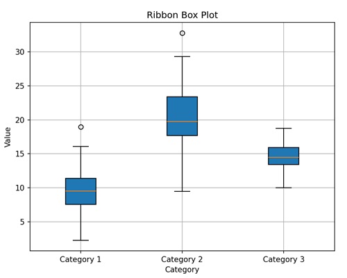
Here, we created a simple ribbon box plot with three categories (Category 1, Category 2, Category 3) along the x-axis and their corresponding distribution of values along the y-axis. We shade the ribbon boxes to indicate the intensity of the distribution within each category.
Ribbon Box in Matplotlib
In Matplotlib, a "ribbon box" is a visual representation used to display the distribution of a numeric variable across different categories or groups. While matplotlib does not have a specific function to create ribbon box plots, you can use other techniques available, such as −
Use matplotlib's plot() function to plot the central line for each category or group. This line represents the central tendency of the data within each category, such as the mean or median.
Using the fill_between function to fill the area between two curves, where one curve represents the upper boundary of the ribbon and the other curve represents the lower boundary.
Customize the appearance of the plot as needed by adding labels, titles, legends, gridlines, etc.
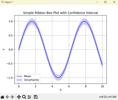
Ribbon Box Plot with Confidence Interval
In matplotlib, a simple ribbon box plot with confidence interval is a graphical representation used to display the central tendency of a dataset along with the uncertainty around that central value.
It is like plotting the average of something (like daily temperatures) and shading an area around it to show how much the actual values might vary due to uncertainty.
Example
In the following example, we are creating a ribbon box plot showing the central tendency and confidence interval (uncertainity) around a sine wave, using matplotlib's plot() and fill_between() functions, respectively −
import matplotlib.pyplot as plt
import numpy as np

# Generating data
x = np.linspace(0, 10, 100)
y_mean = np.sin(x)
# Standard deviation
y_std = 0.1

# Plotting the central line
plt.plot(x, y_mean, color='blue', label='Mean')

# Plotting the shaded area representing the uncertainty (confidence interval)
plt.fill_between(x, y_mean - y_std, y_mean + y_std, color='blue', alpha=0.2, label='Uncertainty')

plt.xlabel('X')
plt.ylabel('Y')
plt.title('Simple Ribbon Box Plot with Confidence Interval')
plt.legend()
plt.grid(True)
plt.show()
Output
Following is the output of the above code −
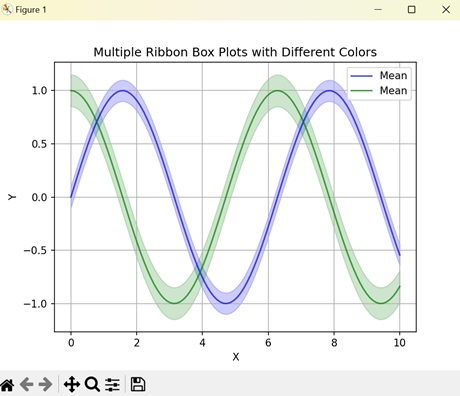
Multiple Ribbon Box Plots
In Matplotlib, multiple ribbon box plots are a way to compare the distributions of multiple datasets using ribbon box plots within the same plot. Each ribbon box plot represents the spread and central tendency of a different dataset, allowing for easy comparison between them.
Example
In here, we are generating multiple ribbon box plots with different colors to represent two sine and cosine waves along with their uncertainty bands using matplotlib −
import matplotlib.pyplot as plt
import numpy as np

# Generating data
x = np.linspace(0, 10, 100)
y_means = [np.sin(x), np.cos(x)]
# Standard deviations
y_stds = [0.1, 0.15]
colors = ['blue', 'green']

# Plotting multiple ribbon box plots with different colors
for y_mean, y_std, color in zip(y_means, y_stds, colors):
   plt.plot(x, y_mean, color=color, label='Mean', alpha=0.7)
   plt.fill_between(x, y_mean - y_std, y_mean + y_std, color=color, alpha=0.2)

plt.xlabel('X')
plt.ylabel('Y')
plt.title('Multiple Ribbon Box Plots with Different Colors')
plt.legend()
plt.grid(True)
plt.show()
Output
On executing the above code we will get the following output −
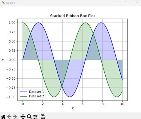
Stacked Ribbon Box Plot
In Matplotlib, stacked ribbon box plots are a type of graphical representation used to compare the distributions of multiple datasets while also showing the combined distribution of all the datasets.
In a stacked ribbon box plot, each dataset is represented by its own ribbon box plot, just like in multiple ribbon box plots. However, instead of displaying the box plots side by side, they are stacked vertically on top of each other. This stacking allows for a direct comparison of the distributions of each dataset while also showing how they contribute to the overall distribution when combined.
Example
Now, we are plotting a stacked ribbon box plot, stacking the distributions of a sine and cosine wave to compare their variations across the x-axis using matplotlib −
import matplotlib.pyplot as plt
import numpy as np

# Generating example data
x = np.linspace(0, 10, 100)
y1 = np.sin(x)
y2 = np.cos(x)

# Plotting stacked ribbon box plot
plt.plot(x, y1, color='blue', label='Dataset 1')
plt.fill_between(x, y1, color='blue', alpha=0.2)
plt.plot(x, y2, color='green', label='Dataset 2')
plt.fill_between(x, y2, color='green', alpha=0.2)

plt.xlabel('X')
plt.ylabel('Y')
plt.title('Stacked Ribbon Box Plot')
plt.legend()
plt.grid(True)
plt.show()
Output
After executing the above code, we get the following output −
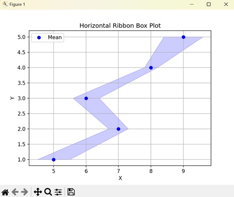
Horizontal Ribbon Box Plot
A horizontal ribbon box plot in Matplotlib is a graphical representation that shows the distribution of a dataset along a horizontal axis using ribbon-shaped boxes.
In a horizontal ribbon box plot, the dataset's values are grouped into categories or bins, and for each category, a ribbon-shaped box is drawn horizontally. The length of each box represents the range of values within that category, while the position along the horizontal axis indicates the category itself.
Example
In the following example, we are creating a horizontal ribbon box plot to represent categories along the y-axis and their corresponding mean values with uncertainty using matplotlib −
import matplotlib.pyplot as plt
import numpy as np

# Generating data
y = np.arange(1, 6)
x_means = [5, 7, 6, 8, 9]
x_stds = [0.5, 0.3, 0.4, 0.2, 0.6]

# Plotting horizontal ribbon box plot
plt.plot(x_means, y, color='blue', label='Mean', linestyle='none', marker='o')
plt.fill_betweenx(y, np.subtract(x_means, x_stds), np.add(x_means, x_stds), color='blue', alpha=0.2) # Fixing this line

plt.xlabel('X')
plt.ylabel('Y')
plt.title('Horizontal Ribbon Box Plot')
plt.legend()
plt.grid(True)
plt.show()
Output
On executing the above code we will get the following output −
To Continue Learning Please Login