- Matplotlib Basics
- Matplotlib - Home
- Matplotlib - Introduction
- Matplotlib - Environment Setup
- Matplotlib - Anaconda distribution
- Matplotlib - Jupyter Notebook
- Matplotlib - Pyplot API
- Matplotlib - Simple Plot
- Matplotlib - Text
- Matplotlib - Images
- Matplotlib - Mathematical Expressions
- Matplotlib - Transforms
- Matplotlib - Ticks and Tick Labels
- Matplotlib - Axis Ranges
- Matplotlib - Axis Scales
- Matplotlib - Axis Ticks
- Matplotlib - Formatting Axes
- Matplotlib - Axes Class
- Matplotlib - Twin Axes
- Matplotlib - Figure Class
- Matplotlib - Multiplots
- Matplotlib - Grids
- Matplotlib - Object-oriented Interface
- Matplotlib - PyLab module
- Matplotlib - Subplots() Function
- Matplotlib - Subplot2grid() Function
- Matplotlib - Anchored Artists
- Matplotlib - Manual Contour
- Matplotlib - Coords Report
- Matplotlib - AGG filter
- Matplotlib - Ribbon Box
- Matplotlib - Fill Spiral
- Matplotlib - Findobj Demo
- Matplotlib - Hyperlinks
- Matplotlib - Image Thumbnail
- Matplotlib - Plotting with Keywords
- Matplotlib - Create Logo
- Matplotlib - Multipage PDF
- Matplotlib - Multiprocessing
- Matplotlib - Print Stdout
- Matplotlib - Compound Path
- Matplotlib - Sankey Class
- Matplotlib - MRI with EEG
- Matplotlib - Stylesheets
- Matplotlib - Background Colors
- Matplotlib - Basemap -->
- Matplotlib Widgets
- Matplotlib - Cursor Widget
- Matplotlib - Annotated Cursor
- Matplotlib - Buttons Widget
- Matplotlib - Check Buttons
- Matplotlib - Lasso Selector
- Matplotlib - Menu Widget
- Matplotlib - Mouse Cursor
- Matplotlib - Multicursor
- Matplotlib - Polygon Selector
- Matplotlib - Radio Buttons
- Matplotlib - RangeSlider
- Matplotlib - Rectangle Selector
- Matplotlib - Ellipse Selector
- Matplotlib - Slider Widget
- Matplotlib - Span Selector
- Matplotlib - Textbox
- Matplotlib Plotting
- Matplotlib - Bar Graphs
- Matplotlib - Histogram
- Matplotlib - Pie Chart
- Matplotlib - Scatter Plot
- Matplotlib - Box Plot
- Matplotlib - Violin Plot
- Matplotlib - Contour Plot
- Matplotlib - 3D Plotting
- Matplotlib - 3D Contours
- Matplotlib - 3D Wireframe Plot
- Matplotlib - 3D Surface Plot
- Matplotlib - Quiver Plot
- Matplotlib Useful Resources
- Matplotlib - Quick Guide
- Matplotlib - Useful Resources
- Matplotlib - Discussion
Matplotlib - Manual Contour
Manual contouring in general refers to the process of outlining the boundaries of an object or a specific area by hand rather than relying on automated methods. This is usually done to create accurate representations of the shapes and boundaries within the image.
A contour line represents a constant value on a map or a graph. It is like drawing a line to connect points that share the same height on a topographic map or lines on a weather map connecting places with the same temperature.
Manual Contour in Matplotlib
In Matplotlib, a manual contour plot is a way to represent three-dimensional data on a two-dimensional surface using contour lines. These lines connect points of equal value in a dataset, creating a map-like visualization of continuous data.
For a manual contour plot, you specify the contour levels or values at which the lines should be drawn. The plot then displays these contour lines, with each line representing a specific value in the dataset.
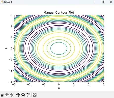
Basic Manual Contour Plot
Creating a basic manual contours in Matplotlib involves drawing lines to connect points with the same value, forming closed loops or curves that represent distinct levels of the measured quantity. This process allows for customization and fine-tuning of the contour lines to accurately represent the given data.
While manual contouring can be time-consuming, it provides a level of control and precision that may be necessary in certain situations where automated methods may not be adequate.
Example
In the following example, we are creating a simple contour plot using Matplotlib. We are using the contour() function to generate contour lines of a sine function, with manually specified levels, overlaying them on the XY-plane −
import matplotlib.pyplot as plt
import numpy as np

# Generating data
x = np.linspace(-3, 3, 100)
y = np.linspace(-3, 3, 100)
# Creating a grid of x and y values
X, Y = np.meshgrid(x, y)
# Calculating the value of Z using the given function
Z = np.sin(X**2 + Y**2)

# Creating contour plot with manual levels
levels = [-0.9, -0.6, -0.3, 0, 0.3, 0.6, 0.9]
plt.contour(X, Y, Z, levels=levels)
plt.xlabel('X')
plt.ylabel('Y')
plt.title('Manual Contour Plot')
# Displaying the plot
plt.show()
Output
Following is the output of the above code −
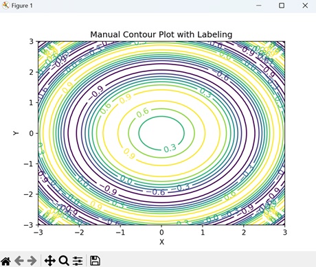
Manual Contour Plot with Labeling
In Matplotlib, a manual contour plot with labeling represents three-dimensional data on a two-dimensional surface with contour lines, and annotate specific contour levels with labels.
This type of plot displays contour lines to show regions of equal data value, and adds text labels to these lines to indicate the corresponding data values. The labels help to identify important features or values in the dataset, making it easier to interpret the plot and understand the distribution of the data.
Example
In here, we are creating a contour plot with inline labels to the contour lines using the clabel() function −
import matplotlib.pyplot as plt
import numpy as np

# Generating data
x = np.linspace(-3, 3, 100)
y = np.linspace(-3, 3, 100)
X, Y = np.meshgrid(x, y)
Z = np.sin(X**2 + Y**2)

# Contour plot with labels
levels = [-0.9, -0.6, -0.3, 0, 0.3, 0.6, 0.9]
CS = plt.contour(X, Y, Z, levels=levels)
plt.clabel(CS, inline=True, fontsize=12)
plt.xlabel('X')
plt.ylabel('Y')
plt.title('Manual Contour Plot with Labeling')
plt.show()
Output
On executing the above code we will get the following output −
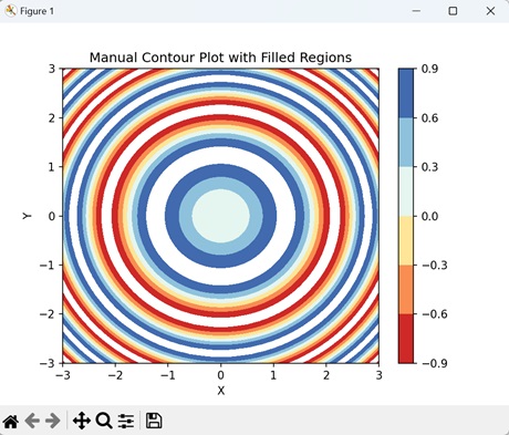
Manual Contour Plot with Filled Regions
In Matplotlib, a manual contour plot with filled regions use colors to visually represent different levels or values in the dataset, unlike traditional contour plots that only show contour lines.
Each filled region corresponds to a specific range of values, with colors indicating the intensity or magnitude of those values.
Example
In the example below, we are creating a filled contour plot of a sine function using the contourf() function with the "RdYlBu" colormap. We then add a color bar to indicate the intensity scale of the filled contours −
import matplotlib.pyplot as plt
import numpy as np

# Generating data
x = np.linspace(-3, 3, 100)
y = np.linspace(-3, 3, 100)
X, Y = np.meshgrid(x, y)
Z = np.sin(X**2 + Y**2)

# Creating contour plot with filled regions
plt.contourf(X, Y, Z, levels=[-0.9, -0.6, -0.3, 0, 0.3, 0.6, 0.9], cmap='RdYlBu')
plt.colorbar()
plt.xlabel('X')
plt.ylabel('Y')
plt.title('Manual Contour Plot with Filled Regions')
plt.show()
Output
After executing the above code, we get the following output −
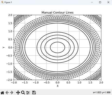
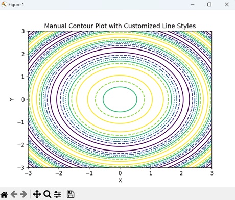
Manual Contour Plot with Custom Line Styles
In Matplotlib, a manual contour plot with custom line styles is a way to represent contour lines, where each line can have a distinct visual style.
Generally, contour lines are drawn as solid lines, but with custom line styles, you can modify aspects like the line width, color, and pattern to distinguish different levels or values in the dataset. For example, you might use dashed lines, dotted lines, or thicker lines to highlight specific contour levels or regions of interest.
Example
Now, we are creating a manual contour plot with custom line styles by specifying a list of line styles to use for different levels. We achieve this by passing the "linestyles" parameter to the contour() function −
import matplotlib.pyplot as plt
import numpy as np

# Generating data
x = np.linspace(-3, 3, 100)
y = np.linspace(-3, 3, 100)
X, Y = np.meshgrid(x, y)
Z = np.sin(X**2 + Y**2)

# Contour plot with custom line styles
levels = [-0.9, -0.6, -0.3, 0, 0.3, 0.6, 0.9]
plt.contour(X, Y, Z, levels=levels, linestyles=['-', '--', '-.', ':', '-', '--'])
plt.xlabel('X')
plt.ylabel('Y')
plt.title('Manual Contour Plot with Customized Line Styles')
plt.show()
Output
On executing the above code we will get the following output −
To Continue Learning Please Login