
Article Categories
- All Categories
-
 Data Structure
-
 Networking
-
 RDBMS
RDBMS
-
 Operating System
-
 Java
Java
-
 MS Excel
-
 iOS
iOS
-
 HTML
HTML
-
 CSS
CSS
-
 Android
-
 Python
-
 C Programming
-
 C++
C++
-
 C#
C#
-
 MongoDB
-
 MySQL
MySQL
-
 Javascript
-
 PHP
PHP
-
 Economics & Finance
Selected Reading
How to create a barplot with gaps on Y-axis scale in R?
If we want to have gaps on Y-axis scale in a barplot then it cannot be done in base R. For this purpose, we can make use of gap.barplot function of plotrix package. The gap.barplot function is very handy, we just need to pass the vector for which we want to create the barplot and the gap values simply by using gap argument.
Loading plotrix package:
> library(plotrix)
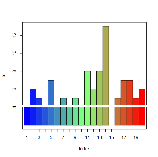
Example1
> x<-rpois(20,5)
> x
Output
[1] 2 6 5 4 7 2 5 2 5 2 8 6 8 13 3 5 7 7 5 6
> gap.barplot(x,gap=c(2,4))
ylim 0 11
Warning message:
In gap.barplot(x, gap = c(2, 4)) : gap includes some values of y
Output:
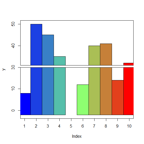
Example2
> y<-sample(0:50,10)
> y
Output
[1] 8 50 45 35 25 12 40 41 14 32
> gap.barplot(y,gap=c(20,30))
ylim -2 40
Warning message:
In gap.barplot(y, gap = c(20, 30)) : gap includes some values of y
Output:

Updated on: 2026-03-11T22:50:53+05:30
755 Views

Advertisements