
Article Categories
- All Categories
-
 Data Structure
-
 Networking
-
 RDBMS
RDBMS
-
 Operating System
-
 Java
Java
-
 MS Excel
-
 iOS
iOS
-
 HTML
HTML
-
 CSS
CSS
-
 Android
-
 Python
-
 C Programming
-
 C++
C++
-
 C#
C#
-
 MongoDB
-
 MySQL
MySQL
-
 Javascript
-
 PHP
PHP
-
 Economics & Finance
Selected Reading
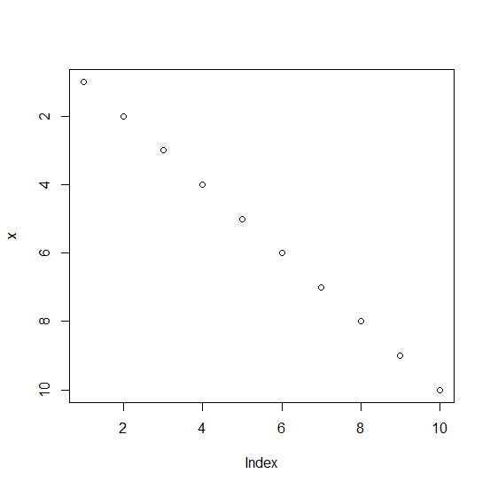
How to create a plot with reversed Y-axis labels in base R?
To create a plot with reversed Y-axis we need to use the rev function for the Y-axis labels with ylim but we would also need to define the range for the y-axis values, otherwise, R will throw an error. For example, if we have two vectors named as x and y then the plot with reversed Y-axis labels can be created by using plot(x,ylim=rev(range(y))).
Example
x<-1:10
y<-1:10
plot(x,y)
Output
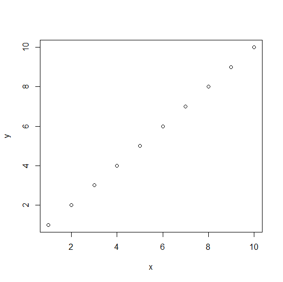
Creating the plot with reversed Y-axis labels −
Example
plot(x,ylim=rev(range(y)))
Output

Updated on: 2026-03-11T22:50:54+05:30
2K+ Views

Advertisements