
Article Categories
- All Categories
-
 Data Structure
-
 Networking
-
 RDBMS
RDBMS
-
 Operating System
-
 Java
Java
-
 MS Excel
-
 iOS
iOS
-
 HTML
HTML
-
 CSS
CSS
-
 Android
-
 Python
-
 C Programming
-
 C++
C++
-
 C#
C#
-
 MongoDB
-
 MySQL
MySQL
-
 Javascript
-
 PHP
PHP
-
 Economics & Finance
Selected Reading
How to create a bar plot using ggplot2 with percentage on Y-axis in R?
Mostly, the bar plot is created with frequency or count on the Y-axis in any way, whether it is manual or by using any software or programming language but sometimes we want to use percentages. It can be done by using scales package in R, that gives us the option labels=percent_format() to change the labels to percentage.
Example
Consider the below data frame −
> x<-sample(1:4,20,replace=TRUE)
> df<-data.frame(x)
> df
Output
 x
1 2
2 3
3 3
4 1
5 2
6 4
7 4
8 4
9 2
10 3
11 3
12 4
13 3
14 4
15 4
16 1
17 3
18 1
19 4
20 1
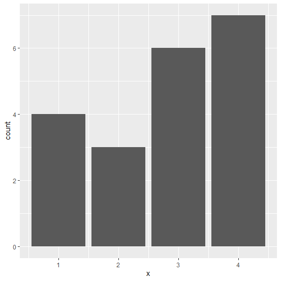
Loading ggplot2 package and creating bar plot −
> library(ggplot2)
> ggplot(df,aes(x))+geom_bar()
Output
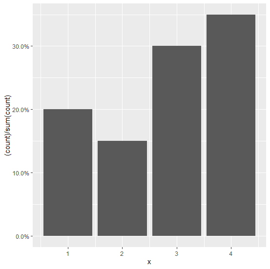
Loading scales package and creating the bar plot with percentage on Y-axis −
Example
> library(scales)
>
ggplot(df,aes(x))+geom_bar(aes(y=(..count..)/sum(..count..)))+scale_y_continuous(labels
=percent_format())
Output

Updated on: 2026-03-11T22:50:51+05:30
2K+ Views

Advertisements