
Article Categories
- All Categories
-
 Data Structure
-
 Networking
-
 RDBMS
RDBMS
-
 Operating System
-
 Java
Java
-
 MS Excel
-
 iOS
iOS
-
 HTML
HTML
-
 CSS
CSS
-
 Android
-
 Python
-
 C Programming
-
 C++
C++
-
 C#
C#
-
 MongoDB
-
 MySQL
MySQL
-
 Javascript
-
 PHP
PHP
-
 Economics & Finance
Create ggplot2 graph with reversed Y-axis and X-axis on top in R.
To create ggplot2 graph with reversed Y-axis and X-axis on top, we can use scale_y_reverse and scale_x_continuous function of ggplot2 package.
For Example, if we have a data frame called df that contains two columns say X and Y and we want to create the scatterplot between X and Y with reversed Y-axis and X-axis on top then we can use the below command −
ggplot(df,aes(X,Y))+geom_point()+scale_y_reverse()+scale_x_continuous(position="top")
Example
Following snippet creates a sample data frame −
x<-rnorm(20)
y<-rnorm(20)
df<-data.frame(x,y)
df
The following dataframe is created
           x           y
1  0.59312447  0.4993337
2  0.08696615 -0.1242276
3  1.11337560 -0.5706901
4  0.01421750  0.3663344
5 -0.84509560  0.4541131
6 -0.65373363  0.9613303
7 -0.35945721 -0.1857298
8  0.59160684  0.3575833
9 -1.26637220 -1.1135318
10 0.38272955  0.8173167
11 0.06691834  0.3234260
12 0.16622601  1.2409558
13 0.46761776 -0.9447498
14 1.58349520 -0.4018503
15 0.58928505 -2.6192820
16 0.36153663  2.1236007
17 0.53978229 -0.5937517
18 -1.03483870 1.0795689
19 -1.17331809 -1.0425776
20 -1.12299141 -0.7738698
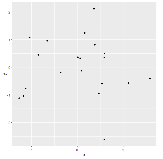
To load ggplot2 package and create scatterplot between x and y on the above created data frame, add the following code to the above snippet −
x<-rnorm(20)
y<-rnorm(20)
df<-data.frame(x,y)
library(ggplot2)
ggplot(df,aes(x,y))+geom_point()
Output
If you execute all the above given snippets as a single program, it generates the following Output −
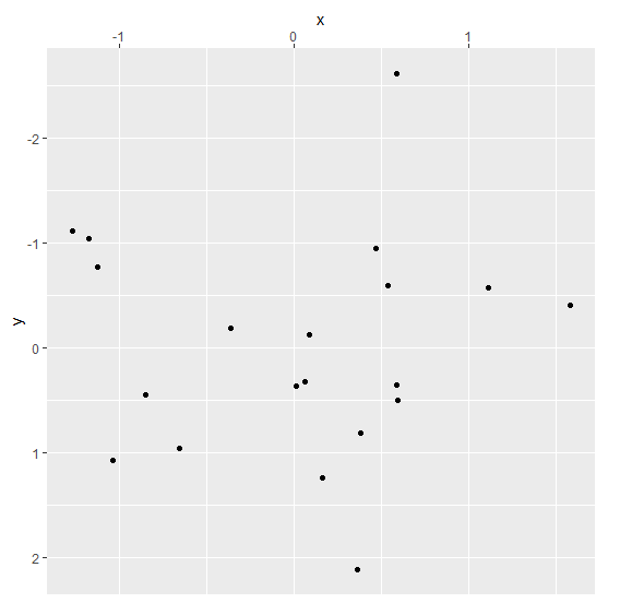
To create scatterplot between x and y with reversed Y-axis and X-axis on top on the above created data frame, add the following code to the above snippet −
x<-rnorm(20)
y<-rnorm(20)
df<-data.frame(x,y)
library(ggplot2)
ggplot(df,aes(x,y))+geom_point()+scale_y_reverse()+scale_x_continuous(position="top")
Output
If you execute all the above given snippets as a single program, it generates the following Output −

1K+ Views
