
Article Categories
- All Categories
-
 Data Structure
-
 Networking
-
 RDBMS
RDBMS
-
 Operating System
-
 Java
Java
-
 MS Excel
-
 iOS
iOS
-
 HTML
HTML
-
 CSS
CSS
-
 Android
-
 Python
-
 C Programming
-
 C++
C++
-
 C#
C#
-
 MongoDB
-
 MySQL
MySQL
-
 Javascript
-
 PHP
PHP
-
 Economics & Finance
Selected Reading
How to create bar plot in base R with different limits for Y-axis?
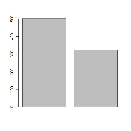
To create a bar plot in base R with different limits for Y-axis, we can use ylim argument but generally that behaves badly, such as extending the bars below X-axis. Therefore, we need to fix those things. Check out the below example to understand how it can be done.
Example
> x<-c(501,324)
> barplot(x)
Output
Example
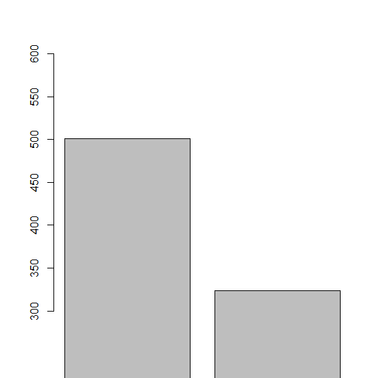
> barplot(x,ylim=c(300,600))
Output
Example
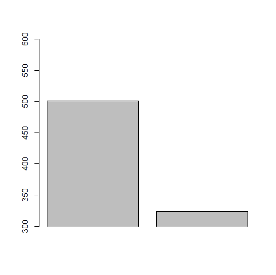
> barplot(x,ylim=c(300,600),xpd=FALSE)
Output
Example
> box(bty="l")
Output


Updated on: 2021-03-05T07:24:35+05:30
2K+ Views

Advertisements