
Article Categories
- All Categories
-
 Data Structure
-
 Networking
-
 RDBMS
RDBMS
-
 Operating System
-
 Java
Java
-
 MS Excel
-
 iOS
iOS
-
 HTML
HTML
-
 CSS
CSS
-
 Android
-
 Python
-
 C Programming
-
 C++
C++
-
 C#
C#
-
 MongoDB
-
 MySQL
MySQL
-
 Javascript
-
 PHP
PHP
-
 Economics & Finance
Selected Reading
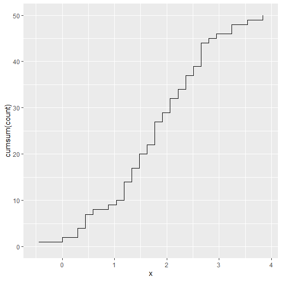
How to create cumulative sum chart with count on Y-axis in R using ggplot2?
Cumulative sums are often used to display the running totals of values and these sums also help us to identify the overall total. In this way, we can analyze the variation in the running totals over time. To create the cumulative sum chart with count on Y-axis we can use stat_bin function of ggplot2 package.
Example
Consider the below data frame −
> x<-rnorm(50,1.5)
> df<-data.frame(x)
> head(df,20)
Output
      x
1 1.755900133
2 1.185746239
3 0.821489888
4 1.358420721
5 2.719636441
6 2.885153151
7 1.131452570
8 0.302981998
9 0.433865254
10 2.373338327
11 0.428436149
12 1.835789725
13 2.600838211
14 2.108302471
15 1.164818373
16 1.547473189
17 2.870272096
18 1.790039472
19 -0.006816034
20 3.510828517
> tail(df,20)
Output
      x
31 3.3137587
32 1.0945959
33 1.5224898
34 2.2356911
35 1.5971496
36 2.6768012
37 1.8453177
38 2.5820093
39 0.4334084
40 2.0123960
41 2.6038358
42 2.3482770
43 1.5645365
44 2.4985221
45 2.5645833
46 1.5095937
47 0.2791473
48 3.8218481
49 2.4270537
50 1.7294788
> sort(df$x)
Output
[1] -0.456686181 -0.006816034 0.279147319 0.302981998 0.428436149
[6] 0.433408448 0.433865254 0.660931044 0.821489888 1.094595884
[11] 1.131452570 1.160498413 1.164818373 1.185746239 1.305236133
[16] 1.321902603 1.358420721 1.509593653 1.522489810 1.547473189
[21] 1.564536491 1.597149639 1.729478762 1.738331537 1.755900133
[26] 1.790039472 1.835789725 1.845317696 1.850792130 2.012395996
[31] 2.075640869 2.108302471 2.177636502 2.235691108 2.348277047
[36] 2.373338327 2.427053655 2.498522135 2.564583339 2.582009262
[41] 2.600838211 2.603835849 2.676801213 2.719636441 2.870272096
[46] 2.885153151 3.265762606 3.313758715 3.510828517 3.821848116
Loading ggplot2 package and creating cumulative sum chart with count on Y-axis −
> library(ggplot2)
> ggplot(df,aes(x))+stat_bin(aes(y=cumsum(..count..)),geom="step",bins=30)
Output

Updated on: 2026-03-11T22:50:51+05:30
2K+ Views

Advertisements