
Article Categories
- All Categories
-
 Data Structure
-
 Networking
-
 RDBMS
RDBMS
-
 Operating System
-
 Java
Java
-
 MS Excel
-
 iOS
iOS
-
 HTML
HTML
-
 CSS
CSS
-
 Android
-
 Python
-
 C Programming
-
 C++
C++
-
 C#
C#
-
 MongoDB
-
 MySQL
MySQL
-
 Javascript
-
 PHP
PHP
-
 Economics & Finance
Selected Reading
How to plot values with log scales on x and y axis or on a single axis in R?
We can plot numerical values in R with many scales and that includes log scale as well. Also, it is possible to plot the values with log scales on both the axes. In base R, the best way to do this is defining the axes values with decimal representation as shown in the below examples with well-defined log.
Consider the below vector −
Example
set.seed(555)
x<-sample(1:9,10,replace=TRUE)
x
Output
[1] 4 8 7 5 6 1 9 2 1 8
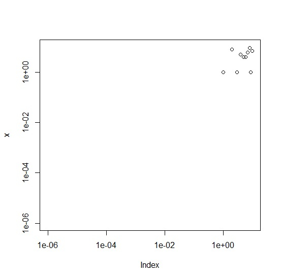
Creating plot of x with log scale on both, x and y axis −
Example
plot(x,xlim=c(0.000001,10),ylim=c(0.000001,10),log="xy")
Output
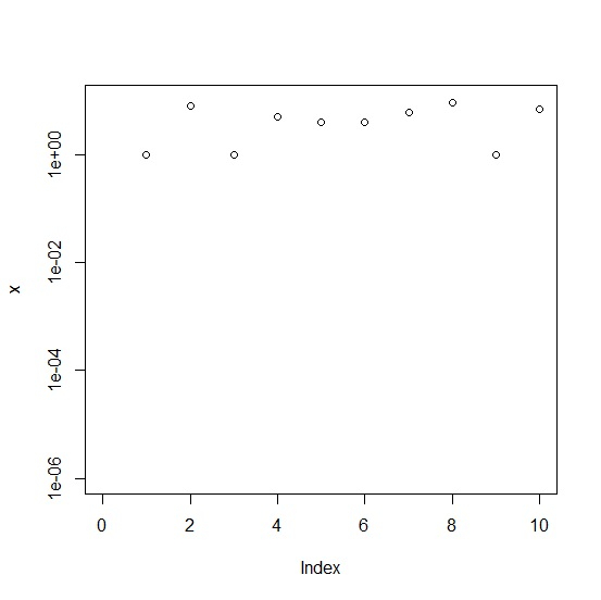
Creating plot of x with log scale on y axis only −
plot(x,xlim=c(0.000001,10),ylim=c(0.000001,10),log="y")
Output
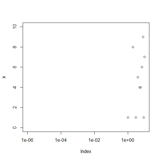
Creating plot of x with log scale on x axis only −
plot(x,xlim=c(0.000001,10),ylim=c(0.000001,10),log="x")
Output

Updated on: 2026-03-11T22:50:52+05:30
4K+ Views

Advertisements