
Article Categories
- All Categories
-
 Data Structure
-
 Networking
-
 RDBMS
RDBMS
-
 Operating System
-
 Java
Java
-
 MS Excel
-
 iOS
iOS
-
 HTML
HTML
-
 CSS
CSS
-
 Android
-
 Python
-
 C Programming
-
 C++
C++
-
 C#
C#
-
 MongoDB
-
 MySQL
MySQL
-
 Javascript
-
 PHP
PHP
-
 Economics & Finance
Selected Reading
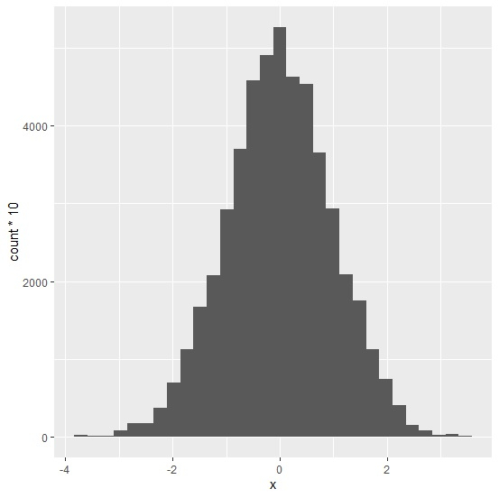
How to create a histogram with Y-axis values as count using ggplot2 in R?
To create a histogram with Y-axis values as count using ggplot2 in R, we can follow the below steps −
- First of all, create a data frame.
- Then, use geom_histogram function of ggplot2 package with aes to create the histogram with Y-axis values as count.
Create the data frame
Let's create a data frame as shown below −
> df<-data.frame(x=rnorm(5000))
> head(df,20)
On executing, the above script generates the below output(this output will vary on your system due to randomization) −
          x
1    -0.008015477
2    -0.981227322
3     1.144050354
4     0.207177231
5     0.179782914
6     0.380085361
7    -0.828305873
8    -0.909047732
9     1.946699123
10    0.384881892
11   -1.107651249
12   -1.290435936
13   -0.305554288
14   -0.427279557
15   -0.587864723
16   -0.295237215
17    0.178995066
18   0.476328701
19   -0.392095095
20   -1.215651876
Create a histogram with Y-axis values as count using ggplot2
Using geom_histogram function of ggplot2 package to create the histogram with Y-axis values as count for the data in data frame df −
> df<-data.frame(x=rnorm(5000))
> library(ggplot2)
> ggplot(df,aes(x))+geom_histogram(aes(y=..count..*10),bins=30)
Output

Updated on: 2026-03-11T22:50:57+05:30
4K+ Views

Advertisements