
Article Categories
- All Categories
-
 Data Structure
-
 Networking
-
 RDBMS
RDBMS
-
 Operating System
-
 Java
Java
-
 MS Excel
-
 iOS
iOS
-
 HTML
HTML
-
 CSS
CSS
-
 Android
-
 Python
-
 C Programming
-
 C++
C++
-
 C#
C#
-
 MongoDB
-
 MySQL
MySQL
-
 Javascript
-
 PHP
PHP
-
 Economics & Finance
Selected Reading
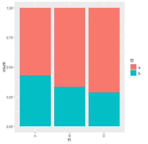
Create stacked bar chart with percentages on Y-axis using ggplot2 in R.
To create stacked bar chart with percentages on Y-axis using ggplot2 in R, we can use fill argument inside geom_bar and put the second categorical variable with position set to fill.
For Example, if we have a data frame called with two categorical columns say C1 and C2 then we can create stacked bar chart with percentages on Y-axis using the below mentioned command −
ggplot(df,aes(C1))+geom_bar(aes(fill=C2),position="fill")
Example
Following snippet creates a sample data frame −
f1<-sample(LETTERS[1:3],20,replace=TRUE)
f2<-sample(letters[1:2],20,replace=TRUE)
df<-data.frame(f1,f2)
df
The following dataframe is created
  f1 f2
 1 B b
 2 C a
 3 A b
 4 A a
 5 A a
 6 C a
 7 B a
 8 B a
 9 C b
10 B a
11 A a
12 C a
13 A b
14 C b
15 C a
16 B b
17 A b
18 B a
19 A a
20 C a
To load ggplot2 package and create stacked bar chart for columns f1 and f2 with percentages on Y-axis on the above created data frame, add the following code to the above snippet −
f1<-sample(LETTERS[1:3],20,replace=TRUE)
f2<-sample(letters[1:2],20,replace=TRUE)
df<-data.frame(f1,f2)
library(ggplot2)
ggplot(df,aes(f1))+geom_bar(aes(fill=f2),position="fill")
Output
If you execute all the above given snippets as a single program, it generates the following Output −

Updated on: 2021-11-08T09:59:33+05:30
1K+ Views

Advertisements