- Excel Data Analysis - Home
- Data Analysis - Overview
- Data Analysis - Process
- Excel Data Analysis - Overview
- Working with Range Names
- Tables
- Cleaning Data with Text Functions
- Cleaning Data Contains Date Values
- Working with Time Values
- Conditional Formatting
- Sorting
- Filtering
- Subtotals with Ranges
- Quick Analysis
- Lookup Functions
- PivotTables
- Data Visualization
- Data Validation
- Financial Analysis
- Working with Multiple Sheets
- Formula Auditing
- Inquire
- Advanced Data Analysis - Overview
- Data Consolidation
- What-If Analysis
- What-If Analysis with Data Tables
- What-If Analysis Scenario Manager
- What-If Analysis with Goal Seek
- Optimization with Excel Solver
- Importing Data into Excel
- Data Model
- Exploring Data with PivotTables
- Exploring Data with Powerpivot
- Exploring Data with Power View
- Exploring Data Power View Charts
- Exploring Data Power View Maps
- Exploring Data PowerView Multiples
- Exploring Data Power View Tiles
- Exploring Data with Hierarchies
- Aesthetic Power View Reports
- Key Performance Indicators
- Excel Data Analysis Resources
- Excel Data Analysis - Quick Guide
- Excel Data Analysis - Resources
- Excel Data Analysis - Discussion
Exploring Data with Power View Multiples
Multiples, also called Trellis Charts are a series of charts with identical X and Y axes. You can arrange Multiples side by side, to compare many different values easily at the same time.
- You can have Line charts, Pie charts, Bar charts and Column charts as Multiples.
- You can arrange the Multiples horizontally or vertically.
Line Charts as Multiples
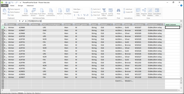
You might want to display the medal count by year for each Region. Firstly, you need to have the field Year. To get this field, you need to have a calculated column as follows −
- Click the Medals tab in the Data View of the Data Model (in the PowerPivot window).
- Click in the first cell in the right most column with the header Add Column.
- Type =YEAR ([Edition]) in the formula bar and press Enter.
A new column with header CalculatedColumn1 is created with values corresponding to the Year values in Edition column.
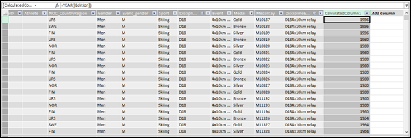
Click on the header and rename it as Year.
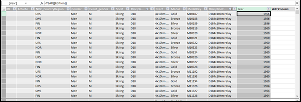
Close the PowerPivot window. The Data Model gets updated. The new field - Year appears in the Power View Fields list.
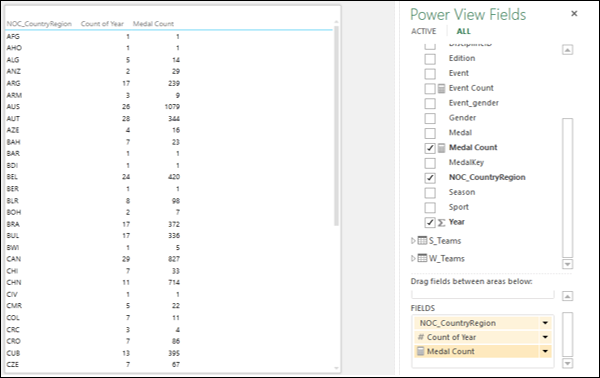
Create a Table in Power View with fields NOC_CountryRegion, Count of Year and Medal Count, by dragging the fields.
- Convert Table into a Line chart in Power View.
- Remove the field NOC_CountryRegion. A Line chart appears with Medal Count by Year.
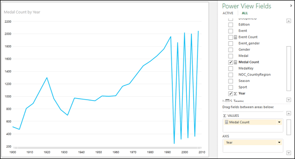
As you can observe, Year is in AXIS area and Medal Count is in ∑ VALUES area in Power View Fields list. In the Line chart, Year values are on X-axis and Medal count on Y-axis.
Now, you can create Multiples visualization with Line charts, as follows −
- Drag the field NOC_CountryRegion to VERTICAL MULTIPLES area in the Power View Fields list.
- Click the tab LAYOUT on the Ribbon.
- Click Grid Height in the Multiples group.
- Click a value in the dropdown list.
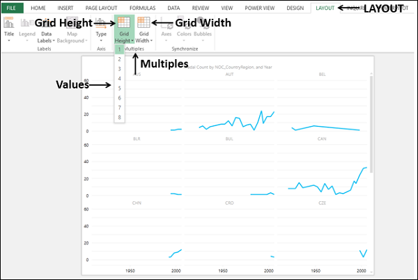
- Click Grid Width in the Multiples group.
- Click on a value from the dropdown list.
You will get the Multiples Visualization with Line charts arranged as a grid, with each Line chart representing a country (NOC_CountryRegion).
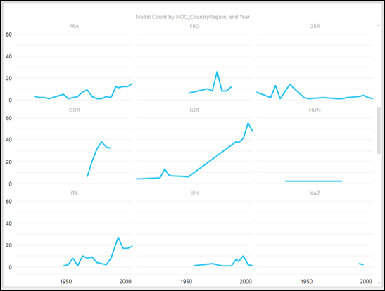
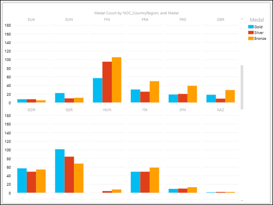
Vertical Multiples
As you are aware, you have placed the NOC_CountryRegion field in the VERTICAL MULTIPLES area. Hence, the visualization that you have got is the Vertical Multiples visualization. You can observe the following in the chart given above.
One Line chart per category that is placed in VERTICAL MULTIPLES area, in this case the country.
The grid height and grid width that you have chosen determine the number of rows and number of columns for the Multiples.
A common x-axis for all the multiples.
A similar y-axis for each row of the multiples.
A vertical scroll bar on the right side that can be used to drag the rows of Line charts up and down, so as to make the other Line charts visible.
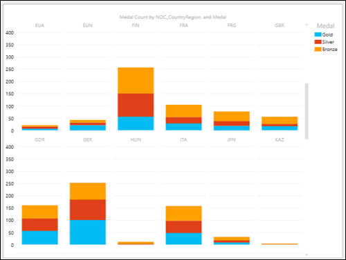
Horizontal Multiples
You can have the Multiples Visualization with Horizontal Multiples also as follows −
- Drag the field NOC_CountryRegion to VERTICAL MULTIPLES area.
- Click the Layout tab on the Ribbon.
- Select the values for Grid Height and Grid Width in the Multiples group.
You will get the Horizontal Multiples visualization as follows −
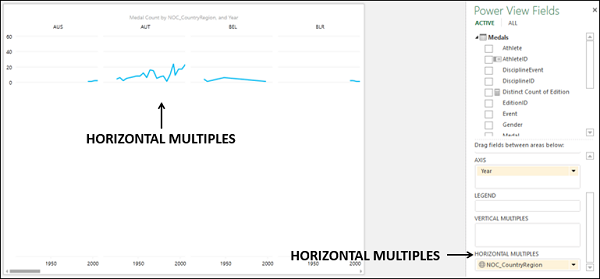
You can observe the following in the above chart −
One Line chart per category that is placed in HORIZONTAL MULTIPLES area, in this case the country.
The grid height that you have chosen determines the height of the Line charts, unlike the number of rows of Line charts as is the case in the VERTICAL MULTIPLES. In other words, there is a single row of Line charts with the height determined by the Grid Height that is chosen.
The grid width that you have chosen determines the number of columns of Line charts in the row.
A common x-axis for all the multiples.
A common y-axis for all the multiples.
A horizontal scroll bar at the bottom, below the x-axis, that can be used to drag the row of Line charts to the left and the right, so as to make the other Line charts visible.
Pie Charts as Multiples
If you want to explore / visualize more than one category in Multiples, Pie charts is an option. Suppose you want to explore the medal count by medal type for each of the countries. Proceed as follows −
- Click the Design tab.
- Select Pie from the dropdown under Other Chart.
- Drag Medal to the area SLICES.
You will get the Horizontal Multiples visualization with Pie charts, as you have the field NOC_CountryRegion in the area HORIZONTAL MULTIPLES.
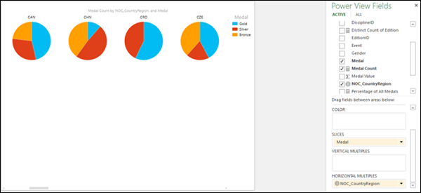
As you can observe the medal-count for each country is displayed as a Pie chart with the slices representing the medal types with the color as given in the Legend.
Suppose you want to highlight the count of gold medals for all the countries. You can do it in a single step as follows −
Click on the blue color slice one of the Pie charts (as blue is color for Gold as per the Legend). In all the Pie charts, only the blue slices are highlighted and other slices are grayed.
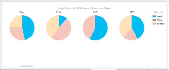
As you can observe, this gives a fast way of exploring and comparing the count of gold medals across the countries.
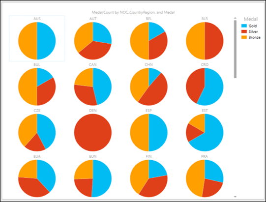
You might want to display more number of Pie charts in a visualization. You can do it by simply switching over to Vertical Multiples Visualization and choosing the right values for Grid Height and Grid Width for a proper display.
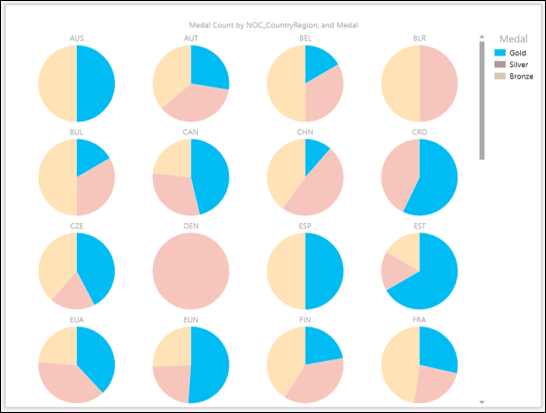
Click on the blue slice on one of the Pie charts. The blue slices in all the Pie charts are highlighted so that you can compare the gold medal counts across the countries.
Bar Charts as Multiples
You can choose Bar charts also for Multiples visualization.
- Switch over to Stacked Bar visualization.
- Adjust the Grid Height and Grid Width to get a proper display of the Bar charts.
With Grid Height of 6 and Grid Width of 2, you will get the following −
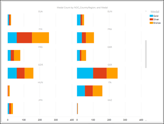
You can have Clustered Bar charts also for this visualization.
Column Charts as Multiples
You can choose Column charts also for Multiples visualization.
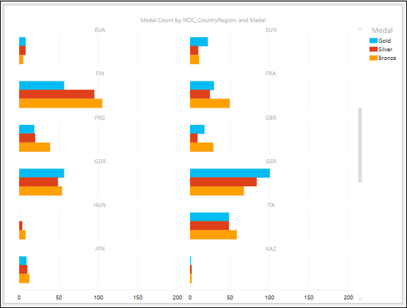
- Switch over to Stacked Column visualization.
- Adjust the Grid Height and Grid Width to get a proper display of the Column charts.
With Grid Height of 2 and Grid Width of 6, you will get the following −
You can have Clustered Column charts also for this visualization.
Wrap-up
The fields you choose depend on what you want to explore, analyze and present. For example, in all the visualizations above, we have chosen Medal for Slices that helped to analyze medal count by medal type. You might want to explore, analyze and present the data gender-wise. In such a case, choose the field Gender for Slices.
Once again, the visualization that is suitable also depends on the data you are displaying. If you are not sure about the suitability, you can just play around to choose the right one as switching across the visualizations is quick and simple in Power View. Moreover, you can also do it in the presentation view, in order to answer any queries that can arise during a presentation.
