- Excel Data Analysis - Home
- Data Analysis - Overview
- Data Analysis - Process
- Excel Data Analysis - Overview
- Working with Range Names
- Tables
- Cleaning Data with Text Functions
- Cleaning Data Contains Date Values
- Working with Time Values
- Conditional Formatting
- Sorting
- Filtering
- Subtotals with Ranges
- Quick Analysis
- Lookup Functions
- PivotTables
- Data Visualization
- Data Validation
- Financial Analysis
- Working with Multiple Sheets
- Formula Auditing
- Inquire
- Advanced Data Analysis - Overview
- Data Consolidation
- What-If Analysis
- What-If Analysis with Data Tables
- What-If Analysis Scenario Manager
- What-If Analysis with Goal Seek
- Optimization with Excel Solver
- Importing Data into Excel
- Data Model
- Exploring Data with PivotTables
- Exploring Data with Powerpivot
- Exploring Data with Power View
- Exploring Data Power View Charts
- Exploring Data Power View Maps
- Exploring Data PowerView Multiples
- Exploring Data Power View Tiles
- Exploring Data with Hierarchies
- Aesthetic Power View Reports
- Key Performance Indicators
- Excel Data Analysis Resources
- Excel Data Analysis - Quick Guide
- Excel Data Analysis - Resources
- Excel Data Analysis - Discussion
Exploring Data with Power View Maps
You can use maps to display your data in the context of geography. Maps in Power View use Bing map tiles, so you can zoom and pan as you would with any other Bing map. To make maps work, Power View has to send the data to Bing through a secured web connection for geocoding. So, it asks you to enable content. Adding locations and values places dots on the map. The larger the value, the bigger the dot. When you add a multivalue series, you get pie charts on the map, with the size of the pie chart showing the size of the total.
Exploring Data with Geographic Fields
You can create a Power View Map Visualization if your data has a geographic field such as Country/Region, State/Province, or City.
To create a map visualization for the medal count, country wise proceed as follows −
Create a new Power View sheet from INSERT tab on the Ribbon.
Drag the fields NOC_CountryRegion and Medal Count in the Power View Fields list to the Power View. A Table with these two fields are created.
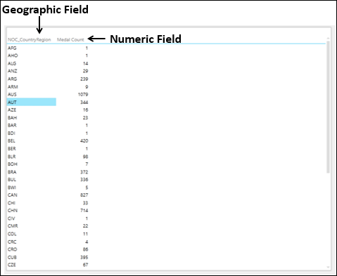
So, you have a geographic field and a numeric field.
- Click the DESIGN tab on the Ribbon.
- Click Map in the Switch Visualization group.
The Table Visualization converts into Map Visualization.
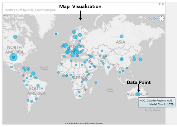
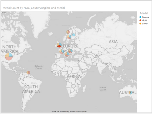
As you observe, Power View creates a map with a dot representing each geographic location. The size of the dot is the value of the corresponding numeric field, which is the medal count in this case. Further, in the Power View Fields list, the Geographic field will be in the Locations area and the Numeric field will be in the ∑ SIZE area.
To display more information about a data point, you can do one of the following −
If you place the cursor on a dot on the map, a box appears displaying the geographic location name and the corresponding numeric value.
If you click on a dot on the map, that particular dot gets highlighted.
Pie Charts as Data Points
Suppose you want to add another field also to the map visualization. For example, you might want to display the details about the medals, viz. the medal types Gold, Silver and Bronze. You can do it as follows −
- Drag the field Medal from the Power View Fields list to the COLOR area.
The dots are converted to Pie charts. A Legend for Medal appears displaying the types of medals and respective colors. i.e., each color in the Pie chart represents the type of the medal.
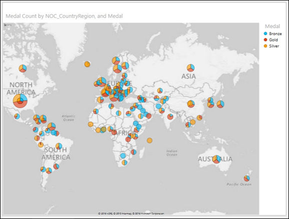
You can observe that the size of a Pie chart corresponds to the medal count and the size of each slice in the Pie chart corresponds to the count of that medal type.
Highlighting a Data Point
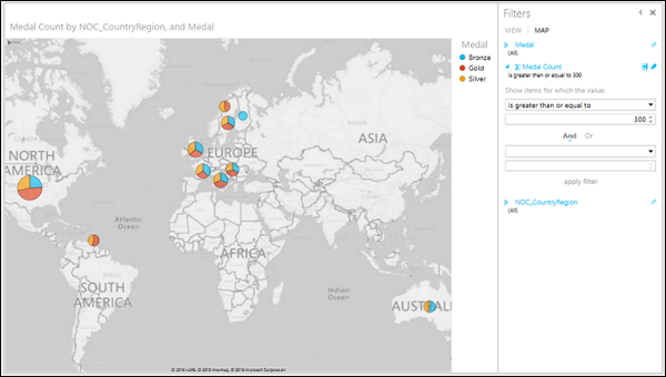
Now, you can filter your data and highlight a significant data point as follows −
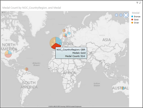
In the Filters area, set the Medal Count to display only the values greater than or equal to 300.
Apply the filter. The map zooms and displays only the filtered values.
Place the cursor on the dot representing Great Britain. The dot gets highlighted and zoomed. The details of the Pie chart will be displayed.
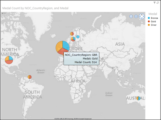
As you can see, the medal count for gold for Great Britain is 514. You can find the medal counts for silver and bronze by placing the cursor on those slices.
Highlighting a Pie Slice in a Data Point
Next, you might want to highlight the gold medal count of Great Britain.
Place the cursor on the slice with red color (as you can make out that red represents gold in the Legend). Click it.
That Pie Slice will be highlighted. The other slices in that Pie chart and all the other Pie charts will be deactivated.
Place the cursor on the dot again. The dot is zoomed. The slice representing gold will be highlighted. The details of the slice will be displayed.