- Excel Data Analysis - Home
- Data Analysis - Overview
- Data Analysis - Process
- Excel Data Analysis - Overview
- Working with Range Names
- Tables
- Cleaning Data with Text Functions
- Cleaning Data Contains Date Values
- Working with Time Values
- Conditional Formatting
- Sorting
- Filtering
- Subtotals with Ranges
- Quick Analysis
- Lookup Functions
- PivotTables
- Data Visualization
- Data Validation
- Financial Analysis
- Working with Multiple Sheets
- Formula Auditing
- Inquire
- Advanced Data Analysis - Overview
- Data Consolidation
- What-If Analysis
- What-If Analysis with Data Tables
- What-If Analysis Scenario Manager
- What-If Analysis with Goal Seek
- Optimization with Excel Solver
- Importing Data into Excel
- Data Model
- Exploring Data with PivotTables
- Exploring Data with Powerpivot
- Exploring Data with Power View
- Exploring Data Power View Charts
- Exploring Data Power View Maps
- Exploring Data PowerView Multiples
- Exploring Data Power View Tiles
- Exploring Data with Hierarchies
- Aesthetic Power View Reports
- Key Performance Indicators
- Excel Data Analysis Resources
- Excel Data Analysis - Quick Guide
- Excel Data Analysis - Resources
- Excel Data Analysis - Discussion
Excel Data Analysis - Quick Guide
Data Analysis - Overview
Data Analysis is a process of inspecting, cleaning, transforming and modeling data with the goal of discovering useful information, suggesting conclusions and supporting decision-making
.Types of Data Analysis
Several data analysis techniques exist encompassing various domains such as business, science, social science, etc. with a variety of names. The major data analysis approaches are −
- Data Mining
- Business Intelligence
- Statistical Analysis
- Predictive Analytics
- Text Analytics
Data Mining
Data Mining is the analysis of large quantities of data to extract previously unknown, interesting patterns of data, unusual data and the dependencies. Note that the goal is the extraction of patterns and knowledge from large amounts of data and not the extraction of data itself.
Data mining analysis involves computer science methods at the intersection of the artificial intelligence, machine learning, statistics, and database systems.
The patterns obtained from data mining can be considered as a summary of the input data that can be used in further analysis or to obtain more accurate prediction results by a decision support system.
Business Intelligence
Business Intelligence techniques and tools are for acquisition and transformation of large amounts of unstructured business data to help identify, develop and create new strategic business opportunities.
The goal of business intelligence is to allow easy interpretation of large volumes of data to identify new opportunities. It helps in implementing an effective strategy based on insights that can provide businesses with a competitive market-advantage and long-term stability.
Statistical Analysis
Statistics is the study of collection, analysis, interpretation, presentation, and organization of data.
In data analysis, two main statistical methodologies are used −
Descriptive statistics − In descriptive statistics, data from the entire population or a sample is summarized with numerical descriptors such as −
Mean, Standard Deviation for Continuous Data
Frequency, Percentage for Categorical Data
Inferential statistics − It uses patterns in the sample data to draw inferences about the represented population or accounting for randomness. These inferences can be −
answering yes/no questions about the data (hypothesis testing)
estimating numerical characteristics of the data (estimation)
describing associations within the data (correlation)
modeling relationships within the data (E.g. regression analysis)
Predictive Analytics
Predictive Analytics use statistical models to analyze current and historical data for forecasting (predictions) about future or otherwise unknown events. In business, predictive analytics is used to identify risks and opportunities that aid in decision-making.
Text Analytics
Text Analytics, also referred to as Text Mining or as Text Data Mining is the process of deriving high-quality information from text. Text mining usually involves the process of structuring the input text, deriving patterns within the structured data using means such as statistical pattern learning, and finally evaluation and interpretation of the output.
Data Analysis Process
Data Analysis is defined by the statistician John Tukey in 1961 as "Procedures for analyzing data, techniques for interpreting the results of such procedures, ways of planning the gathering of data to make its analysis easier, more precise or more accurate, and all the machinery and results of (mathematical) statistics which apply to analyzing data.
Thus, data analysis is a process for obtaining large, unstructured data from various sources and converting it into information that is useful for −
- Answering questions
- Test hypotheses
- Decision-making
- Disproving theories
Data Analysis with Excel
Microsoft Excel provides several means and ways to analyze and interpret data. The data can be from various sources. The data can be converted and formatted in several ways. It can be analyzed with the relevant Excel commands, functions and tools - encompassing Conditional Formatting, Ranges, Tables, Text functions, Date functions, Time functions, Financial functions, Subtotals, Quick Analysis, Formula Auditing, Inquire Tool, What-if Analysis, Solvers, Data Model, PowerPivot, PowerView, PowerMap, etc.
You will be learning these data analysis techniques with Excel as part of two parts −
- Data Analysis with Excel and
- Advanced Data Analysis with Excel
Data Analysis - Process
Data Analysis is a process of collecting, transforming, cleaning, and modeling data with the goal of discovering the required information. The results so obtained are communicated, suggesting conclusions, and supporting decision-making. Data visualization is at times used to portray the data for the ease of discovering the useful patterns in the data. The terms Data Modeling and Data Analysis mean the same.
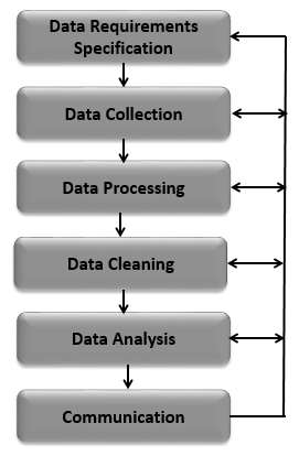
Data Analysis Process consists of the following phases that are iterative in nature −
- Data Requirements Specification
- Data Collection
- Data Processing
- Data Cleaning
- Data Analysis
- Communication
Data Requirements Specification
The data required for analysis is based on a question or an experiment. Based on the requirements of those directing the analysis, the data necessary as inputs to the analysis is identified (e.g., Population of people). Specific variables regarding a population (e.g., Age and Income) may be specified and obtained. Data may be numerical or categorical.
Data Collection
Data Collection is the process of gathering information on targeted variables identified as data requirements. The emphasis is on ensuring accurate and honest collection of data. Data Collection ensures that data gathered is accurate such that the related decisions are valid. Data Collection provides both a baseline to measure and a target to improve.
Data is collected from various sources ranging from organizational databases to the information in web pages. The data thus obtained, may not be structured and may contain irrelevant information. Hence, the collected data is required to be subjected to Data Processing and Data Cleaning.
Data Processing
The data that is collected must be processed or organized for analysis. This includes structuring the data as required for the relevant Analysis Tools. For example, the data might have to be placed into rows and columns in a table within a Spreadsheet or Statistical Application. A Data Model might have to be created.
Data Cleaning
The processed and organized data may be incomplete, contain duplicates, or contain errors. Data Cleaning is the process of preventing and correcting these errors. There are several types of Data Cleaning that depend on the type of data. For example, while cleaning the financial data, certain totals might be compared against reliable published numbers or defined thresholds. Likewise, quantitative data methods can be used for outlier detection that would be subsequently excluded in analysis.
Data Analysis
Data that is processed, organized and cleaned would be ready for the analysis. Various data analysis techniques are available to understand, interpret, and derive conclusions based on the requirements. Data Visualization may also be used to examine the data in graphical format, to obtain additional insight regarding the messages within the data.
Statistical Data Models such as Correlation, Regression Analysis can be used to identify the relations among the data variables. These models that are descriptive of the data are helpful in simplifying analysis and communicate results.
The process might require additional Data Cleaning or additional Data Collection, and hence these activities are iterative in nature.
Communication
The results of the data analysis are to be reported in a format as required by the users to support their decisions and further action. The feedback from the users might result in additional analysis.
The data analysts can choose data visualization techniques, such as tables and charts, which help in communicating the message clearly and efficiently to the users. The analysis tools provide facility to highlight the required information with color codes and formatting in tables and charts.
Excel Data Analysis - Overview
Excel provide commands, functions and tools that make your data analysis tasks easy. You can avoid many time consuming and/or complex calculations using Excel. In this tutorial, you will get a head start on how you can perform data analysis with Excel. You will understand with relevant examples, step by step usage of Excel commands and screen shots at every step.
Ranges and Tables
The data that you have can be in a range or in a table. Certain operations on data can be performed whether the data is in a range or in a table.
However, there are certain operations that are more effective when data is in tables rather than in ranges. There are also operations that are exclusively for tables.
You will understand the ways of analyzing data in ranges and tables as well. You will understand how to name ranges, use the names and manage the names. The same would apply for names in the tables.
Data Cleaning Text Functions, Dates and Times
You need to clean the data obtained from various sources and structure it before proceeding to data analysis. You will learn how you can clean the data.
- With Text Functions
- Containing Date Values
- Containing Time Values
Conditional Formatting
Excel provides you conditional formatting commands that allow you to color the cells or font, have symbols next to values in the cells based on predefined criteria. This helps one in visualizing the prominent values. You will understand the various commands for conditionally formatting the cells.
Sorting and Filtering
During the preparation of data analysis and/or to display certain important data, you might have to sort and/or filter your data. You can do the same with the easy to use sorting and filtering options that you have in Excel.
Subtotals with Ranges
As you are aware, PivotTable is normally used to summarize data. However, Subtotals with Ranges is another feature provided by Excel that will allow you to group / ungroup data and summarize the data present in ranges with easy steps.
Quick Analysis
With Quick Analysis tool in Excel, you can quickly perform various data analysis tasks and make quick visualizations of the results.
Understanding Lookup Functions
Excel Lookup Functions enable you to find the data values that match a defined criteria from a huge amount of data.
PivotTables
With PivotTables you can summarize the data, prepare reports dynamically by changing the contents of the PivotTable.
Data Visualization
You will learn several Data Visualization techniques using Excel Charts. You will also learn how to create Band Chart, Thermometer Chart, Gantt chart, Waterfall Chart, Sparklines and PivotCharts.
Data Validation
It might be required that only valid values be entered into certain cells. Otherwise, they may lead to incorrect calculations. With data validation commands, you can easily set up data validation values for a cell, an input message prompting the user on what is expected to be entered in the cell, validate the values entered with the defined criteria and display an error message in case of incorrect entries.
Financial Analysis
Excel provides you several financial functions. However, for commonly occurring problems that require financial analysis, you can learn how to use a combination of these functions.
Working with Multiple Worksheets
You might have to perform several identical calculations in more than one worksheet. Instead of repeating these calculations in each worksheet, you can do it one worksheet and have it appear in the other selected worksheets as well. You can also summarize the data from the various worksheets into a report worksheet.
Formula Auditing
When you use formulas, you might want to check whether the formulas are working as expected. In Excel, Formula Auditing commands help you in tracing the precedent and dependent values and error checking.
Inquire
Excel also provides Inquire add-in that enables you compare two workbooks to identify changes, create interactive reports, and view the relationships among workbooks, worksheets, and cells. You can also clean the excessive formatting in a worksheet that makes Excel slow or makes the file size huge.
Working with Range Names
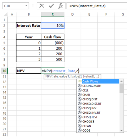
While doing Data Analysis, referring to various data will be more meaningful and easy if the reference is by Names rather than cell references either a single cell or a range of cells. For example, if you are calculating Net Present Value based on a Discount Rate and a series of Cash Flows, the formula
Net_Present_Value = NPV (Discount_Rate, Cash_Flows)
is more meaningful than
C10 = NPV (C2, C6:C8)
With Excel, you can create and use meaningful names to various parts of your data. The advantages of using range names include −
A meaningful Range name (such as Cash_Flows) is much easier to remember than a Range address (such as C6:C8).
Entering a name is less error prone than entering a cell or range address.
If you type a name incorrectly in a formula, Excel will display a #NAME? error.
You can quickly move to areas of your worksheet by using the defined names.
With Names, your formulas will be more understandable and easier to use. For example, a formula Net_Income = Gross_Income Deductions is more intuitive than C40 = C20 B18.
Creating formulas with range names is easier than with cell or range addresses. You can copy a cell or range name into a formula by using formula Autocomplete.
In this chapter, you will learn −
- Syntax rules for names.
- Creating names for cell references.
- Creating names for constants.
- Managing the names.
- Scope of your defined names.
- Editing names.
- Filtering names.
- Deleting names.
- Applying names.
- Using names in a formula.
- Viewing names in a workbook.
- Using paste names and paste list.
- Using names for range intersections.
- Copying formulas with names.
Copying Name using Formula Autocomplete
Type the first letter of the name in the formula. A drop-down box appears with function names and range names. Select the required name. It is copied into your formula.
Range Name Syntax Rules
Excel has the following syntax rules for names −
You can use any combination of letters, numbers and the symbols - underscores, backslashes, and periods. Other symbols are not allowed.
A name can begin with a character, underscore or backslash.
A name cannot begin with a number (example - 1stQuarter) or resemble a cell address (example - QTR1).
If you prefer to use such names, precede the name with an underscore or a backslash (example - \1stQuarter, _QTR1).
Names cannot contain spaces. If you want to distinguish two words in a name, you can use underscore (example- Cash_Flows instead of Cash Flows)
Your defined names should not clash with Excels internally defined names, such as Print_Area, Print_Titles, Consolidate_Area, and Sheet_Title. If you define the same names, they will override the Excels internal names and you will not get any error message. However, it is advised not to do so.
Keep the names short but understandable, though you can use up to 255 characters
Creating Range Names
You can create Range Names in two ways −
Using the Name box.
Using the New Name dialog box.
Using the Selection dialog box.
Create a Range Name using the Name Box
To create a Range name, using the Name box that is to the left of formula bar is the fastest way. Follow the steps given below −
Step 1 − Select the range for which you want to define a Name.
Step 2 − Click on the Name box.
Step 3 − Type the name and press Enter to create the Name.
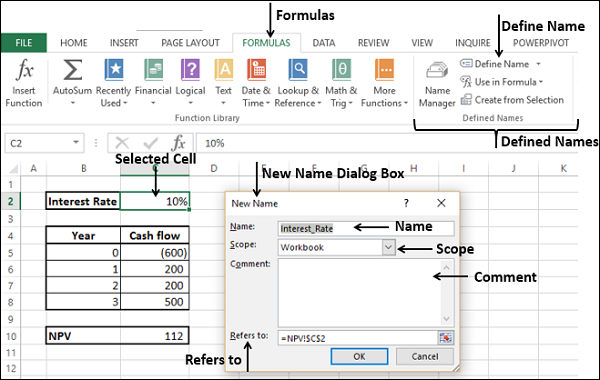
Create a Range Name using the New Name dialog box
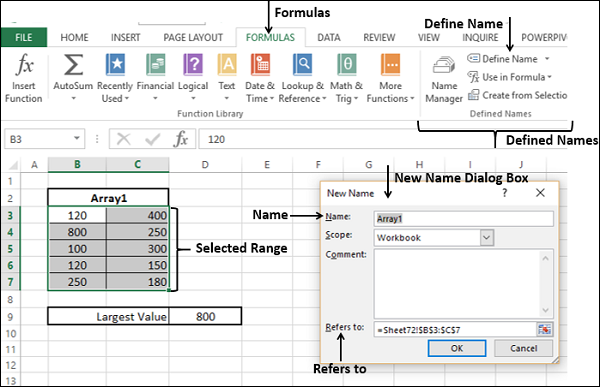
You can also create Range Names using the New Name dialog box from Formulas tab.
Step 1 − Select the range for which you want to define a name.
Step 2 − Click the Formulas tab.
Step 3 − Click Define Name in the Defined Names group. The New Name dialog box appears.
Step 4 − Type the name in the box next to Name
Step 5 − Check that the range that is selected and displayed in the Refers box is correct. Click OK.
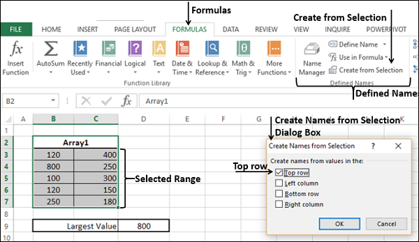
Create a Range Name using the Create Names from Selection dialog box
You can also create Range names using the Create Names from the Selection dialog box from Formulas tab, when you have Text values that are adjacent to your range.
Step 1 − Select the range for which you want to define a name along with the row / column that contains the name.
Step 2 − Click the Formulas tab.
Step 3 − Click Create from Selection in the Defined Names group. The Create Names from Selection dialog box appears.
Step 4 − Select top row as the Text appears in the top row of the selection.
Step 5 − Check the range that got selected and displayed in the box next to Refers to be correct. Click OK.
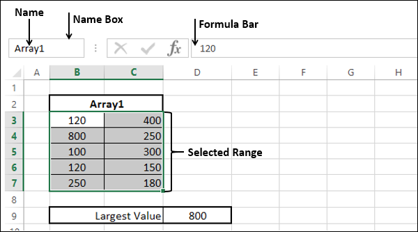
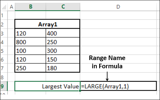
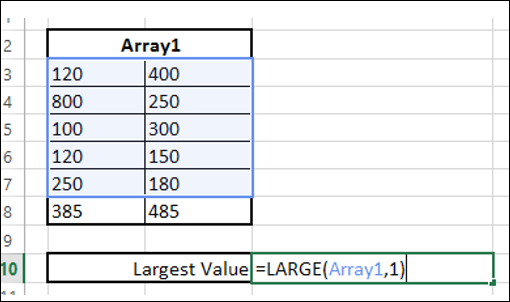
Now, you can find the largest value in the range with =Sum(Student Name), as shown below −
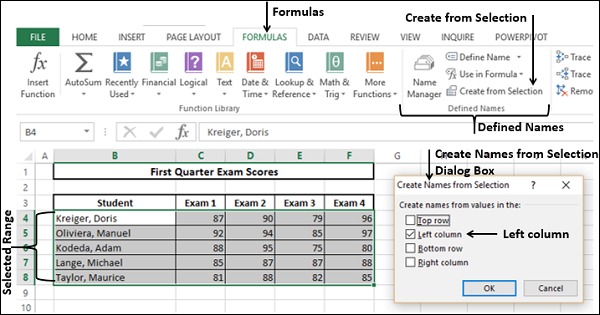
You can create names with multiple selection also. In the example given below, you can name the row of marks of each student with the students name.
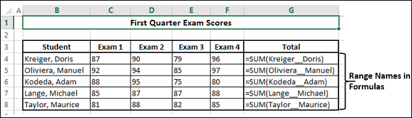
Now, you can find the total marks for each student with =Sum (student name), as shown below.
Creating Names for Constants
Suppose you have a constant that will be used throughout your workbook. You can assign a name to it directly, without placing it in a cell.
In the example below, Savings Bank Interest Rate is set to 5%.
- Click Define Name.
- In the New Name dialog box, type Savings_Bank_Interest_Rate in the Name box.
- In Scope, select Workbook.
- In Refers to box, clear the contents and type 5%.
- Click OK.
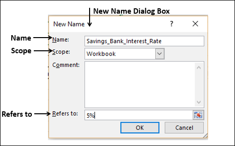
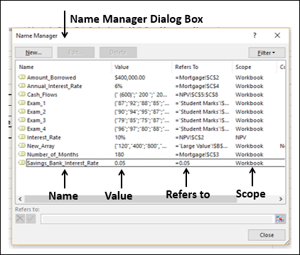
The Name Savings_Bank_Interest_Rate is set to a constant 5%. You can verify this in Name Manager. You can see that the value is set to 0.05 and in the Refers to =0.05 is placed.
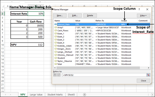
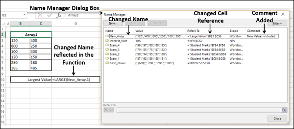
Managing Names
An Excel Workbook can have any number of named cells and ranges. You can manage these names with the Name Manager.
Click the Formulas tab.
Click Name Manager in the Defined Names group. The Name Manager dialog box appears. All the names defined in the current workbook are displayed.
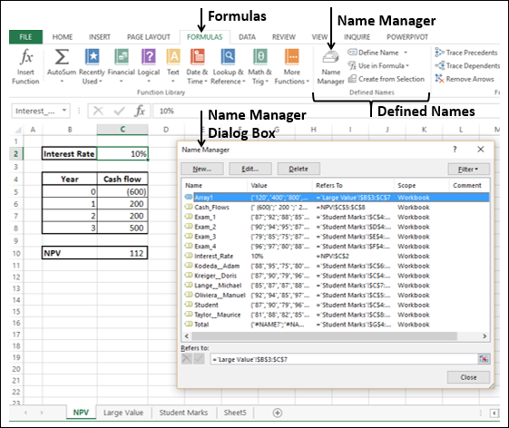
The List of Names are displayed with the defined Values, Cell Reference (including Sheet Name), Scope and Comment.
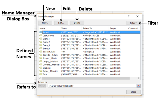
The Name Manager has the options to −
Define a New Name with the New Button.
Edit a Defined Name.
Delete a Defined Name.
Filter the Defined Names by Category.
Modify the Range of a Defined Name that it Refers to.
Scope of a Name
The Scope of a name by default is the workbook. You can find the Scope of a defined names from the list of names under the Scope column in the Name Manager.
You can define the Scope of a New Name when you define the name using New Name dialog box. For example, you are defining the name Interest_Rate. Then you can see that the Scope of the New Name Interest_Rate is the Workbook.
Suppose you want the Scope of this interest rate restricted to this Worksheet only.
Step 1 − Click the down-arrow in the Scope Box. The available Scope options appear in the drop-down list.
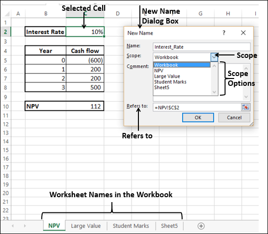
The Scope options include Workbook, and the sheet names in the workbook.
Step 2 − Click the current worksheet name, in this case NPV and click OK. You can define / find the sheet name in the worksheet tab.
Step 3 − To verify that Scope is worksheet, click Name Manager. In the Scope column, you will find NPV for Interest_Rate. This means you can use the Name Interest_Rate only in the Worksheet NPV, but not in the other Worksheets.
Note − Once you define the Scope of a Name, it cannot be modified later.
Deleting Names with Error Values
Sometimes, it may so happen that Name definition may have errors for various reasons. You can delete such names as follows −
Step 1 − Click Filter in the Name Manager dialog box.
The following filtering options appear −
- Clear Filter
- Names Scoped to Worksheet
- Names Scoped to Workbook
- Names with Errors
- Names without Errors
- Defined Names
- Table Names
You can apply Filter to the defined Names by selecting one or more of these options.
Step 2 − Select Names with Errors. Names that contain error values will be displayed.
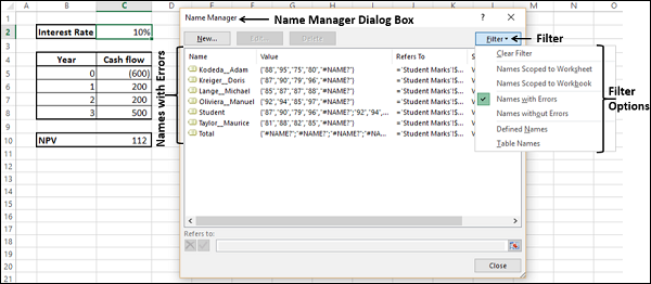
Step 3 − From the obtained list of Names, select the ones you want to delete and click Delete.
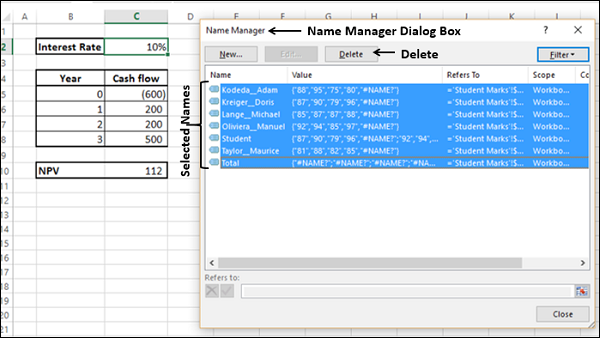
You will get a message, confirming delete. Click OK.
Editing Names
You can use the Edit option in the Name Manager dialog box to −
Change the Name.
Modify the Refers to range
Edit the Comment in a Name.
Change the Name
Step 1 − Click the cell containing the function Large.
You can see, two more values are added in the array, but are not included in the function as they are not part of Array1.
Step 2 − Click the Name you want to edit in the Name Manager dialog box. In this case, Array1.
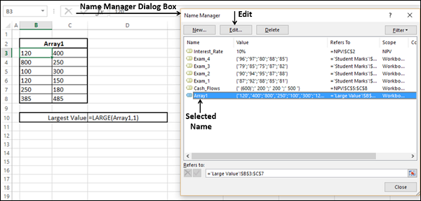
Step 3 − Click Edit. The Edit Name dialog box appears.
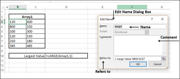
Step 4 − Change the Name by typing the new name that you want in the Name Box.
Step 5 − Click the Range button to the right of Refers to Box and include the new cell references.
Step 6 − Add a Comment (Optional)
Notice that Scope is deactive and hence cannot be changed.
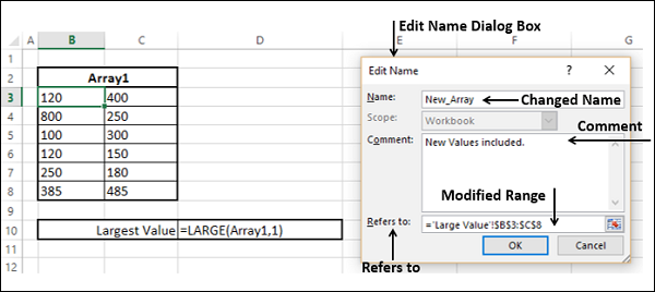
Click OK. You will observe the changes made.
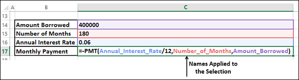
Applying Names
Consider the following example −
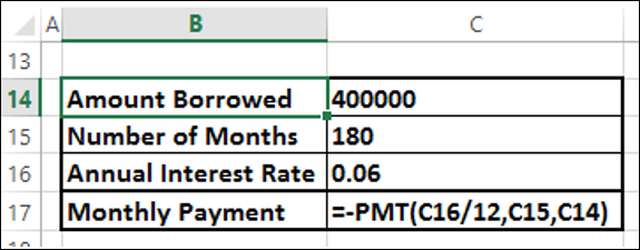
As you observe, names are not defined and used in PMT function. If you place this function somewhere else in the worksheet, you also need to remember where exactly the parameter values are. You know that using names is a better option.
In this case, the function is already defined with cell references that do not have names. You can still define names and apply them.
Step 1 − Using Create from Selection, define the names.
Step 2 − Select the cell containing the formula. Click  next to Define Name in the Defined Names group on the Formulas tab. From the drop-down list, click Apply Names.
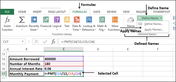
Step 3 − The Apply Names dialog box appears. Select the Names that you want to Apply and click OK.
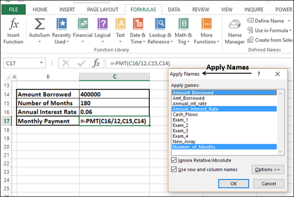
The selected names will be applied to the selected cells.
You can also Apply Names to an entire worksheet, by selecting the worksheet and repeating the above steps.
Using Names in a Formula
You can use a Name in a Formula in the following ways −
Typing the Name if you remember it, or
Typing first one or two letters and using the Excel Formula Autocomplete feature.
Clicking Use in Formula in the Defined Names group on the Formulas tab.
Select the required Name from the drop-down list of defined names.
Double-click on that name.
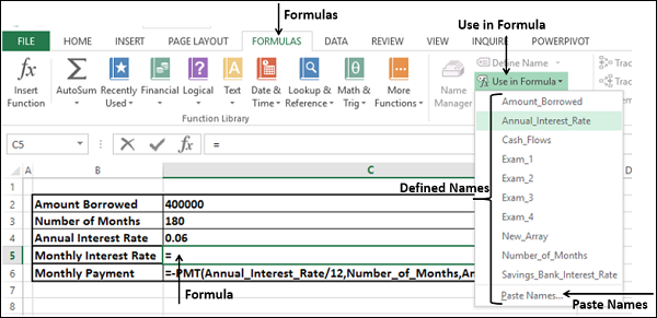
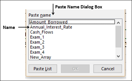
Using the Paste Name dialog box.
Select the Paste Names option from the drop-down list of defined names. The Paste Name dialog box appears.
Select the Name in the Paste Names dialog box and double-click it.
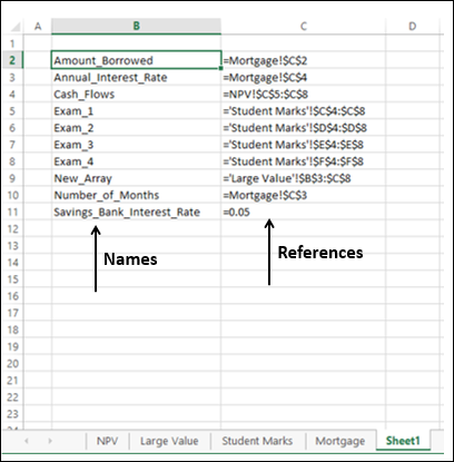
Viewing Names in a Workbook
You can get all the Names in your workbook along with their References and Save them or Print them.
Click an empty Cell where you want to copy the Names in your workbook.
Click Use in Formula in the Defined Names group.
Click Paste Names from the drop-down list.
Click Paste List in the Paste Name dialog box that appears.
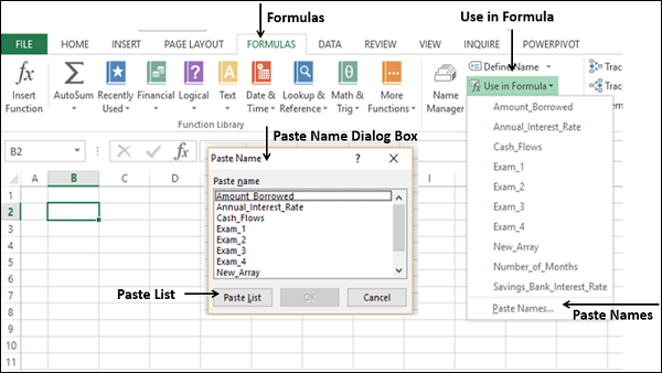
The list of names and their corresponding references are copied at the specified location on your worksheet as shown in the screen shot given below −
Using Names for Range Intersections
Range Intersections are those individual cells that have two Ranges in common.
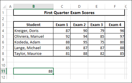
For example, in the data given below, the Range B6:F6 and the Range C3:C8 have Cell C6 in common, which actually represents the marks scored by the student Kodeda, Adam in Exam 1.
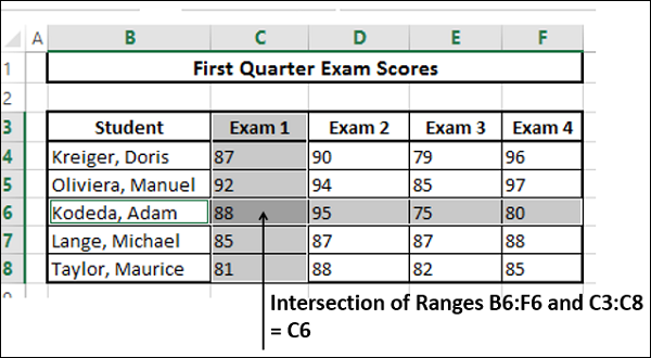
You can make this more meaningful with the Range Names.
Create Names with Create from Selection for both Students and Exams.
Your Names will look as follows −
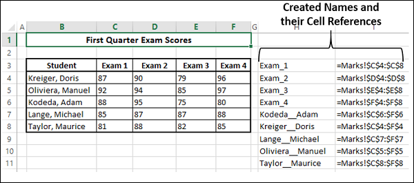
Type =Kodeda_Adam Exam_1 in B11.
Here, you are using the Range Intersection operation, space between the two ranges.
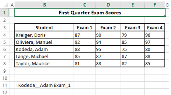
This will display marks of Kodeda, Adam in Exam 1, that are given in Cell C6.
Copying Formulas with Names
You can copy a formula with names by Copyand Paste within the same worksheet.
You can also copy a formula with names to a different worksheet by copy and paste, provided all the names in the formula have workbook as Scope. Otherwise, you will get a #VALUE error.
Excel Data Analysis - Tables
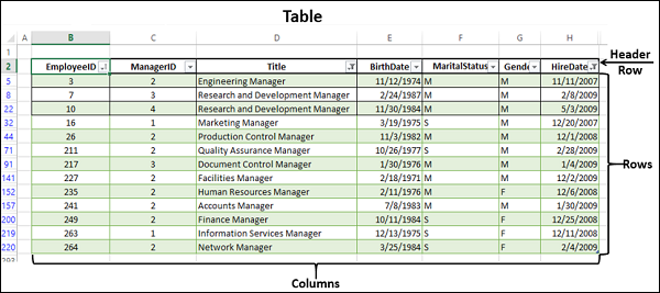
A Table is a rectangular range of structured data. The key features are −
Each row in the table corresponds to a single record of the data. Example - Employee information.
Each column contains a specific piece of information. Exmaple - The columns can contain data such as name, employee number, hire date, salary, department, etc.
The top row describes the information contained in each column and is referred to as header row.
Each entry in the top row is referred to as column header.
You can create and use an Excel table to manage and analyze data easily. Further, with Excel Tables you get built-in Filtering, Sorting, and Row Shading that ease your reporting activities.
Further, Excel responds to the actions performed on a table intelligently. For example, you have a formula in a column or you have created a chart based on the data in the table. When you add more data to the table (i.e., more rows), Excel extends the formula to the new data and the chart expands automatically.
Difference between Tables and Ranges
Following are the differences between a table and range −
- A table is a more structured way of working with data than a range.
- You can convert a range into a table and Excel automatically provides −
- a Table Name
- Column Header Names
- Formatting to the Data (Cell Color and Font Color) for better Visualization
Tables provide additional features that are not available for ranges. These are −
Excel provides table tools in the ribbon ranging from properties to styles.
Excel automatically provides a Filter button in each column header to sort the data or filter the table such that only rows that meet your defined criteria are displayed.
If you have multiple rows in a table, and you scroll down the sheet so that the header row disappears, the column letters in the worksheet are replaced by the table headers.
When you place a formula in any cell in a column of the table, it gets propagated to all the cells in that column.
You can use table name and column header names in the formulas, without having to use cell references or creating range names.
You can extend the table size by adding more rows or more columns by clicking and dragging the small triangular control at the lower-right corner of the lower-right cell.
You can create and use slicers for a table for filtering data.
You will learn about all these Features in this Chapter.
Create Table
To create a table from the data you have on the worksheet, follow the given steps −
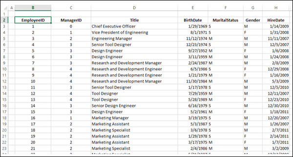
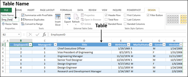
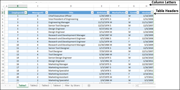
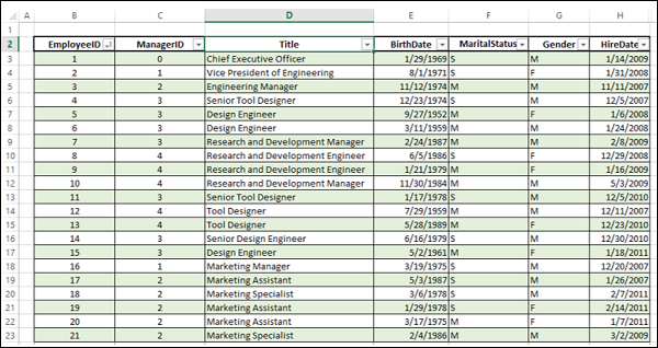
Step 1 − Select the Range of Cells that you want to include in the Table. Cells can contain data or can be empty. The following Range has 290 rows of employee data. The top row of the data has headers.
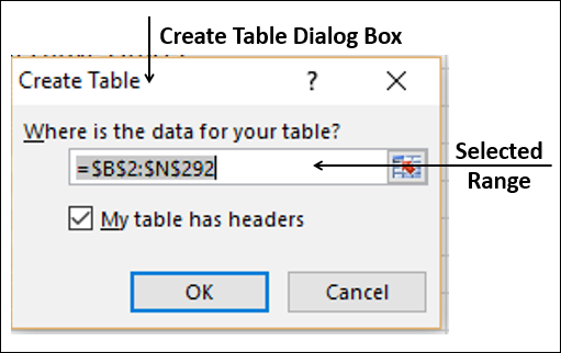
Step 2 − Under the Insert tab, in the Tables group, click Tables. The Create Table dialog box appears. Check that the data range selected in the Where is the data for your table? Box is correct.
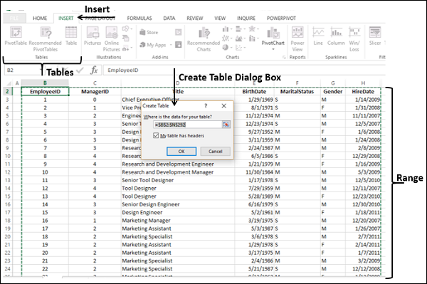
Step 3 − Check the My table has headers box if the top row of the selected Range contains data that you want to use as the Table Headers.
Note − If you do not check this box, your table will have Headers Column1, Column2,
Step 4 − Click OK.
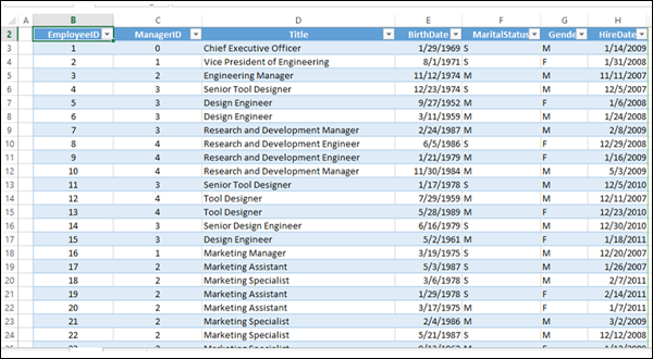
Range is converted to Table with the default Style.
Step 5 − You can also convert a range to a table by clicking anywhere on the range and pressing Ctrl+T. A Create Table dialog box appears and then you can repeat the steps as given above.
Table Name
Excel assigns a name to every table that is created.
Step 1 − To look at the name of the table you just created, click table, click on table tools design tab on the Ribbon.
Step 2 − In the Properties group, in the Table Name box, your Table Name will be displayed.
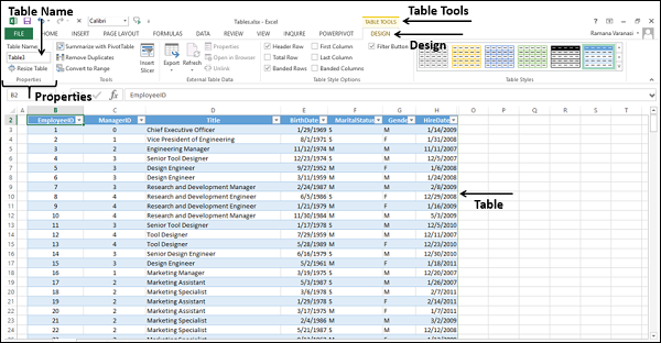
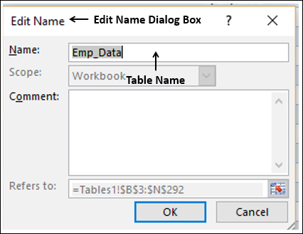
Step 3 − You can edit this Table Name to make it more meaningful to your data.
Step 4 − Click the Table Name box. Clear the Name and type Emp_Data.
Note − The syntax rules of range names are applicable to table names.
Managing Names in a Table
You can manage table names just similar to how you manage range names with Name Manager.
Click the Table.
Click Name Manager in the Defined Names group on Formulas tab.
The Name Manager dialog box appears and you can find the Table Names in your workbook.
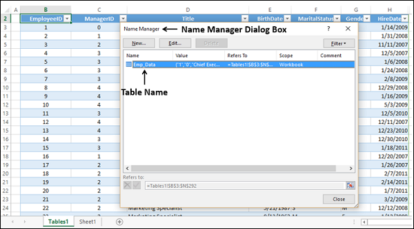
You can Edit a Table Name or add a comment with New option in the Name Manager dialog box. However, you cannot change the range in Refers to.
You can Create Names with column headers to use them in formulas, charts, etc.
Click the Column Header EmployeeID in the Table.
Click Name Manager.
Click New in the Name Manager dialog box.
The New Name dialog box appears.
In the Name box, you can find the Column Header, and in the Refers to box,you will find Emp_Data[[#Headers],[EmployeeID]].
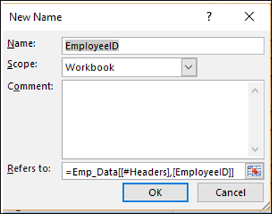
As you observe, this is a quick way of defining Names in a Table.
Table Headers replacing Column Letters
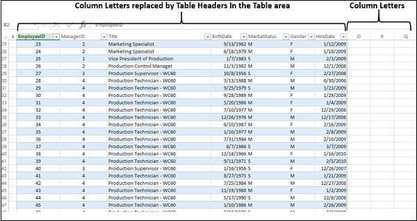
When you are working with more number of rows of data in a table, you may have to scroll down to look at the data in those rows.
However, while doing so, you also require the table headers to identify which value belongs to which column. Excel automatically provides a smooth way of doing this. As you scroll down your data, the column letters of the worksheet themselves get converted to table headers.
In the worksheet given below, the column letters are appearing as they are and the table headers are in row 2. 21 rows of 290 rows of data are visible.
Scroll down to see the table rows 25 35. The table headers will replace the column letters for the table columns. Other column letters remain as they are.
Propagation of a Formula in a Table
In the table given below, suppose you want to include the age of each employee.
Step 1 − Insert a column to the right of the column Birthdate. Type Age in the Column Header.
Step 2 − In any of the Cells in that empty column, type the Formula, =DAYS ([@BirthDate], TODAY ()) and Press Enter.
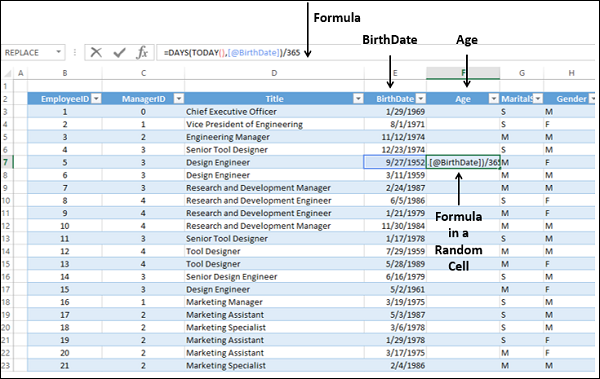
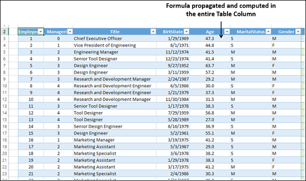
The formula propagates automatically to the other cells in that column of the table.
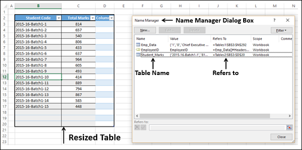
Resize Table
You can resize a table to add or remove rows/columns.
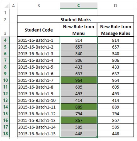
Consider the following table Student_Marks that contains Total Marks for Batches 1 - 15.
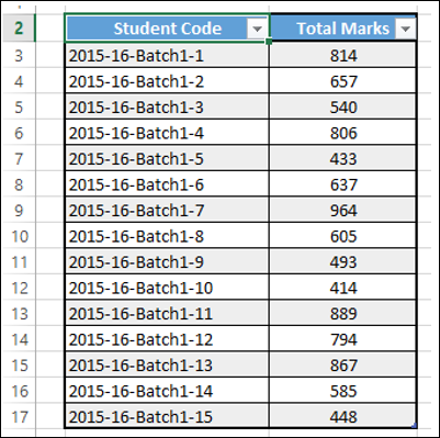
Suppose you want to add three more batches 16 18 and a column containing pass percentage.
Click the table.
Drag the blue-color control at the lower-right, downwards to include three more rows in the table.
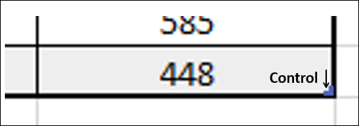
Again drag the blue-color control at the lower-right, sideways to include one more column in the table.
Your table looks as follows. You can also check the range included in the table in the Name Manager dialog box −
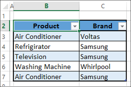
Remove Duplicates
When you gather data from different sources, you probably can have duplicate values. You need to remove the duplicate values before going further with analysis.
Look at the following data where you have information about various products of various brands. Suppose, you want to remove duplicates from this data.
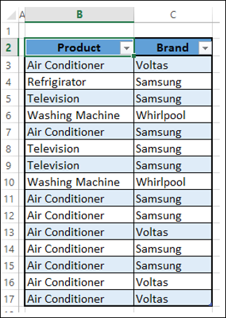
Click the table.
On the DESIGN tab, click Remove Duplicates in the Tools group on the Ribbon. The Remove Duplicates dialog box appears.
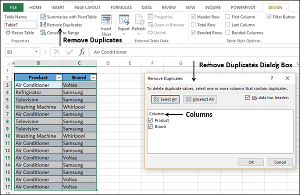
The column headers appear under columns in the Remove Duplicates dialog box.
Check the column headers depending on which column you want to remove the duplicates and click OK.
You will get a message on how many rows with duplicate values are removed and how many unique values remain. The cleaned data will be displayed in the table.
You can also remove duplicates with Remove Duplicates in the Data Tools group under DATA tab on the Ribbon.
Convert to Range
You can convert a table to a Range.
Click the table.
Click Convert to Range in the Tools group, under the Design tab on the Ribbon.
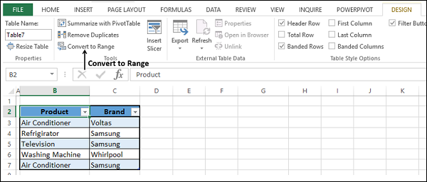
You will get a message asking you if you want to convert the table to a Range. After you confirm with Yes, the table will be converted to Range.
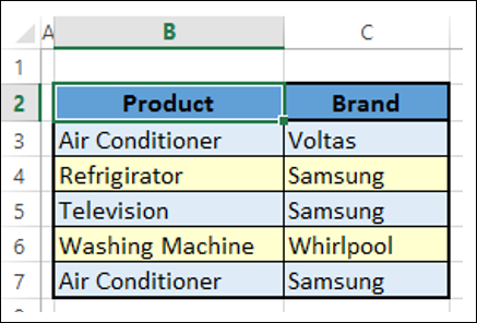
Table Style Options
You have several options of Table Styles to choose. These options can be used if you need to highlight a Row / Column.
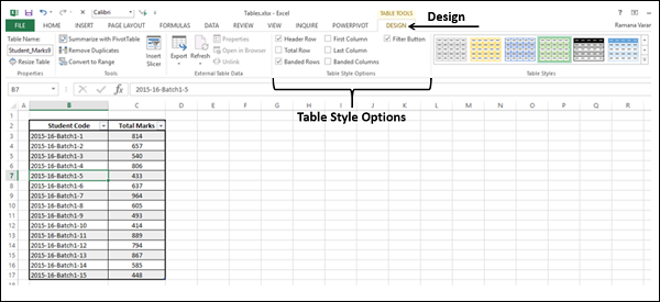
You can check / uncheck these boxes to see how your table looks. Finally, you can decide on what options suit your data.
It is advised that the Table Style Options be used only to project important information in your data rather than making it colorful, which is not needed in data analysis.
Table Styles
You have several table styles to choose from. These styles can be used depending on what color and pattern you want to display your data in the table.
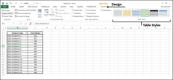
Move your mouse on these styles to have a preview of your table with the styles. Finally, you can decide on what style suit your data.
It is advised that the Table Styles be used only to project important information in your data in a presentable way rather than making it colorful, which is not needed in data analysis.
Slicers for Tables
If you are using Excel 2013 or Excel 2016, you can use Slicers for filtering data in your table.
For details on how to use Slicers for Tables, refer the chapter on Filtering in this tutorial.
Cleaning Data with Text Functions
The data that you obtain from different sources many not be in a form ready for analysis. In this chapter, you will understand how to prepare your data that is in the form of text for analysis.
Initially, you need to clean the data. Data cleaning includes removing unwanted characters from text. Next, you need to structure the data in the form you require for further analysis. You can do the same by −
- Finding required text patterns with the text functions.
- Extracting data values from text.
- Formatting data with text functions.
- Executing data operations with the text functions.
Removing Unwanted Characters from Text
When you import data from another application, it can have nonprintable characters and/or excess spaces. The excess spaces can be −
- leading spaces, and/or
- extra spaces between words.
If you sort or analyze such data, you will get erroneous results.
Consider the following example −
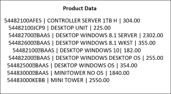
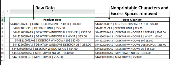
This is the raw data that you have obtained on product information containing the Product ID, Product description and the price. The character | separates the field in each row.
When you import this data into Excel worksheet, it looks as follows −
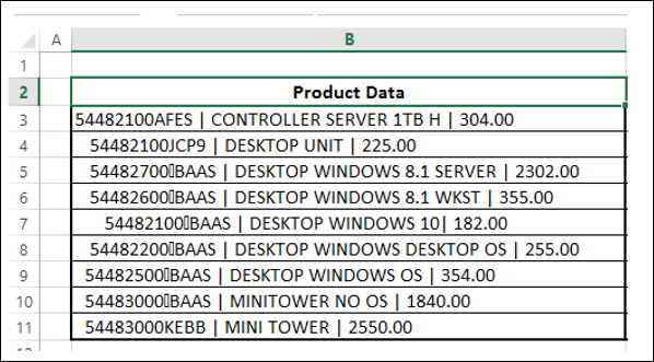
As you observe, the entire data is in a single column. You need to structure this data to perform data analysis. However, initially you need to clean the data.
You need to remove any nonprintable characters and excess spaces that might be present in the data. You can use the CLEAN function and TRIM function for this purpose.
| S.No. | Function & Description |
|---|---|
| 1. | CLEAN Removes all nonprintable characters from text |
| 2. | TRIM Removes spaces from text |
- Select the Cells C3 C11.
- Type =TRIM (CLEAN (B3)) and then press CTRL + Enter.
The formula is filled in the cells C3 C11.
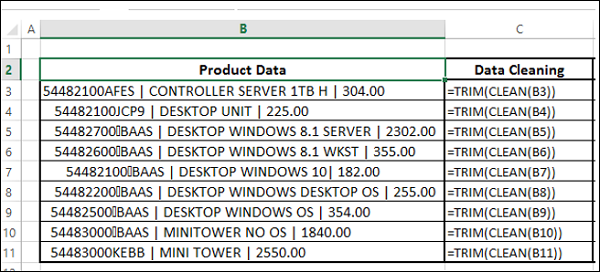
The result will be as shown below −
Finding required Text Patterns with the Text Functions
To structure your data, you might have to do certain Text Pattern matching based on which you can extract the Data Values. Some of the Text Functions that are useful for this purpose are −
| S.No. | Function & Description |
|---|---|
| 1. | EXACT Checks to see if two text values are identical |
| 2. | FIND Finds one text value within another (case-sensitive) |
| 3. | SEARCH Finds one text value within another (not case-sensitive) |
Extracting Data Values from Text
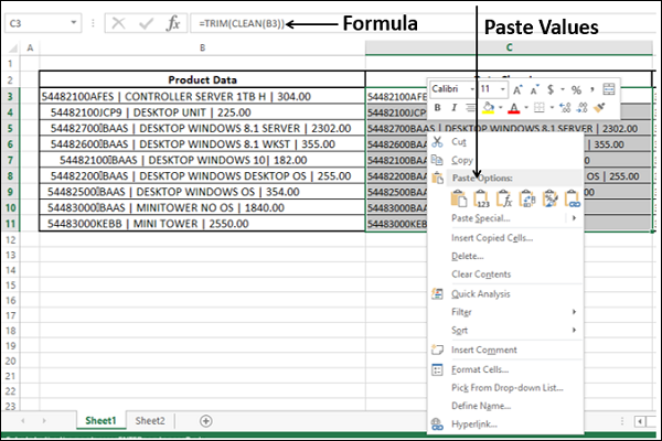
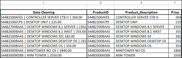
You need to extract the required data from text in order to structure the same. In the above example, say, you need to place the data in three columns ProductID, Product_Description and Price.
You can extract data in one of the following ways −
- Extracting Data Values with Convert Text to Columns Wizard
- Extracting Data Values with Text Functions
- Extracting Data Values with Flash Fill
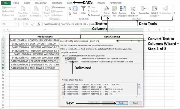
Extracting Data Values with Convert Text to Columns Wizard
You can use the Convert Text to Columns Wizard to extract Data Values into Excel columns if your fields are −
- Delimited by a character, or
- Aligned in columns with spaces between each field.
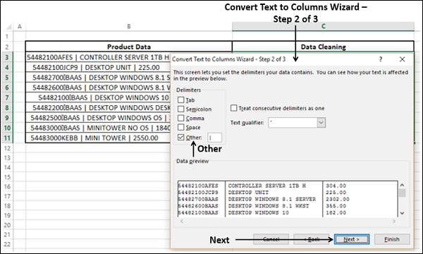
In the above example, the fields are delimited by the character |. Hence, you can use the Convert Text to Columns wizard.
Select the data.
Copy and paste values in the same place. Otherwise, Convert Text to Columns takes the functions rather than the data itself as the input.
Select the data.
Click on Text to Columns in the Data Tools group under Data Tab on the Ribbon.
Step 1 − Convert Text to Columns Wizard - Step 1 of 3 appears.
- Select Delimited.
- Click Next.
Step 2 − Convert Text to Columns Wizard - Step 2 of 3 appears.
Under Delimiters, select Other.
In the box next to Other, type the character |
Click Next.
Step 3 − Convert Text to Columns Wizard - Step 3 of 3 appears.
In this screen, you can select each column of your data in the wizard and set the format for that column.
For Destination, select the cell D3.
You can click Advanced, and set Decimal Separator and Thousands Separator in the Advanced Text Import Settings dialog box that appears.
Click Finish.
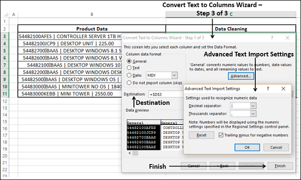
Your data, which is converted to columns appears in the three Columns D, E and F.
- Name the Column headers as ProductID, Product_Description and Price.
Extracting Data Values with Text Functions
Suppose the fields in your data neither are delimited by a character nor are aligned in columns with spaces between each field, you can use text functions to extract data values. Even in the case the fields are delimited, you can still use text functions to extract data.
Some of the text functions that are useful for this purpose are −
| S.No. | Function & Description |
|---|---|
| 1. | LEFT Returns the leftmost characters from a text value |
| 2. | RIGHT Returns the rightmost characters from a text value |
| 3. | MID Returns a specific number of characters from a text string starting at the position you specify |
| 4. | LEN Returns the number of characters in a text string |
You can also combine two or more of these text functions as per the data you have at hand, to extract the required data values. For example, using a combination of LEFT, RIGHT and VALUE functions or using a combination of FIND, LEFT, LEN and MID functions.
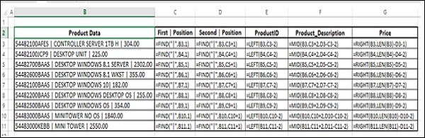
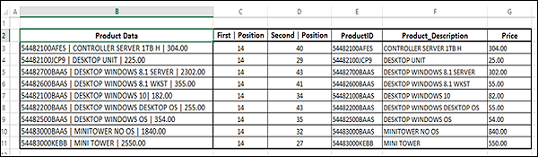
In the above example,
All the characters left to the first | give the name ProductID.
All the characters right to the second | give the name Price.
All the characters that lie between the first | and second | give the name Product_Description.
Each | has a space before and after.
Observing this information, you can extract the data values with the following steps −
Find the Position of First | - First | Position
You can use FIND function
Find the Position of Second | - Second | Position
You can use FIND function again
Beginning to (First | Position 2) Characters of the Text give ProductID
You can use LEFT Function
(First | Position + 2) to (Second | Position - 2) Characters of the Text give Product_Description
You can use MID Function
(Second | Position + 2) to End Characters of the Text give Price
You can use RIGHT Function
The result will be as shown below −
You can observe that the values in the price column are text values. To perform calculations on these values, you have to format the corresponding cells. You can look at the section given below to understand formatting text.
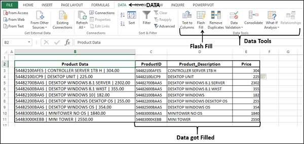
Extracting Data Values with Flash Fill
Using Excel Flash Fill is another way to extract data values from text. However, this works only when Excel is able to find a pattern in the data.
Step 1 − Create three columns for ProductID, Product_Description and Price next to the data.
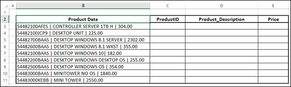
Step 2 − Copy and paste the values for C3, D3 and E3 from B3.
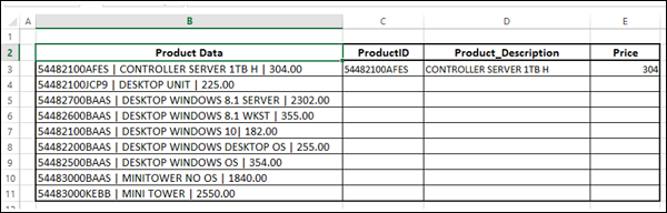
Step 3 − Select cell C3 and click Flash Fill in the Data Tools group on the Data tab. All the values for ProductID get filled.
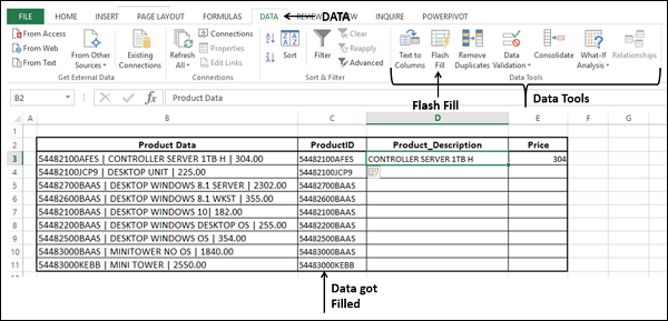
Step 4 − Repeat the above given steps for Product_Description and Price. The data is filled.
Formatting Data with Text Functions
Excel has several built-in text functions that you can use for formatting data containing text. These include −
Functions that format the Text as per your need −
| S.No. | Function & Description |
|---|---|
| 1. | LOWER Converts text to lowercase |
| S.No. | Function & Description |
|---|---|
| 1. | UPPER Converts text to uppercase |
| 2. | PROPER Capitalizes the first letter in each word of a text value |
Functions that convert and/or format the Numbers as Text −
| S.No. | Function & Description |
|---|---|
| 1. | DOLLAR Converts a number to text, using the $ (dollar) currency format |
| 2. | FIXED Formats a number as text with a fixed number of decimals |
| 3. | TEXT Formats a number and converts it to text |
Functions that convert the Text to Numbers −
| S.No. | Function & Description |
|---|---|
| 1. | VALUE Converts a text argument to a number |
Executing Data Operations with the Text Functions
You might have to perform certain Text Operations on your Data. For example, if Login-IDs for the Employees are changed to a New Format in an Organization, based on the Format Change, Text Replacements might have to be done.
Following Text Functions help you in performing Text Operations on your data containing Text −
| S.No. | Function & Description |
|---|---|
| 1. | REPLACE Replaces characters within text |
| 2. | SUBSTITUTE Substitutes new text for old text in a text string |
| 3. | CONCATENATE Joins several text items into one text item |
| 4. | CONCAT Combines the text from multiple ranges and/or strings, but it does not provide the delimiter or IgnoreEmpty arguments. |
| 5. | TEXTJOIN Combines the text from multiple ranges and/or strings, and includes a delimiter you specify between each text value that will be combined. If the delimiter is an empty text string, this function will effectively concatenate the ranges. |
| 6. | REPT Repeats text a given number of times |
Cleaning Data Containing Date Values
The data that you obtain from different sources might contain date values. In this chapter, you will understand how to prepare your data that contains data values for analysis.
You will learn about −
- Date Formats
- Date in Serial Format
- Date in different Month-Day-Year Formats
- Converting Dates in Serial Format to Month-Day-Year Format
- Converting Dates in Month-Day-Year Format to Serial Format
- Obtaining Today's Date
- Finding a Workday after specified Days
- Customizing the Definition of a Weekend
- Number of Workdays between two given Dates
- Extracting Year, Month, Day from Date
- Extracting Day of the Week from Date
- Obtaining Date from Year, Month and Day
- Calculating Number of Years, Months and Days between two Dates
Date Formats
Excel supports Date values in two ways −
- Serial Format
- In different Year-Month-Day Formats
You can convert −
A Date in Serial Format to a Date in Year-Month-Day Format
A Date in Year-Month-Day Format to a Date in Serial Format
Date in Serial Format
A Date in serial format is a positive integer that represents the number of days between the given date and January 1, 1900. Both the current Date and January 1, 1900 are included in the count. For example, 42354 is a Date that represents 12/16/2015.
Date in Month-Day-Year Formats
Excel supports different Date Formats based on the Locale (Location) you choose. Hence, you need to first determine the compatibility of your Date formats and the Data Analysis at hand. Note that certain Date formats are prefixed with *(asterisk) −
Date formats that begin with *(asterisk) respond to changes in regional date and time settings that are specified for the operating system
Date formats without an *(asterisk) are not affected by operating system settings
For understanding purpose, you can assume United States as the Locale. You find the following Date formats to choose for the Date - 8th June, 2016 −
- *6/8/2016 (affected by operating system settings)
- *Wednesday, June 8, 2016 (affected by operating system settings)
- 6/8
- 6/8/16
- 06/08/16
- 8-Jun
- 8-Jun-16
- 08-Jun-16
- Jun-16
- June-16
- J
- J-16
- 6/8/2016
- 8-Jun-2016
If you enter only two digits to represent a year and if −
The digits are 30 or higher, Excel assumes the digits represent years in the twentieth century.
The digits are lower than 30, Excel assumes the digits represent years in the twenty-first century.
For example, 1/1/29 is treated as January 1, 2029 and 1/1/30 is treated as January 1, 1930.
Converting Dates in Serial Format to Month-Day-Year Format
To convert dates from serial format to Month-Day-Year format, follow the steps given below −
Click the Number tab in the Format Cells dialog box.
Click Date under Category.
Select Locale. The available Date formats will be displayed as a list under Type.
Click on a Format under Type to look at the preview in the box adjacent to Sample.
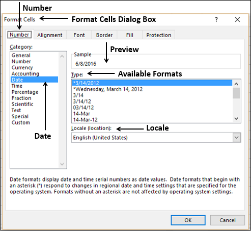
After choosing the Format, click OK.
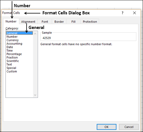
Converting Dates in Month-Day-Year Format to Serial Format
You can convert dates in Month-Day-Year format to Serial format in two ways −
Using Format Cells dialog box
Using Excel DATEVALUE function
Using Format Cells dialog box
Click the Number tab in the Format Cells dialog box.
Click General under Category.
Using Excel DATEVALUE Function
You can use Excel DATEVALUE function to convert a Date to Serial Number format. You need to enclose the Date argument in . For example,
=DATEVALUE ("6/8/2016") results in 42529
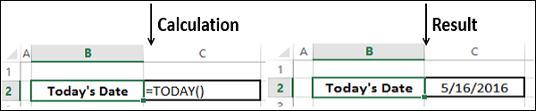
Obtaining Today's Date
If you need to perform calculations based on todays date, simply use the Excel function TODAY (). The result reflects the date when it is used.
The following screenshot of TODAY () function usage has been taken on 16th May, 2016 −
Finding a Workday after Specified Days
You might have to perform certain calculations based on your workdays.
Workdays exclude weekend days and any holidays. This means if you can define your weekend and holidays, whatever calculations you do will be based on workdays. For example, you can calculate invoice due dates, expected delivery times, the next meeting date, etc.
You can use Excel WORKDAY and WORKDAY.INTL functions for such operations.
| S.No. | Function & Description |
|---|---|
| 1. | WORKDAY Returns the serial number of the date before or after a specified number of workdays |
| 2. | WORKDAY.INTL Returns the serial number of the date before or after a specified number of workdays using parameters to indicate which and how many days are weekend days |
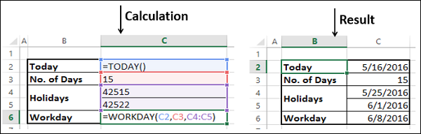
For example, you can specify the 15th working day from today (the screenshot below is taken on 16th May 2016) using the Functions TODAY and WORKDAY.
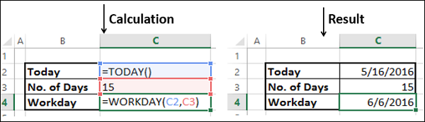
Suppose 25th May 2016 and 1st June 2016 are holidays. Then, your calculation will be as follows −
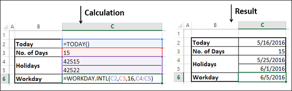
Customizing the Definition of a Weekend
By default, weekend is Saturday and Sunday, i.e. two days. You can also optionally define your weekend with the WORKDAY.INTL function. You can specify your own weekend by a weekend-number that corresponds to the weekend days as given in the table below. You need not remember these numbers, because when you start typing the function, you get a list of numbers and the weekend days in the drop-down list.
| Weekend Days | Weekend-number |
|---|---|
| Saturday, Sunday | 1 or omitted |
| Sunday, Monday | 2 |
| Monday, Tuesday | 3 |
| Tuesday, Wednesday | 4 |
| Wednesday, Thursday | 5 |
| Thursday, Friday | 6 |
| Friday, Saturday | 7 |
| Sunday only | 11 |
| Monday only | 12 |
| Tuesday only | 13 |
| Wednesday only | 14 |
| Thursday only | 15 |
| Friday only | 16 |
| Saturday only | 17 |
Suppose, if weekend is Friday only, you need to use the number 16 in the WORKDAY.INTL function.
Number of Workdays between two given Dates
There might be a requirement to calculate the number of workdays between two dates, for example, in the case of calculating payment to a contract employee who is paid on per day basis.
You can find the number of workdays between two dates with the Excel functions NETWORKDAYS and NETWORKDAYS.INTL. Just as in the case of WORKDAYS and WORKDAYS.INTL, NETWORKDAYS and NETWORKDAYS.INTL allow you to specify holidays and with NETWORKDAYS.INTL you can additionally specify the weekend.
| S.No. | Function & Description |
|---|---|
| 1. | NETWORKDAYS Returns the number of whole workdays between two dates |
| 2. | NETWORKDAYS.INTL Returns the number of whole workdays between two dates using parameters to indicate which and how many days are weekend days |
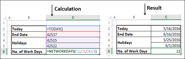
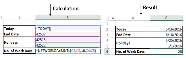
You can calculate the number of workdays between today and another date with the functions TODAY and NETWORKDAYS. In the screen shot given below, today is 16th May 2016 and end date is 16th June 2016. 25th May 2016 and 1st June 2016 are holidays.
Again, the weekend is assumed to be Saturday and Sunday. You can have your own definition for weekend and calculate the number of workdays between two dates with the NETWORKDAYS.INTL function. In the screen shot given below, only Friday is defined as weekend.
Extracting Year, Month, Day from Date
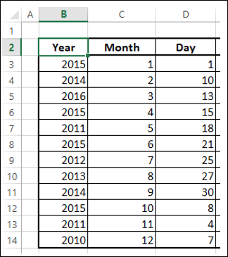
You can extract from each date in a list of dates, the corresponding day, month and year using the excel functions DAY, MONTH and YEAR.
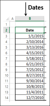
For example, consider the following dates −
From each of these dates, you can extract day, month and year as follows −
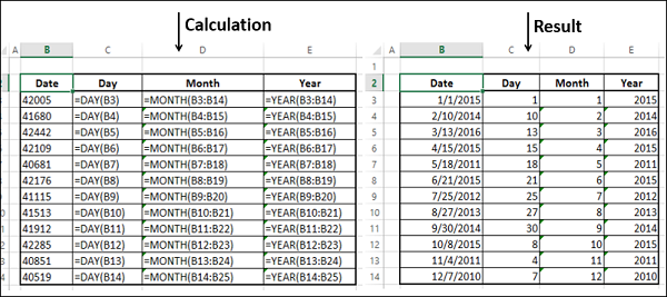
Extracting Day of the Week from Date
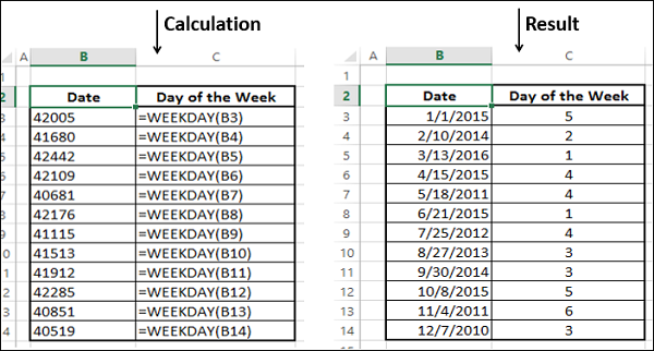
You can extract from each date in a list of dates, the corresponding day of the week with Excel WEEKDAY function.
Consider the same example given above.
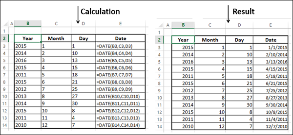
Obtaining Date from Year, Month and Day
You data might have the information about Year, Month and Day separately. You need to get the date combining these three values to perform any calculation. You can use the DATE function for getting the date values.
Consider the following data −
Use the DATE function to obtain DATE values.
Calculating Years, Months and Days between two Dates
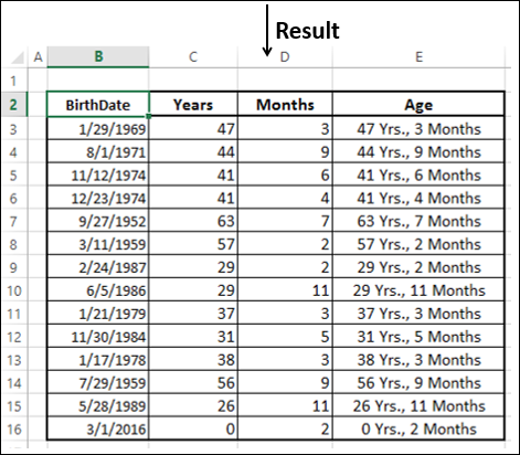
You might have to calculate the time lapsed from a given date. You might need this information in the form of years, months and days. A simple example would be calculating the current age of a person. It is effectively the difference between the birth date and today. You can use Excel DATEDIF, TODAY and CONCATENATE functions for this purpose.
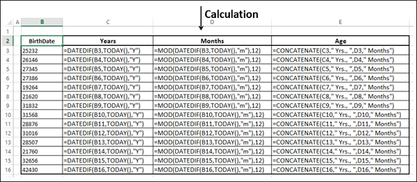
The output is as follows −
Working with Time Values
The data that you obtain from different sources might contain time values. In this chapter, you will understand how to prepare your data that contains time values for analysis.
You will learn about −
- Time Formats
- Time in Serial Format
- Time in Hour-Minute-Second Format
- Converting Times in Serial Format to Hour-Minute-Second Format
- Converting Times in Hour-Minute-Second Format to Serial Format
- Obtaining the Current Time
- Obtaining Time from Hour, Minute and Second
- Extracting Hour, Minute and Second from Time
- Number of hours between Start Time and End Time
Time Formats
Excel supports Time Values in two ways −
- Serial Format
- In various Hour-Minute-Second Formats
You can convert −
Time in Serial Format to Time in Hour-Minute-Second Format
Time in Hour-Minute-Second Format to Time in Serial Format
Time in Serial Format
Time in serial format is a positive number that represents the Time as a fraction of a 24-hour day, the starting point being midnight. For example, 0.29 represents 7 AM and 0.5 represents 12 PM.
You can also combine Date and Time in the same cell. The serial number is the number of days after January 1, 1900, and the time fraction associated with the given time. For example, if you type May 17, 2016 6 AM, it gets converted to 42507.25 when you format the cell as General.
Time in Hour-Minute-Second Format
Excel allows you to specify time in Hour-Minute-Second Format with a colon (:) after the hour and another colon before the seconds. Example, 8:50 AM, 8:50 PM or just 8:50 using the 12-Hour Format or as 8:50, 20:50 in 24-Hour format. The time 8:50:55 AM represents 8 hours, 50 minutes and 55 seconds.
You can also specify date and time together. For example, if you type May 17, 2016 7:25 in a cell, it will be displayed as 5/17/2016 7:25 and it represents 5/17/2016 7:25:00 AM.
Excel supports different Time formats based on the Locale (Location) you choose. Hence, you need to first determine the compatibility of your Time formats and data analysis at hand.
For understanding purpose, you can assume United States as the Locale. You find the following Time formats to choose for Date and Time 17th May, 2016 4 PM −
- 4:00:00 PM
- 16:00
- 4:00 PM
- 16:00:00
- 5/17/16 4:00 PM
- 5/17/16 16:00
Converting Times in Serial Format to Hour-Minute-Second Format
To convert serial time format to hour-min-sec format follow the steps given below −
Click the Number tab in the Format Cells dialog box
Click Time under Category.
Select the Locale. Available Time formats will be displayed as a list under Type.
Click on a Format under Type to look at the Preview in the box adjacent to Sample.
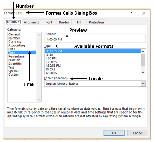
After choosing the Format, click OK
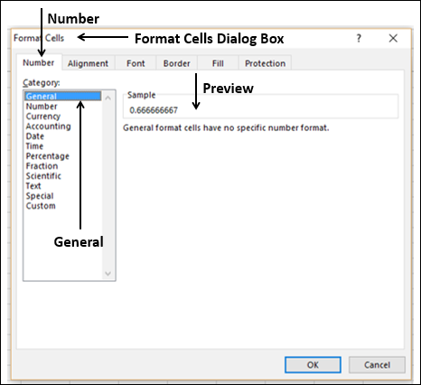
Converting Times in Hour-Minute-Second Format to Serial Format
You can convert Time in Hour-Minute-Second format to serial format in two ways −
Using Format Cells dialog box
Using Excel TIMEVALUE function
Using Format Cells dialog box
Click the Number tab in the Format Cells dialog box.
Click General under Category.
Using Excel TIMEVALUE Function
You can use Excel TIMEVALUE function to convert Time to Serial Number format. You need to enclose the Time argument in . For example,
TIMEVALUE ("16:55:15") results in 0.70503472
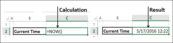
Obtaining the Current Time
If you need to perform calculations based on current time, simply use the Excel function NOW (). The result reflects the date and time when it is used.
The following screen shot of Now () function usage has been taken on 17th May, 2016 at 12:22 PM.
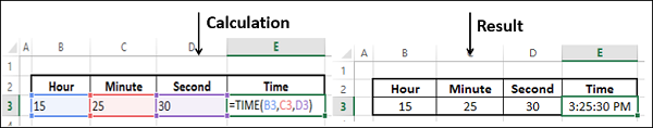
Obtaining Time from Hour, Minute and Second
Your data might have the information about hours, minutes and seconds separately. Suppose, you need to get the Time combining these 3 values to perform any calculation. You can use Excel Function Time for getting the Time values.
Extracting Hour, Minute and Second from Time
You can extract hour, minute and second from a given time using the Excel functions HOUR, MINUTE and SECOND.
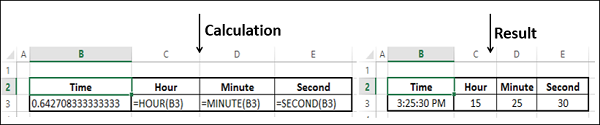
Number of hours between Start Time and End Time
When you perform computations on Time values, the result displayed depends on the format used in the cell. For example, you can compute the number of hours between 9:30 AM and 6 PM as follows −
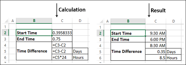
- C4 is formatted as Time
- C5 and C6 are formatted as Number.
You get the time difference as days. To convert to hours you need to multiply by 24.
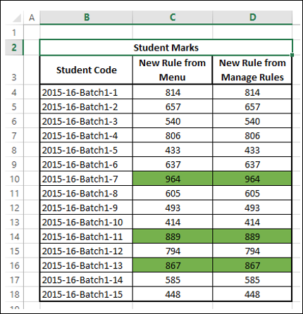
Excel Data Analysis - Conditional Formatting
In Microsoft Excel, you can use Conditional Formatting for data visualization. You have to specify formatting for a cell range based on the contents of the cell range. The cells that meet the specified conditions would be formatted as you have defined.
Example
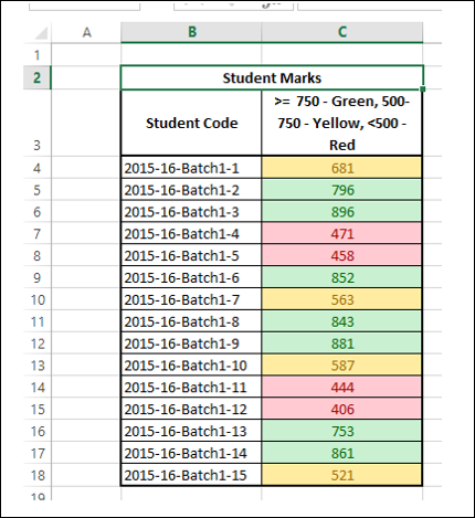
In a range containing the sales figures of the past quarter for a set of salespersons, you can highlight those cells representing who have met the defined target, say, $2500.
You can set the condition as total sales of the person >= $2500 and specify a color code green. Excel checks each cell in the range to determine whether the condition you specified, i.e., total sales of the person >= $2500 is satisfied.
Excel applies the format you chose, i.e. the green color to all the cells that satisfy the condition. If the content of a cell does not satisfy the condition, the formatting of the cell remains unchanged. The result is as expected, only for the salespersons who have met the target, the cells are highlighted in green a quick visualization of the analysis results.
You can specify any number of conditions for formatting by specifying Rules. You can pick up the rules that match your conditions from
- Highlight cells rules
- Top / Bottom rules
You can also define your own rules. You can −
- Add a rule
- Clear an existing rule
- Manage the defined rules
Further, you have several formatting options in Excel to choose the ones that are appropriate for your Data Visualization −
- Data Bars
- Color Scales
- Icon Sets
Conditional formatting has been promoted over the versions Excel 2007, Excel 2010, Excel 2013. The examples you find in this chapter are from Excel 2013.
In the following sections, you will understand the conditional formatting rules, formatting options and how to work with rules.
Highlight Cells Rules
You can use Highlight Cells rule to assign a format to cells whose contents meet any of the following criteria −
- Numbers within a given numerical range −
- Greater Than
- Less Than
- Between
- Equal To
- Text that contains a given text string.
- Date occurring within a given range of dates relative to the current date −
- Yesterday
- Today
- Tomorrow
- In the last 7 days
- Last week
- This week
- Next week
- Last month
- This Month
- Next month
- Values that are duplicate or unique.
Follow the steps to conditionally format cells −
Select the range to be conditionally formatted.
Click Conditional Formatting in the Styles group under Home tab.
Click Highlight Cells Rules from the drop-down menu.
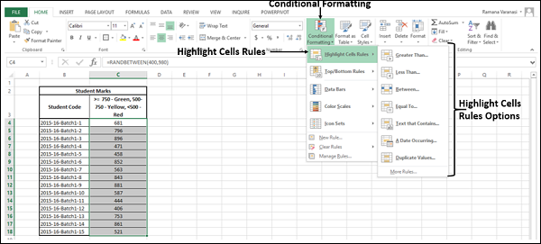
Click Greater Than and specify >750. Choose green color.
Click Less Than and specify < 500. Choose red color.
Click Between and specify 500 and 750. Choose yellow color.
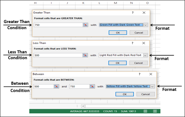
The data will be highlighted based on the given conditions and the corresponding formatting.
Top / Bottom Rules
You can use Top / Bottom Rules to assign a format to cells whose contents meet any of the following criteria −
Top 10 items − Cells that rank in the top N, where 1 <= N <= 1000.
Top 10% − Cells that rank in the top n%, where 1 <= n <= 100.
Bottom 10 items − Cells that rank in the bottom N, where 1 <= N <= 1000.
Bottom 10% − Cells that rank in the bottom n%, where 1 <= n <= 100.
Above average − Cells that are above average for the selected range.
Below average − Cells that are below average for the selected range.
Follow the steps given below to assign the Top/Bottom rules.
Select the range to be conditionally formatted.
Click Conditional Formatting in the Styles group under Home tab.
Click Top/Bottom Rules from the drop-down menu. Top/Bottom rules options appear.
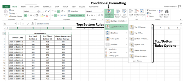
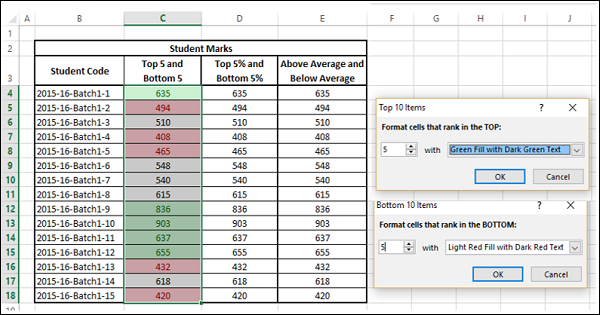
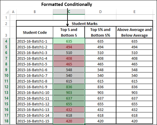
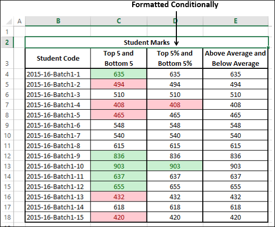
Click Top Ten Items and specify 5. Choose green color.
Click Bottom Ten Items and specify 5. Choose red color.
The data will be highlighted based on the given conditions and the corresponding formatting.
Repeat the first three steps given above.
Click Top Ten% and specify 5. Choose green color.
Click Bottom Ten% and specify 5. Choose red color.
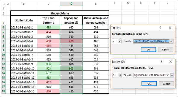
The data will be highlighted based on the given conditions and the corresponding formatting.
Repeat the first three steps given above.
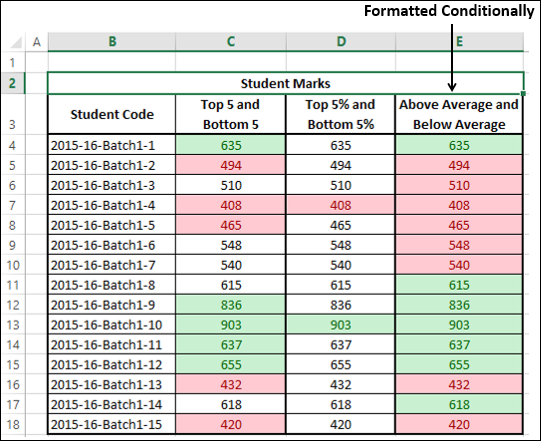
Click Above Average. Choose green color.
Click Below Average. Choose red color.
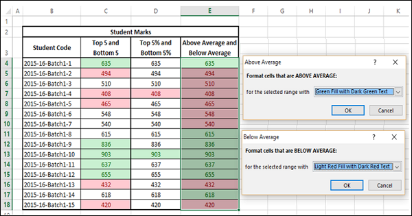
The data will be highlighted based on the given conditions and the corresponding formatting.
Data Bars
You can use colored Data Bars to see the value in a cell relative to the values in the other cells. The length of the data bar represents the value in the cell. A longer bar represents a higher value, and a shorter bar represents a lower value. You have six solid colors to choose from for the data bars blue, green, red, yellow, light blue and purple.
Data bars are helpful in visualizing the higher, lower and intermediate values when you have large amounts of data. Example - Day temperatures across regions in a particular month. You can use gradient fill color bars to visualize the value in a cell relative to the values in other cells. You have six Gradient Colors to choose from for the Data Bars Blue, Green, Red, Yellow, Light Blue and Purple.
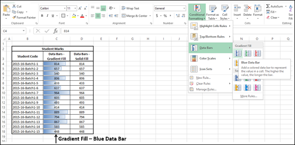
Select the range to be formatted conditionally.
Click Conditional Formatting in the Styles group under Home tab.
Click Data Bars from the drop-down menu. The Gradient Fill options and Fill options appear.
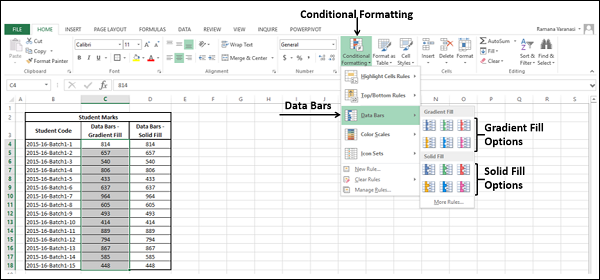
Click the blue data bar in the Gradient Fill options.
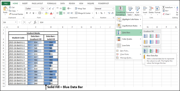
Repeat the first three steps.
Click the blue data bar in the Solid Fill options.
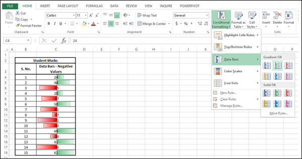
You can also format data bars such that the data bar starts in the middle of the cell, and stretches to the left for negative values and stretches to the right for positive values.
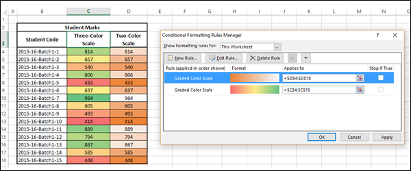
Color Scales
You can use Color Scales to see the value in a cell relative to the values in the other cells in a given range. As in the case of Highlight Cells Rules, a Color Scale uses cell shading to display the differences in cell values. A color gradient will be applied to a range of cells. The color indicates where each cell value falls within that range.
You can choose from −
- Three - Color Scale −
- Green Yellow Red Color Scale
- Red Yellow Green Color Scale
- Green White Red Color Scale
- Red White Green Color Scale
- Blue White Red Color Scale
- Red White Blue Color Scale
- Two-Color Scale −
- White Red Color Scale
- Red White Color Scale
- Green White Color Scale
- White Green Color Scale
- Green Yellow Color Scale
- Yellow Green Color Scale
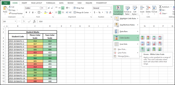
Follow the steps given below −
Select the Range to be conditionally formatted.
Click Conditional Formatting in the Styles group under Home tab.
Click Color Scales from the drop-down menu. The Color Scale options appear.
Click the Green Yellow Red Color Scale.
The Data will be highlighted based on the Green Yellow Red color scale in the selected range.
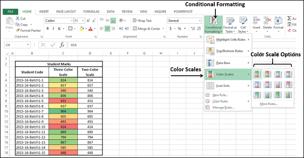
- Repeat the first three steps.
- Click the Green White color scale.
The data will be highlighted based on the Green White color scale in the selected range.
Icon Sets
You can use the icon sets to visualize numerical differences. The following icon sets are available −
As you observe, an icon set consists of three to five symbols. You can define criteria to associate an icon with each value in a cell range. For example, a red down arrow for small numbers, a green up arrow for large numbers, and a yellow horizontal arrow for intermediate values.
Select the range to be conditionally formatted.
Click Conditional Formatting in the Styles group under Home tab.
Click Icon Sets from the drop-down menu. The Icon Sets options appear.
Click the colored three arrows.
Colored Arrows appear next to the Data based on the Values in the selected range.
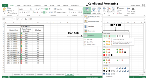
Repeat the first three steps. The Icon Sets options appear.
Select 5 Ratings. The Rating Icons appear next to the data based on the values in the selected range.
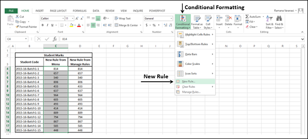
New Rule
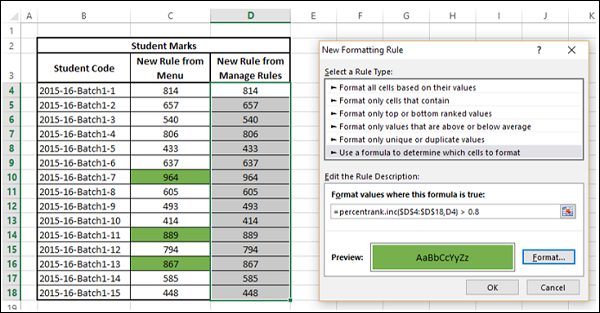
You can use New Rule to create your own formula as a condition to format a cell as you define.
There are two ways to use New Rule −
With New Rule option from the drop-down menu
With New Rule button in Manage Rules dialog box
With New Rule option from the Drop-Down Menu
Select the Range to be conditionally formatted.
Click Conditional Formatting in the Styles group under Home tab.
Click New Rule from the drop-down menu.
The New Formatting Rule dialog box appears.
From the Select a Rule Type Box, select Use a formula to determine which cells to format. Edit the Rule Description box appears.
In the format values where this formula is true: type the formula.
Click the format button and click OK.
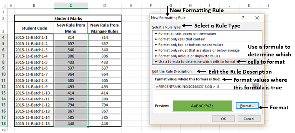
Cells that contain values with the formula TRUE, are formatted as defined.
With New Rule Button in Manage Rules dialog box
Select the range to be conditionally formatted.
Click Conditional Formatting in the Styles group under Home tab.
Click Manage Rules from the drop-down menu.
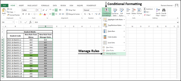
The Conditional Formatting Rules Manager dialog box appears.
Click the New Rule button.
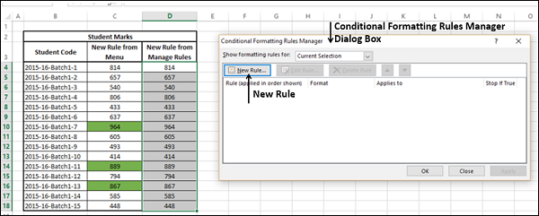
The New Formatting Rule dialog box appears.
Repeat the Steps given above to define your formula and format.
The Conditional Formatting Rules Manager dialog box appears with defined New Rule highlighted. Click the Apply button.
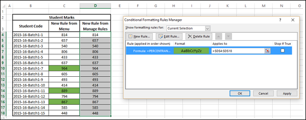
Cells that contain values with the formula TRUE, are formatted as defined.
Clear Rules
You can Clear Rules to delete all conditional formats you have created for
- Selected cells
- Current Worksheet
- Selected Table
- Selected PivotTable
Follow the given steps −
Select the Range / Click on a Worksheet / Click the table > PivotTable where conditional formatting rules need to be removed.
Click Conditional Formatting in the Styles group under Home tab.
Click Clear Rules from the drop-down menu. The Clear rules options appear.
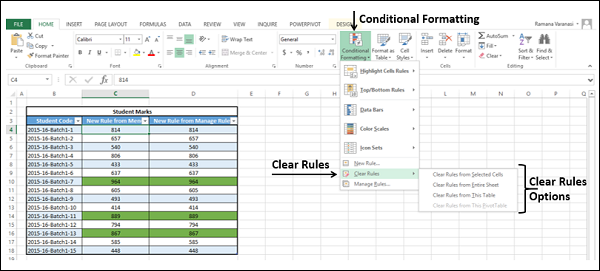
Select the appropriate option. The conditional formatting is cleared from the Range / Worksheet / Table / PivotTable.
Manage Rules
You can Manage Rulesfrom the Conditional Formatting Rules Manager window. You can see formatting rules for the current selection, for the entire current worksheet, for the other worksheets in the workbook or the tables or PivotTables in the workbook.
Click Conditional Formatting in the Styles group under Home tab.
Click Manage Rules from the drop-down menu.
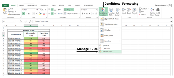
The Conditional Formatting Rules Manager dialog box appears.
Click the arrow in the List Box next to Show formatting rules for Current Selection, This Worksheet and other Sheets, Tables, PivotTable if exist with Conditional Formatting Rules, appear.
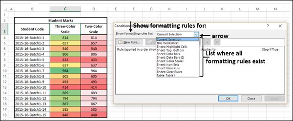
Select This Worksheet from the drop-down list. Formatting Rules on the current Worksheet appear in the order that they will be applied. You can change this order by using the up and down arrows.
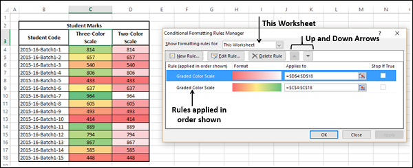
You can add a New Rule, Edit a Rule and Delete a Rule.
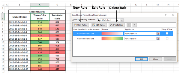
You have already seen New Rule in the earlier section. You can delete a rule by selecting the Rule and clicking Delete Rule. The highlighted Rule is deleted.
To edit a Rule, select the RULE and click on Edit Rule. Edit Formatting Rule dialog box appears.
You can
Select a Rule Type
Edit the Rule Description
Edit Formatting
Once you are done with the changes, click OK.
The changes for the Rule will be reflected in the Conditional Formatting Rules Manager dialog box. Click Apply.
The data will be highlighted based on the modified Conditional Formatting Rules.
Excel Data Analysis - Sorting
Sorting data is an integral part of Data Analysis. You can arrange a list of names in alphabetical order, compile a list of sales figures from highest to lowest, or order rows by colors or icons. Sorting data helps you quickly visualize and understand your data better, organize and find the data that you want, and ultimately make more effective decisions.
You can sort by columns or by rows. Most of the sorts that you use will be column sorts.
You can sort data in one or more columns by
- text (A to Z or Z to A)
- numbers (smallest to largest or largest to smallest)
- dates and times (oldest to newest and newest to oldest)
- a custom list (E.g. Large, Medium, and Small)
- format, including cell color, font color, or icon set
Sort criteria for a table are saved with the workbook such that you can reapply the sort to that table every time you open the workbook. Sort criteria are not saved for a range of cells. For multicolumn sorts or for sorts that take a long time to create, you can convert the range to a table. Then, you can reapply the sort when you open a workbook.
In all the examples in the following sections, you will find tables only, since it is more meaningful to sort a table.
Sort by Text
You can sort a table using a column containing text.
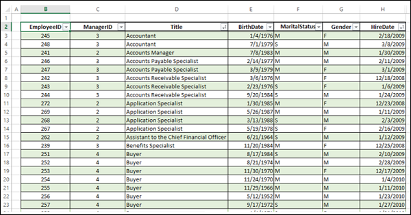
The following table has information about employees in an organization (You are able to see only the first few rows in the data).
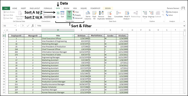
To sort the table by the column title that contains text, click the header of the column Title.
Click the Data tab.
In the Sort & Filter group, click Sort A to Z
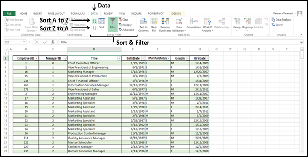
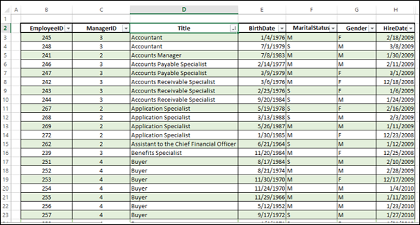
The table will be sorted by the column Title in the ascending alphanumeric order.
Note − You can sort in the descending alphanumeric order, by clicking Sort Z to A. You can also sort with case-sensitive option. Go through the Sort by a Custom List section given below.
Sort by Numbers
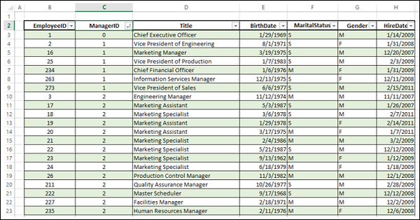
To sort the table by the column ManagerID that contains numbers, follow the steps given below −
Click the header of the column ManagerID.
Click the Data tab.
In the Sort & Filter group, click Sort A to Z
The column, ManagerID will be sorted in the ascending numeric order. You can sort in the descending numeric order, by clicking Sort Z to A.
Sort by Dates or Times
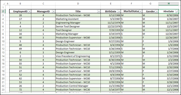
To sort the Table by the column HireDate that contains Dates, follow the steps given below −
Click the Header of the column HireDate.
Click Data tab.
In the Sort & Filter group, click Sort A to Z as shown in the screen shot given below −

The column HireDate will be sorted with the dates sorted from oldest to newest. You can sort the dates from newest to oldest, by clicking Sort Z to A.
Sort by Cell Color
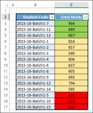
To sort the table by the column total marks that contains cells with colors (Conditionally Formatted) −
Click the Header of the column Total Marks.
Click Data tab.
In the Sort & Filter group, click Sort. The Sort dialog box appears.
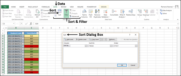
Choose Sort By as Total Marks, Sort on as Cell Color and specify the color green in Order. Click Add Level.
Choose Sort By as Total Marks, Sort on as Cell Color and specify the color Yellow in Order. Click Add Level.
Choose Sort By as Total Marks, Sort on as Cell Color and specify the color Red in Order.
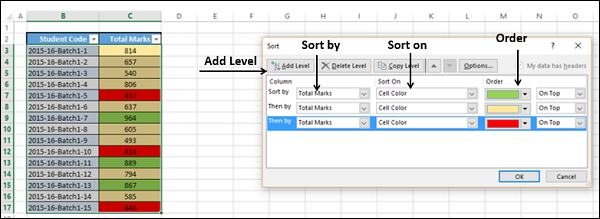
The column Total Marks will be sorted by the cell color as specified in the Order.
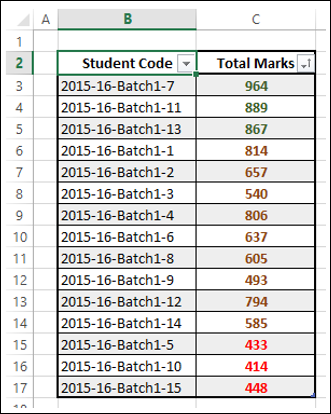
Sort by Font Color
To sort the column Total Marks in the table, that contains cells with font colors (conditionally formatted) −
Click the header of the column Total Marks.
Click Data tab.
In the Sort & Filter group, click Sort. The Sort dialog box appears.
Choose Sort By as Total Marks, Sort On as Font Color and specify the color green in Order. Click Add Level.
Choose Sort By as Total Marks, Sort On as Font Color and specify the color yellow in Order. Click Add Level.
Choose Sort By as Total Marks, Sort On as Font Color and specify the color red in Order.
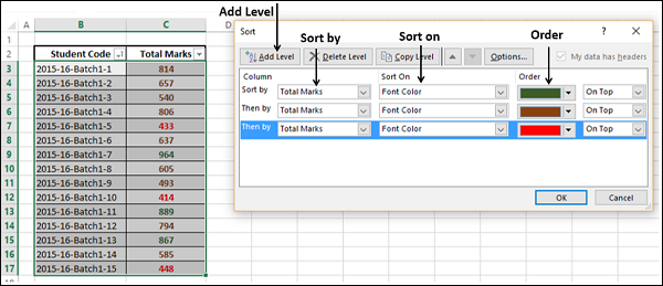
The column Total Marks is sorted by the font color as specified in the Order.
Sort by Cell Icon
To sort the table by the column Total Marks that contains cells with Cell Icons (Conditionally Formatted), follow the steps given below −
Click the Header of the column Total Marks.
Click Data tab.
In the Sort & Filter group, click Sort. The Sort dialog box appears.
Choose Sort By as Total Marks, Sort On as Cell Icon and specify in
 Order. Click Add Level.
Choose Sort By as Total Marks, Sort On as Cell Icon and specify
 in Order. Click Add Level.
Choose Sort By as Total Marks, Sort On as Cell Icon and specify
 in Order.
The column Total Marks will be sorted by Cell Icon as specified in the Order.
Sort by a Custom List
You can create a custom list and sort the table by the custom list.
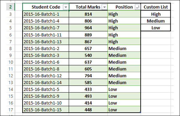
In the table given below, you find an indicator column with title Position. It has the values high, medium and low based on the position of total marks with respect to the entire range.
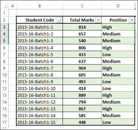
Now, suppose you want to sort the column - Position, with all High values on top, all low values at bottom, and all medium values in between. That means the order you want is low, medium and high. With Sort A to Z, you get the order high, low and medium. On the other hand, with Sort Z to A, you get the order medium, low and high.
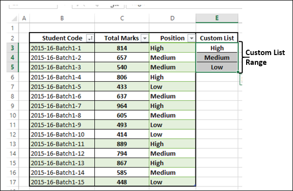
You can resolve this is to create a custom list.
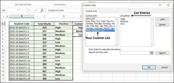
Define the order for the custom list as high, medium and low in a range of cells as shown below.
Select that Range.
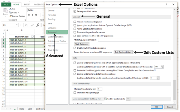
Click the File tab.
Click Options. In the Excel Options dialog box, Click Advanced.
Scroll to the General.
Click Edit Custom Lists.
The Edit Custom Lists dialog box appears. The select range in worksheet appears in the Import list from cells Box. Click Import.
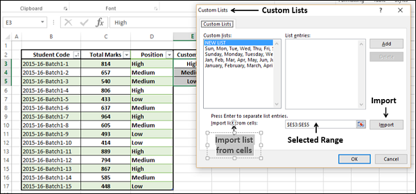
Your custom list is added to the Custom Lists. Click OK.
The next step is to sort the table with this Custom List.
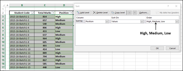
Click the Column Position. Click on Sort. In the Sort dialog box, ensure Sort By is Position, Sort On is Values.
Click on Order. Select Custom List. Custom Lists dialog box appears.
Click on the High, Medium, Low Custom List. Click on OK.
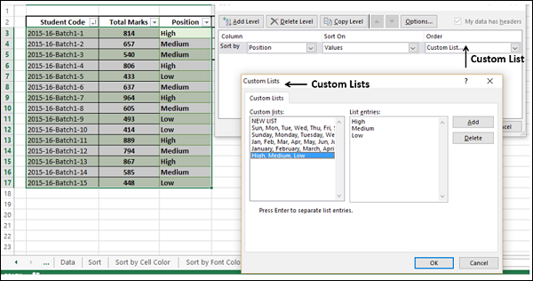
In the Sort dialog box, in the Order Box, High, Medium, Low appears. Click on OK.
The table will be sorted in the defined order high, medium, low.
You can create Custom Lists based on the following values −
- Text
- Number
- Date
- Time
You cannot create custom lists based on format, i.e. by cell / font color, or cell icon.
Sort by Rows
You can sort a table by rows also. Follow the steps given below −
Click the row you want to sort the data.
Click Sort.
In the Sort dialog box, Click Options. The Sort Options dialog box opens.
Under Orientation, click Sort from left to right. Click OK.
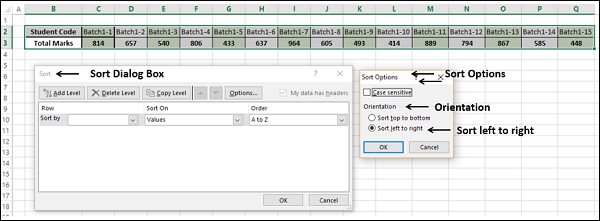
Click Sort by row. Select the row.
Choose values for Sort On and Largest to Smallest for Order.
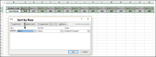
The data will be sorted by the selected row in a descending order.

Sort by more than one Column or Row
You can sort a table by more than one column or row.
Click the Table.
Click Sort.
In the Sort dialog box, specify the column by which you want to sort first.
In the screen shot given below, Sort By Title, Sort On Values, Order A Z are chosen.
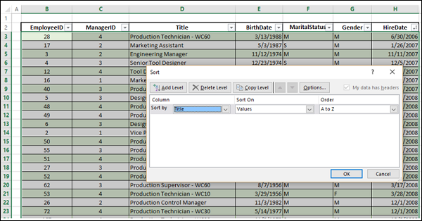
Click Add Level in the Sort dialog box. The Then By dialog appears.
Specify the column by which you want to sort next.
In the screen shot given below, Then By HireDate, Sort On Values, Order Oldest to Newest are chosen.
Click OK.
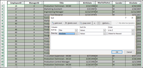
The data will be sorted for Title in the ascending alphanumeric order and then by HireDate. You will see the employee data sorted by title, and in each title category, in the seniority order.
Excel Data Analysis - Filtering
Filtering allows you to extract data that meets the defined criteria from a given Range or table. This is a quick way to display only the information that is needed by you.
You can Filter data in a Range, table or PivotTable.
You can filter data by −
- Selected values
- Text filters if the column you selected contains text
- Date filters if the column you selected contains dates
- Number filters if the column you selected contains numbers
- Number filters if the column you selected contains numbers
- Font color if the column you selected contains font with color
- Cell icon if the column you selected contains cell icons
- Advanced filter
- Using slicers
In a table, the column headers are automatically tagged to filters, known as AutoFilters. AutoFilter is represented by the arrow ![]() next to column header. Each AutoFilter has filter options based on the type of data you have in that column. For example, if the column contains numbers, when you click on the arrow
next to column header. Each AutoFilter has filter options based on the type of data you have in that column. For example, if the column contains numbers, when you click on the arrow ![]() next to the column header, Number Filter Options appear.
next to the column header, Number Filter Options appear.
When you click a Filter option or when you click on Custom Filter that appears at the end of the Filter options, Custom AutoFilter dialog box appears, wherein you can customize your filtering options.
In case of a Range, you can provide the column headers in the first row of the range and click on filter in the Editing group on Home tab. This will make the AutoFilter on for the Range. You can remove the filters that you have in your data. You can also reapply the filters when data changes occur.
Filter by Selected Values
You can choose what data is to be displayed by clicking the arrow next to a column header and selecting the Values in the column. Only those rows containing the selected values in the chosen column will be displayed.
Consider the following data −
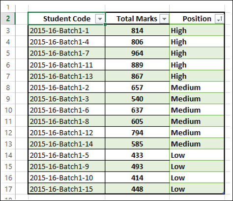
If you want to display the data only for Position = High, click the arrow next to Position. A drop-down box appears with all the values in the position column. By default, all the values will be selected.
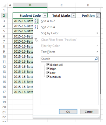
- Click Select All. All the boxes are cleared.
- Select High as shown in the following screen shot.
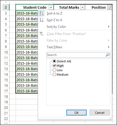
Click OK. Only those Rows, which have the value High as Position, will be displayed.
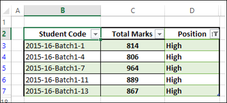
Filter by Text
Consider the following data −

You can filter this data such that only those Rows wherein the Title is Manager will be displayed.
Click the arrow next to the column header Title. From the drop-down list, click Text Filters. Text filter options appear.
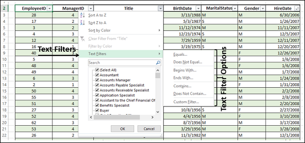
Select Contains from the available options. The Custom AutoFilter dialog box opens. Type Manager in the Box next to Contains.
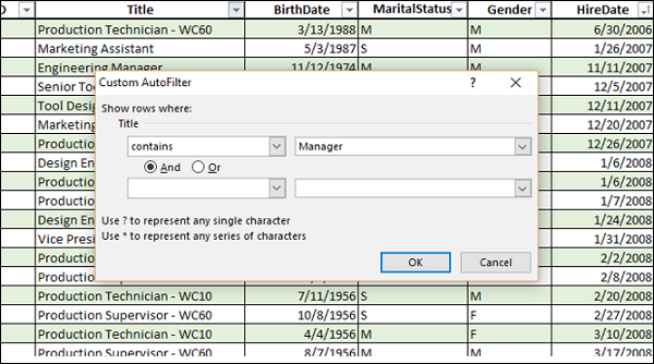
Click OK. Only the Rows where Title contains Manager will be displayed.
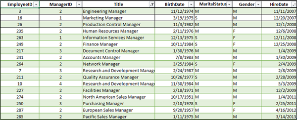
Filter by Date
You can filter this data further such that only those Rows wherein the Title is Manager and HireDate is prior to 2011 can be displayed. That means you will display the Employee information for all the managers who have been with the organization from before 2011.
Click the arrow next to the column header HireDate. From the drop-down list, click Date Filters. The Date filter options appear. Select Before from the drop-down list.
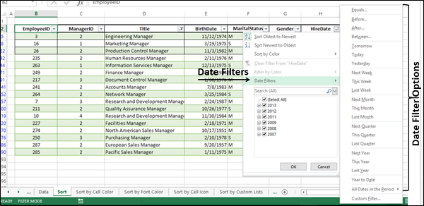
Custom AutoFilter dialog box opens. Type 1/1/2011 in the box next to is before. You can also select the date from the date picker next to the box.
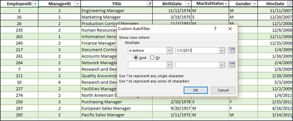
Click OK. Only the rows where Title contains Manager and HireDate is prior to 1/1/2011 will be displayed.
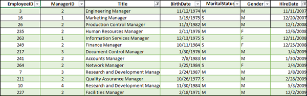
Filter by Numbers
Consider the following data −
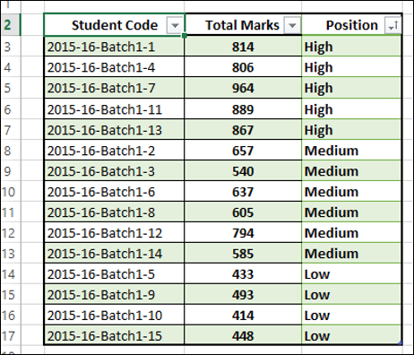
You can filter this data such that only those rows where Total Marks > 850 can be displayed.
Click the arrow next to the column header Total Marks. From the drop-down list, click Number Filters. The Number Filter options appear.
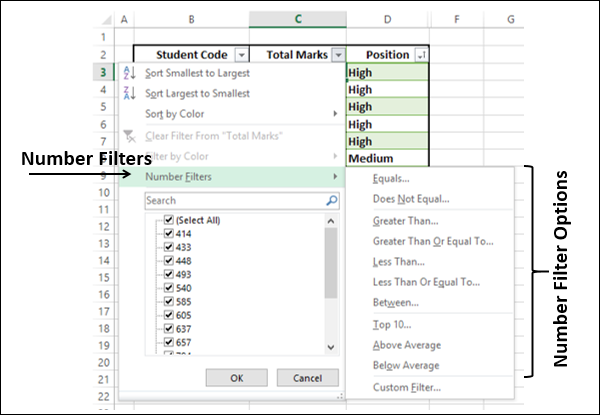
Click Greater Than. Custom AutoFilter dialog box opens. Type 850 in the box next to Greater Than.
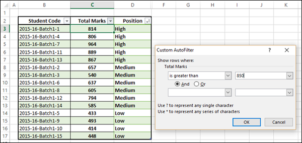
Click OK. Only the rows wherein the total marks are greater than 850 will be displayed.
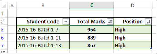
Filter by Cell Color
If the data has different cell colors or is conditionally formatted, you can filter by the colors that are displayed in your table.
Consider the following data. The column Total Marks has conditional formatting with different cell colors.
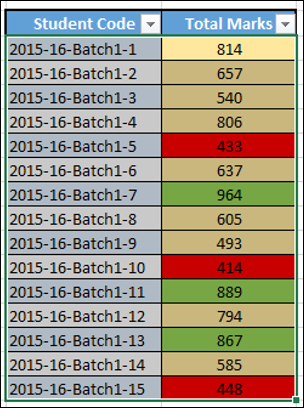
Click the arrow ![]() in the header Total Marks. From the drop-down list, click Filter by Color. The Filter by Cell Color options appear.
in the header Total Marks. From the drop-down list, click Filter by Color. The Filter by Cell Color options appear.
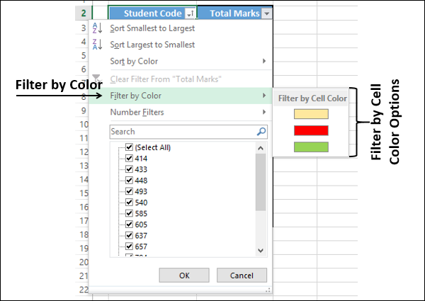
Select the green color and click OK. Only the rows wherein the total marks column has green color cells will be displayed.
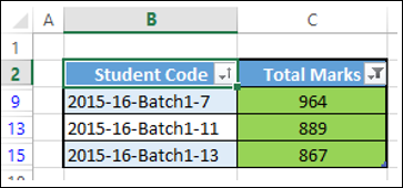
Filter by Font Color
If the data has different font colors or is conditionally formatted, you can filter by the colors that are displayed in your table.
Consider the following data. The column - Total Marks has conditional formatting with font color applied.
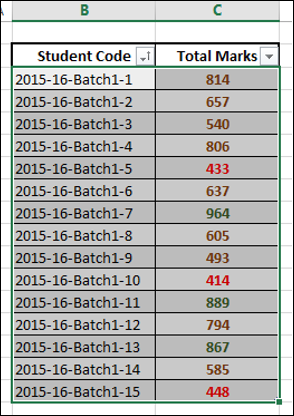
Click the arrow ![]() in the header Total Marks. From the Drop-Down List, click Filter by Color. Filter by Font Color options appear.
in the header Total Marks. From the Drop-Down List, click Filter by Color. Filter by Font Color options appear.

Select the green color and click OK. Only the rows wherein the Total Marks column has green color font will be displayed.
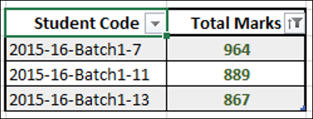
Filter by Cell Icon
If the data has different icons or a conditional format, you can filter by the icons that are shown in your table.
Consider the following data. The column Total Marks has conditional formatting with icons applied.
Click the arrow ![]() in the header Total Marks. From the drop-down list, select Filter by Color. The Filter by Cell Icon options appear.
in the header Total Marks. From the drop-down list, select Filter by Color. The Filter by Cell Icon options appear.
Select the icon ![]() and click OK.
and click OK.
Only the rows wherein the Total Marks column has the ![]() icon will be displayed.
icon will be displayed.
Clear Filter
Removing filters is termed as Clear Filter in Excel.
You can remove
- A filter from a specific column, or
- All of the filters in the worksheet at once.
To remove a filter from a specific column, click the arrow in the table header of that column. From the drop-drown menu, click Clear Filter From <specific Column Name>.
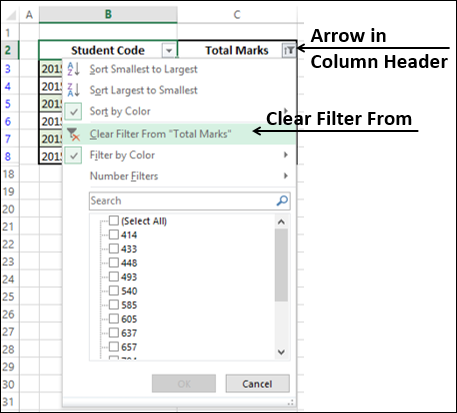
The filter in the column is removed. To remove filtering from the entire worksheet, select
 Clear in the
Editing group on the Home tab, or
Sort & Filter group in the Data tab.
All the filters in the worksheet are removed at once. Click Undo Show All
 if you have removed the Filters by mistake.
Reapply Filter
When changes occur in your data, click Reapply in Sort & Filter group on the Data tab. The defined filter will be applied again on the modified data.
Advanced Filtering
You can use Advance Filtering if you want to filter the data of more than one column.
You need to define your filtering criteria as a range. Suppose you want to display the information of those employees who are specialists or whose EmployeeID is 2, define the Criteria as follows −
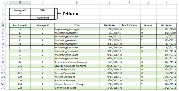
Next, click Advanced in the Sort & Filter group on the Data tab. The Advanced Filter dialog box appears.
Specify the List Range and the Criteria Range.
You can either filter the list, in place or copy to another location.
In the filtering given below, filter the data in place is chosen.
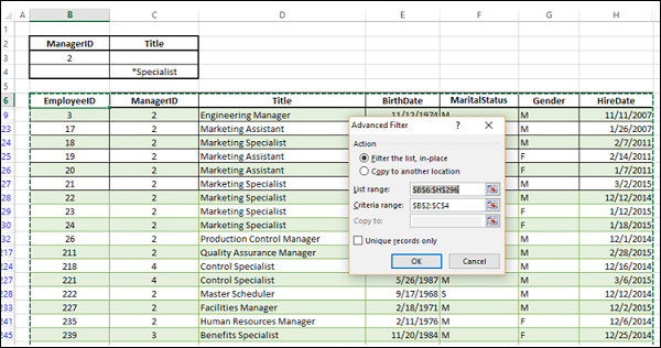
The employee information where ManagerID = 2 OR Title = *Specialist is displayed.
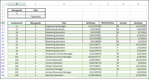
Suppose you want to display information about specialists and vice presidents. You can define the criteria and filter as follows −
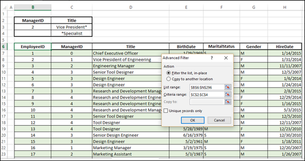
The criteria you applied is Title = *Specialist OR Title = Vice President. The employee information of specialists and vice presidents will be displayed.
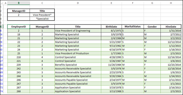
You can copy the filtered data to another location. You can also select only few columns to include in the copy operation.
Copy EmployeedID, Title and SalariedFlag to the Cells Q2, R2, S2. This will be the first Row of your filtered data.
Click on Advanced and in the Advanced Filter dialog box, click on Copy to another location. In the Copy to box, specify reference to the Headers you copied in another location, i.e. Q2:S2.
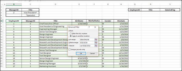
Click OK after specifying the List Range and Criteria Range. The selected columns in the filtered data will be copied to the location you specified.
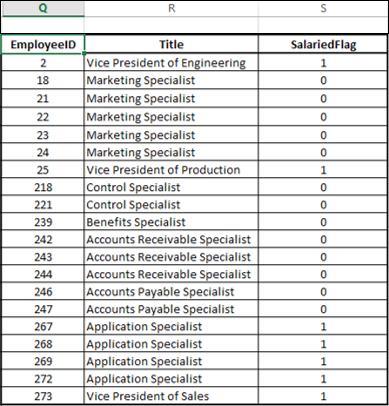
Filter Using Slicers
Slicers to filter data in PivotTables were introduced in Excel 2010. In Excel 2013, you can use Slicers to filter data in tables also.
Consider the data in the following table.
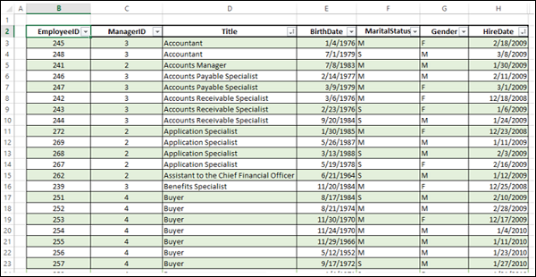
- Click the Table.
- Click Table Toolsthat appear on the Ribbon.
- The Design Ribbon appears.
- Click Insert Slicer.
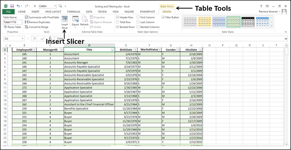
Insert Slicers dialog box appears as shown in the screen shot given below.
In the Insert Slicers dialog box, you will find all the column headers including those columns that are hidden.
Check the boxes Title and HireDate. Click OK.
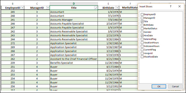
A Slicer appears for each of the table headers you checked in the Insert Slicers dialog box. In each Slicer, all the values of that column will be highlighted.
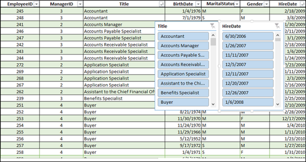
In the Title Slicer, click the first value. Only that value will be highlighted and the rest of the values get unselected. Further, you will find the values in HireDate Slicer that are corresponding to the value in the Title Slicer also get highlighted.
In the table, only the selected values are displayed.
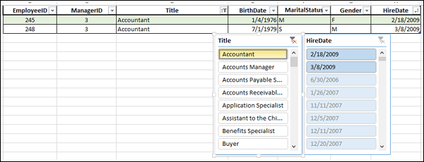
You can select / deselect the values in the Slicers and you find that the data is automatically updated in the table. To choose more than one value, hold down the Ctrl key, and pick the values that you want to display.
Select the Title values that belong to the Accounts department and the HireDate values in the year 2015 from the two Slicers.
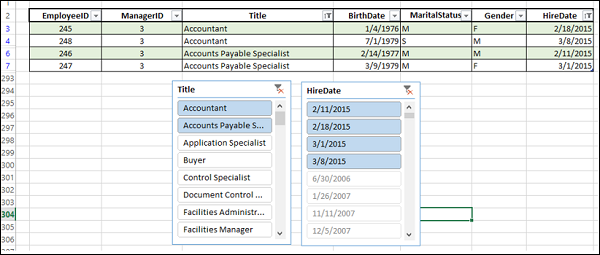
You can clear the selections in any Slicer by clicking the Clear Filter at the right end corner of the Slicer header.
Excel Data Analysis - Subtotals with Ranges
If you have a list of data that you want to group and summarize, you can use Excel Subtotal and Outline to display summary rows or columns. You can use PivotTable also for this purpose, but using Subtotal and Outline is the quickest way to analyze a range of data. Note that Subtotal and Outline can be used only on a range and not on a table.
You can create an Outline of up to eight levels, one for each group. Outer Levels are represented by Lower Numbers and Inner Levels by Higher Numbers. Each inner level displays detailed data for the preceding outer level.
To understand how to use Subtotal and Outline, consider the following example wherein the sales data of various items is given salesperson wise and location wise. In total, there are 1891 rows of data.
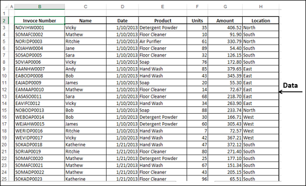
Subtotals
You can obtain the sum of sales location wise using Subtotal.
First, sort the data location wise.
Click anywhere on the data range.
Click the DATA tab.
Click Sort.
Data is selected. The Sort dialog box appears.
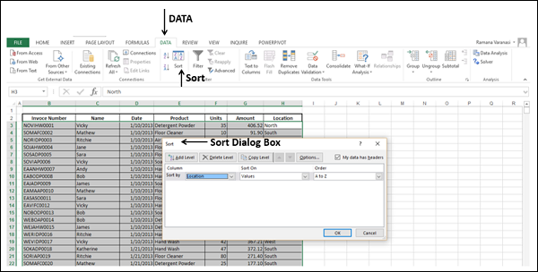
In the Sort dialog box,
Select Location for Sort by
Select Values for Sort On
Select A to Z for Order
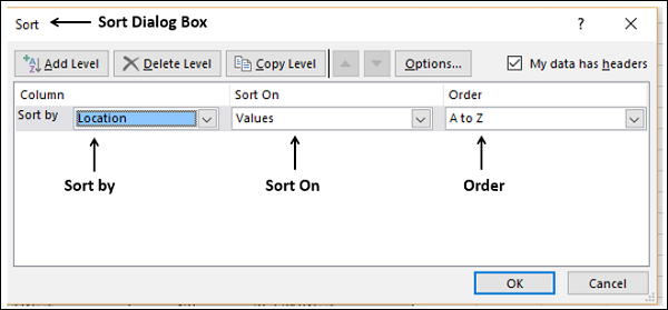
Click OK. The data is sorted location wise.
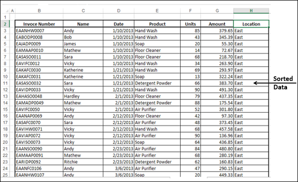
Click anywhere on the Data Range.
Click DATA tab.
Click Subtotal in the Outline group. The data gets selected and the Subtotal dialog box appears.
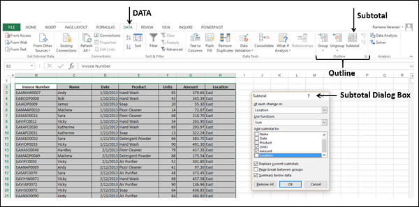
In the Subtotal dialog box,
Select Location under At each change in:
Select Sum under Use function:
Select Unit and Amount under Add subtotal to:
Select Replace current subtotals
Select Summary below data

Click OK. The data is grouped with three levels and the subtotals are calculated location wise.
Note − The data that is displayed is of Level 3 i.e. entire data.
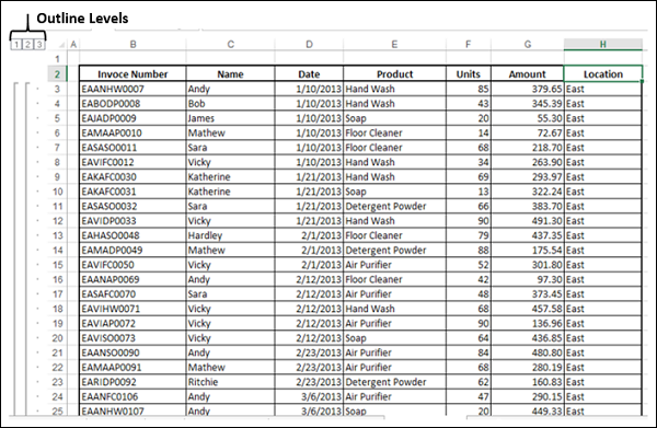
Click the Outline Level 2. The Totals will be displayed location wise for units and amount.
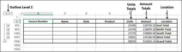
Click Outline Level 1. The Grand Totals will be displayed for units and amount.
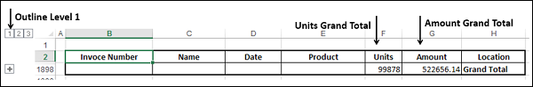
You can zoom-in or zoom-out the data by clicking the Outline Levels or by clicking the + Symbols to the left of the data.
Nested Subtotals
You can obtain the sum of sales by each salesperson, location wise using Nested Subtotals.
Sort the data location wise and then salesperson wise.
Click anywhere on the data range.
Click the DATA tab.
Click Sort. The data is selected and the Sort dialog box appears.
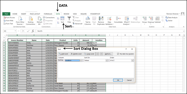
In the Sort dialog box,
Select Location for Sort by
Select Values for Sort On
Select A to Z for Order
Click on Add Level
Then by row appears
Select Name for Then by
Select Values for Sort On
Select A to Z for Order
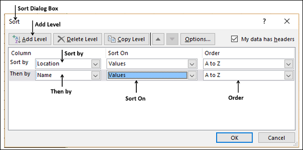
Click OK. The data is sorted by location and then by name.
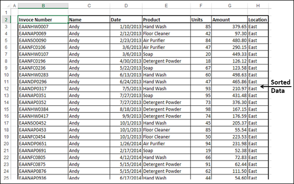
Click anywhere on the Data Range
Click on DATA tab
Click on Subtotal in the Outline group
Data gets selected. Subtotal dialog box appears.
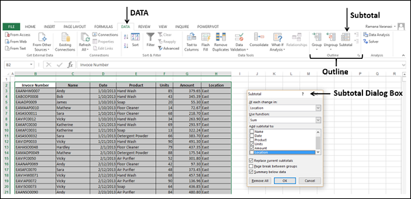
In the Subtotal dialog box,
Select Location under At each change in:
Select Sum under Use function:
Select Unit and Amount under Add subtotal to:
Select Replace current subtotals
Select Summary below data
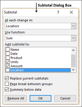
Click OK. The data is grouped with three Levels and the subtotals are calculated location wise as described earlier.
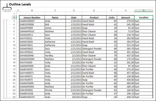
Click Subtotal.
In the Subtotal dialog box,
Select Name under At each change in:
Select Sum under Use function:
Select Unit and Amount under Add subtotal to:
Unselect Replace current subtotals
Select Summary below data
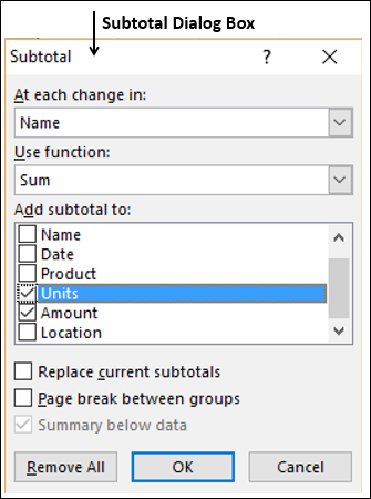
Click OK. The data is grouped with four levels and the subtotals are calculated location wise and name wise.
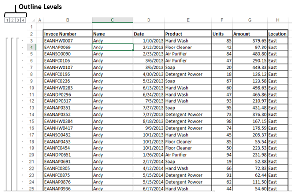
Click Outline Level 3. The Totals will be displayed name wise and location wise for Units and Amount.
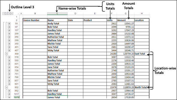
Click on Outline Level 2. The Totals will be displayed location wise for Units and Amount.
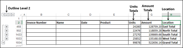
Click Outline Level 1. The Grand Totals will be displayed for Units and Amount.
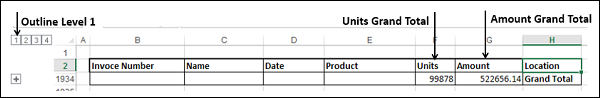
You can zoom-in or zoom-out the data by clicking the Outline Levels or by clicking the + symbol to the Left of the data.
Excel Data Analysis - Quick Analysis
In Microsoft Excel 2013, the Quick Analysis tool makes it possible to analyze your data quickly and easily using different Excel tools.
You can use Quick Analysis with a range or a table of data. To access Quick Access tool, select the cells that contain the data you want to analyze. The Quick Analysis tool button  appears at the bottom right of your selected data.
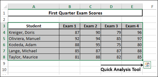
Click the Quick Analysis button. The Quick Analysis toolbar appears with the options FORMATTING, CHARTS, TOTALS, TABLES, SPARKLINES.
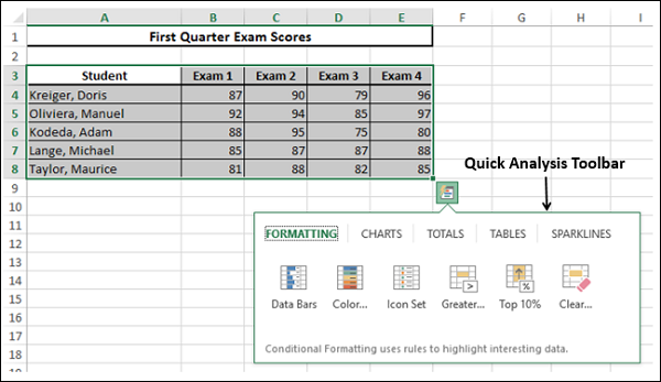
Quick Analysis tool is handy and quick to use as you can also have a preview of applying different options, before selecting the one you want.
Formatting
Conditional Formatting allows you to highlight parts of your data by adding Data Bars, Colors, etc. This lets you quickly visualize the values in your data.
You have learnt about formatting rules in the Conditional Formatting chapter in this tutorial. The difference is that you can have a quick preview and select the option you want. However, if you want to utilize all the features of Conditional Formatting, you rather go through the main menu on the Ribbon. The same thing holds for all the options in the Quick Analysis tool.
Click Formatting on the Quick Analysis toolbar. The Conditional Formatting options appear in the toolbar. Move your mouse on the options. You will see the previews. You can then select the option you want by clicking it.
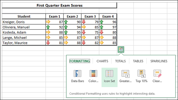
Charts
Charts are used to depict the data pictorially. There are several types of Charts to suit different types of data.
If you click CHARTS on the Quick Analysis toolbar, the recommended charts for the data you have selected will be displayed. You can always choose More Charts option if you want to go to the main Charts on the Ribbon.
Hover your mouse on the options. You will see the previews. You can then select the option you want by clicking it.
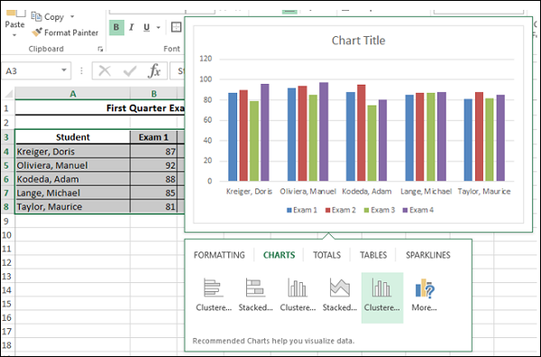
Totals
Totals can be used to calculate the numbers in columns and rows. You will have functions such as Sum, Average, Count, etc.
We will go into the details on how to use Quick Analysis tool with TOTALS later in this chapter. You can use the other options in Quick Analysis with the same ease, as you observe.
Tables
Tables help you to filter, sort and summarize your data, as you have already learnt in the Tables chapter. In the Quick Analysis tool, both the Table and PivotTable options are available under TABLES. However, you can have a preview for the table, but in the case of PivotTable no preview is available as by clicking you will get an empty PivotTable which you need to populate with the data.
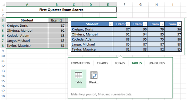
Sparklines
Sparklines are tiny charts that you can show alongside your data in single cells. They provide a quick way to see trends.
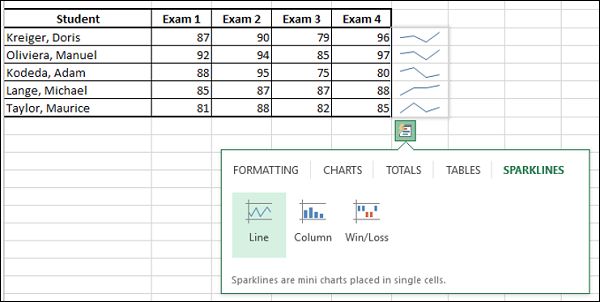
Quick Analysis with TOTALS
Click on TOTALS in the Quick Analysis Toolbar.
In Quick Analysis with TOTALS, you can analyze
Row-wise 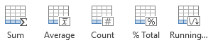
Column-wise 
For row wise calculations, ensure that you have an empty row below the selected data.
Example
We will analyze the data of the votes polled in an election for five candidates. The counting is done in four rounds. Following is the data.
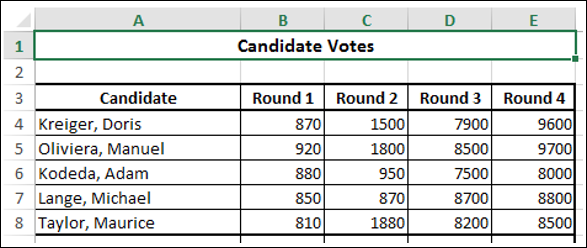
Sum
Select the data and Click  on the Quick Analysis toolbar under TOTALS.
Ensure that the row below the data is empty. Otherwise, you will get a message saying that there is already data present there and you will only have two options, either replace the existing data or cancel the operation.
In the row below the selected data, the sum of each column of the data is displayed. The caption Sum is also automatically provided. This means the total count of votes in each round for all the candidates is displayed.
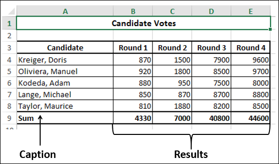
Average
Select the data and click  on the Quick Analysis Toolbar under TOTALS.
The average of each column of the data appears in the row below the data. The caption Average is also automatically provided. The average number of votes polled in each round is displayed.
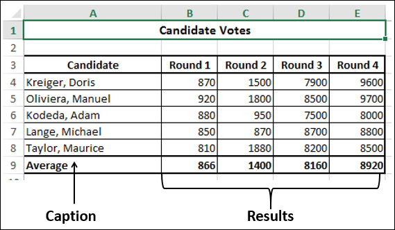
Count
Select the data and click  on the Quick Analysis Toolbar under TOTALS.
The count of each column of the data appears in the row below the data. The caption Count is also automatically provided. This means the count of candidates in each round is displayed.
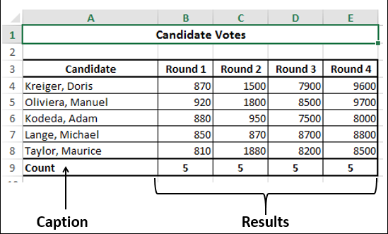
%Total
Select the data and click  on the Quick Analysis Toolbar under TOTALS.
The %Total of each column of the data appears in the row below the data. The caption %Total is also automatically provided. This means the %Total of votes in each round is displayed.
Running Total
Select the data and Click  on the Quick Analysis Toolbar under TOTALS.
The running total of each column of the data appears in the row below the data. The caption Running Total is also automatically provided. This means the running total of votes across the rounds is displayed.
Sum of Columns
Select the data and click  on the Quick Analysis toolbar under TOTALS.
Ensure that the column next to the data is empty. Otherwise, you will get a message saying that there is already data present there and you will only have two options, either replace the existing data or cancel the operation.
In the column next to the selected data, the sum of each row of the data is displayed. The column header Sum is also automatically provided. This means the total number of votes polled for each candidate in all the rounds is displayed.
Excel Data Analysis - Lookup Functions
You can use Excel functions to −
- Find values in a range of data - VLOOKUP and HLOOKUP
- Obtain a value or the reference to a value from within a table or range - INDEX
- Obtain the relative position of a specified item in a range of cells - MATCH
You can also combine these functions to get the required results based on the inputs you have.
Using VLOOKUP Function
The syntax of the VLOOKUP function is
VLOOKUP (lookup_value, table_array, col_index_num, [range_lookup])
Where
lookup_value − is the value you want to look up. Lookup_value can be a value or a reference to a cell. Lookup_value must be in the first column of the range of cells you specify in table_array
table_array − is the range of cells in which the VLOOKUP will search for the lookup_value and the return value. table_array must contain
the lookup_value in the first column, and
the return value you want to find
Note − The first column containing the lookup_value can either be sorted in ascending order or not. However, the result will be based on the order of this column.
col_index_num − is the column number in the table_array that contains the return value. The numbers start with 1 for the left-most column of table-array
range_lookup − is an optional logical value that specifies whether you want VLOOKUP to find an exact match or an approximate match. range_lookup can be
omitted, in which case it is assumed to be TRUE and VLOOKUP tries to find an approximate match
TRUE, in which case VLOOKUP tries to find an approximate match. In other words, if an exact match is not found, the next largest value that is less than lookup_value is returned
FALSE, in which case VLOOKUP tries to find an exact match
1, in which case it is assumed to be TRUE and VLOOKUP tries to find an approximate match
0, in which case it is assumed to be FALSE and VLOOKUP tries to find an exact match
Note − If range_lookup is omitted or TRUE or 1, VLOOKUP works correctly only when the first column in table_array is sorted in ascending order. Otherwise, it may result in incorrect values. In such a case, use FALSE for range_lookup.
Using VLOOKUP Function with range_lookup TRUE
Consider a list of student marks. You can obtain the corresponding grades with VLOOKUP from an array containing the marks intervals and pass category.
table_array −

Note that the first column marks based on which the grades are obtained is sorted in ascending order. Hence, using TRUE for range_lookup argument you can get approximate match that is what is required.
Name this array as Grades.
It is a good practice to name arrays in this way so that you need not remember the cell ranges. Now, you are ready to look up the grade for the list of marks you have as follows −
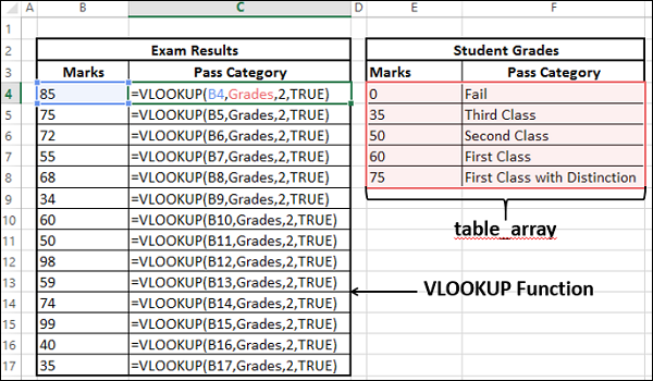
As you can observe,
col_index_num − indicates the column of the return value in table_array is 2
the range_lookup is TRUE
The first column containing the lookup value in the table_array grades is in ascending order. Hence, the results will be correct.
You can get the return value for approximate matches also. i.e. VLOOKUP computes as follows −
| Marks | Pass Category |
|---|---|
| < 35 | Fail |
| >= 35 and < 50 | Third Class |
| >= 50 and < 60 | Second Class |
| >=60 and < 75 | First Class |
| >= 75 | First Class with Distinction |
You will get the following results −
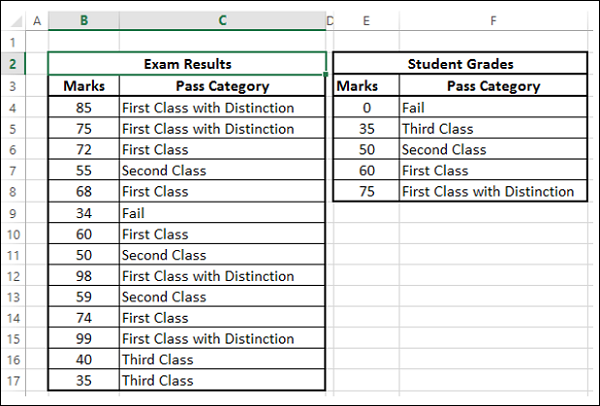
Using VLOOKUP Function with range_lookup FALSE
Consider a list of products containing the Product ID and price for each of the products. The product ID and price will be added to the end of the list whenever a new product is launched. This would mean that the product IDs need not be in ascending order. The product list might be as shown below −
table_array −
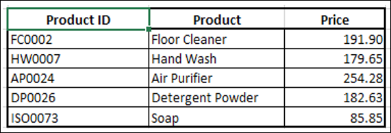
Name this array as ProductInfo.
You can obtain the price of a product given the product ID with the VLOOKUP function as the product ID is in the first column. The price is in column 3 and hence col_index_ num should be 3.
- Use VLOOKUP Function with range_lookup as TRUE
- Use VLOOKUP Function with range_lookup as FALSE
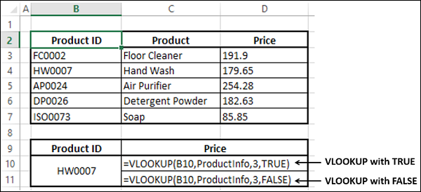
The correct answer is from the ProductInfo array is 171.65. You can check the results.
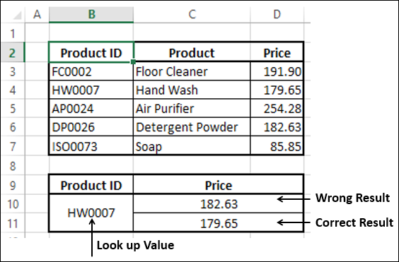
You observe that you got −
- The correct result when range_lookup is FALSE, and
- A wrong result when range_lookup is TRUE.
This is because, the first column in the ProductInfo array is not sorted in ascending order. Hence, remember to use FALSE whenever the data is not sorted.
Using HLOOKUP Function
You can use HLOOKUP function if the data is in rows rather than columns.
Example
Let us take the example of product information. Suppose the array looks as follows −
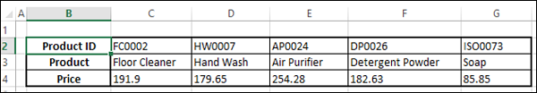
Name this Array ProductRange. You can find the price of a product given the product ID with HLOOKUP function.
The Syntax of HLOOKUP function is
HLOOKUP (lookup_value, table_array, row_index_num, [range_lookup])
Where
lookup_value − is the value to be found in the first row of the table
table_array − is a table of information in which data is looked up
row_index_num − is the row number in table_array from which the matching value will be returned
range_lookup − is a logical value that specifies whether you want HLOOKUP to find an exact match or an approximate match
range_lookup can be
omitted, in which case it is assumed to be TRUE and HLOOKUP tries to find an approximate match
TRUE, in which case HLOOKUP tries to find an approximate match. In other words, if an exact match is not found, the next largest value that is less than lookup_value is returned
FALSE, in which case HLOOKUP tries to find an exact match
1, in which case it is assumed to be TRUE and HLOOKUP tries to find an approximate match
0, in which case it is assumed to be FALSE and HLOOKUP tries to find an exact match
Note − If range_lookup is Omitted or TRUE or 1, HLOOKUP works correctly only when the first column in table_array is sorted in ascending order. Otherwise, it may result in incorrect values. In such a case, use FALSE for range_lookup.
Using HLOOKUP Function with range_lookup FALSE
You can obtain the price of a product given the product ID with the HLOOKUP function as the product ID is in the first row. The price is in row 3 and hence row_index_ num should be 3.
- Use HLOOKUP Function with range_lookup as TRUE.
- Use HLOOKUP Function with range_lookup as FALSE.
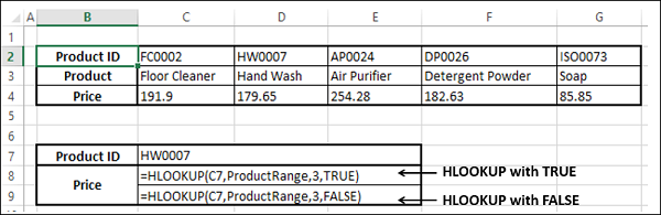
The correct answer from the ProductRange array is 171.65. You can check the results.
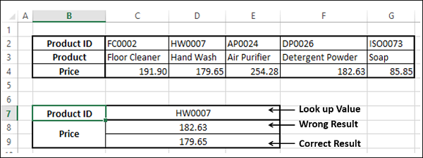
You observe that as in the case of VLOOKUP, you got
The correct result when range_lookup is FALSE, and
A wrong result when range_lookup is TRUE.
This is because the first row in the ProductRange array is not sorted in ascending order. Hence, remember to use FALSE whenever the data is not sorted.
Using HLOOKUP Function with range_lookup TRUE
Consider the example of student marks used in VLOOKUP. Suppose you have the data in rows instead of columns as shown in the table given below −
table_array −
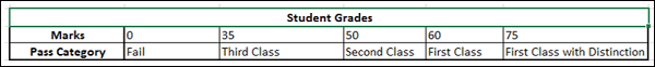
Name this array as GradesRange.
Note that the first row marks based on which the grades are obtained is sorted in ascending order. Hence, using HLOOKUP with TRUE for range_lookup argument, you can get the Grades with approximate match and that is what is required.
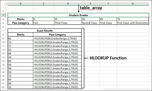
As you can observe,
row_index_num − indicates the column of the return value in table_array is 2
the range_lookup is TRUE
The first column containing the lookup value in the table_array Grades is in ascending order. Hence, the results will be correct.
You can get the return value for approximate matches also. i.e. HLOOKUP computes as follows −
| Marks | < 35 | >= 35 and < 50 | >= 50 and < 60 | >=60 and < 75 | >= 75 |
|---|---|---|---|---|---|
| Pass Category | Fail | Third Class | Second Class | First Class | First Class with Distinction |
You will get the following results −
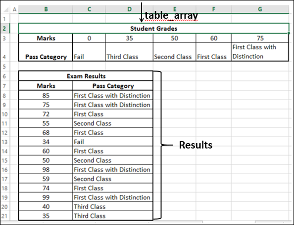
Using INDEX Function
When you have an array of data, you can retrieve a value in the array by specifying the row number and column number of that value in the array.
Consider the following sales data, wherein you find the sales in each of the North, South, East and West regions by the salespersons who are listed.
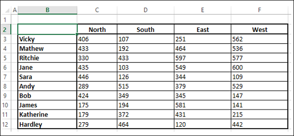
- Name the array as SalesData.
Using INDEX Function, you can find −
- The Sales of any of the Salespersons in a certain Region.
- Total Sales in a Region by all the Salespersons.
- Total Sales by a Salesperson in all the Regions.
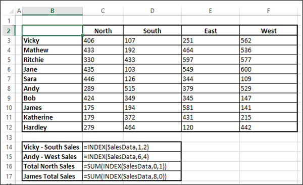
You will get the following results −
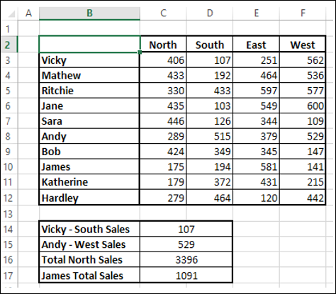
Suppose you do not know the row numbers for the salespersons and column numbers for the regions. Then, you need to find the row number and column number first before you retrieve the value with the index function.
You can do it with the MATCH function as explained in the next section.
Using MATCH Function
If you need the position of an item in a range, you can use the MATCH function. You can combine MATCH and INDEX functions as follows −
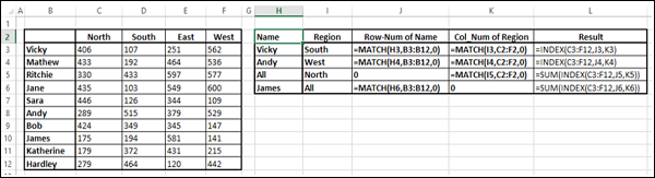
You will get the following results −
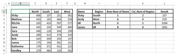
Excel Data Analysis - PivotTables
Data analysis on a large set of data is quite often necessary and important. It involves summarizing the data, obtaining the needed values and presenting the results.
Excel provides PivotTable to enable you summarize thousands of data values easily and quickly so as to obtain the required results.
Consider the following table of sales data. From this data, you might have to summarize total sales region wise, month wise, or salesperson wise. The easy way to handle these tasks is to create a PivotTable that you can dynamically modify to summarize the results the way you want.
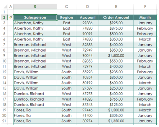
Creating PivotTable
To create PivotTables, ensure the first row has headers.
- Click the table.
- Click the INSERT tab on the Ribbon.
- Click PivotTable in the Tables group. The PivotTable dialog box appears.
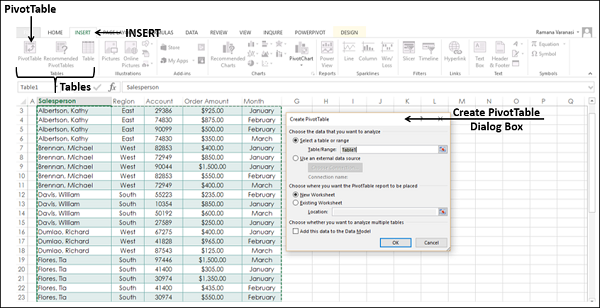
As you can see in the dialog box, you can use either a Table or Range from the current workbook or use an external data source.
- In the Table / Range Box, type the table name.
- Click New Worksheet to tell Excel where to keep the PivotTable.
- Click OK.
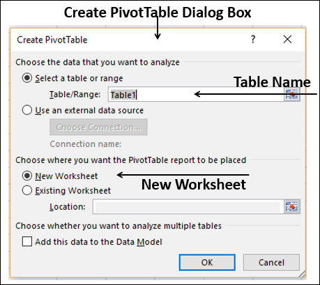
A Blank PivotTable and a PivotTable fields list appear.
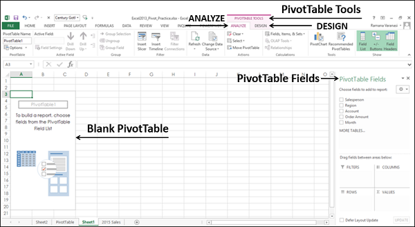
Recommended PivotTables
In case you are new to PivotTables or you do not know which fields to select from the data, you can use the Recommended PivotTables that Excel provides.
Click the data table.
Click the INSERT tab.
Click on Recommended PivotTables in the Tables group. The Recommended PivotTables dialog box appears.
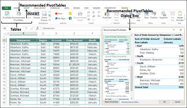
In the recommended PivotTables dialog box, the possible customized PivotTables that suit your data are displayed.
- Click each of the PivotTable options to see the preview on the right side.
- Click the PivotTable Sum of Order Amount by Salesperson and month.
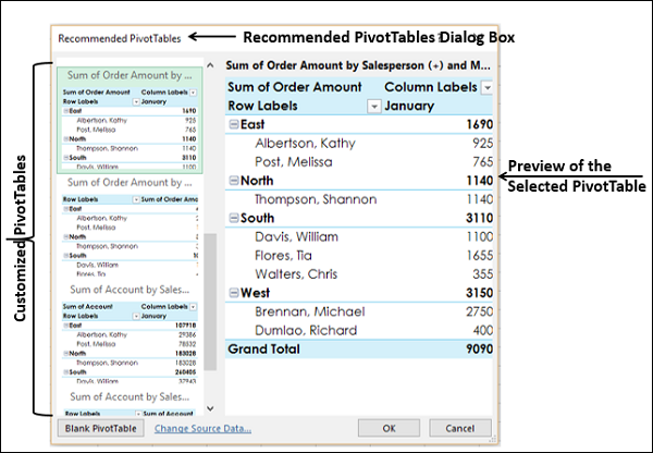
Click OK. The selected PivotTable appears on a new worksheet. You can observe the PivotTable fields that was selected in the PivotTable fields list.
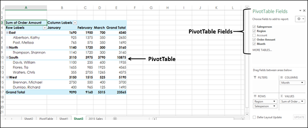
PivotTable Fields
The headers in your data table will appear as the fields in the PivotTable.
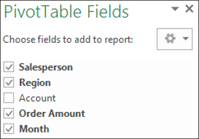
You can select / deselect them to instantly change your PivotTable to display only the information you want and in a way that you want. For example, if you want to display the account information instead of order amount information, deselect Order Amount and select Account.
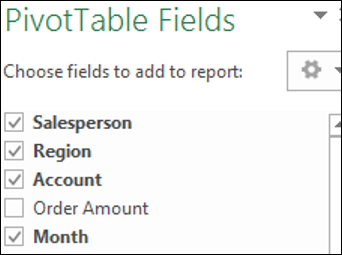
PivotTable Areas
You can even change the Layout of your PivotTable instantly. You can use the PivotTable Areas to accomplish this.
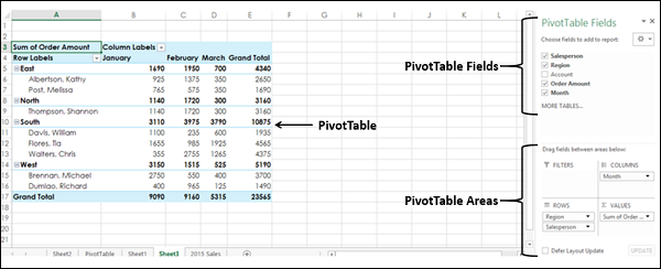
In PivotTable areas, you can choose −
- What fields to display as rows
- What fields to display as columns
- How to summarize your data
- Filters for any of the fields
- When to update your PivotTable Layout
- You can update it instantly as you drag the fields across areas, or
- You can defer the update and get it updated only when you click on UPDATE
An instant update helps you to play around with the different Layouts and pick the one that suits your report requirement.
You can just drag the fields across these areas and observe the PivotTable layout as you do it.
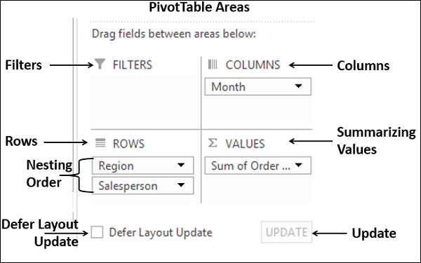
Nesting in the PivotTable
If you have more than one field in any of the areas, then nesting happens in the order you place the fields in that area. You can change the order by dragging the fields and observe how nesting changes. In the above layout options, you can observe that
- Months are in columns.
- Region and salesperson in rows in that order. i.e. salesperson values are nested under region values.
- Summarizing is by Sum of Order Amount.
- No filters are chosen.
The resulting PivotTable is as follows −
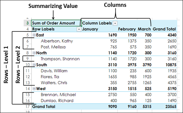
In the PivotTable Areas, in rows, click region and drag it below salesperson such that it looks as follows −
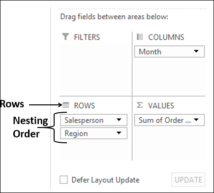
The nesting order changes and the resulting PivotTable is as follows −
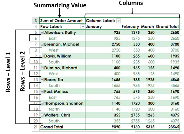
Note − You can clearly observe that the layout with the nesting order Region and then Salesperson yields a better and compact report than the one with the nesting order Salesperson and then Region. In case Salesperson represents more than one area and you need to summarize the sales by Salesperson, then the second layout would have been a better option.
Filters
You can assign a Filter to one of the fields so that you can dynamically change the PivotTable based on the values of that field.
Drag Region from Rows to Filters in the PivotTable Areas.
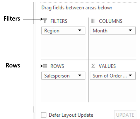
The filter with the label as Region appears above the PivotTable (in case you do not have empty rows above your PivotTable, PivotTable gets pushed down to make space for the Filter.
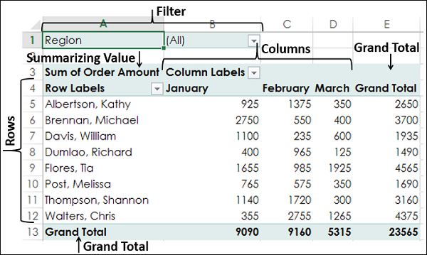
You can see that −
- Salesperson values appear in rows.
- Month values appear in columns.
- Region Filter appears on the top with default selected as ALL.
- Summarizing value is Sum of Order Amount
- Sum of Order Amount Salesperson-wise appears in the column Grand Total
- Sum of Order Amount Month-wise appears in the row Grand Total
Click the arrow in the box to the right of the filter region. A drop-down list with the values of the field region appears.
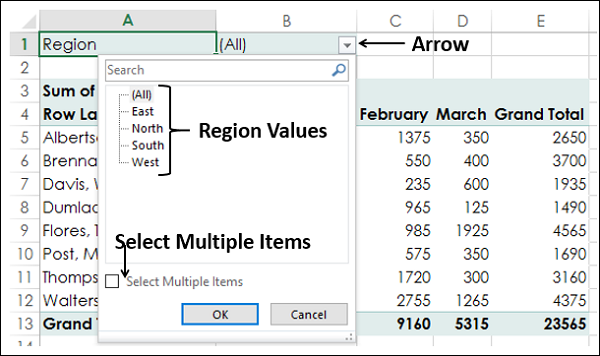
- Check the option Select Multiple Items. Check boxes appear for all the values.
- Select South and West and deselect the other values and click OK.
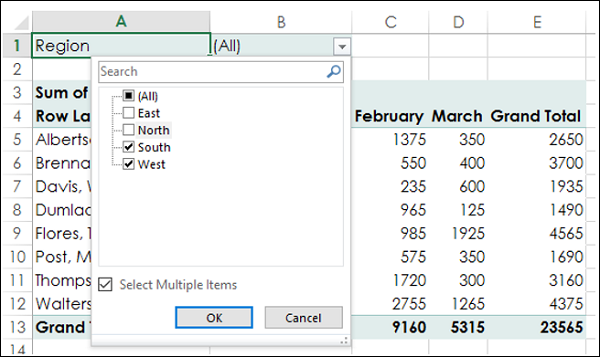
The data pertaining to South and West Regions only will be summarized as shown in the screen shot given below −
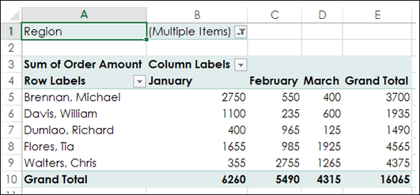
You can see that next to the Filter Region, Multiple Items is displayed, indicating that you have selected more than one item. However, how many items and / or which items are selected is not known from the report that is displayed. In such a case, using Slicers is a better option for filtering.
Slicers
You can use Slicers to have a better clarity on which items the data was filtered.
Click ANALYZE under PIVOTTABLE TOOLS on the Ribbon.
Click Insert Slicer in the Filter group. The Insert Slicers box appears. It contains all the fields from your data.
Select the fields Region and month. Click OK.
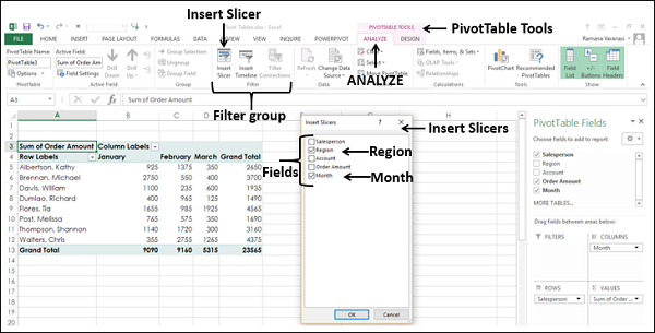
Slicers for each of the selected fields appear with all the values selected by default. Slicer Tools appear on the Ribbon to work on the Slicer settings, look and feel.
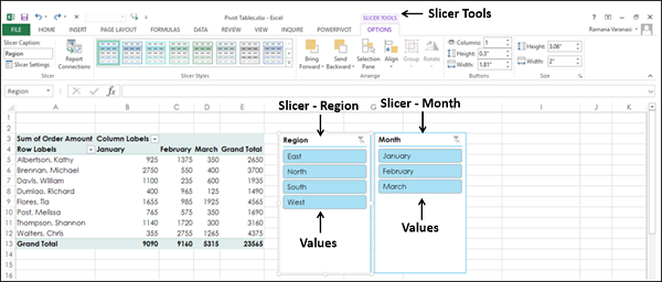
- Select South and West in the Slicer for Region.
- Select February and March in the Slicer for month.
- Keep Ctrl key pressed while selecting multiple values in a Slicer.
Selected items in the Slicers are highlighted. PivotTable with summarized values for the selected items will be displayed.
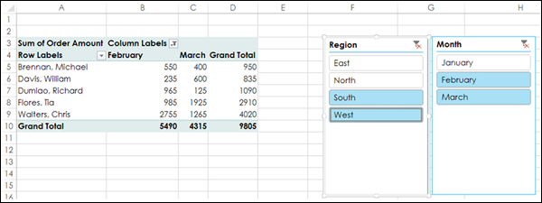
Summarizing Values by other Calculations
In the examples so far, you have seen summarizing values by Sum. However, you can use other calculations also if necessary.
In the PivotTable Fields List
- Select the Field Account.
- Unselect the Field Order Amount.
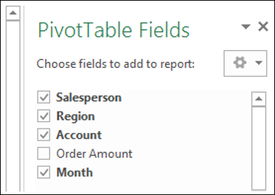
- Drag the field Account to Summarizing Values area. By default, Sum of Account will be displayed.
- Click the arrow on the right side of the box.
- In the drop-down that appears, click Value Field Settings.
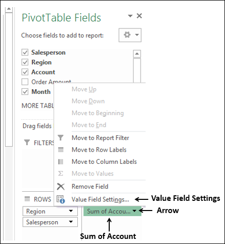
The Value Field Settings box appears. Several types of calculations appear as a list under Summarize value field by −
- Select Count in the list.
- The Custom Name automatically changes to Count of Account. Click OK.
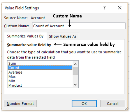
The PivotTable summarizes the Account values by Count.
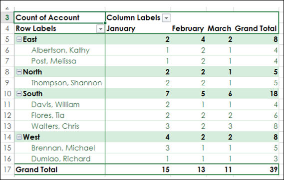
PivotTable Tools
Follow the steps given below to learn to use the PivotTable Tools.
- Select the PivotTable.
The following PivotTable Tools appear on the Ribbon −
- ANALYZE
- DESIGN
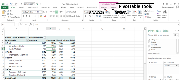
ANALYZE
Some of the ANALYZE Ribbon commands are −
- Set PivotTable Options
- Value Field Settings for the selected Field
- Expand Field
- Collapse Field
- Insert Slicer
- Insert Timeline
- Refresh Data
- Change Data Source
- Move PivotTable
- Solve Order (If there are more calculations)
- PivotChart
DESIGN
Some of the DESIGN Ribbon commands are −
- PivotTable Layout
- Options for Sub Totals
- Options for Grand Totals
- Report Layout Forms
- Options for Blank Rows
- PivotTable Style Options
- PivotTable Styles
Expanding and Collapsing Field
You can either expand or collapse all items of a selected field in two ways −
- By selecting the symbol
 or
or  to the left of the selected field.
 - By clicking the Expand Field or Collapse Field on the ANALYZE Ribbon.
By selecting the Expand symbol or Collapse symbol to the left of the selected field
- Select the cell containing East in the PivotTable.
- Click on the Collapse symbol to the left of East.
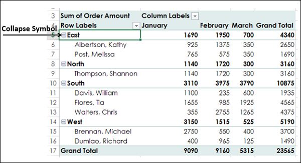
All the items under East will be collapsed. The Collapse symbol to the left of East changes to the Expand symbol .
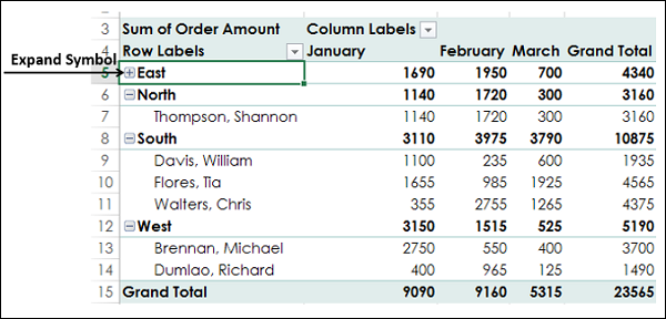
You can observe that only the items below East are collapsed. The rest of the PivotTable items are as they are.
Click the Expand symbol to the left of East. All the items below East will be displayed.
Using ANALYZE on the Ribbon
You can collapse or expand all items in the PivotTable at once with the Expand Field and Collapse Field commands on the Ribbon.
- Click the cell containing East in the PivotTable.
- Click the ANALYZE tab on the Ribbon.
- Click Collapse Field in the Active Field group.
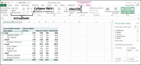
All the items of the field East in the PivotTable will collapse.
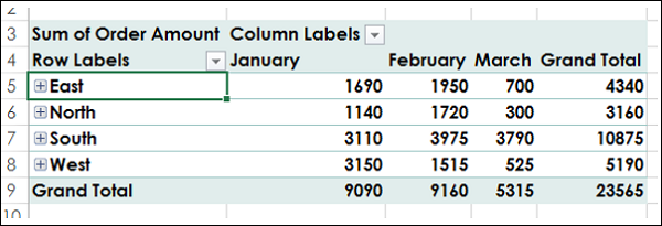
Click Expand Field in the Active Field group.
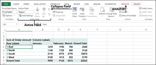
All the items will be displayed.
Report Presentation Styles
You can choose the presentation style for your PivotTable as you would be including it as a report. Select a style that fits into the rest of your presentation or report. However, do not get over bored with the styles because a report that gives an impact in showing the results is always better than a colorful one, which does not highlight the important data points.
- Click East in the PivotTable.
- Click ANALYZE.
- Click Field Settings in Active Field group. The Field Settings dialog box appears.
- Click the Layout & Print tab.
- Check Insert blank line after each item label.
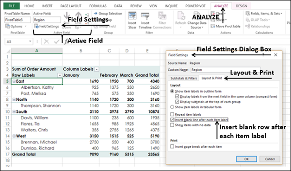
Blank rows will be displayed after each value of the Region field.
You can insert blank rows from the DESIGN tab also.
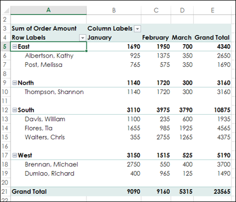
- Click the DESIGN tab.
- Click Report Layout in Layout group.
- Select Show in Outline Form in the drop-down list.
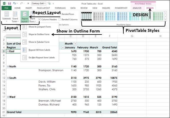
- Hover the mouse over the PivotTable Styles. A preview of the style on which the mouse is placed will appear.
- Select the Style that suits your report.
PivotTable in Outline Form with the selected Style will be displayed.
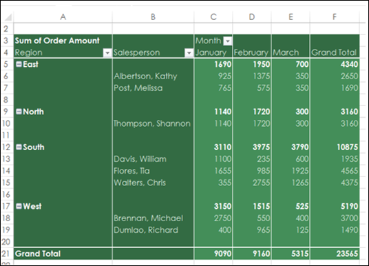
Timeline in PivotTables
To understand how to use Timeline, consider the following example wherein the sales data of various items is given salesperson wise and location wise. There are total 1891 rows of data.
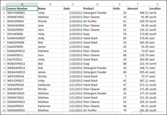
Create a PivotTable from this Range with −
- Location and Salesperson in Rows in that order
- Product in Columns
- Sum of Amount in Summarizing values
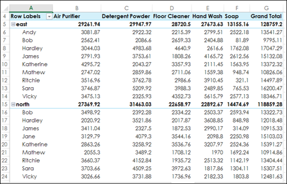
- Click the PivotTable.
- Click INSERT tab.
- Click Timeline in Filters group. The Insert Timelines appears.
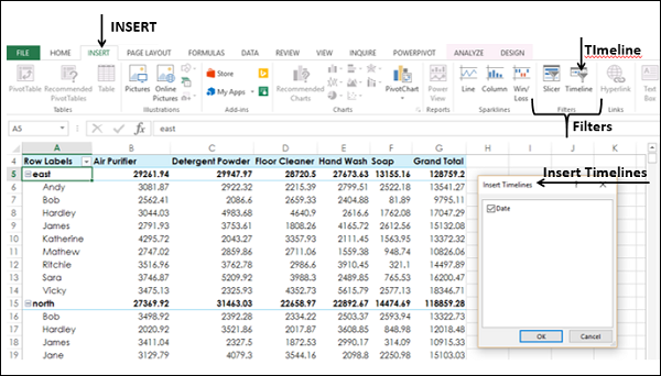
Click Date and click OK. The Timeline dialog box appears and the Timeline Tools appear on the Ribbon.
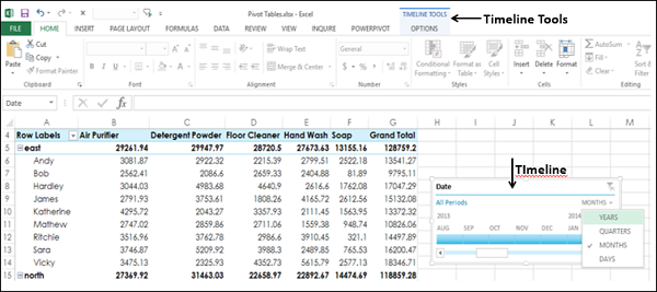
- In Timeline dialog box, select MONTHS.
- From the drop-down list select QUARTERS.
- Click 2014 Q2.
- Keep the Shift key pressed and drag to 2014 Q4.
Timeline is selected to Q2 Q4 2014.
PivotTable is filtered to this Timeline.
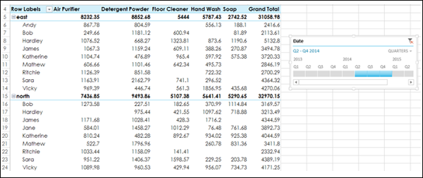
Excel Data Analysis - Data Visualization
You can display your data analysis reports in a number of ways in Excel. However, if your data analysis results can be visualized as charts that highlight the notable points in the data, your audience can quickly grasp what you want to project in the data. It also leaves a good impact on your presentation style.
In this chapter, you will get to know how to use Excel charts and Excel formatting features on charts that enable you to present your data analysis results with emphasis.
Visualizing Data with Charts
In Excel, charts are used to make a graphical representation of any set of data. A chart is a visual representation of the data, in which the data is represented by symbols such as bars in a Bar Chart or lines in a Line Chart. Excel provides you with many chart types and you can choose one that suits your data or you can use the Excel Recommended Charts option to view charts customized to your data and select one of those.
Refer to the Tutorial Excel Charts for more information on chart types.
In this chapter, you will understand the different techniques that you can use with the Excel charts to highlight your data analysis results more effectively.
Creating Combination Charts
Suppose you have the target and actual profits for the fiscal year 2015-2016 that you obtained from different regions.
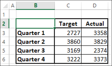
We will create a Clustered Column Chart for these results.
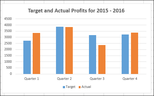
As you observe, it is difficult to visualize the comparison quickly between the targets and actual in this chart. It does not give a true impact on your results.
A better way of distinguishing two types of data to compare the values is by using Combination Charts. In Excel 2013 and versions above, you can use Combo charts for the same purpose.
Use Vertical Columns for the target values and a Line with Markers for the actual values.
- Click the DESIGN tab under the CHART TOOLS tab on the Ribbon.
- Click Change Chart Type in the Type group. The Change Chart Type dialog box appears.
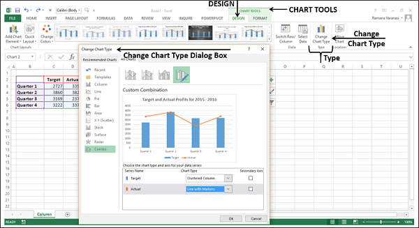
Click Combo.
Change the Chart Type for the series Actual to Line with Markers. The preview appears under Custom Combination.
Click OK.
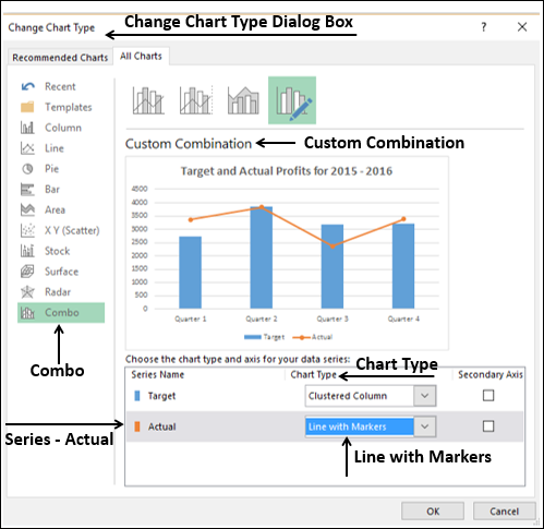
Your Customized Combination Chart will be displayed.
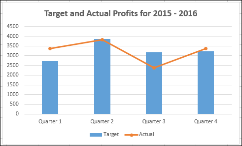
As you observe in the chart, the Target values are in Columns and the Actual values are marked along the line. The data visualization has become better as it also shows you the trend of your results.
However, this type of representation does not work well when the data ranges of your two data values vary significantly.
Creating a Combo Chart with Secondary Axis
Suppose you have the data on the number of units of your product that was shipped and the actual profits for the fiscal year 2015-2016 that you obtained from different regions.
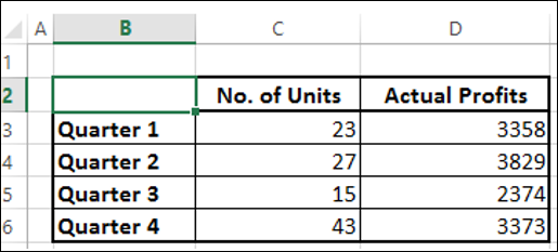
If you use the same combination chart as before, you will get the following −
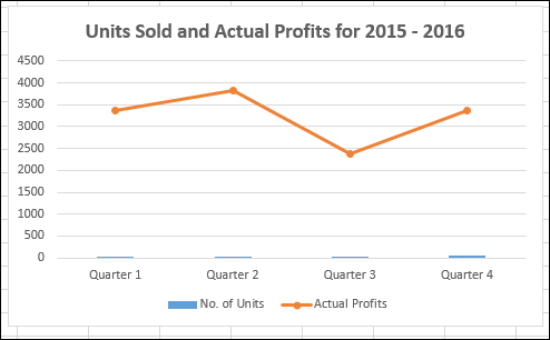
In the chart, the data of No. of Units is not visible as the data ranges are varying significantly.
In such cases, you can create a combination chart with secondary axis, so that the primary axis displays one range and the secondary axis displays the other.
- Click the INSERT tab.
- Click Combo in Charts group.
- Click Create Custom Combo Chart from the drop-down list.
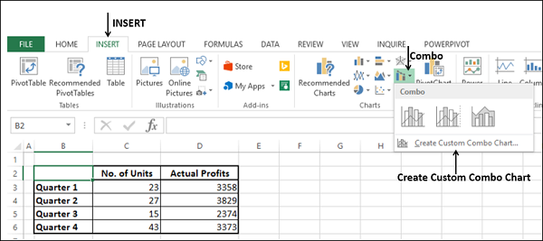
The Insert Chart dialog box appears with Combo highlighted.
For Chart Type, choose −
- Line with Markers for the Series No. of Units
- Clustered Column for the Series Actual Profits
- Check the Box Secondary Axis to the right of the Series No. of Units and click OK.
A preview of your chart appears under Custom Combination.
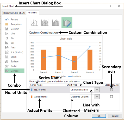
Your Combo chart appears with Secondary Axis.
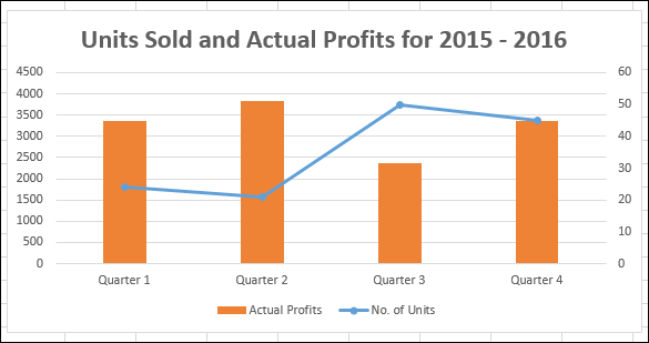
You can observe the values for Actual Profits on the primary axis and the values for No. of Units on the secondary axis.
A significant observation in the above chart is for Quarter 3 where No. of Units sold is more, but the Actual Profits made are less. This could probably be assigned to the promotion costs that were incurred to increase sales. The situation is improved in Quarter 4, with a slight decrease in sales and a significant rise in the Actual Profits made.
Discriminating Series and Category Axis
Suppose you want to project the Actual Profits made in Years 2013-2016.
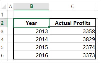
Create a clustered column for this data.
As you observe, the data visualization is not effective as the years are not displayed. You can overcome this by changing year to category.
Remove the header year in the data range.
Now, year is considered as a category and not a series. Your chart looks as follows −
Chart Elements and Chart Styles
Chart Elements give more descriptions to your charts, thus helping visualizing your data more meaningfully.
- Click the Chart
Three buttons appear next to the upper-right corner of the chart −
 Chart Elements
 Chart Styles
  Chart Filters
For a detailed explanation of these, refer to Excel Charts tutorial.
- Click Chart Elements.
- Click Data Labels.
- Click Chart Styles
- Select a Style and Color that suits your data.
You can use Trendline to graphically display trends in data. You can extend a Trendline in a chart beyond the actual data to predict future values.
Data Labels
Excel 2013 and later versions provide you with various options to display Data Labels. You can choose one Data Label, format it as you like, and then use Clone Current Label to copy the formatting to the rest of the Data Labels in the chart.
The Data Labels in a chart can have effects, varying shapes and sizes.
It is also possible to display the content of a cell as part of the Data Label with Insert Data Label Field.
Quick Layout
You can use Quick Layout to change the overall layout of the chart quickly by choosing one of the predefined layout options.
- Click the chart.
- Click the DESIGN tab under CHART TOOLS.
- Click Quick Layout.
Different possible layouts will be displayed. As you move on the layout options, the chart layout changes to that particular option.
Select the layout you like. The chart will be displayed with the chosen layout.
Using Pictures in Column Charts
You can create more emphasis on your data presentation by using a picture in place of columns.
Click on a Column on the Column Chart.
In the Format Data Series, click on Fill.
Select Picture.
Under Insert picture from, provide the filename or optionally clipboard if you had copied an image earlier.
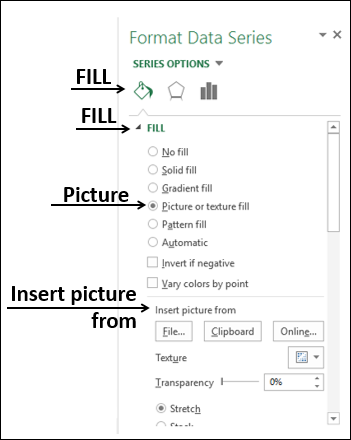
The picture you have chosen will appear in place of columns in the chart.
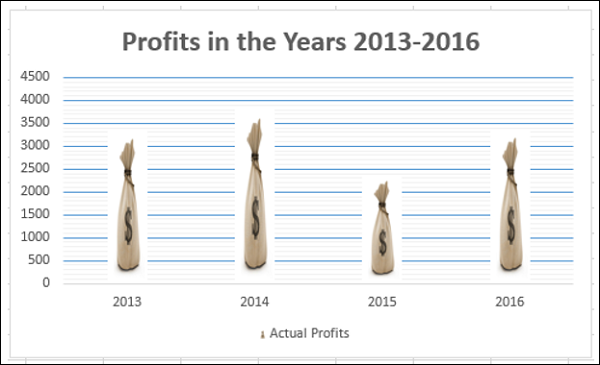
Band Chart
You might have to present customer survey results of a product from different regions. Band Chart is suitable for this purpose. A Band Chart is a Line Chart with an added shaded area to display the upper and lower boundaries of groups of data.
Suppose your customer survey results from the east and west regions, month wise are −
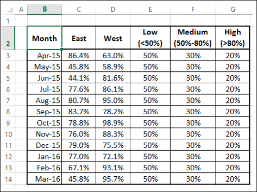
Here, in the data < 50% is Low, 50% - 80% is Medium and > 80% is High.
With Band Chart, you can display your survey results as follows −
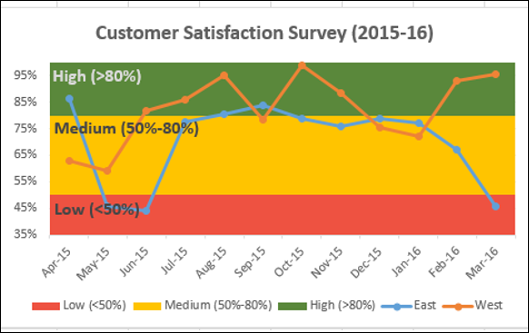
Create a Line Chart from your data.
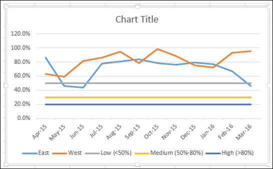
Change the chart type to −
- East and West Series to Line with Markers.
- Low, Medium and High Series to Stacked Column.
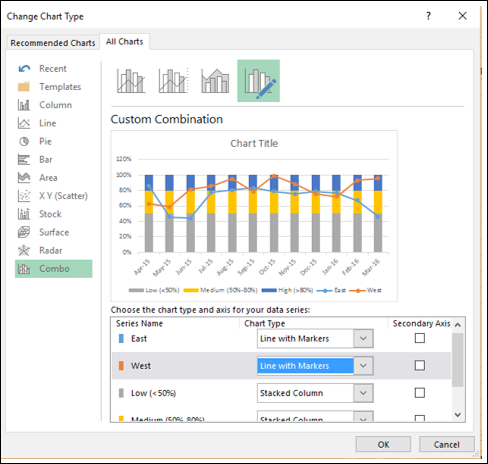
Your chart looks as follows.
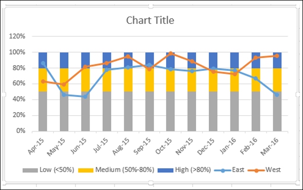
- Click on one of the columns.
- Change gap width to 0% in Format Data Series.
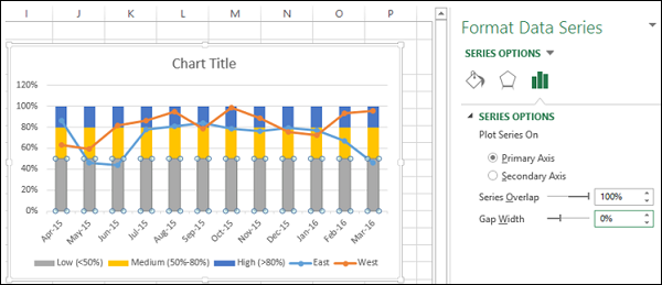
You will get Bands instead of columns.
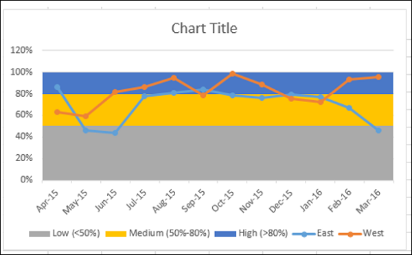
To make the chart more presentable −
- Add Chart Title.
- Adjust Vertical Axis range.
- Change the colors of the bands to Green-Yellow-Red.
- Add Labels to bands.
The final result is the Band Chart with the defined boundaries and the survey results represented across the bands. One can quickly and clearly make out from the chart that while the survey results for the region West are satisfactory, those for the region East have a decline in the last quarter and need attention.
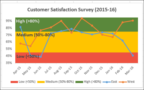
Thermometer Chart
When you have to represent a target value and an actual value, you can easily create a Thermometer Chart in Excel that emphatically shows these values.
With Thermometer chart, you can display your data as follows −

Arrange your data as shown below −
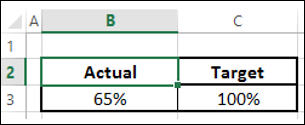
- Select the data.
- Create a Clustered Column chart.
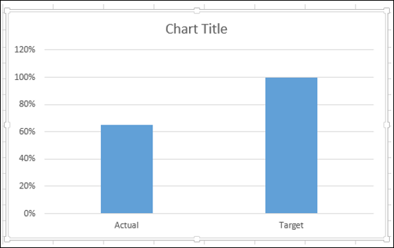
As you observe, the right side Column is Target.
- Click on a Column in the chart.
- Click on Switch Row/Column on the Ribbon.
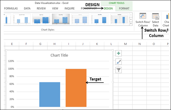
- Right click on the Target Column.
- Click on Format Data Series.
- Click on Secondary Axis.
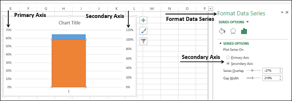
As you observe the Primary Axis and Secondary Axis have different ranges.
- Right click the Primary Axis.
- In the Format Axis options, under Bounds, type 0 for Minimum and 1 for Maximum.
- Repeat the same for Secondary Axis.
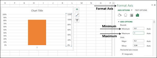
Both Primary Axis and Secondary Axis will be set to 0% - 100%. The Target Column hides the Actual Column.
- Right click the visible column (Target)
- In the Format Data Series, select
- No fill for FILL
- Solid line for BORDER
- Blue for Color
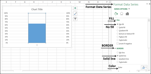
- In Chart Elements, unselect
- Axis → Primary Horizontal
- Axis → Secondary Vertical
- Gridlines
- Chart Title
- In the chart, right click on Primary Vertical Axis
- In Format Axis options, click on TICK MARKS
- For Major type, select Inside
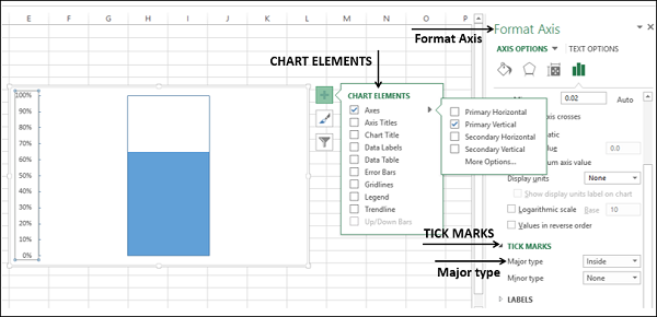
- Right click on the Chart Area.
- In the Format Chart Area options, select
- No fill for FILL
- No line for BORDER
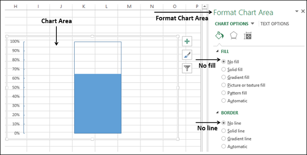
Resize the chart area, to get the shape of a thermometer.
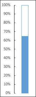
You got your thermometer chart, with the actual value as against target value being shown. You can make this thermometer chart more impressive with some formatting.
- Insert a rectangle shape superimposing the blue rectangular part in the chart.
- In Format Shape options, select −
- Gradient fill for FILL
- Linear for Type
- 1800 for Angle
- Set the Gradient stops at 0%, 50% and 100%.
- For the Gradient stops at 0% and 100%, choose the color black.
- For the Gradient stop at 50%, choose the color white.
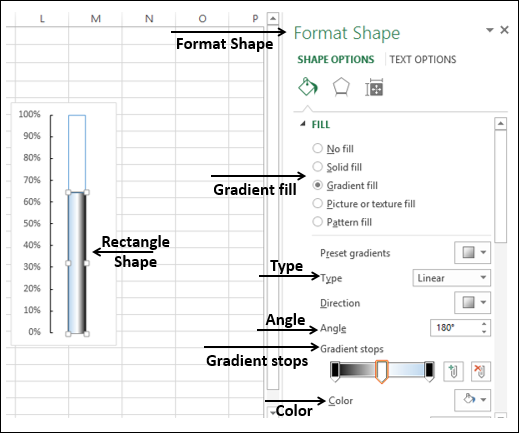
- Insert an oval shape at the bottom.
- Format shape with same options.
The result is the Thermometer Chart that we started with.

Gantt Chart
A Gantt chart is a chart in which a series of horizontal lines shows the amount of work done in certain periods of time in relation to the amount of work planned for those periods.
In Excel, you can create a Gantt chart by customizing a Stacked Bar chart type so that it depicts tasks, task duration, and hierarchy. An Excel Gantt chart typically uses days as the unit of time along the horizontal axis.
Consider the following data where the column −
- Task represents the Tasks in the project
- Start represents number of days from the Start Date of the project
- Duration represents the duration of the Task
Note that Start of any Task is Start of previous Task + Duration. This is the case when the Tasks are in hierarchy.
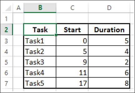
- Select the data.
- Create Stacked Bar Chart.
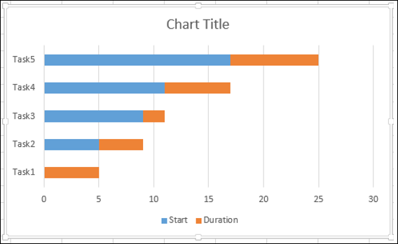
- Right-click on Start Series.
- In Format Data Series options, select No fill.
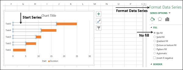
- Right-click on Categories Axis.
- In Format Axis options, select Categories in reverse order.
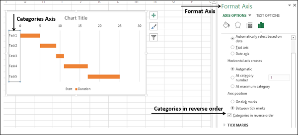
- In Chart Elements, deselect
- Legend
- Gridlines
- Format the Horizontal Axis to
- Adjust the range
- Major Tick Marks at 5 day intervals
- Minor Tick Marks at 1 day intervals
- Format Data Series to make it look impressive
- Give a Chart Title
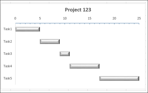
Waterfall Chart
Waterfall Chart is one of the most popular visualization tools used in small and large businesses. Waterfall charts are ideal for showing how you have arrived at a net value such as net income, by breaking down the cumulative effect of positive and negative contributions.
Excel 2016 provides Waterfall Chart type. If you are using earlier versions of Excel, you can still create a Waterfall Chart using Stacked Column Chart.
The columns are color coded so that you can quickly tell positive from negative numbers. The initial and the final value columns start on the horizontal axis, while the intermediate values are floating columns. Because of this look, Waterfall Charts are also called Bridge Charts.
Consider the following data.
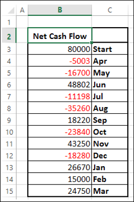
Prepare the data for Waterfall Chart
Ensure the column Net Cash Flow is to the left of the Months Column (This is because you will not include this column while creating the chart)
Add 2 columns Increase and Decrease for positive and negative cash flows respectively
Add a column Start - the first column in the chart with the start value in the Net Cash Flow
Add a column End - the last column in the chart with the end value in the Net Cash Flow
Add a column Float that supports the intermediate columns
Compute the values for these columns as follows
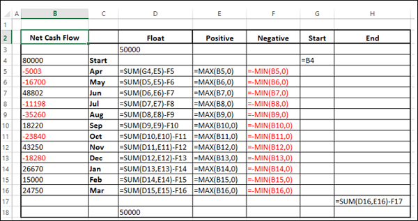
In the Float column, insert a row in the beginning and at the end. Place n arbitrary value 50000. This just to have some space to the left and right of the chart
The data will be as follows.
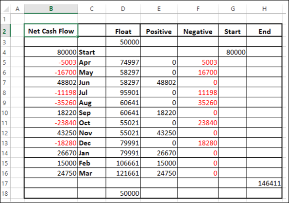
- Select the cells C2:H18 (Exclude Net Cash Flow column)
- Create Stacked Column Chart
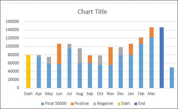
- Right click on the Float Series.
- Click Format Data Series.
- In Format Data Series options, select No fill.
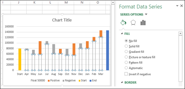
- Right click on Negative Series.
- Select Fill Color as Red.
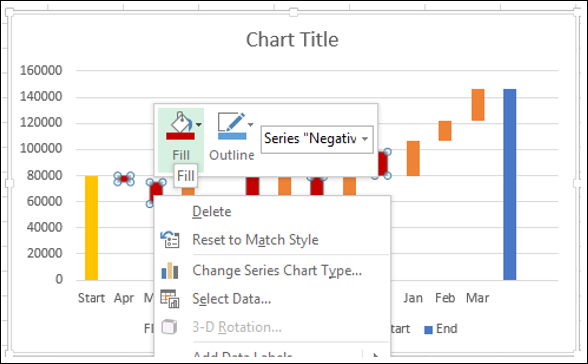
- Right click on Positive Series.
- Select Fill Color as Green.
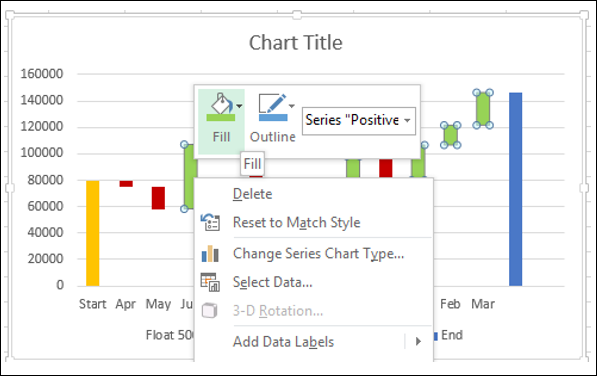
- Right click on Start Series.
- Select Fill Color as Grey.
- Right click on End Series.
- Select Fill Color as Grey.
- Delete the Legend.
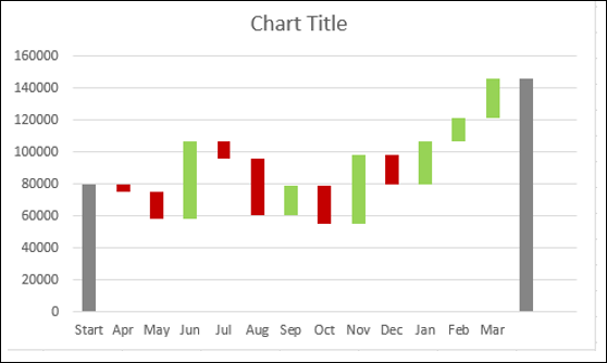
- Right click on any Series
- In Format Data Series options, select Gap Width as 10% under Series Options
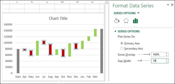
Give the Chart Title. The Waterfall Chart will be displayed.
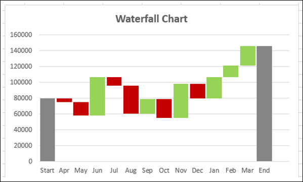
Sparklines
Sparklines are tiny charts placed in single cells, each representing a row of data in your selection. They provide a quick way to see trends.
You can add Sparklines with Quick Analysis tool.
- Select the data for which you want to add Sparklines.
- Keep an empty column to the right side of the data for the Sparklines.
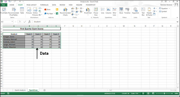
Quick Analysis button appears at the bottom right of your selected data.
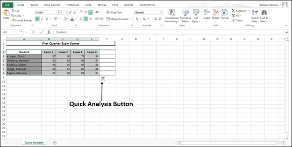
Click on the Quick Analysis
button. The Quick Analysis Toolbar appears with various options.
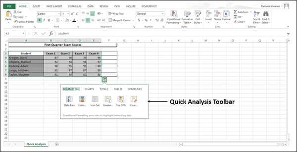
Click SPARKLINES. The chart options displayed are based on the data and may vary.
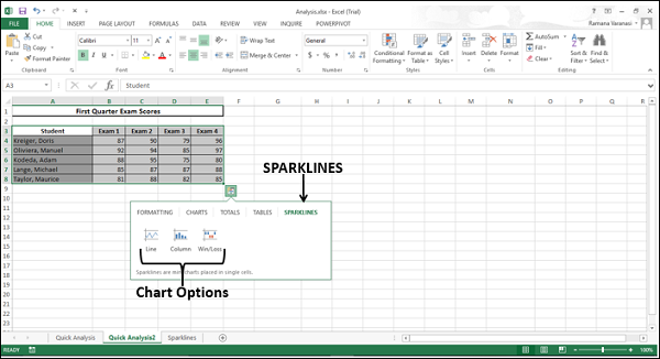
Click Line. A Line Chart for each row is displayed in the column to the right of the data.
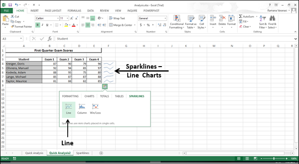
PivotCharts
Pivot Charts are used to graphically summarize data and explore complicated data.
A PivotChart shows Data Series, Categories, and Chart Axes the same way a standard chart does. Additionally, it also gives you interactive filtering controls right on the chart so that you can quickly analyze a subset of your data.
PivotCharts are useful when you have data in a huge PivotTable, or many complex worksheet data that includes text and numbers. A PivotChart can help you make sense of this data.
You can create a PivotChart from
- A PivotTable.
- A Data Table as a standalone without PivotTable.
PivotChart from PivotTable
To create a PivotChart follow the steps given below −
- Click the PivotTable.
- Click ANALYZE under PIVOTTABLE TOOLS on the Ribbon.
- Click on PivotChart. The Insert Chart dialog box appears.
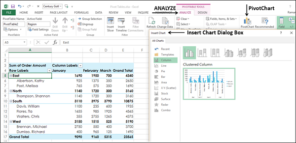
Select Clustered Column from the option Column.
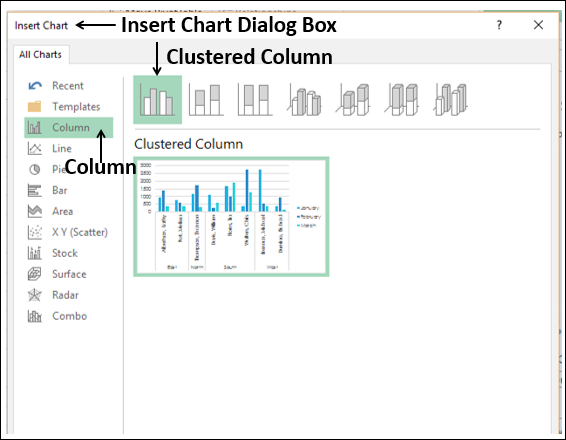
Click OK. The PivotChart is displayed.
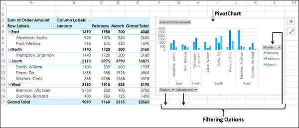
The PivotChart has three filters Region, Salesperson and Month.
Click the Region Filter Control option. The Search Box appears with the list of all Regions. Check boxes appear next to Regions.
Select East and South options.
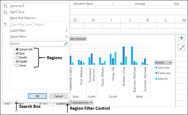
The filtered data appears on both the PivotChart and the PivotTable.
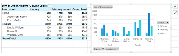
PivotChart without a PivotTable
You can create a standalone PivotChart without creating a PivotTable.
- Click the Data Table.
- Click the Insert tab.
- Click PivotChart in Charts group. The Create PivotChart window appears.
- Select the Table/Range.
- Select the Location where you want the PivotChart to be placed.
You can choose a cell in the existing worksheet itself, or in a new worksheet. Click OK.
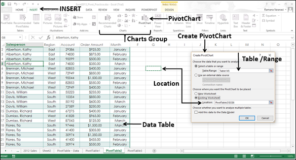
An empty PivotChart and an empty PivotTable appear along with the PivotChart Field List to build the PivotChart.
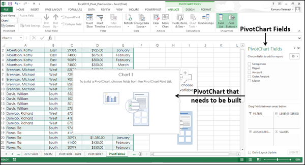
Choose the Fields to be added to the PivotChart
Arrange the Fields by dragging them into FILTERS, LEGEND (SERIES), AXIS (CATEGORIES) and VALUES
Use the Filter Controls on the PivotChart to select the Data to be placed on the PivotChart
Excel will automatically create a coupled PivotTable.
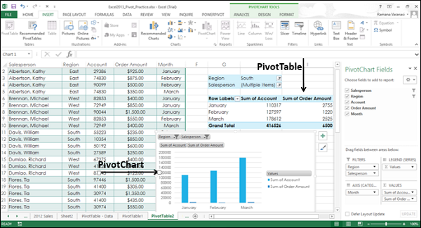
Excel Data Analysis - Data Validation
Data Validation is a very useful and easy to use tool in Excel with which you can set data validations on the data that is entered that is entered into your Worksheet.
For any cell on the worksheet, you can
- Display an input message on what needs to be entered into it.
- Restrict the values that get entered.
- Provide a list of values to choose from.
- Display an error message and reject an invalid data entry.
Consider the following Risk Tracker that can be used to enter and track the identified Risks information.
In this tracker, the data that is entered into the following columns is validated with preset data constraints and the entered data is accepted only when it meets the validation criteria. Otherwise, you will get an error message.
- Probability
- Impact
- Risk Category
- Risk Source
- Status
The column Risk Exposure will have calculated values and you cannot enter any data. Even the column S. No. is set to have calculated values that are adjusted even if you delete a row.
Now, you will learn how to set up such a worksheet.
Prepare the Structure for the Worksheet
To prepare the structure for the worksheet −
- Start with a blank worksheet.
- Put the header in Row 2.
- Put the column headers in Row 3.
- For the column headers Probability, Impact and Risk Exposure −
- Right click on the cell.
- Click on Format Cells from drop down.
- In the Format Cells dialog box, click on Alignment tab.
- Type 90 under Orientation.
- Merge and Centre the cells in Rows 3, 4, and 5 for each of the column headers.
- Format Borders for the cells in Rows 2 5.
- Adjust the row and column widths.
Your worksheet will look as follow −
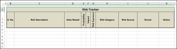
Set Valid Values for Risk Category
In the cells M5 M13 enter the following values (M5 is heading and M6 - M13 are the values)
| Category Values |
| End-Users |
| Customer |
| Management |
| Schedule |
| Schedule |
| Environment |
| Product |
| Project |
- Click the first cell under the column Risk Category (H6).
- Click DATA tab on the Ribbon.
- Click Data Validation in the Data Tools group.
- Select Data Validation from the drop-down list.
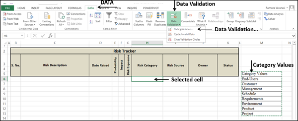
The Data Validation dialog box appears.
- Click the Settings tab.
- Under Validation criteria, in the Allow: drop-down list, Select the option List.
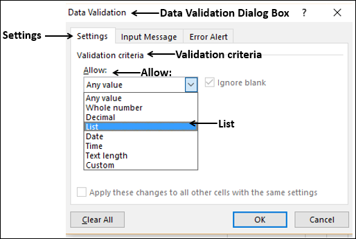
- Select the range M6:M13 in the Source: box that appears.
- Check the boxes Ignore blank and In-cell dropdown that appear.
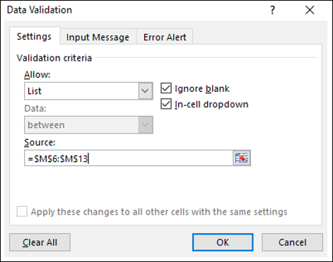
Set Input Message for Risk Category
- Click the Input Message tab in the Data Validation dialog box.
- Check the box Show input message when cell is selected.
- In the box under Title:, type Risk Category:
- In the box under Input message: Choose the Category of the Risk from the List.
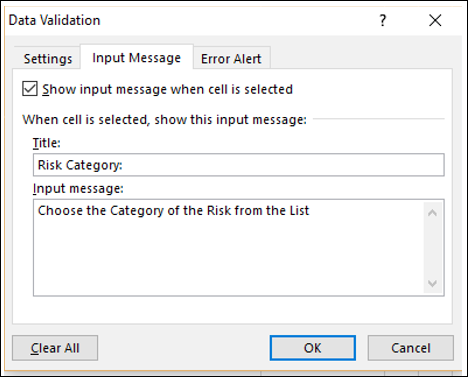
Set Error Alert for Risk Category
To set error alert −
- Click the Error Alert tab in the Data validation dialog box.
- Check the box Show error alert after invalid data is entered.
- Select Stop under Style: dropdown
- In the box under Title:, type Invalid Entry:
- In the box under Error message: type Choose a value from dropdown list.
- Click OK.
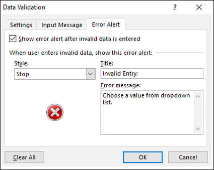
Verify Data Validation for Risk Category
For the selected first cell under Risk Category,
- Data Validation criteria is set
- Input message is set
- Error alert is set
Now, you can verify your settings.
Click in the cell for which you have set Data Validation criteria. The Input message appears. The dropdown button appears on the right side of the cell.
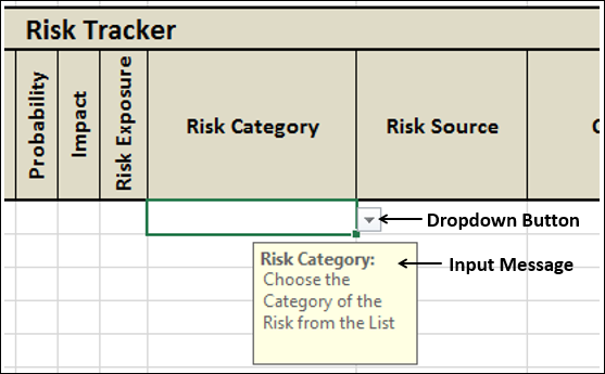
The input message is correctly displayed.
Click on the dropdown button on the right side of the cell. The drop-down list appears with the values that can be selected.
Cross-check the values in the drop-down list with those that are used to create the drop-down list.
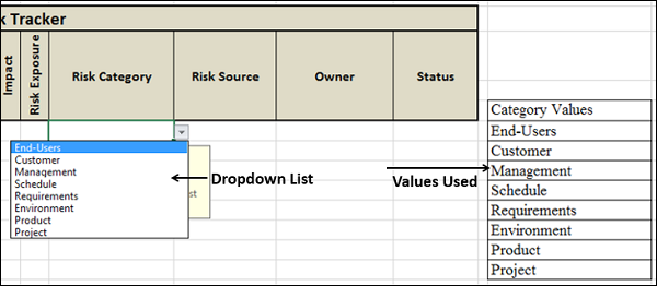
Both the sets of values match. Note that if the number of values is more, you will get a scroll-down bar on the right side of the dropdown list.
Select a value from the dropdown list. It appears in the cell.
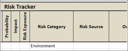
You can see that the selection of valid values is working fine.
Finally, try to enter an invalid entry and verify the Error alert.
Type People in the cell and press Enter. Error message that you have set for the cell will be displayed.
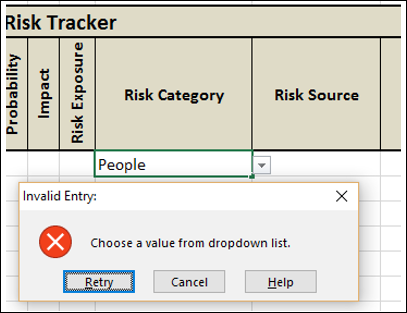
- Verify the Error message.
- You have an option to either Retry or Cancel. Verify both the options.
You have successfully set the Data Validation for the cell.
Note − It is very important to check the spelling and grammar of your messages.
Set Valid Criteria for the Risk Category Column
Now, you are ready to apply the Data Validation criteria to all the cells in the Risk Category column.
At this point, you need to remember two things −
You need to set the criteria for maximum number of cells that are possible to be used. In our example, it can vary from 10 100 based on where the worksheet will be used.
You should not set the criteria for unwanted range of cells or for the entire column. This will unnecessarily increases the file size. It is called excess formatting. If you get a worksheet from an outside source, you have to remove the excess formatting, which you will learn in the chapter on Inquire in this tutorial.
Follow the steps given below −
- Set the validation criteria for 10 cells under Risk Category.
- You can easily do this by clicking on the right-bottom corner of the first cell.
- Hold on the + symbol that appears and pull it down.
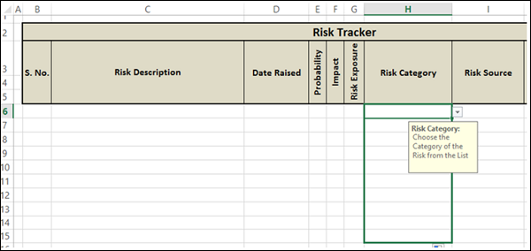
Data Validation is set for all the selected cells.
Click the last column that is selected and verify.
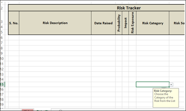
Data Validation for the column Risk Category is complete.
Set Validation Values for Risk Source
In this case, we have only two values Internal and External.
- Click in the first cell under the column Risk Source (I6)
- Click the DATA tab on the Ribbon
- Click Data Validation in the Data Tools group
- Select Data Validation from the drop-down list.
Data Validation dialog box appears.
- Click the Settings tab.
- Under Validation criteria, in the Allow: drop-down list, select the option List.
- Type Internal, External in the Source: box that appears.
- Check the boxes Ignore blank and In-cell dropdown that appear.
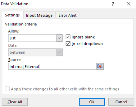
Set Input Message for Risk Source.
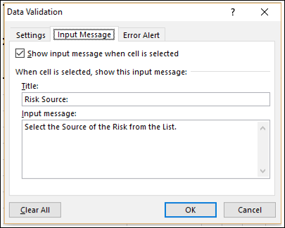
Set Error Alert for Risk Source.
For the selected first cell under Risk Source −
- Data Validation criteria is set
- Input message is set
- Error alert is set
Now, you can verify your settings.
Click in the cell for which you have set Data Validation criteria. Input message appears. The drop-down button appears on the right side of the cell.
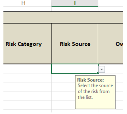
The input message is displayed correctly.
Click the drop-down arrow button on the right side of the cell. A drop-down list appears with the values that can be selected.
Check if the values are the same as you typed Internal and External.
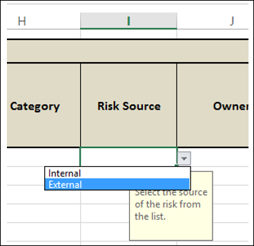
Both the sets of values match. Select a value from the drop-down list. It appears in the cell.
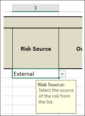
You can see that the selection of valid values is working fine. Finally, try to enter an invalid entry and verify the Error alert.
Type Financial in the cell and press Enter. Error message that you have set for the cell will be displayed.
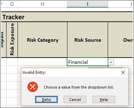
Verify the Error message. You have successfully set the Data Validation for the cell.
Set valid criteria for the Risk Source Column
Apply the Data Validation criteria to the cells I6 - I15 in the Risk Source column (i.e. same range as that of Risk Category column).
Data Validation is set for all the selected cells. Data Validation for the column Risk Source is complete.
Set Validation Values for Status
Repeat the same steps that you used for setting Validation values for Risk Source.
Set the List values as Open, Closed.
Apply the Data Validation criteria to the cells K6 - K15 in the Status column (i.e. same range as that of Risk Category column).
Data Validation is set for all the selected cells. Data Validation for the column status is complete.
Set Validation Values for Probability
Risk Probability Score values are in the range 1-5, 1 being low and 5 being high. The value can be any integer between 1 and 5, both inclusive.
- Click in the first cell under the column Risk Source (I6).
- Click the DATA tab on the Ribbon.
- Click Data Validation in the Data Tools group.
- Select Data Validation from the drop-down list.
The Data Validation dialog box appears.
- Click the Settings tab.
- Under Validation criteria, in the Allow: drop-down list, select Whole number.
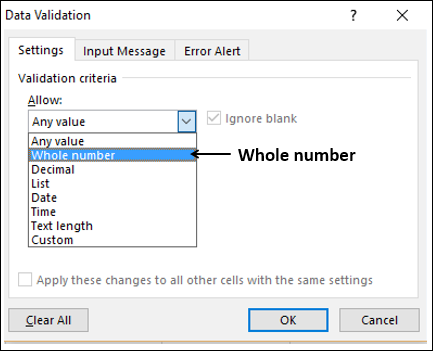
- Select between under Data:
- Type 1 in the box under Minimum:
- Type 5 in the box under Maximum:
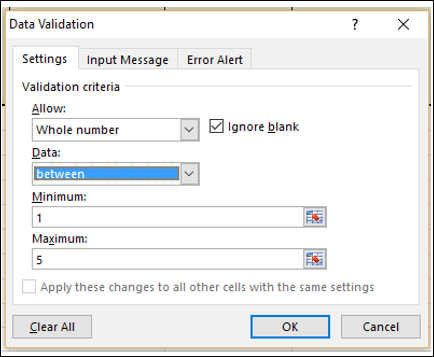
Set Input Message for Probability
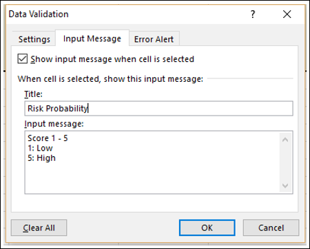
Set Error Alert for Probability and click OK.
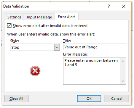
For the selected first cell under Probability,
- Data Validation criteria is set.
- Input message is set.
- Error alert is set.
Now, you can verify your settings.
Click on the cell for which you have set Data Validation criteria. Input message appears. In this case, there will not be a dropdown button because the input values are set to be in a range and not from list.
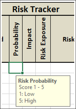
The input message is correctly displayed.
Enter an integer between 1 and 5 in the cell. It appears in the cell.
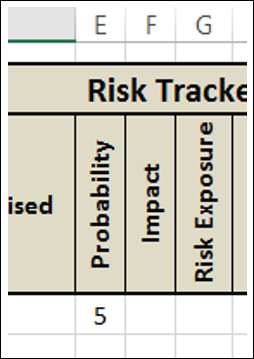
Selection of valid values is working fine. Finally, try to enter an invalid entry and verify the Error alert.
Type 6 in the cell and press Enter. The Error message that you have set for the cell will be displayed.
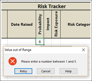
You have successfully set the Data Validation for the cell.
Set valid criteria for the Probability Column.
Apply the Data Validation criteria to the cells E6 - E15 in the Probability column (i.e. same range as that of Risk Category column).
Data Validation is set for all the selected cells. Data Validation for the column Probability is complete.
Set Validation Values for Impact
To set the validation values for Impact, repeat the same steps that you used for setting validation values for probability.
Apply the Data Validation criteria to the cells F6 - F15 in the Impact column (i.e. same range as that of Risk Category column).
Data Validation is set for all the selected cells. Data Validation for the column Impact is complete.
Set the Column Risk Exposure with Calculated Values
Risk Exposure is calculated as a product of Risk Probability and Risk Impact.
Risk Exposure = Probability * Impact
Type =E6*F6 in cell G6 and press Enter.
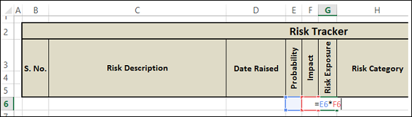
0 will be displayed in the cell G6 as E6 and F6 are empty.
Copy the formula in the cells G6 G15. 0 will be displayed in the cells G6 - G15.
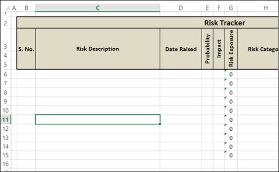
As the Risk Exposure column is meant for calculated values, you should not allow data entry in that column.
Select cells G6-G15
Right-click and in the dropdown list that appears, select Format Cells. The Format Cells dialog box appears.
Click the Protection tab.
Check the option Locked.
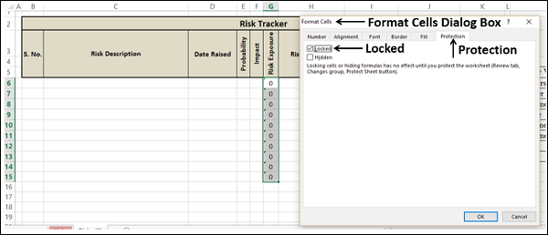
This is to ensure that data entry is not allowed in those cells. However, this will come into effect only when the worksheet is protected, which you will do as the last step after the worksheet is ready.
- Click OK.
- Shade the cells G6-G15 to indicate they are calculated values.
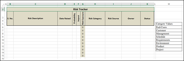
Format Serial Number Values
You can leave it to the user to fill in the S. No. Column. However, if you format the S. No. values, the worksheet looks more presentable. In addition, it shows for how many rows the worksheet is formatted.
Type =row()-5 in the cell B6 and press Enter.
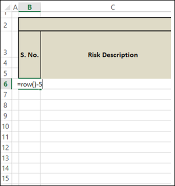
1 will appear in cell B6. Copy the formula in the cells B6-B15. Values 1-10 appear.
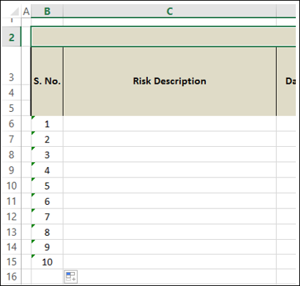
Shade the cells B6-B15.
Wrap-up
You are almost done with your project.
- Hide Column M that contains Data Category values.
- Format Borders for the cells B6-K16.
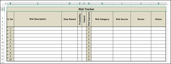
- Right-click on the worksheet tab.
- Select Protect Sheet from the menu.
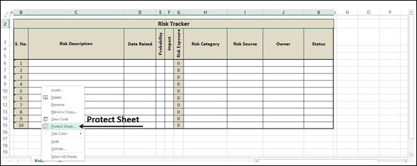
The Protect Sheet dialog box appears.
- Check the option Protect worksheet and contents of locked cells.
- Type in a password under Password to unprotect sheet −
- Password is case sensitive
- Protected sheet cannot be recovered if password is forgotten
- It is a good practice to keep a list of worksheet names and passwords somewhere
- Under Allow all users of this worksheet to: check the box Select unlocked cells.
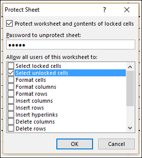
You have protected the locked cells in the column Risk Exposure from data entry and kept the rest of the unlocked cells editable. Click OK.
The Confirm Password dialog box appears.
- Re-enter the password.
- Click OK.
Your worksheet with Data Validation set for selected cells is ready to use.
Excel Data Financial Analysis
You can perform financial analysis with Excel in an easy way. Excel provides you several financial functions such as PMT, PV, NPV, XNPV, IRR, MIRR, XIRR, and so on that enable you to quickly arrive at the financial analysis results.
In this chapter, you will learn where and how you can use these functions for your analysis.
What is Annuity?
An annuity is a series of constant cash payments made over a continuous period. For example, savings for retirement, insurance payments, home loan, mortgage, etc. In annuity functions −
- A positive number represents cash received.
- A negative number represents cash paid out.
Present Value of a series of Future Payments
The present value is the total amount that a series of future payments is worth now. You can calculate the present value using the Excel functions −
PV − Calculates the present value of an investment by using an interest rate and a series of future payments (negative values) and income (positive values). At least one of the cash flows must be positive and at least one must be negative.
NPV − Calculates the net present value of an investment by using a discount rate and a series of periodic future payments (negative values) and income (positive values).
XNPV − Calculates the net present value for a schedule of cash flows that is not necessarily periodic.
Note that −
PV cash flows must be constant whereas NPV cash flows can be variable.
PV cash flows can be either at the beginning or at the end of the period whereas NPV cash flows must be at the end of the period.
NPV cash flows must be periodic whereas XNPV cash flows need not be periodic.
In this section, you will understand how to work with PV. You will learn about NPV in a later section.
Example
Suppose you are buying a refrigerator. The salesperson tells you that the price of the refrigerator is 32000, but you have an option to pay out the amount in 8 years with an interest rate of 13% per annum and yearly payments of 6000. You also have an option to make the payments either at the beginning or end of each year.
You want to know which of these options is beneficial for you.
You can use Excel function PV −
PV (rate, nper, pmt, [fv ], [type])
To calculate present value with payments at the end of each year, omit type or specify 0 for type.
To calculate present value with payments at the end of each year, specify 1 for type.
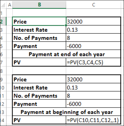
You will get the following results −
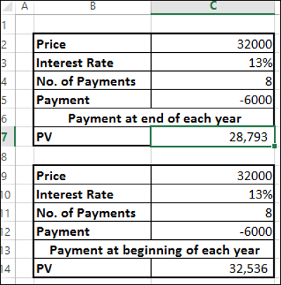
Therefore,
- If you make the payment now, you need to pay 32,000 of present value.
- If you opt for yearly payments with payment at the end of the year, you need to pay 28, 793 of present value.
- If you opt for yearly payments with payment at the end of the year, you need to pay 32,536 of present value.
You can clearly see that option 2 is beneficial for you.
What is EMI?
An Equated Monthly Installment (EMI) is defined by Investopedia as "A fixed payment amount made by a borrower to a lender at a specified date each calendar month. Equated monthly installments are used to pay off both interest and principal each month, so that over a specified number of years, the loan is paid off in full."
EMI on a Loan
In Excel, you can calculate the EMI on a loan with the PMT function.
Suppose, you want to take a home loan of 5000000 with an annual interest rate of 11.5% and the term of the loan for 25 years. You can find your EMI as follows −
- Calculate interest rate per month (Interest Rate per Annum/12)
- Calculate number of monthly payments (No. of years * 12)
- Use PMT function to calculate EMI
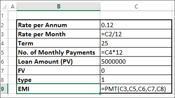
As you observe,
- Present Value (PV) is the loan amount.
- Future Value (FV) is 0 as at the end of the term the loan amount should be 0.
- Type is 1 as the EMIs are paid at the beginning of each month.
You will get the following results −
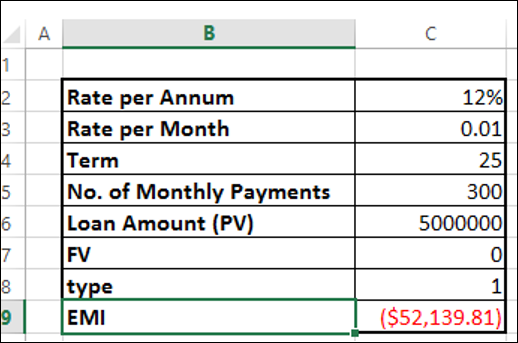
Monthly Payment of Principal and Interest on a Loan
EMI includes both-interest and a part payment of principal. As the time increases, these two components of EMI will vary, reducing the balance.
To get
The interest part of your monthly payments, you can use the Excel IPMT function.
The payment of principal part of your monthly payments, you can use the Excel PPMT function.
For example, if you have taken a loan of 1,000,000 for a term of 8 months at the rate of 16% per annum. You can get values for the EMI, the decreasing interest amounts, the increasing payment of principal amounts and the diminishing loan balance over the 8 months. At the end of 8 months, loan balance will be 0.
Follow the procedure given below.
Step 1 − Calculate the EMI as follows.
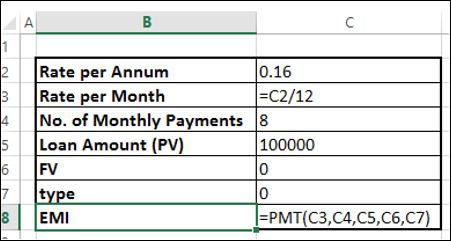
This results in an EMI of Rs. 13261.59.
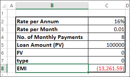
Step 2 − Next calculate the interest and principal parts of the EMI for the 8 months as shown below.
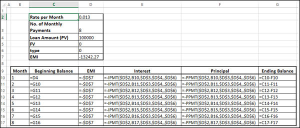
You will get the following results.
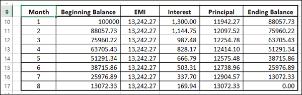
Interest and Principal paid between two Periods
You can compute the interest and principal paid between two periods, inclusive.
Compute the cumulative interest paid between 2nd and 3rd months using the CUMIPMT function.
Verify the result summing up the interest values for 2nd and 3rd months.
Compute the cumulative principal paid between 2nd and 3rd months using the CUMPRINC function.
Verify the result summing up the principal values for 2nd and 3rd months.
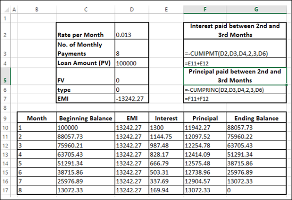
You will get the following results.
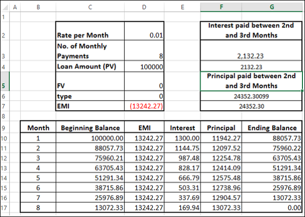
You can see that your calculations match with your verification results.
Calculating Interest Rate
Suppose you take a loan of 100,000 and you want to pay back in 15 months with a maximum monthly payment of 12000. You might want to know the interest rate at which you have to pay.
Find the interest rate with the Excel RATE function −
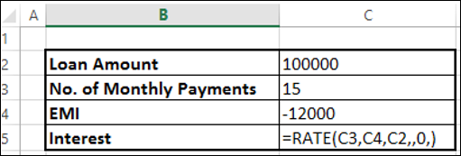
You will get the result as 8%.
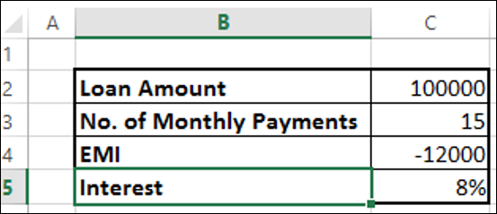
Calculating Term of Loan
Suppose you take a loan of 100,000 at the interest rate 10%. You want a maximum monthly payment of 15,000. You might want to know how long it will take for you to clear the loan.
Find the number of payments with Excel NPER function
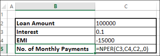
You will get the result as 12 months.
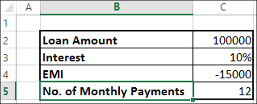
Decisions on Investments
When you want to make an investment, you compare the different options and choose the one that yields better returns. Net present value is useful in comparing cash flows over a period of time and deciding which one is better. The cash flows can occur at regular, periodical intervals or at irregular intervals.
First, we consider the case of regular, periodical cash flows.
The net present value of a sequence of cash flows received at different points in time in n years from now (n can be a fraction) is 1/(1 + r)n, where r is the annual interest rate.
Consider the following two investments over a period of 3 years.
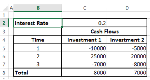
At face value, Investment 1 looks better than Investment 2. However, you can decide on which investment is better only when you know the true worth of the investment as of today. You can use the NPV function to calculate the returns.
The cash flows can occur
- At the end of every year.
- At the beginning of every year.
- In the middle of every year.
NPV function assumes that the cash flows are at the end of the year. If the cash flows occur at different times then you have to take into account that particular factor along with the calculation with NPV.
Suppose the cash flows occur at the end of the year. Then you can straight away use the NPV function.
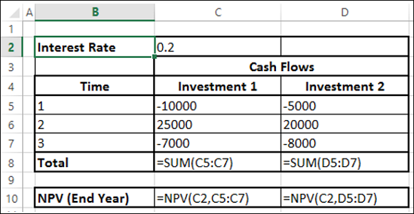
You will get the following results −
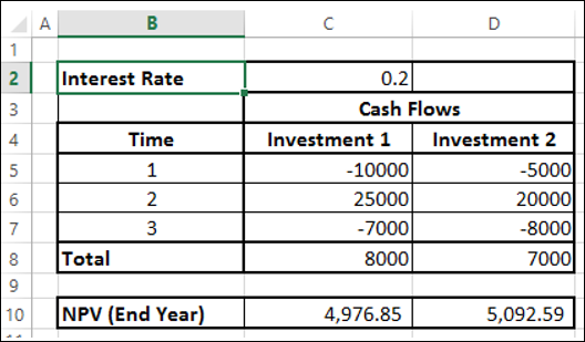
As you observe NPV for Investment 2 is higher than that for Investment 1. Hence, Investment 2 is a better choice. You got this result as cash out flows for Investment 2 are at later periods as compared to that of Investment 1.
Cash Flows at the Beginning of the Year
Suppose the cash flows occur at the beginning of every year. In such a case, you should not include the first cash flow in NPV calculation as it already represents the current value. You need to add the first cash flow to the NPV obtained from rest of the cash flows to get the net present value.
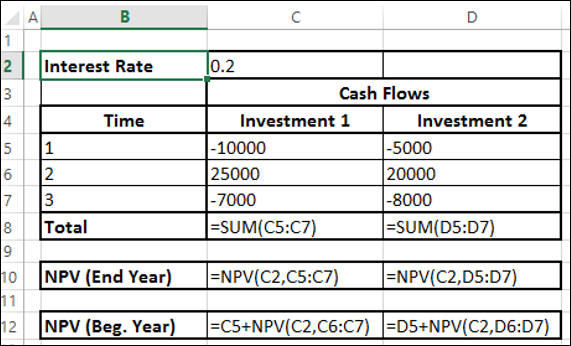
You will get the following results −
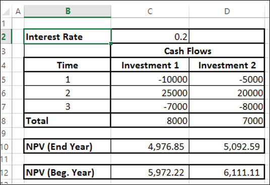
Cash Flows in the Middle of the Year
Suppose the cash flows occur in the middle of every year. In such a case, you need to multiply the NPV obtained from the cash flows by $\sqrt{1+r}$ to get the net present value.
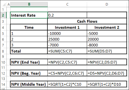
You will get the following results −
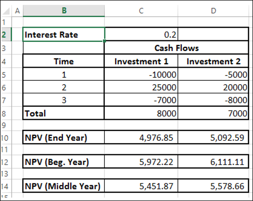
Cash Flows at Irregular Intervals
If you want to calculate the net present value with irregular cash flows, i.e. cash flows occurring at random times, the calculation is a bit complex.
However, in Excel, you can easily do such a calculation with XNPV function.
- Arrange your data with the dates and the cash flows.
Note − The first date in your data should be the earliest of all the dates. The other dates can occur in any order.
- Use the XNPV function to calculate the net present value.
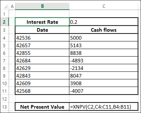
You will get the following results −
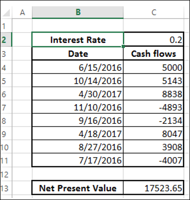
Suppose todays date is 15th March, 2015. As you observe, all the dates of cash flows are of later dates. If you want to find the net present value as of today, include it in the data at the top and specify 0 for the cash flow.
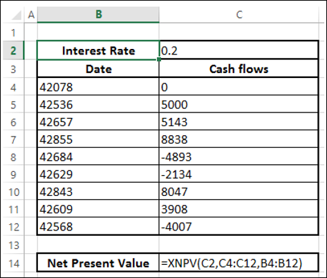
You will get the following results −
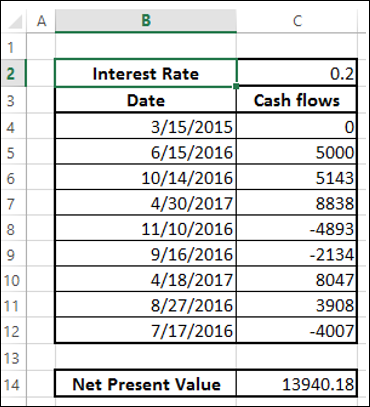
Internal Rate of Return (IRR)
Internal Rate of Return (IRR) of an investment is the rate of interest at which NPV is 0. It is the rate value for which the present values of the positive cash flows exactly compensate the negative ones. When the discount rate is the IRR, the investment is perfectly indifferent, i.e. the investor is neither gaining nor losing money.
Consider the following cash flows, different interest rates and the corresponding NPV values.
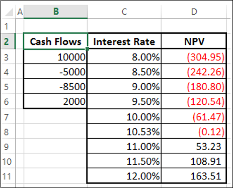
As you can observe between the values of interest rate 10% and 11%, the sign of NPV changes. When you fine-tune the interest rate to 10.53%, NPV is nearly 0. Hence, IRR is 10.53%.
Determining IRR of Cash Flows for a Project
You can calculate IRR of cash flows with Excel function IRR.
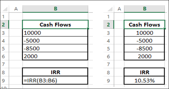
The IRR is 10.53% as you had seen in the previous section.
For the given cash flows, IRR may −
- exist and unique
- exist and multiple
- not exist
Unique IRR
If IRR exists and is unique, it can be used to choose the best investment among several possibilities.
If the first cash flow is negative, it means the investor has the money and wants to invest. Then, the higher the IRR the better, since it represents the interest rate the investor is receiving.
If the first cash flow is positive, it means the investor needs money and is looking for a loan, the lower the IRR the better since it represents the interest rate the investor is paying.
To find if an IRR is unique or not, vary the guess value and calculate IRR. If IRR remains constant then it is unique.
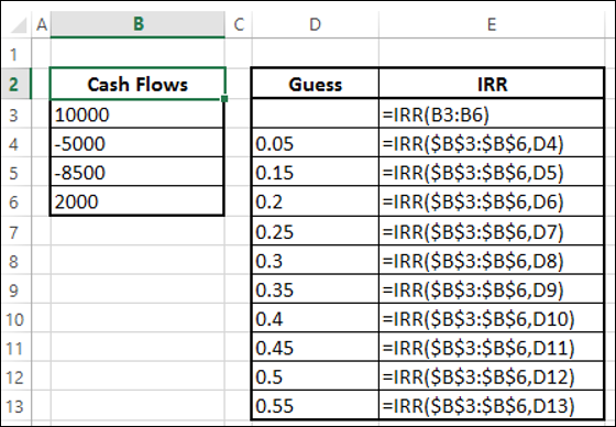
As you observe, the IRR has a unique value for the different guess values.
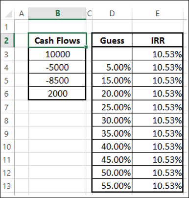
Multiple IRRs
In certain cases, you may have multiple IRRs. Consider the following cash flows. Calculate IRR with different guess values.
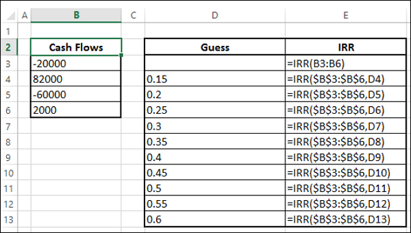
You will get the following results −
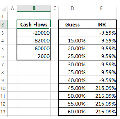
You can observe that there are two IRRs - -9.59% and 216.09%. You can verify these two IRRs calculating NPV.
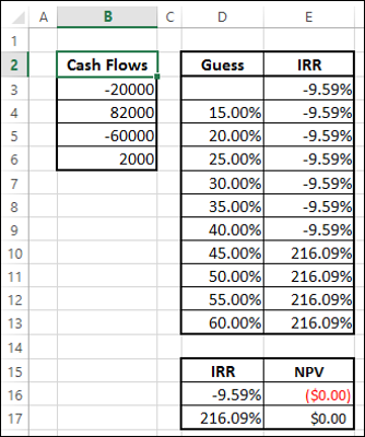
For both -9.59% and 216.09%, NPV is 0.
No IRRs
In certain cases, you may not have IRR. Consider the following cash flows. Calculate IRR with different guess values.
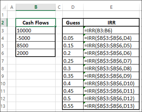
You will get the result as #NUM for all the guess values.
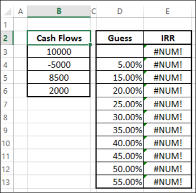
The result #NUM means that there is no IRR for the cash flows considered.
Cash Flows Patterns and IRR
If there is only one sign change in the cash flows, such as from negative to positive or positive to negative, then a unique IRR is guaranteed. For example, in capital investments, the first cash flow will be negative, while the rest of the cash flows will be positive. In such cases, unique IRR exists.
If there is more than one sign change in the cash flows, IRR may not exist. Even if it exists, it may not be unique.
Decisions based on IRRs
Many analysts prefer to use IRR and it is a popular profitability measure because, as a percentage, it is easy to understand and easy to compare to the required return. However, there are certain problems while making decisions with IRR. If you rank with IRRs and make decisions based on these ranks, you may end up with wrong decisions.
You have already seen that NPV will enable you to make financial decisions. However, IRR and NPV will not always lead to the same decision when projects are mutually exclusive.
Mutually exclusive projects are those for which the selection of one project precludes the acceptance of another. When projects that are being compared are mutually exclusive, a ranking conflict may arise between NPV and IRR. If you have to choose between project A and project B, NPV may suggest acceptance of project A whereas IRR may suggest project B.
This type of conflict between NPV and IRR may arise because of one of the following reasons −
- The projects are of greatly different sizes, or
- The timing of the cash flows are different.
Projects of significant size difference
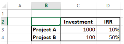
If you want to make a decision by IRR, project A yields a return of 100 and Project B a return of 50. Hence, investment on project A looks profitable. However, this is a wrong decision because of the difference in the scale of projects.
Consider −
You have 1000 to invest.
If you invest entire 1000 on project A, you get a return of 100.
If you invest 100 on project B, you will still have 900 in your hand that you can invest on another project, say project C. Suppose you get a return of 20% on project C, then the total return on project B and project C is 230, which is way ahead in profitability.
Thus, NPV is a better way for decision making in such cases.
Projects with different cash flows timings
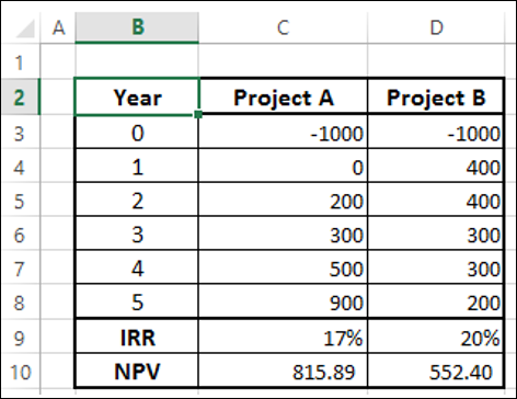
Again, if you consider IRR to decide, project B would be the choice. However, project A has a higher NPV and is an ideal choice.
IRR of Irregularly Spaced Cash Flows (XIRR)
Your cash flows may sometimes be irregularly spaced. In such a case, you cannot use IRR as IRR requires equally spaced time intervals. You can use XIRR instead, which takes into account the dates of the cash flows along with the cash flows.
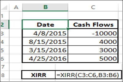
The Internal Rate of Return that results in is 26.42%.
Modified IRR (MIRR)
Consider a case when your finance rate is different from your reinvestment rate. If you calculate Internal Rate of Return with IRR, it assumes same rate for both finance and reinvestment. Further, you might also get multiple IRRs.
For example, consider the cash flows given below −
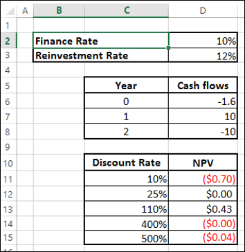
As you observe, NPV is 0 more than once, resulting in multiple IRRs. Further, reinvestment rate is not taken into account. In such cases, you can use modified IRR (MIRR).
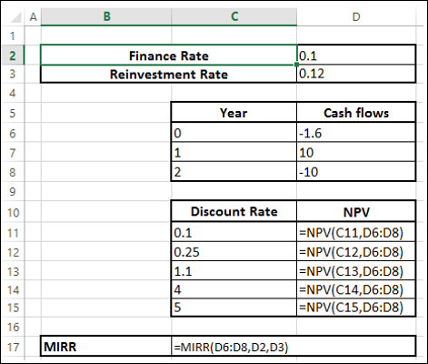
You will get a result of 7% as shown below −
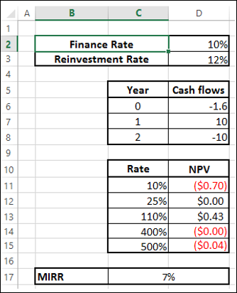
Note − Unlike IRR, MIRR will always be unique.
Working with Multiple Sheets
In certain situations, you might have to
- Set up workbooks in which several worksheets have a similar format or structure.
- Get information for these worksheets from another worksheet.
- Summarize the results from these worksheets into a summary worksheet.
For example, you might have to track sales information region wise and month wise in separate worksheets. The price of each product is taken from the product catalog that is set up across the company in a separate worksheet. Finally, you have to summarize the results across all the regions into a summary sheet.
In this chapter, you will learn how you can accomplish this in easy steps. You are going to summarize results from April 2015 to March 2016, i.e. financial year 2015-16.
The First Step
The first step is to set up a product catalog. Follow the steps given below −
- Start with a blank workbook.
- Set up product catalog worksheet with products and prices.
- Name the worksheet Product Catalog.
- Assume the catalog is revised on the first of every month.
- Provide a place holder for last updated on.
The price of a product at selling time is determined by the current cost of the product.
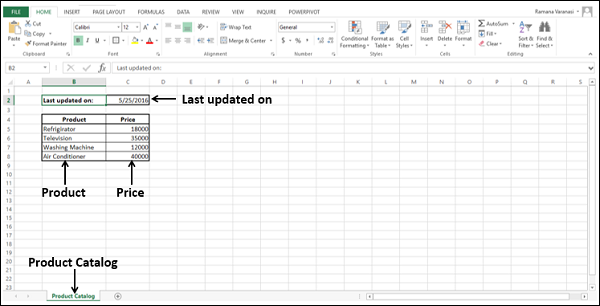
Multiple Worksheets with same Structure
Next, you have to set up worksheets for the Regions East, North, South, and West, in that order with same structure.
- Add 4 blank worksheets.
- Name the worksheets East, North, South and West.
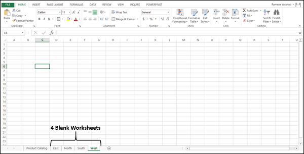
These four worksheets should have the same structure.
- Click the tab East. The East worksheet opens.
- Press the shift key and click on the tab West. All the 4 tabs will be selected.
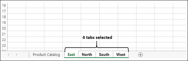
Now, whatever editing you do in the East worksheet will get automatically reflected in the other three selected worksheets.
In the East worksheet,
- Add the column headers S. No., Month, Product, Price, No. of Units, Total Amount.
- Add the S. No., Month April and the 4 Product Names.
- Format the Table.
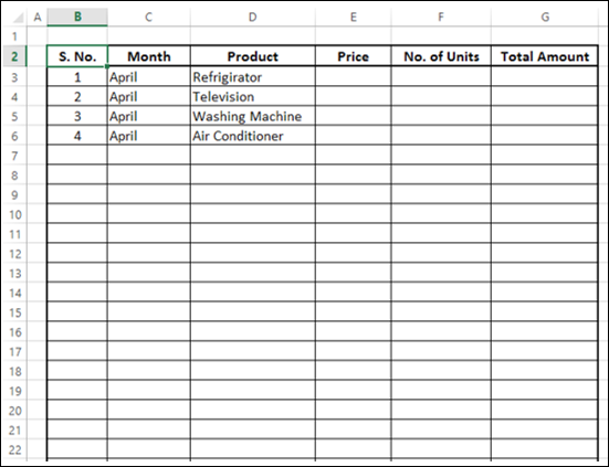
The same structure appears in the other worksheets North, South and West.
Creating a Formula across Multiple Worksheets
To create a formula across multiple worksheets −
- Define names for the price values of the products in the product catalog worksheet.
- Set the Scope as Workbook for all the names.
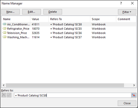
- Once again select all the four worksheets East, North, South and West.
- In the East worksheet, for each product, in the price column, give the formula as the Price Value Name.
As we defined earlier, the price of a product is as per the product catalog that is updated on the first of every month.
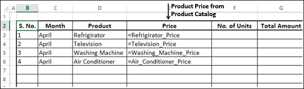
- Repeat the same steps for each Month
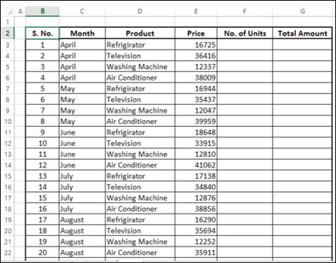
Therefore, for the worksheets for the regions East, North, South, and West, you have successfully set the same structure and placed the price information for each product based on the month from product catalog worksheet.
The Product Catalog can be in another Workbook too.
Calculations in the Worksheets
The next step is to fill in the information of No. of Units sold for each Product in each Month and in each Region. Therefore, you need to work separately on these worksheets.
For each region, for each product −
- Fill No. of Units sold.
- Calculate the corresponding Total Amount as Price*No. of Units.
In each worksheet (East, North, South and West), calculate subtotals month-wise −
Note − You can use Subtotal on a single worksheet but not on multiple worksheets. Hence, you have to repeat this step for North, South and West worksheets.
Click the Outline Level 2. You will get all month-wise Totals.
Now, you are ready to summarize the results from all the four worksheets East, North, South and West.
Summarizing Data in Multiple Worksheets
The following steps will show you how to summarize data from multiple worksheets.
- Add a worksheet and name it Summary.
- Create the structure for Summary worksheet.
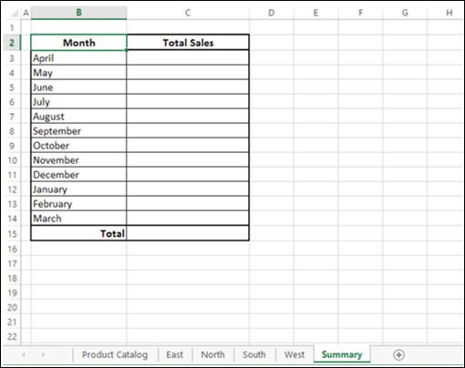
In the column- Total Sales, in the cell C3, type =sum(
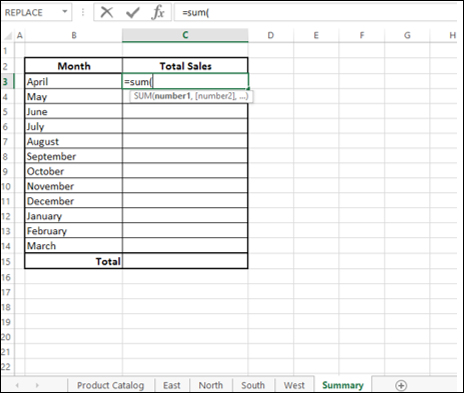
- Select the worksheet East.
- Select the cell G7.
- With East tab pressed, click the tab West.
- The tabs East to West get selected.
- The formula in the formula bar appears as
=sum(East:West!G7)
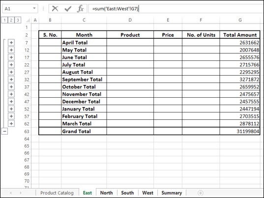
Note that you are still in the East worksheet. Press Enter.
You will be in the Summary worksheet. In the formula bar, you will see the formula as
=SUM(East:West!G7)
The calculated value appears in the cell C3.
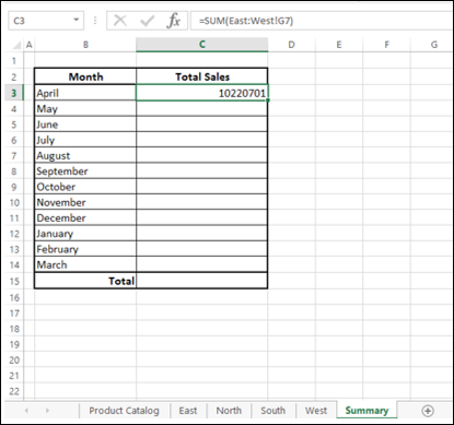
- Copy the formula to the cells C4 to C14.
- Click Show Formulas in the Formula Auditing group under the FORMULAS tab.
All the formulas in the column Total Sales appear.
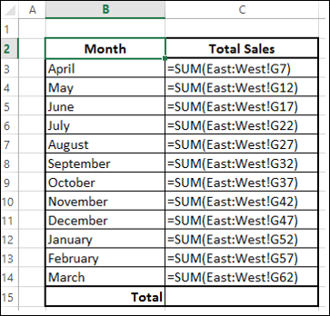
This is exactly how you wanted to summarize the results from each region.
- Click in the cell C15.
- Type =sum(C3:C14)
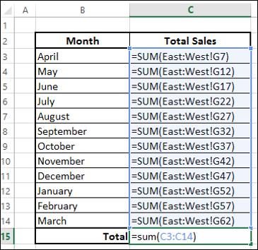
Your summarized results are ready in the Summary worksheet.
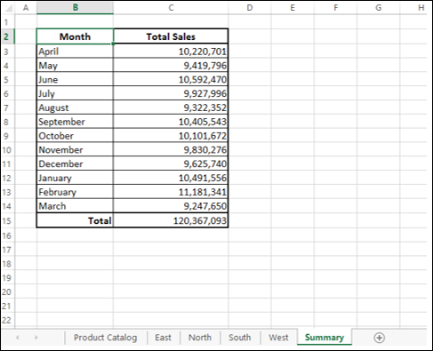
Excel Data Analysis - Formula Auditing
You might want to check formulas for accuracy or find the source of an error. Excel Formula Auditing commands provide you an easy way to find
- Which cells are contributing in the calculation of a formula in the active cell.
- Which formulas are referring to the active cell.
These findings are shown graphically by arrow lines that makes the visualization easy. You can display all the formulas in the active worksheet with a single command. If your formulas refer to cells in a different workbook, open that workbook also. Excel cannot go to a cell in a workbook that is not open.
Setting the Display Options
You need to check whether the display options for the workbooks you are using are correctly set.
- Click FILE > Options.
- In the Excel Options dialog box, click Advanced.
- In Display options for the workbook −
- Select the workbook.
- Check that under For objects, show, All is selected.
- Repeat this step for all the workbooks you are auditing.
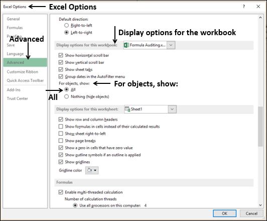
Tracing Precedents
Precedent cells are those cells that are referred to by a formula in the active cell.
In the following example, the active cell is C2. In C2, you have the formula =B2*C4.
B2 and C4 are precedent cells for C2.
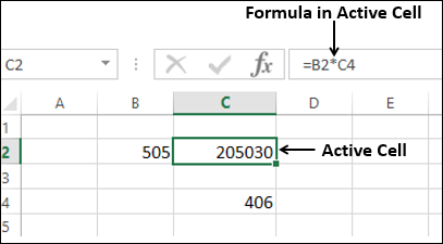
To trace the precedents of the cell C2,
- Click in the cell C2.
- Click the Formulas tab.
- Click Trace Precedents in the Formula Auditing group.
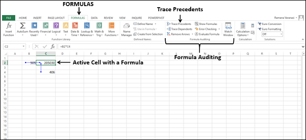
Two arrows, one from B2 to C2 and another from C4 to C2 will be displayed, tracing the precedents.
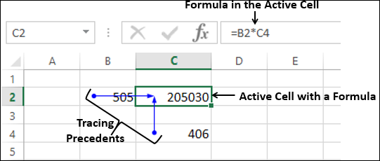
Note that for tracing precedents of a cell, the cell should have a formula with valid references. Otherwise, you will get an error message.
- Click in a cell that does not contain a formula or click in an empty cell.
- Click Trace Precedents in the Formula Auditing group.
You will get a message.
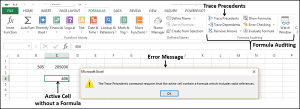
Removing Arrows
Click Remove Arrows in the Formula Auditing group.

All the arrows in the worksheet will disappear.
Tracing Dependents
Dependent cells contain formulas that refer to other cells. That means, if the active cell contributes to a formula in another cell, the other cell is a dependent cell on the active cell.
In the example below, C2 has the formula =B2*C4. Therefore, C2 is a dependent cell on the cells B2 and C4
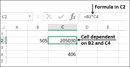
To trace the dependents of the cell B2,
- Click in the cell B2.
- Click the Formulas tab.
- Click Trace Dependents in the Formula Auditing group.
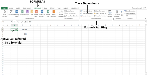
An arrow appears from B2 to C2, showing C2 is dependent on B2.
To trace the dependents of the cell C4 −
- Click in the cell C4.
- Click the Formula tab > Trace Dependents in the Formula Auditing group.
Another arrow appears from C4 to C2, showing C2 is dependent on C4 also.
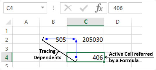
Click Remove Arrows in the Formula Auditing group. All the arrows in the worksheet will disappear.
Note − For tracing dependents of a cell, the cell should be referenced by a formula in another cell. Otherwise, you will get an error message.
- Click in the cell B6 is not referenced by any formula or click in any empty cell.
- Click Trace Dependents in the Formula Auditing group. You will get a message.
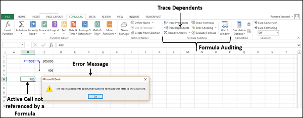
Working with Formulae
You have understood the concept of Precedents and Dependents. Now, consider a worksheet with several formulae.
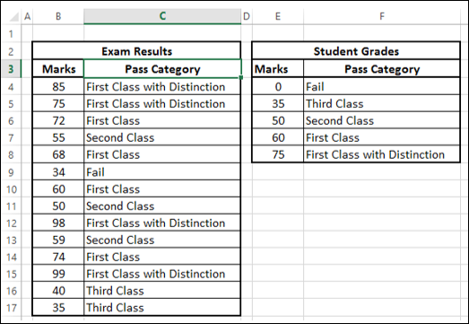
- Click in a cell under Pass Category in Exam Results table.
- Click Trace Precedents. The cell to its left (Marks) and the range E4:F8 will be mapped as the precedents.
- Repeat for all the cells under Pass Category in Exam Results table.
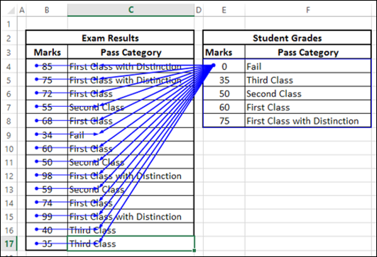
Click in a cell under Pass Category in Student Grades table.
Click Trace Dependents. All the cells under Pass Category in Exam Results table will be mapped as the dependents.
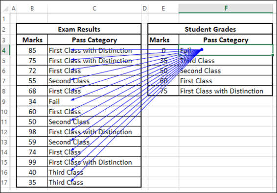
Showing Formulas
The worksheet below contains the summary of sales by the salespersons in the regions East, North, South, and West.
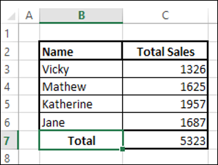
Click the FORMULAS tab on the Ribbon.
Click Show Formulas in the Formula Auditing group. The Formulas in the worksheet will appear, so that you will know which cells contain formulas and what the formulas are.
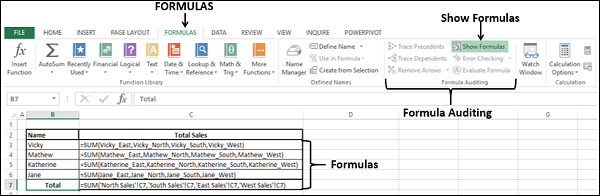
Click in a cell under TotalSales.
Click Trace Precedents. A worksheet icon appears at the end of the arrow. The worksheet icon indicates that the precedents are in a different worksheet.
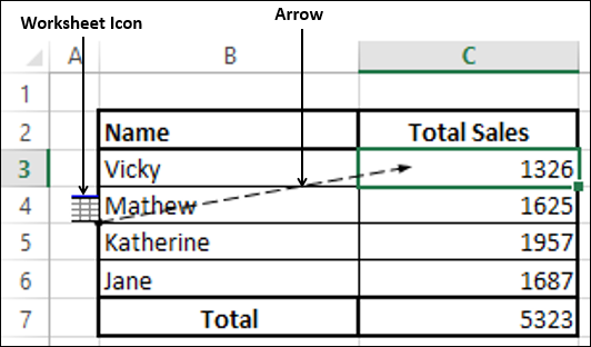
Double-click on the arrow. A Go TO dialog box appears, showing the precedents.
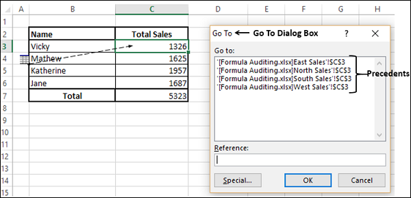
As you observe, there are four precedents, on four different worksheets.
- Click a reference of one of the precedents.
- The reference appears in the Reference box.
- Click OK. The worksheet containing that precedent appears.
Evaluating a Formula
To find how a complex formula in a cell works step by step, you can use Evaluate Formula command.
Consider the formula NPV (Middle Year) in the cell C14. The formula is
=SQRT (1 + C2)*C10
- Click in the cell C14.
- Click the FORMULAS tab on the Ribbon.
- Click Evaluate Formula in the Formula Auditing group. The Evaluate Formula dialog box appears.
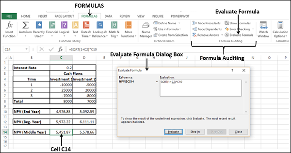
In the Evaluate Formula dialog box, the formula is displayed in the box under Evaluation. By clicking the Evaluate button several times, the formula gets evaluated step-wise. The expression with an underline will always be executed next.
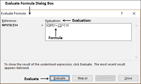
Here, C2 is underlined in the formula. So, it is evaluated in the next step. Click Evaluate.
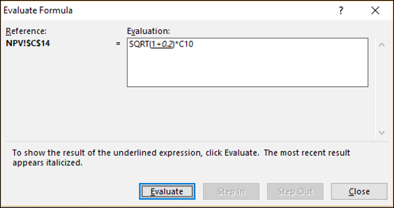
Cell C2 has value 0.2. Hence, C2 will be evaluated as 0.2. 1+0.2 is underlined showing it as the next step. Click Evaluate.
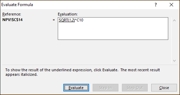
1+0.2 will be evaluated as 1.2. SQRT(1.2) is underlined showing it as next step. Click Evaluate.
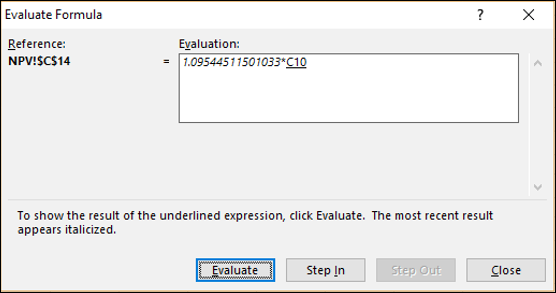
SQRT(1.2) will be evaluated as 1.09544511501033. C10 is underlined showing it as next step. Click Evaluate.
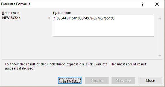
C10 will be evaluated as 4976.8518518515.
1.09544511501033*4976.8518518515 is underlined showing it as next step. Click Evaluate.
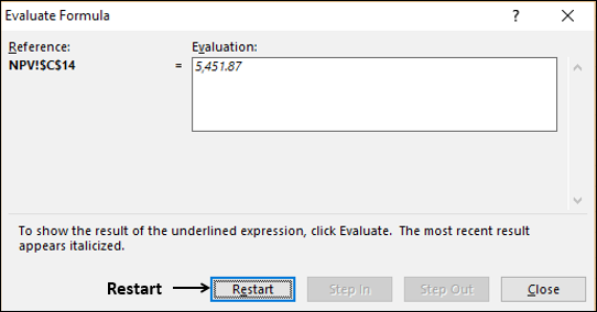
1.09544511501033*4976.8518518515 will be evaluated as 5,451.87.
There are no more expressions to evaluate and this is the answer. The Evaluate button will be changed to Restart button, indicating completion of evaluation.
Error Checking
It is a good practice to do an error check once your worksheet and/or workbook is ready with calculations.
Consider the following simple calculations.
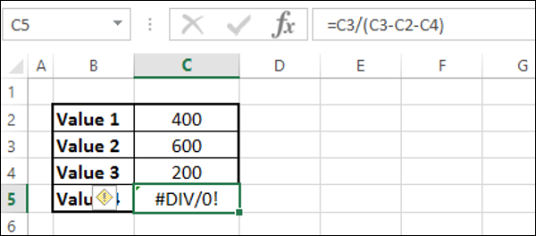
The calculation in the cell has resulted in the error #DIV/0!.
Click in the cell C5.
Click the FORMULAS tab on the Ribbon.
Click the arrow next to Error Checking in the Formula Auditing group. In the drop-down list, you will find that Circular References is deactivated, indicating that your worksheet has no circular references.
Select Trace Error from the drop-down list.
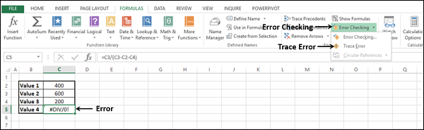
The cells needed to compute the active cell are indicated by blue arrows.
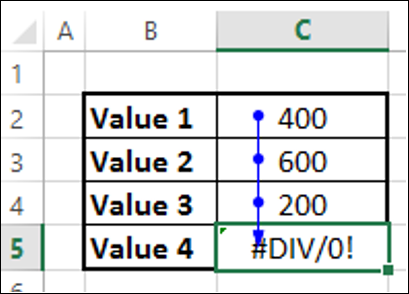
- Click Remove Arrows.
- Click the arrow next to Error Checking.
- Select Error Checking from the drop-down list.
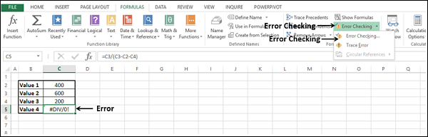
The Error Checking dialog box appears.
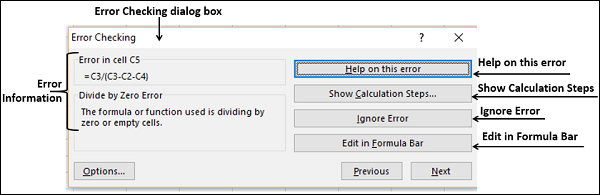
Observe the following −
If you click Help on this error, Excel help on the error will be displayed.
If you click Show Calculation Steps, Evaluate Formula dialog box appears.
If you click Ignore Error, the Error Checking dialog box closes and if you click Error Checking command again, it ignores this error.
If you click Edit in Formula Bar, you will be taken to the formula in the formula bar, so that you can edit the formula in the cell.
Excel Data Analysis - Inquire
You can use Inquire to −
- Compare two workbooks.
- Analyze a workbook for problems or inconsistencies.
- View the links between workbooks.
- View the links between worksheets.
- View the relationships between cells.
- Clean excess cell formatting.
- Manage passwords.
The INQUIRE tab will be on the Ribbon. If you find the INQUIRE tab on the Ribbon, you can skip to the next section.
If you do not find the INQUIRE tab on the Ribbon, make the Inquire Add-in active.
- Click File > Options.
- In Excel Options window, click on Add-Ins.
- In Manage box, click on COM Add-ins.
- Click Go.
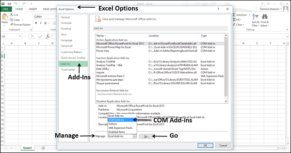
COM Add-Ins dialog box appears.
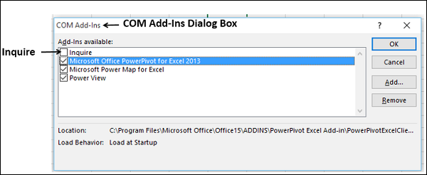
- Check the Inquire box.
- Click OK. Now, Inquire Add-In is active. You will find the INQUIRE tab on the Ribbon.
INQUIRE Commands
Let us learn about the INQUIRE commands.
Click the INQUIRE tab. You will find the following commands −
- Workbook Analysis
- Workbook Relationship
- Worksheet Relationship
- Cell Relationship
- Compare Files
- Clean Excess Cell Formatting
- Workbook Passwords
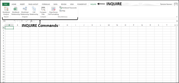
Comparing Two Workbooks
You can compare two workbooks cell by cell and find the differences, if any, in terms of changes in the second workbook as compared to the first.
Follow the below given steps −
- Open two workbooks that you want to compare.
- Click on INQUIRE tab on the Ribbon.
- Click on Compare Files in the Compare group.

- The Select Files To Compare dialog box appears.
- Check the file names displayed in the boxes next to Compare and To.
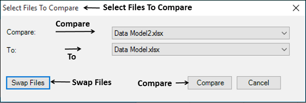
- If any File name that is displayed is not the one you wanted, click the down-arrow next to that File name.
- Only the workbooks that are open will be displayed.
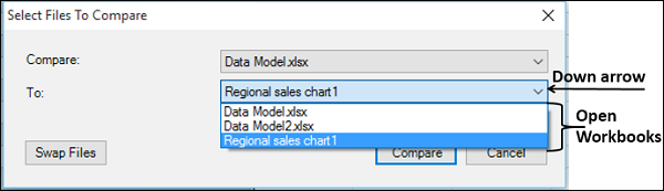
- Select the File.
- Check if the order of Files in Compare and To is OK.
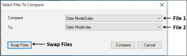
If the order is not OK, click Swap Files. The order of Files in Compare and To gets changed.
Click Compare.
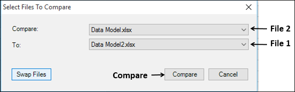
The results of the comparison appear in a two-pane grid −
- The workbook on the left corresponds to the "Compare" file you have chosen.
- The workbook on the right corresponds to the "To" file you have chosen.
Details of changes in workbook-To as compared to Workbook-Compare appear in a pane below these two grids. The changes are highlighted by color, depending on the kind of change. The legend for the highlight colors appears in the lower-left pane.
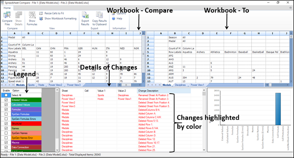
Click Resize Cells to Fit on the Ribbon to view the cell contents in the Compare and To workbooks. The cells in both the workbooks are resized so that the contents are visible.
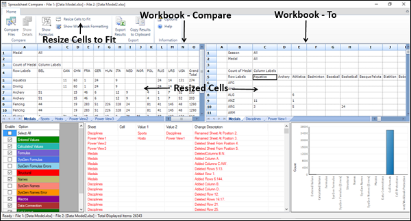
Click the Export Results in the Export group on the Ribbon.
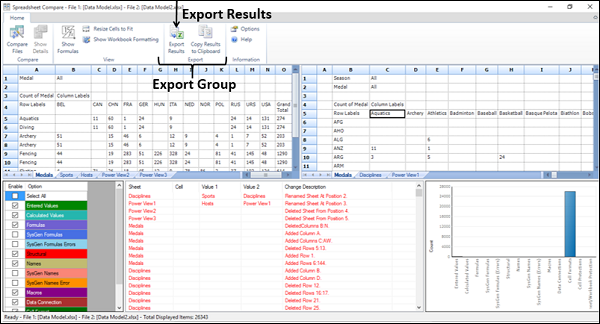
The Save As dialog box appears. You can save the results to an Excel workbook. Note that only .xlsx file type is available.
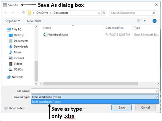
If you need the results in another application, you can do it by copying it to Clipboard.
Click Copy Results to Clipboard in the Export group on the Ribbon.
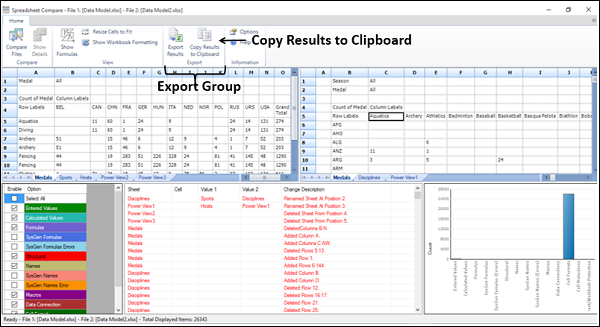
Paste in an application you want.
Creating an Interactive Report
You can use the Workbook Analysis command to create an interactive report that can show detailed information about the workbook and its Structure, Formulas, Cells, Ranges and Warnings.
- Click the Inquire tab on the Ribbon.
- Click Workbook Analysis in the Report group.
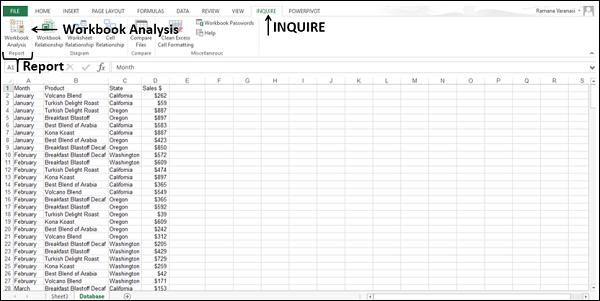
The report will be displayed after the Workbook Analysis is completed.
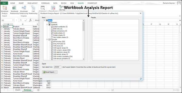
The Report has the following six categories −
Summary − General information about the structure and content of the workbook.
Workbook (with subcategories) − General workbook statistics.
Formulas (with subcategories) − Specific information about formulae in the workbook.
Cells (with subcategories) − Specific information about cells in the workbook.
Ranges (with subcategories) − Specific information about ranges in the workbook.
Warnings − Several types of warnings about workbook structure and content.
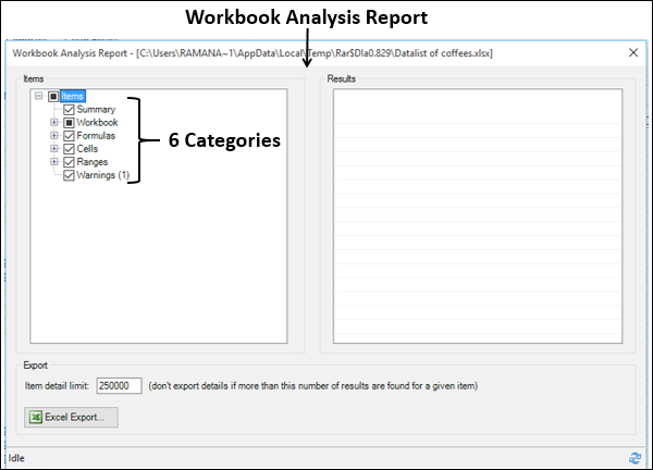
Selecting a category gives you more information about that category.
Check the Formulas option. The sub-categories of formulas will be displayed.
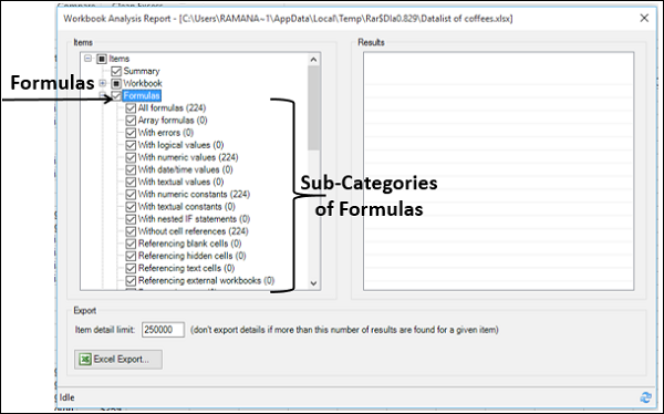
You will observe the following in the workbook that you are analyzing −
- All formulas are 224 in number.
- With numeric values, they are 224 in number.
- Click Sub-Category With numeric values.
In the Results pane, for each of the cells with formula with numeric values, worksheet name, cell address and formula are displayed.
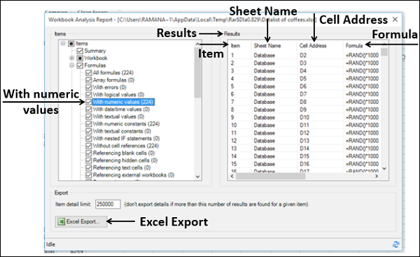
Click the Excel Export button. The Save As dialog box appears.
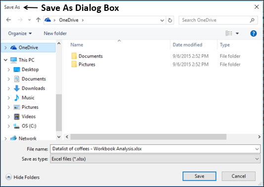
- Save the Report as an Excel file.
- Load Export File button appears next to Excel Export button.
- Click on Load Export File button.
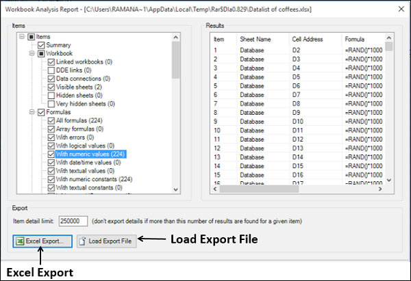
The saved Report Excel workbook opens and you can clearly view the workbook analysis results.
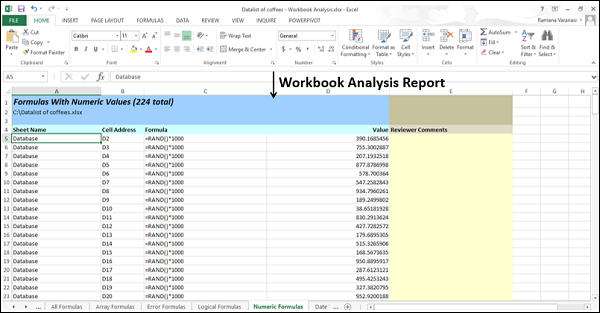
Viewing with Diagrams
You can view workbook relationships, worksheet relationships and cell relationships with interactive diagrams created by links. The links show the dependencies between the nodes in the diagram. You can drag the links or nodes to arrange them and align them to view whatever you are looking for.
Viewing Workbook Relationships
You can have an interactive, graphical map of workbook dependencies created by connections (links) between files using workbook relationship diagram.
The types of links in the diagram can include other workbooks, Access databases, text files, HTML pages, SQL Server databases and other data sources.
- Click the INQUIRE tab on the Ribbon.
- Click Workbook Relationship in the Diagram group.
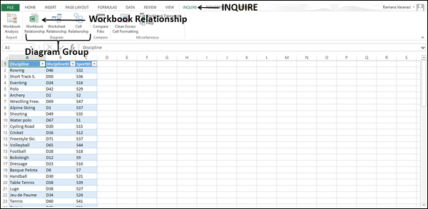
The Workbook Relationship Diagram appears, showing links of the workbook with different Data Sources.
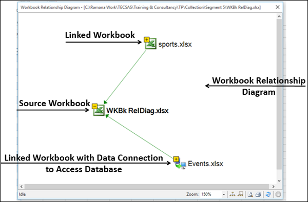
Viewing Worksheet Relationships
You can use Worksheet Relationship Diagram to create an interactive, graphical map of connections (links) between worksheets in the same workbook and /or worksheets in other workbooks.
- Click the INQUIRE tab on the Ribbon.
- Click Worksheet Relationship in the Diagram group.
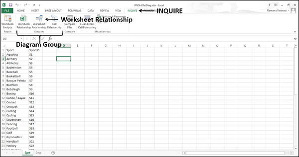
The Worksheet Relationship Diagram appears, showing links between the worksheets in the same workbook, and in other workbooks.
The difference between these two can be identified by the direction of the arrows.
Viewing Cell Relationships
You can use the Cell Relationship Diagram to get a detailed, interactive map of all links from a selected cell to cells in other worksheets or even other workbooks.
- Click the INQUIRE tab on the Ribbon.
- Click Cell Relationship in the Diagram group.
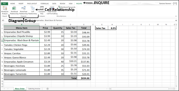
The Cell Relationship Diagram Options dialog box appears.
Check Span sheets and Span workbooks.
Select Trace both under Trace cell precedents and Trace cell dependents.
Under Initial number of expansion levels, select limited and type 5 in the box next to it.
Click OK.
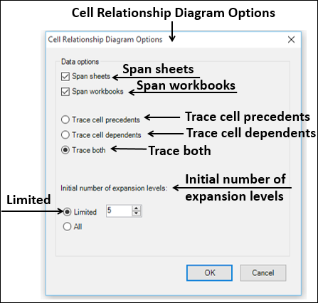
The Cell Relationship Diagram appears, showing links between the selected cell and the cells in the same worksheet, same workbook and in other workbooks, based on the options you have chosen.
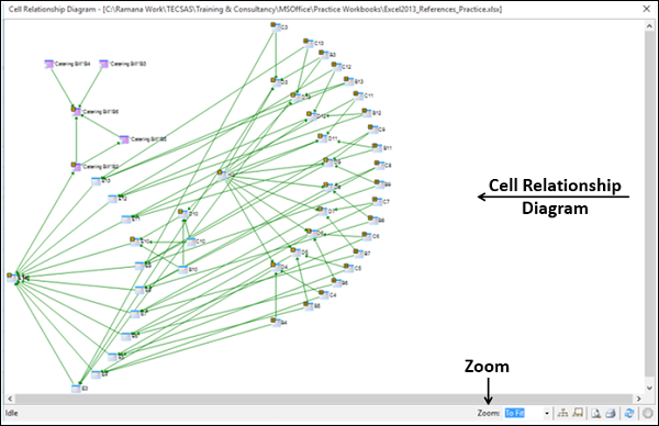
Click Zoom. You can view the nodes clearly.
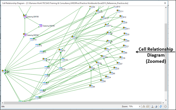
Cleaning Excess Cell Formatting
When you find that a workbook is getting loaded slowly, or has become huge in size, it might have formatting applied to rows and/or columns that is not needed (for example, conditional formatting an entire column that has less than 15 values).
You can use the Clean Excess Cell Formatting command to remove excess formatting and greatly reduce the file size. This also results in improving Excel's speed.
Before cleaning the excess cell formatting, create a backup copy of your Excel file because there are certain cases where this process may increase your file size, and there is no way to undo the change.
- Click the INQUIRE tab on the Ribbon.
- Click Clean Excess Cell Formatting in the Miscellaneous group.
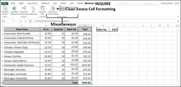
The Clean Excess Cell Formatting dialog box appears. Choose All Sheets in the Apply to box
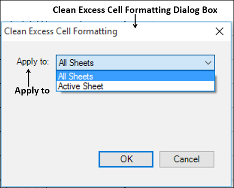
You will get a message about saving changes. Click OK.
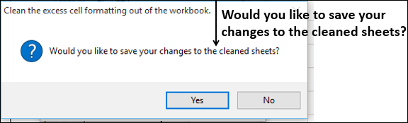
Managing Passwords of Files
If you are using Workbook Analysis or Compare Files commands for workbooks that are password protected, you can avoid having to type the password each time those files are opened. This is possible with using Password Manager.
- Click the INQUIRE tab on the Ribbon.
- Click Workbook Passwords in the Miscellaneous group.
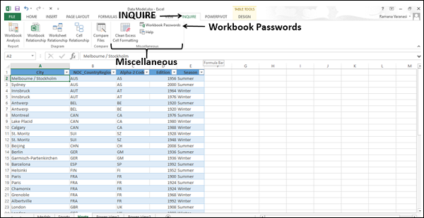
The Password Manager Dialog box appears. Click the Add button to add passwords of your workbooks.
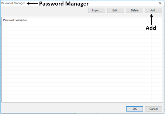
Add password descriptions also, for the passwords you added.
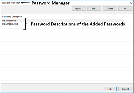
Next time when you need to use any of these files for comparing or analyzing, you do not have to key in the passwords.
Advanced Data Analysis - Overview
Excel provides several commands, functions and tools that make your complex data analysis tasks easy. Excel lets you perform various complex calculations with ease. In this tutorial, you will understand the versatile data analysis tools of Excel. You will understand data analysis with relevant examples, step by step instructions and screen shots at every step.
Data Consolidation
You might have to consolidate the data from various sources and present a report. The data could be in the worksheets of the same workbook or in different workbooks. With Excel data tool Consolidate, you can perform this in a few easy steps.
What-If Analysis
What-If Analysis provides you tools to handle the following data analysis situations −
Find the input values that result in a specified value. The result could be set up as a formula with the input values as variables. By varying the values of the input variables, Excel provides the solution with the Goal Seek Tool.
Find the possible output values by varying the values of one or two variables. The result could be set up as a formula with one or two input values as variables. By varying the values for the input variables, Excel provides the solution with the Data Table Tool.
Find the possible output values that are a result of varying the values of more than two variables. The result could be set up as a formula with the input values as variables. By varying the values for the input variables, Excel provides the solution with the Scenario Manager Tool.
Optimizing with Excel Solver Add-in
Solver is used to handle complex goal seek situations. In such cases, in addition to the inputs and outputs, there will be defined constraints or limits imposed on the possible input values. Further, Solver is used to result in an optimal solution.
Excel has a Solver Add-in that helps you solve such complex problems.
Importing Data into Excel
Your data analysis might depend on various external data sources. In Excel, you can import data from different data sources, such as Microsoft Access Database, Web Pages, Text Files, SQL Server Table, SQL Server Analysis Cube, XML File, etc.
You can import any number of data tables simultaneously from a database. When you are importing multiple tables from a relational database such as Access, the existing relationships among the tables will be retained in Excel also. While importing the data, you can also optionally create a PivotTable or PivotChart or Power View report based on that data.
You can just create a data connection with a data source, or import the data into Excel. If you import the data into Excel, the data tables are added to the Data Model in Excel.
Data Model
Data Model in Excel is used to integrate data from multiple tables in the current workbook and / or from the imported data and / or from the data sources connected to the workbook through data connections. Data model is used transparently in PivotTable, PivotChart, PowerPivot and Power View reports.
You can create a Data Model while importing data, or from the Excel tables in the workbook.
The data tables in the Data Model can be viewed either in Data View or Diagram View.
With a Data Model, you can create relationships among the data tables.
You can either use the Create Relationship command or just click and drag and connect the fields in the two tables that define the relationship in the diagram view of the Data Model.
Exploring Data with PivotTable
As you can integrate the Data Model with a PivotTable, you can do extensive data analysis by collating, connecting, summarizing and reporting data from several different sources. As you can import tables from external data sources and create a PivotTable, it is possible to have automatic updates of the values in the PivotTable whenever the data in the connected data sources is updated.
You can create a PivotTable with the fields from multiple tables, provided the tables have relationships defined. If a relationship does not exist, Excel prompts you to create one and you can do so from the PivotTable itself. The relationship that you so define is reflected in the Data Model.
Exploring Data with PowerPivot
You can use PowerPivot to access, analyze and report data from various data sources. PowerPivot can help you handle large data with ease and produce fascinating analysis reports.
PowerPivot provides you commands to manage the Data Model, add Excel tables to Data Model, to add calculated fields in the Data Tables, to define KPIs, etc.
Exploring Data with Power View
Power View provides interactive exploration, visualization and analysis of large data. Owing to its versatile visualization options, you can definitely find the one that gives your data the perfect platform wherein you can explore the data, summarize and report.
Ranging from Tables to Maps, it is just a play for you to visualize your data, filter it, analyze it, and report it interactively. Moreover, you can have multiple visualizations on the same Power View sheet that reflect and highlight values, when you click on a data point in any one of them.
You can explore data in Power View with a table, a matrix, a card, different chart types, multiples, maps and tiles. You will get fascinated with the versatility of these different views once you get hands-on experience. This is because it is easy to produce interactive reports highlighting significant values and dynamically switching across the views.
Exploring Data with Hierarchies
If your data has hierarchies, they can be either defined in the Data Model that is reflected in the Power View or build the hierarchies in Power View itself.
Once a hierarchy is defined, you can drill-up and drill-down the hierarchy, displaying the required data.
Aesthetic Power View Reports
You can arrive at a report layout based on what you want to present in Power View. You can add a background image that reflects your company logo or your corporate view. Optionally, you can format the background of the report to give it an elegant look.
You can select a theme for your report that best portrays your data. You can change the font and text size so that your report becomes easily readable.
Key Performance Indicators (KPIs)
Key Performance Indicators are commonly used to gauge the performance. In Excel, you define and portray KPIs in PowerPivot or Power View. The graphical presentation of KPIs will uplift your reports.
Advanced Data Analysis - Data Consolidation
You might have come across different situations wherein you have to present consolidated data. The source of the data could be from one place, or several places. Another challenge could be that the data might be updated by other people from time to time.
You need to know how you can set up a summary worksheet that consolidates the data from the sources that you set up, whenever you want. In Excel, you can easily perform this task in a few steps with the Data Tool Consolidate.
Preparing Data for Consolidation
Before you begin consolidating the data, make sure that there is consistency across the data sources. This means that the data is arranged as follows −
Each range of data is on a separate worksheet.
Each range of data is in list format, with labels in the first row.
Additionally, you can have labels for the categories, if applicable, in the first column.
All the ranges of data have the same layout.
All the ranges of data contain similar facts.
There are no blank rows or columns within each range.
In case the data sources are external, ensure usage of a predefined layout in the form of an Excel template.
Suppose you have the sales data of various commodities from each of the regions East, North, South, and West. You might need to consolidate this data and present a product wise summary of sales from time to time. Preparation includes the following −
One worksheet per region i.e. four worksheets with names East, North, South, and West. These could be in the same workbook or different workbooks.
Each worksheet has same layout, representing the details of product, number of units, and amount.
You need to consolidate the data product wise. Hence, ensure that the column with the label Product is the first column and it contains the Product labels.
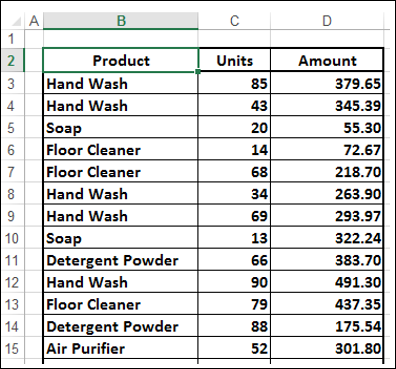
Consolidating Data in the Same Workbook
If you have all the data, that you have to consolidate, in the same workbook, proceed as follows −
Step 1 − Ensure that data of each region is on a separate worksheet.
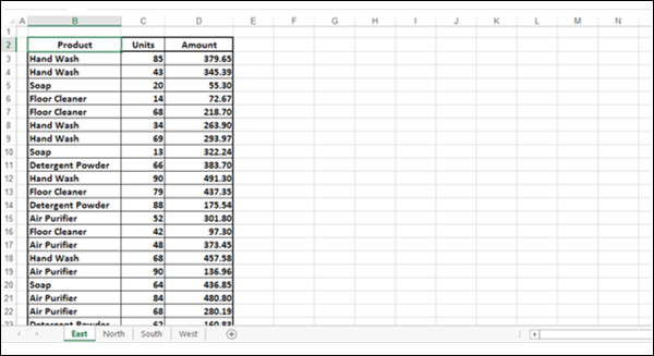
Step 2 − Add a new worksheet and name it Summary.
Step 3 − Click the Summary worksheet.
Step 4 − Click the cell where you want to place the summary results.
Step 5 − Click the DATA tab on the Ribbon.
Step 6 − Click the Consolidate button in the Data Tools group.
The Consolidate dialog box appears.
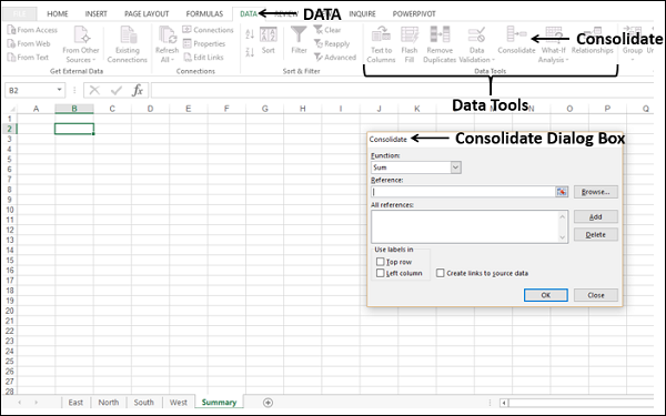
Step 7 − Select Sum from the dropdown list under Function.
Step 8 − Select the data from each worksheet as follows.
- Click the icon in the box under Reference.
- Select the worksheet East.
- Select the data range.
- Again, click the icon in the box under Reference.
The selected range appears in the Reference box −
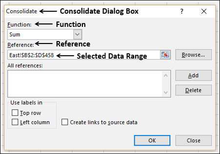
Step 9 − Click the Add button to the right of the box. The selected data range appears in the box under All References.
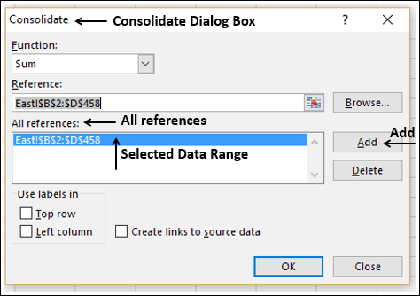
Step 10 − Repeat Steps 1-5 for the rest of the data worksheets North, South, and West. The Consolidate dialog box looks as follows.
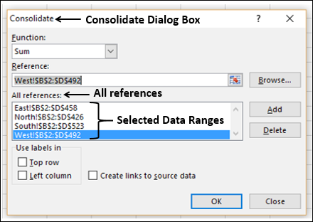
You can see that the data ranges appear worksheet wise in alphabetical order, in the box under All references.
Step 11 − Check the boxes Top row and Left column under Use labels in. Click OK.
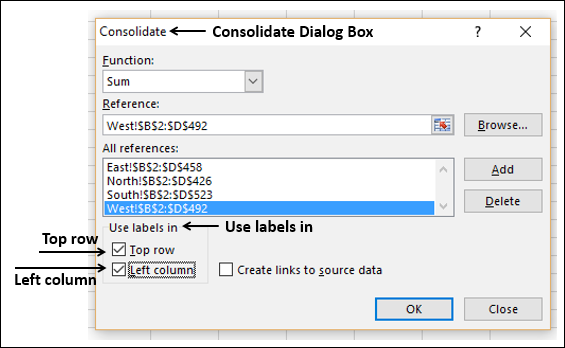
Your data is summarized product wise for the regions East, North, South and West.
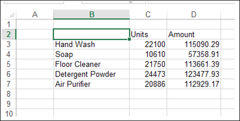
You can repeat the steps given above to refresh your summary results manually, whenever you need them.
Consolidating Data Automatically
Suppose you want your summary sheet to be updated automatically, whenever there are changes in the data. To accomplish this, you need to have links to the source data.
Step 1 − Check the box - Create links to source data in the Consolidate dialog box and click OK.
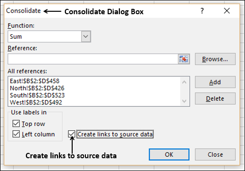
Your summary results appear with an outline as follows −
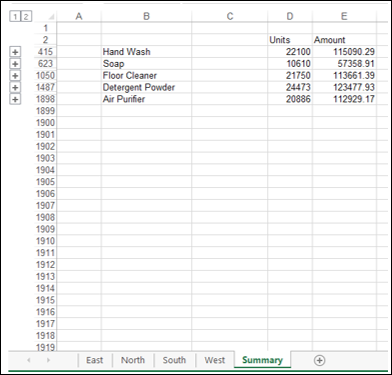
You will observe that a new column is inserted to the right of the column named Product.
Step 2 − Click the + sign on the outline in the row containing the Product value named Soap. You can see that the new column contains the consolidated value for each set of product values, region wise.
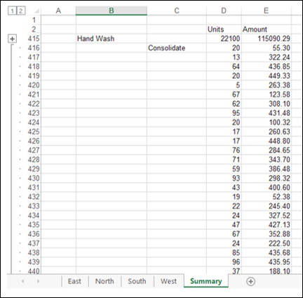
Consolidating Data from Different Workbooks
In the previous example, all the data that you need to summarize is in the same workbook. However, it is likely that the data is maintained separately for each region and is updated region wise. In such a case, you can consolidate the data as follows −
Step 1 − Open the workbooks containing the data, say, workbooks East-Sales, North-Sales, South-Sales and West-Sales.
Step 2 − Open a new workbook.
Step 3 − On a new worksheet, click a cell where you want the summary to appear.
Step 4 − Click the DATA tab on the Ribbon.
Step 5 − Click Consolidate in the Data Tools box.
A Consolidate dialog box appears. In the Consolidate dialog box −
- Select Sum from the dropdown list in the box under Function.
- Click the icon in the box under Reference.
- Select the workbook East-Sales.xlsx.
- Select the data range.
- Again, click the icon in the box under Reference.
- Click the Add button to the right.
The Consolidate dialog box looks as follows −
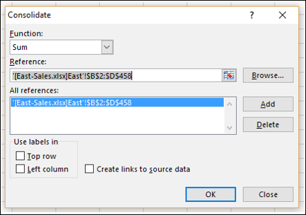
- Click the icon to the right of the box under References.
- Select the workbook North-Sales.xlsx.
- Select the data range.
- Again, click the icon to the right of the box under References.
- Click Add.
Step 6 − Repeat the steps 16 to add the data ranges from the workbooks South-Sales.xlsx and West-Sales.xlsx.
Step 7 − Under Use labels in, check the following boxes.
- Top row.
- Left column.
Step 8 − Check the box Create links to source data.
Your Consolidate dialog box looks as follows −
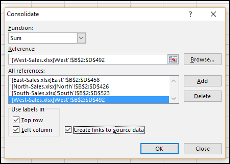
Your data is summarized in your workbook.
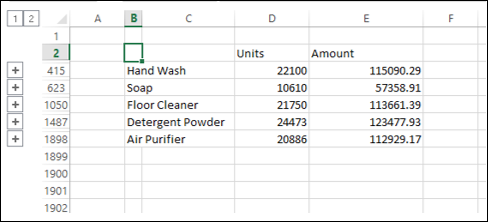
Advanced Data Analysis - What-If Analysis
What-if analysis is the process of changing the values in cells to see how those changes will affect the outcome of formulas on the worksheet. You can use several different sets of values in one or more formulas to explore all the various results.
What-if analysis is useful in many situations while doing data analysis. For example −
You can propose different budgets based on revenue.
You can predict the future values based on the given historical values.
If you are expecting a certain value as the result from a formula, you can find different sets of input values that produce the desired result.
Excel provides you with the following What-if analysis tools that can be used based on your data analysis needs −
- Data Tables
- Scenario Manager
- Goal Seek
Data Tables and Scenarios take sets of input values and project forward to determine possible results. Goal seek differs from Data Tables and Scenarios in that it takes a result and projects backwards to determine possible input values that produce that result.
In this chapter, you will understand the possible situations where you can use the Whatif Analysis tools. For details on usage of these tools, refer to the later chapters in this tutorial.
Data Tables
A Data Table is a range of cells in which you can change values in some of the cells and come up with different answers to a problem. For example, you might want to know how much loan you can afford for a home by analyzing different loan amounts and interest rates. You can put these different values along with the PMT function in a Data Table and get the desired result.
A Data Table works only with one or two variables, but it can accept many different values for those variables.
For the details on Data Tables, refer to the chapter What-If Analysis with Data Tables in this tutorial.
Scenario Manager
A scenario is a set of values that Excel saves and can substitute automatically in cells on a worksheet.
The key features are −
You can create and save different groups of values on a worksheet and then switch to any of these new scenarios to view different results.
A scenario can have multiple variables, but it can accommodate only up to 32 values.
You can also create a scenario summary report, which combines all the scenarios on one worksheet. For example, you can create several different budget scenarios that compare various possible income levels and expenses, and then create a report that lets you compare the scenarios side-by-side.
Scenario Manager is a dialog box that allows you to save the values as a scenario and name the scenario.
For the details on Scenarios, refer to the chapter What-If Analysis with Scenario Manager in this tutorial.
Goal Seek
Goal Seek is useful if you know the result that you want from a formula, but not sure what input value the formula needs, to get that result. For example, if you want to borrow a loan and you know the loan amount, tenure of loan and the EMI that you can pay, you can use Goal Seek to find the interest rate at which you can avail the loan.
Goal Seek can be used only with one variable input value. If you have more than one variable for input values, you can use the Solver add-in.
For details on the usage of Goal Seek, refer to the chapter What-If Analysis with Goal Seek in this tutorial.
Solver
Solver comes with Excel as an add-in. You can use Solver to find an optimal value for a formula in a cell called the target cell on a worksheet.
Solver works with a group of cells that are related to the formula in the target cell. Solver adjusts the values in the adjustable cells that you specify, to produce the result that you specify, from the target cell formula.
For the details on the usage of Excel Solver add-in, refer to the chapter - Optimization with Excel Solver in this tutorial.
What-If Analysis with Data Tables
With a Data Table in Excel, you can easily vary one or two inputs and perform What-if analysis. A Data Table is a range of cells in which you can change values in some of the cells and come up with different answers to a problem.
There are two types of Data Tables −
- One-variable Data Tables
- Two-variable Data Tables
If you have more than two variables in your analysis problem, you need to use Scenario Manager Tool of Excel. For details, refer to the chapter What-If Analysis with Scenario Manager in this tutorial.
One-variable Data Tables
A one-variable Data Table can be used if you want to see how different values of one variable in one or more formulas will change the results of those formulas. In other words, with a one-variable Data Table, you can determine how changing one input changes any number of outputs. You will understand this with the help of an example.
Example
There is a loan of 5,000,000 for a tenure of 30 years. You want to know the monthly payments (EMI) for varied interest rates. You also might be interested in knowing the amount of interest and Principal that is paid in the second year.
Analysis with One-variable Data Table
Analysis with one-variable Data Table needs to be done in three steps −
Step 1 − Set the required background.
Step 2 − Create the Data Table.
Step 3 − Perform the Analysis.
Let us understand these steps in detail −
Step 1: Set the required background
Assume that the interest rate is 12%.
List all the required values.
Name the cells containing the values, so that the formulas will have names instead of cell references.
Set the calculations for EMI, Cumulative Interest and Cumulative Principal with the Excel functions PMT, CUMIPMT and CUMPRINC respectively.
Your worksheet should look as follows −
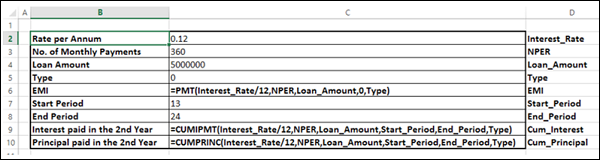
You can see that the cells in column C are named as given in the corresponding cells in column D.
Step 2: Create the Data Table
Type the list of values i.e. interest rates that you want to substitute in the input cell down the column E as follows −
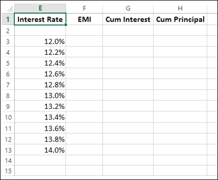
Type the first function (PMT) in the cell one row above and one cell to the right of the column of values. Type the other functions (CUMIPMT and CUMPRINC) in the cells to the right of the first function.
Now, the two rows above the Interest Rate values look as follows −
As you observe, there is an empty row above the Interest Rate values. This row is for the formulas that you want to use.
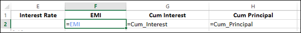
The Data Table looks as given below −
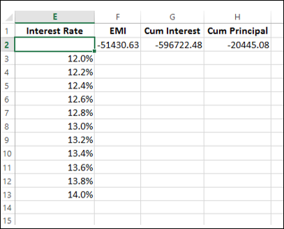
Step 3: Do the analysis with the What-If Analysis Data Table Tool
Select the range of cells that contains the formulas and values that you want to substitute, i.e. select the range E2:H13.
Click the DATA tab on the Ribbon.
Click What-if Analysis in the Data Tools group.
Select Data Table in the dropdown list.
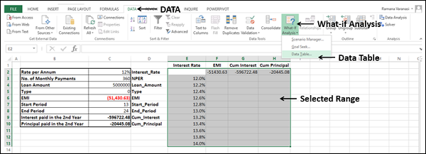
Data Table dialog box appears.
- Click the icon in the Column input cell box.
- Click the cell Interest_Rate, which is C2.
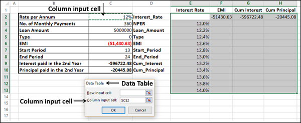
You can see that the Column input cell is taken as $C$2. Click OK.
The Data Table is filled with the calculated results for each of the input values as shown below −
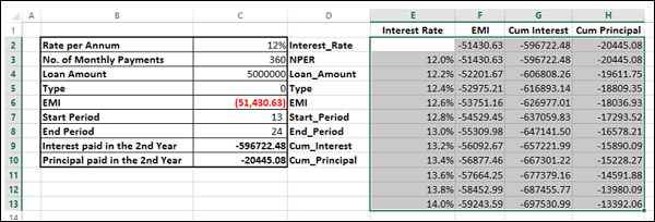
If you can pay an EMI of 54,000, you can observe that the interest rate of 12.6% is suitable for you.
Two-variable Data Tables
A two-variable Data Table can be used if you want to see how different values of two variables in a formula will change the results of that formula. In other words, with a twovariable Data Table, you can determine how changing two inputs changes a single output. You will understand this with the help of an example.
Example
There is a loan of 50,000,000. You want to know how different combinations of interest rates and loan tenures will affect the monthly payment (EMI).
Analysis with Two-variable Data Table
Analysis with two-variable Data Table needs to be done in three steps −
Step 1 − Set the required background.
Step 2 − Create the Data Table.
Step 3 − Perform the Analysis.
Step 1: Set the required background
Assume that the interest rate is 12%.
List all the required values.
Name the cells containing the values, so that the formula will have names instead of cell references.
Set the calculation for EMI with the Excel function PMT.
Your worksheet should look as follows −
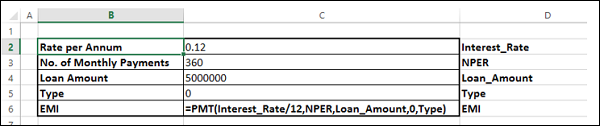
You can see that the cells in the column C are named as given in the corresponding cells in the column D.
Step 2: Create the Data Table
Type =EMI in cell F2.
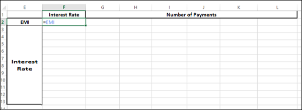
Type the first list of input values, i.e. interest rates down the column F, starting with the cell below the formula, i.e. F3.
Type the second list of input values, i.e. number of payments across row 2, starting with the cell to the right of the formula, i.e. G2.
The Data Table looks as follows −
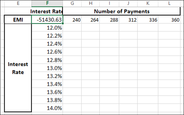
Do the analysis with the What-If Analysis Tool Data Table
Select the range of cells that contains the formula and the two sets of values that you want to substitute, i.e. select the range F2:L13.
Click the DATA tab on the Ribbon.
Click What-if Analysis in the Data Tools group.
Select Data Table from the dropdown list.
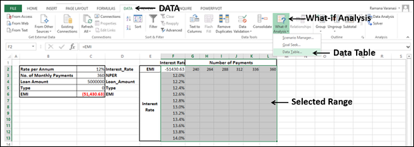
Data Table dialog box appears.
- Click the icon in the Row input cell box.
- Click the cell NPER, which is C3.
- Again, click the icon in the Row input cell box.
- Next, click the icon in the Column input cell box.
- Click the cell Interest_Rate, which is C2.
- Again, click the icon in the Column input cell box.
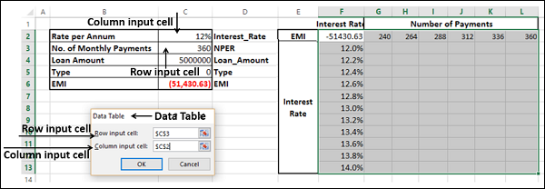
You will see that the Row input cell is taken as $C$3 and the Column input cell is taken as $C$2. Click OK.
The Data Table gets filled with the calculated results for each combination of the two input values −
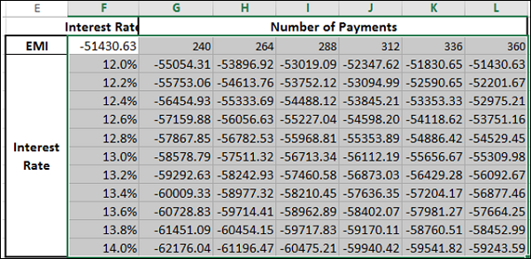
If you can pay an EMI of 54,000, the interest rate of 12.2% and 288 EMIs are suitable for you. This means the tenure of the loan would be 24 years.
Data Table Calculations
Data Tables are recalculated each time the worksheet containing them is recalculated, even if they have not changed. To speed up the calculations in a worksheet that contains a Data Table, you need to change the calculation options to Automatically Recalculate the worksheet but not the Data Tables, as given in the next section.
Speeding up the Calculations in a Worksheet
You can speed up the calculations in a worksheet containing Data Tables in two ways −
- From Excel Options.
- From the Ribbon.
From Excel Options
- Click the FILE tab on the Ribbon.
- Select Options from the list in the left pane.
Excel Options dialog box appears.
From the left pane, select Formulas.
Select the option Automatic except for data tables under Workbook Calculation in the Calculation options section. Click OK.
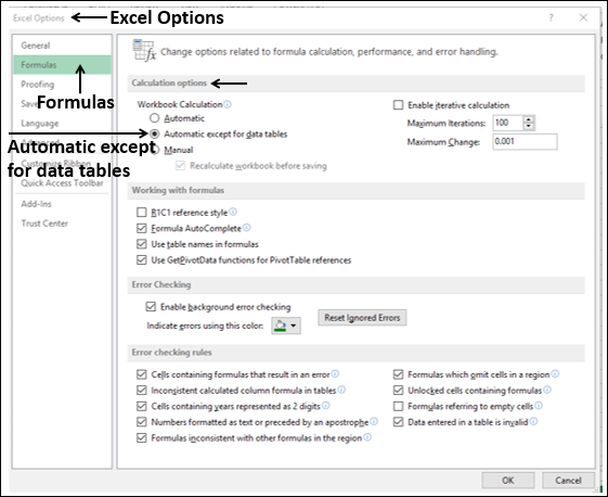
From the Ribbon
Click the FORMULAS tab on the Ribbon.
Click the Calculation Options in the Calculations group.
Select Automatic Except for Data Tables in the dropdown list.
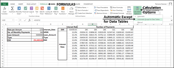
What-If Analysis with Scenario Manager
Scenario Manager is useful in the cases where you have more than two variables in sensitivity analysis. Scenario Manager creates scenarios for each set of the input values for the variables under consideration. Scenarios help you to explore a set of possible outcomes, supporting the following −
- Varying as many as 32 input sets.
- Merging the scenarios from several different worksheets or workbooks.
If you want to analyze more than 32 input sets, and the values represent only one or two variables, you can use Data Tables. Although it is limited to only one or two variables, a Data Table can include as many different input values as you want. Refer to What-If Analysis with Data Tables in this tutorial.
Scenarios
A scenario is a set of values that Excel saves and can substitute automatically on your worksheet. You can create and save different groups of values as scenarios on a worksheet and then switch between these scenarios to view the different results.
For example, you can have several different budget scenarios that compare various possible income levels and expenses. You can also have different loan scenarios from different sources that compare various possible interest rates and loan tenures.
If the information that you want to use in scenarios is from different sources, you can collect the information in separate workbooks, and then merge the scenarios from the different workbooks into one.
After you have all the scenarios you need, you can create a scenario summary report −
- That incorporates information from all the scenarios.
- That lets you compare the scenarios side-by-side.
Scenario Manager
Scenario Manager is one of the What-if Analysis tools in Excel.
To create an analysis report with Scenario Manager, you have to follow these steps −
Step 1 − Define the set of initial values and identify the input cells that you want to vary, called the changing cells.
Step 2 − Create each scenario, name the scenario and enter the value for each changing input cell for that scenario.
Step 3 − Select the output cells, called the result cells that you want to track. These cells contain formulas in the initial set of values. The formulas use the changing input cells.
The Scenario Manager creates a report containing the input and the output values for each scenario.
Initial Values for Scenarios
Before you create several different scenarios, you need to define a set of initial values on which the scenarios will be based.
The steps for setting up the initial values for Scenarios are −
- Define the cells that contain the input values.
- Name the input cells appropriately.
- Identify the input cells with constant values.
- Specify the values for the constant inputs.
- Identify the input cells with changing values.
- Specify the initial values for the changing inputs.
- Define the cells that contain the results. The result cells contain formulas.
- Name the result cells appropriately.
- Place the formulas in the result cells.
Consider the previous example of loan. Now, proceed as follows −
Define a cell for Loan Amount.
This input value is constant for all the scenarios.
Name the cell Loan_Amount.
Specify the value as 5,000,000.
Define the cells for Interest Rate, No. of payments and Type (Payment at the beginning or end of the month).
These input values will be changing across the scenarios.
Name the cells Interest_Rate, NPER and Type.
Specify the initial values for the analysis in these cells as 12%, 360 and 0 respectively.
Define the cell for the EMI.
This is the result value.
Name the cell EMI.
Place the formula in this cell as −
=PMT (Interest_Rate/12, NPER, Loan_Amount, 0, Type)
Your worksheet looks as shown below −
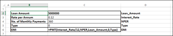
As you can see that the input cells and the result cells are in column C with the names as given in column D.
Creating Scenarios
After setting up the initial values for the Scenarios, you can create the scenarios using Scenario Manager as follows −
- Click the DATA tab on the Ribbon.
- Click What-if Analysis in the Data Tools group.
- Select Scenario Manager from the dropdown list.
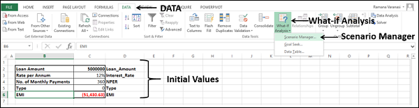
The Scenario Manager Dialog box appears. You can observe that it contains a message −
No Scenarios defined. Choose Add to.
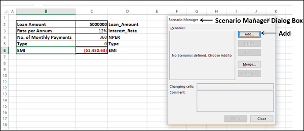
You need to create scenarios for each set of changing values in the Scenario Manager. It is good to have the first scenario defined with initial values, as it enables you to switch back to initial values whenever you want while displaying different scenarios.
Create the first scenario with the initial values as follows −
- Click the Add button in the Scenario Manager Dialog box.
The Add Scenario dialog box appears.
- Under Scenario Name, type Scenario 1.
- Under Changing Cells, enter the references for the cells i.e. C3, C4 and C5 with the Ctrl key pressed.
The name of the dialog box changes to Edit Scenario.
Edit the text in the Comment as Initial Values box.
Select the option Prevent changes under Protection and then click OK.
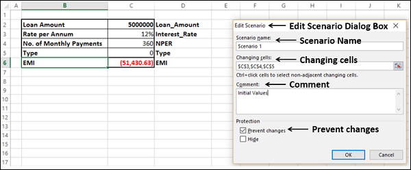
The Scenario Values dialog box appears. The initial values that you have defined appear in each of the changing cells boxes.
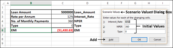
Scenario 1 with the initial values is created.
Create three more scenarios with varying values in the changing cells as follows −
- Click the Add button in the Scenario Values dialog box.
Add Scenario dialog box appears. Note that C3, C4, C5 appear in the Changing cells box.
In the Scenario Name box, type Scenario 2.
Edit the text in the Comment as Different Interest Rate.
Select Prevent changes under Protection and click OK.
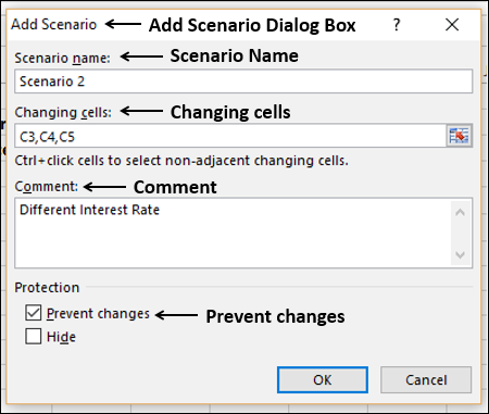
The Scenario Values dialog box appears. The initial values appear in the changing cells. Change the value of Interest_Rate to 0.13 and click Add.
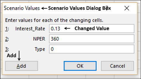
The Add Scenario dialog box appears. Note that C3, C4, C5 appear in the box under changing cells.
In the Scenario Name box, type Scenario 3.
Edit the text in the Comment box as Different no. of Payments.
Select Prevent changes under Protection and click OK.
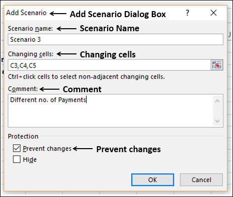
The Scenario Values dialog box appears. The initial values appear in the changing cells. Change the value of NPER to 300 and click Add.
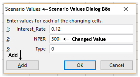
The Add Scenario dialog box appears. Note that C3, C4, C5 appear in the Changing cells box.
In the Scenario Name box, type Scenario 4.
Edit the text in the Comment box as Different Type of Payment.
Select Prevent changes under Protection and click OK.
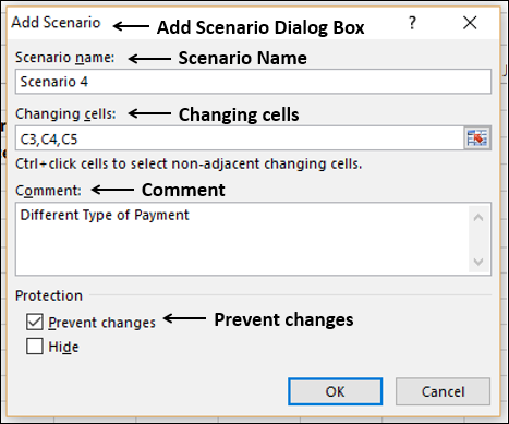
The Scenario Values dialog box appears. The initial values appear in the changing cells. Change the value of Type to 1. Click OK as you have added all the scenarios that you wanted to add.
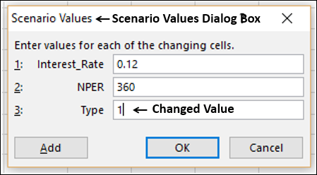
The Scenario Manager dialog box appears. In the box under Scenarios, You will find the names of all the scenarios that you have created.
- Click Scenario 1. As you are aware, Scenario 1 contains the initial values.
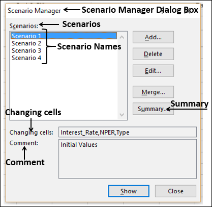
Now, click Summary. The Scenario Summary dialog box appears.
Scenario Summary Reports
Excel provides two types of Scenario Summary reports −
- Scenario summary.
- Scenario PivotTable report.
In the Scenario Summary dialog box, you can find these two Report types.
Select Scenario summary under Report type.
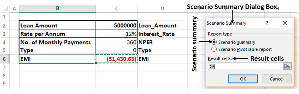
Scenario Summary
In the Result cells box, select the cell C6 (Here, we had put the PMT function). Click OK.
Scenario Summary report appears in a new worksheet. The worksheet is named as Scenario Summary.
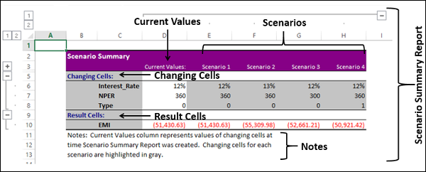
You can observe the following in the Scenario Summary report −
Changing Cells − Enlists all the cells used as changing cells. As you have named the cells, Interest_Rate, NPER and Type, these appear to make the report meaningful. Otherwise, only cell references will be listed.
Result Cells − Displays the result cell specified, i.e. EMI.
Current Values − It is the first column and enlists the values of that scenario which is selected in the Scenario Manager Dialog box before creating the summary report.
For all the scenarios you have created, the changing cells will be highlighted in gray.
In the EMI row, the result values for each scenario will be displayed.
You can make the report more meaningful by displaying the comments that you added while creating the scenarios.
Click the + button to the left of the row containing the scenario names. The comments for the scenarios appear in the row under the scenario names.
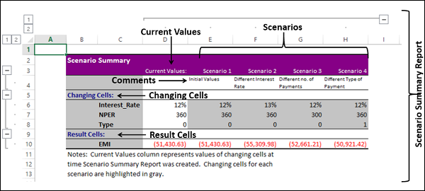
Scenarios from Different Sources
Suppose you get the scenarios from three different sources and you need to prepare the Scenario summary report in a Master workbook. You can do this by merging the scenarios from different workbooks into the Master workbook. Follow the steps given below −
Assume that the scenarios are in the workbooks, Bank1_Scenarios, Bank2_Scenarios and Bank3_Scenarios. Open the three workbooks.
Open the Master workbook, in which you have the initial values.
Click DATA > What-if Analysis > Scenario Manager in the Master workbook.
The Scenario Manager Dialog box appears.
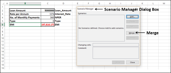
As you can observe, there are no scenarios as you have not yet added any. Click Merge.
The Merge Scenarios dialog box appears.
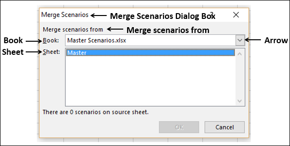
As you can see, under Merge scenarios from, you have two boxes −
- Book
- Sheet
You can select specific worksheet from a specific workbook that contains the scenarios, which you want to add to your results. Click the drop-down arrow of Book to see the workbooks.
Note − The corresponding workbooks should be open to appear in this list.
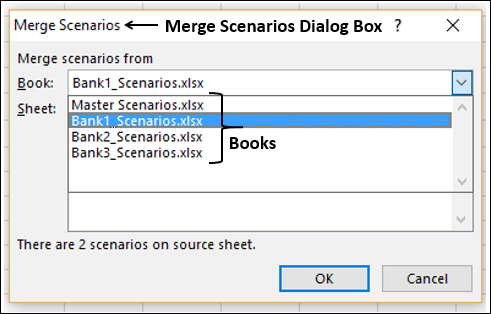
Select the book Bank1_Scenarios.
Bank1 sheet is displayed. At the bottom of the dialog box, the number of scenarios found on source sheet is displayed. Click OK.
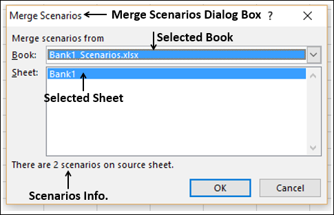
The Scenario Manager dialog box appears. The two scenarios that were merged into the Master workbook will be listed under Scenarios.
Click the Merge button. The Merge Scenarios dialog box appears. Now, select Bank2_Scenarios from the drop-down list in the Book box.
Bank2 sheet is dislayed. At the bottom of the dialog box, the number of scenarios found on source sheet are displayed. Click OK.
The Scenario Manager Dialog box appears. The four scenarios that were merged into the Master workbook are listed under Scenarios.
Click the Merge button. The Merge Scenarios dialog box appears. Now, select Bank3_Scenarios from the drop-down list in the Book box.
Bank3 sheet is displayed. At the bottom of the dialog box, the number of scenarios found on source sheet will be displayed. Click OK.
The Scenario Manager Dialog box appears. The five scenarios that were merged into the Master workbook will be listed under Scenarios.
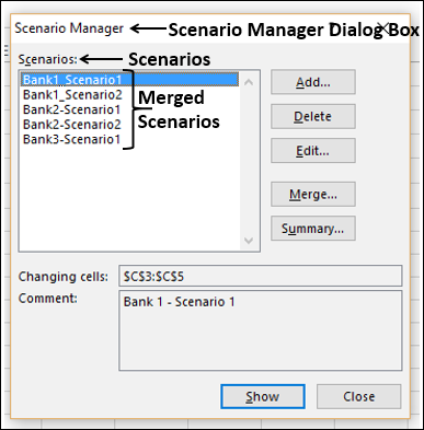
Now, you have all the required scenarios to produce the Scenario summary report.
Click the Summary button. The Scenario Summary dialog box appears.
- Select Scenario summary.
- In the Result cells box, type C6 and click OK.
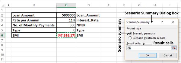
The Scenario summary report appears on a new worksheet in the Master workbook.
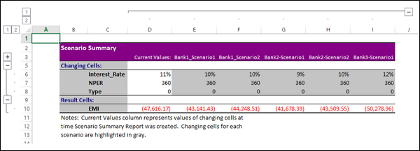
Displaying Scenarios
Suppose you are presenting your scenarios and you would like to dynamically switch from one scenario to another and display the set of input values and result values of the corresponding scenario.
Click DATA > What-if Analysis > Scenario Manager from the Data Tools group. The Scenario Manager Dialog box appears. The list of scenarios appear.
Select the scenario you want to display. Click Show.
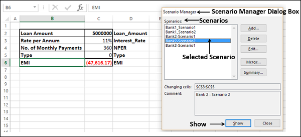
The values on the worksheet are updated to that of the selected scenario. The result values are recalculated.
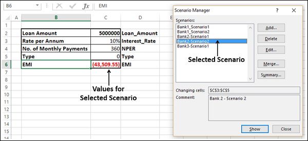
Scenario PivotTable Report
You can see the Scenario report in the form of a PivotTable also.
Click the Summary button in the Scenario Manager Dialog box. The Scenario Summary dialog box appears.
Select the Scenario PivotTable report under Report type.
Type C6 in the Result cells box.
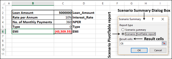
Scenario PivotTable report appears on a new worksheet.
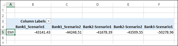
What-If Analysis with Goal Seek
Goal Seek is a What-If Analysis tool that helps you to find the input value that results in a target value that you want. Goal Seek requires a formula that uses the input value to give result in the target value. Then, by varying the input value in the formula, Goal Seek tries to arrive at a solution for the input value.
Goal Seek works only with one variable input value. If you have more than one input value to be determined, you have to use the Solver add-in. Refer to the chapter Optimization with Excel Solver in this tutorial.
Analysis with Goal Seek
Suppose you want to take a loan of 5,000,000 and you want to repay in 25 years. You can pay an EMI of 50000. You want to know at what interest rate you can borrow the loan.
You can use Goal Seek to find the interest rate at which you can borrow the loan as follows −
Step 1 − Set up the Excel cells for Goal Seek as given below.
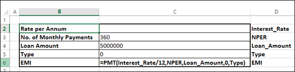
Step 2 − Enter the values in column C corresponding to column D. The cell Interest_Rate is kept empty, as you have to retrieve that value. Further, though you know the EMI that you can pay (50000), that value is not included as you have to use the Excel PMT function to arrive at it. Goal Seek requires a formula to find the result. The PMT function is placed in the cell EMI so that it can be used by Goal Seek.
Excel computes the EMI with the PMT function. The table now looks like −
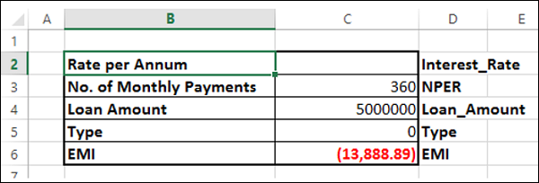
As the Interest_Rate cell is empty, Excel takes that value as 0 and calculates the EMI. You can ignore the result -13,888.89.
Perform the Analysis with Goal Seek as follows −
Step 1 − Go to DATA > What If Analysis > Goal Seek on the Ribbon.
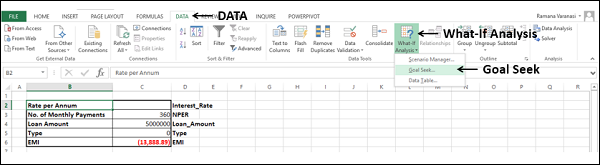
The Goal Seek dialog box appears.
Step 2 − Type EMI in the Set cell box. This box is the reference for the cell that contains the formula that you want to resolve, in this case the PMT function. It is the cell C6, which you named as EMI.
Step 3 − Type -50000 in the To value box. Here, you get the formula result, in this case, the EMI that you want to pay. The number is negative because it represents a payment.
Step 4 − Type Interest_Rate in the By changing cell box. This box has the reference of the cell that contains the value you want to adjust, in this case the interest rate. It is cell C2, which you named as Interest_Rate.
Step 5 − This cell that Goal Seek changes, must be referenced by the formula in the cell that you specified in the Set cell box. Click OK.
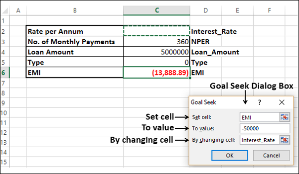
Goal Seek produces a result, as shown below −
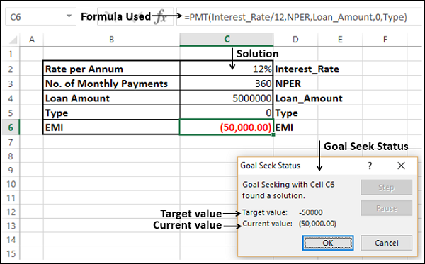
As you can observe, Goal Seek found the solution using cell C6 (containing the formula) as 12% that is displayed in the cell C2, which is the interest rate. Click OK.
Solving Story Problems
You can solve story problems easily with Goal Seek. Let us understand this with the help of an example.
Example
Suppose there is a bookstore that has 100 books in storage. The original price of the book is 250 and certain number of books was sold at that price. Later, the bookstore announced a 10% discount on that book and cleared off the stock. You might want to know how many books are sold at the original price to obtain a total revenue of 24,500.
You can use Goal Seek to find the solution. Follow the steps given below −
Step 1 − Set the worksheet as given below.
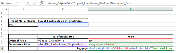
Step 2 − Go to DATA > What If Analysis > Goal Seek on the Ribbon.
The Goal Seek dialog box appears.
Step 3 − Type Revenue, 24500 and Books_OriginalPrice in the Set cell box, To Value box and By changing cell box respectively. Click OK.
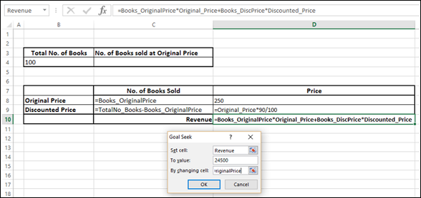
Goal Seek displays the status and solution.
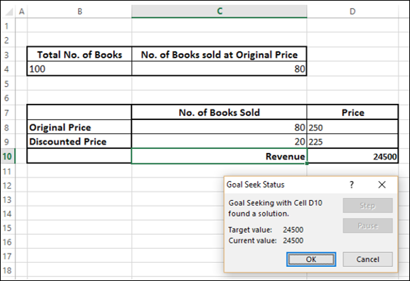
If 80 books were sold at the original price, the revenue would be 24500.
Performing a Break-even Analysis
In economy, break-even point is the point at which there is neither profit nor loss. This would mean −
Revenue = Expenses, or
Revenue Expenses = 0
You can do break-even analysis with Goal Seek in Excel.
Example
Suppose there is a store that sells toys. You might want to make a break-even analysis of the store. Collect the following information from the store −
- Fixed cost of the store.
- Unit cost of the toy.
- Number of toys to be sold.
You need to find at which price they should sell the toys to break even.
Step 1 − Set the worksheet as given below.
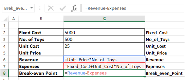
Step 2 − Go to DATA > What If Analysis > Goal Seek on the Ribbon. The Goal Seek dialog box appears.
Step 3 − Type Break_even_Point, 0, and Unit_Price in the Set cell box, To value box and By changing cell box respectively. Click OK.
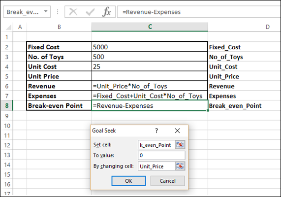
As you can observe, Goal Seek gave the result that if the Unit Price is 35, the store will break even.
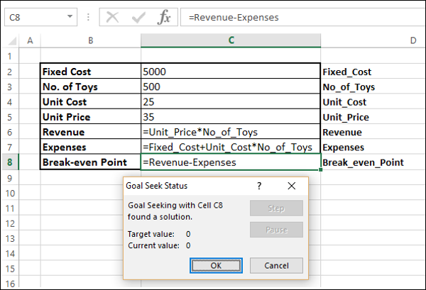
Optimization with Excel Solver
Solver is a Microsoft Excel add-in program you can use for optimization in what-if analysis.
According to O'Brien and Marakas, optimization analysis is a more complex extension of goal-seeking analysis. Instead of setting a specific target value for a variable, the goal is to find the optimum value for one or more target variables, under certain constraints. Then, one or more other variables are changed repeatedly, subject to the specified constraints, until you discover the best values for the target variables.
In Excel, you can use Solver to find an optimal value (maximum or minimum, or a certain value) for a formula in one cell called the objective cell, subject to certain constraints or limits, on the values of other formula cells on the worksheet.
This means that the Solver works with a group of cells called decision variables that are used in computing the formulas in the objective and constraint cells. Solver adjusts the values in the decision variable cells to satisfy the limits on constraint cells and produce the result you want for the objective cell.
You can use Solver to find optimal solutions for diverse problems such as −
Determining the monthly product mix for a drug manufacturing unit that maximizes the profitability.
Scheduling workforce in an organization.
Solving transportation problems.
Financial planning and budgeting.
Activating Solver Add-in
Before you proceed with finding solution for a problem with Solver, ensure that the Solver Add-in is activated in Excel as follows −
- Click the DATA tab on the Ribbon. The Solver command should appear in the Analysis group as shown below.
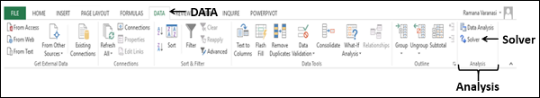
In case you do not find the Solver command, activate it as follows −
- Click the FILE tab.
- Click Options in the left pane. Excel Options dialog box appears.
- Click Add-Ins in the left pane.
- Select Excel Add-Ins in the Manage box and click Go.
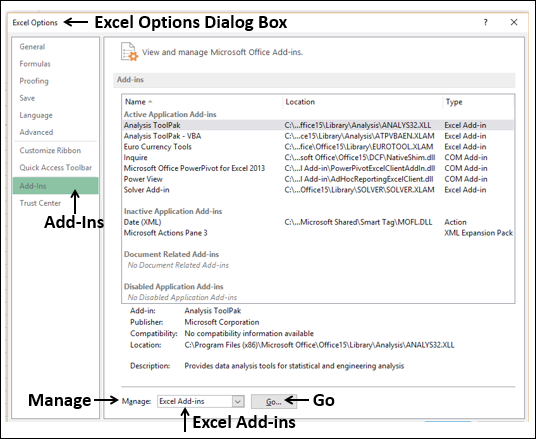
The Add-Ins dialog box appears. Check Solver Add-in and click Ok. Now, you should be able to find the Solver command on the Ribbon under the DATA tab.
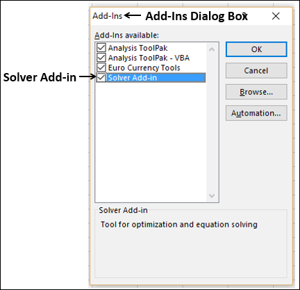
Solving Methods used by Solver
You can choose one of the following three solving methods that Excel Solver supports, based on the type of problem −
LP Simplex
Used for linear problems. A Solver model is linear under the following conditions −
The target cell is computed by adding together the terms of the (changing cell)*(constant) form.
Each constraint satisfies the linear model requirement. This means that each constraint is evaluated by adding together the terms of the (changing cell)*(constant) form and comparing the sums to a constant.
Generalized Reduced Gradient (GRG) Nonlinear
Used for smooth nonlinear problems. If your target cell, any of your constraints, or both contain references to changing cells that are not of the (changing cell)*(constant) form, you have a nonlinear model.
Evolutionary
Used for smooth nonlinear problems. If your target cell, any of your constraints, or both contain references to changing cells that are not of the (changing cell)*(constant) form, you have a nonlinear model.
Understanding Solver Evaluation
The Solver requires the following parameters −
- Decision Variable Cells
- Constraint Cells
- Objective Cells
- Solving Method
Solver evaluation is based on the following −
The values in the decision variable cells are restricted by the values in the constraint cells.
The calculation of the value in the objective cell includes the values in the decision variable cells.
Solver uses the chosen Solving Method to result in the optimal value in the objective cell.
Defining a Problem
Suppose you are analyzing the profits made by a company that manufactures and sells a certain product. You are asked to find the amount that can be spent on advertising in the next two quarters subject to a maximum of 20,000. The level of advertising in each quarter affects the following −
- The number of units sold, indirectly determining the amount of sales revenue.
- The associated expenses, and
- The profit.
You can proceed to define the problem as −
- Find Unit Cost.
- Find the advertising cost per Unit.
- Find Unit Price.
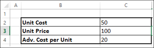
Next, set the cells for the required calculations as given below.
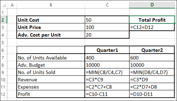
As you can observe, the calculations are done for Quarter1 and Quarter2 that are in consideration are −
No. of units available for sale in Quarter1 is 400 and in Quarter2 is 600 (cells C7 and D7).
The initial values for advertising budget are set as 10000 per Quarter (Cells C8 and D8).
No. of units sold is dependent on the advertising cost per unit and hence is budget for the quarter / Adv. Cost per unit. Note that we have used the Min function to take care to see that the no. of units sold in <= no. of units available. (Cells C9 and D9).
Revenue is calculated as Unit Price * No. of Units sold (Cells C10 and D10).
Expenses is calculated as Unit Cost * No. of Units Available + Adv. Cost for that quarter (Cells C11 and D12).
Profit is Revenue Expenses (Cells C12 and D12).
Total Profit is Profit in Quarter1 + Profit in Quarter2 (Cell D3).
Next, you can set the parameters for Solver as given below −
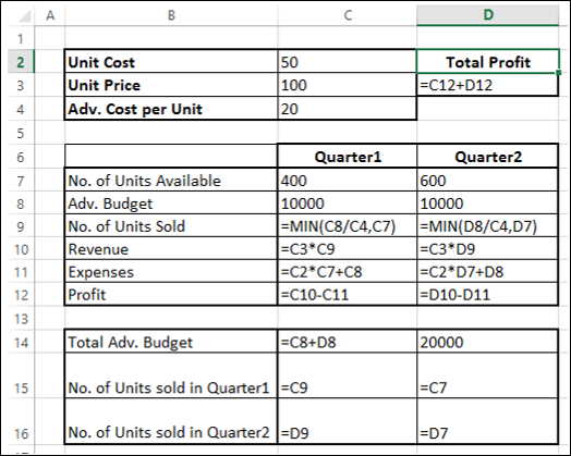
As you can observe, the parameters for Solver are −
Objective cell is D3 that contains Total Profit, which you want to maximize.
Decision Variable cells are C8 and D8 that contain the budgets for the two quarters Quarter1 and Quarter2.
There are three Constraint cells - C14, C15 and C16.
Cell C14 that contains total budget is to set the constraint of 20000 (cell D14).
Cell C15 that contains the no. of units sold in Quarter1 is to set the constraint of <= no. of units available in Quarter1 (cell D15).
Cell C16 that contains the no. of units sold in Quarter2 is to set the constraint of <= no. of units available in Quarter2 (cell D16).
Solving the Problem
The next step is to use Solver to find the solution as follows −
Step 1 − Go to DATA > Analysis > Solver on the Ribbon. The Solver Parameters dialog box appears.
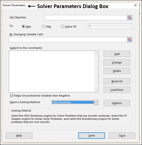
Step 2 − In the Set Objective box, select the cell D3.
Step 3 − Select Max.
Step 4 − Select range C8:D8 in the By Changing Variable Cells box.
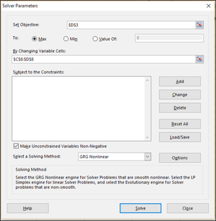
Step 5 − Next, click the Add button to add the three constraints that you have identified.
Step 6 − The Add Constraint dialog box appears. Set the constraint for total budget as given below and click Add.

Step 7 − Set the constraint for total no. of units sold in Quarter1 as given below and click Add.
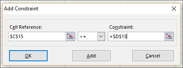
Step 8 − Set the constraint for total no. of units sold in Quarter2 as given below and click OK.
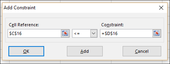
The Solver Parameters dialog box appears with the three constraints added in box Subject to the Constraints.
Step 9 − In the Select a Solving Method box, select Simplex LP.
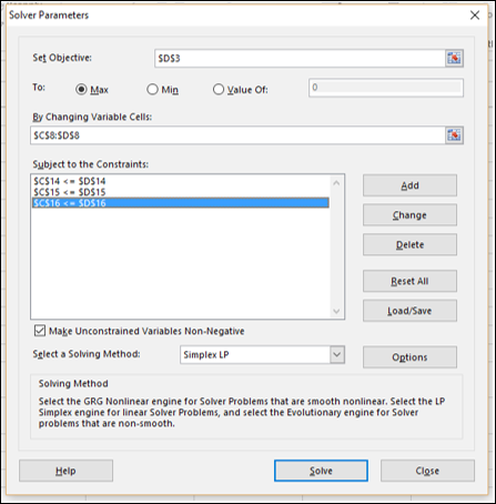
Step 10 − Click the Solve button. The Solver Results dialog box appears. Select Keep Solver Solution and click OK.
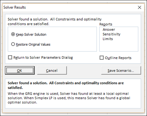
The results will appear in your worksheet.
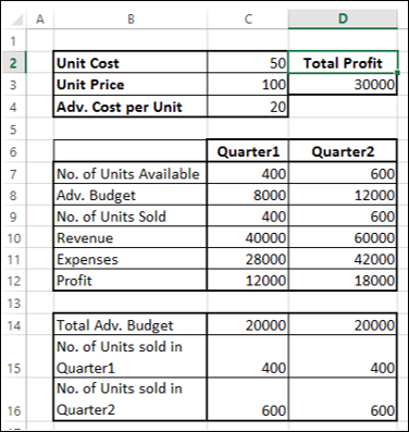
As you can observe, the optimal solution that produces maximum total profit, subject to the given constraints, is found to be the following −
- Total Profit 30000.
- Adv. Budget for Quarter1 8000.
- Adv. Budget for Quarter2 12000.
Stepping through Solver Trial Solutions
You can step through the Solver trial solutions, looking at the iteration results.
Step 1 − Click the Options button in the Solver Parameters dialog box.
The Options dialog box appears.
Step 2 − Select the Show Iteration Results box and click OK.
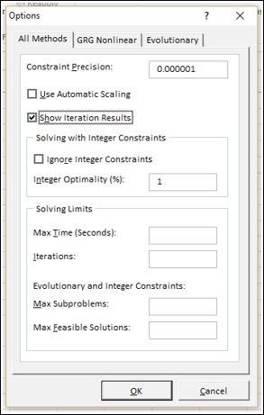
Step 3 − The Solver Parameters dialog box appears. Click Solve.
Step 4 − The Show Trial Solution dialog box appears, displaying the message - Solver paused, current solution values displayed on worksheet.
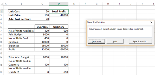
As you can observe, the current iteration values are displayed in your working cells. You can either stop the Solver accepting the current results or continue with the Solver from finding solution in further steps.
Step 5 − Click Continue.
The Show Trial Solution dialog box appears at every step and finally after the optimal solution is found, Solver Results dialog box appears. Your worksheet is updated at every step, finally showing the result values.
Saving Solver Selections
You have the following saving options for the problems that you solve with Solver −
You can save the last selections in the Solver Parameters dialog box with a worksheet by saving the workbook.
Each worksheet in a workbook can have its own Solver selections, and all of them will be saved when you save the workbook.
You can also define more than one problem in a worksheet, each with its own Solver selections. In such a case, you can load and save problems individually with the Load/Save in the Solver Parameters dialog box.
Click the Load/Save button. The Load/Save dialog box appears.
To save a problem model, enter the reference for the first cell of a vertical range of empty cells in which you want to place the problem model. Click Save.
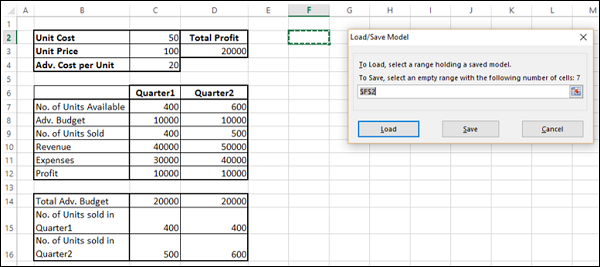
The problem model (the Solver Parameters set) appears starting at the cell that you have given as the reference.
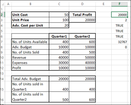
To load a problem model, enter the reference for the entire range of cells that contains the problem model. Then, click on the Load button.
Importing Data into Excel
You might have to use data from various sources for analysis. In Excel, you can import data from different data sources. Some of the data sources are as follows −
- Microsoft Access Database
- Web Page
- Text File
- SQL Server Table
- SQL Server Analysis Cube
- XML File
You can import any number of tables simultaneously from a database.
Importing Data from Microsoft Access Database
We will learn how to import data from MS Access database. Follow the steps given below −
Step 1 − Open a new blank workbook in Excel.
Step 2 − Click the DATA tab on the Ribbon.
Step 3 − Click From Access in the Get External Data group. The Select Data Source dialog box appears.
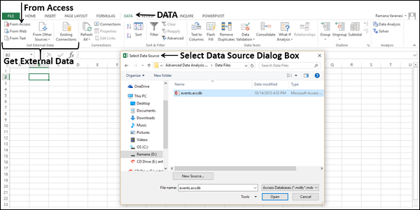
Step 4 − Select the Access database file that you want to import. Access database files will have the extension .accdb.
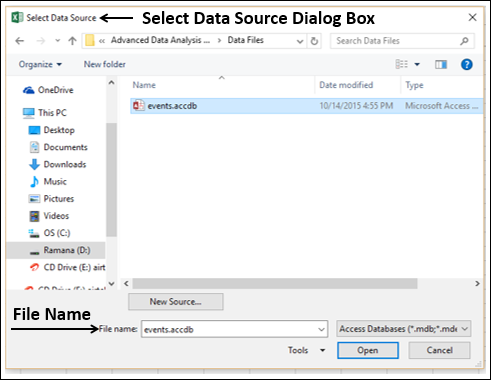
The Select Table dialog box appears displaying the tables found in the Access database. You can either import all the tables in the database at once or import only the selected tables based on your data analysis needs.
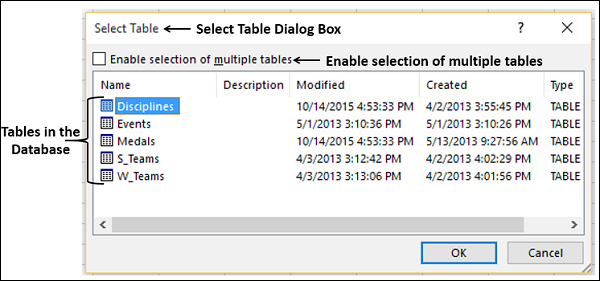
Step 5 − Select the Enable selection of multiple tables box and select all the tables.
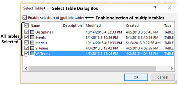
Step 6 − Click OK. The Import Data dialog box appears.
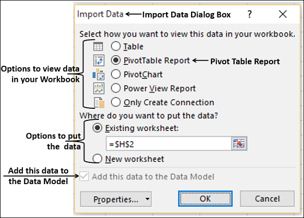
As you observe, you have the following options to view the data you are importing in your workbook −
- Table
- PivotTable Report
- PivotChart
- Power View Report
You also have an option - only create connection. Further, PivotTable Report is selected by default.
Excel also gives you the options to put the data in your workbook −
- Existing worksheet
- New worksheet
You will find another check box that is selected and disabled Add this data to the Data Model. Whenever you import data tables into your workbook, they are automatically added to the Data Model in your workbook. You will learn more about the Data Model in later chapters.
You can try each one of the options to view the data you are importing, and check how the data appears in your workbook −
If you select Table, Existing worksheet option gets disabled, New worksheet option gets selected and Excel creates as many worksheets as the number of tables you are importing from the database. The Excel tables appear in these worksheets.
If you select PivotTable Report, Excel imports the tables into the workbook and creates an empty PivotTable for analyzing the data in the imported tables. You have an option to create the PivotTable in an existing worksheet or a new worksheet.
Excel tables for the imported data tables will not appear in the workbook. However, you will find all the data tables in the PivotTable fields list, along with the fields in each table.
If you select PivotChart, Excel imports the tables into the workbook and creates an empty PivotChart for displaying the data in the imported tables. You have an option to create the PivotChart in an existing worksheet or a new worksheet.
Excel tables for the imported data tables will not appear in the workbook. However, you will find all the data tables in the PivotChart fields list, along with the fields in each table.
If you select Power View Report, Excel imports the tables into the workbook and creates a Power View Report in a new worksheet. You will learn how to use Power View Reports for analyzing data in later chapters.
Excel tables for the imported data tables will not appear in the workbook. However, you will find all the data tables in the Power View Report fields list, along with the fields in each table.
If you select the option - Only Create Connection, a data connection will be established between the database and your workbook. No tables or reports appear in the workbook. However, the imported tables are added to the Data Model in your workbook by default.
You need to choose any of these options, based on your intent of importing data for data analysis. As you observed above, irrespective of the option you have chosen, the data is imported and added to the Data Model in your workbook.
Importing Data from a Web Page
Sometimes, you might have to use the data that is refreshed on a web site. You can import data from a table on a website into Excel.
Step 1 − Open a new blank workbook in Excel.
Step 2 − Click the DATA tab on the Ribbon.
Step 3 − Click From Web in the Get External Data group. The New Web Query dialog box appears.
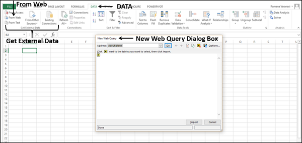
Step 4 − Enter the URL of the web site from where you want to import data, in the box next to Address and click Go.
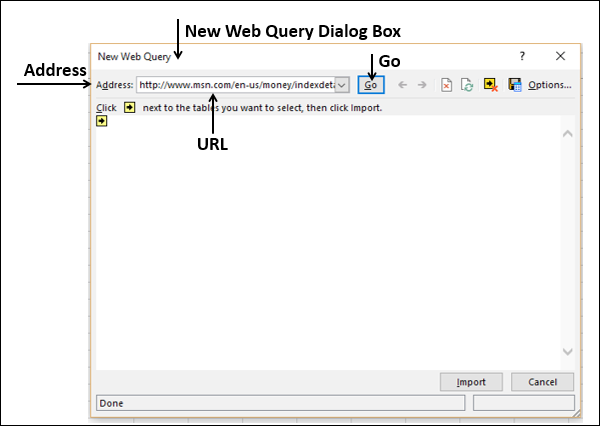
Step 5 − The data on the website appears. There will be yellow arrow icons next to the table data that can be imported.
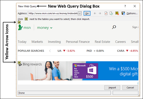
Step 6 − Click the yellow icons to select the data you want to import. This turns the yellow icons to green boxes with a checkmark as shown in the following screen shot.
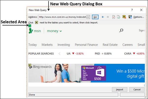
Step 7 − Click the Import button after you have selected what you want.
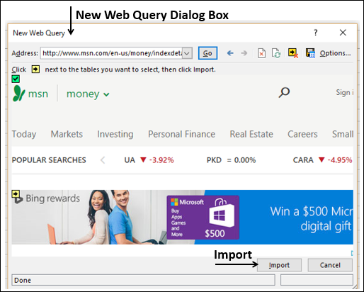
The Import Data dialog box appears.
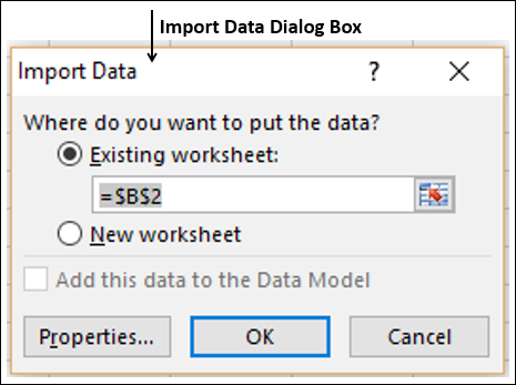
Step 8 − Specify where you want to put the data and click Ok.
Step 9 − Arrange the data for further analysis and/or presentation.
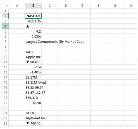
Copy-pasting data from web
Another way of getting data from a web page is by copying and pasting the required data.
Step 1 − Insert a new worksheet.
Step 2 − Copy the data from the web page and paste it on the worksheet.
Step 3 − Create a table with the pasted data.
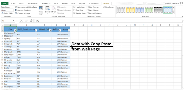
Importing Data from a Text File
If you have data in .txt or .csv or .prn files, you can import data from those files treating them as text files. Follow the steps given below −
Step 1 − Open a new worksheet in Excel.
Step 2 − Click the DATA tab on the Ribbon.
Step 3 − Click From Text in the Get External Data group. The Import Text File dialog box appears.
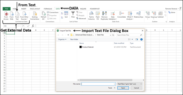
You can see that .prn, .txt and .csv extension text files are accepted.
Step 4 − Select the file. The selected file name appears in the File name box. The Open button changes to Import button.
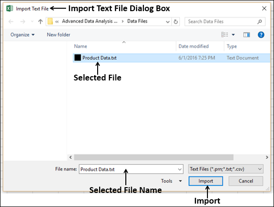
Step 5 − Click the Import button. Text Import Wizard Step 1 of 3 dialog box appears.
Step 6 − Click the option Delimited to choose the file type and click Next.
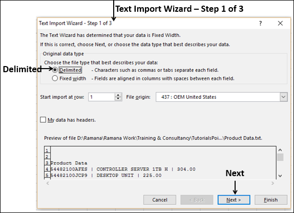
The Text Import Wizard Step 2 of 3 dialog box appears.
Step 7 − Under Delimiters, select Other.
Step 8 − In the box next to Other, type | (That is the delimiter in the text file you are importing).
Step 9 − Click Next.
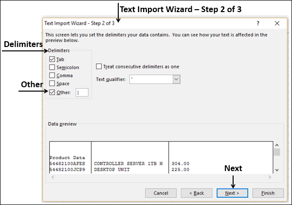
The Text Import Wizard Step 3 of 3 dialog box appears.
Step 10 − In this dialog box, you can set column data format for each of the columns.
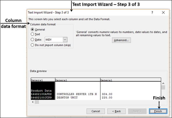
Step 11 − After you complete the data formatting of columns, click Finish. The Import Data dialog box appears.
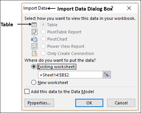
You will observe the following −
Table is selected for view and is grayed. Table is the only view option you have in this case.
You can put the data either in an existing worksheet or a New worksheet.
You can select or not select the check box Add this data to the Data Model.
Click OK after you have made the choices.
Data appears on the worksheet you specified. You have imported data from Text file into Excel workbook.
Importing Data from another Workbook
You might have to use data from another Excel workbook for your data analysis, but someone else might maintain the other workbook.
To get up to date data from another workbook, establish a data connection with that workbook.
Step 1 − Click DATA > Connections in the Connections group on the Ribbon.
The Workbook Connections dialog box appears.
Step 2 − Click the Add button in the Workbook Connections dialog box. The Existing Connections dialog box appears.
Step 3 − Click Browse for More button. The Select Data Source dialog box appears.
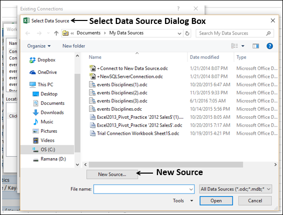
Step 4 − Click the New Source button. The Data Connection Wizard dialog box appears.
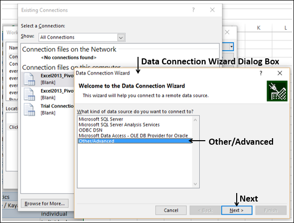
Step 5 − Select Other/Advanced in the data source list and click Next. The Data Link Properties dialog box appears.
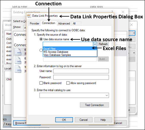
Step 6 − Set the data link properties as follows −
Click the Connection tab.
Click Use data source name.
Click the down-arrow and select Excel Files from the drop-down list.
Click OK.
The Select Workbook dialog box appears.
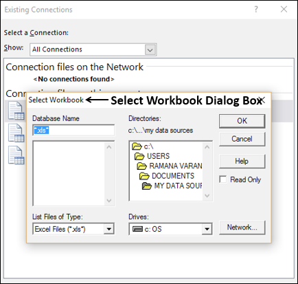
Step 7 − Browse to the location where you have the workbook to be imported is located. Click OK.
The Data Connection Wizard dialog box appears with Select Database and Table.
Note − In this case, Excel treats each worksheet that is getting imported as a table. The table name will be the worksheet name. So, to have meaningful table names, name / rename the worksheets as appropriate.
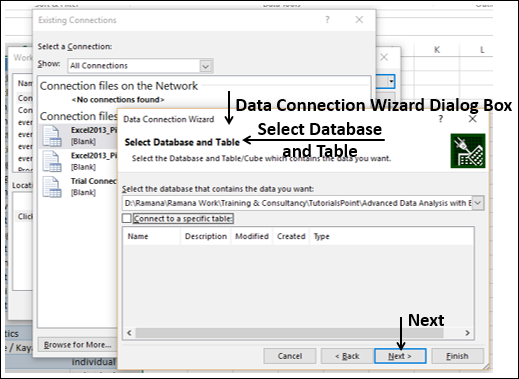
Step 8 − Click Next. The Data Connection Wizard dialog box appears with Save Data Connection File and Finish.
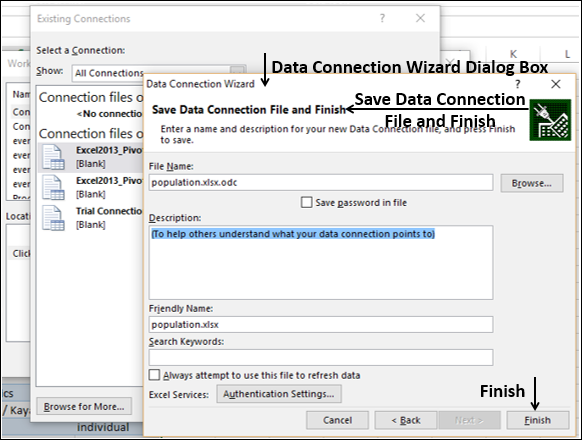
Step 9 − Click the Finish button. The Select Table dialog box appears.
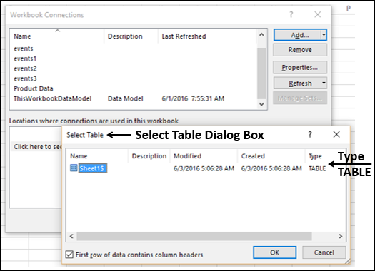
As you observe, Name is the worksheet name that is imported as type TABLE. Click OK.
The Data connection with the workbook you have chosen will be established.
Importing Data from Other Sources
Excel provides you options to choose various other data sources. You can import data from these in few steps.
Step 1 − Open a new blank workbook in Excel.
Step 2 − Click the DATA tab on the Ribbon.
Step 3 − Click From Other Sources in the Get External Data group.
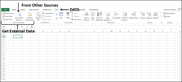
Dropdown with various data sources appears.
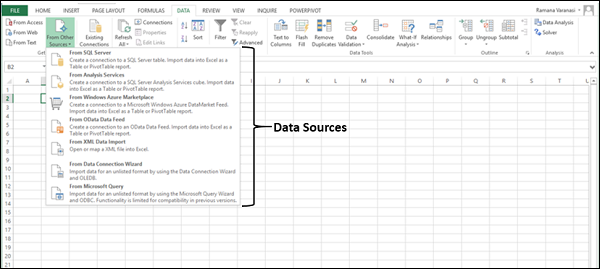
You can import data from any of these data sources into Excel.
Importing Data using an Existing Connection
In an earlier section, you have established a data connection with a workbook.
Now, you can import data using that existing connection.
Step 1 − Click the DATA tab on the Ribbon.
Step 2 − Click Existing Connections in the Get External Data group. The Existing Connections dialog box appears.
Step 3 − Select the connection from where you want to import data and click Open.
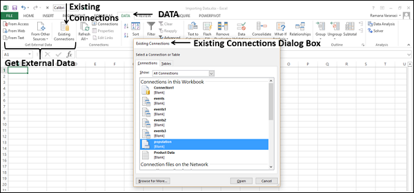
Renaming the Data Connections
It will be useful if the data connections you have in your workbook have meaningful names for the ease of understanding and locating.
Step 1 − Go to DATA > Connections on the Ribbon. The Workbook Connections dialog box appears.
Step 2 − Select the connection that you want to rename and click Properties.
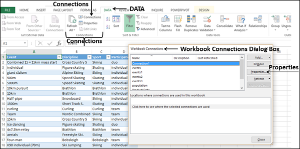
The Connection Properties dialog box appears. The present name appears in the Connection name box −
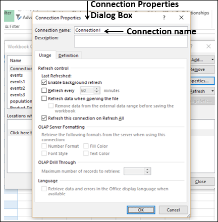
Step 3 − Edit the Connection name and click OK. The data connection will have the new name that you have given.
Refreshing an External Data Connection
When you connect your Excel workbook to an external data source, as you have seen in the above sections, you would like to keep the data in your workbook up to date reflecting the changes made to the external data source time to time.
You can do this by refreshing the data connections you have made to those data sources. Whenever you refresh the data connection, you see the most recent data changes from that data source, including anything that is new or that is modified or that has been deleted.
You can either refresh only the selected data or all the data connections in the workbook at once.
Step 1 − Click the DATA tab on the Ribbon.
Step 2 − Click Refresh All in the Connections group.
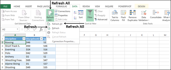
As you observe, there are two commands in the dropdown list Refresh and Refresh All.
If you click Refresh, the selected data in your workbook is updated.
If you click Refresh All, all the data connections to your workbook are updated.
Updating all the Data Connections in the Workbook
You might have several data connections to your workbook. You need to update them from time to time so that your workbook will have access to the most recent data.
Step 1 − Click any cell in the table that contains the link to the imported data file.
Step 2 − Click the Data tab on the Ribbon.
Step 3 − Click Refresh All in the Connections group.
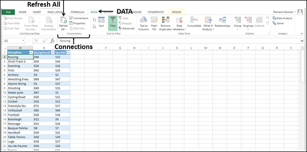
Step 4 − Select Refresh All from the dropdown list. All the data connections in the workbook will be updated.
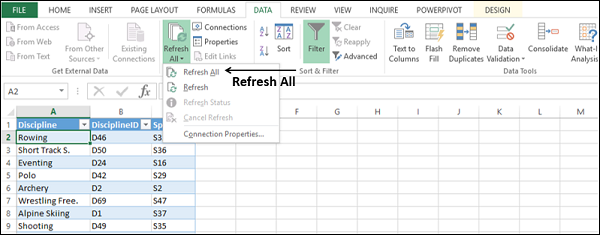
Automatically Refresh Data when a Workbook is opened
You might want to have access to the recent data from the data connections to your workbook whenever your workbook is opened.
Step 1 − Click any cell in the table that contains the link to the imported data file.
Step 2 − Click the Data tab.
Step 3 − Click Connections in the Connections group.
The Workbook Connections dialog box appears.
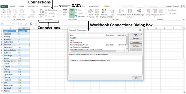
Step 4 − Click the Properties button. The Connection Properties dialog box appears.

Step 5 − Click the Usage tab.
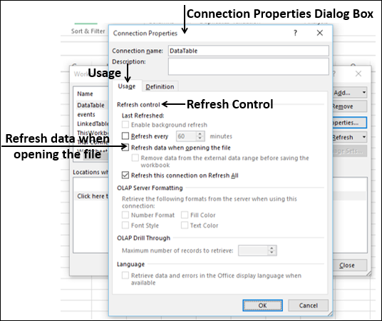
Step 6 − Check the option - Refresh data when opening the file.
You have another option also - Remove data from the external data range before saving the workbook. You can use this option to save the workbook with the query definition but without the external data.
Step 7 − Click OK. Whenever you open your workbook, the up to date data will be loaded into your workbook.
Automatically Refresh Data at regular Intervals
You might be using your workbook keeping it open for longer durations. In such a case, you might want to have the data refreshed periodically without any intervention from you.
Step 1 − Click any cell in the table that contains the link to the imported data file.
Step 2 − Click the Data tab on the Ribbon.
Step 3 − Click Connections in the Connections group.
The Workbook Connections dialog box appears.
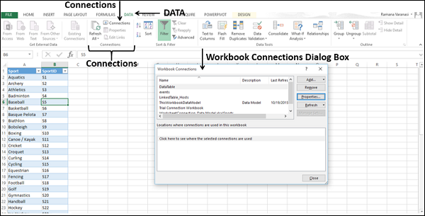
Step 4 − Click the Properties button.

The Connection Properties dialog box appears. Set the properties as follows −
Click the Usage tab.
Check the option Refresh every.
Enter 60 as the number of minutes between each refresh operation and click Ok.
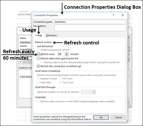
Your Data will be automatically refreshed every 60 min. (i.e. every one hour).
Enabling Background Refresh
For very large data sets, consider running a background refresh. This returns control of Excel to you instead of making you wait several minutes or more for the refresh to finish. You can use this option when you are running a query in the background. However, during this time, you cannot run a query for any connection type that retrieves data for the Data Model.
Click in any cell in the table that contains the link to the imported data file.
Click the Data tab.
Click Connections in the Connections group. The Workbook Connections dialog box appears.
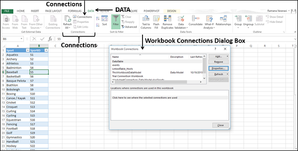
Click the Properties button.
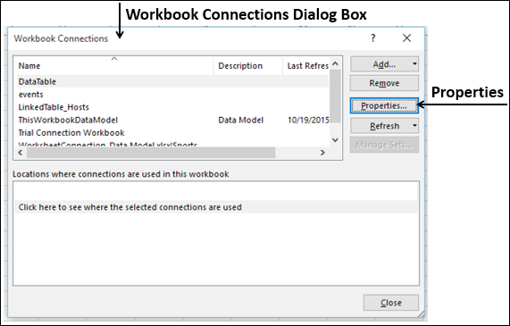
The Connection Properties dialog box appears. Click the Usage tab. The Refresh Control options appear.
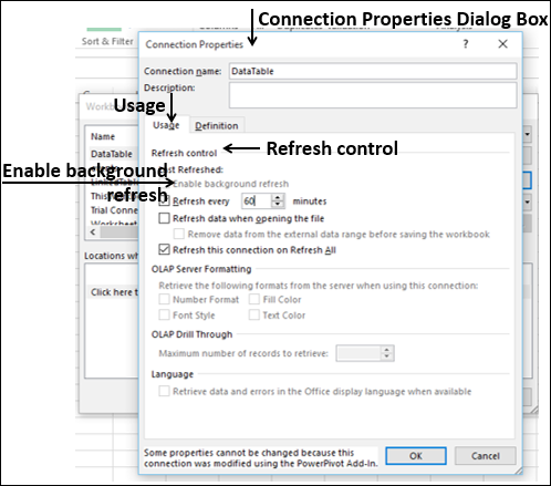
- Click Enable background refresh.
- Click OK. The Background refresh is enabled for your workbook.
Advanced Data Analysis - Data Model
Data Model is available in Excel 2013 and later versions. In Excel, you can use the Data Model to integrate data from multiple tables in the current workbook and / or from the imported data and / or from the data sources connected to the workbook through data connections.
With a Data Model, you can create relationships among the tables. Data model is used transparently in PivotTable, PivotChart, PowerPivot and Power View reports.
Creating Data Model while Importing Data
When you import data from relational databases like Microsoft Access database that contain multiple related tables, Data Model is automatically created if you import more than one table at once.
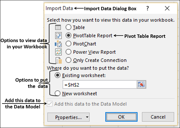
You can optionally add tables to the Data Model, when you import data from the following data sources −
- Relational databases, one table at a time
- Text Files
- Excel Workbooks
For example, while you are importing data from an Excel workbook, you can observe the option Add this data to the Data Model, with an enabled check box.
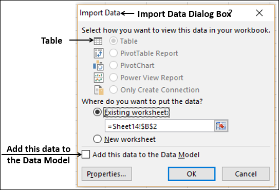
If you want to add the data you are importing to the Data Model, check the box.
Creating Data Model from Excel Tables
You can create the Data Model from Excel tables using PowerPivot commands. You will learn PowerPivot in detail in later chapters.
All the Data Model commands are available under the PowerPivot tab on the Ribbon. You can add Excel tables to the Data Model with these commands.
Consider the following sales data workbook, wherein you have Product Catalog worksheet that contains Product, Product ID and Price. You have four worksheets for the sales in 4 regions East, North, South and West.
Each of these four worksheets contain No. of Units sold and Total Amount for each of the Products in each month. You need to calculate the total amount for each of the products in each region and total amount of sales in each region.
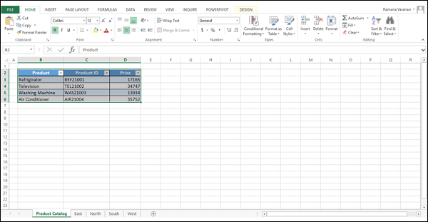
The following steps enable you to arrive at the desired results −
- Start with creating the Data Model.
- Click in the Product Catalog worksheet.
- Click the POWERPIVOT tab on the Ribbon.
- Click Add to Data Model. The Create Table dialog box appears.
- Select the table range.
- Check the box My table has headers. Click OK.
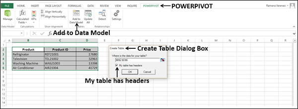
A new window PowerPivot for Excel - <your Excel file name> appears.
The following message appears in the center of the blank window −
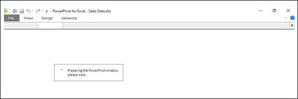
The table Product Backlog that you added to the Data Model appears as a sheet in PowerPivot window. Each row in the table is a record and you can go back and forth the records using the left and right arrow buttons at the bottom of the window.

- Click the Linked Table tab in the PowerPivot window.
- Click Go to Excel Table.
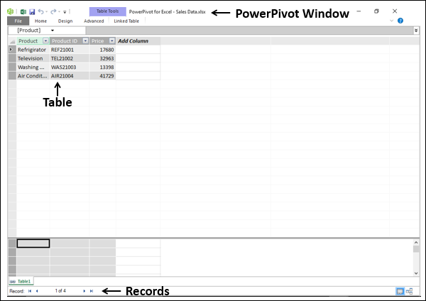
The Excel data window appears.
- Click the worksheet tab East.
- Click the POWERPIVOT tab on the Ribbon.
- Click Add to Data Model.
Another sheet appears in the PowerPivot window displaying the East table.
Repeat for the worksheets North, South and West. In all, you have added five tables to the Data Model. Your PowerPivot window looks as below −
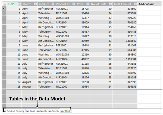
Creating Relationships between Tables
If you want to make calculations across the tables, you have to first define relationships among them.
Click the Home tab on the Ribbon in the PowerPivot window. As you can observe, the tables are displayed in the Data View.
Click Diagram View.
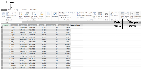
The tables appear in the Diagram View. As you observe, some of the tables may be out of display area and all the fields in the tables may not be visible.
- Resize each table to show all the fields in that table.
- Drag and arrange the tables so that all are displayed.
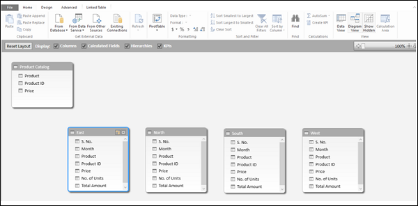
- In the East table, click on Product ID.
- Click the Design tab on the Ribbon.
- Click Create Relationship. The Create Relationship dialog box appears.
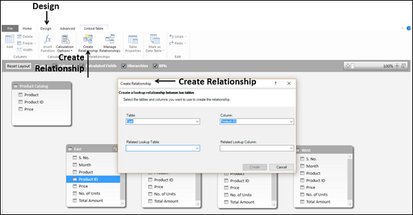
In the box under Table, East is displayed. In the box under Column, Product ID is displayed.
- In the box under Related Lookup Table, select Product Catalog.
- Product ID appears in the box under Related Lookup Column.
- Click the Create button.
Line representing Relationship between the tables East and Product Backlog appears.
- Repeat the same steps for the tables North, South and West. Relationship Lines appear.
Summarizing the Data in the Tables in the Data Model
Now, you are all set to summarize the sales data for each of the products in each region in just few steps.
- Click the Home tab.
- Click PivotTable.
- Select PivotTable from the drop-down list.
Create PivotTable dialog box appears in the Excel tables window. Select New Worksheet.
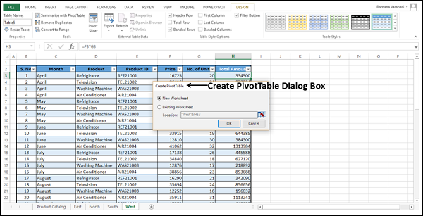
In a new worksheet, an empty PivotTable appears. As you can observe, the Fields List contains all the tables in the Data Model with all the fields displayed.
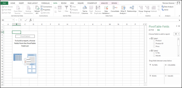
Select Product ID from Table 1 (Product Catalog).
Select Total Amount from the other four tables.
For each of fields in ∑ Values, change the Custom Name in Value Field Settings to display the region names as column labels.
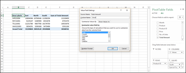
The sum of Total Amount will be replaced by the label you give. PivotTable with summarized values from all the data tables shows you the required results.
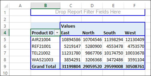
Adding Data to Data Model
You can add a new data table to the Data Model or new rows of data to the existing tables in the Data Model.
Add a new data table to the Data Model with the following steps.
Click the DATA tab on the Ribbon.
Click Existing Connections in the Get External Data group. The Existing Connections dialog box appears.
Click the Tables tab. The names of all the tables in the workbook will be displayed.
Click the name of the table you want to add to the Data Model.
Click on the Open button. The Import Data dialog box appears.
As you are aware, while importing data table, it is automatically added to the Data Model. The newly added table appears in the PowerPivot window.
Add new rows of data to the existing tables in the Data Model.
Refresh the Data Connection. New rows of data from the data source get added to the Data Model.
Exploring Data with PivotTables
You can do extensive data analysis using PivotTables and produce desired reports. The integration of Data Model with PivotTable enhances the way the data is collated, connected, summarized and reported. You can import tables from external data sources and create a PivotTable with the imported tables. This facilitates automatic updations of the values in the PivotTable whenever the data in the connected data sources is updated.
Creating a PivotTable to analyze External Data
To create a PivotTable to analyze external data −
- Open a new blank workbook in Excel.
- Click the DATA tab on the Ribbon.
- Click From Access in the Get External Data group. The Select Data Source dialog box appears.
- Select the Access database file.

Click the Open button. The Select Table dialog box appears, displaying the tables in the database. Access database is a relational database and the tables will be similar to Excel tables, with the exception that relationships exist among those tables.
Check the box Enable selection of multiple tables.
Select all the tables. Click OK.
The Import Data dialog box appears. Select PivotTable Report. This option imports the tables into your Excel workbook and creates a PivotTable for analyzing the imported tables.

As you observe, the checkbox Add this data to the Data Model is selected and disabled, indicating that the tables will be added to the Data Model automatically.
The data will be imported and an empty PivotTable will be created. The imported tables appear in the PivotTable Fields list.
Exploring Data in Multiple Tables
You can analyze the data from the imported multiple tables with PivotTable and arrive at the specific report you want in just few steps. This is possible because of the pre-existing relationships among the tables in the source database. As you imported all the tables from the database together at the same time, Excel recreates the relationships in its Data Model.
In the PivotTable Fields list, you will find all the tables that you imported and the fields in each of them. If the fields are not visible for any table,
- Click on the arrow next to that table in the PivotTable Fields list.
- The fields in that table will be displayed.
Exploring Data using PivotTable
You know how to add fields to PivotTable and drag fields across areas. Even if you are not sure of the final report that you want, you can play with the data and choose the appropriate report.
Suppose you want to have a report displaying the following −
- Data for five disciplines - Archery, Diving, Fencing, Figure Skating and Speed Skating.
- Regions that scored more than 80 medals in these 5 disciplines.
- The count of medals in each of the five disciplines in each of these regions.
- Total count of medals for the five disciplines in each of these regions.
You can see how easily you can create this report in few steps.
To start with, create a PivotTable displaying the count of medals in all the regions for the selected five disciplines as follows −
Drag the NOC_CountryRegion field from the Medals table to the COLUMNS area.
Drag Discipline from the Disciplines table to the ROWS area.
Filter Discipline to display only the five disciplines for which you wanted the report. This can be done either in the PivotTable Fields area, or from the Row Labels filter in the PivotTable itself.
Drag Medal from the Medals table to the VALUES area.
Drag Medal from the Medals table to the FILTERS area.
You will get the following PivotTable −
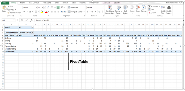
As you observe, Count of Medals is displayed for all the regions and for the five disciplines that you selected. Next, you have to fine-tune this report so that only those regions with total count of medals greater than 80 will be displayed.
Click the arrow button to the right of Column Labels.
Click Value Filters in the drop-down list that appears.
Select Greater Than from the drop-down list that appears.
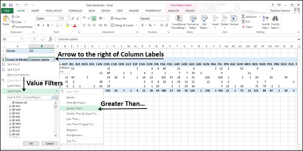
Value Filters dialog box appears.
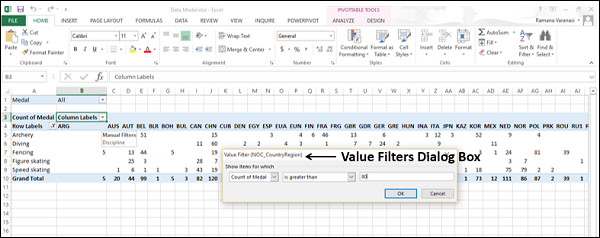
As you observe, Count of Medals and is greater than are displayed in the boxes below Show items for which. Type 80 in the box next to the box containing is greater than and click OK.
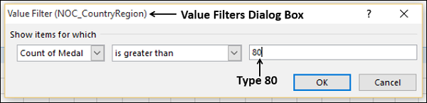
Now, the PivotTable displays only those regions with total count of medals in the selected five disciplines greater than 80.
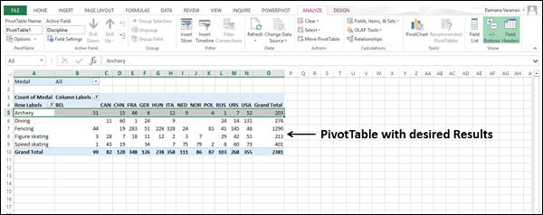
Creating a Relationship between Tables with PivotTable Fields
If you do not import the tables at the same time, if the data is from different sources, or if you add new tables to your workbook, you have to create the relationships among the tables by yourself.
Add a new worksheet with a table that contains Sport and SportID fields to your workbook.
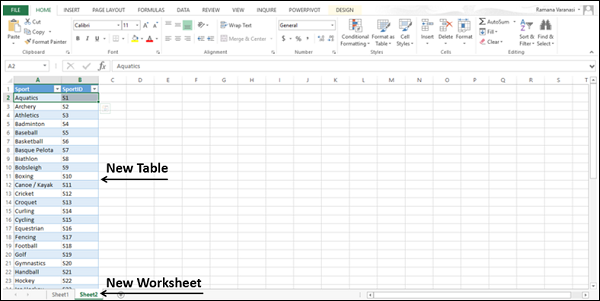
- Name the table - Sports.
- Click ALL in the PivotTable Fields list in the PivotTable worksheet.
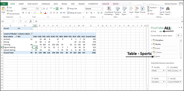
You can see that the newly added table- Sports is also visible in the PivotTable Fields list.
Next, add the field Sport also to the PivotTable as follows −
Drag the field Sport from the table Sports to ROWS area. The Sport values appear as Row labels in the PivotTable.
A message will appear in the PivotTable Fields list that Relationships between tables may be needed. A CREATE button appears next to the message.
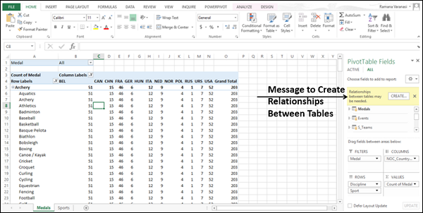
Click the CREATE button. The Create Relationship dialog box appears.
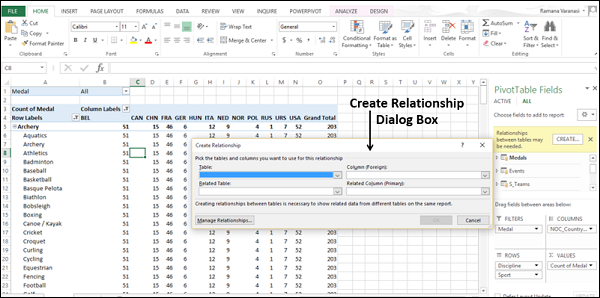
- Select Medals under Table.
- Select Sport under Column.
- Select Sports under Related Table. Sport appears under related column.
- Click OK.
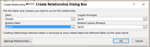
Drag Discipline under Sport in ROWS. This is to define the hierarchy in the PivotTable. The PivotTable displays the Sport and the corresponding group of disciplines for that sport.
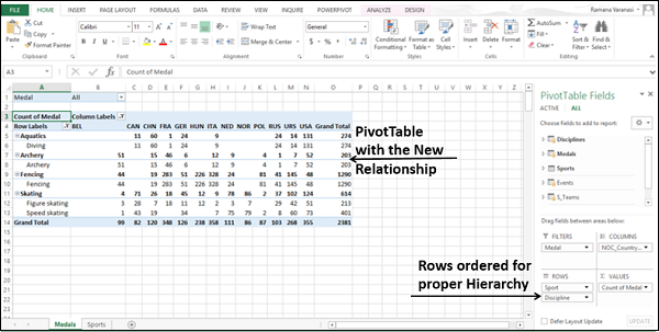
Exploring Data with Powerpivot
PowerPivot is an easy to use Data Analysis tool that can be used from within Excel. You can use PowerPivot to access and mashup data from virtually any data source. You can create your own fascinating reports with PowerPivot.
You can access the PowerPivot commands from PowerPivot tab on the Ribbon. Click the PowerPivot tab on the Ribbon. The PowerPivot commands will be displayed on the Ribbon. You can observe that the commands related to Data Model also appear here.
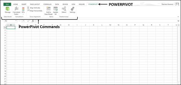
Adding Tables to Data Model
If you have imported tables, they are added to the Data Model. You can manage the Data Model from PowerPivot Ribbon. You can add tables to Data Model with PowerPivot as follows −
- Insert a new worksheet in your workbook.
- Copy data from the web page and paste it on the worksheet.
- Create a table with the pasted data.
- Name the table as Hosts.
- Rename the worksheet as Hosts.
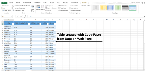
- Click the table Hosts.
- Click the POWERPIVOT tab on the Ribbon.
- Click Add to Data Model in the Tables group.
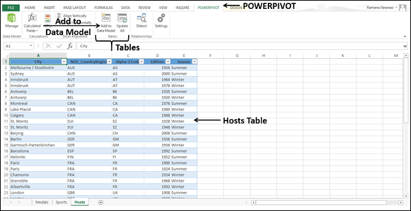
The table is added to the Data Model. The PowerPivot window appears. You will find the table Hosts in the Data Model tables.
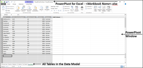
Viewing Tables in the Data Model
- Click on the POWERPIVOT tab on the Ribbon.
- Click on Manage in the Data Model group.
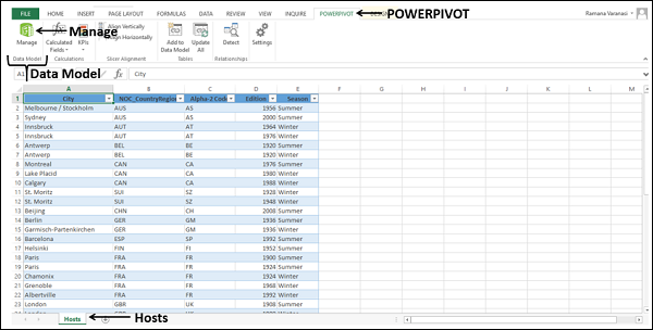
PowerPivot window appears, in Data View.
PowerPivot has two views −
Data View − It displays all the tables in the Data Model with fields displayed in columns and data as records in the rows, with a calculation area below each table. The table tabs look similar to the Excel worksheet tabs with names. You can move from table to table by clicking on the tabs.
Diagram View − It displays all the tables as boxes with table name as caption and the fields listed in the box. You can drag the tables to align them, resize them to make all the fields visible, and create relationships by just clicking on the fields and connecting them with lines.
You will understand the Diagram View and the Relationships in detail in the later sections.
Here, observe that all the tables in the Data Model are visible in the PowerPivot window, irrespective of whether they are present as worksheets in the workbook or not.
Viewing Relationships between Tables
You can use the data from different tables for analysis and reporting only when relationships exist among them.
You can view the relationships between tables from the diagram view in the PowerPivot window.
Click Diagram View in the View group.
Resize the diagram using the scroll bar so that you can see all the tables in the Data Model in the diagram.
All the tables in the Data Model appear with their fields lists. The relationships among the tables are denoted by the lines connecting them.
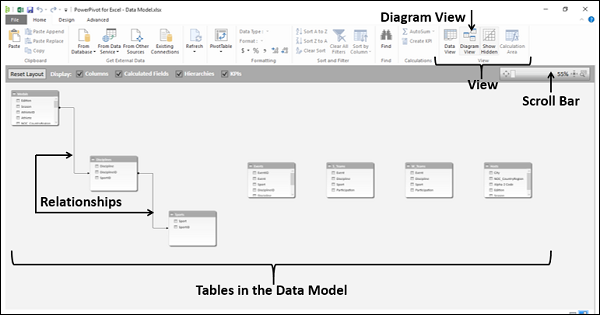
Creating Relationships between Tables
You might want to create a relationship between the tables Medals and Events. In order to do this, there should be a field that is common in both the tables and contains unique values in one of the tables. First, you need to verify this.
- Click the Data View in the View group.
- Click the Events tab to view the Events table.
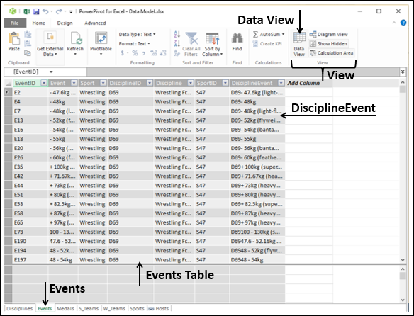
You can observe that the field DisciplineEvent in the Events table has unique values (no duplicate values).
Click the Medals tab to view the Medals table. The field DisciplineEvent is available in the Medals table also. Hence, you can create a relationship using the field DisciplineEvent as follows −
Click Diagram View in the View group.
Rearrange the tables in the view by dragging them so that Events table and Medals table are close to each other.
Resize the tables so that all the fields are visible.
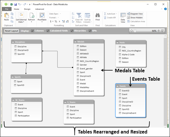
Click the field DisciplineEvent in the Events table and Drag to the field DisciplineEvent in the Medals table.
A line appears between the Events table and the Medals table, indicating that a relationship has been established.
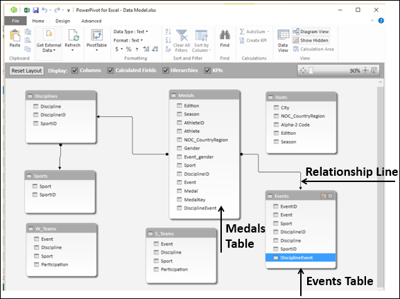
Viewing the Field defining a Relationship
You can view the field that is used to create the relationship between two tables.
Click the relationship line connecting the two tables. The relationship line and the field defining the relationship between the two tables get highlighted.
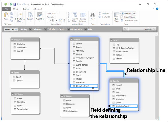
Exploring Data with Power View
Power View enables interactive data exploration, visualization and presentation that encourages intuitive ad-hoc reporting. Large data sets can be analyzed on the fly using the versatile visualizations. The data visualizations can also be made dynamic facilitating ease of presentation of the data with a single Power View report.
Power View is introduced in Microsoft Excel 2013. Before you start your data analysis with Power View, make sure that the Power View add-in enabled and available on the Ribbon.
Click the INSERT tab on the Ribbon. Power View should be visible in the Reports group.
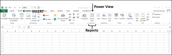
Creating a Power View Report
You can create a Power View report from the tables in the Data Model.
- Click the INSERT tab on the Ribbon.
- Click Power View in the Reports group.
Opening Power View message box appears with a horizontal scrolling green status bar. This might take a little while.
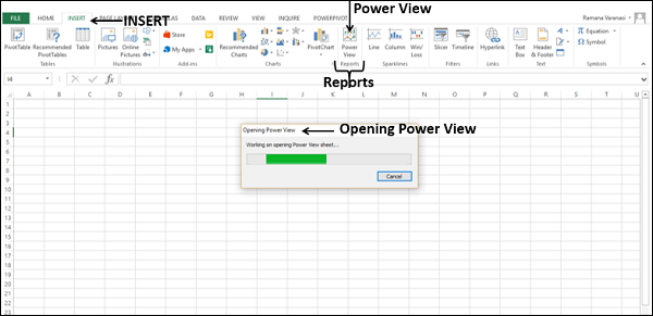
Power View sheet is created as a worksheet in your Excel workbook. It contains an empty Power View report, Filters space holder and the Power View Fields list displaying the tables in the Data Model. Power View appears as a tab on the Ribbon in the Power View sheet.
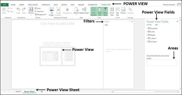
Power View with Calculated Fields
In the Data Model of your workbook, you have the following data tables −
- Disciplines
- Events
- Medals
Suppose you want to display the number of medals that each country has won.
- Select the fields NOC_CountryRegion and Medal in the table Medals.
These two fields appear under FIELDS in the Areas. Power View will be displayed as a table with the two selected fields as columns.
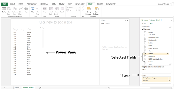
The Power View is displaying what medals each country has won. To display the number of medals won by each country, the medals need to be counted. To get the medal count field, you need to do a calculation in the Data Model.
Click PowerPivot tab on the Ribbon.
Click Manage in the Data Model group. The tables in the Data Model will be displayed.
Click the Medals tab.
In the Medals table, in the calculation area, in the cell below the Medal column, type the following DAX formula
Medal Count:=COUNTA([Medal])
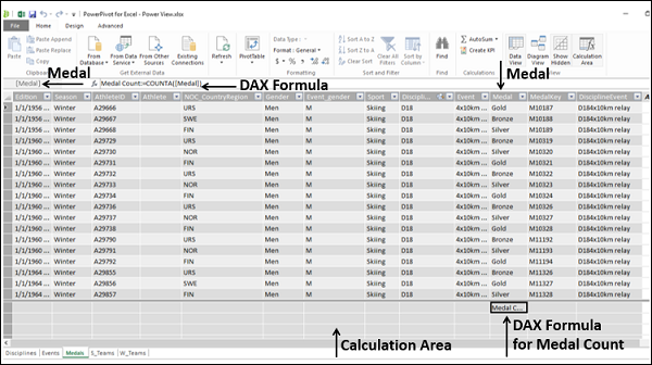
You can observe that the medal count formula appears in the formula bar and to the left of the formula bar, the column name Medal is displayed.
You will get a Power View message that the Data Model is changed and if you click OK, the changes will be reflected in your Power View. Click OK.
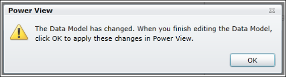
In the Power View Sheet, in the Power View Fields list, you can observe the following −
A new field Medal Count is added in the Medals table.
A calculator icon appears adjacent to the field Medal Count, indicating that it is a calculated field.
Deselect the Medal field and select the Medal Count field.
Your Power View table displays the medal count country wise.
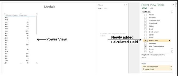
Filtering Power View
You can filter the values displayed in Power View by defining the filter criteria.
Click the TABLE tab in the Filters.
Click Medal Count.
Click the icon Range file mode that is to the right of Medal Count.
Select is greater than or equal to from the drop-down list in the box below Show items for which the value.
Type 1000 in the box below that.
Click apply filter.
Below the field name Medal Count, is greater than or equal to 1000 appears. Power View will display only those records with Medal Count >= 1000.
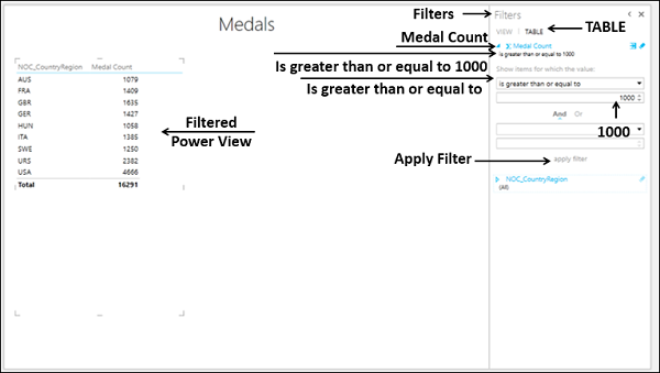
Power View Visualizations
In the Power View sheet, two tabs POWER VIEW and DESIGN appear on the Ribbon.
Click the DESIGN tab.You will find several visualization commands in the Switch Visualization group on the Ribbon.
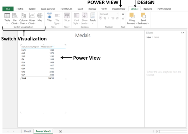
You can quickly create a number of different data visualizations that suit your data using Power View. The visualizations possible are Table, Matrix, Card, Map, Chart types such as Bar, Column, Scatter, Line, Pie and Bubble Charts, and sets of multiple charts (charts with same axis).
To explore the data using these visualizations, you can start on the Power View sheet by creating a table, which is the default visualization and then easily convert it to other visualizations, to find the one that best illustrates your Data. You can convert one Power View visualization to another, by selecting a visualization from the Switch Visualization group on the Ribbon.
It is also possible to have multiple visualizations on the same Power View sheet, so that you can highlight the significant fields.
In the sections below, you will understand how you can explore data in two visualizations Matrix and Card. You will get to know about exploring data with other Power View visualizations in later chapters.
Exploring Data with Matrix Visualization
Matrix Visualization is similar to a Table Visualization in that it also contains rows and columns of data. However, a matrix has additional features −
- It can be collapsed and expanded by rows and/or columns.
- If it contains a hierarchy, you can drill down/drill up.
- It can display totals and subtotals by columns and/or rows.
- It can display the data without repeating values.
You can see these the differences in the views by having a Table Visualization and a Matrix Visualization of the same data side by side in the Power View.
Choose the fields Sport, Discipline and Event. A Table representing these fields appears in Power View.
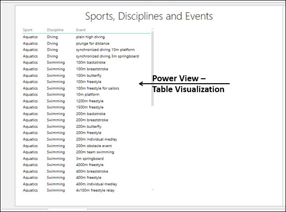
As you observe, there are multiple disciplines for every sport and multiple events for every discipline. Now, create another Power View visualization on the right side of this Table visualization as follows −
- Click the Power View sheet in the space to the right of the Table.
- Choose the fields Sport, Discipline and Event.
Another Table representing these fields appears in Power View, to the right of the earlier Table.
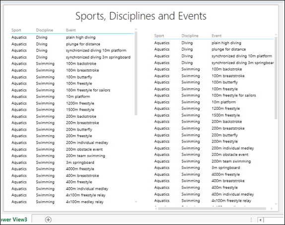
- Click the right Table.
- Click the DESIGN tab on the Ribbon.
- Click Table in the Switch Visualization group.
- Select Matrix from the drop-down list.
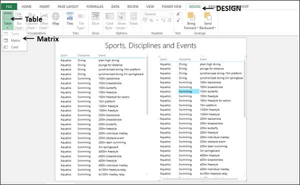
The Table on the right in Power View gets converted to Matrix.
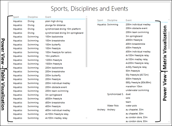
The table on the left lists the sport and discipline for each and every event, whereas the matrix on the right lists each sport and discipline only once. So, in this case, Matrix visualization gives you a comprehensive, compact and readable format for your data.
Now, you can explore the data to find the countries that scored more than 300 medals. You can also find the corresponding sports and have subtotals.
Select the fields NOC_CountryRegion, Sport and Medal Count in both the Table and Matrix Visualizations.
In the Filters, select the filter for the Table and set the filtering criteria as is greater than or equal to 300.
Click apply filter.
Set the same filter to Matrix also. Click apply filter.
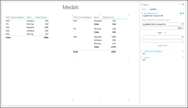
Once again, you can observe that in the Matrix view, the results are legible.
Exploring Data with Card Visualization
In a card visualization, you will have a series of snapshots that display the data from each row in the table, laid out like an index card.
- Click the Matrix Visualization that is on the right side in the Power view.
- Click Table in the Switch Visualization group.
- Select Card from the drop-down list.
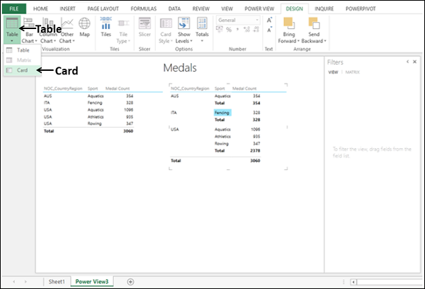
The Matrix Visualization gets converted to Card Visualization.
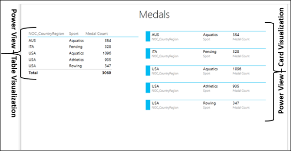
You can use the Card view for presenting the highlighted data in a comprehensive way.
Data Model and Power View
A workbook can contain the following combinations of Data Model and Power View.
An internal Data Model in your workbook that you can modify in Excel, in PowerPivot, and even in a Power View sheet.
Only one internal Data Model in your workbook, on which you can base a Power View sheet.
Multiple Power View sheets in your workbook, with each sheet based on a different Data Model.
If you have multiple Power View sheets in your workbook, you can copy visualizations from one to another only if both the sheets are based on the same Data Model.
Creating Data Model from Power View Sheet
You can create and/or modify the Data Model in your workbook from the Power View sheet as follows −
Start with a new workbook that contains Salesperson data and Sales data in two worksheets.
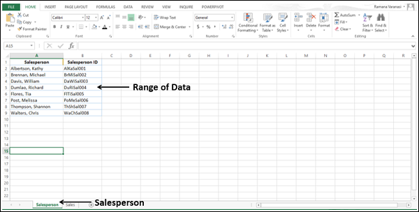
Create a table from the range of data in the Salesperson worksheet and name it Salesperson.
Create a table from the range of data in the Sales worksheet and name it Sales.
You have two tables Salesperson and Sales in your workbook.
- Click the Sales table in the Sales worksheet.
- Click the INSERT tab on the Ribbon.
- Click Power View in the Reports group.
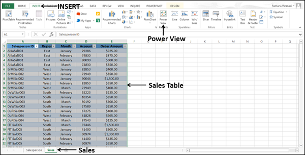
Power View Sheet will be created in your workbook.
You can observe that in the Power View Fields list, both the tables that are in the workbook are displayed. However, in the Power View, only the active table (Sales) fields are displayed since only the active data table fields are selected in the Fields list.
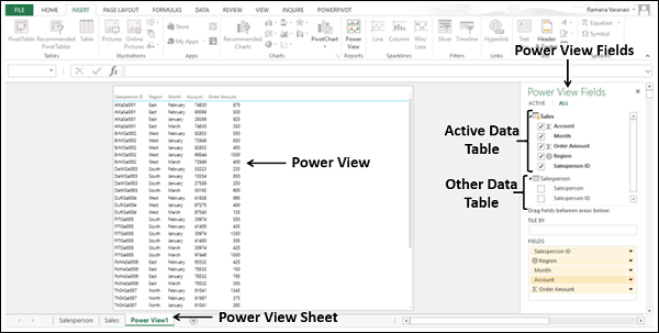
You can observe that in the Power View, Salesperson ID is displayed. Suppose you want to display the Salesperson name instead.
In the Power View Fields list, make the following changes.
- Deselect the field Salesperson ID in the Salesperson table.
- Select the field Salesperson in the Salesperson table.
As you do not have a Data Model in the workbook, no relationship exists between the two tables. No data is displayed in Power View. Excel displays messages directing you what to do.
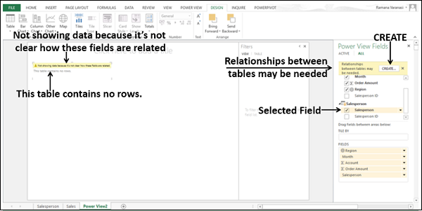
A CREATE button also will be displayed. Click the CREATE button.
The Create Relationship dialog box opens in the Power View Sheet itself.
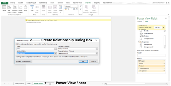
- Create a relationship between the two tables using the Salesperson ID field.
Without leaving the Power View sheet, you have successfully created the following −
- The internal Data Model with the two tables, and
- The relationship between the two tables.
The field Salesperson appears in Power View along with the Sales data.
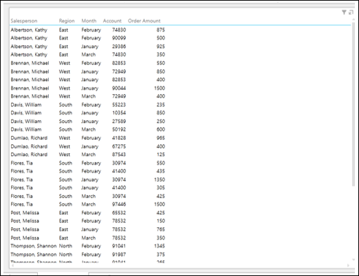
Retain the fields Region, Salesperson and ∑ Order Amount in that order in the area FIELDS.
Convert the Power View to Matrix Visualization.
Drag the field Month to the area TILE BY. Matrix Visualization appears as follows −
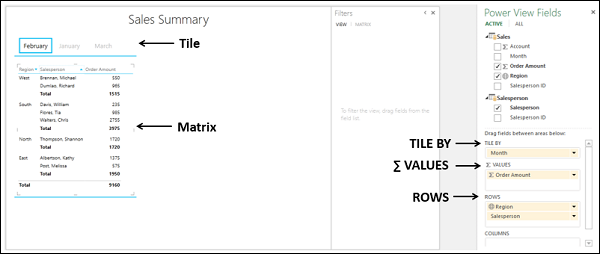
As you observe, for each of the regions, the Salespersons of that region and sum of Order Amount are displayed. Subtotals are displayed for each region. The display is month wise as selected in the tile above the view. As you select the month in the tile, the data of that month will be displayed.
Exploring Data with Power View Charts
In Power View, you have a number of Chart options: Pie, Column, Bar, Line, Scatter, and Bubble. The Charts in Power View are interactive. If you click on a value in one chart −
- That value in that chart is highlighted.
- That value in all the other charts in Power View is also highlighted.
- All the tables, matrices and tiles in Power View are filtered to that value.
Thus, Power View Charts serve as interactive, pictorial data analysis tools. Further, the charts are interactive in a presentation setting also, which would enable you to highlight the analysis results.
Exploring with Line Charts
You can use Line charts for comparing data points in one or more data series. Line charts distribute category data evenly along a horizontal (category) axis, and all numerical value data along a vertical (value) axis.
Suppose you want to display the Medal Count for each country.
Create a Power View with the fields NOC_CountryRegion and Medal Count selected. By default, Table will be displayed.
Click the Table.
Click Other Chart in the Switch Visualization group.
Select Line from the drop-down list. Line Chart will be displayed in the Power View.
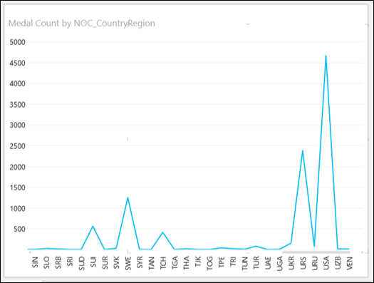
Click on the Line or the Category (x-axis) axis.
Drag to left or right. The Categories to the left or right will be displayed and Line chart will be displayed accordingly.
Place the cursor on any of the data points on the line.
The values corresponding to that data point will be displayed at that point.
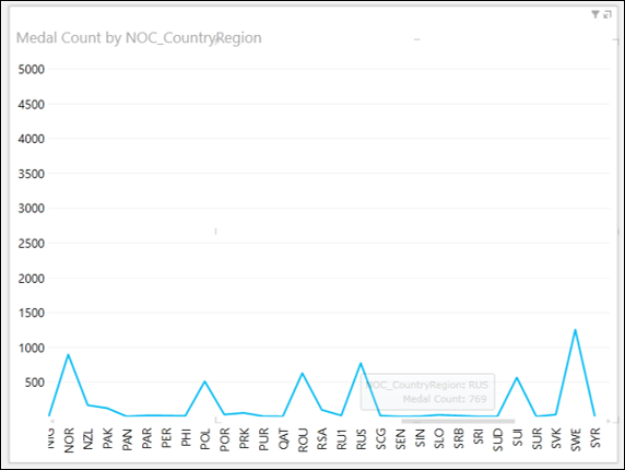
Exploring with Bar Charts
You can use Bar charts for comparing data points in one or more data series. In a Bar chart, categories are organized along the vertical axis and values along the horizontal axis. In Power View, there are three Bar chart subtypes −
- Stacked Bar.
- 100% Stacked Bar.
- Clustered Bar.
You can convert a Table Visualization to Bar Chart Visualization as follows −
- Create two Table visualizations side-by-side.
- Click the right Table.
- Click Bar Chart in the Switch Visualization group.
- Click Stacked Bar.
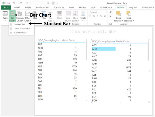
The Table Visualization on the right gets converted to Bar Chart Visualization. As you observe, the y-axis values are sorted by the category values in ascending order.
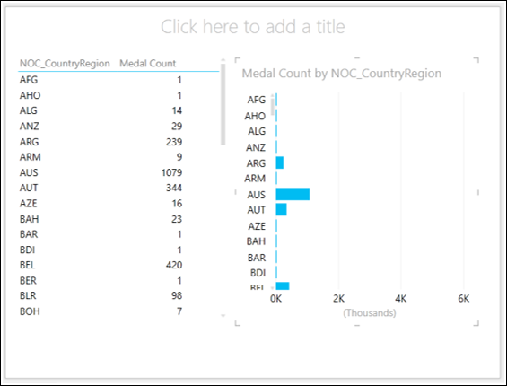
Take the cursor above the Bar chart. You will find sort by NOC_CountryRegion asc.
Click NOC_CountryRegion. It is changed to Medal Count.
Click asc. It is changed to desc. You will find that the Bar Chart is sorted by descending Medal Count.
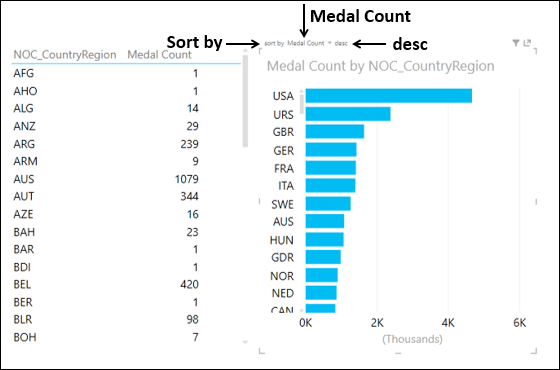
Click the Bar with Category GER. Only that Bar will be highlighted.
With Ctrl key pressed, click the Bars with Categories FRA and ITA. The Bars for GER, FRA and ITA will be highlighted.
The Table on the left also shows values for these three Categories only.
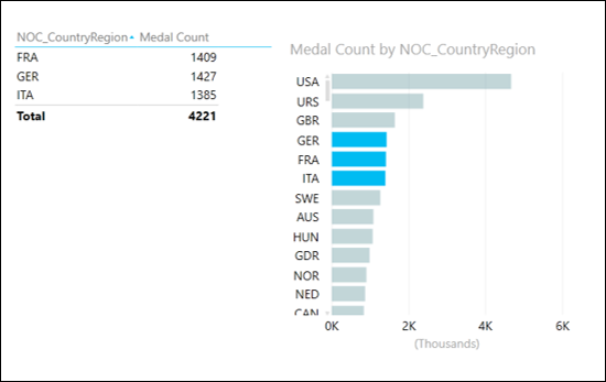
In both the visualizations, click the Gender field also in the Power View Fields list.
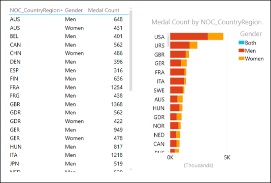
Click the left portion of the Bar GER. It is highlighted. In the Table, only the information for GER and Men will be displayed.
Note − You cannot make multiple selections in this case.
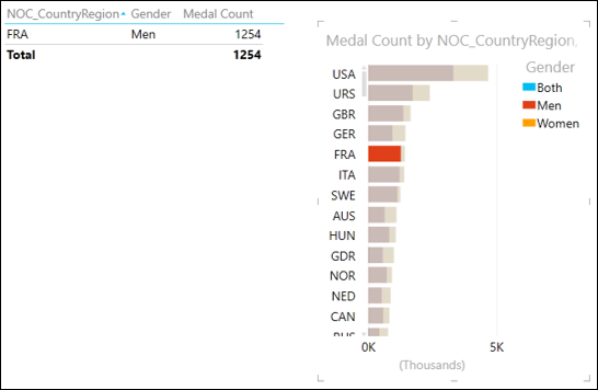
Exploring with Column Charts
You can use Column charts for showing data changes over a period of time or for illustrating comparison among items. In Column charts, categories are along the horizontal axis and values along the vertical axis.
In Power View, there are three Column chart subtypes −
- Stacked Column.
- 100% Stacked Column.
- Clustered Column.
You can convert a Table Visualization to Column Chart Visualization as follows −
- Create two Table visualizations side-by-side.
- Click the right Table.
- Click Column Chart in the Switch Visualization group.
- Click Stacked Column.
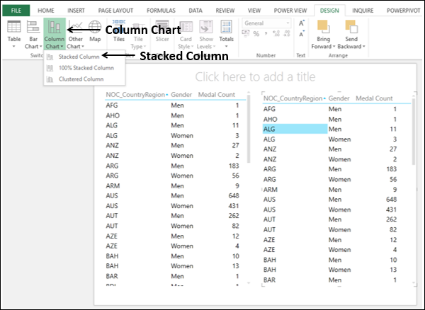
The Table Visualization on the right is converted to Bar Chart Visualization. As you observe, the x-axis values are sorted by the category values in ascending order.
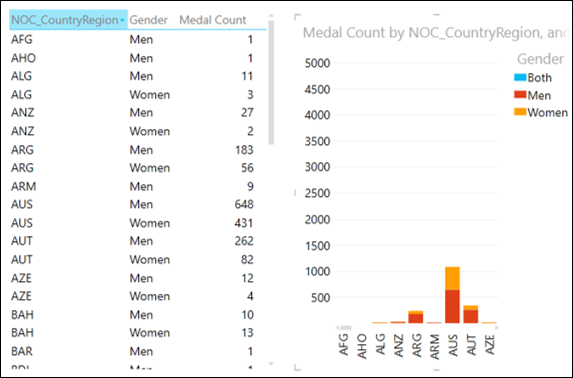
Take the cursor to above the Column chart. You will find sort by NOC_CountryRegion asc.
Click on NOC_CountryRegion. It gets changed to Medal Count.
Click on asc. It gets changed to desc. You will find that the Column Chart is sorted by descending Medal Count.
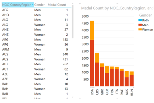
Click on the lower portion of the Bar with Category GER. It gets highlighted.
In the Table, only the information for GER and Men will be displayed.
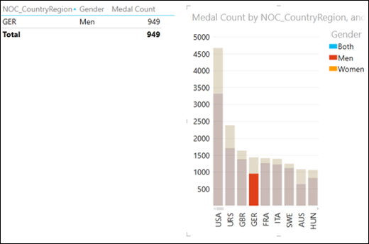
Exploring with Simple Pie Charts
Pie charts in Power View are simple or sophisticated. You will learn simple Pie charts in this section. You will learn sophisticated Pie charts in the next section.
Start with creating a Pie chart as follows −
- Resize the Stacked Column chart and move it upwards.
- Create another Table visualization below the Stacked Column chart.
- Click the new Table.
- Click Other Chart in the Switch Visualization group.
- Select Pie.
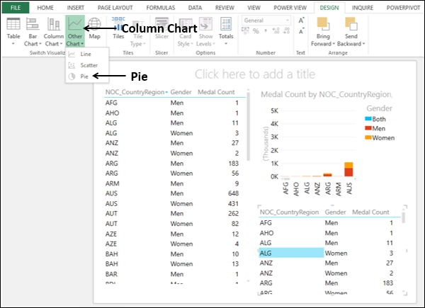
The Table Visualization below the Stacked Column chart is converted to Pie Chart Visualization. As you observe, there are too many slices in the Pie chart as there are many categories (countries). Note that Pie charts work well only when the number of categories is 8 or less.
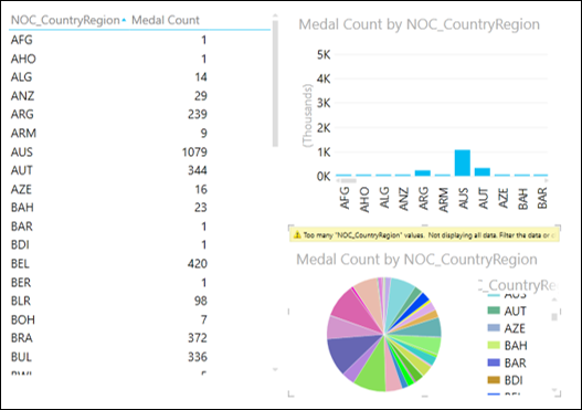
You can reduce the number of categories by filtering the values as follows −
- Set the filtering as Medal Count is greater than or equal to 1300 in −
- Table Visualization
- Column Chart Visualization
- Pie Chart Visualization
Note − You have to define and apply filtering to each of the visualizations separately.
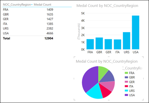
Now, you have a Simple Pie Chart Visualization, wherein the count of Medals are shown by the Pie size, and countries by colors.
Click on a Pie slice. That slice is highlighted and others get grayed. The corresponding column in the Column chart also is highlighted. In the table, only the values corresponding to the highlighted Pie slice will be displayed.
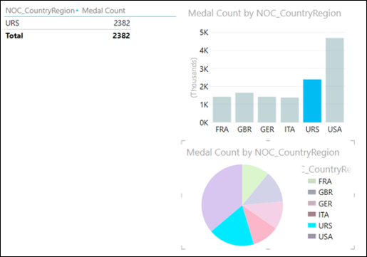
Exploring with Sophisticated Pie Charts
You can make your Pie Chart Visualization sophisticated, by adding more features. You can make a pie char that −
- Drills down when you double-click a slice, or
- Shows sub-slices within the larger color slices.
A Pie chart that drills down when you double-click a slice
In the Pie chart, in the Power View Fields list, drag the field Gender to COLOR area, to below the field NOC_CountryRegion. This means you have two categories.
In the Table, include Gender also in the Fields list.
Your Power View looks as follows −
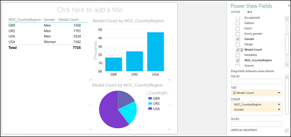
As you observe, there is a single slice with one color for each category - country.
On the Pie chart, double-click on the USA slice.
The Pie chart in your Power View will be changed to show values by Gender, which is the second category, for the selected category (USA). The colors of the pie chart now show the percentages of the second field, i.e., Gender, filtered for the pie color you doubleclicked. In other words, the Pie chart was drilled down. As you observe, a small arrow appears on the top right corner of the Pie chart. If you place the mouse over it, the arrow is highlighted and Drill up will be displayed.
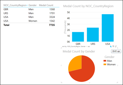
Click the drill up arrow. The Pie Chart returns to its previous state.
A Pie chart that shows sub-slices within the larger color slices
In the Pie chart, in the Power View Fields list, drag the field Gender from COLOR area to SLICES area.
Your Power View looks as follows −
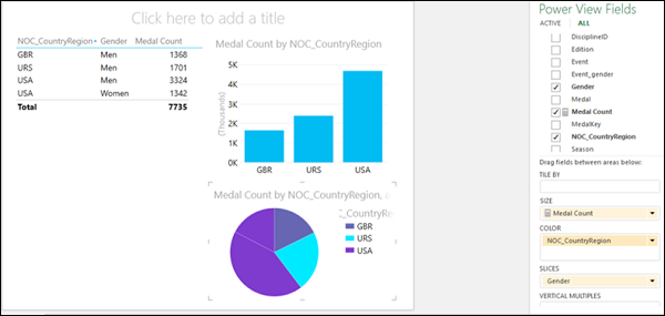
As you can see, in the Pie chart, there are two slices of same color for the category USA.
Click on one of these slices.
You will be able to see the following changes in Power View −
- The selected slice is highlighted and other slices are grayed or deactivated.
- The bar for the category USA displays the medal count for the selected slice.
- The Table shows the values for the selected slice.
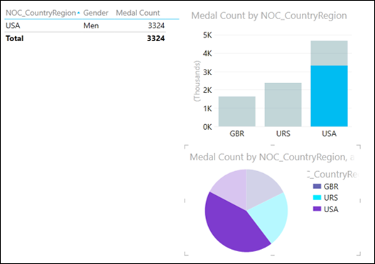
- Click the other slice. You can observe the changes as given above for this selected slice.
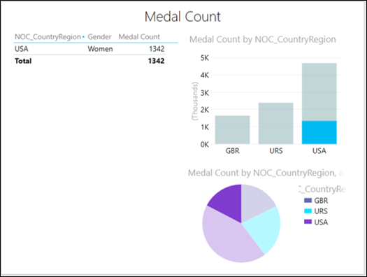
Exploring with Scatter Charts
You can use Scatter charts to display many related data in one chart. In Scatter charts, the x-axis displays one numeric field and the y-axis displays another, making it easy to see the relationship between the two values for all the items in the chart.
To create a Scatter Chart Visualization, proceed as follows −
Add the fields Sport, Medal Count and Event to Table.
Click the arrow next to Event in the Power View Fields list. Click Count (Distinct). The field Event changes to the numeric field Count of Event. Therefore, you have one category field Sport and two numeric fields Medal Count and Count of Event.
Click Other Chart in the Switch Visualization group.
Click Scatter.
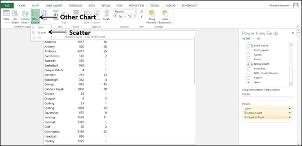
You will get the Scatter Chart Visualization, with the data points displayed as circles of same size, showing how the Count of Event and Medal Count values are related for each sport.
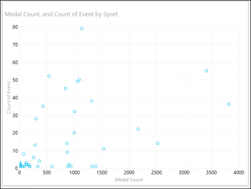
- Click the LAYOUT tab on the Ribbon.
- Click Data Labels in the Labels group.
- Select Right from the drop-down list. The Data labels appear for the data points.
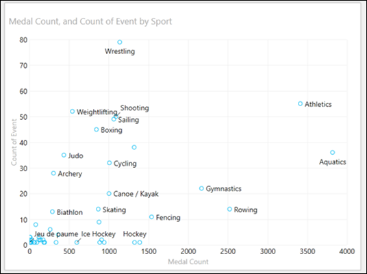
The sport Wrestling has less number of medals in more number of events as compared to the sport Aquatics that has more number of medals in less number of events.
Exploring with Bubble Charts
You can use Bubble charts to display many related data in one chart. In Bubble Charts, the x-axis displays one numeric field and the y-axis displays another, making it easy to see the relationship between the two values for all the items in the chart. A third numeric field controls the size of the data points.
To create a Bubble Chart Visualization, proceed as follows −
- Drag Medal Count to Size.
- Drag NOC_CountryRegion to ∑ X-VALUE. The Scatter chart is converted to Bubble chart.
As you observe, the size of each bubble shows the medal count. The data labels show the Sport.
Exploring with Colors
You can also color the bubbles by a category as follows −
- Drag the field NOC_CountryRegion to COLOR area in the Power View Fields list.
- Drag the field DiscipleEvent to ∑ X-VALUES.
As you observe, Legend shows the values of the category that is in COLOR area and the respective colors. The data labels correspond to the category in DETAILS area. The size of the data points is by the area ∑ SIZE.
Next, you can see how selecting a category in Legend changes the visualization −
Click on a value in the Legend. Only the data points of that color (i.e., corresponding to that value) will be highlighted. All the other data points will be deactivated.
As you observe, all the sports corresponding to the selected country are displayed and the size of each bubble represents the medal count.
If you want to know the details of a single data point −
- Highlight the data point by just clicking on that bubble.
- Place the cursor on that data point.
Only that bubble is highlighted and the rest of the bubbles get grayed. All the information about that data point will be displayed in a box next to the data point.
Exploring with Play Axis
You can visualize the data changes over a period of time using Play Axis as follows −
- Drag the field Edition in the Power View Fields list to PLAY AXIS area.
A timeline with a Play button is inserted in your Bubble chart visualization. You can adjust the timeline by filtering the Edition field values in the Filters. This would be useful if you want to focus on a particular time range or if the timeline is too wide.
- Adjust the timeline by filtering Edition field in Filters and choosing a span of time values.
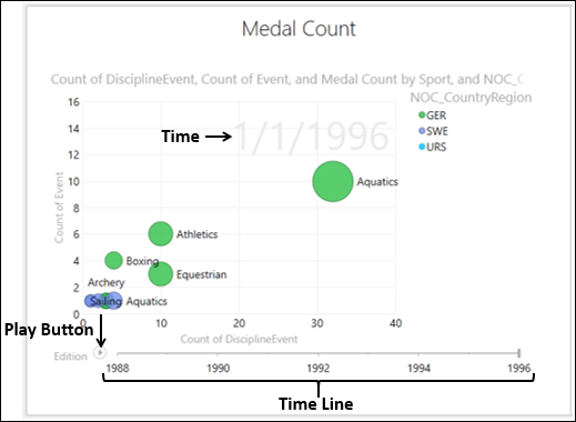
Click the Play button. The bubbles travel, grows and shrink to show how the values change based on the play axis. A small vertical line appears on the timeline that moves across the timeline. The time at that point also is displayed.
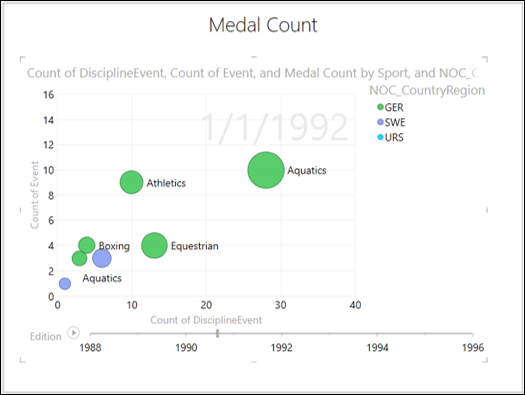
You can pause at any point to study the data in more detail.
Exploring Data with Power View Maps
You can use maps to display your data in the context of geography. Maps in Power View use Bing map tiles, so you can zoom and pan as you would with any other Bing map. To make maps work, Power View has to send the data to Bing through a secured web connection for geocoding. So, it asks you to enable content. Adding locations and values places dots on the map. The larger the value, the bigger the dot. When you add a multivalue series, you get pie charts on the map, with the size of the pie chart showing the size of the total.
Exploring Data with Geographic Fields
You can create a Power View Map Visualization if your data has a geographic field such as Country/Region, State/Province, or City.
To create a map visualization for the medal count, country wise proceed as follows −
Create a new Power View sheet from INSERT tab on the Ribbon.
Drag the fields NOC_CountryRegion and Medal Count in the Power View Fields list to the Power View. A Table with these two fields are created.
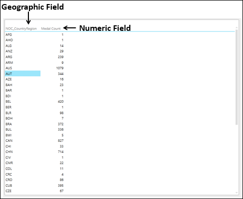
So, you have a geographic field and a numeric field.
- Click the DESIGN tab on the Ribbon.
- Click Map in the Switch Visualization group.
The Table Visualization converts into Map Visualization.
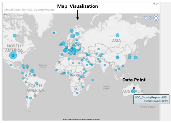
As you observe, Power View creates a map with a dot representing each geographic location. The size of the dot is the value of the corresponding numeric field, which is the medal count in this case. Further, in the Power View Fields list, the Geographic field will be in the Locations area and the Numeric field will be in the ∑ SIZE area.
To display more information about a data point, you can do one of the following −
If you place the cursor on a dot on the map, a box appears displaying the geographic location name and the corresponding numeric value.
If you click on a dot on the map, that particular dot gets highlighted.
Pie Charts as Data Points
Suppose you want to add another field also to the map visualization. For example, you might want to display the details about the medals, viz. the medal types Gold, Silver and Bronze. You can do it as follows −
- Drag the field Medal from the Power View Fields list to the COLOR area.
The dots are converted to Pie charts. A Legend for Medal appears displaying the types of medals and respective colors. i.e., each color in the Pie chart represents the type of the medal.
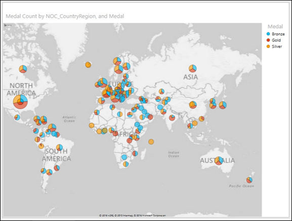
You can observe that the size of a Pie chart corresponds to the medal count and the size of each slice in the Pie chart corresponds to the count of that medal type.
Highlighting a Data Point
Now, you can filter your data and highlight a significant data point as follows −
In the Filters area, set the Medal Count to display only the values greater than or equal to 300.
Apply the filter. The map zooms and displays only the filtered values.
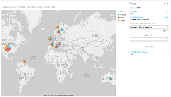
Place the cursor on the dot representing Great Britain. The dot gets highlighted and zoomed. The details of the Pie chart will be displayed.
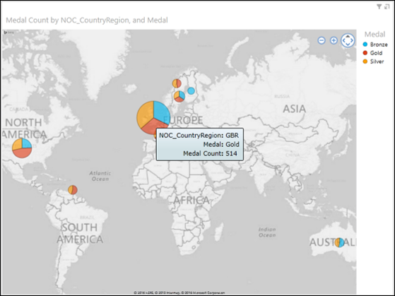
As you can see, the medal count for gold for Great Britain is 514. You can find the medal counts for silver and bronze by placing the cursor on those slices.
Highlighting a Pie Slice in a Data Point
Next, you might want to highlight the gold medal count of Great Britain.
Place the cursor on the slice with red color (as you can make out that red represents gold in the Legend). Click it.
That Pie Slice will be highlighted. The other slices in that Pie chart and all the other Pie charts will be deactivated.
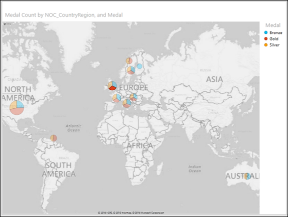
Place the cursor on the dot again. The dot is zoomed. The slice representing gold will be highlighted. The details of the slice will be displayed.
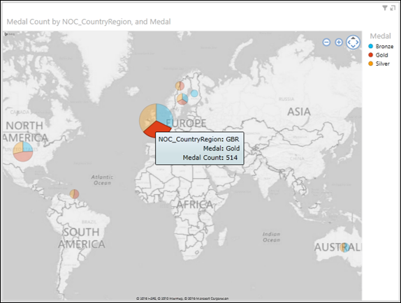
Exploring Data with Power View Multiples
Multiples, also called Trellis Charts are a series of charts with identical X and Y axes. You can arrange Multiples side by side, to compare many different values easily at the same time.
- You can have Line charts, Pie charts, Bar charts and Column charts as Multiples.
- You can arrange the Multiples horizontally or vertically.
Line Charts as Multiples
You might want to display the medal count by year for each Region. Firstly, you need to have the field Year. To get this field, you need to have a calculated column as follows −
- Click the Medals tab in the Data View of the Data Model (in the PowerPivot window).
- Click in the first cell in the right most column with the header Add Column.
- Type =YEAR ([Edition]) in the formula bar and press Enter.
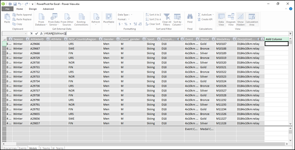
A new column with header CalculatedColumn1 is created with values corresponding to the Year values in Edition column.
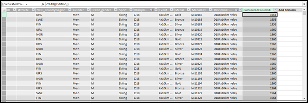
Click on the header and rename it as Year.
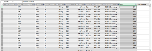
Close the PowerPivot window. The Data Model gets updated. The new field - Year appears in the Power View Fields list.
Create a Table in Power View with fields NOC_CountryRegion, Count of Year and Medal Count, by dragging the fields.
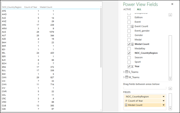
- Convert Table into a Line chart in Power View.
- Remove the field NOC_CountryRegion. A Line chart appears with Medal Count by Year.
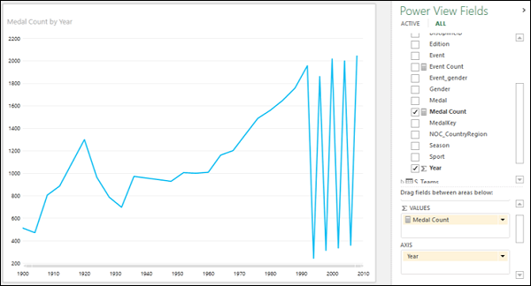
As you can observe, Year is in AXIS area and Medal Count is in ∑ VALUES area in Power View Fields list. In the Line chart, Year values are on X-axis and Medal count on Y-axis.
Now, you can create Multiples visualization with Line charts, as follows −
- Drag the field NOC_CountryRegion to VERTICAL MULTIPLES area in the Power View Fields list.
- Click the tab LAYOUT on the Ribbon.
- Click Grid Height in the Multiples group.
- Click a value in the dropdown list.
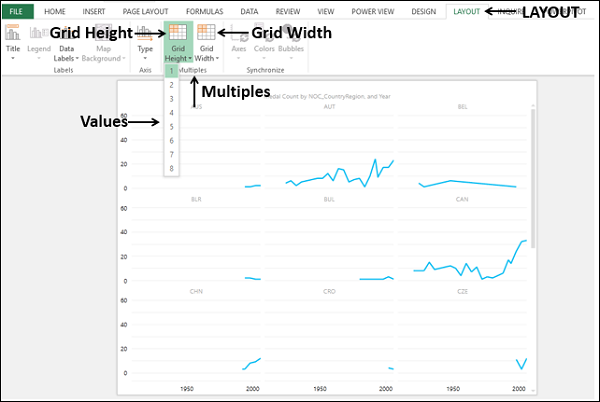
- Click Grid Width in the Multiples group.
- Click on a value from the dropdown list.
You will get the Multiples Visualization with Line charts arranged as a grid, with each Line chart representing a country (NOC_CountryRegion).
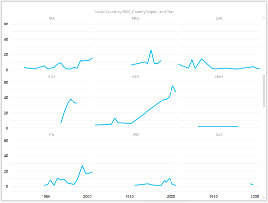
Vertical Multiples
As you are aware, you have placed the NOC_CountryRegion field in the VERTICAL MULTIPLES area. Hence, the visualization that you have got is the Vertical Multiples visualization. You can observe the following in the chart given above.
One Line chart per category that is placed in VERTICAL MULTIPLES area, in this case the country.
The grid height and grid width that you have chosen determine the number of rows and number of columns for the Multiples.
A common x-axis for all the multiples.
A similar y-axis for each row of the multiples.
A vertical scroll bar on the right side that can be used to drag the rows of Line charts up and down, so as to make the other Line charts visible.
Horizontal Multiples
You can have the Multiples Visualization with Horizontal Multiples also as follows −
- Drag the field NOC_CountryRegion to VERTICAL MULTIPLES area.
- Click the Layout tab on the Ribbon.
- Select the values for Grid Height and Grid Width in the Multiples group.
You will get the Horizontal Multiples visualization as follows −
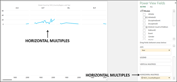
You can observe the following in the above chart −
One Line chart per category that is placed in HORIZONTAL MULTIPLES area, in this case the country.
The grid height that you have chosen determines the height of the Line charts, unlike the number of rows of Line charts as is the case in the VERTICAL MULTIPLES. In other words, there is a single row of Line charts with the height determined by the Grid Height that is chosen.
The grid width that you have chosen determines the number of columns of Line charts in the row.
A common x-axis for all the multiples.
A common y-axis for all the multiples.
A horizontal scroll bar at the bottom, below the x-axis, that can be used to drag the row of Line charts to the left and the right, so as to make the other Line charts visible.
Pie Charts as Multiples
If you want to explore / visualize more than one category in Multiples, Pie charts is an option. Suppose you want to explore the medal count by medal type for each of the countries. Proceed as follows −
- Click the Design tab.
- Select Pie from the dropdown under Other Chart.
- Drag Medal to the area SLICES.
You will get the Horizontal Multiples visualization with Pie charts, as you have the field NOC_CountryRegion in the area HORIZONTAL MULTIPLES.
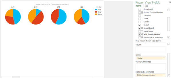
As you can observe the medal-count for each country is displayed as a Pie chart with the slices representing the medal types with the color as given in the Legend.
Suppose you want to highlight the count of gold medals for all the countries. You can do it in a single step as follows −
Click on the blue color slice one of the Pie charts (as blue is color for Gold as per the Legend). In all the Pie charts, only the blue slices are highlighted and other slices are grayed.
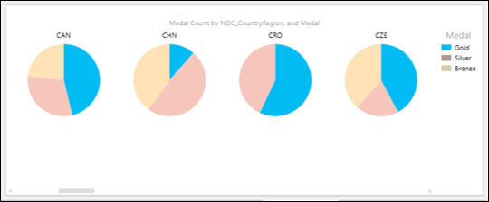
As you can observe, this gives a fast way of exploring and comparing the count of gold medals across the countries.
You might want to display more number of Pie charts in a visualization. You can do it by simply switching over to Vertical Multiples Visualization and choosing the right values for Grid Height and Grid Width for a proper display.
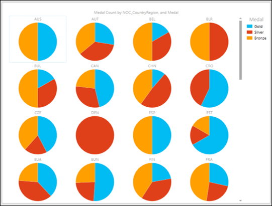
Click on the blue slice on one of the Pie charts. The blue slices in all the Pie charts are highlighted so that you can compare the gold medal counts across the countries.
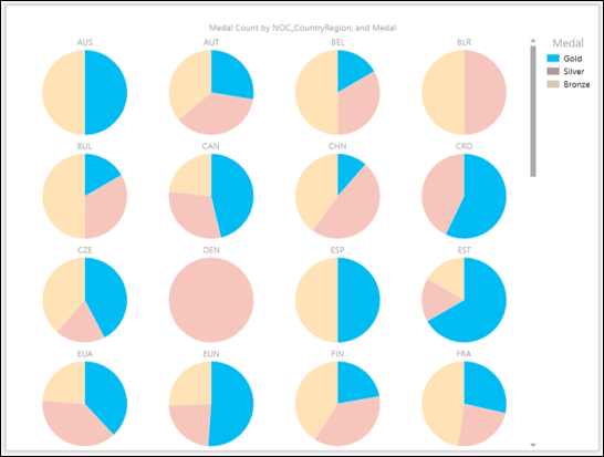
Bar Charts as Multiples
You can choose Bar charts also for Multiples visualization.
- Switch over to Stacked Bar visualization.
- Adjust the Grid Height and Grid Width to get a proper display of the Bar charts.
With Grid Height of 6 and Grid Width of 2, you will get the following −
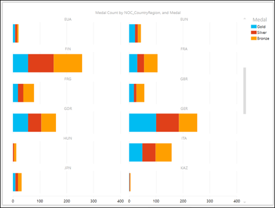
You can have Clustered Bar charts also for this visualization.
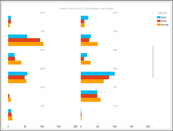
Column Charts as Multiples
You can choose Column charts also for Multiples visualization.
- Switch over to Stacked Column visualization.
- Adjust the Grid Height and Grid Width to get a proper display of the Column charts.
With Grid Height of 2 and Grid Width of 6, you will get the following −
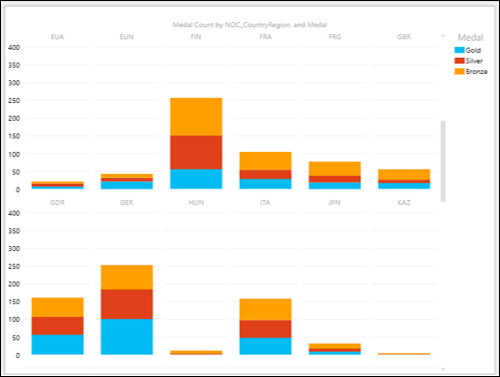
You can have Clustered Column charts also for this visualization.
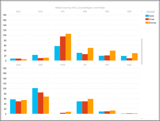
Wrap-up
The fields you choose depend on what you want to explore, analyze and present. For example, in all the visualizations above, we have chosen Medal for Slices that helped to analyze medal count by medal type. You might want to explore, analyze and present the data gender-wise. In such a case, choose the field Gender for Slices.
Once again, the visualization that is suitable also depends on the data you are displaying. If you are not sure about the suitability, you can just play around to choose the right one as switching across the visualizations is quick and simple in Power View. Moreover, you can also do it in the presentation view, in order to answer any queries that can arise during a presentation.
Exploring Data with Power View Tiles
Suppose you have lot of data to display with significant data points at varied places. In such a case, you might have to scroll very often in your Power View visualizations to find the data you are looking for. This would be tedious and also might not be smooth when you are presenting the results.
You can overcome this drudgery, using the tile feature in Power View. With tiles, you can gain insights from your data much more quickly. Tiles act as navigation strips, with a single tile for each possible field value. When you click on a tile, only data related to that field value is displayed. As it is easy to scroll the values in the navigation strip that dynamically changes the corresponding values in the visualization, tiles become an easy to use tool for you.
You can have Tiles in a Table, Matrix, Card or Chart visualization. You can have a combination of these in Power View and get them filtered with Tiles. A Tile can be simple text or an image.
Table with Tiles
Start with a Table Visualization as follows −
Drag the fields NOC_CountryRegion, Sport and Medal Count to Power View. As you observe, as the number of rows is large, it is difficult to scroll up and down to highlight values.
Drag the field Sport from FIELDS area to TILE BY area in the Power View Fields list.
Navigation Strip appears at the top of the Table.
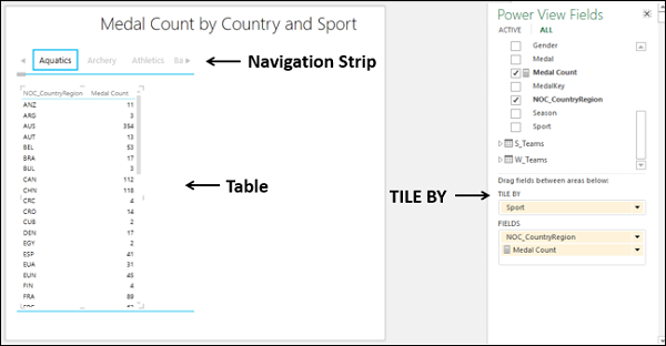
You can observe the following −
By default, the first Tile in the Navigation Strip is selected.
In the Table, the values are filtered to that of the Tile selected. In this case, the Sport that is selected.
There are arrow buttons at the left and right edges of the Navigation strip to enable scrolling.
You can select a different Tile as follows −
Scroll the Navigation Strip to display the Tile representing the Sport you are looking for, for e.g. Badminton.
Click the Tile Badminton. The values in the Table are filtered to those of Badminton.
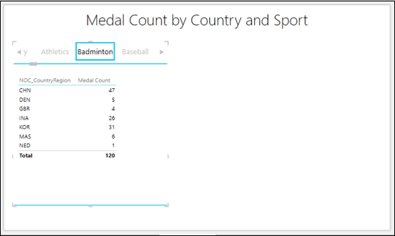
You can observe the medal count Total is also displayed. You have an option to turn Totals on or off from the Ribbon. You also can make the Tiles more appealing and meaningful by having images in place of Text.
Include a column that has hyperlinks to the image files corresponding to each of the Sports.
Include that field, for e.g. Discimage in TILE BY. You will get the Tiles as images, portraying each sport.
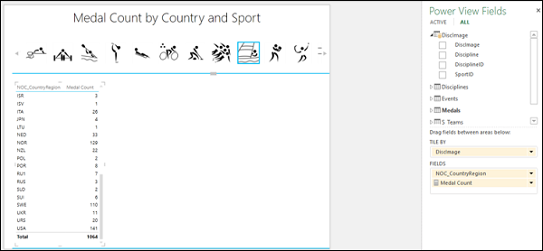
Tile Navigation Strip - Tab Strip
There are two types of navigation strips in Excel - Tile Flow and Tab Strip.
In a Tab strip, you can observe the following −
Tab strip displays the navigation strip across the top of the Visualization.
By default, the first Tile in the navigation strip that is the leftmost is selected.
There are arrow buttons at the left and right edges of the navigation strip to enable scrolling.
You can scroll to the left or right to display the Tiles.
The highlighted Tile moves to the left or right as you scroll the tab strip. It can also go out of view, while scrolling.
You can click on a Tile to select it. The Tile gets highlighted at the same position as it was before.
In the Table, the values are filtered to that of the Tile selected. In this case, the Sport that is selected.
Tile Navigation Strip - Tile Flow
You can covert the navigation strip from tab strip to tile flow as follows −
- Click a Tile on the navigation strip.
- Click the DESIGN tab on the Ribbon.
- Click Tile Type in the Tiles group.
- Click Tile Flow in the dropdown list.
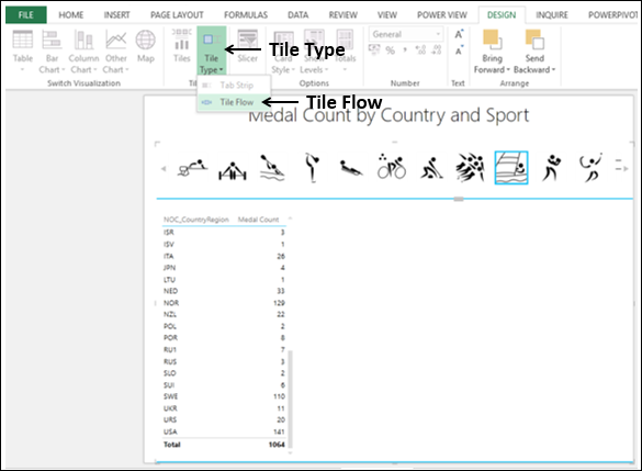
The navigation strip shifts to the bottom of the Table.
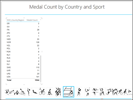
In a Tile Flow, you can observe the following −
Tile flow displays the navigation strip across the bottom of the Visualization.
By default, the first Tile in the navigation strip is selected. It will be displayed at the center of the tile flow.
There are no arrow buttons for scrolling.
You can scroll to the left or right by clicking on any of the Tiles to the left or right of the center Tile.
The Tiles flow to the left or right and the center Tile will always get highlighted.
You can click on a Tile to select it. The Tile gets highlighted and moves to the center of the Tile flow.
As the selected Tile is always the center Tile, the following happens −
Selected Tile does not go out of view.
When you scroll to the left or right, the Tile that comes to the center position gets automatically selected and highlighted.
The original selection disappears.
The Visualization, Table in this case, automatically is updated to the Tile in the center of the Tile flow.
In the Table, the values are filtered to that of the Tile selected. In this case, the Sport that is selected.
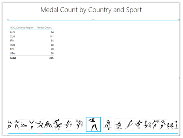
Matrix with Tiles
Suppose you want the medal count by medal type Gold, Silver and Bronze and also the total medal count, by country for a selected sport, you can display the results in a Matrix Tile visualization.
- Switch Visualization to Matrix.
- Add the field Medal to Matrix.
You will get the desired results as follows −
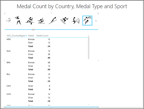
Stacked Bar Chart with Tiles
You can make your explored results more conspicuous by switching your visualization to Stacked Bar Chart Tile Visualization −
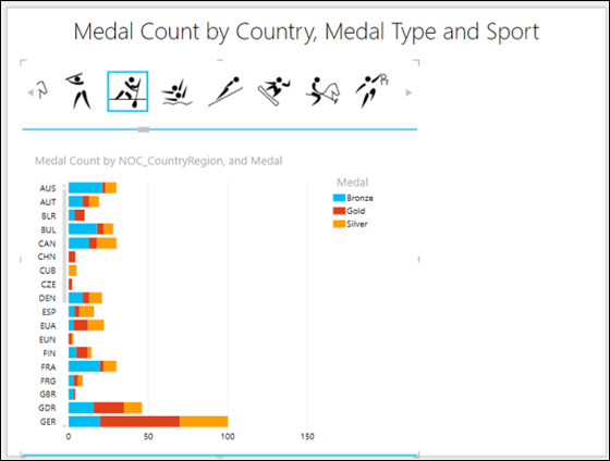
Maps with Tiles
As your data contains geographic locations, you can also switch over to Map Tile Visualization −
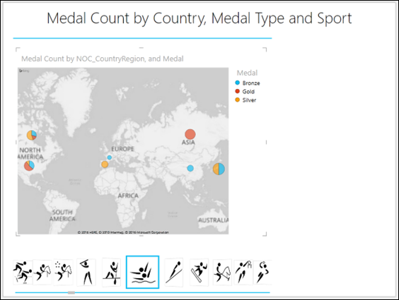
Exploring Data with Hierarchies
If your data more number of levels, it would be easy for you to explore and present it with Hierarchies. For any data value in your Hierarchy, you can drill down to display more details or drill up to have a holistic view.
If your data model has a hierarchy, you can use it in Power View. Otherwise, you can create a hierarchy in the Power View itself with few easy steps.
Creating a Hierarchy in Power View
In Power View a Hierarchy is best depicted in Matrix visualization. Create a Hierarchy in Matrix visualization as follows −
Drag the fields NOC_CountryRegion, Sport, Discipline, Year and Medal in that order to ROWS area.
Drag the field Medal Count to ∑ VALUES. The order of the fields in the ROWS area defines the Hierarchy in Power View.
If you are not sure about the order of fields, start with any order and then rearrange them in the ROWS area by dragging them up and down, while looking at the display in the Power View.
You will get the following Matrix visualization showing the five Hierarchy levels −
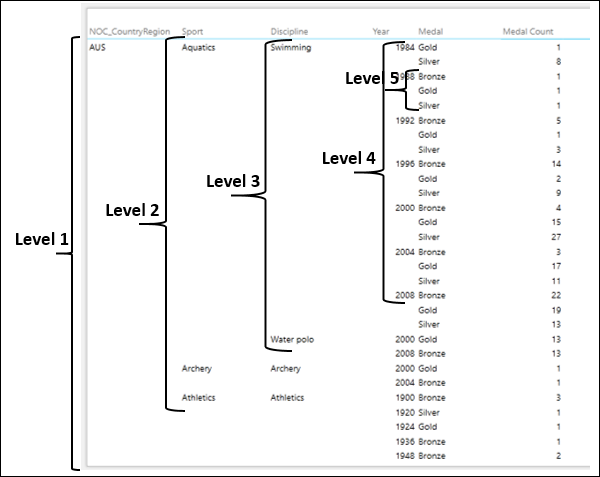
As you observe, the levels are nested.
Drilling Up and Drilling Down the Hierarchy
You can drill up and drill down the hierarchy such that you can show just one level at a time. You can drill down for details and drill up for summary.
To enable drill up and drill down, first set up show levels option as follows −
- Click the DESIGN tab on the Ribbon.
- Click Show Levels in the Options group.
- Select Rows Enable Drill Down One Level at a Time from the drop-down list.
The Matrix collapses to display only Level 1 data.
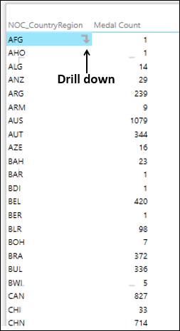
As you observe, when you click on each of the data items, a downward arrow appears on the right side for that item indicating drill down.
Now, you can drill down the data one level at a time as follows −
Click Level 1 data item for which you want further details. For example, click AUS. As you observe, Medal Count for AUS is 1079.
Click on the arrow to the right side of it. Alternatively, you can double click on the data item.
Level 2 data pertaining to AUS will be displayed.
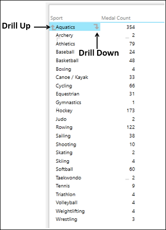
As you observe, an upward arrow appears on the left side of the first item, indicating drill up and when you click on each of the data items, a downward arrow appears on the right side for that item indicating drill down.
Now, you can drill down the data one more level as follows −
Click Level 2 data item for which you want further details. For example, click Aquatics. As you observe, the medal count for Aquatics is 354.
Click on the arrow to the right side of it.
Level 3 data pertaining to Aquatics will be displayed.
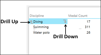
As you observe, an upward arrow appears on the left side of the first item, indicating drill up and when you click on each of the data items, a downward arrow appears on the right side for that item indicating drill down.
Now, you can drill down the data one more level as follows −
Click Level 3 data item for which you want further details. For e.g. click on Diving. As you observe, the medal count for Diving is 17.
Click on the arrow to the right side of it.
Level 4 data pertaining to Diving will be displayed.
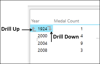
As you observe, an upward arrow appears on the left side of the first item, indicating drill up and when you click on each of the data items, a downward arrow appears on the right side for that item indicating drill down.
Now, you can drill down the data one more level as follows −
Click on the Level 4 data item for which you want further details. For example, click on 2008. As you observe, the medal count for 2008 is 3.
Click on the arrow to the right side of it.
Level 5 data pertaining to 2008 will be displayed.
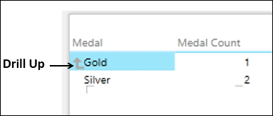
As you observe, for the first Level 5 data item an upward arrow appears on the left side indicating drill up. Drill down arrows do not appear on the right side for the data items as there are further levels to drill down.
Now, you can drill up the data one level at a time by clicking on the upward arrow to the left side of the first item at each Level.
Exploring a Hierarchy in Stacked Bar Chart
You might want to highlight certain values in a hierarchy in a significant way. In such a case, you can use a chart visualization, such as Stacked Bar chart as follows −
- Click the Matrix visualization and switch to Stacked Bar Chart.
- Drag the field Medal to LEGEND area.
You will get the Stacked Bar chart visualization as follows −
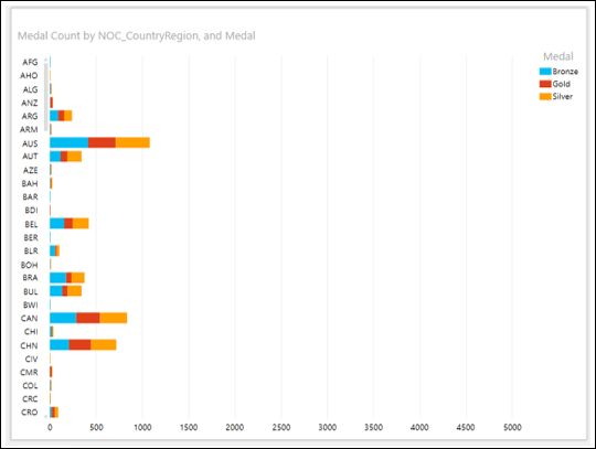
In this case, you need to double-click on a Bar to drill down.
Double-click on Bar representing AUS. The chart is drilled down to display the next level of data in the hierarchy.
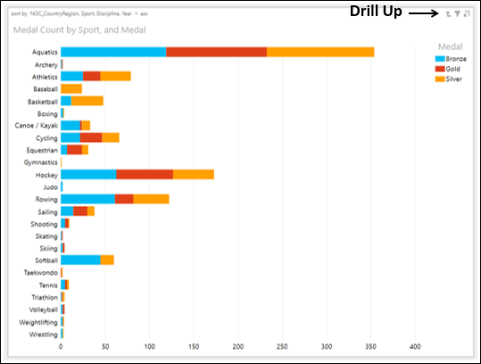
As you can observe, an upward arrow indicating drill up appears at the top-right corner of the chart.
Drill down one more level by double-clicking on Aquatics Bar. The chart is drilled down to display the next level of data in the hierarchy.
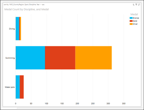
You can drill down by double-clicking on a Bar or drill up by clicking on the drill up arrow on the top-right corner of the chart.
This gives you an interactive exploration of data during presentation also.
Aesthetic Power View Reports
You have learnt how to explore data interactively using Power View in the earlier chapters of this tutorial. Each Power View sheet can in turn be used as an interactive report. To make the Power View report more appealing, you can choose any of the themes, chart palettes, fonts and background colors that Power View provides you.
When you change the theme, the new theme applies to all the Power View visualizations in the report. Further, you can add background images, choose background formatting, format numbers, and change the Font or the text size.
Report Layout Finalization
As with any other report, you need to first decide on what you are going to report and the best layout so that you can highlight the significant data points.
Suppose you need to report the details of the medals won by Australia in aquatics. As you are aware, the details include the disciplines in aquatics, medal count, and the medal types (Gold, Silver and Bronze).
You can have three views in the report for the best portrayal of the data points in this case −
- Matrix that contains the data - country, sport, and medal count.
- Card that contains the data country, sport, discipline and medal Count.
- Stacked Bar chart that contains the data that is drilled down to discipline, medal and medal count.
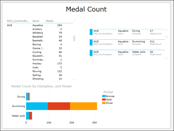
As you can observe, the data in the Matrix and Card is scrolled so that −
Matrix displays the details of Australia for all sports and aquatics got 354 medals.
Card displays Australia sport aquatics, disciplines Diving, Swimming and Water polo and medal count in each of them.
Stacked Bar chart displays the medal count by medal type in these three disciplines.
Now that the report layout is ready, you can start making it appealing. However, you need to keep two points in mind during this task −
The look of the report should be based on the audience (Managers / Top Management / Clients).
Do not get over bored with the different formatting options. Just keep it simple and highlight the data points that require attention.
In the following sections, you will understand how to arrive at a sample report with the following options −
- Selecting the Background.
- Selecting the Theme.
- Changing the Font.
- Changing the Text Size.
Selecting the Background
You can have a background color for your Power View Report. By default, it is white. You can change it with the Background command.
- Click the POWER VIEW tab on the Ribbon.
- Click Background in the Themes group.
- Click Light1 Center Gradient. (You can choose the one that best suits your report).
The background color changes to the selected one.
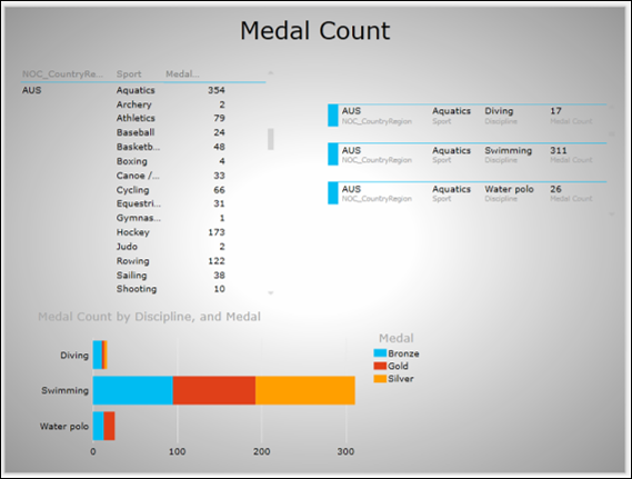
You can even set a background image. For e.g. you can put your company logo or a view of your company facility.
Selecting the Theme
Power View supports several themes. Choose the one that suits your report as follows −
- Click on the POWER VIEW tab on the Ribbon.
- Click on Themes in the Themes group.
You will get many options to choose from. If you are not sure about the appropriate one, just play around with some to find how the display looks.
- Click on the theme Aspect.
Your report will be displayed in the selected theme.
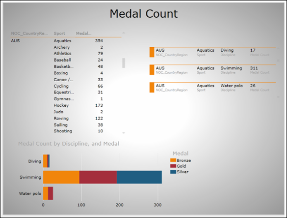
Changing the Font
As you can observe, the text in the report is not conspicuous. You can change the font as follows −
- Click on the POWER VIEW tab on the Ribbon.
- Click on Font in the Themes group.
- Click on Verdana in the dropdown list of fonts. (You can choose the one that best suits your report).
Next, you have to make the text display a bit larger.
Changing the Text Size
Change the text size as follows −
Click on the POWER VIEW tab on the Ribbon.
Click on Text Size in the Themes group.
Click on 150% in the dropdown list. (You can choose the one that best suits your report).
Adjust the widths of the columns in Matrix.
Adjust the size of each view in the report.
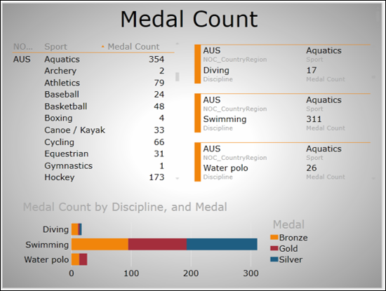
Your sample report is ready.
Key Performance Indicators
Key Performance Indicators (KPI) are a set of quantifiable measures that an organization uses to measure its performance over time. KPIs are normally used to evaluate the success of an organization as a whole or department-wise (e.g. sales, finance, etc.). You need to define the KPIs based on the organization objectives and monitor them from time to time to track the progress.
There are a number of KPI types to choose from based on your requirements. Examples include −
- Income and Expenses
- Rate of Return
- Average Purchase Value
- Customer Lifetime Value
- Working Capital
Note that KPIs are a form of communication involving the following activities −
Identifying the KPIs based on the organizations objectives.
Monitoring and reporting the KPIs.
Altering the KPIs as the organization progresses and / or the organizations goals change.
Identifying the KPIs
The first and the most crucial step in KPI analysis is to identify the KPIs that effectively monitor the required trends in the organization. This requires complete understanding of the objectives and requires proper communication channels between the analysts and those who are responsible for fulfilling the objectives.
There are a number of KPIs to choose from, but the success in monitoring relies on the right choice of those that are relevant to the objectives. The KPIs differ from organization to organization and from department to department and will be effective only when they lead to improvement in the performance.
You can evaluate the relevance of a KPI using the SMART criteria i.e. the KPI should be Specific, Measurable, Attainable, Relevant and Time-bound. In other words, the KPI chosen should meet the following criteria −
The KPI reflects your Specific objective.
The KPI enables you to Measure progress towards that goal.
The goal for which the KPI is being defined is realistically Attainable.
The goal that the KPI is targeting is Relevant to the organization.
You can set a time-frame for achieving the goal so that the KPI reveals how near the goal is as compared to the time that is left.
The defined KPIs are to be evaluated from time to time to find their relevance as the time progresses. If required, different KPIs need to be defined and monitored. Only then, your KPI monitoring will be relating to the current organization needs.
Based on the analysis needs, you have to choose the relevant KPIs, and examples include the following −
Sales department might use a KPI to measure monthly gross profit against projected gross profit.
Accounting department might measure monthly expenditures against revenue to evaluate costs.
Human resources department might measure quarterly employee turnover.
Business professionals frequently use KPIs that are grouped together in a business scorecard to obtain a quick and accurate historical summary of business success or to identify trends or to identify performance improvement opportunities.
The examples used in this chapter are indicative so as to help you in understanding how you can define and monitor KPIs in Excel. The sole discretion of identifying the KPIs lies with you based on the objectives so as to reflect the current scenario as compared to the targets.
KPIs in Excel
You can analyze performance against the set target with PowerPivot. For e.g., a PowerPivot KPI could be used to determine for each year and salesperson how his actual sales compared to his sales target.
You can explore and visualize the same KPI with Power View.
You can also define new KPIs and /or edit them in Power View.
You can produce aesthetic reports with KPIs in Power View.
Defining a KPI in Excel
The first step in KPI analysis is to define the identified KPI. This requires defining the three parameters for the KPI as follows −
Base Value
A Base Value is defined by a calculated field that resolves to a value. The calculated field represents the current value for the item in that row of the table. E.g., aggregate of sales, profit for a given period, etc.
Target Value/ Goal
A Target Value (or Goal) is defined by a calculated field that resolves to a value, or by an absolute value. It is the value against which the current value is evaluated. This could be a fixed number, for example, average number of sick-leave days that is applicable to all the employees, or a calculated field, which results in a different goal for each row, for example, budget of each department in the organization.
Status
Status is the indicator of the value. It would be striking if you set it as visual indicator. In Power View in Excel, you can edit the KPI, choosing which indicators to use and what values to trigger each indicator.
For example, suppose you want to monitor the Sales targets of the Salespersons in an organization who are selling a product. The objective of the analysis is to identify the best performers who are meeting the target Sales Amount. You can proceed to define the KPI as follows −
Base Value − Current Value of the Sales Amount for each salesperson.
Target Value / Goal − This is fixed for all the salespersons so as to enable comparison between the salespersons. Assume that the Target Sales Amount is 3500. Note that for a different analysis you could vary the target values for the salespersons.
Status − The Status is to be displayed with a graphic to easily determine the status of the Base Value compared to the Target Value.
KPIs in PowerPivot
You can define KPIs in PowerPivot as follows −
- Start with two tables SalesPerson and Sales.
- SalesPerson table contains SalesPerson ID and SalesPerson Name.
- Sales table contains the sales information salesperson-wise and month-wise.
- Add the two tables to Data Model.
- Create a relationship between the two tables using the field SalesPerson ID.
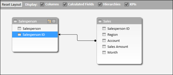
To set the Base Value, you need a calculated field for Sales Amount.
Add the calculated field in the Sales table for Sales Amount column in the Data Model as follows −
Total Sales:= sum([Sales Amount])
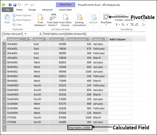
- Click on PivotTable on the Ribbon in the PowerPivot window.
- Select New Worksheet in the Create PivotTable dialog box.
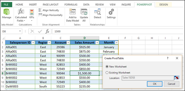
- Add the field Salesperson to ROWS area in the PivotTable.
- Click on the POWERPIVOT tab on the Ribbon.
- Click on KPIs in the Calculations group.
- Click on New KPI in the dropdown list.
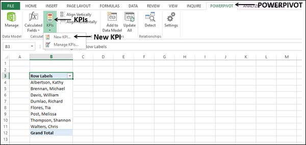
Key Performance Indicator (KPI) dialog box appears.
Select Total Sales in the KPI base field (value) box.
Under KPI Status, have the following options −
Under Define target value, select Absolute value and type 3500 in the box.
Under Define status thresholds, adjust the vertical bars representing the percentages to 40 and 80.
Under Select icon style, select the first option.
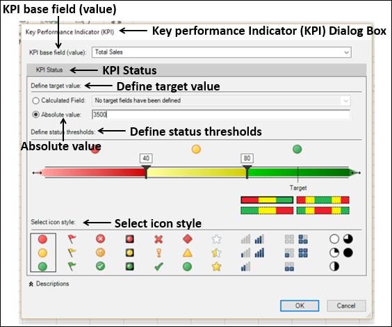
Click on the OK button. You can observe the following in the Sales table in PivotTable Fields list −
Total Sales field is a KPI and is depicted by the icon
 .
.The three KPI parameters Value, Goal and Status appear as fields under Total Sales KPI.
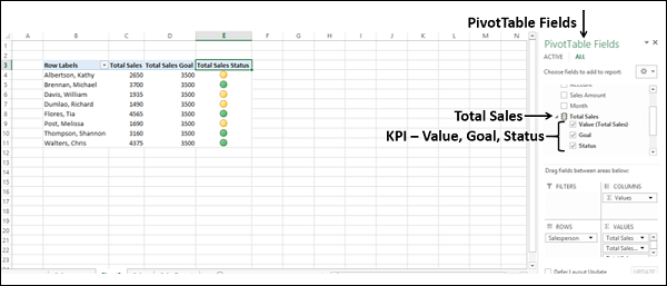
Select the three KPI parameters Value, Goal and Status under Total Sales.
The three columns appear in the PowerPivot, with the Status column displaying the icons as per the corresponding value.
You can also define the KPI thresholds by values instead of percentages. To modify a defined KPI, proceed as follows −
- Click on KPIs in the Calculations group on the Ribbon.
- Click on Manage KPIs in the dropdown list.
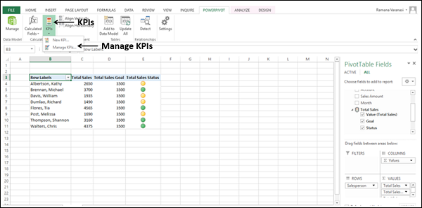
Manage KPIs dialog box appears.
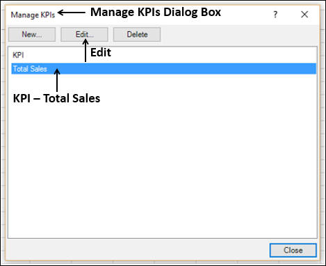
- Click on the KPI Total Sales.
- Click on the Edit button.
Key Performance Indicator (KPI) dialog box appears.
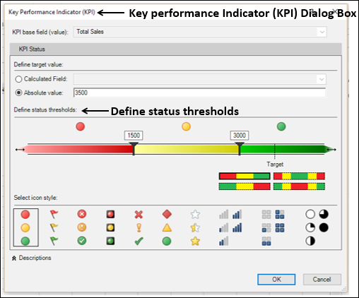
- Under Define status thresholds, adjust the vertical bars to 1500 and 3000.
- Retain the rest of the earlier options.
- Click on OK.
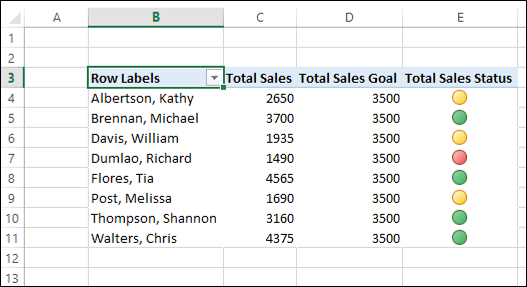
As you can observe, the status icons reflect the changed thresholds.
KPIs in Power View
You can create aesthetic reports with KPIs in Power View. You can either use the prior defined KPIs in Data Model or you can add KPIs in Power View.
To add or edit a KPI in Power View, proceed as follows −
- In the Power View Sheet, click on the PowerPivot tab.
The PowerPivot Ribbon appears, which you had used in the previous section.
- Click on KPIs in the Calculation group.
- Click on New KPI to add a KPI.
- Click on Manage KPIs to edit a KPI.
The steps are the same as in the previous section.
You can create an aesthetic report of Sales Performance with KPIs in Power View as follows −
- Click on DATA tab on the ribbon.
- Click on Power View in the Reports group.
Power View sheet appears.
Add a Table with the fields Salesperson, Total Sales and Total Sales Status.
Add a second Table with the fields Salesperson, Total Sales and Total Sales Goal.
Convert the second Table to 100% Stacked Bar.
Add a third Table with the fields Salesperson, Region, Total Sales and Total Sales Status.
Convert the third Table to Card. Drag the field Region to Tile By.
Add the Title Sales Performance.
Change the font.
Increase the Text Size.
Resize Table, 100% Stacked Bar and Card appropriately.
Your Sales Performance report is ready −
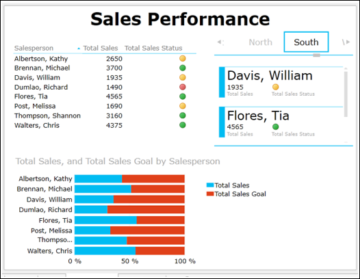
As you can observe, in the Power View you could portray the results as follows −
Table with icons for KPI status is similar to the PowerPivot report.
100% Stacked Bar depicts the percentage achieved with respect to the Goal. You can also notice that it gives a clear comparison of the performance of all.
Card depicts the KPI status of the Salespersons along with the Region they belong to. You can interactively scroll through the Tiles to display results for different Regions that would give scope to assess performance region-wise also.
