- Excel Data Analysis - Home
- Data Analysis - Overview
- Data Analysis - Process
- Excel Data Analysis - Overview
- Working with Range Names
- Tables
- Cleaning Data with Text Functions
- Cleaning Data Contains Date Values
- Working with Time Values
- Conditional Formatting
- Sorting
- Filtering
- Subtotals with Ranges
- Quick Analysis
- Lookup Functions
- PivotTables
- Data Visualization
- Data Validation
- Financial Analysis
- Working with Multiple Sheets
- Formula Auditing
- Inquire
- Advanced Data Analysis - Overview
- Data Consolidation
- What-If Analysis
- What-If Analysis with Data Tables
- What-If Analysis Scenario Manager
- What-If Analysis with Goal Seek
- Optimization with Excel Solver
- Importing Data into Excel
- Data Model
- Exploring Data with PivotTables
- Exploring Data with Powerpivot
- Exploring Data with Power View
- Exploring Data Power View Charts
- Exploring Data Power View Maps
- Exploring Data PowerView Multiples
- Exploring Data Power View Tiles
- Exploring Data with Hierarchies
- Aesthetic Power View Reports
- Key Performance Indicators
- Excel Data Analysis Resources
- Excel Data Analysis - Quick Guide
- Excel Data Analysis - Resources
- Excel Data Analysis - Discussion
Aesthetic Power View Reports
You have learnt how to explore data interactively using Power View in the earlier chapters of this tutorial. Each Power View sheet can in turn be used as an interactive report. To make the Power View report more appealing, you can choose any of the themes, chart palettes, fonts and background colors that Power View provides you.
When you change the theme, the new theme applies to all the Power View visualizations in the report. Further, you can add background images, choose background formatting, format numbers, and change the Font or the text size.
Report Layout Finalization
As with any other report, you need to first decide on what you are going to report and the best layout so that you can highlight the significant data points.
Suppose you need to report the details of the medals won by Australia in aquatics. As you are aware, the details include the disciplines in aquatics, medal count, and the medal types (Gold, Silver and Bronze).
You can have three views in the report for the best portrayal of the data points in this case −
- Matrix that contains the data - country, sport, and medal count.
- Card that contains the data country, sport, discipline and medal Count.
- Stacked Bar chart that contains the data that is drilled down to discipline, medal and medal count.
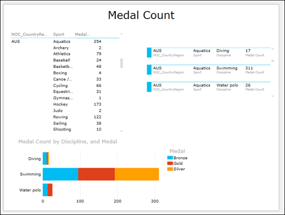
As you can observe, the data in the Matrix and Card is scrolled so that −
Matrix displays the details of Australia for all sports and aquatics got 354 medals.
Card displays Australia sport aquatics, disciplines Diving, Swimming and Water polo and medal count in each of them.
Stacked Bar chart displays the medal count by medal type in these three disciplines.
Now that the report layout is ready, you can start making it appealing. However, you need to keep two points in mind during this task −
The look of the report should be based on the audience (Managers / Top Management / Clients).
Do not get over bored with the different formatting options. Just keep it simple and highlight the data points that require attention.
In the following sections, you will understand how to arrive at a sample report with the following options −
- Selecting the Background.
- Selecting the Theme.
- Changing the Font.
- Changing the Text Size.
Selecting the Background
You can have a background color for your Power View Report. By default, it is white. You can change it with the Background command.
- Click the POWER VIEW tab on the Ribbon.
- Click Background in the Themes group.
- Click Light1 Center Gradient. (You can choose the one that best suits your report).
The background color changes to the selected one.
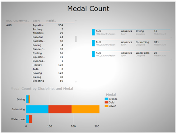
You can even set a background image. For e.g. you can put your company logo or a view of your company facility.
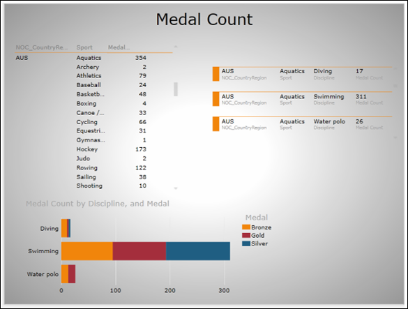
Selecting the Theme
Power View supports several themes. Choose the one that suits your report as follows −
- Click on the POWER VIEW tab on the Ribbon.
- Click on Themes in the Themes group.
You will get many options to choose from. If you are not sure about the appropriate one, just play around with some to find how the display looks.
- Click on the theme Aspect.
Your report will be displayed in the selected theme.
Changing the Font
As you can observe, the text in the report is not conspicuous. You can change the font as follows −
- Click on the POWER VIEW tab on the Ribbon.
- Click on Font in the Themes group.
- Click on Verdana in the dropdown list of fonts. (You can choose the one that best suits your report).
Next, you have to make the text display a bit larger.
Changing the Text Size
Change the text size as follows −
Click on the POWER VIEW tab on the Ribbon.
Click on Text Size in the Themes group.
Click on 150% in the dropdown list. (You can choose the one that best suits your report).
Adjust the widths of the columns in Matrix.
Adjust the size of each view in the report.
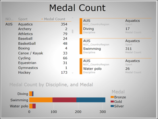
Your sample report is ready.
