- Excel Data Analysis - Home
- Data Analysis - Overview
- Data Analysis - Process
- Excel Data Analysis - Overview
- Working with Range Names
- Tables
- Cleaning Data with Text Functions
- Cleaning Data Contains Date Values
- Working with Time Values
- Conditional Formatting
- Sorting
- Filtering
- Subtotals with Ranges
- Quick Analysis
- Lookup Functions
- PivotTables
- Data Visualization
- Data Validation
- Financial Analysis
- Working with Multiple Sheets
- Formula Auditing
- Inquire
- Advanced Data Analysis - Overview
- Data Consolidation
- What-If Analysis
- What-If Analysis with Data Tables
- What-If Analysis Scenario Manager
- What-If Analysis with Goal Seek
- Optimization with Excel Solver
- Importing Data into Excel
- Data Model
- Exploring Data with PivotTables
- Exploring Data with Powerpivot
- Exploring Data with Power View
- Exploring Data Power View Charts
- Exploring Data Power View Maps
- Exploring Data PowerView Multiples
- Exploring Data Power View Tiles
- Exploring Data with Hierarchies
- Aesthetic Power View Reports
- Key Performance Indicators
- Excel Data Analysis Resources
- Excel Data Analysis - Quick Guide
- Excel Data Analysis - Resources
- Excel Data Analysis - Discussion
Excel Data Analysis - Data Visualization
You can display your data analysis reports in a number of ways in Excel. However, if your data analysis results can be visualized as charts that highlight the notable points in the data, your audience can quickly grasp what you want to project in the data. It also leaves a good impact on your presentation style.
In this chapter, you will get to know how to use Excel charts and Excel formatting features on charts that enable you to present your data analysis results with emphasis.
Visualizing Data with Charts
In Excel, charts are used to make a graphical representation of any set of data. A chart is a visual representation of the data, in which the data is represented by symbols such as bars in a Bar Chart or lines in a Line Chart. Excel provides you with many chart types and you can choose one that suits your data or you can use the Excel Recommended Charts option to view charts customized to your data and select one of those.
Refer to the Tutorial Excel Charts for more information on chart types.
In this chapter, you will understand the different techniques that you can use with the Excel charts to highlight your data analysis results more effectively.
Creating Combination Charts
Suppose you have the target and actual profits for the fiscal year 2015-2016 that you obtained from different regions.
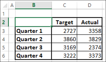
We will create a Clustered Column Chart for these results.
As you observe, it is difficult to visualize the comparison quickly between the targets and actual in this chart. It does not give a true impact on your results.
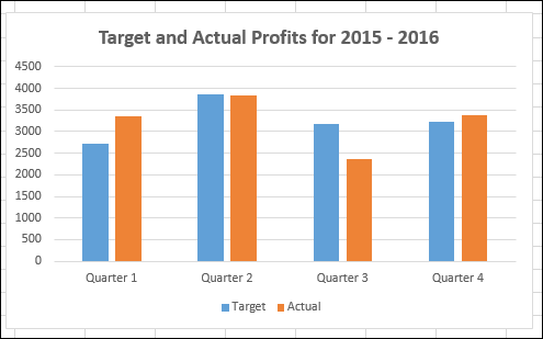
A better way of distinguishing two types of data to compare the values is by using Combination Charts. In Excel 2013 and versions above, you can use Combo charts for the same purpose.
Use Vertical Columns for the target values and a Line with Markers for the actual values.
- Click the DESIGN tab under the CHART TOOLS tab on the Ribbon.
- Click Change Chart Type in the Type group. The Change Chart Type dialog box appears.
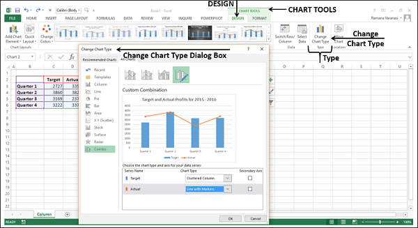
Click Combo.
Change the Chart Type for the series Actual to Line with Markers. The preview appears under Custom Combination.
Click OK.
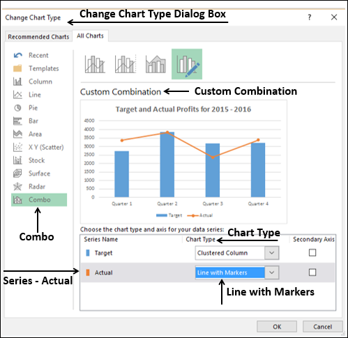
Your Customized Combination Chart will be displayed.
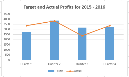
As you observe in the chart, the Target values are in Columns and the Actual values are marked along the line. The data visualization has become better as it also shows you the trend of your results.
However, this type of representation does not work well when the data ranges of your two data values vary significantly.
Creating a Combo Chart with Secondary Axis
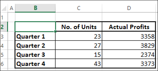
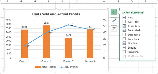
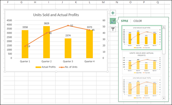
Suppose you have the data on the number of units of your product that was shipped and the actual profits for the fiscal year 2015-2016 that you obtained from different regions.
If you use the same combination chart as before, you will get the following −
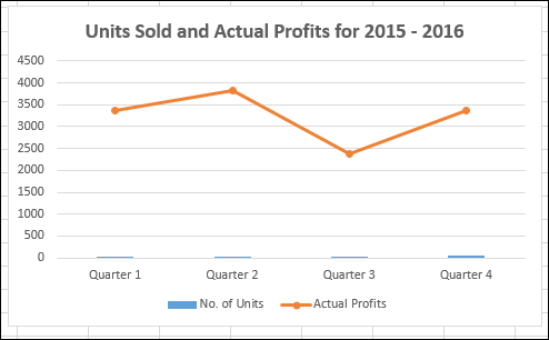
In the chart, the data of No. of Units is not visible as the data ranges are varying significantly.
In such cases, you can create a combination chart with secondary axis, so that the primary axis displays one range and the secondary axis displays the other.
- Click the INSERT tab.
- Click Combo in Charts group.
- Click Create Custom Combo Chart from the drop-down list.
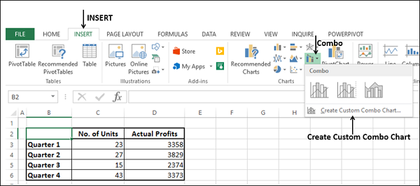
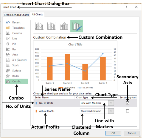
The Insert Chart dialog box appears with Combo highlighted.
For Chart Type, choose −
- Line with Markers for the Series No. of Units
- Clustered Column for the Series Actual Profits
- Check the Box Secondary Axis to the right of the Series No. of Units and click OK.
A preview of your chart appears under Custom Combination.
Your Combo chart appears with Secondary Axis.
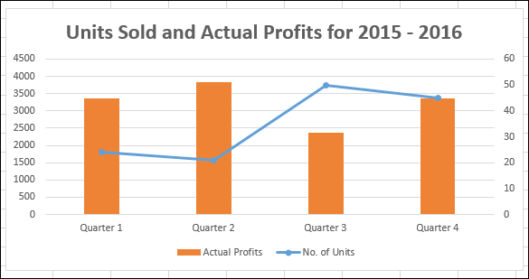
You can observe the values for Actual Profits on the primary axis and the values for No. of Units on the secondary axis.
A significant observation in the above chart is for Quarter 3 where No. of Units sold is more, but the Actual Profits made are less. This could probably be assigned to the promotion costs that were incurred to increase sales. The situation is improved in Quarter 4, with a slight decrease in sales and a significant rise in the Actual Profits made.
Discriminating Series and Category Axis
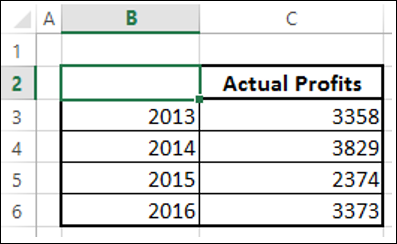
Suppose you want to project the Actual Profits made in Years 2013-2016.
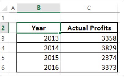
Create a clustered column for this data.
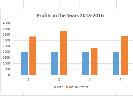
As you observe, the data visualization is not effective as the years are not displayed. You can overcome this by changing year to category.
Remove the header year in the data range.
Now, year is considered as a category and not a series. Your chart looks as follows −
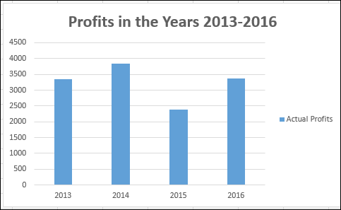
Chart Elements and Chart Styles
Chart Elements give more descriptions to your charts, thus helping visualizing your data more meaningfully.
- Click the Chart
Three buttons appear next to the upper-right corner of the chart −
 Chart Elements
 Chart Styles
  Chart Filters
For a detailed explanation of these, refer to Excel Charts tutorial.
- Click Chart Elements.
- Click Data Labels.
- Click Chart Styles
- Select a Style and Color that suits your data.
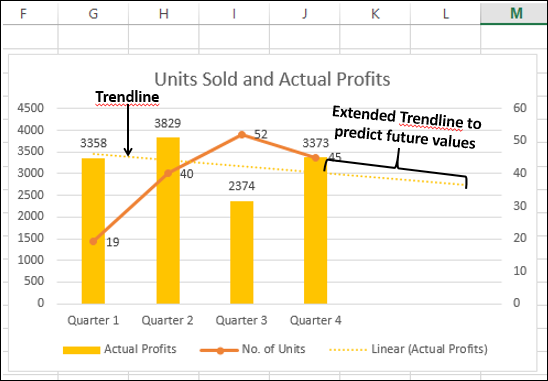
You can use Trendline to graphically display trends in data. You can extend a Trendline in a chart beyond the actual data to predict future values.
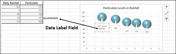
Data Labels
Excel 2013 and later versions provide you with various options to display Data Labels. You can choose one Data Label, format it as you like, and then use Clone Current Label to copy the formatting to the rest of the Data Labels in the chart.
The Data Labels in a chart can have effects, varying shapes and sizes.
It is also possible to display the content of a cell as part of the Data Label with Insert Data Label Field.
Quick Layout
You can use Quick Layout to change the overall layout of the chart quickly by choosing one of the predefined layout options.
- Click the chart.
- Click the DESIGN tab under CHART TOOLS.
- Click Quick Layout.
Different possible layouts will be displayed. As you move on the layout options, the chart layout changes to that particular option.
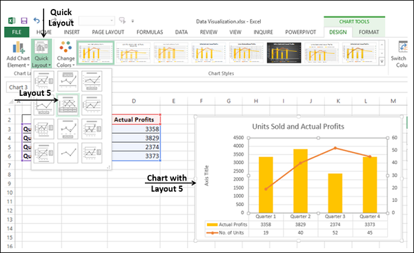
Select the layout you like. The chart will be displayed with the chosen layout.
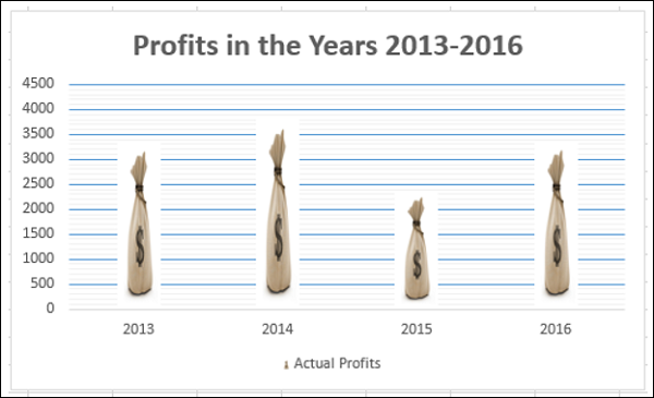
Using Pictures in Column Charts
You can create more emphasis on your data presentation by using a picture in place of columns.
Click on a Column on the Column Chart.
In the Format Data Series, click on Fill.
Select Picture.
Under Insert picture from, provide the filename or optionally clipboard if you had copied an image earlier.
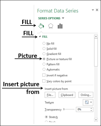
The picture you have chosen will appear in place of columns in the chart.
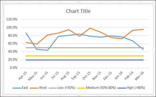
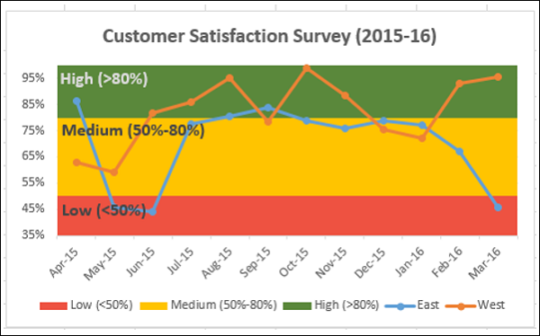
Band Chart
You might have to present customer survey results of a product from different regions. Band Chart is suitable for this purpose. A Band Chart is a Line Chart with an added shaded area to display the upper and lower boundaries of groups of data.
Suppose your customer survey results from the east and west regions, month wise are −
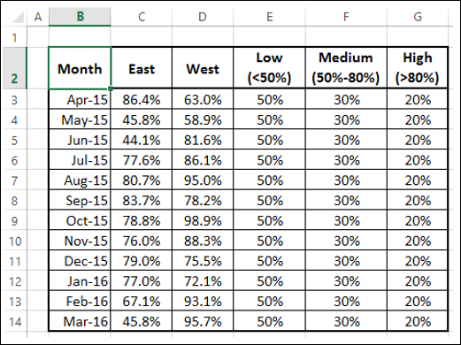
Here, in the data < 50% is Low, 50% - 80% is Medium and > 80% is High.
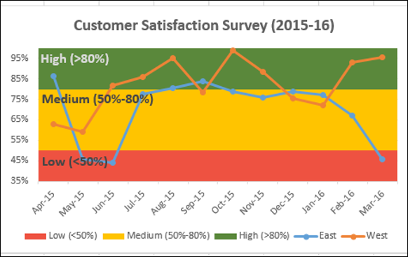
With Band Chart, you can display your survey results as follows −
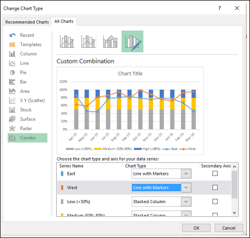
Create a Line Chart from your data.
Change the chart type to −
- East and West Series to Line with Markers.
- Low, Medium and High Series to Stacked Column.
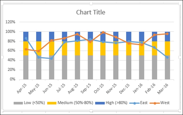
Your chart looks as follows.
- Click on one of the columns.
- Change gap width to 0% in Format Data Series.
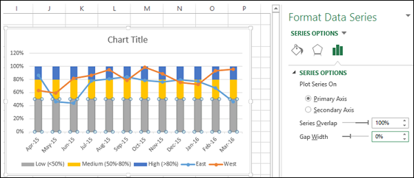
You will get Bands instead of columns.
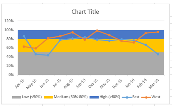
To make the chart more presentable −
- Add Chart Title.
- Adjust Vertical Axis range.
- Change the colors of the bands to Green-Yellow-Red.
- Add Labels to bands.
The final result is the Band Chart with the defined boundaries and the survey results represented across the bands. One can quickly and clearly make out from the chart that while the survey results for the region West are satisfactory, those for the region East have a decline in the last quarter and need attention.
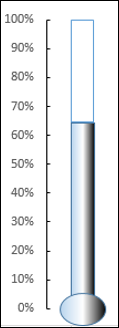
Thermometer Chart
When you have to represent a target value and an actual value, you can easily create a Thermometer Chart in Excel that emphatically shows these values.
With Thermometer chart, you can display your data as follows −
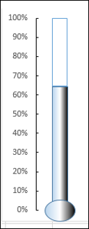
Arrange your data as shown below −
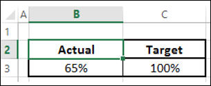
- Select the data.
- Create a Clustered Column chart.
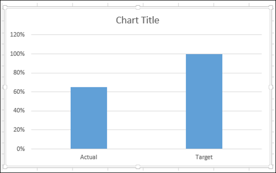
As you observe, the right side Column is Target.
- Click on a Column in the chart.
- Click on Switch Row/Column on the Ribbon.
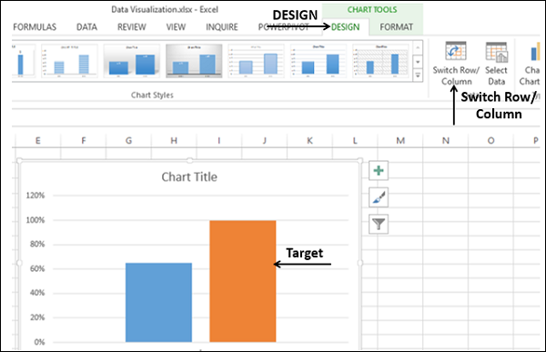
- Right click on the Target Column.
- Click on Format Data Series.
- Click on Secondary Axis.
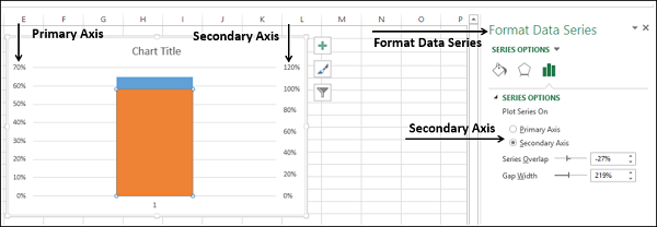
As you observe the Primary Axis and Secondary Axis have different ranges.
- Right click the Primary Axis.
- In the Format Axis options, under Bounds, type 0 for Minimum and 1 for Maximum.
- Repeat the same for Secondary Axis.
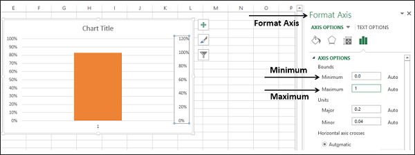
Both Primary Axis and Secondary Axis will be set to 0% - 100%. The Target Column hides the Actual Column.
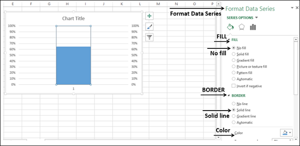
- Right click the visible column (Target)
- In the Format Data Series, select
- No fill for FILL
- Solid line for BORDER
- Blue for Color
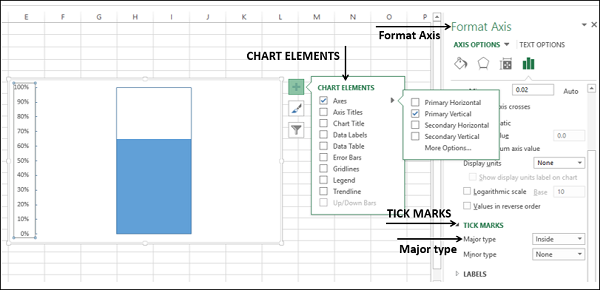
- In Chart Elements, unselect
- Axis → Primary Horizontal
- Axis → Secondary Vertical
- Gridlines
- Chart Title
- In the chart, right click on Primary Vertical Axis
- In Format Axis options, click on TICK MARKS
- For Major type, select Inside
- Right click on the Chart Area.
- In the Format Chart Area options, select
- No fill for FILL
- No line for BORDER
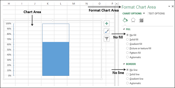
Resize the chart area, to get the shape of a thermometer.
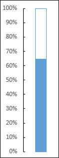
You got your thermometer chart, with the actual value as against target value being shown. You can make this thermometer chart more impressive with some formatting.
- Insert a rectangle shape superimposing the blue rectangular part in the chart.
- In Format Shape options, select −
- Gradient fill for FILL
- Linear for Type
- 1800 for Angle
- Set the Gradient stops at 0%, 50% and 100%.
- For the Gradient stops at 0% and 100%, choose the color black.
- For the Gradient stop at 50%, choose the color white.
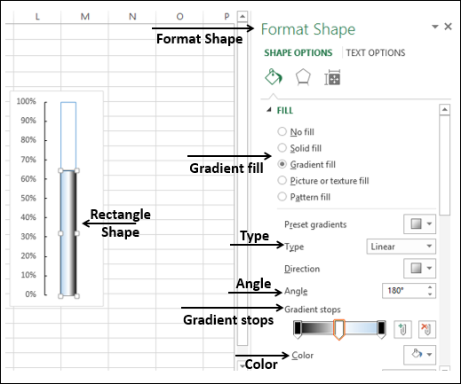
- Insert an oval shape at the bottom.
- Format shape with same options.
The result is the Thermometer Chart that we started with.
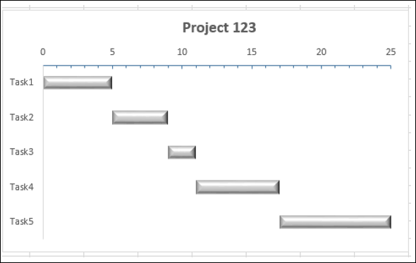
Gantt Chart
A Gantt chart is a chart in which a series of horizontal lines shows the amount of work done in certain periods of time in relation to the amount of work planned for those periods.
In Excel, you can create a Gantt chart by customizing a Stacked Bar chart type so that it depicts tasks, task duration, and hierarchy. An Excel Gantt chart typically uses days as the unit of time along the horizontal axis.
Consider the following data where the column −
- Task represents the Tasks in the project
- Start represents number of days from the Start Date of the project
- Duration represents the duration of the Task
Note that Start of any Task is Start of previous Task + Duration. This is the case when the Tasks are in hierarchy.
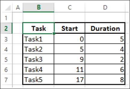
- Select the data.
- Create Stacked Bar Chart.
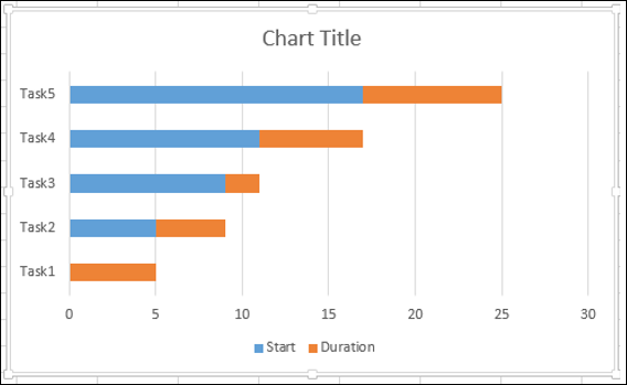
- Right-click on Start Series.
- In Format Data Series options, select No fill.
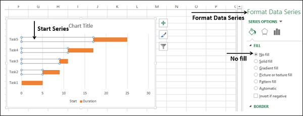
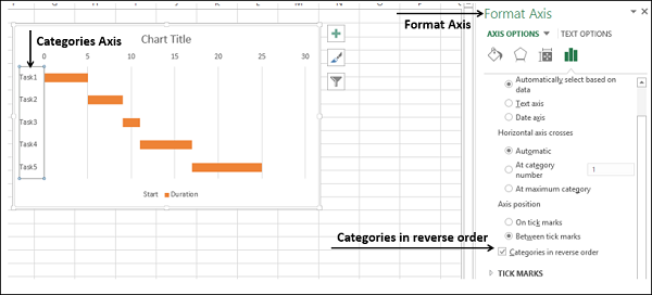
- Right-click on Categories Axis.
- In Format Axis options, select Categories in reverse order.
- In Chart Elements, deselect
- Legend
- Gridlines
- Format the Horizontal Axis to
- Adjust the range
- Major Tick Marks at 5 day intervals
- Minor Tick Marks at 1 day intervals
- Format Data Series to make it look impressive
- Give a Chart Title
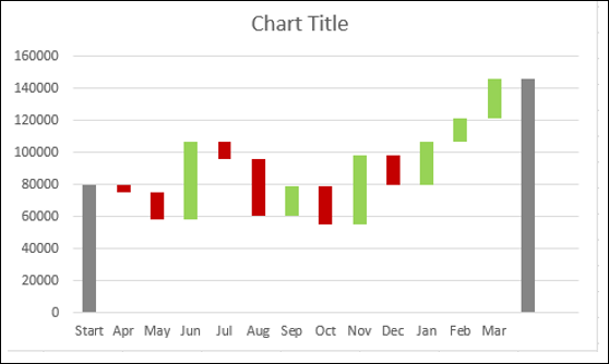
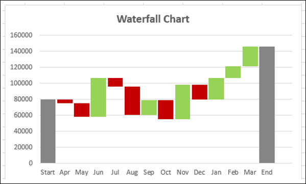
Waterfall Chart
Waterfall Chart is one of the most popular visualization tools used in small and large businesses. Waterfall charts are ideal for showing how you have arrived at a net value such as net income, by breaking down the cumulative effect of positive and negative contributions.
Excel 2016 provides Waterfall Chart type. If you are using earlier versions of Excel, you can still create a Waterfall Chart using Stacked Column Chart.
The columns are color coded so that you can quickly tell positive from negative numbers. The initial and the final value columns start on the horizontal axis, while the intermediate values are floating columns. Because of this look, Waterfall Charts are also called Bridge Charts.
Consider the following data.
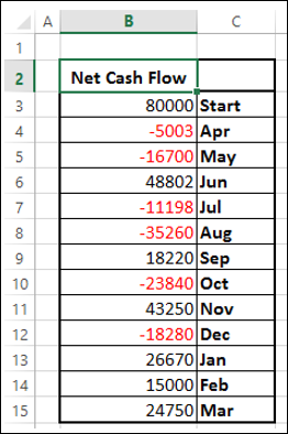
Prepare the data for Waterfall Chart
Ensure the column Net Cash Flow is to the left of the Months Column (This is because you will not include this column while creating the chart)
Add 2 columns Increase and Decrease for positive and negative cash flows respectively
Add a column Start - the first column in the chart with the start value in the Net Cash Flow
Add a column End - the last column in the chart with the end value in the Net Cash Flow
Add a column Float that supports the intermediate columns
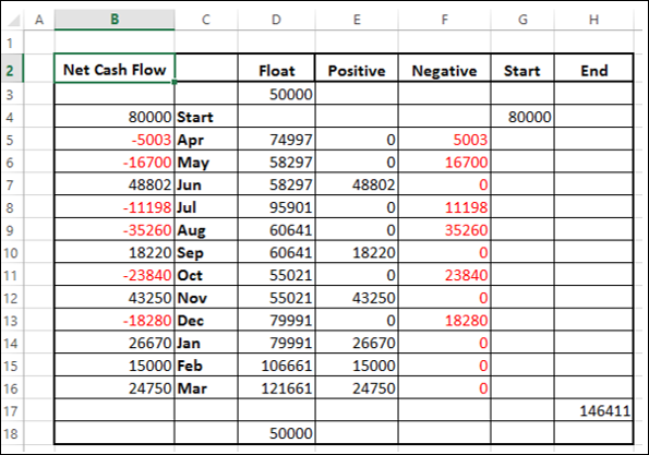
Compute the values for these columns as follows
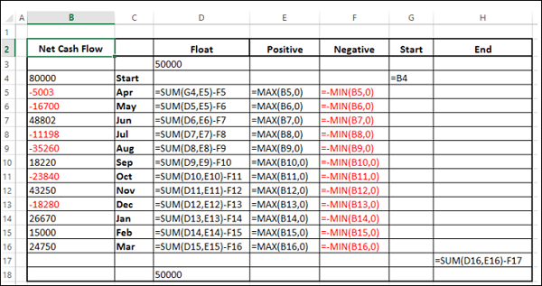
In the Float column, insert a row in the beginning and at the end. Place n arbitrary value 50000. This just to have some space to the left and right of the chart
The data will be as follows.
- Select the cells C2:H18 (Exclude Net Cash Flow column)
- Create Stacked Column Chart
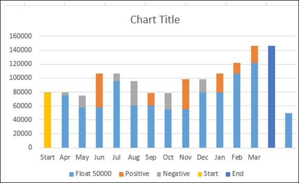
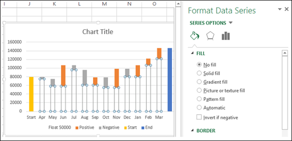
- Right click on the Float Series.
- Click Format Data Series.
- In Format Data Series options, select No fill.
- Right click on Negative Series.
- Select Fill Color as Red.
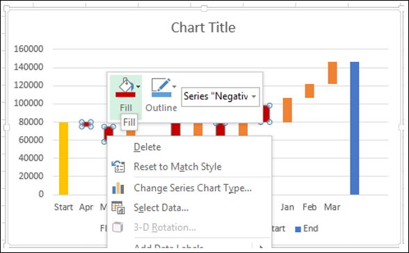
- Right click on Positive Series.
- Select Fill Color as Green.
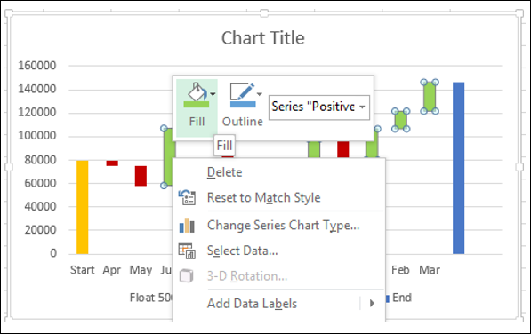
- Right click on Start Series.
- Select Fill Color as Grey.
- Right click on End Series.
- Select Fill Color as Grey.
- Delete the Legend.
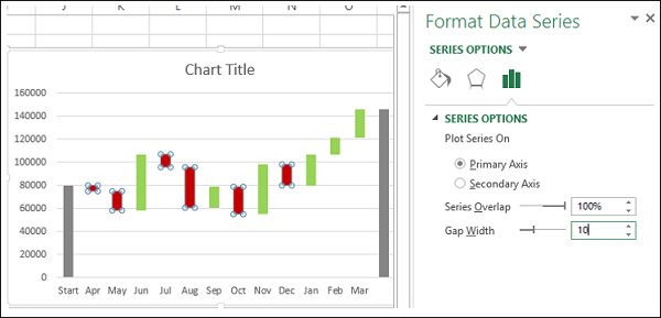
- Right click on any Series
- In Format Data Series options, select Gap Width as 10% under Series Options
Give the Chart Title. The Waterfall Chart will be displayed.
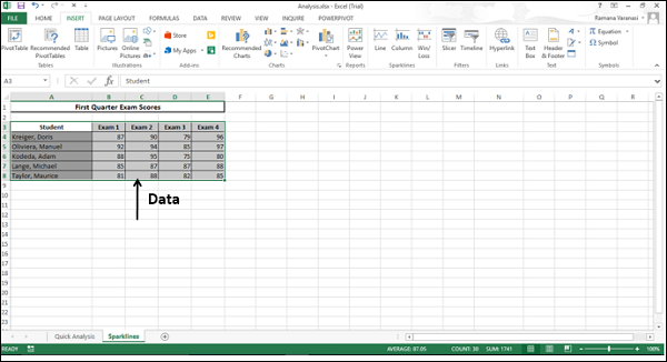
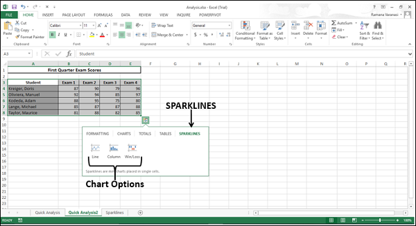
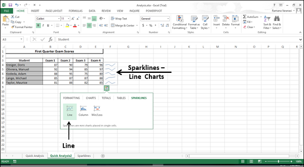
Sparklines
Sparklines are tiny charts placed in single cells, each representing a row of data in your selection. They provide a quick way to see trends.
You can add Sparklines with Quick Analysis tool.
- Select the data for which you want to add Sparklines.
- Keep an empty column to the right side of the data for the Sparklines.
Quick Analysis button  appears at the bottom right of your selected data.
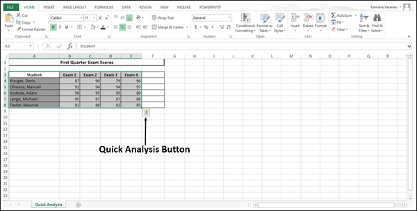
Click on the Quick Analysis
button. The Quick Analysis Toolbar appears with various options.
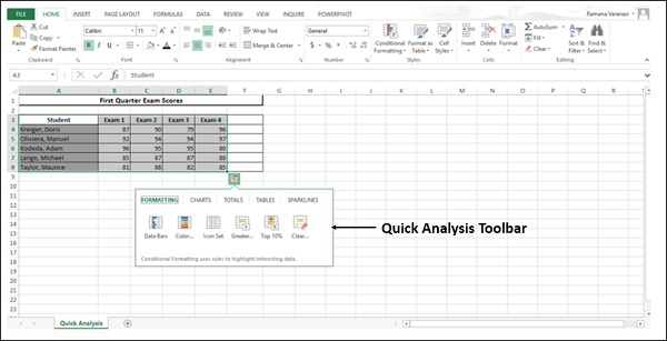
Click SPARKLINES. The chart options displayed are based on the data and may vary.
Click Line. A Line Chart for each row is displayed in the column to the right of the data.
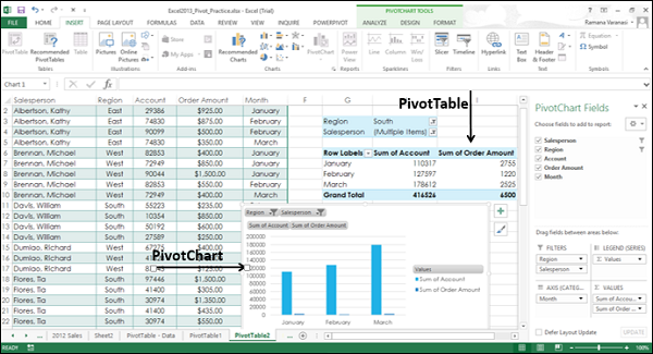
PivotCharts
Pivot Charts are used to graphically summarize data and explore complicated data.
A PivotChart shows Data Series, Categories, and Chart Axes the same way a standard chart does. Additionally, it also gives you interactive filtering controls right on the chart so that you can quickly analyze a subset of your data.
PivotCharts are useful when you have data in a huge PivotTable, or many complex worksheet data that includes text and numbers. A PivotChart can help you make sense of this data.
You can create a PivotChart from
- A PivotTable.
- A Data Table as a standalone without PivotTable.
PivotChart from PivotTable
To create a PivotChart follow the steps given below −
- Click the PivotTable.
- Click ANALYZE under PIVOTTABLE TOOLS on the Ribbon.
- Click on PivotChart. The Insert Chart dialog box appears.
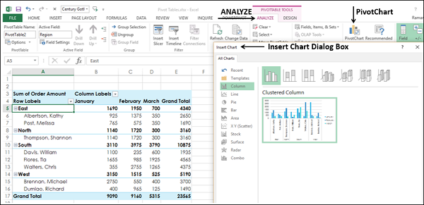
Select Clustered Column from the option Column.
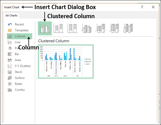
Click OK. The PivotChart is displayed.
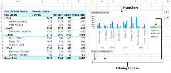
The PivotChart has three filters Region, Salesperson and Month.
Click the Region Filter Control option. The Search Box appears with the list of all Regions. Check boxes appear next to Regions.
Select East and South options.
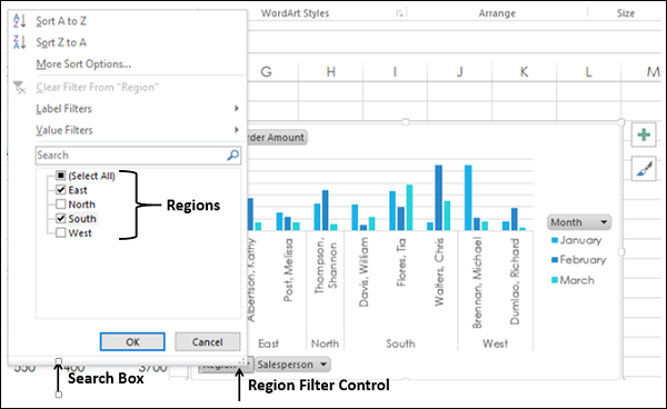
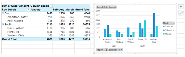
The filtered data appears on both the PivotChart and the PivotTable.
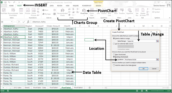
PivotChart without a PivotTable
You can create a standalone PivotChart without creating a PivotTable.
- Click the Data Table.
- Click the Insert tab.
- Click PivotChart in Charts group. The Create PivotChart window appears.
- Select the Table/Range.
- Select the Location where you want the PivotChart to be placed.
You can choose a cell in the existing worksheet itself, or in a new worksheet. Click OK.
An empty PivotChart and an empty PivotTable appear along with the PivotChart Field List to build the PivotChart.
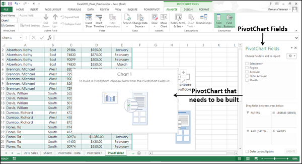
Choose the Fields to be added to the PivotChart
Arrange the Fields by dragging them into FILTERS, LEGEND (SERIES), AXIS (CATEGORIES) and VALUES
Use the Filter Controls on the PivotChart to select the Data to be placed on the PivotChart
Excel will automatically create a coupled PivotTable.