- Excel Data Analysis - Home
- Data Analysis - Overview
- Data Analysis - Process
- Excel Data Analysis - Overview
- Working with Range Names
- Tables
- Cleaning Data with Text Functions
- Cleaning Data Contains Date Values
- Working with Time Values
- Conditional Formatting
- Sorting
- Filtering
- Subtotals with Ranges
- Quick Analysis
- Lookup Functions
- PivotTables
- Data Visualization
- Data Validation
- Financial Analysis
- Working with Multiple Sheets
- Formula Auditing
- Inquire
- Advanced Data Analysis - Overview
- Data Consolidation
- What-If Analysis
- What-If Analysis with Data Tables
- What-If Analysis Scenario Manager
- What-If Analysis with Goal Seek
- Optimization with Excel Solver
- Importing Data into Excel
- Data Model
- Exploring Data with PivotTables
- Exploring Data with Powerpivot
- Exploring Data with Power View
- Exploring Data Power View Charts
- Exploring Data Power View Maps
- Exploring Data PowerView Multiples
- Exploring Data Power View Tiles
- Exploring Data with Hierarchies
- Aesthetic Power View Reports
- Key Performance Indicators
- Excel Data Analysis Resources
- Excel Data Analysis - Quick Guide
- Excel Data Analysis - Resources
- Excel Data Analysis - Discussion
Exploring Data with Power View Charts
In Power View, you have a number of Chart options: Pie, Column, Bar, Line, Scatter, and Bubble. The Charts in Power View are interactive. If you click on a value in one chart −
- That value in that chart is highlighted.
- That value in all the other charts in Power View is also highlighted.
- All the tables, matrices and tiles in Power View are filtered to that value.
Thus, Power View Charts serve as interactive, pictorial data analysis tools. Further, the charts are interactive in a presentation setting also, which would enable you to highlight the analysis results.
Exploring with Line Charts
You can use Line charts for comparing data points in one or more data series. Line charts distribute category data evenly along a horizontal (category) axis, and all numerical value data along a vertical (value) axis.
Suppose you want to display the Medal Count for each country.
Create a Power View with the fields NOC_CountryRegion and Medal Count selected. By default, Table will be displayed.
Click the Table.
Click Other Chart in the Switch Visualization group.
Select Line from the drop-down list. Line Chart will be displayed in the Power View.
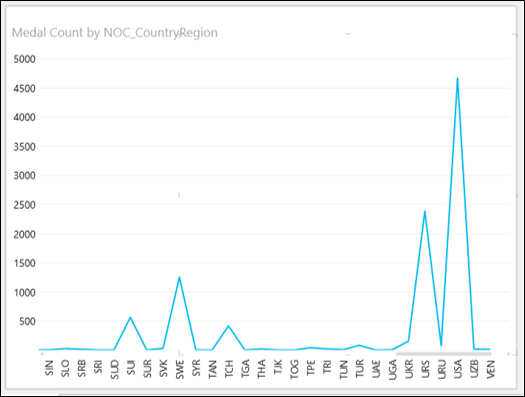
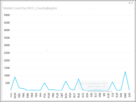
Click on the Line or the Category (x-axis) axis.
Drag to left or right. The Categories to the left or right will be displayed and Line chart will be displayed accordingly.
Place the cursor on any of the data points on the line.
The values corresponding to that data point will be displayed at that point.
Exploring with Bar Charts
You can use Bar charts for comparing data points in one or more data series. In a Bar chart, categories are organized along the vertical axis and values along the horizontal axis. In Power View, there are three Bar chart subtypes −
- Stacked Bar.
- 100% Stacked Bar.
- Clustered Bar.
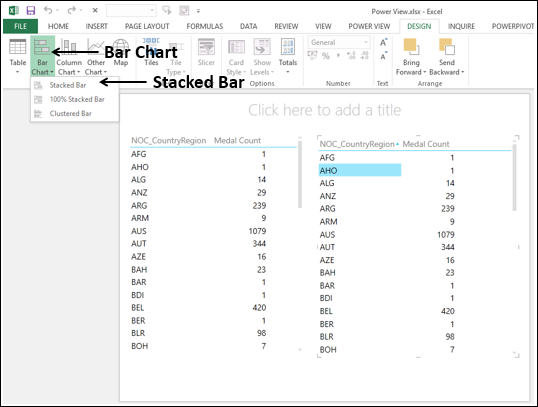
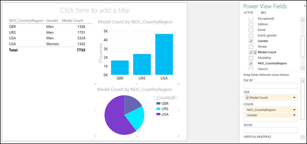
You can convert a Table Visualization to Bar Chart Visualization as follows −
- Create two Table visualizations side-by-side.
- Click the right Table.
- Click Bar Chart in the Switch Visualization group.
- Click Stacked Bar.
The Table Visualization on the right gets converted to Bar Chart Visualization. As you observe, the y-axis values are sorted by the category values in ascending order.
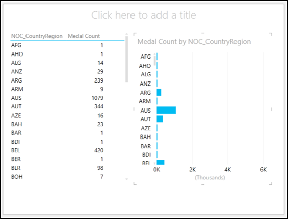
Take the cursor above the Bar chart. You will find sort by NOC_CountryRegion asc.
Click NOC_CountryRegion. It is changed to Medal Count.
Click asc. It is changed to desc. You will find that the Bar Chart is sorted by descending Medal Count.
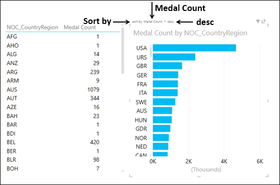
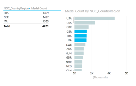
Click the Bar with Category GER. Only that Bar will be highlighted.
With Ctrl key pressed, click the Bars with Categories FRA and ITA. The Bars for GER, FRA and ITA will be highlighted.
The Table on the left also shows values for these three Categories only.
In both the visualizations, click the Gender field also in the Power View Fields list.
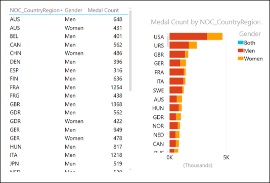
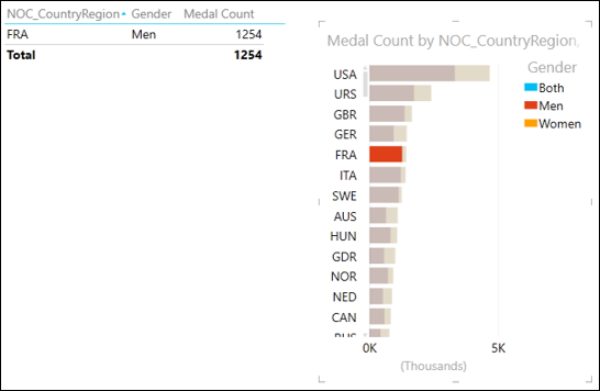
Click the left portion of the Bar GER. It is highlighted. In the Table, only the information for GER and Men will be displayed.
Note − You cannot make multiple selections in this case.
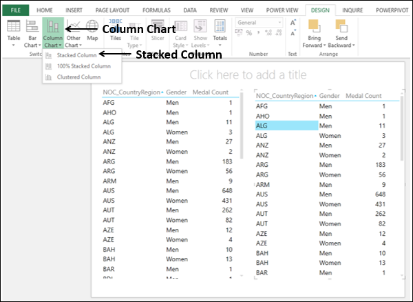
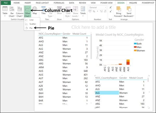
Exploring with Column Charts
You can use Column charts for showing data changes over a period of time or for illustrating comparison among items. In Column charts, categories are along the horizontal axis and values along the vertical axis.
In Power View, there are three Column chart subtypes −
- Stacked Column.
- 100% Stacked Column.
- Clustered Column.
You can convert a Table Visualization to Column Chart Visualization as follows −
- Create two Table visualizations side-by-side.
- Click the right Table.
- Click Column Chart in the Switch Visualization group.
- Click Stacked Column.
The Table Visualization on the right is converted to Bar Chart Visualization. As you observe, the x-axis values are sorted by the category values in ascending order.
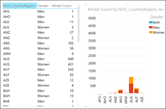
Take the cursor to above the Column chart. You will find sort by NOC_CountryRegion asc.
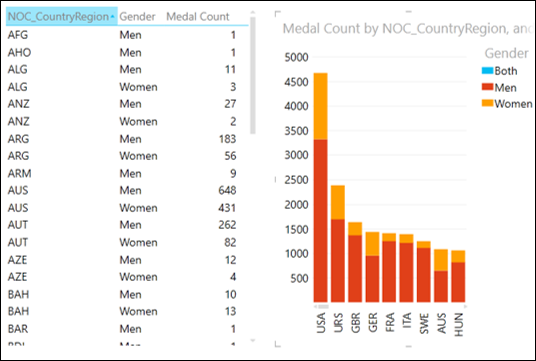
Click on NOC_CountryRegion. It gets changed to Medal Count.
Click on asc. It gets changed to desc. You will find that the Column Chart is sorted by descending Medal Count.
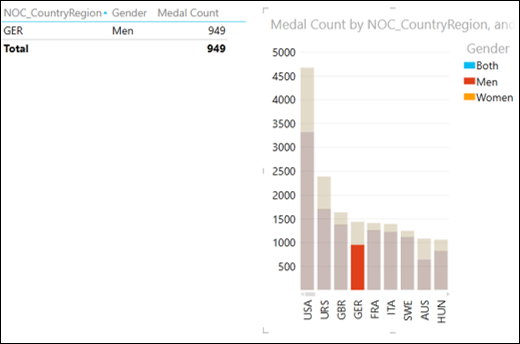
Click on the lower portion of the Bar with Category GER. It gets highlighted.
In the Table, only the information for GER and Men will be displayed.
Exploring with Simple Pie Charts
Pie charts in Power View are simple or sophisticated. You will learn simple Pie charts in this section. You will learn sophisticated Pie charts in the next section.
Start with creating a Pie chart as follows −
- Resize the Stacked Column chart and move it upwards.
- Create another Table visualization below the Stacked Column chart.
- Click the new Table.
- Click Other Chart in the Switch Visualization group.
- Select Pie.
The Table Visualization below the Stacked Column chart is converted to Pie Chart Visualization. As you observe, there are too many slices in the Pie chart as there are many categories (countries). Note that Pie charts work well only when the number of categories is 8 or less.
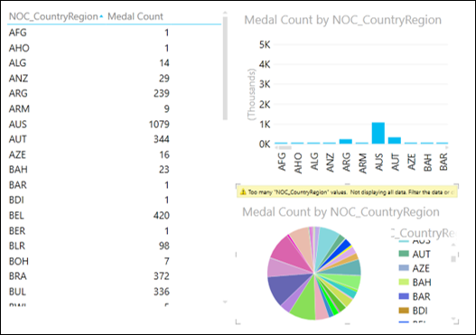
You can reduce the number of categories by filtering the values as follows −
- Set the filtering as Medal Count is greater than or equal to 1300 in −
- Table Visualization
- Column Chart Visualization
- Pie Chart Visualization
Note − You have to define and apply filtering to each of the visualizations separately.
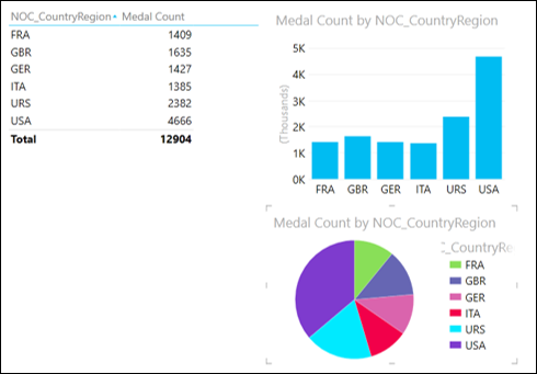
Now, you have a Simple Pie Chart Visualization, wherein the count of Medals are shown by the Pie size, and countries by colors.
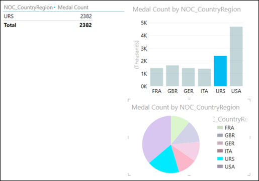
Click on a Pie slice. That slice is highlighted and others get grayed. The corresponding column in the Column chart also is highlighted. In the table, only the values corresponding to the highlighted Pie slice will be displayed.
Exploring with Sophisticated Pie Charts
You can make your Pie Chart Visualization sophisticated, by adding more features. You can make a pie char that −
- Drills down when you double-click a slice, or
- Shows sub-slices within the larger color slices.
A Pie chart that drills down when you double-click a slice
In the Pie chart, in the Power View Fields list, drag the field Gender to COLOR area, to below the field NOC_CountryRegion. This means you have two categories.
In the Table, include Gender also in the Fields list.
Your Power View looks as follows −
As you observe, there is a single slice with one color for each category - country.
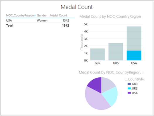
On the Pie chart, double-click on the USA slice.
The Pie chart in your Power View will be changed to show values by Gender, which is the second category, for the selected category (USA). The colors of the pie chart now show the percentages of the second field, i.e., Gender, filtered for the pie color you doubleclicked. In other words, the Pie chart was drilled down. As you observe, a small arrow appears on the top right corner of the Pie chart. If you place the mouse over it, the arrow is highlighted and Drill up will be displayed.
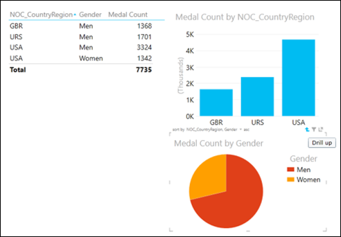
Click the drill up arrow. The Pie Chart returns to its previous state.
A Pie chart that shows sub-slices within the larger color slices
In the Pie chart, in the Power View Fields list, drag the field Gender from COLOR area to SLICES area.
Your Power View looks as follows −
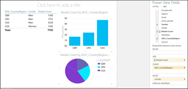
As you can see, in the Pie chart, there are two slices of same color for the category USA.
Click on one of these slices.
You will be able to see the following changes in Power View −
- The selected slice is highlighted and other slices are grayed or deactivated.
- The bar for the category USA displays the medal count for the selected slice.
- The Table shows the values for the selected slice.
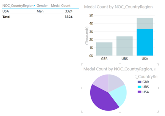
- Click the other slice. You can observe the changes as given above for this selected slice.
Exploring with Scatter Charts
You can use Scatter charts to display many related data in one chart. In Scatter charts, the x-axis displays one numeric field and the y-axis displays another, making it easy to see the relationship between the two values for all the items in the chart.
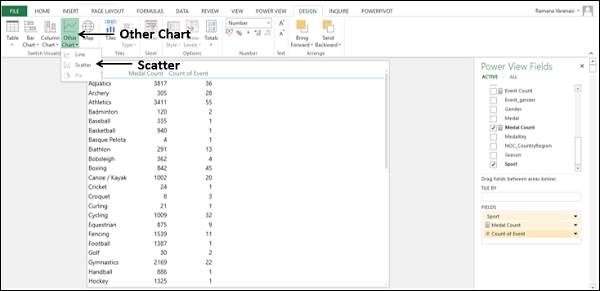
To create a Scatter Chart Visualization, proceed as follows −
Add the fields Sport, Medal Count and Event to Table.
Click the arrow next to Event in the Power View Fields list. Click Count (Distinct). The field Event changes to the numeric field Count of Event. Therefore, you have one category field Sport and two numeric fields Medal Count and Count of Event.
Click Other Chart in the Switch Visualization group.
Click Scatter.
You will get the Scatter Chart Visualization, with the data points displayed as circles of same size, showing how the Count of Event and Medal Count values are related for each sport.
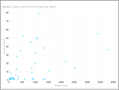
- Click the LAYOUT tab on the Ribbon.
- Click Data Labels in the Labels group.
- Select Right from the drop-down list. The Data labels appear for the data points.
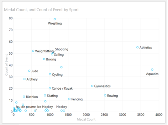
The sport Wrestling has less number of medals in more number of events as compared to the sport Aquatics that has more number of medals in less number of events.
Exploring with Bubble Charts
You can use Bubble charts to display many related data in one chart. In Bubble Charts, the x-axis displays one numeric field and the y-axis displays another, making it easy to see the relationship between the two values for all the items in the chart. A third numeric field controls the size of the data points.
To create a Bubble Chart Visualization, proceed as follows −
- Drag Medal Count to Size.
- Drag NOC_CountryRegion to ∑ X-VALUE. The Scatter chart is converted to Bubble chart.
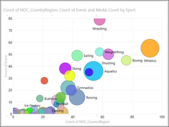
As you observe, the size of each bubble shows the medal count. The data labels show the Sport.
Exploring with Colors
You can also color the bubbles by a category as follows −
- Drag the field NOC_CountryRegion to COLOR area in the Power View Fields list.
- Drag the field DiscipleEvent to ∑ X-VALUES.
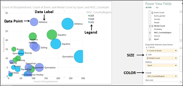
As you observe, Legend shows the values of the category that is in COLOR area and the respective colors. The data labels correspond to the category in DETAILS area. The size of the data points is by the area ∑ SIZE.
Next, you can see how selecting a category in Legend changes the visualization −
Click on a value in the Legend. Only the data points of that color (i.e., corresponding to that value) will be highlighted. All the other data points will be deactivated.
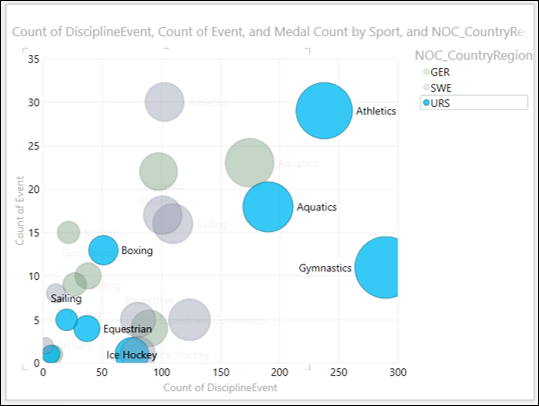
As you observe, all the sports corresponding to the selected country are displayed and the size of each bubble represents the medal count.
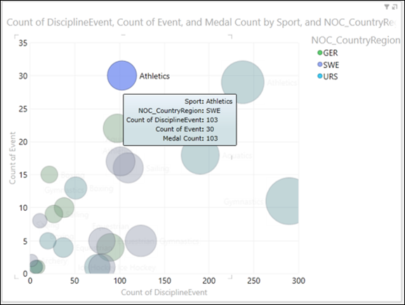
If you want to know the details of a single data point −
- Highlight the data point by just clicking on that bubble.
- Place the cursor on that data point.
Only that bubble is highlighted and the rest of the bubbles get grayed. All the information about that data point will be displayed in a box next to the data point.
Exploring with Play Axis
You can visualize the data changes over a period of time using Play Axis as follows −
- Drag the field Edition in the Power View Fields list to PLAY AXIS area.
A timeline with a Play button is inserted in your Bubble chart visualization. You can adjust the timeline by filtering the Edition field values in the Filters. This would be useful if you want to focus on a particular time range or if the timeline is too wide.
- Adjust the timeline by filtering Edition field in Filters and choosing a span of time values.
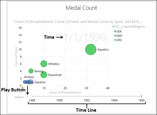
Click the Play button. The bubbles travel, grows and shrink to show how the values change based on the play axis. A small vertical line appears on the timeline that moves across the timeline. The time at that point also is displayed.
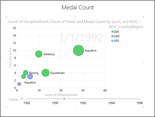
You can pause at any point to study the data in more detail.
