- Plotly Tutorial
- Plotly - Home
- Plotly - Introduction
- Plotly - Environment Setup
- Plotly - Online & Offline Plotting
- Plotting Inline with Jupyter Notebook
- Plotly - Package Structure
- Plotly - Exporting to Static Images
- Plotly - Legends
- Plotly - Format Axis & Ticks
- Plotly - Subplots & Inset Plots
- Plotly - Bar Chart & Pie Chart
- Plotly - Scatter Plot, Scattergl Plot & Bubble Charts
- Plotly - Dot Plots & Table
- Plotly - Histogram
- Plotly - Box Plot Violin Plot & Contour Plot
- Plotly - Distplots, Density Plot & Error Bar Plot
- Plotly - Heatmap
- Plotly - Polar Chart & Radar Chart
- Plotly - OHLC Chart Waterfall Chart & Funnel Chart
- Plotly - 3D Scatter & Surface Plot
- Plotly - Adding Buttons/Dropdown
- Plotly - Slider Control
- Plotly - FigureWidget Class
- Plotly with Pandas and Cufflinks
- Plotly with Matplotlib and Chart Studio
- Plotly Useful Resources
- Plotly - Quick Guide
- Plotly - Useful Resources
- Plotly - Discussion
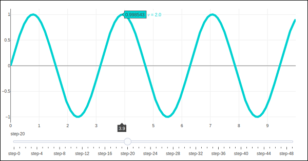
Plotly - Slider Control
Plotly has a convenient Slider that can be used to change the view of data/style of a plot by sliding a knob on the control which is placed at the bottom of rendered plot.
Slider control is made up of different properties which are as follows −
steps property is required for defining sliding positions of knob over the control.
method property is having possible values as restyle | relayout | animate | update | skip, default is restyle.
args property sets the arguments values to be passed to the Plotly method set in method on slide.
We now deploy a simple slider control on a scatter plot which will vary the frequency of sine wave as the knob slides along the control. The slider is configured to have 50 steps. First add 50 traces of sine wave curve with incrementing frequency, all but 10th trace set to visible.
Then, we configure each step with restyle method. For each step, all other step objects have visibility set to false. Finally, update Figure object’s layout by initializing sliders property.
# Add traces, one for each slider step
for step in np.arange(0, 5, 0.1):
fig.add_trace(
   go.Scatter(
      visible = False,
      line = dict(color = "blue", width = 2),
      name = "𝜈 = " + str(step),
      x = np.arange(0, 10, 0.01),
      y = np.sin(step * np.arange(0, 10, 0.01))
   )
)
fig.data[10].visible=True

# Create and add slider
steps = []
for i in range(len(fig.data)):
step = dict(
   method = "restyle",
   args = ["visible", [False] * len(fig.data)],
)
step["args"][1][i] = True # Toggle i'th trace to "visible"
steps.append(step)
sliders = [dict(active = 10, steps = steps)]
fig.layout.update(sliders=sliders)
iplot(fig)
To begin with, 10th sine wave trace will be visible. Try sliding the knob across the horizontal control at the bottom. You will see the frequency changing as shown below.