- Plotly Tutorial
- Plotly - Home
- Plotly - Introduction
- Plotly - Environment Setup
- Plotly - Online & Offline Plotting
- Plotting Inline with Jupyter Notebook
- Plotly - Package Structure
- Plotly - Exporting to Static Images
- Plotly - Legends
- Plotly - Format Axis & Ticks
- Plotly - Subplots & Inset Plots
- Plotly - Bar Chart & Pie Chart
- Plotly - Scatter Plot, Scattergl Plot & Bubble Charts
- Plotly - Dot Plots & Table
- Plotly - Histogram
- Plotly - Box Plot Violin Plot & Contour Plot
- Plotly - Distplots, Density Plot & Error Bar Plot
- Plotly - Heatmap
- Plotly - Polar Chart & Radar Chart
- Plotly - OHLC Chart Waterfall Chart & Funnel Chart
- Plotly - 3D Scatter & Surface Plot
- Plotly - Adding Buttons/Dropdown
- Plotly - Slider Control
- Plotly - FigureWidget Class
- Plotly with Pandas and Cufflinks
- Plotly with Matplotlib and Chart Studio
- Plotly Useful Resources
- Plotly - Quick Guide
- Plotly - Useful Resources
- Plotly - Discussion
Plotly - Bar Chart and Pie Chart
In this chapter, we will learn how to make bar and pie charts with the help of Plotly. Let us begin by understanding about bar chart.
Bar Chart
A bar chart presents categorical data with rectangular bars with heights or lengths proportional to the values that they represent. Bars can be displayed vertically or horizontally. It helps to show comparisons among discrete categories. One axis of the chart shows the specific categories being compared, and the other axis represents a measured value.
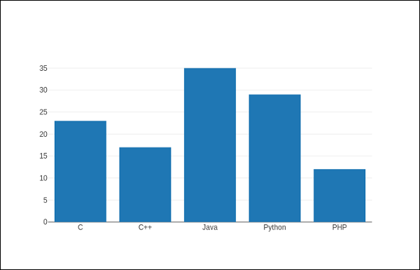
Following example plots a simple bar chart about number of students enrolled for different courses. The go.Bar() function returns a bar trace with x coordinate set as list of subjects and y coordinate as number of students.
import plotly.graph_objs as go
langs = ['C', 'C++', 'Java', 'Python', 'PHP']
students = [23,17,35,29,12]
data = [go.Bar(
   x = langs,
   y = students
)]
fig = go.Figure(data=data)
iplot(fig)
The output will be as shown below −
To display a grouped bar chart, the barmode property of Layout object must be set to group. In the following code, multiple traces representing students in each year are plotted against subjects and shown as grouped bar chart.
branches = ['CSE', 'Mech', 'Electronics']
fy = [23,17,35]
sy = [20, 23, 30]
ty = [30,20,15]
trace1 = go.Bar(
   x = branches,
   y = fy,
   name = 'FY'
)
trace2 = go.Bar(
   x = branches,
   y = sy,
   name = 'SY'
)
trace3 = go.Bar(
   x = branches,
   y = ty,
   name = 'TY'
)
data = [trace1, trace2, trace3]
layout = go.Layout(barmode = 'group')
fig = go.Figure(data = data, layout = layout)
iplot(fig)
The output of the same is as follows −
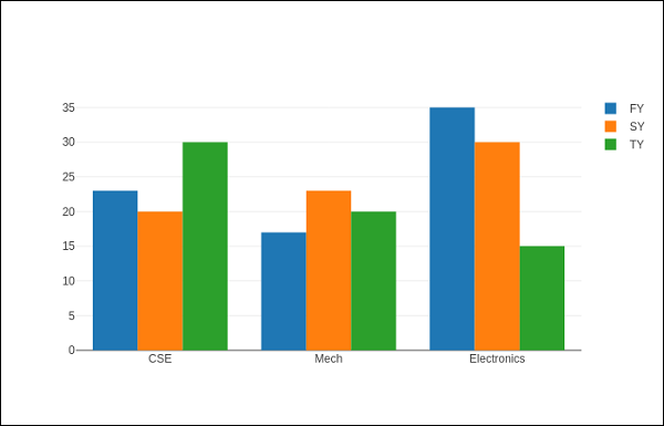
The barmode property determines how bars at the same location coordinate are displayed on the graph. Defined values are "stack" (bars stacked on top of one another), "relative", (bars are stacked on top of one another, with negative values below the axis, positive values above), "group" (bars plotted next to one another).
By changing barmode property to ‘stack’ the plotted graph appears as below −

Pie chart
A Pie Chart displays only one series of data. Pie Charts show the size of items (called wedge) in one data series, proportional to the sum of the items. Data points are shown as a percentage of the whole pie.
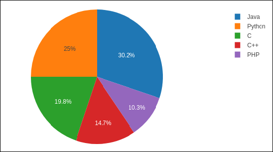
The pie() function in graph_objs module – go.Pie(), returns a Pie trace. Two required arguments are labels and values. Let us plot a simple pie chart of language courses vs number of students as in the example given herewith.
import plotly
plotly.tools.set_credentials_file(
   username = 'lathkar', api_key = 'U7vgRe1hqmRp4ZNf4PTN'
)
from plotly.offline import iplot, init_notebook_mode
init_notebook_mode(connected = True)
import plotly.graph_objs as go
langs = ['C', 'C++', 'Java', 'Python', 'PHP']
students = [23,17,35,29,12]
trace = go.Pie(labels = langs, values = students)
data = [trace]
fig = go.Figure(data = data)
iplot(fig)
Following output is displayed in Jupyter notebook −
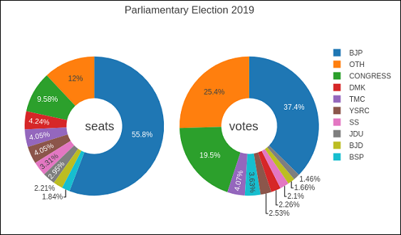
Donut chart is a pie chart with a round hole in the center which makes it look like a donut. In the following example, two donut charts are displayed in 1X2 grid layout. While ‘label’ layout is same for both pie traces, row and column destination of each subplot is decided by domain property.
For this purpose, we use the data of party-wise seats and vote share in 2019 parliamentary elections. Enter the following code in Jupyter notebook cell −
parties = ['BJP', 'CONGRESS', 'DMK', 'TMC', 'YSRC', 'SS', 'JDU','BJD', 'BSP','OTH']
seats = [303,52,23,22,22,18,16,12,10, 65]
percent = [37.36, 19.49, 2.26, 4.07, 2.53, 2.10, 1.46, 1.66, 3.63, 25.44]
import plotly.graph_objs as go
data1 = {
   "values": seats,
   "labels": parties,
   "domain": {"column": 0},
   "name": "seats",
   "hoverinfo":"label+percent+name",
   "hole": .4,
   "type": "pie"
}
data2 = {
   "values": percent,
   "labels": parties,
   "domain": {"column": 1},
   "name": "vote share",
   "hoverinfo":"label+percent+name",
   "hole": .4,
   "type": "pie"
}
data = [data1,data2]
layout = go.Layout(
   {
      "title":"Parliamentary Election 2019",
      "grid": {"rows": 1, "columns": 2},
      "annotations": [
         {
            "font": {
               "size": 20
            },
            "showarrow": False,
            "text": "seats",
            "x": 0.20,
            "y": 0.5
         },
         {
            "font": {
               "size": 20
            },
            "showarrow": False,
            "text": "votes",
            "x": 0.8,
            "y": 0.5
         }
      ]
   }
)
fig = go.Figure(data = data, layout = layout)
iplot(fig)
The output of the same is given below −