- Plotly Tutorial
- Plotly - Home
- Plotly - Introduction
- Plotly - Environment Setup
- Plotly - Online & Offline Plotting
- Plotting Inline with Jupyter Notebook
- Plotly - Package Structure
- Plotly - Exporting to Static Images
- Plotly - Legends
- Plotly - Format Axis & Ticks
- Plotly - Subplots & Inset Plots
- Plotly - Bar Chart & Pie Chart
- Plotly - Scatter Plot, Scattergl Plot & Bubble Charts
- Plotly - Dot Plots & Table
- Plotly - Histogram
- Plotly - Box Plot Violin Plot & Contour Plot
- Plotly - Distplots, Density Plot & Error Bar Plot
- Plotly - Heatmap
- Plotly - Polar Chart & Radar Chart
- Plotly - OHLC Chart Waterfall Chart & Funnel Chart
- Plotly - 3D Scatter & Surface Plot
- Plotly - Adding Buttons/Dropdown
- Plotly - Slider Control
- Plotly - FigureWidget Class
- Plotly with Pandas and Cufflinks
- Plotly with Matplotlib and Chart Studio
- Plotly Useful Resources
- Plotly - Quick Guide
- Plotly - Useful Resources
- Plotly - Discussion
OHLC Chart, Waterfall Chart and Funnel Chart
This chapter focusses on other three types of charts including OHLC, Waterfall and Funnel Chart which can be made with the help of Plotly.
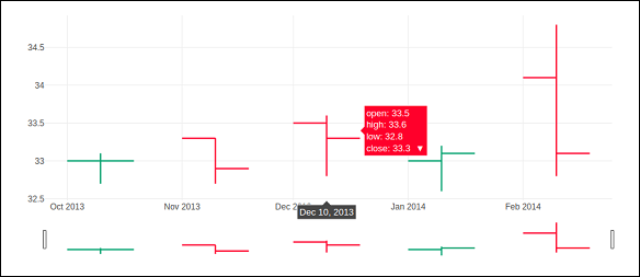
OHLC Chart
An open-high-low-close chart (also OHLC) is a type of bar chart typically used to illustrate movements in the price of a financial instrument such as shares. OHLC charts are useful since they show the four major data points over a period. The chart type is useful because it can show increasing or decreasing momentum. The high and low data points are useful in assessing volatility.
Each vertical line on the chart shows the price range (the highest and lowest prices) over one unit of time, such as day or hour. Tick marks project from each side of the line indicating the opening price (e.g., for a daily bar chart this would be the starting price for that day) on the left, and the closing price for that time period on the right.
Sample data for demonstration of OHLC chart is shown below. It has list objects corresponding to high, low, open and close values as on corresponding date strings. The date representation of string is converted to date object by using strtp() function from datetime module.
open_data = [33.0, 33.3, 33.5, 33.0, 34.1]
high_data = [33.1, 33.3, 33.6, 33.2, 34.8]
low_data = [32.7, 32.7, 32.8, 32.6, 32.8]
close_data = [33.0, 32.9, 33.3, 33.1, 33.1]
date_data = ['10-10-2013', '11-10-2013', '12-10-2013','01-10-2014','02-10-2014']
import datetime
dates = [
   datetime.datetime.strptime(date_str, '%m-%d-%Y').date()
   for date_str in date_data
]
We have to use above dates object as x parameter and others for open, high, low and close parameters required for go.Ohlc() function that returns OHLC trace.
trace = go.Ohlc(
   x = dates,
   open = open_data,
   high = high_data,
   low = low_data,
   close = close_data
)
data = [trace]
fig = go.Figure(data = data)
iplot(fig)
The output of the code is given below −
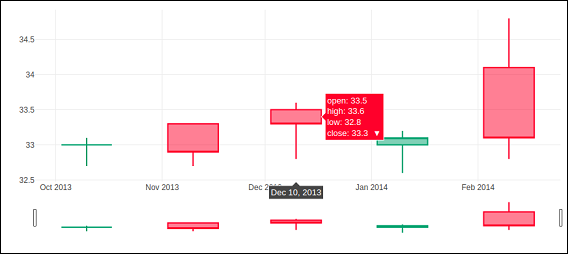
Candlestick Chart
The candlestick chart is similar to OHLC chart. It is like a combination of line-chart and a bar-chart. The boxes represent the spread between the open and close values and the lines represent the spread between the low and high values. Sample points where the close value is higher (lower) then the open value are called increasing (decreasing).
Candlestrick trace is returned by go.Candlestick() function. We use same data (as for OHLC chart) to render candlestick chart as given below −
trace = go.Candlestick(
   x = dates,
   open = open_data,
   high = high_data,
   low = low_data,
   close = close_data
)
Output of the above given code is mentioned below −
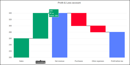
Waterfall chart
A waterfall chart (also known as flying bricks chart or Mario chart) helps in understanding the cumulative effect of sequentially introduced positive or negative values which can either be time based or category based.
Initial and final values are shown as columns with the individual negative and positive adjustments depicted as floating steps. Some waterfall charts connect the lines between the columns to make the chart look like a bridge.
go.Waterfall() function returns a Waterfall trace. This object can be customized by various named arguments or attributes. Here, x and y attributes set up data for x and y coordinates of the graph. Both can be a Python list, numpy array or Pandas series or strings or date time objects.
Another attribute is measure which is an array containing types of values. By default, the values are considered as relative. Set it to 'total' to compute the sums. If it is equal to absolute it resets the computed total or to declare an initial value where needed. The 'base' attribute sets where the bar base is drawn (in position axis units).
Following code renders a waterfall chart −
s1=[
   "Sales",
   "Consulting",
   "Net revenue",
   "Purchases",
   "Other expenses",
   "Profit before tax"
]
s2 = [60, 80, 0, -40, -20, 0]
trace = go.Waterfall(
   x = s1,
   y = s2,
   base = 200,
   measure = [
      "relative",
      "relative",
      "total",
      "relative",
      "relative",
      "total"
   ]
)
data = [trace]
fig = go.Figure(data = data)
iplot(fig)
Below mentioned output is a result of the code given above.
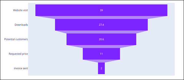
Funnel Chart
Funnel charts represent data in different stages of a business process. It is an important mechanism in Business Intelligence to identify potential problem areas of a process. Funnel chart is used to visualize how data reduces progressively as it passes from one phase to another. Data in each of these phases is represented as different portions of 100% (the whole).
Like the Pie chart, the Funnel chart does not use any axes either. It can also be treated as similar to a stacked percent bar chart. Any funnel consists of the higher part called head (or base) and the lower part referred to as neck. The most common use of the Funnel chart is in visualizing sales conversion data.
Plotly's go.Funnel() function produces Funnel trace. Essential attributes to be provided to this function are x and y. Each of them is assigned a Python list of items or an array.
from plotly import graph_objects as go
fig = go.Figure(
   go.Funnel(
      y = [
         "Website visit",
         "Downloads",
         "Potential customers",
         "Requested price",
         "invoice sent"
      ],
      x = [39, 27.4, 20.6, 11, 2]
   )
)
fig.show()
The output is as given below −