- Plotly Tutorial
- Plotly - Home
- Plotly - Introduction
- Plotly - Environment Setup
- Plotly - Online & Offline Plotting
- Plotting Inline with Jupyter Notebook
- Plotly - Package Structure
- Plotly - Exporting to Static Images
- Plotly - Legends
- Plotly - Format Axis & Ticks
- Plotly - Subplots & Inset Plots
- Plotly - Bar Chart & Pie Chart
- Plotly - Scatter Plot, Scattergl Plot & Bubble Charts
- Plotly - Dot Plots & Table
- Plotly - Histogram
- Plotly - Box Plot Violin Plot & Contour Plot
- Plotly - Distplots, Density Plot & Error Bar Plot
- Plotly - Heatmap
- Plotly - Polar Chart & Radar Chart
- Plotly - OHLC Chart Waterfall Chart & Funnel Chart
- Plotly - 3D Scatter & Surface Plot
- Plotly - Adding Buttons/Dropdown
- Plotly - Slider Control
- Plotly - FigureWidget Class
- Plotly with Pandas and Cufflinks
- Plotly with Matplotlib and Chart Studio
- Plotly Useful Resources
- Plotly - Quick Guide
- Plotly - Useful Resources
- Plotly - Discussion
Plotly - Dot Plots and Table
Here, we will learn about dot plots and table function in Plotly. Firstly, let us start with dot plots.
Dot Plots
A dot plot displays points on a very simple scale. It is only suitable for a small amount of data as a large number of points will make it look very cluttered. Dot plots are also known as Cleveland dot plots. They show changes between two (or more) points in time or between two (or more) conditions.
Dot plots are similar to horizontal bar chart. However, they can be less cluttered and allow an easier comparison between conditions. The figure plots a scatter trace with mode attribute set to markers.
Following example shows comparison of literacy rate amongst men and women as recorded in each census after independence of India. Two traces in the graph represent literacy percentage of men and women in each census after 1951 up to 2011.
from plotly.offline import iplot, init_notebook_mode
init_notebook_mode(connected = True)
census = [1951,1961,1971,1981,1991,2001, 2011]
x1 = [8.86, 15.35, 21.97, 29.76, 39.29, 53.67, 64.63]
x2 = [27.15, 40.40, 45.96, 56.38,64.13, 75.26, 80.88]
traceA = go.Scatter(
   x = x1,
   y = census,
   marker = dict(color = "crimson", size = 12),
   mode = "markers",
   name = "Women"
)
traceB = go.Scatter(
x = x2,
y = census,
marker = dict(color = "gold", size = 12),
mode = "markers",
name = "Men")
data = [traceA, traceB]
layout = go.Layout(
   title = "Trend in Literacy rate in Post independent India",
   xaxis_title = "percentage",
   yaxis_title = "census"
)
fig = go.Figure(data = data, layout = layout)
iplot(fig)
The output would be as shown below −
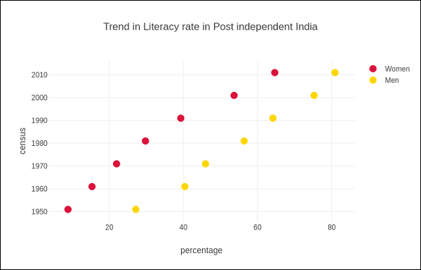
Table in Plotly
Plotly's Table object is returned by go.Table() function. Table trace is a graph object useful for detailed data viewing in a grid of rows and columns. Table is using a column-major order, i.e. the grid is represented as a vector of column vectors.
Two important parameters of go.Table() function are header which is the first row of table and cells which form rest of rows. Both parameters are dictionary objects. The values attribute of headers is a list of column headings, and a list of lists, each corresponding to one row.
Further styling customization is done by linecolor, fill_color, font and other attributes.
Following code displays the points table of round robin stage of recently concluded Cricket World Cup 2019.
trace = go.Table(
   header = dict(
      values = ['Teams','Mat','Won','Lost','Tied','NR','Pts','NRR'],
      line_color = 'gray',
      fill_color = 'lightskyblue',
      align = 'left'
   ),
   cells = dict(
      values =
      [
         [
            'India',
            'Australia',
            'England',
            'New Zealand',
            'Pakistan',
            'Sri Lanka',
            'South Africa',
            'Bangladesh',
            'West Indies',
            'Afghanistan'
         ],
         [9,9,9,9,9,9,9,9,9,9],
         [7,7,6,5,5,3,3,3,2,0],
         [1,2,3,3,3,4,5,5,6,9],
         [0,0,0,0,0,0,0,0,0,0],
         [1,0,0,1,1,2,1,1,1,0],
         [15,14,12,11,11,8,7,7,5,0],
         [0.809,0.868,1.152,0.175,-0.43,-0.919,-0.03,-0.41,-0.225,-1.322]
      ],
      line_color='gray',
      fill_color='lightcyan',
      align='left'
   )
)
data = [trace]
fig = go.Figure(data = data)
iplot(fig)
The output is as mentioned below −
Table data can also be populated from Pandas dataframe. Let us create a comma separated file (points-table.csv) as below −
| Teams | Mat | Won | Lost | Tied | NR | Pts | NRR |
|---|---|---|---|---|---|---|---|
| India | 9 | 7 | 1 | 0 | 1 | 15 | 0.809 |
| Australia | 9 | 7 | 2 | 0 | 0 | 14 | 0.868 |
| England | 9 | 6 | 3 | 0 | 0 | 14 | 1.152 |
| New Zealand | 9 | 5 | 3 | 0 | 1 | 11 | 0.175 |
| Pakistan | 9 | 5 | 3 | 0 | 1 | 11 | -0.43 |
| Sri Lanka | 9 | 3 | 4 | 0 | 2 | 8 | -0.919 |
| South Africa | 9 | 3 | 5 | 0 | 1 | 7 | -0.03 |
| Bangladesh | 9 | 3 | 5 | 0 | 1 | 7 | -0.41 |
Teams,Matches,Won,Lost,Tie,NR,Points,NRR
India,9,7,1,0,1,15,0.809
Australia,9,7,2,0,0,14,0.868
England,9,6,3,0,0,12,1.152
New Zealand,9,5,3,0,1,11,0.175
Pakistan,9,5,3,0,1,11,-0.43
Sri Lanka,9,3,4,0,2,8,-0.919
South Africa,9,3,5,0,1,7,-0.03
Bangladesh,9,3,5,0,1,7,-0.41
West Indies,9,2,6,0,1,5,-0.225
Afghanistan,9,0,9,0,0,0,-1.322
We now construct a dataframe object from this csv file and use it to construct table trace as below −
import pandas as pd
df = pd.read_csv('point-table.csv')
trace = go.Table(
   header = dict(values = list(df.columns)),
   cells = dict(
      values = [
         df.Teams,
         df.Matches,
         df.Won,
         df.Lost,
         df.Tie,
         df.NR,
         df.Points,
         df.NRR
      ]
   )
)
data = [trace]
fig = go.Figure(data = data)
iplot(fig)