- Plotly Tutorial
- Plotly - Home
- Plotly - Introduction
- Plotly - Environment Setup
- Plotly - Online & Offline Plotting
- Plotting Inline with Jupyter Notebook
- Plotly - Package Structure
- Plotly - Exporting to Static Images
- Plotly - Legends
- Plotly - Format Axis & Ticks
- Plotly - Subplots & Inset Plots
- Plotly - Bar Chart & Pie Chart
- Plotly - Scatter Plot, Scattergl Plot & Bubble Charts
- Plotly - Dot Plots & Table
- Plotly - Histogram
- Plotly - Box Plot Violin Plot & Contour Plot
- Plotly - Distplots, Density Plot & Error Bar Plot
- Plotly - Heatmap
- Plotly - Polar Chart & Radar Chart
- Plotly - OHLC Chart Waterfall Chart & Funnel Chart
- Plotly - 3D Scatter & Surface Plot
- Plotly - Adding Buttons/Dropdown
- Plotly - Slider Control
- Plotly - FigureWidget Class
- Plotly with Pandas and Cufflinks
- Plotly with Matplotlib and Chart Studio
- Plotly Useful Resources
- Plotly - Quick Guide
- Plotly - Useful Resources
- Plotly - Discussion
Plotly - Quick Guide
Plotly - Introduction
Plotly is a Montreal based technical computing company involved in development of data analytics and visualisation tools such as Dash and Chart Studio. It has also developed open source graphing Application Programming Interface (API) libraries for Python, R, MATLAB, Javascript and other computer programming languages.
Some of the important features of Plotly are as follows −
It produces interactive graphs.
The graphs are stored in JavaScript Object Notation (JSON) data format so that they can be read using scripts of other programming languages such as R, Julia, MATLAB etc.
Graphs can be exported in various raster as well as vector image formats
Plotly - Environment Setup
This chapter focusses on how to do the environmental set up in Python with the help of Plotly.
Installation of Python package
It is always recommended to use Python’s virtual environment feature for installation of a new package. Following command creates a virtual environment in the specified folder.
python -m myenv
To activate the so created virtual environment run activate script in bin sub folder as shown below.
source bin/activate
Now we can install plotly’s Python package as given below using pip utility.
pip install plotly
You may also want to install Jupyter notebook app which is a web based interface to Ipython interpreter.
pip install jupyter notebook
Firstly, you need to create an account on website which is available at https://plot.ly. You can sign up by using the link mentioned herewith https://plot.ly/api_signup and then log in successfully.
Next, obtain the API key from settings page of your dashboard.
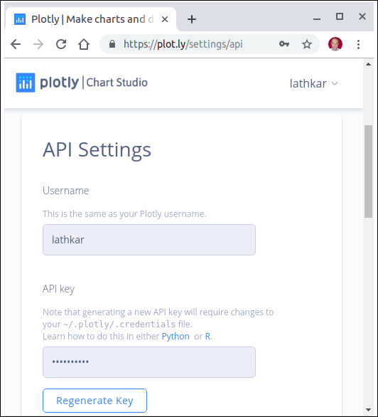
Use your username and API key to set up credentials on Python interpreter session.
import plotly
plotly.tools.set_credentials_file(username='test',
api_key='********************')
A special file named credentials is created in .plotly subfolder under your home directory. It looks similar to the following −
{
   "username": "test",
   "api_key": "********************",
   "proxy_username": "",
   "proxy_password": "",
   "stream_ids": []
}
In order to generate plots, we need to import the following module from plotly package −
import plotly.plotly as py
import plotly.graph_objs as go
plotly.plotly module contains the functions that will help us communicate with the Plotly servers. Functions in plotly.graph_objs module generates graph objects
Plotly - Online and Offline Plotting
The following chapter deals with the settings for the online and offline plotting. Let us first study the settings for online plotting.
Settings for online plotting
Data and graph of online plot are save in your plot.ly account. Online plots are generated by two methods both of which create a unique url for the plot and save it in your Plotly account.
py.plot() − returns the unique url and optionally open the url.
py.iplot() − when working in a Jupyter Notebook to display the plot in the notebook.
We shall now display simple plot of angle in radians vs. its sine value. First, obtain ndarray object of angles between 0 and 2π using arange() function from numpy library. This ndarray object serves as values on x axis of the graph. Corresponding sine values of angles in x which has to be displayed on y axis are obtained by following statements −
import numpy as np
import math #needed for definition of pi
xpoints = np.arange(0, math.pi*2, 0.05)
ypoints = np.sin(xpoints)
Next, create a scatter trace using Scatter() function in graph_objs module.
trace0 = go.Scatter(
   x = xpoints,
   y = ypoints
)
data = [trace0]
Use above list object as argument to plot() function.
py.plot(data, filename = 'Sine wave', auto_open=True)
Save following script as plotly1.py
import plotly
plotly.tools.set_credentials_file(username='lathkar', api_key='********************')
import plotly.plotly as py
import plotly.graph_objs as go
import numpy as np
import math #needed for definition of pi

xpoints = np.arange(0, math.pi*2, 0.05)
ypoints = np.sin(xpoints)
trace0 = go.Scatter(
   x = xpoints, y = ypoints
)
data = [trace0]
py.plot(data, filename = 'Sine wave', auto_open=True)
Execute the above mentioned script from command line. Resultant plot will be displayed in the browser at specified URL as stated below.
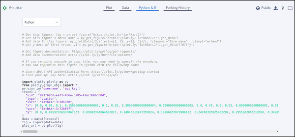
$ python plotly1.py
High five! You successfully sent some data to your account on plotly.
View your plot in your browser at https://plot.ly/~lathkar/0
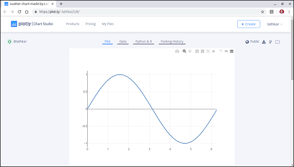
Just above the displayed graph, you will find tabs Plot, Data, Python & Rand Forking history.
Currently, Plot tab is selected. The Data tab shows a grid containing x and y data points. From Python & R tab, you can view code corresponding to current plot in Python, R, JSON, Matlab etc. Following snapshot shows Python code for the plot as generated above −
Setting for Offline Plotting
Plotly allows you to generate graphs offline and save them in local machine. The plotly.offline.plot() function creates a standalone HTML that is saved locally and opened inside your web browser.
Use plotly.offline.iplot() when working offline in a Jupyter Notebook to display the plot in the notebook.
Note − Plotly's version 1.9.4+ is needed for offline plotting.
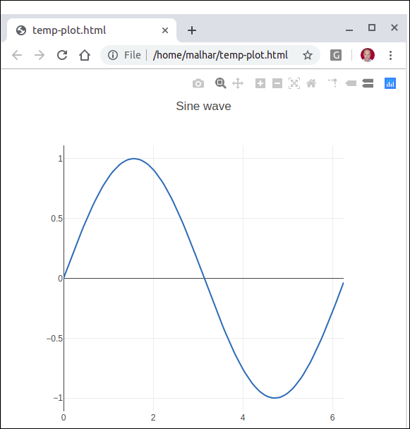
Change plot() function statement in the script and run. A HTML file named temp-plot.html will be created locally and opened in web browser.
plotly.offline.plot(
   { "data": data,"layout": go.Layout(title = "hello world")}, auto_open = True)
Plotly - Plotting Inline with Jupyter Notebook
In this chapter, we will study how to do inline plotting with the Jupyter Notebook.
In order to display the plot inside the notebook, you need to initiate plotly’s notebook mode as follows −
from plotly.offline import init_notebook_mode
init_notebook_mode(connected = True)
Keep rest of the script as it is and run the notebook cell by pressing Shift+Enter. Graph will be displayed offline inside the notebook itself.
import plotly
plotly.tools.set_credentials_file(username = 'lathkar', api_key = '************')
from plotly.offline import iplot, init_notebook_mode
init_notebook_mode(connected = True)

import plotly
import plotly.graph_objs as go
import numpy as np
import math #needed for definition of pi

xpoints = np.arange(0, math.pi*2, 0.05)
ypoints = np.sin(xpoints)
trace0 = go.Scatter(
   x = xpoints, y = ypoints
)
data = [trace0]
plotly.offline.iplot({ "data": data,"layout": go.Layout(title="Sine wave")})
Jupyter notebook output will be as shown below −
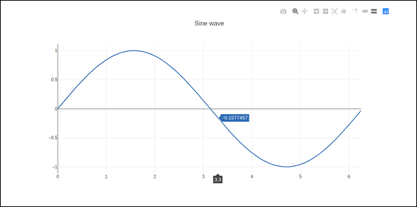
The plot output shows a tool bar at top right. It contains buttons for download as png, zoom in and out, box and lasso, select and hover.

Plotly - Package Structure
Plotly Python package has three main modules which are given below −
- plotly.plotly
- plotly.graph_objs
- plotly.tools
The plotly.plotly module contains functions that require a response from Plotly's servers. Functions in this module are interface between your local machine and Plotly.
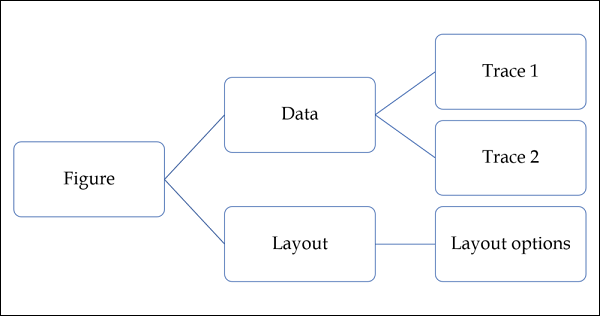
The plotly.graph_objs module is the most important module that contains all of the class definitions for the objects that make up the plots you see. Following graph objects are defined −
- Figure,
- Data,
- ayout,
- Different graph traces like Scatter, Box, Histogram etc.
All graph objects are dictionary- and list-like objects used to generate and/or modify every feature of a Plotly plot.
The plotly.tools module contains many helpful functions facilitating and enhancing the Plotly experience. Functions for subplot generation, embedding Plotly plots in IPython notebooks, saving and retrieving your credentials are defined in this module.
A plot is represented by Figure object which represents Figure class defined in plotly.graph_objs module. It’s constructor needs following parameters −
import plotly.graph_objs as go
fig = go.Figure(data, layout, frames)
The data parameter is a list object in Python. It is a list of all the traces that you wish to plot. A trace is just the name we give to a collection of data which is to be plotted. A trace object is named according to how you want the data displayed on the plotting surface.
Plotly provides number of trace objects such as scatter, bar, pie, heatmap etc. and each is returned by respective functions in graph_objs functions. For example: go.scatter() returns a scatter trace.
import numpy as np
import math #needed for definition of pi

xpoints=np.arange(0, math.pi*2, 0.05)
ypoints=np.sin(xpoints)

trace0 = go.Scatter(
   x = xpoints, y = ypoints
)
data = [trace0]
The layout parameter defines the appearance of the plot, and plot features which are unrelated to the data. So we will be able to change things like the title, axis titles, annotations, legends, spacing, font and even draw shapes on top of your plot.
layout = go.Layout(title = "Sine wave", xaxis = {'title':'angle'}, yaxis = {'title':'sine'})
A plot can have plot title as well as axis title. It also may have annotations to indicate other descriptions.
Finally, there is a Figure object created by go.Figure() function. It is a dictionary-like object that contains both the data object and the layout object. The figure object is eventually plotted.
py.iplot(fig)
Plotly - Exporting to Static Images
Outputs of offline graphs can be exported to various raster and vector image formats. For that purpose, we need to install two dependencies – orca and psutil.
Orca
Orca stands for Open-source Report Creator App. It is an Electron app that generates images and reports of plotly graphs, dash apps, dashboards from the command line. Orca is the backbone of Plotly's Image Server.
psutil
psutil (python system and process utilities) is a cross-platform library for retrieving information on running processes and system utilization in Python. It implements many functionalities offered by UNIX command line tools such as: ps, top, netstat, ifconfig, who, etc. psutil supports all major operating systems such as Linux, Windows and MacOs
Installation of Orca and psutil
If you are using Anaconda distribution of Python, installation of orca and psutil is very easily done by conda package manager as follows −
conda install -c plotly plotly-orca psutil
Since, orca is not available in PyPi repository. You can instead use npm utility to install it.
npm install -g electron@1.8.4 orca
Use pip to install psutil
pip install psutil
If you are not able to use npm or conda, prebuilt binaries of orca can also be downloaded from the following website which is available at https://github.com/plotly/orca/releases.
To export Figure object to png, jpg or WebP format, first, import plotly.io module
import plotly.io as pio
Now, we can call write_image() function as follows −
pio.write_image(fig, ‘sinewave.png’)
pio.write_image(fig, ‘sinewave.jpeg’)
pio.write_image(fig,’sinewave.webp)
The orca tool also supports exporting plotly to svg, pdf and eps formats.
Pio.write_image(fig, ‘sinewave.svg’)
pio.write_image(fig, ‘sinewave.pdf’)
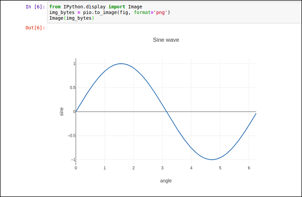
In Jupyter notebook, the image object obtained by pio.to_image() function can be displayed inline as follows −
Plotly - Legends
By default, Plotly chart with multiple traces shows legends automatically. If it has only one trace, it is not displayed automatically. To display, set showlegend parameter of Layout object to True.
layout = go.Layoyt(showlegend = True)
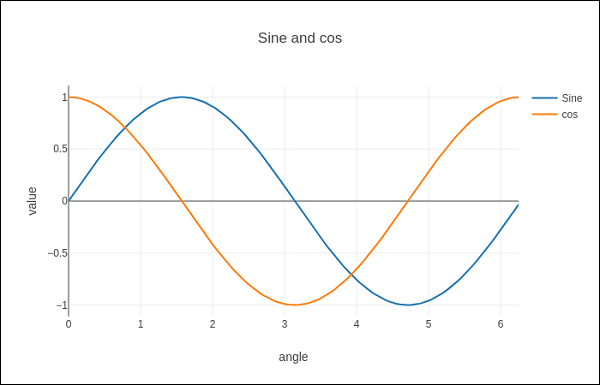
Default labels of legends are trace object names. To set legend label explicitly set name property of trace.
In following example, two scatter traces with name property are plotted.
import numpy as np
import math #needed for definition of pi

xpoints = np.arange(0, math.pi*2, 0.05)
y1 = np.sin(xpoints)
y2 = np.cos(xpoints)
trace0 = go.Scatter(
   x = xpoints,
   y = y1,
   name='Sine'
)
trace1 = go.Scatter(
   x = xpoints,
   y = y2,
   name = 'cos'
)
data = [trace0, trace1]
layout = go.Layout(title = "Sine and cos", xaxis = {'title':'angle'}, yaxis = {'title':'value'})
fig = go.Figure(data = data, layout = layout)
iplot(fig)
The plot appears as below −
Plotly - Format Axis and Ticks
You can configure appearance of each axis by specifying the line width and color. It is also possible to define grid width and grid color. Let us learn about the same in detail in this chapter.
Plot with Axis and Tick
In the Layout object’s properties, setting showticklabels to true will enable ticks. The tickfont property is a dict object specifying font name, size, color, etc. The tickmode property can have two possible values — linear and array. If it is linear, the position of starting tick is determined by tick0 and step between ticks by dtick properties.
If tickmode is set to array, you have to provide list of values and labels as tickval and ticktext properties.
The Layout object also has Exponentformat attribute set to ‘e’ will cause tick values to be displayed in scientific notation. You also need to set showexponent property to ‘all’.
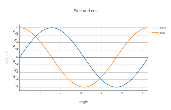
We now format the Layout object in above example to configure x and y axis by specifying line, grid and title font properties and tick mode, values and font.
layout = go.Layout(
   title = "Sine and cos",
   xaxis = dict(
      title = 'angle',
      showgrid = True,
      zeroline = True,
      showline = True,
      showticklabels = True,
      gridwidth = 1
   ),
   yaxis = dict(
      showgrid = True,
      zeroline = True,
      showline = True,
      gridcolor = '#bdbdbd',
      gridwidth = 2,
      zerolinecolor = '#969696',
      zerolinewidth = 2,
      linecolor = '#636363',
      linewidth = 2,
      title = 'VALUE',
      titlefont = dict(
         family = 'Arial, sans-serif',
         size = 18,
         color = 'lightgrey'
      ),
      showticklabels = True,
      tickangle = 45,
      tickfont = dict(
      family = 'Old Standard TT, serif',
      size = 14,
      color = 'black'
      ),
      tickmode = 'linear',
      tick0 = 0.0,
      dtick = 0.25
   )
)
Plot with Multiple Axes
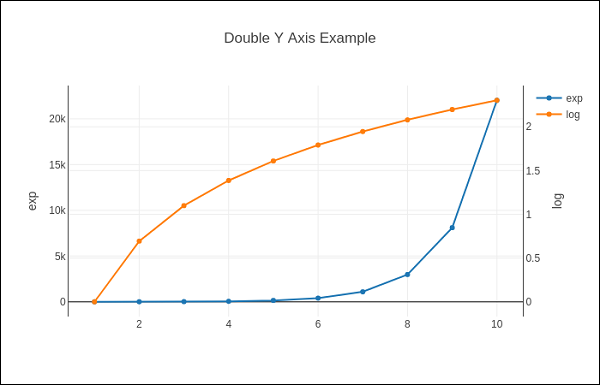
Sometimes it is useful to have dual x or y axes in a figure; for example, when plotting curves with different units together. Matplotlib supports this with the twinx and twiny functions. In the following example, the plot has dual y axes, one showing exp(x) and other showing log(x)
x = np.arange(1,11)
y1 = np.exp(x)
y2 = np.log(x)
trace1 = go.Scatter(
   x = x,
   y = y1,
   name = 'exp'
)
trace2 = go.Scatter(
   x = x,
   y = y2,
   name = 'log',
   yaxis = 'y2'
)
data = [trace1, trace2]
layout = go.Layout(
   title = 'Double Y Axis Example',
   yaxis = dict(
      title = 'exp',zeroline=True,
      showline = True
   ),
   yaxis2 = dict(
      title = 'log',
      zeroline = True,
      showline = True,
      overlaying = 'y',
      side = 'right'
   )
)
fig = go.Figure(data=data, layout=layout)
iplot(fig)
Here, additional y axis is configured as yaxis2 and appears on right side, having ‘log’ as title. Resultant plot is as follows −
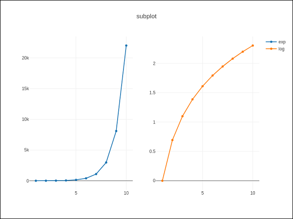
Plotly - Subplots and Inset Plots
Here, we will understand the concept of subplots and inset plots in Plotly.
Making Subplots
Sometimes it is helpful to compare different views of data side by side. This supports the concept of subplots. It offers make_subplots() function in plotly.tools module. The function returns a Figure object.
The following statement creates two subplots in one row.
fig = tools.make_subplots(rows = 1, cols = 2)
We can now add two different traces (the exp and log traces in example above) to the figure.
fig.append_trace(trace1, 1, 1)
fig.append_trace(trace2, 1, 2)
The Layout of figure is further configured by specifying title, width, height, etc. using update() method.
fig['layout'].update(height = 600, width = 800s, title = 'subplots')
Here's the complete script −
from plotly import tools
import plotly.plotly as py
import plotly.graph_objs as go
from plotly.offline import iplot, init_notebook_mode
init_notebook_mode(connected = True)
import numpy as np
x = np.arange(1,11)
y1 = np.exp(x)
y2 = np.log(x)
trace1 = go.Scatter(
   x = x,
   y = y1,
   name = 'exp'
)
trace2 = go.Scatter(
   x = x,
   y = y2,
   name = 'log'
)
fig = tools.make_subplots(rows = 1, cols = 2)
fig.append_trace(trace1, 1, 1)
fig.append_trace(trace2, 1, 2)
fig['layout'].update(height = 600, width = 800, title = 'subplot')
iplot(fig)
This is the format of your plot grid: [ (1,1) x1,y1 ] [ (1,2) x2,y2 ]
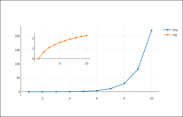
Inset Plots
To display a subplot as inset, we need to configure its trace object. First the xaxis and yaxis properties of inset trace to ‘x2’ and ‘y2’ respectively. Following statement puts ‘log’ trace in inset.
trace2 = go.Scatter(
   x = x,
   y = y2,
   xaxis = 'x2',
   yaxis = 'y2',
   name = 'log'
)
Secondly, configure Layout object where the location of x and y axes of inset is defined by domain property that specifies is position with respective to major axis.
xaxis2=dict(
   domain = [0.1, 0.5],
   anchor = 'y2'
),
yaxis2 = dict(
   domain = [0.5, 0.9],
   anchor = 'x2'
)
Complete script to display log trace in inset and exp trace on main axis is given below −
trace1 = go.Scatter(
   x = x,
   y = y1,
   name = 'exp'
)
trace2 = go.Scatter(
   x = x,
   y = y2,
   xaxis = 'x2',
   yaxis = 'y2',
   name = 'log'
)
data = [trace1, trace2]
layout = go.Layout(
   yaxis = dict(showline = True),
   xaxis2 = dict(
      domain = [0.1, 0.5],
      anchor = 'y2'
   ),
   yaxis2 = dict(
      showline = True,
      domain = [0.5, 0.9],
      anchor = 'x2'
   )
)
fig = go.Figure(data=data, layout=layout)
iplot(fig)
The output is mentioned below −
Plotly - Bar Chart and Pie Chart
In this chapter, we will learn how to make bar and pie charts with the help of Plotly. Let us begin by understanding about bar chart.
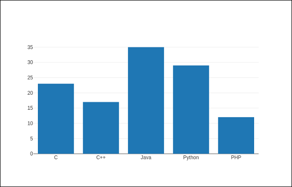
Bar Chart
A bar chart presents categorical data with rectangular bars with heights or lengths proportional to the values that they represent. Bars can be displayed vertically or horizontally. It helps to show comparisons among discrete categories. One axis of the chart shows the specific categories being compared, and the other axis represents a measured value.
Following example plots a simple bar chart about number of students enrolled for different courses. The go.Bar() function returns a bar trace with x coordinate set as list of subjects and y coordinate as number of students.
import plotly.graph_objs as go
langs = ['C', 'C++', 'Java', 'Python', 'PHP']
students = [23,17,35,29,12]
data = [go.Bar(
   x = langs,
   y = students
)]
fig = go.Figure(data=data)
iplot(fig)
The output will be as shown below −
To display a grouped bar chart, the barmode property of Layout object must be set to group. In the following code, multiple traces representing students in each year are plotted against subjects and shown as grouped bar chart.
branches = ['CSE', 'Mech', 'Electronics']
fy = [23,17,35]
sy = [20, 23, 30]
ty = [30,20,15]
trace1 = go.Bar(
   x = branches,
   y = fy,
   name = 'FY'
)
trace2 = go.Bar(
   x = branches,
   y = sy,
   name = 'SY'
)
trace3 = go.Bar(
   x = branches,
   y = ty,
   name = 'TY'
)
data = [trace1, trace2, trace3]
layout = go.Layout(barmode = 'group')
fig = go.Figure(data = data, layout = layout)
iplot(fig)
The output of the same is as follows −
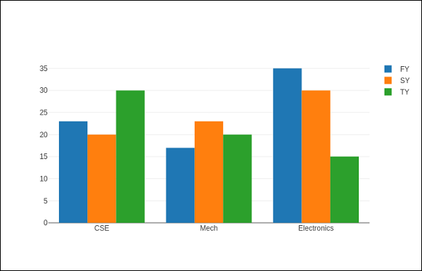
The barmode property determines how bars at the same location coordinate are displayed on the graph. Defined values are "stack" (bars stacked on top of one another), "relative", (bars are stacked on top of one another, with negative values below the axis, positive values above), "group" (bars plotted next to one another).
By changing barmode property to ‘stack’ the plotted graph appears as below −

Pie chart
A Pie Chart displays only one series of data. Pie Charts show the size of items (called wedge) in one data series, proportional to the sum of the items. Data points are shown as a percentage of the whole pie.
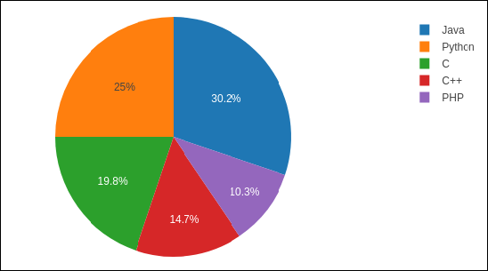
The pie() function in graph_objs module – go.Pie(), returns a Pie trace. Two required arguments are labels and values. Let us plot a simple pie chart of language courses vs number of students as in the example given herewith.
import plotly
plotly.tools.set_credentials_file(
   username = 'lathkar', api_key = 'U7vgRe1hqmRp4ZNf4PTN'
)
from plotly.offline import iplot, init_notebook_mode
init_notebook_mode(connected = True)
import plotly.graph_objs as go
langs = ['C', 'C++', 'Java', 'Python', 'PHP']
students = [23,17,35,29,12]
trace = go.Pie(labels = langs, values = students)
data = [trace]
fig = go.Figure(data = data)
iplot(fig)
Following output is displayed in Jupyter notebook −
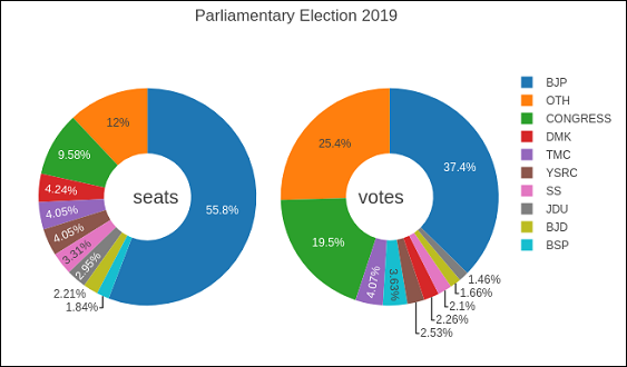
Donut chart is a pie chart with a round hole in the center which makes it look like a donut. In the following example, two donut charts are displayed in 1X2 grid layout. While ‘label’ layout is same for both pie traces, row and column destination of each subplot is decided by domain property.
For this purpose, we use the data of party-wise seats and vote share in 2019 parliamentary elections. Enter the following code in Jupyter notebook cell −
parties = ['BJP', 'CONGRESS', 'DMK', 'TMC', 'YSRC', 'SS', 'JDU','BJD', 'BSP','OTH']
seats = [303,52,23,22,22,18,16,12,10, 65]
percent = [37.36, 19.49, 2.26, 4.07, 2.53, 2.10, 1.46, 1.66, 3.63, 25.44]
import plotly.graph_objs as go
data1 = {
   "values": seats,
   "labels": parties,
   "domain": {"column": 0},
   "name": "seats",
   "hoverinfo":"label+percent+name",
   "hole": .4,
   "type": "pie"
}
data2 = {
   "values": percent,
   "labels": parties,
   "domain": {"column": 1},
   "name": "vote share",
   "hoverinfo":"label+percent+name",
   "hole": .4,
   "type": "pie"
}
data = [data1,data2]
layout = go.Layout(
   {
      "title":"Parliamentary Election 2019",
      "grid": {"rows": 1, "columns": 2},
      "annotations": [
         {
            "font": {
               "size": 20
            },
            "showarrow": False,
            "text": "seats",
            "x": 0.20,
            "y": 0.5
         },
         {
            "font": {
               "size": 20
            },
            "showarrow": False,
            "text": "votes",
            "x": 0.8,
            "y": 0.5
         }
      ]
   }
)
fig = go.Figure(data = data, layout = layout)
iplot(fig)
The output of the same is given below −
Scatter Plot, Scattergl Plot and Bubble Charts
This chapter emphasizes on details about Scatter Plot, Scattergl Plot and Bubble Charts. First, let us study about Scatter Plot.
Scatter Plot
Scatter plots are used to plot data points on a horizontal and a vertical axis to show how one variable affects another. Each row in the data table is represented by a marker whose position depends on its values in the columns set on the X and Y axes.
The scatter() method of graph_objs module (go.Scatter) produces a scatter trace. Here, the mode property decides the appearance of data points. Default value of mode is lines which displays a continuous line connecting data points. If set to markers, only the data points represented by small filled circles are displayed. When mode is assigned ‘lines+markers’, both circles and lines are displayed.
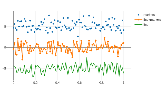
In the following example, plots scatter traces of three sets of randomly generated points in Cartesian coordinate system. Each trace displayed with different mode property is explained below.
import numpy as np
N = 100
x_vals = np.linspace(0, 1, N)
y1 = np.random.randn(N) + 5
y2 = np.random.randn(N)
y3 = np.random.randn(N) - 5
trace0 = go.Scatter(
   x = x_vals,
   y = y1,
   mode = 'markers',
   name = 'markers'
)
trace1 = go.Scatter(
   x = x_vals,
   y = y2,
   mode = 'lines+markers',
   name = 'line+markers'
)
trace2 = go.Scatter(
   x = x_vals,
   y = y3,
   mode = 'lines',
   name = 'line'
)
data = [trace0, trace1, trace2]
fig = go.Figure(data = data)
iplot(fig)
The output of Jupyter notebook cell is as given below −
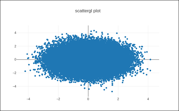
Scattergl Plot
WebGL (Web Graphics Library) is a JavaScript API for rendering interactive 2D and 3D graphics within any compatible web browser without the use of plug-ins. WebGL is fully integrated with other web standards, allowing Graphics Processing Unit (GPU) accelerated usage of image processing.
Plotly you can implement WebGL with Scattergl() in place of Scatter() for increased speed, improved interactivity, and the ability to plot even more data. The go.scattergl() function which gives better performance when a large number of data points are involved.
import numpy as np
N = 100000
x = np.random.randn(N)
y = np.random.randn(N)
   trace0 = go.Scattergl(
   x = x, y = y, mode = 'markers'
)
data = [trace0]
layout = go.Layout(title = "scattergl plot ")
fig = go.Figure(data = data, layout = layout)
iplot(fig)
The output is mentioned below −
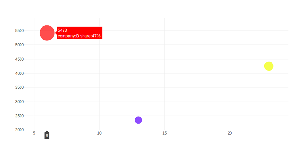
Bubble charts
A bubble chart displays three dimensions of data. Each entity with its three dimensions of associated data is plotted as a disk (bubble) that expresses two of the dimensions through the disk's xy location and the third through its size. The sizes of the bubbles are determined by the values in the third data series.
Bubble chart is a variation of the scatter plot, in which the data points are replaced with bubbles. If your data has three dimensions as shown below, creating a Bubble chart will be a good choice.
| Company | Products | Sale | Share |
|---|---|---|---|
| A | 13 | 2354 | 23 |
| B | 6 | 5423 | 47 |
| C | 23 | 2451 | 30 |
Bubble chart is produced with go.Scatter() trace. Two of the above data series are given as x and y properties. Third dimension is shown by marker with its size representing third data series. In the above mentioned case, we use products and sale as x and y properties and market share as marker size.
Enter the following code in Jupyter notebook.
company = ['A','B','C']
products = [13,6,23]
sale = [2354,5423,4251]
share = [23,47,30]
fig = go.Figure(data = [go.Scatter(
   x = products, y = sale,
   text = [
      'company:'+c+' share:'+str(s)+'%'
      for c in company for s in share if company.index(c)==share.index(s)
   ],
   mode = 'markers',
   marker_size = share, marker_color = ['blue','red','yellow'])
])
iplot(fig)
The output would be as shown below −
Plotly - Dot Plots and Table
Here, we will learn about dot plots and table function in Plotly. Firstly, let us start with dot plots.
Dot Plots
A dot plot displays points on a very simple scale. It is only suitable for a small amount of data as a large number of points will make it look very cluttered. Dot plots are also known as Cleveland dot plots. They show changes between two (or more) points in time or between two (or more) conditions.
Dot plots are similar to horizontal bar chart. However, they can be less cluttered and allow an easier comparison between conditions. The figure plots a scatter trace with mode attribute set to markers.
Following example shows comparison of literacy rate amongst men and women as recorded in each census after independence of India. Two traces in the graph represent literacy percentage of men and women in each census after 1951 up to 2011.
from plotly.offline import iplot, init_notebook_mode
init_notebook_mode(connected = True)
census = [1951,1961,1971,1981,1991,2001, 2011]
x1 = [8.86, 15.35, 21.97, 29.76, 39.29, 53.67, 64.63]
x2 = [27.15, 40.40, 45.96, 56.38,64.13, 75.26, 80.88]
traceA = go.Scatter(
   x = x1,
   y = census,
   marker = dict(color = "crimson", size = 12),
   mode = "markers",
   name = "Women"
)
traceB = go.Scatter(
x = x2,
y = census,
marker = dict(color = "gold", size = 12),
mode = "markers",
name = "Men")
data = [traceA, traceB]
layout = go.Layout(
   title = "Trend in Literacy rate in Post independent India",
   xaxis_title = "percentage",
   yaxis_title = "census"
)
fig = go.Figure(data = data, layout = layout)
iplot(fig)
The output would be as shown below −
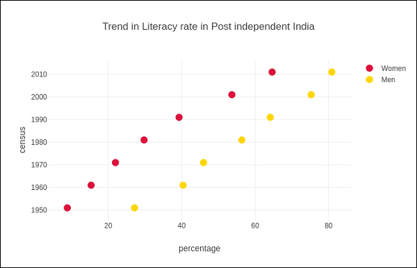
Table in Plotly
Plotly's Table object is returned by go.Table() function. Table trace is a graph object useful for detailed data viewing in a grid of rows and columns. Table is using a column-major order, i.e. the grid is represented as a vector of column vectors.
Two important parameters of go.Table() function are header which is the first row of table and cells which form rest of rows. Both parameters are dictionary objects. The values attribute of headers is a list of column headings, and a list of lists, each corresponding to one row.
Further styling customization is done by linecolor, fill_color, font and other attributes.
Following code displays the points table of round robin stage of recently concluded Cricket World Cup 2019.
trace = go.Table(
   header = dict(
      values = ['Teams','Mat','Won','Lost','Tied','NR','Pts','NRR'],
      line_color = 'gray',
      fill_color = 'lightskyblue',
      align = 'left'
   ),
   cells = dict(
      values =
      [
         [
            'India',
            'Australia',
            'England',
            'New Zealand',
            'Pakistan',
            'Sri Lanka',
            'South Africa',
            'Bangladesh',
            'West Indies',
            'Afghanistan'
         ],
         [9,9,9,9,9,9,9,9,9,9],
         [7,7,6,5,5,3,3,3,2,0],
         [1,2,3,3,3,4,5,5,6,9],
         [0,0,0,0,0,0,0,0,0,0],
         [1,0,0,1,1,2,1,1,1,0],
         [15,14,12,11,11,8,7,7,5,0],
         [0.809,0.868,1.152,0.175,-0.43,-0.919,-0.03,-0.41,-0.225,-1.322]
      ],
      line_color='gray',
      fill_color='lightcyan',
      align='left'
   )
)
data = [trace]
fig = go.Figure(data = data)
iplot(fig)
The output is as mentioned below −
Table data can also be populated from Pandas dataframe. Let us create a comma separated file (points-table.csv) as below −
| Teams | Mat | Won | Lost | Tied | NR | Pts | NRR |
|---|---|---|---|---|---|---|---|
| India | 9 | 7 | 1 | 0 | 1 | 15 | 0.809 |
| Australia | 9 | 7 | 2 | 0 | 0 | 14 | 0.868 |
| England | 9 | 6 | 3 | 0 | 0 | 14 | 1.152 |
| New Zealand | 9 | 5 | 3 | 0 | 1 | 11 | 0.175 |
| Pakistan | 9 | 5 | 3 | 0 | 1 | 11 | -0.43 |
| Sri Lanka | 9 | 3 | 4 | 0 | 2 | 8 | -0.919 |
| South Africa | 9 | 3 | 5 | 0 | 1 | 7 | -0.03 |
| Bangladesh | 9 | 3 | 5 | 0 | 1 | 7 | -0.41 |
Teams,Matches,Won,Lost,Tie,NR,Points,NRR
India,9,7,1,0,1,15,0.809
Australia,9,7,2,0,0,14,0.868
England,9,6,3,0,0,12,1.152
New Zealand,9,5,3,0,1,11,0.175
Pakistan,9,5,3,0,1,11,-0.43
Sri Lanka,9,3,4,0,2,8,-0.919
South Africa,9,3,5,0,1,7,-0.03
Bangladesh,9,3,5,0,1,7,-0.41
West Indies,9,2,6,0,1,5,-0.225
Afghanistan,9,0,9,0,0,0,-1.322
We now construct a dataframe object from this csv file and use it to construct table trace as below −
import pandas as pd
df = pd.read_csv('point-table.csv')
trace = go.Table(
   header = dict(values = list(df.columns)),
   cells = dict(
      values = [
         df.Teams,
         df.Matches,
         df.Won,
         df.Lost,
         df.Tie,
         df.NR,
         df.Points,
         df.NRR
      ]
   )
)
data = [trace]
fig = go.Figure(data = data)
iplot(fig)
Plotly - Histogram
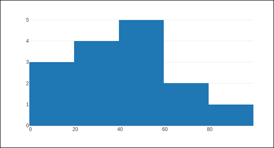
Introduced by Karl Pearson, a histogram is an accurate representation of the distribution of numerical data which is an estimate of the probability distribution of a continuous variable (CORAL). It appears similar to bar graph, but, a bar graph relates two variables, whereas a histogram relates only one.
A histogram requires bin (or bucket) which divides the entire range of values into a series of intervals—and then count how many values fall into each interval. The bins are usually specified as consecutive, non-overlapping intervals of a variable. The bins must be adjacent, and are often of equal size. A rectangle is erected over the bin with height proportional to the frequency—the number of cases in each bin.
Histogram trace object is returned by go.Histogram() function. Its customization is done by various arguments or attributes. One essential argument is x or y set to a list, numpy array or Pandas dataframe object which is to be distributed in bins.
By default, Plotly distributes the data points in automatically sized bins. However, you can define custom bin size. For that you need to set autobins to false, specify nbins (number of bins), its start and end values and size.
Following code generates a simple histogram showing distribution of marks of students in a class inbins (sized automatically) −
import numpy as np
x1 = np.array([22,87,5,43,56,73,55,54,11,20,51,5,79,31,27])
data = [go.Histogram(x = x1)]
fig = go.Figure(data)
iplot(fig)
The output is as shown below −
The go.Histogram() function accepts histnorm, which specifies the type of normalization used for this histogram trace. Default is "", the span of each bar corresponds to the number of occurrences (i.e. the number of data points lying inside the bins). If assigned "percent" / "probability", the span of each bar corresponds to the percentage / fraction of occurrences with respect to the total number of sample points. If it is equal to "density", the span of each bar corresponds to the number of occurrences in a bin divided by the size of the bin interval.
There is also histfunc parameter whose default value is count. As a result, height of rectangle over a bin corresponds to count of data points. It can be set to sum, avg, min or max.
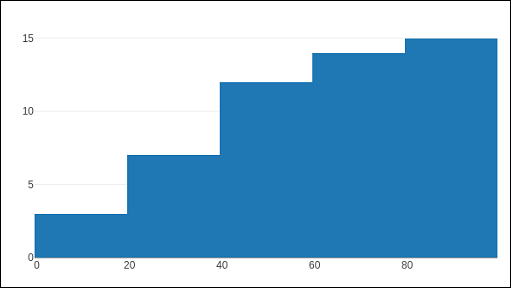
The histogram() function can be set to display cumulative distribution of values in successive bins. For that, you need to set cumulative property to enabled. Result can be seen as below −
data=[go.Histogram(x = x1, cumulative_enabled = True)]
fig = go.Figure(data)
iplot(fig)
The output is as mentioned below −
Plotly - Box Plot Violin Plot and Contour Plot
This chapter focusses on detail understanding about various plots including box plot, violin plot, contour plot and quiver plot. Initially, we will begin with the Box Plot follow.
Box Plot
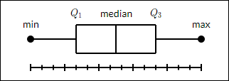
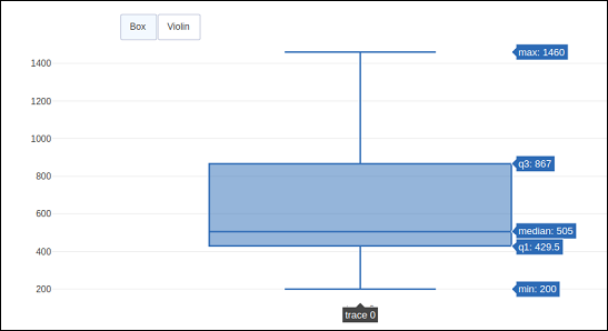
A box plot displays a summary of a set of data containing the minimum, first quartile, median, third quartile, and maximum. In a box plot, we draw a box from the first quartile to the third quartile. A vertical line goes through the box at the median. The lines extending vertically from the boxes indicating variability outside the upper and lower quartiles are called whiskers. Hence, box plot is also known as box and whisker plot. The whiskers go from each quartile to the minimum or maximum.
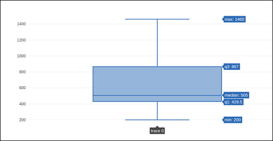
To draw Box chart, we have to use go.Box() function. The data series can be assigned to x or y parameter. Accordingly, the box plot will be drawn horizontally or vertically. In following example, sales figures of a certain company in its various branches is converted in horizontal box plot. It shows the median of minimum and maximum value.
trace1 = go.Box(y = [1140,1460,489,594,502,508,370,200])
data = [trace1]
fig = go.Figure(data)
iplot(fig)
The output of the same will be as follows −
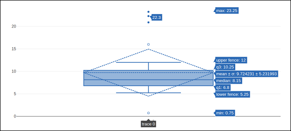
The go.Box() function can be given various other parameters to control the appearance and behaviour of box plot. One such is boxmean parameter.
The boxmean parameter is set to true by default. As a result, the mean of the boxes' underlying distribution is drawn as a dashed line inside the boxes. If it is set to sd, the standard deviation of the distribution is also drawn.
The boxpoints parameter is by default equal to "outliers". Only the sample points lying outside the whiskers are shown. If "suspectedoutliers", the outlier points are shown and points either less than 4"Q1-3"Q3 or greater than 4"Q3-3"Q1 are highlighted. If "False", only the box(es) are shown with no sample points.
In the following example, the box trace is drawn with standard deviation and outlier points.
trc = go.Box(
   y = [
      0.75, 5.25, 5.5, 6, 6.2, 6.6, 6.80, 7.0, 7.2, 7.5, 7.5, 7.75, 8.15,
      8.15, 8.65, 8.93, 9.2, 9.5, 10, 10.25, 11.5, 12, 16, 20.90, 22.3, 23.25
   ],
   boxpoints = 'suspectedoutliers', boxmean = 'sd'
)
data = [trc]
fig = go.Figure(data)
iplot(fig)
The output of the same is stated below −
Violin Plot
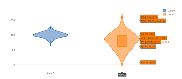
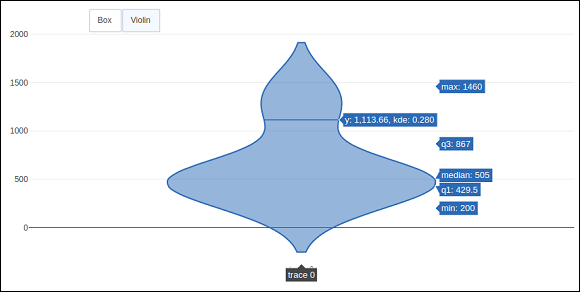
Violin plots are similar to box plots, except that they also show the probability density of the data at different values. Violin plots will include a marker for the median of the data and a box indicating the interquartile range, as in standard box plots. Overlaid on this box plot is a kernel density estimation. Like box plots, violin plots are used to represent comparison of a variable distribution (or sample distribution) across different "categories".
A violin plot is more informative than a plain box plot. In fact, while a box plot only shows summary statistics such as mean/median and interquartile ranges, the violin plot shows the full distribution of the data.
Violin trace object is returned by go.Violin() function in graph_objects module. In order to display underlying box plot, the boxplot_visible attribute is set to True. Similarly, by setting meanline_visible property to true, a line corresponding to the sample's mean is shown inside the violins.
Following example demonstrates how Violin plot is displayed using plotly’s functionality.
import numpy as np
np.random.seed(10)
c1 = np.random.normal(100, 10, 200)
c2 = np.random.normal(80, 30, 200)
trace1 = go.Violin(y = c1, meanline_visible = True)
trace2 = go.Violin(y = c2, box_visible = True)
data = [trace1, trace2]
fig = go.Figure(data = data)
iplot(fig)
The output is as follows −
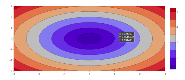
Contour plot
A 2D contour plot shows the contour lines of a 2D numerical array z, i.e. interpolated lines of isovalues of z. A contour line of a function of two variables is a curve along which the function has a constant value, so that the curve joins points of equal value.
A contour plot is appropriate if you want to see how some value Z changes as a function of two inputs, X and Y such that Z = f(X,Y). A contour line or isoline of a function of two variables is a curve along which the function has a constant value.
The independent variables x and y are usually restricted to a regular grid called meshgrid. The numpy.meshgrid creates a rectangular grid out of an array of x values and an array of y values.
Let us first create data values for x, y and z using linspace() function from Numpy library. We create a meshgrid from x and y values and obtain z array consisting of square root of x2+y2
We have go.Contour() function in graph_objects module which takes x,y and z attributes. Following code snippet displays contour plot of x, y and z values computed as above.
import numpy as np
xlist = np.linspace(-3.0, 3.0, 100)
ylist = np.linspace(-3.0, 3.0, 100)
X, Y = np.meshgrid(xlist, ylist)
Z = np.sqrt(X**2 + Y**2)
trace = go.Contour(x = xlist, y = ylist, z = Z)
data = [trace]
fig = go.Figure(data)
iplot(fig)
The output is as follows −
The contour plot can be customized by one or more of following parameters −
Transpose (boolean) − Transposes the z data.
If xtype (or ytype) equals "array", x/y coordinates are given by "x"/"y". If "scaled", x coordinates are given by "x0" and "dx".
The connectgaps parameter determines whether or not gaps in the z data are filled in.
Default value of ncontours parameter is 15. The actual number of contours will be chosen automatically to be less than or equal to the value of `ncontours`. Has an effect only if `autocontour` is "True".
Contours type is by default: "levels" so the data is represented as a contour plot with multiple levels displayed. If constrain, the data is represented as constraints with the invalid region shaded as specified by the operation and value parameters.
showlines − Determines whether or not the contour lines are drawn.
zauto is True by default and determines whether or not the color domain is computed with respect to the input data (here in `z`) or the bounds set in `zmin` and `zmax` Defaults to `False` when `zmin` and `zmax` are set by the user.
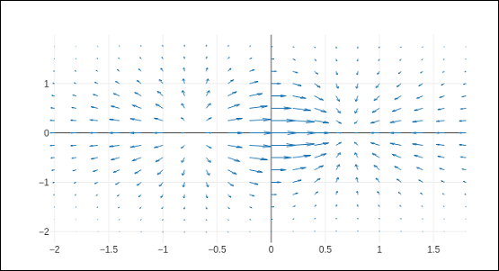
Quiver plot
Quiver plot is also known as velocity plot. It displays velocity vectors as arrows with components (u,v) at the points (x,y). In order to draw Quiver plot, we will use create_quiver() function defined in figure_factory module in Plotly.
Plotly's Python API contains a figure factory module which includes many wrapper functions that create unique chart types that are not yet included in plotly.js, Plotly's open-source graphing library.
The create_quiver() function accepts following parameters −
x − x coordinates of the arrow locations
y − y coordinates of the arrow locations
u − x components of the arrow vectors
v − y components of the arrow vectors
scale − scales size of the arrows
arrow_scale − length of arrowhead.
angle − angle of arrowhead.
Following code renders a simple quiver plot in Jupyter notebook −
import plotly.figure_factory as ff
import numpy as np
x,y = np.meshgrid(np.arange(-2, 2, .2), np.arange(-2, 2, .25))
z = x*np.exp(-x**2 - y**2)
v, u = np.gradient(z, .2, .2)

# Create quiver figure
fig = ff.create_quiver(x, y, u, v,
scale = .25, arrow_scale = .4,
name = 'quiver', line = dict(width = 1))
iplot(fig)
Output of the code is as follows −
Plotly - Distplots Density Plot and Error Bar Plot
In this chapter, we will understand about distplots, density plot and error bar plot in detail. Let us begin by learning about distplots.
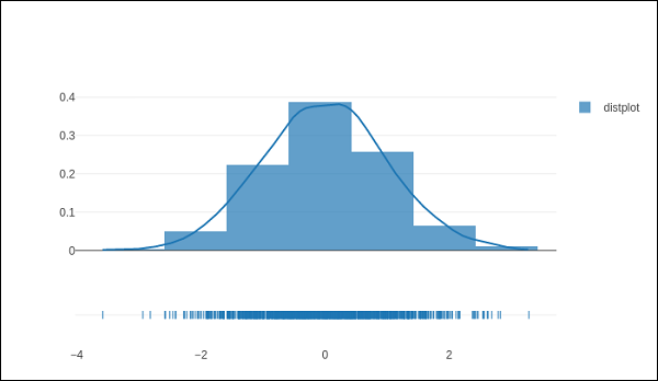
Distplots
The distplot figure factory displays a combination of statistical representations of numerical data, such as histogram, kernel density estimation or normal curve, and rug plot.
The distplot can be composed of all or any combination of the following 3 components −
- histogram
- curve: (a) kernel density estimation or (b) normal curve, and
- rug plot
The figure_factory module has create_distplot() function which needs a mandatory parameter called hist_data.
Following code creates a basic distplot consisting of a histogram, a kde plot and a rug plot.
x = np.random.randn(1000)
hist_data = [x]
group_labels = ['distplot']
fig = ff.create_distplot(hist_data, group_labels)
iplot(fig)
The output of the code mentioned above is as follows −
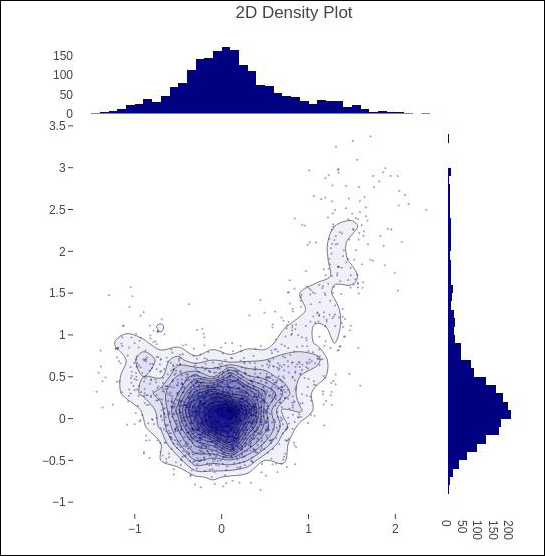
Density Plot
A density plot is a smoothed, continuous version of a histogram estimated from the data. The most common form of estimation is known as kernel density estimation (KDE). In this method, a continuous curve (the kernel) is drawn at every individual data point and all of these curves are then added together to make a single smooth density estimation.
The create_2d_density() function in module plotly.figure_factory._2d_density returns a figure object for a 2D density plot.
Following code is used to produce 2D Density plot over histogram data.
t = np.linspace(-1, 1.2, 2000)
x = (t**3) + (0.3 * np.random.randn(2000))
y = (t**6) + (0.3 * np.random.randn(2000))
fig = ff.create_2d_density( x, y)
iplot(fig)
Below mentioned is the output of the above given code.
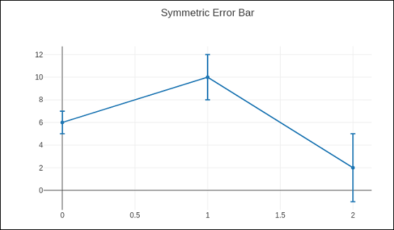
Error Bar Plot
Error bars are graphical representations of the error or uncertainty in data, and they assist correct interpretation. For scientific purposes, reporting of errors is crucial in understanding the given data.
Error bars are useful to problem solvers because error bars show the confidence or precision in a set of measurements or calculated values.
Mostly error bars represent range and standard deviation of a dataset. They can help visualize how the data is spread around the mean value. Error bars can be generated on variety of plots such as bar plot, line plot, scatter plot etc.
The go.Scatter() function has error_x and error_y properties that control how error bars are generated.
visible (boolean) − Determines whether or not this set of error bars is visible.
Type property has possible values "percent" | "constant" | "sqrt" | "data”. It sets the rule used to generate the error bars. If "percent", the bar lengths correspond to a percentage of underlying data. Set this percentage in `value`. If "sqrt", the bar lengths correspond to the square of the underlying data. If "data", the bar lengths are set with data set `array`.
symmetric property can be true or false. Accordingly, the error bars will have the same length in both direction or not (top/bottom for vertical bars, left/right for horizontal bars.
array − sets the data corresponding the length of each error bar. Values are plotted relative to the underlying data.
arrayminus − Sets the data corresponding the length of each error bar in the bottom (left) direction for vertical (horizontal) bars Values are plotted relative to the underlying data.
Following code displays symmetric error bars on a scatter plot −
trace = go.Scatter(
   x = [0, 1, 2], y = [6, 10, 2],
   error_y = dict(
   type = 'data', # value of error bar given in data coordinates
   array = [1, 2, 3], visible = True)
)
data = [trace]
layout = go.Layout(title = 'Symmetric Error Bar')
fig = go.Figure(data = data, layout = layout)
iplot(fig)
Given below is the output of the above stated code.
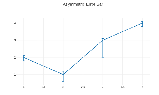
Asymmetric error plot is rendered by following script −
trace = go.Scatter(
   x = [1, 2, 3, 4],
   y =[ 2, 1, 3, 4],
   error_y = dict(
      type = 'data',
      symmetric = False,
      array = [0.1, 0.2, 0.1, 0.1],
      arrayminus = [0.2, 0.4, 1, 0.2]
   )
)
data = [trace]
layout = go.Layout(title = 'Asymmetric Error Bar')
fig = go.Figure(data = data, layout = layout)
iplot(fig)
The output of the same is as given below −
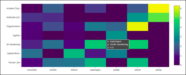
Plotly - Heatmap
A heat map (or heatmap) is a graphical representation of data where the individual values contained in a matrix are represented as colors. The primary purpose of Heat Maps is to better visualize the volume of locations/events within a dataset and assist in directing viewers towards areas on data visualizations that matter most.
Because of their reliance on color to communicate values, Heat Maps are perhaps most commonly used to display a more generalized view of numeric values. Heat Maps are extremely versatile and efficient in drawing attention to trends, and it’s for these reasons they have become increasingly popular within the analytics community.
Heat Maps are innately self-explanatory. The darker the shade, the greater the quantity (the higher the value, the tighter the dispersion, etc.). Plotly’s graph_objects module contains Heatmap() function. It needs x, y and z attributes. Their value can be a list, numpy array or Pandas dataframe.
In the following example, we have a 2D list or array which defines the data (harvest by different farmers in tons/year) to color code. We then also need two lists of names of farmers and vegetables cultivated by them.
vegetables = [
   "cucumber",
   "tomato",
   "lettuce",
   "asparagus",
   "potato",
   "wheat",
   "barley"
]
farmers = [
   "Farmer Joe",
   "Upland Bros.",
   "Smith Gardening",
   "Agrifun",
   "Organiculture",
   "BioGoods Ltd.",
   "Cornylee Corp."
]
harvest = np.array(
   [
      [0.8, 2.4, 2.5, 3.9, 0.0, 4.0, 0.0],
      [2.4, 0.0, 4.0, 1.0, 2.7, 0.0, 0.0],
      [1.1, 2.4, 0.8, 4.3, 1.9, 4.4, 0.0],
      [0.6, 0.0, 0.3, 0.0, 3.1, 0.0, 0.0],
      [0.7, 1.7, 0.6, 2.6, 2.2, 6.2, 0.0],
      [1.3, 1.2, 0.0, 0.0, 0.0, 3.2, 5.1],
      [0.1, 2.0, 0.0, 1.4, 0.0, 1.9, 6.3]
   ]
)
trace = go.Heatmap(
   x = vegetables,
   y = farmers,
   z = harvest,
   type = 'heatmap',
   colorscale = 'Viridis'
)
data = [trace]
fig = go.Figure(data = data)
iplot(fig)
The output of the above mentioned code is given as follows −
Plotly - Polar Chart and Radar Chart
In this chapter, we will learn how Polar Chart and Radar Chart can be made with the help Plotly.
First of all, let us study about polar chart.
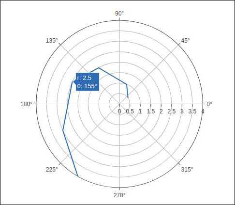
Polar Chart
Polar Chart is a common variation of circular graphs. It is useful when relationships between data points can be visualized most easily in terms of radiuses and angles.
In Polar Charts, a series is represented by a closed curve that connect points in the polar coordinate system. Each data point is determined by the distance from the pole (the radial coordinate) and the angle from the fixed direction (the angular coordinate).
A polar chart represents data along radial and angular axes. The radial and angular coordinates are given with the r and theta arguments for go.Scatterpolar() function. The theta data can be categorical, but, numerical data are possible too and is the most commonly used.
Following code produces a basic polar chart. In addition to r and theta arguments, we set mode to lines (it can be set to markers well in which case only the data points will be displayed).
import numpy as np
r1 = [0,6,12,18,24,30,36,42,48,54,60]
t1 = [1,0.995,0.978,0.951,0.914,0.866,0.809,0.743,0.669,0.588,0.5]
trace = go.Scatterpolar(
   r = [0.5,1,2,2.5,3,4],
   theta = [35,70,120,155,205,240],
   mode = 'lines',
)
data = [trace]
fig = go.Figure(data = data)
iplot(fig)
The output is given below −
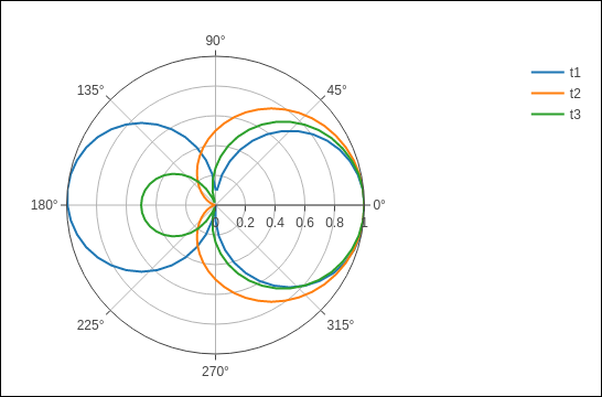
In the following example data from a comma-separated values (CSV) file is used to generate polar chart. First few rows of polar.csv are as follows −
y,x1,x2,x3,x4,x5,
0,1,1,1,1,1,
6,0.995,0.997,0.996,0.998,0.997,
12,0.978,0.989,0.984,0.993,0.986,
18,0.951,0.976,0.963,0.985,0.969,
24,0.914,0.957,0.935,0.974,0.946,
30,0.866,0.933,0.9,0.96,0.916,
36,0.809,0.905,0.857,0.943,0.88,
42,0.743,0.872,0.807,0.923,0.838,
48,0.669,0.835,0.752,0.901,0.792,
54,0.588,0.794,0.691,0.876,0.74,
60,0.5,0.75,0.625,0.85,0.685,
Enter the following script in notebook’s input cell to generate polar chart as below −
import pandas as pd
df = pd.read_csv("polar.csv")
t1 = go.Scatterpolar(
   r = df['x1'], theta = df['y'], mode = 'lines', name = 't1'
)
t2 = go.Scatterpolar(
   r = df['x2'], theta = df['y'], mode = 'lines', name = 't2'
)
t3 = go.Scatterpolar(
   r = df['x3'], theta = df['y'], mode = 'lines', name = 't3'
)
data = [t1,t2,t3]
fig = go.Figure(data = data)
iplot(fig)
Given below is the output of the above mentioned code −
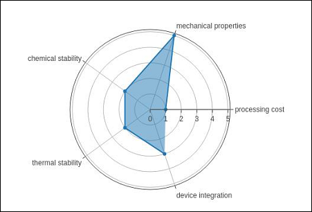
Radar chart
A Radar Chart (also known as a spider plot or star plot) displays multivariate data in the form of a two-dimensional chart of quantitative variables represented on axes originating from the center. The relative position and angle of the axes is typically uninformative.
For a Radar Chart, use a polar chart with categorical angular variables in go.Scatterpolar() function in the general case.
Following code renders a basic radar chart with Scatterpolar() function −
radar = go.Scatterpolar(
   r = [1, 5, 2, 2, 3],
   theta = [
      'processing cost',
      'mechanical properties',
      'chemical stability',
      'thermal stability',
      'device integration'
   ],
   fill = 'toself'
)
data = [radar]
fig = go.Figure(data = data)
iplot(fig)
The below mentioned output is a result of the above given code −
OHLC Chart, Waterfall Chart and Funnel Chart
This chapter focusses on other three types of charts including OHLC, Waterfall and Funnel Chart which can be made with the help of Plotly.
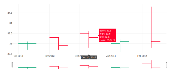
OHLC Chart
An open-high-low-close chart (also OHLC) is a type of bar chart typically used to illustrate movements in the price of a financial instrument such as shares. OHLC charts are useful since they show the four major data points over a period. The chart type is useful because it can show increasing or decreasing momentum. The high and low data points are useful in assessing volatility.
Each vertical line on the chart shows the price range (the highest and lowest prices) over one unit of time, such as day or hour. Tick marks project from each side of the line indicating the opening price (e.g., for a daily bar chart this would be the starting price for that day) on the left, and the closing price for that time period on the right.
Sample data for demonstration of OHLC chart is shown below. It has list objects corresponding to high, low, open and close values as on corresponding date strings. The date representation of string is converted to date object by using strtp() function from datetime module.
open_data = [33.0, 33.3, 33.5, 33.0, 34.1]
high_data = [33.1, 33.3, 33.6, 33.2, 34.8]
low_data = [32.7, 32.7, 32.8, 32.6, 32.8]
close_data = [33.0, 32.9, 33.3, 33.1, 33.1]
date_data = ['10-10-2013', '11-10-2013', '12-10-2013','01-10-2014','02-10-2014']
import datetime
dates = [
   datetime.datetime.strptime(date_str, '%m-%d-%Y').date()
   for date_str in date_data
]
We have to use above dates object as x parameter and others for open, high, low and close parameters required for go.Ohlc() function that returns OHLC trace.
trace = go.Ohlc(
   x = dates,
   open = open_data,
   high = high_data,
   low = low_data,
   close = close_data
)
data = [trace]
fig = go.Figure(data = data)
iplot(fig)
The output of the code is given below −
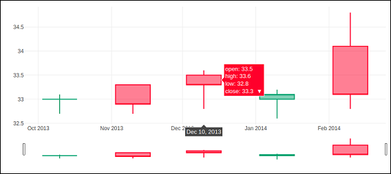
Candlestick Chart
The candlestick chart is similar to OHLC chart. It is like a combination of line-chart and a bar-chart. The boxes represent the spread between the open and close values and the lines represent the spread between the low and high values. Sample points where the close value is higher (lower) then the open value are called increasing (decreasing).
Candlestrick trace is returned by go.Candlestick() function. We use same data (as for OHLC chart) to render candlestick chart as given below −
trace = go.Candlestick(
   x = dates,
   open = open_data,
   high = high_data,
   low = low_data,
   close = close_data
)
Output of the above given code is mentioned below −
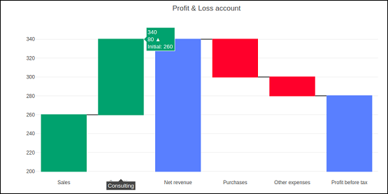
Waterfall chart
A waterfall chart (also known as flying bricks chart or Mario chart) helps in understanding the cumulative effect of sequentially introduced positive or negative values which can either be time based or category based.
Initial and final values are shown as columns with the individual negative and positive adjustments depicted as floating steps. Some waterfall charts connect the lines between the columns to make the chart look like a bridge.
go.Waterfall() function returns a Waterfall trace. This object can be customized by various named arguments or attributes. Here, x and y attributes set up data for x and y coordinates of the graph. Both can be a Python list, numpy array or Pandas series or strings or date time objects.
Another attribute is measure which is an array containing types of values. By default, the values are considered as relative. Set it to 'total' to compute the sums. If it is equal to absolute it resets the computed total or to declare an initial value where needed. The 'base' attribute sets where the bar base is drawn (in position axis units).
Following code renders a waterfall chart −
s1=[
   "Sales",
   "Consulting",
   "Net revenue",
   "Purchases",
   "Other expenses",
   "Profit before tax"
]
s2 = [60, 80, 0, -40, -20, 0]
trace = go.Waterfall(
   x = s1,
   y = s2,
   base = 200,
   measure = [
      "relative",
      "relative",
      "total",
      "relative",
      "relative",
      "total"
   ]
)
data = [trace]
fig = go.Figure(data = data)
iplot(fig)
Below mentioned output is a result of the code given above.
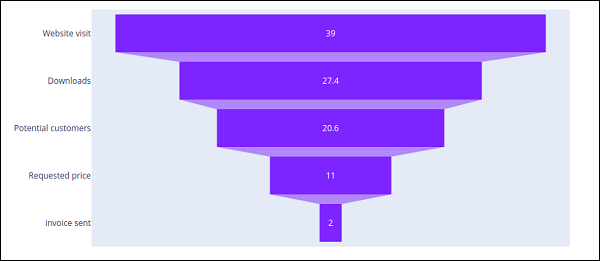
Funnel Chart
Funnel charts represent data in different stages of a business process. It is an important mechanism in Business Intelligence to identify potential problem areas of a process. Funnel chart is used to visualize how data reduces progressively as it passes from one phase to another. Data in each of these phases is represented as different portions of 100% (the whole).
Like the Pie chart, the Funnel chart does not use any axes either. It can also be treated as similar to a stacked percent bar chart. Any funnel consists of the higher part called head (or base) and the lower part referred to as neck. The most common use of the Funnel chart is in visualizing sales conversion data.
Plotly's go.Funnel() function produces Funnel trace. Essential attributes to be provided to this function are x and y. Each of them is assigned a Python list of items or an array.
from plotly import graph_objects as go
fig = go.Figure(
   go.Funnel(
      y = [
         "Website visit",
         "Downloads",
         "Potential customers",
         "Requested price",
         "invoice sent"
      ],
      x = [39, 27.4, 20.6, 11, 2]
   )
)
fig.show()
The output is as given below −
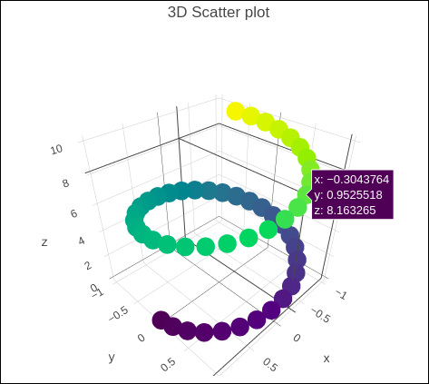
Plotly - 3D Scatter and Surface Plot
This chapter will give information about the three-dimensional (3D) Scatter Plot and 3D Surface Plot and how to make them with the help of Plotly.
3D Scatter Plot
A three-dimensional (3D) scatter plot is like a scatter plot, but with three variables - x, y, and z or f(x, y) are real numbers. The graph can be represented as dots in a three-dimensional Cartesian coordinate system. It is typically drawn on a two-dimensional page or screen using perspective methods (isometric or perspective), so that one of the dimensions appears to be coming out of the page.
3D scatter plots are used to plot data points on three axes in an attempt to show the relationship between three variables. Each row in the data table is represented by a marker whose position depends on its values in the columns set on the X, Y, and Z axes.
A fourth variable can be set to correspond to the color or size of the markers, thus, adding yet another dimension to the plot. The relationship between different variables is called correlation.
A Scatter3D trace is a graph object returned by go.Scatter3D() function. Mandatory arguments to this function are x, y and z each of them is a list or array object.
For example −
import plotly.graph_objs as go
import numpy as np
z = np.linspace(0, 10, 50)
x = np.cos(z)
y = np.sin(z)
trace = go.Scatter3d(
   x = x, y = y, z = z,mode = 'markers', marker = dict(
      size = 12,
      color = z, # set color to an array/list of desired values
      colorscale = 'Viridis'
      )
   )
layout = go.Layout(title = '3D Scatter plot')
fig = go.Figure(data = [trace], layout = layout)
iplot(fig)
The output of the code is given below −
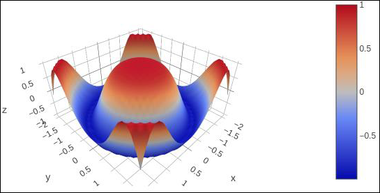
3D Surface Plot
Surface plots are diagrams of three-dimensional data. In a surface plot, each point is defined by 3 points: its latitude, longitude, and altitude (X, Y and Z). Rather than showing the individual data points, surface plots show a functional relationship between a designated dependent variable (Y), and two independent variables (X and Z). This plot is a companion plot to the contour plot.
Here, is a Python script to render simple surface plot where y array is transpose of x and z is calculated as cos(x2+y2)
import numpy as np
x = np.outer(np.linspace(-2, 2, 30), np.ones(30))
y = x.copy().T # transpose
z = np.cos(x ** 2 + y ** 2)
trace = go.Surface(x = x, y = y, z =z )
data = [trace]
layout = go.Layout(title = '3D Surface plot')
fig = go.Figure(data = data)
iplot(fig)
Below mentioned is the output of the code which is explained above −
Plotly - Adding Buttons Dropdown
Plotly provides high degree of interactivity by use of different controls on the plotting area – such as buttons, dropdowns and sliders etc. These controls are incorporated with updatemenu attribute of the plot layout. You can add button and its behaviour by specifying the method to be called.
There are four possible methods that can be associated with a button as follows −
restyle − modify data or data attributes
relayout − modify layout attributes
update − modify data and layout attributes
animate − start or pause an animation
The restyle method should be used when modifying the data and data attributes of the graph. In the following example, two buttons are added by Updatemenu() method to the layout with restyle method.
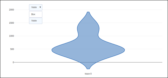
go.layout.Updatemenu(
type = "buttons",
direction = "left",
buttons = list([
   dict(args = ["type", "box"], label = "Box", method = "restyle"),
   dict(args = ["type", "violin"], label = "Violin", method = "restyle" )]
))
Value of type property is buttons by default. To render a dropdown list of buttons, change type to dropdown. A Box trace added to Figure object before updating its layout as above. The complete code that renders boxplot and violin plot depending on button clicked, is as follows −
import plotly.graph_objs as go
fig = go.Figure()
fig.add_trace(go.Box(y = [1140,1460,489,594,502,508,370,200]))
fig.layout.update(
   updatemenus = [
      go.layout.Updatemenu(
         type = "buttons", direction = "left", buttons=list(
            [
               dict(args = ["type", "box"], label = "Box", method = "restyle"),
               dict(args = ["type", "violin"], label = "Violin", method = "restyle")
            ]
         ),
         pad = {"r": 2, "t": 2},
         showactive = True,
         x = 0.11,
         xanchor = "left",
         y = 1.1,
         yanchor = "top"
      ),
   ]
)
iplot(fig)
The output of the code is given below −
Click on Violin button to display corresponding Violin plot.
As mentioned above, value of type key in Updatemenu() method is assigned dropdown to display dropdown list of buttons. The plot appears as below −
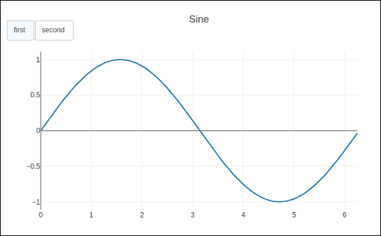
The update method should be used when modifying the data and layout sections of the graph. Following example demonstrates how to update and which traces are displayed while simultaneously updating layout attributes, such as, the chart title. Two Scatter traces corresponding to sine and cos wave are added to Figure object. The trace with visible attribute as True will be displayed on the plot and other traces will be hidden.
import numpy as np
import math #needed for definition of pi

xpoints = np.arange(0, math.pi*2, 0.05)
y1 = np.sin(xpoints)
y2 = np.cos(xpoints)
fig = go.Figure()
# Add Traces
fig.add_trace(
   go.Scatter(
      x = xpoints, y = y1, name = 'Sine'
   )
)
fig.add_trace(
   go.Scatter(
      x = xpoints, y = y2, name = 'cos'
   )
)
fig.layout.update(
   updatemenus = [
      go.layout.Updatemenu(
         type = "buttons", direction = "right", active = 0, x = 0.1, y = 1.2,
         buttons = list(
            [
               dict(
                  label = "first", method = "update",
                  args = [{"visible": [True, False]},{"title": "Sine"} ]
               ),
               dict(
                  label = "second", method = "update",
                  args = [{"visible": [False, True]},{"title": Cos"}]
               )
            ]
         )
      )
   ]
)
iplot(fig)
Initially, Sine curve will be displayed. If clicked on second button, cos trace appears.
Note that chart title also updates accordingly.
In order to use animate method, we need to add one or more Frames to the Figure object. Along with data and layout, frames can be added as a key in a figure object. The frames key points to a list of figures, each of which will be cycled through when animation is triggered.
You can add, play and pause buttons to introduce animation in chart by adding an updatemenus array to the layout.
"updatemenus": [{
   "type": "buttons", "buttons": [{
      "label": "Your Label", "method": "animate", "args": [frames]
   }]
}]
In the following example, a scatter curve trace is first plotted. Then add frames which is a list of 50 Frame objects, each representing a red marker on the curve. Note that the args attribute of button is set to None, due to which all frames are animated.
import numpy as np
t = np.linspace(-1, 1, 100)
x = t + t ** 2
y = t - t ** 2
xm = np.min(x) - 1.5
xM = np.max(x) + 1.5
ym = np.min(y) - 1.5
yM = np.max(y) + 1.5
N = 50
s = np.linspace(-1, 1, N)
#s = np.arange(0, math.pi*2, 0.1)
xx = s + s ** 2
yy = s - s ** 2
fig = go.Figure(
   data = [
      go.Scatter(x = x, y = y, mode = "lines", line = dict(width = 2, color = "blue")),
      go.Scatter(x = x, y = y, mode = "lines", line = dict(width = 2, color = "blue"))
   ],
   layout = go.Layout(
      xaxis=dict(range=[xm, xM], autorange=False, zeroline=False),
      yaxis=dict(range=[ym, yM], autorange=False, zeroline=False),
      title_text="Moving marker on curve",
      updatemenus=[
         dict(type="buttons", buttons=[dict(label="Play", method="animate", args=[None])])
      ]
   ),
   frames = [go.Frame(
      data = [
            go.Scatter(
            x = [xx[k]], y = [yy[k]], mode = "markers", marker = dict(
               color = "red", size = 10
            )
         )
      ]
   )
   for k in range(N)]
)
iplot(fig)
The output of the code is stated below −
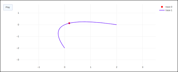
The red marker will start moving along the curve on clicking play button.
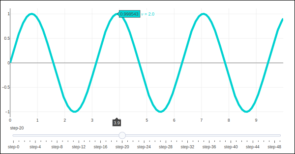
Plotly - Slider Control
Plotly has a convenient Slider that can be used to change the view of data/style of a plot by sliding a knob on the control which is placed at the bottom of rendered plot.
Slider control is made up of different properties which are as follows −
steps property is required for defining sliding positions of knob over the control.
method property is having possible values as restyle | relayout | animate | update | skip, default is restyle.
args property sets the arguments values to be passed to the Plotly method set in method on slide.
We now deploy a simple slider control on a scatter plot which will vary the frequency of sine wave as the knob slides along the control. The slider is configured to have 50 steps. First add 50 traces of sine wave curve with incrementing frequency, all but 10th trace set to visible.
Then, we configure each step with restyle method. For each step, all other step objects have visibility set to false. Finally, update Figure object’s layout by initializing sliders property.
# Add traces, one for each slider step
for step in np.arange(0, 5, 0.1):
fig.add_trace(
go.Scatter(
visible = False,
line = dict(color = "blue", width = 2),
name = "𜈠= " + str(step),
x = np.arange(0, 10, 0.01),
y = np.sin(step * np.arange(0, 10, 0.01))
)
)
fig.data[10].visible=True
# Create and add slider
steps = []
for i in range(len(fig.data)):
step = dict(
method = "restyle",
args = ["visible", [False] * len(fig.data)],
)
step["args"][1][i] = True # Toggle i'th trace to "visible"
steps.append(step)
sliders = [dict(active = 10, steps = steps)]
fig.layout.update(sliders=sliders)
iplot(fig)
To begin with, 10th sine wave trace will be visible. Try sliding the knob across the horizontal control at the bottom. You will see the frequency changing as shown below.
Plotly - FigureWidget Class
Plotly 3.0.0 introduces a new Jupyter widget class: plotly.graph_objs.FigureWidget. It has the same call signature as our existing Figure, and it is made specifically for Jupyter Notebook and JupyterLab environments.
The go.FigureWiget() function returns an empty FigureWidget object with default x and y axes.
f = go.FigureWidget()
iplot(f)
Given below is the output of the code −
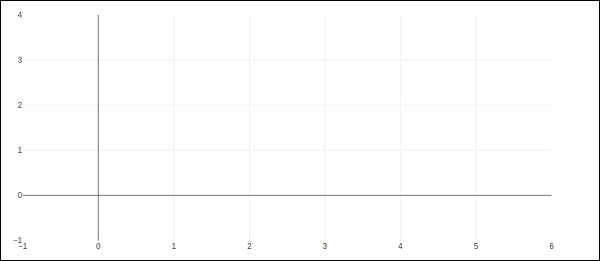
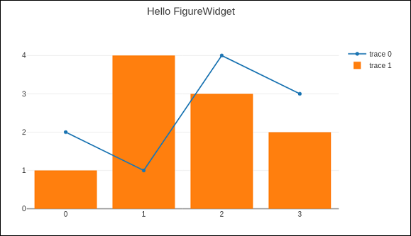
Most important feature of FigureWidget is the resulting Plotly figure and it is dynamically updatable as we go on adding data and other layout attributes to it.
For example, add following graph traces one by one and see the original empty figure dynamically updated. That means we don’t have to call iplot() function again and again as the plot is refreshed automatically. Final appearance of the FigureWidget is as shown below −
f.add_scatter(y = [2, 1, 4, 3]);
f.add_bar(y = [1, 4, 3, 2]);
f.layout.title = 'Hello FigureWidget'
This widget is capable of event listeners for hovering, clicking, and selecting points and zooming into regions.
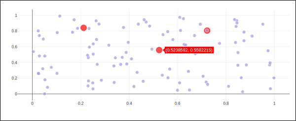
In following example, the FigureWidget is programmed to respond to click event on plot area. The widget itself contains a simple scatter plot with markers. The mouse click location is marked with different color and size.
x = np.random.rand(100)
y = np.random.rand(100)
f = go.FigureWidget([go.Scatter(x=x, y=y, mode='markers')])

scatter = f.data[0]
colors = ['#a3a7e4'] * 100

scatter.marker.color = colors
scatter.marker.size = [10] * 100
f.layout.hovermode = 'closest'
def update_point(trace, points, selector):

c = list(scatter.marker.color)
s = list(scatter.marker.size)
for i in points.point_inds:

c[i] = 'red'
s[i] = 20

scatter.marker.color = c
scatter.marker.size = s
scatter.on_click(update_point)
f
Run above code in Jupyter notebook. A scatter plot is displayed. Click on a location in the area which will be markd with red colour.
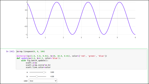
Plotly’s FigureWidget object can also make use of Ipython’s own widgets. Here, we use interact control as defined in ipwidgets module. We first construct a FigureWidget and add an empty scatter plot.
from ipywidgets import interact
fig = go.FigureWidget()
scatt = fig.add_scatter()
fig
We now define an update function that inputs the frequency and phase and sets the x and y properties of the scatter trace defined above. The @interact decorator from ipywidgets module is used to create a simple set of widgets to control the parameters of a plot. The update function is decorated with @interact decorator from the ipywidgets package. The decorator parameters are used to specify the ranges of parameters that we want to sweep over.
xs = np.linspace(0, 6, 100)
@interact(a = (1.0, 4.0, 0.01), b = (0, 10.0, 0.01), color = ['red', 'green', 'blue'])
def update(a = 3.6, b = 4.3, color = 'blue'):
with fig.batch_update():
scatt.x = xs
scatt.y = np.sin(a*xs-b)
scatt.line.color = color
Empty FigureWidget is now populated in blue colour with sine curve a and b as 3.6 and 4.3 respectively. Below the current notebook cell, you will get a group of sliders for selecting values of a and b. There is also a dropdown to select the trace color. These parameters are defined in @interact decorator.
Plotly with Pandas and Cufflinks
Pandas is a very popular library in Python for data analysis. It also has its own plot function support. However, Pandas plots don't provide interactivity in visualization. Thankfully, plotly's interactive and dynamic plots can be built using Pandas dataframe objects.
We start by building a Dataframe from simple list objects.
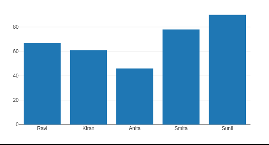
data = [['Ravi',21,67],['Kiran',24,61],['Anita',18,46],['Smita',20,78],['Sunil',17,90]]
df = pd.DataFrame(data,columns = ['name','age','marks'],dtype = float)
The dataframe columns are used as data values for x and y properties of graph object traces. Here, we will generate a bar trace using name and marks columns.
trace = go.Bar(x = df.name, y = df.marks)
fig = go.Figure(data = [trace])
iplot(fig)
A simple bar plot will be displayed in Jupyter notebook as below −
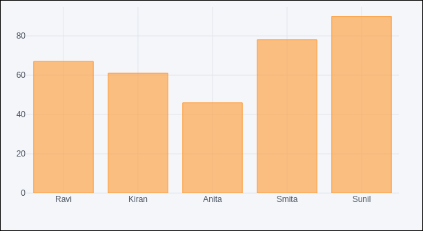
Plotly is built on top of d3.js and is specifically a charting library which can be used directly with Pandas dataframes using another library named Cufflinks.
If not already available, install cufflinks package by using your favourite package manager like pip as given below −
pip install cufflinks
or
conda install -c conda-forge cufflinks-py
First, import cufflinks along with other libraries such as Pandas and numpy which can configure it for offline use.
import cufflinks as cf
cf.go_offline()
Now, you can directly use Pandas dataframe to display various kinds of plots without having to use trace and figure objects from graph_objs module as we have been doing previously.
df.iplot(kind = 'bar', x = 'name', y = 'marks')
Bar plot, very similar to earlier one will be displayed as given below −
Pandas dataframes from databases
Instead of using Python lists for constructing dataframe, it can be populated by data in different types of databases. For example, data from a CSV file, SQLite database table or mysql database table can be fetched into a Pandas dataframe, which eventually is subjected to plotly graphs using Figure object or Cufflinks interface.
To fetch data from CSV file, we can use read_csv() function from Pandas library.
import pandas as pd
df = pd.read_csv('sample-data.csv')
If data is available in SQLite database table, it can be retrieved using SQLAlchemy library as follows −
import pandas as pd
from sqlalchemy import create_engine
disk_engine = create_engine('sqlite:///mydb.db')
df = pd.read_sql_query('SELECT name,age,marks', disk_engine)
On the other hand, data from MySQL database is retrieved in a Pandas dataframe as follows −
import pymysql
import pandas as pd
conn = pymysql.connect(host = "localhost", user = "root", passwd = "xxxx", db = "mydb")
cursor = conn.cursor()
cursor.execute('select name,age,marks')
rows = cursor.fetchall()
df = pd.DataFrame( [[ij for ij in i] for i in rows] )
df.rename(columns = {0: 'Name', 1: 'age', 2: 'marks'}, inplace = True)
Plotly with Matplotlib and Chart Studio
This chapter deals with data visualization library titled Matplotlib and online plot maker named Chart Studio.
Matplotlib
Matplotlib is a popular Python data visualization library capable of producing production-ready but static plots. you can convert your static matplotlib figures into interactive plots with the help of mpl_to_plotly() function in plotly.tools module.
Following script produces a Sine wave Line plot using Matplotlib’s PyPlot API.
from matplotlib import pyplot as plt
import numpy as np
import math
#needed for definition of pi
x = np.arange(0, math.pi*2, 0.05)
y = np.sin(x)
plt.plot(x,y)
plt.xlabel("angle")
plt.ylabel("sine")
plt.title('sine wave')
plt.show()
Now we shall convert it into a plotly figure as follows −
fig = plt.gcf()
plotly_fig = tls.mpl_to_plotly(fig)
py.iplot(plotly_fig)
The output of the code is as given below −

Chart Studio
Chart Studio is an online plot maker tool made available by Plotly. It provides a graphical user interface for importing and analyzing data into a grid and using stats tools. Graphs can be embedded or downloaded. It is mainly used to enable creating graphs faster and more efficiently.
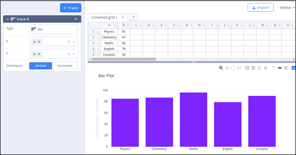
After logging in to plotly’s account, start the chart studio app by visiting the link https://plot.ly/create. The web page offers a blank work sheet below the plot area. Chart Studio lets you to add plot traces by pushing + trace button.
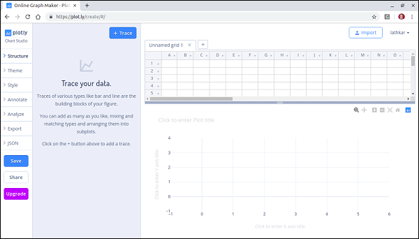
Various plot structure elements such as annotations, style etc. as well as facility to save, export and share the plots is available in the menu.
Let us add data in the worksheet and add choose bar plot trace from the trace types.
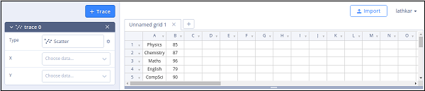
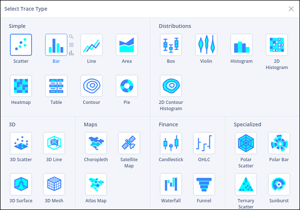
Click in the type text box and select bar plot.
Then, provide data columns for x and y axes and enter plot title.