- Plotly Tutorial
- Plotly - Home
- Plotly - Introduction
- Plotly - Environment Setup
- Plotly - Online & Offline Plotting
- Plotting Inline with Jupyter Notebook
- Plotly - Package Structure
- Plotly - Exporting to Static Images
- Plotly - Legends
- Plotly - Format Axis & Ticks
- Plotly - Subplots & Inset Plots
- Plotly - Bar Chart & Pie Chart
- Plotly - Scatter Plot, Scattergl Plot & Bubble Charts
- Plotly - Dot Plots & Table
- Plotly - Histogram
- Plotly - Box Plot Violin Plot & Contour Plot
- Plotly - Distplots, Density Plot & Error Bar Plot
- Plotly - Heatmap
- Plotly - Polar Chart & Radar Chart
- Plotly - OHLC Chart Waterfall Chart & Funnel Chart
- Plotly - 3D Scatter & Surface Plot
- Plotly - Adding Buttons/Dropdown
- Plotly - Slider Control
- Plotly - FigureWidget Class
- Plotly with Pandas and Cufflinks
- Plotly with Matplotlib and Chart Studio
- Plotly Useful Resources
- Plotly - Quick Guide
- Plotly - Useful Resources
- Plotly - Discussion
Plotly - Adding Buttons Dropdown
Plotly provides high degree of interactivity by use of different controls on the plotting area – such as buttons, dropdowns and sliders etc. These controls are incorporated with updatemenu attribute of the plot layout. You can add button and its behaviour by specifying the method to be called.
There are four possible methods that can be associated with a button as follows −
restyle − modify data or data attributes
relayout − modify layout attributes
update − modify data and layout attributes
animate − start or pause an animation
The restyle method should be used when modifying the data and data attributes of the graph. In the following example, two buttons are added by Updatemenu() method to the layout with restyle method.
go.layout.Updatemenu(
type = "buttons",
direction = "left",
buttons = list([
   dict(args = ["type", "box"], label = "Box", method = "restyle"),
   dict(args = ["type", "violin"], label = "Violin", method = "restyle" )]
))
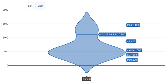
Value of type property is buttons by default. To render a dropdown list of buttons, change type to dropdown. A Box trace added to Figure object before updating its layout as above. The complete code that renders boxplot and violin plot depending on button clicked, is as follows −
import plotly.graph_objs as go
fig = go.Figure()
fig.add_trace(go.Box(y = [1140,1460,489,594,502,508,370,200]))
fig.layout.update(
   updatemenus = [
      go.layout.Updatemenu(
         type = "buttons", direction = "left", buttons=list(
            [
               dict(args = ["type", "box"], label = "Box", method = "restyle"),
               dict(args = ["type", "violin"], label = "Violin", method = "restyle")
            ]
         ),
         pad = {"r": 2, "t": 2},
         showactive = True,
         x = 0.11,
         xanchor = "left",
         y = 1.1,
         yanchor = "top"
      ),
   ]
)
iplot(fig)
The output of the code is given below −
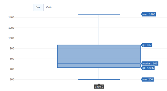
Click on Violin button to display corresponding Violin plot.
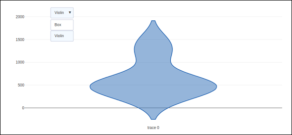
As mentioned above, value of type key in Updatemenu() method is assigned dropdown to display dropdown list of buttons. The plot appears as below −
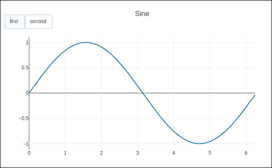
The update method should be used when modifying the data and layout sections of the graph. Following example demonstrates how to update and which traces are displayed while simultaneously updating layout attributes, such as, the chart title. Two Scatter traces corresponding to sine and cos wave are added to Figure object. The trace with visible attribute as True will be displayed on the plot and other traces will be hidden.
import numpy as np
import math #needed for definition of pi

xpoints = np.arange(0, math.pi*2, 0.05)
y1 = np.sin(xpoints)
y2 = np.cos(xpoints)
fig = go.Figure()
# Add Traces
fig.add_trace(
   go.Scatter(
      x = xpoints, y = y1, name = 'Sine'
   )
)
fig.add_trace(
   go.Scatter(
      x = xpoints, y = y2, name = 'cos'
   )
)
fig.layout.update(
   updatemenus = [
      go.layout.Updatemenu(
         type = "buttons", direction = "right", active = 0, x = 0.1, y = 1.2,
         buttons = list(
            [
               dict(
                  label = "first", method = "update",
                  args = [{"visible": [True, False]},{"title": "Sine"} ]
               ),
               dict(
                  label = "second", method = "update",
                  args = [{"visible": [False, True]},{"title": Cos"}]
               )
            ]
         )
      )
   ]
)
iplot(fig)
Initially, Sine curve will be displayed. If clicked on second button, cos trace appears.
Note that chart title also updates accordingly.
In order to use animate method, we need to add one or more Frames to the Figure object. Along with data and layout, frames can be added as a key in a figure object. The frames key points to a list of figures, each of which will be cycled through when animation is triggered.
You can add, play and pause buttons to introduce animation in chart by adding an updatemenus array to the layout.
"updatemenus": [{
   "type": "buttons", "buttons": [{
      "label": "Your Label", "method": "animate", "args": [frames]
   }]
}]
In the following example, a scatter curve trace is first plotted. Then add frames which is a list of 50 Frame objects, each representing a red marker on the curve. Note that the args attribute of button is set to None, due to which all frames are animated.
import numpy as np
t = np.linspace(-1, 1, 100)
x = t + t ** 2
y = t - t ** 2
xm = np.min(x) - 1.5
xM = np.max(x) + 1.5
ym = np.min(y) - 1.5
yM = np.max(y) + 1.5
N = 50
s = np.linspace(-1, 1, N)
#s = np.arange(0, math.pi*2, 0.1)
xx = s + s ** 2
yy = s - s ** 2
fig = go.Figure(
   data = [
      go.Scatter(x = x, y = y, mode = "lines", line = dict(width = 2, color = "blue")),
      go.Scatter(x = x, y = y, mode = "lines", line = dict(width = 2, color = "blue"))
   ],
   layout = go.Layout(
      xaxis=dict(range=[xm, xM], autorange=False, zeroline=False),
      yaxis=dict(range=[ym, yM], autorange=False, zeroline=False),
      title_text="Moving marker on curve",
      updatemenus=[
         dict(type="buttons", buttons=[dict(label="Play", method="animate", args=[None])])
      ]
   ),
   frames = [go.Frame(
      data = [
            go.Scatter(
            x = [xx[k]], y = [yy[k]], mode = "markers", marker = dict(
               color = "red", size = 10
            )
         )
      ]
   )
   for k in range(N)]
)
iplot(fig)
The output of the code is stated below −
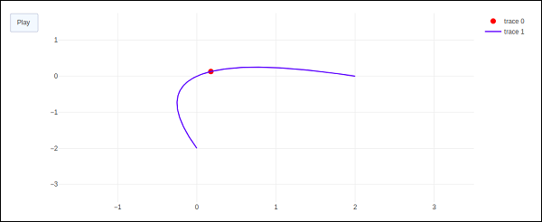
The red marker will start moving along the curve on clicking play button.