- Plotly Tutorial
- Plotly - Home
- Plotly - Introduction
- Plotly - Environment Setup
- Plotly - Online & Offline Plotting
- Plotting Inline with Jupyter Notebook
- Plotly - Package Structure
- Plotly - Exporting to Static Images
- Plotly - Legends
- Plotly - Format Axis & Ticks
- Plotly - Subplots & Inset Plots
- Plotly - Bar Chart & Pie Chart
- Plotly - Scatter Plot, Scattergl Plot & Bubble Charts
- Plotly - Dot Plots & Table
- Plotly - Histogram
- Plotly - Box Plot Violin Plot & Contour Plot
- Plotly - Distplots, Density Plot & Error Bar Plot
- Plotly - Heatmap
- Plotly - Polar Chart & Radar Chart
- Plotly - OHLC Chart Waterfall Chart & Funnel Chart
- Plotly - 3D Scatter & Surface Plot
- Plotly - Adding Buttons/Dropdown
- Plotly - Slider Control
- Plotly - FigureWidget Class
- Plotly with Pandas and Cufflinks
- Plotly with Matplotlib and Chart Studio
- Plotly Useful Resources
- Plotly - Quick Guide
- Plotly - Useful Resources
- Plotly - Discussion
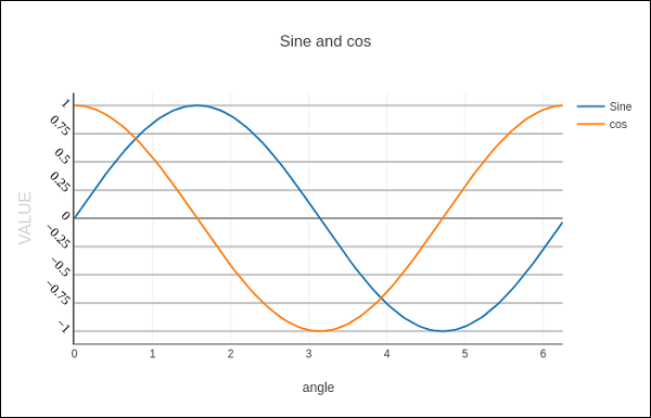
Plotly - Format Axis and Ticks
You can configure appearance of each axis by specifying the line width and color. It is also possible to define grid width and grid color. Let us learn about the same in detail in this chapter.
Plot with Axis and Tick
In the Layout object’s properties, setting showticklabels to true will enable ticks. The tickfont property is a dict object specifying font name, size, color, etc. The tickmode property can have two possible values — linear and array. If it is linear, the position of starting tick is determined by tick0 and step between ticks by dtick properties.
If tickmode is set to array, you have to provide list of values and labels as tickval and ticktext properties.
The Layout object also has Exponentformat attribute set to ‘e’ will cause tick values to be displayed in scientific notation. You also need to set showexponent property to ‘all’.
We now format the Layout object in above example to configure x and y axis by specifying line, grid and title font properties and tick mode, values and font.
layout = go.Layout(
   title = "Sine and cos",
   xaxis = dict(
      title = 'angle',
      showgrid = True,
      zeroline = True,
      showline = True,
      showticklabels = True,
      gridwidth = 1
   ),
   yaxis = dict(
      showgrid = True,
      zeroline = True,
      showline = True,
      gridcolor = '#bdbdbd',
      gridwidth = 2,
      zerolinecolor = '#969696',
      zerolinewidth = 2,
      linecolor = '#636363',
      linewidth = 2,
      title = 'VALUE',
      titlefont = dict(
         family = 'Arial, sans-serif',
         size = 18,
         color = 'lightgrey'
      ),
      showticklabels = True,
      tickangle = 45,
      tickfont = dict(
      family = 'Old Standard TT, serif',
      size = 14,
      color = 'black'
      ),
      tickmode = 'linear',
      tick0 = 0.0,
      dtick = 0.25
   )
)
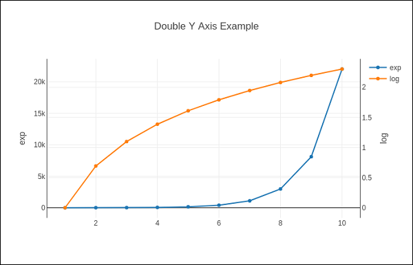
Plot with Multiple Axes
Sometimes it is useful to have dual x or y axes in a figure; for example, when plotting curves with different units together. Matplotlib supports this with the twinx and twiny functions. In the following example, the plot has dual y axes, one showing exp(x) and other showing log(x)
x = np.arange(1,11)
y1 = np.exp(x)
y2 = np.log(x)
trace1 = go.Scatter(
   x = x,
   y = y1,
   name = 'exp'
)
trace2 = go.Scatter(
   x = x,
   y = y2,
   name = 'log',
   yaxis = 'y2'
)
data = [trace1, trace2]
layout = go.Layout(
   title = 'Double Y Axis Example',
   yaxis = dict(
      title = 'exp',zeroline=True,
      showline = True
   ),
   yaxis2 = dict(
      title = 'log',
      zeroline = True,
      showline = True,
      overlaying = 'y',
      side = 'right'
   )
)
fig = go.Figure(data=data, layout=layout)
iplot(fig)
Here, additional y axis is configured as yaxis2 and appears on right side, having ‘log’ as title. Resultant plot is as follows −