
- Android Basics
- Android - Home
- Android - Overview
- Android - Environment Setup
- Android - Architecture
- Android - Application Components
- Android - Hello World Example
- Android - Resources
- Android - Activities
- Android - Services
- Android - Broadcast Receivers
- Android - Content Providers
- Android - Fragments
- Android - Intents/Filters
- Android - User Interface
- Android - UI Layouts
- Android - UI Controls
- Android - Event Handling
- Android - Styles and Themes
- Android - Custom Components
- Android Advanced Concepts
- Android - Drag and Drop
- Android - Notifications
- Location Based Services
- Android - Sending Email
- Android - Sending SMS
- Android - Phone Calls
- Publishing Android Application
- Android Useful Examples
- Android - Alert Dialoges
- Android - Animations
- Android - Audio Capture
- Android - AudioManager
- Android - Auto Complete
- Android - Best Practices
- Android - Bluetooth
- Android - Camera
- Android - Clipboard
- Android - Custom Fonts
- Android - Data Backup
- Android - Developer Tools
- Android - Emulator
- Android - Facebook Integration
- Android - Gestures
- Android - Google Maps
- Android - Image Effects
- Android - ImageSwitcher
- Android - Internal Storage
- Android - JetPlayer
- Android - JSON Parser
- Android - Linkedin Integration
- Android - Loading Spinner
- Android - Localization
- Android - Login Screen
- Android - MediaPlayer
- Android - Multitouch
- Android - Navigation
- Android - Network Connection
- Android - NFC Guide
- Android - PHP/MySQL
- Android - Progress Circle
- Android - ProgressBar
- Android - Push Notification
- Android - RenderScript
- Android - RSS Reader
- Android - Screen Cast
- Android - SDK Manager
- Android - Sensors
- Android - Session Management
- Android - Shared Preferences
- Android - SIP Protocol
- Android - Spelling Checker
- Android - SQLite Database
- Android - Support Library
- Android - Testing
- Android - Text to Speech
- Android - TextureView
- Android - Twitter Integration
- Android - UI Design
- Android - UI Patterns
- Android - UI Testing
- Android - WebView Layout
- Android - Wi-Fi
- Android - Widgets
- Android - XML Parsers
- Android Useful Resources
- Android - Questions and Answers
- Android - Useful Resources
- Android - Discussion
Android - UI Patterns
In this chapter we will look at the different UI Patterns which are available by android to design apps that behave in a consistent and foreseeable way.
UI Patterns components
A good android application should follow following UI patterns −
- Action Bar
- Confirming and Acknowledging
- Settings
- Help
- Selection
Now we will discuss the above mentioned UI Patterns in detail.
Action Bar
The action bar is a dedicated bar at the top of each screen that is generally persistent throughout the app. It provides you several key function which are as following −
- Makes important actions prominent and accessible
- Supports consistent navigation and view switching within apps
- Reduces clutter by providing an action overflow for rarely used actions
- Provides a dedicated space for giving your app an identity
Action Bar Components
Action Bar has four major components which can be seen in the following image.
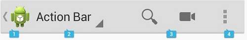
These components name and functionality is discussed below −
| Sr.No | Action Bar Components |
|---|---|
| 1 |
App Icon The app icon establishes your app's identity. It can be replaced with a different logo or branding if you wish. |
| 2 |
View control If your app displays data in different views, this segment of the action bar allows users to switch views. |
| 3 |
Action buttons Show the most important actions of your app in the actions section. |
| 4 |
Action overflow Move less often used actions to the action overflow. |
Confirming and Acknowledging
When a user invokes a action on your app's UI, it is a good practice to confirm or acknowledge that action through a toast or a dialog box.
There is a difference between Confirming and Acknowledging.
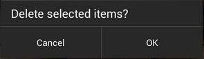
Confirming
When we ask the user to verify that they truly want to proceed with a action that they just invoked, it is called confirming. As you can see in the following image −
Acknowledging
When we display a toast to let the user know that the action they just invoked has been completed, this is called acknowledging, As you can see in the following image −

Settings
The place in your app where users can indicate their preferences for how your app should behave is called as Settings. The use of settings can benefit your app's users in the following ways −
Settings help user to predetermine that what will happen in certain situations
Use of settings in your app help users to feel in control
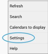
Placement of Settings
It is preferred by the android developers to always make "settings" option part of action overflow which is mentioned above. As users did not frequently use this option so the common practice is to place it below all other items except "Help". As you can see in the following picture −
Help
Some of your app users may run into some difficulty while using your app and they will be looking for some answers, and they want them within the app. So always make "help" part of your app.
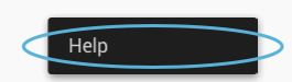
Placement of Help
Like "Settings" the standard design of placing "Help" option is in action overflow. Always make it very last item in the menu and always label it "Help". Even if your app screen has no other action overflow items, "Help" should appear there. As you can see this in the following picture −
Selection
Android 3.0 version changed the long press gesture to the global gesture to select data. The long press gesture is now used to select data, combining contextual actions and selection management functions for selected data into a new element called the contextual action bar (CAB).
Using Contextual Action Bar (CAB)
The selection CAB is a temporary action bar that overlays your app's current action bar while data is selected. It appears after the user long presses on a selectable data item. As you can see in the following picture −

From the CAB bar user can perform following actions −
- Select additional data items by touching them
- Trigger an action from the CAB that applies to all highlighted data items
- Dismiss the CAB via the navigation bar's Back button or the CAB's checkmark button