
- Android Basics
- Android - Home
- Android - Overview
- Android - Environment Setup
- Android - Architecture
- Android - Application Components
- Android - Hello World Example
- Android - Resources
- Android - Activities
- Android - Services
- Android - Broadcast Receivers
- Android - Content Providers
- Android - Fragments
- Android - Intents/Filters
- Android - User Interface
- Android - UI Layouts
- Android - UI Controls
- Android - Event Handling
- Android - Styles and Themes
- Android - Custom Components
- Android Advanced Concepts
- Android - Drag and Drop
- Android - Notifications
- Location Based Services
- Android - Sending Email
- Android - Sending SMS
- Android - Phone Calls
- Publishing Android Application
- Android Useful Examples
- Android - Alert Dialoges
- Android - Animations
- Android - Audio Capture
- Android - AudioManager
- Android - Auto Complete
- Android - Best Practices
- Android - Bluetooth
- Android - Camera
- Android - Clipboard
- Android - Custom Fonts
- Android - Data Backup
- Android - Developer Tools
- Android - Emulator
- Android - Facebook Integration
- Android - Gestures
- Android - Google Maps
- Android - Image Effects
- Android - ImageSwitcher
- Android - Internal Storage
- Android - JetPlayer
- Android - JSON Parser
- Android - Linkedin Integration
- Android - Loading Spinner
- Android - Localization
- Android - Login Screen
- Android - MediaPlayer
- Android - Multitouch
- Android - Navigation
- Android - Network Connection
- Android - NFC Guide
- Android - PHP/MySQL
- Android - Progress Circle
- Android - ProgressBar
- Android - Push Notification
- Android - RenderScript
- Android - RSS Reader
- Android - Screen Cast
- Android - SDK Manager
- Android - Sensors
- Android - Session Management
- Android - Shared Preferences
- Android - SIP Protocol
- Android - Spelling Checker
- Android - SQLite Database
- Android - Support Library
- Android - Testing
- Android - Text to Speech
- Android - TextureView
- Android - Twitter Integration
- Android - UI Design
- Android - UI Patterns
- Android - UI Testing
- Android - WebView Layout
- Android - Wi-Fi
- Android - Widgets
- Android - XML Parsers
- Android Useful Resources
- Android - Questions and Answers
- Android - Useful Resources
- Android - Discussion
Android - Styles and Themes
A style resource defines the format and look for a UI. A style can be applied to an individual View (from within a layout file) or to an entire Activity or application (from within the manifest file).
Defining Styles
A style is defined in an XML resource that is separate from the XML that specifies the layout. This XML file resides under res/values/ directory of your project and will have <resources> as the root node which is mandatory for the style file. The name of the XML file is arbitrary, but it must use the .xml extension.
You can define multiple styles per file using <style> tag but each style will have its name that uniquely identifies the style. Android style attributes are set using <item> tag as shown below −
<?xml version="1.0" encoding="utf-8"?>
<resources>
   <style name="CustomFontStyle">
      <item name="android:layout_width">fill_parent</item>
      <item name="android:layout_height">wrap_content</item>
      <item name="android:capitalize">characters</item>
      <item name="android:typeface">monospace</item>
      <item name="android:textSize">12pt</item>
      <item name="android:textColor">#00FF00</item>/>
   </style>
</resources>
The value for the <item> can be a keyword string, a hex color, a reference to another resource type, or other value depending on the style property.
Using Styles
Once your style is defined, you can use it in your XML Layout file using style attribute as follows −
<?xml version="1.0" encoding="utf-8"?>
<LinearLayout xmlns:android="http://schemas.android.com/apk/res/android"
   android:layout_width="fill_parent"
   android:layout_height="fill_parent"
   android:orientation="vertical" >

   <TextView
      android:id="@+id/text_id"
      style="@style/CustomFontStyle"
      android:text="@string/hello_world" />

</LinearLayout>
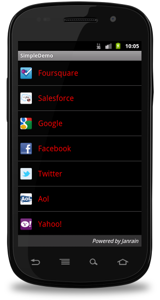
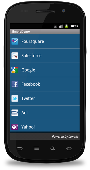
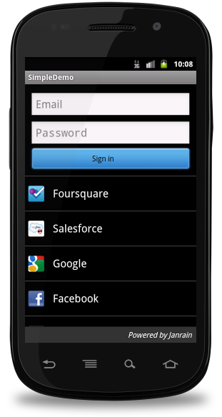
To understand the concept related to Android Style, you can check Style Demo Example.
Style Inheritance
Android supports style Inheritance in very much similar way as cascading style sheet in web design. You can use this to inherit properties from an existing style and then define only the properties that you want to change or add.
To implement a custom theme create or edit MyAndroidApp/res/values/themes.xml and add the following −
<resources>
   ...
   <style name="MyCustomTheme" parent="android:style/Theme">
   <item name="android:textColorPrimary">#ffff0000</item>
   </style>
   ...
</resources>
In your AndroidManifest.xml apply the theme to the activities you want to style −
<activity
   android:name="com.myapp.MyActivity"
   ...
   android:theme="@style/MyCustomTheme"
   />
Your new theme will be applied to your activity, and text is now bright red.
Applying Colors to Theme Attributes
Your color resource can then be applied to some theme attributes, such as the window background and the primary text color, by adding <item> elements to your custom theme. These attributes are defined in your styles.xml file. For example, to apply the custom color to the window background, add the following two <item> elements to your custom theme, defined in MyAndroidApp/res/values/styles.xml file −
<resources>
   ...
   <style name="MyCustomTheme" ...>
      <item name="android:windowBackground">@color/my_custom_color</item>
      <item name="android:colorBackgroundCacheHint">@color/my_custom_color</item>
   </style>
   ...
</resources>
Using a Custom Nine-Patch With Buttons
A nine-patch drawable is a special kind of image which can be scaled in width and height while maintaining its visual integrity. Nine-patches are the most common way to specify the appearance of Android buttons, though any drawable type can be used.

a Sample of Nine-Patch button
Steps to create Nine-Patch Buttons
- Save this bitmap as /res/drawable/my_nine_patch.9.png
- Define a new style
- Apply the new button style to the buttonStyle attribute of your custom theme
Define a new Style
<resources>
   ...
      <style name="MyCustomButton" parent="android:Widget.Button">
      <item name="android:background">@drawable/my_nine_patch</item>
      </style>
   ...
</resources>
Apply the theme
<resources>
   ...
      <style name="MyCustomTheme" parent=...>
         ...
         <item name="android:buttonStyle">@style/MyCustomButton</item>
      </style>
   ...
</resources>
Android Themes
Hope you understood the concept of Style, so now let's try to understand what is a Theme. A theme is nothing but an Android style applied to an entire Activity or application, rather than an individual View.
Thus, when a style is applied as a theme, every View in the Activity or application will apply each style property that it supports. For example, you can apply the same CustomFontStyle style as a theme for an Activity and then all text inside that Activity will have green monospace font.
To set a theme for all the activities of your application, open the AndroidManifest.xml file and edit the <application> tag to include the android:theme attribute with the style name. For example −
<application android:theme="@style/CustomFontStyle">
But if you want a theme applied to just one Activity in your application, then add the android:theme attribute to the <activity> tag only. For example −
<activity android:theme="@style/CustomFontStyle">
There are number of default themes defined by Android which you can use directly or inherit them using parent attribute as follows −
<style name="CustomTheme" parent="android:Theme.Light">
   ...
</style>
To understand the concept related to Android Theme, you can check Theme Demo Example.
Styling the colour palette
The layout design can implementable based on them based colours, for example as following design is designed based on them colour(blue)
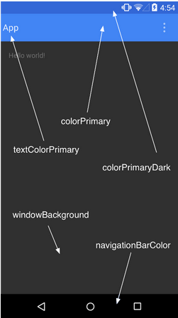
Above layout has designed based on style.xml file,Which has placed at res/values/
<resource>
   <style name="AppTheme" parent="android:Theme.Material">
      <item name ="android:color/primary">@color/primary</item>
      <item name ="android:color/primaryDark">@color/primary_dark</item>
      <item name ="android:colorAccent/primary">@color/accent</item>
   </style>
<resource>
Default Styles & Themes
The Android platform provides a large collection of styles and themes that you can use in your applications. You can find a reference of all available styles in the R.style class. To use the styles listed here, replace all underscores in the style name with a period. For example, you can apply the Theme_NoTitleBar theme with "@android:style/Theme.NoTitleBar". You can see the following source code for Android styles and themes −