- SolidJS - Home
- SolidJS - Cheatsheet
- SolidJS - vs Vue, and Svelte
- SolidJS - Environment Setup
- SolidJS - First Solid App
- SolidJS - JSX Fundamentals
- SolidJS - Fine-grained Reactivity
- Building with Components
- SolidJS - Function Components
- SolidJS - Styling Your Components
- SolidJS - Conditional Rendering
- SolidJS - Dynamic Lists
- SolidJS - Passing Data
- SolidJS - Event Handling
- Routing, Data, and Async Operations
- SolidJS - Setting up Routes
- SolidJS - Input Handling
- SolidJS - Input Types
- SolidJS - Form Handling
- SolidJS Useful Resources
- SolidJS - Useful Resources
- SolidJS - Discussion
SolidJS - Styling Your Components
What are Class and Style Attributes?
SolidJS uses class and style attributes to style elements using CSS (Cascading Style Sheets), similar to HTML. The class attributes allow us to style one or more elements with CSS rules. Whereas the style attribute helps us to style single elements. Read this chapter to learn how to style your componentsin SolidJS.
classList Attribute
The classList attribute is used when you want to apply multiple classes to an element. To use the classList, you can pass an object or a string where the keys are class names and the values are Boolean expressions. When the value is true, the class is used; otherwise, when the value is false, it is removed.
Different Ways of Styling Your Components
The following are the different ways to style your components in SolidJS −
Inline Styles
Similar to HTML, inline styles are defined directly inside the tags, here inside the JSX using the style attribute. In SolidJS, CSS properties use camelCase. The values inside the style attribute should be strings, and it's best to use it when you need simple or dynamic styling.
Example
In the example below, we have applied the inline styling on the <h1> tag and displayed the UI on the Application −
function StyledDemo() {
  return (
    <h1
      style={{
        'background-color': 'green',
         color: 'black',
         padding: '10px 20px',
        'text-align': 'center',
        'border-radius': '8px',
      }}
    >
      Welcome to SolidJS Tutorial!
    </h1>
  )
}

export default StyledDemo
Below is the output for the above code −
External CSS Files
For styling your components, we can use the external CSS files and link them to your components. This traditional method helps us to separate logic and styles from our code and makes the code more readable.
Example
In the example below, we have created two files, one consisting of logic(app.tsx) and the other styling(app.css), and displayed the UI on the Application −
app.tsx
import './app.css'

function StyledDemo() {
  return <h1 class="heading">Welcome to SolidJS Tutorial!</h1>
}

export default StyledDemo
app.css
.heading {
  color: black;
  text-align: center;
  padding: 10px 20px;
  border-radius: 8px;
  background-color: green;
}
Below is the output for the above code −

CSS Modules
CSS Modules are CSS files where class names are scoped locally by default. CSS modules help you style within components, preventing naming conflicts in your application, and by bundling only the used selectors, it improves the output.
Example
In the example below, we have created two files, one consisting of logic (app.tsx) and the other styling in the form of CSS module (Heading.module.css), and displayed the UI on the Application −
app.tsx
import styles from './Heading.module.css'

export default function StyledDemo() {
  return (
    <>
      <h1 class={styles.heading}>Welcome to Tutorial Point!</h1>
      <img
        src="https://www.tutorialspoint.com/images/tp_logo_436.png"
        alt="logo"
        class={styles.image}
      />
    <>
  )
}
Heading.module.css
.heading {
  color: black;
  text-align: center;
  padding: 10px 20px;
  border-radius: 8px;
  background-color: green;
}

.image {
  display: block;
  margin: 20px auto;
}
Below is the output for the above code −

Styled Library
By importing the solid-styled-components library, you can write the styles in CSS-in-JS form, which means defining your component's styles directly inside your JSX code. This eliminates the global CSS conflicts and reduces styling errors.
To install the styled library, run the following command in your project directory −
npm install solid-styled-components
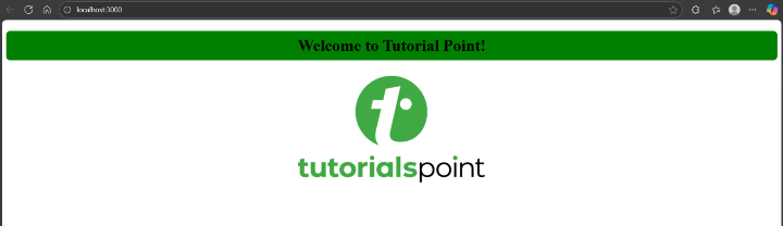
Example
In the example below, we have imported the styled library and created two styled components(Heading and Image), and displayed the UI on the Application −
import { styled } from 'solid-styled-components'

const Heading = styled('h1')`
  color: black;
  text-align: center;
  padding: 10px 20px;
  border-radius: 8px;
  background-color: green;
`

const Image = styled('img')`
  display: block;
  margin: 20px auto;
`

export default function StyledDemo() {
  return (
    <>
      <Heading>Welcome to TutorialsPoint!</Heading>
      <Image
        src="https://www.tutorialspoint.com/images/tp_logo_436.png"
        alt="logo"
      />
    </>
  )
}
Below is the output for the above code −
Dynamic Styling
In SolidJS, the dynamic styling helps us to change the appearance of a component based on state or other factors like user inputs, and you can pass reactive values directly into the style or classList attributes. This is useful for creating components that can adapt to different scenarios, and reactivity updates the DOM automatically when state changes.
Example
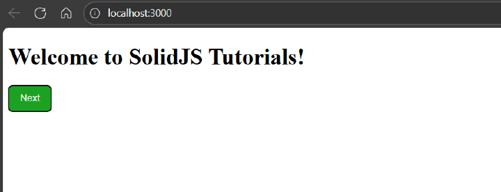
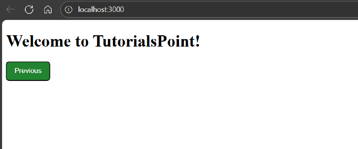
In the example below, we have created a toggle-based heading using the classList attribute and displayed the UI on the Application −
import { createSignal } from 'solid-js'

function StyledDemo() {
  const [isSolid, setIsSolid] = createSignal(false)

  return (
    <>
      <h1>
        {isSolid()
          ? 'Welcome to SolidJS Tutorials!'
          : 'Welcome to TutorialsPoint!'}
      </h1>

      <button
        onClick={() => setIsSolid(!isSolid())}
        style={{
          'background-color': isSolid() ? '#1ba222ff' : '#228331ff',
          color: 'white',
          padding: '10px 16px',
          border: 'none',
          'border-radius': '6px',
          cursor: 'pointer',
        }}
      >
        {isSolid() ? 'Next' : 'Previous'}
      </button>
    </>
  )
}

export default StyledDemo
Below is the output for the above code −