- SolidJS - Home
- SolidJS - Cheatsheet
- SolidJS - vs Vue, and Svelte
- SolidJS - Environment Setup
- SolidJS - First Solid App
- SolidJS - JSX Fundamentals
- SolidJS - Fine-grained Reactivity
- Building with Components
- SolidJS - Function Components
- SolidJS - Styling Your Components
- SolidJS - Conditional Rendering
- SolidJS - Dynamic Lists
- SolidJS - Passing Data
- SolidJS - Event Handling
- Routing, Data, and Async Operations
- SolidJS - Setting up Routes
- SolidJS - Input Handling
- SolidJS - Input Types
- SolidJS - Form Handling
- SolidJS Useful Resources
- SolidJS - Useful Resources
- SolidJS - Discussion
SolidJS - Input Types
In Solid.js the input types allow developers/users to enter or submit different types of data in an application. These include text, selections, dates, numbers, and colours. These input types in Solid.js are handled using signals and event listeners, which help in tracking user inputs. In this chapter, we will learn to use various input types in Solid.js, which include text inputs, textareas, radio buttons, checkboxes, range sliders, dropdowns, date and time inputs, and colour pickers.
Working with Different Input Types
Different input types, such as text, email, password, and number, require handling user input based on the type of data being entered and these are managed using signals to store values and event listeners to handle user input events.
The following are some of the input types in Solid.js to handle user input using signals and events −
- Text Inputs
- Textarea
- Single Checkbox
- Multiple Checkbox
- Radio Buttons
- Single Select
- Multiple Select
- Range Slider
- Date & Time Inputs
- Color Picker
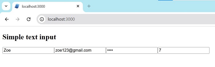
Text Inputs
Text inputs are used to collect user data such as plain text, email addresses, passwords, and numeric values. Each input type can be managed using signals and onInput events. Paste the code in app.tsx, or create one more file(example TextInput) and import it in the app.tsx file.
import { createSignal } from 'solid-js'

export default function TextInputs() {
  const [text, setText] = createSignal('')
  const [email, setEmail] = createSignal('')
  const [password, setPassword] = createSignal('')
  const [number, setNumber] = createSignal(0)

  return (
    <div><h2>Simple text input</h2>
      <input
        placeholder="Text"
        value={text()}
        onInput={e => setText(e.currentTarget.value)}
      />

      <input
        type="email"
        placeholder="Email"
        value={email()}
        onInput={e => setEmail(e.currentTarget.value)}
      />

      <input
        type="password"
        placeholder="Password"
        value={password()}
        onInput={e => setPassword(e.currentTarget.value)}
      />

      <input
        type="number"
        value={number()}
        onInput={e => setNumber(+e.currentTarget.value || 0)}
      />
    </div>
  )
}
The output for the above code is −
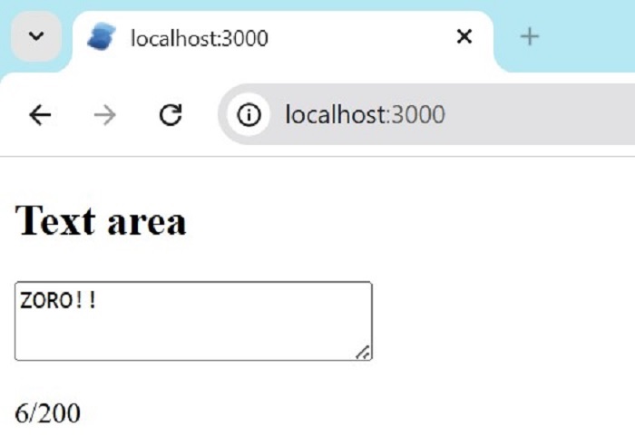
Textarea
A textarea is used to enter long text like messages or comments. The text entered by the user is stored in the signal. Paste the code in app.tsx, or create one more file(example Textarea) and import it into the app.tsx file.
import { createSignal } from 'solid-js'

export default function TextareaExample() {
  const [text, setText] = createSignal('')
  const max = 200

  return (
    <div><h2>Text area</h2>
      <textarea
        rows={4}
        maxLength={max}
        value={text()}
        onInput={e => setText(e.currentTarget.value)}
      />
      <p>{text().length}/{max}</p>
    </div>
  )
}
The output for the above code is −
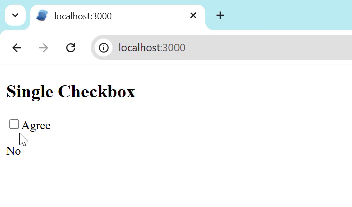
Single Checkbox
A single checkbox is used for a yes or no choice. The result shows Yes when checked and No when unchecked. Paste the code in app.tsx, or create one more file(example singlecheckbox) and import it into the app.tsx file.
import { createSignal } from 'solid-js'

export default function SingleCheckbox() {
  const [checked, setChecked] = createSignal(false)

  return (
    <div><h2>Single Checkbox</h2>
      <label>
        <input
          type="checkbox"
          checked={checked()}
          onChange={e => setChecked(e.currentTarget.checked)}
        />
        Agree
      </label>
      <p>{checked() ? 'Yes' : 'No'}</p>
    </div>
  )
}
The output for the above code is −
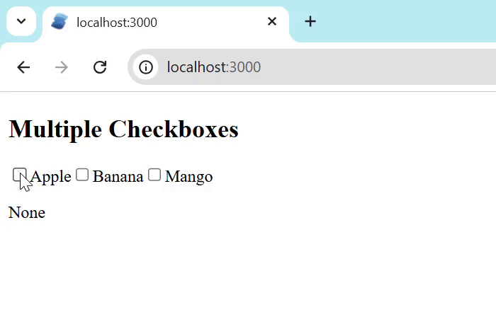
Multiple Checkboxes
Multiple checkboxes let users select more than one option. An array signal stores selected items. Paste the code in app.tsx, or create one more file(example multiplecheckbox) and import it into the app.tsx file.
import { createSignal, For } from 'solid-js'

export default function MultipleCheckboxes() {
  const fruits = ['Apple', 'Banana', 'Mango']
  const [selected, setSelected] = createSignal<string[]>([])

  const toggle = (item: string, checked: boolean) =>
    setSelected(
      checked ? [...selected(), item] : selected().filter(i => i !== item)
    )

  return (
    <div><h2>Multiple Checkboxes</h2>
      <For each={fruits}>
        {fruit => (
          <label>
            <input
              type="checkbox"
              checked={selected().includes(fruit)}
              onChange={e => toggle(fruit, e.currentTarget.checked)}
            />
            {fruit}
          </label>
        )}
      </For>
      <p>{selected().join(', ') || 'None'}</p>
    </div>
  )
}
The output for the above code is −
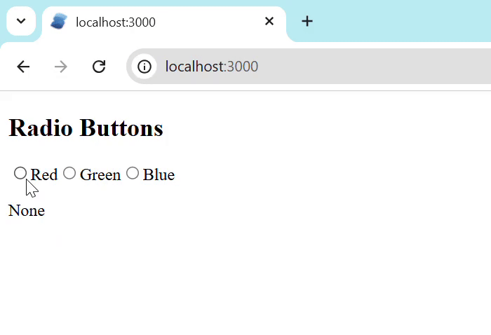
Radio Buttons
Radio buttons allow users to select only one option. The selected option is stored in signal. we can choose one option at a time. Paste the code in app.tsx, or create one more file(example radiobutton) and import it into the app.tsx file.
import { createSignal, For } from 'solid-js'

export default function RadioButtons() {
  const colors = ['Red', 'Green', 'Blue']
  const [value, setValue] = createSignal('')

  return (
    <div><h2>Radio Buttons</h2>
      <For each={colors}>
        {c => (
          <label>
            <input
              type="radio"
              name="color"
              value={c}
              checked={value() === c}
              onChange={e => setValue(e.currentTarget.value)}
            />
            {c}
          </label>
        )}
      </For>
      <p>{value() || 'None'}</p>
    </div>
  )
}
The output for the above code is −
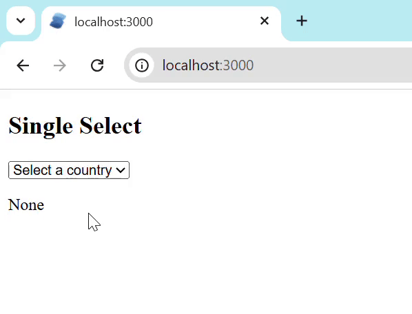
Single Select
The single select helps the user to choose one option from a list. The selected value is stored in a signal. The <select> element contains multiple <option> elements. Paste the code in app.tsx, or create one more file(example singleselect) and import it into the app.tsx file.
 { createSignal, For } from 'solid-js'

export default function SingleSelect() {
  const [country, setCountry] = createSignal('')

  const countries = [
    { code: '', name: 'Select a country' },
    { code: 'us', name: 'United States' },
    { code: 'uk', name: 'United Kingdom' },
    { code: 'ca', name: 'Canada' }
  ]

  return (
    <div><h2>Single Select</h2>
      <select
        value={country()}
        onChange={e => setCountry(e.currentTarget.value)}
      >
        <For each={countries}>
          {c => <option value={c.code}>{c.name}</option>}
        </For>
      </select>
      <p>{country() || 'None'}</p>
    </div>
  )
}
The output for the above code is −
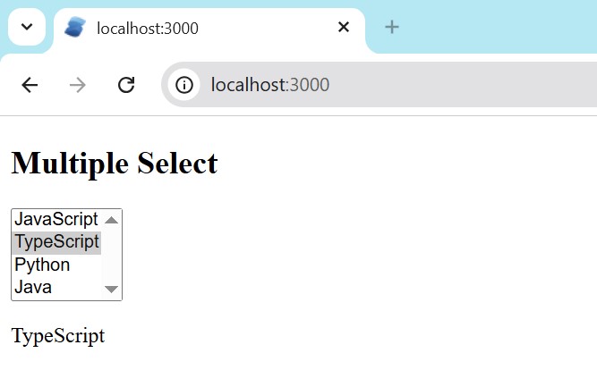
Multiple Select
The multiple select helps the user to choose multiple options from a list. The selected values are stored in an array signal. Paste the code in app.tsx, or create one more file(example multipleselect) and import it into the app.tsx file.
import { createSignal, For } from 'solid-js'

export default function MultipleSelect() {
  const skills = ['JavaScript', 'TypeScript', 'Python', 'Java']
  const [selected, setSelected] = createSignal<string[]>([])

  const handleChange = (e: Event & { currentTarget: HTMLSelectElement }) => {
    const values = Array.from(e.currentTarget.selectedOptions).map(
      o => o.value
    )
    setSelected(values)
  }

  return (
    <div><h2>Multiple Select</h2>
      <select multiple onChange={handleChange}>
        <For each={skills}>
          {s => <option value={s}>{s}</option>}
        </For>
      </select>
      <p>{selected().join(', ') || 'None'}</p>
    </div>
  )
}
The output for the above code is −
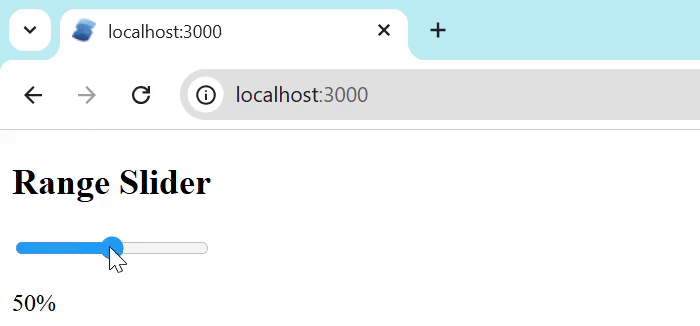
Range Slider
A range slider allows users to select a numeric value within a range. The value is stored in a numeric signal. Paste the code in app.tsx, or create one more file(example rangeslider) and import it into the app.tsx file.
import { createSignal } from 'solid-js'

export default function RangeSlider() {
  const [value, setValue] = createSignal(50)

  return (
    <div><h2>Range Slider</h2>
      <input
        type="range"
        min="0"
        max="100"
        value={value()}
        onInput={e => setValue(+e.currentTarget.value)}
      />
      <p>{value()}%</p>
    </div>
  )
}
The output for the above code is −
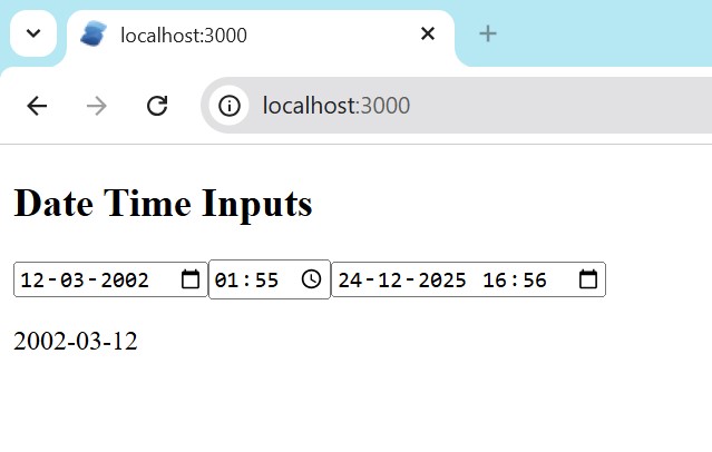
Date & Time Inputs
Date and time inputs allow users to select dates, times, or both. Paste the code in app.tsx, or create one more file(example dateandtime) and import it into the app.tsx file.
import { createSignal } from 'solid-js'

export default function DateTimeInputs() {
  const [date, setDate] = createSignal('')
  const [time, setTime] = createSignal('')
  const [dateTime, setDateTime] = createSignal('')

  return (
    <div>
      <h2>Date Time Inputs</h2>

      <input
        type="date"
        value={date()}
        onInput={e => setDate(e.currentTarget.value)}
      />

      <input
        type="time"
        value={time()}
        onInput={e => setTime(e.currentTarget.value)}
      />

      <input
        type="datetime-local"
        value={dateTime()}
        onInput={e => setDateTime(e.currentTarget.value)}
      />

      <p>{date() || time() || dateTime()}</p>
    </div>
  )
}
The output for the above code is −
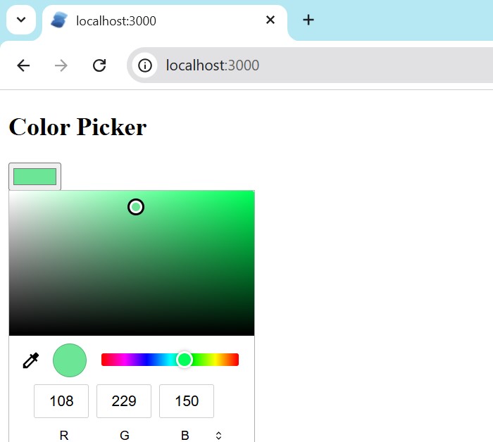
Color Picker
The colour picker helps us in selecting the colour. It provides a colour selection interface where users can choose a colour visually. The selected color is stored as a hexadecimal value in a signal. Paste the code in app.tsx, or create one more file(example colorpicker) and import it into the app.tsx file.
import { createSignal } from 'solid-js'

export default function ColorPicker() {
  const [color, setColor] = createSignal('#3498db')

  return (
    <div><h2>Color Picker</h2>
      <input
        type="color"
        value={color()}
        onInput={e => setColor(e.currentTarget.value)}
      />
      <div
        style={{
          width: '80px',
          height: '80px',
          'background-color': color(),
          border: '1px solid #ccc'
        }}
      />
      <p>{color()}</p>
    </div>
  )
}
The output for the above code is −
Conclusion
In this chapter, we learned how to work with different input types in Solid.js using signals and event listeners. We have discussed various inputs such as text fields, checkboxes, radio buttons, select dropdowns, sliders, date and time inputs, and colour pickers. These input types help collect different kinds of user data. In the next chapter, we will learn more advanced form handling concepts in Solid.js.
