- Kivy - Home
- Kivy Basics
- Kivy - Getting Started
- Kivy - Installation
- Kivy - Architecture
- Kivy - File Syntax
- Kivy - Applications
- Kivy - Hello World
- Kivy - App Life Cycle
- Kivy - Events
- Kivy - Properties
- Kivy - Inputs
- Kivy - Behaviors
- Kivy Buttons
- Kivy - Buttons
- Kivy - Button Events
- Kivy - Button Colors
- Kivy - Button Size
- Kivy - Button Position
- Kivy - Round Buttons
- Kivy - Disabled Buttons
- Kivy - Image Button
- Kivy Widgets
- Kivy - Widgets
- Kivy - Label
- Kivy - Text Input
- Kivy - Canvas
- Kivy - Line
- Kivy - Checkbox
- Kivy - Dropdown List
- Kivy - Windows
- Kivy - ScrollView
- Kivy - Carousel
- Kivy - Slider
- Kivy - Images
- Kivy - Popup
- Kivy - Switch
- Kivy - Spinner
- Kivy - Splitter
- Kivy - Progress Bar
- Kivy - Bubble
- Kivy - Tabbed Panel
- Kivy - Scatter
- Kivy - Accordion
- Kivy - File Chooser
- Kivy - Color Picker
- Kivy - Code Input
- Kivy - Modal View
- Kivy - Toggle Button
- Kivy - Camera
- Kivy - Tree View
- Kivy - reStructuredText
- Kivy - Action Bar
- Kivy - Video Player
- Kivy - Stencil View
- Kivy - VKeyboard
- Kivy - Touch Ripple
- Kivy - Audio
- Kivy - Videos
- Kivy - Spelling
- Kivy - Effects
- Kivy - Input Recorder
- Kivy - OpenGL
- Kivy - Text
- Kivy - Text Markup
- Kivy - Settings
- Kivy Layouts
- Kivy - Layouts
- Kivy - Float Layout
- Kivy - Grid Layouts
- Kivy - Box Layouts
- Kivy - Stack Layout
- Kivy - Anchor Layout
- Kivy - Relative Layout
- Kivy - Page Layout
- Kivy - Recycle Layout
- Kivy - Layouts in Layouts
- Kivy Advanced Concepts
- Kivy - Configuration Object
- Kivy - Atlas
- Kivy - Data Loader
- Kivy - Cache Manager
- Kivy - Console
- Kivy - Animation
- Kivy - Multistroke
- Kivy - Clock
- Kivy - SVGs
- Kivy - UrlRequest
- Kivy - Clipboard
- Kivy - Factory
- Kivy - Gesture
- Kivy - Language
- Kivy - Graphics
- Kivy - Drawing
- Kivy - Packaging
- Kivy - Garden
- Kivy - Storage
- Kivy - Vector
- Kivy - Utils
- Kivy - Inspector
- Kivy - Tools
- Kivy - Logger
- Kivy - Framebuffer
- Kivy Applications and Projects
- Kivy - Drawing App
- Kivy - Calculator App
- Kivy - Stopwatch App
- Kivy - Camera Handling
- Kivy - Image Viewer
- Kivy - Bezier
- Kivy - Canvas Stress
- Kivy - Circle Drawing
- Kivy - Widget Animation
- Kivy - Miscellaneous
- Kivy Useful Resources
- Kivy - Quick Guide
- Kivy - Useful Resources
- Kivy - Discussion
Kivy - Accordion
This GUI widget, because of its resemblance with a musical instrument of the same name, is called the "accordion". In Kivy, an Accordion is a graphical control element comprising a vertically or horizontally stacked list of items, such as labels or buttons or images.
Just as in a musical accordion in which sections of the bellows can be expanded by pulling outward, each item can be "expanded" or "collapsed" to reveal the content associated with that item. There can be zero expanded items, exactly one, or more than one item expanded at a time, depending on the configuration.
An accordion is similar in purpose to a tabbed panel, a list of items where exactly one item is expanded into a panel.
There are two important classes - "Accordion" and "AccordionItem" - in the "kivy.uix.accordion" module. Each AccordianItem object holds any one Kivy widget such as a label, a button an image or even other layout object. Multiple AccordioItems are then added to the main Accordion object.
Following properties/methods are supported by Accordion class −
title − Title string of the AccordionItem.
min_space − Minimum space to use for the title of each item. This value is automatically set for each child every time the layout event occurs. It is a NumericProperty and defaults to 44 (px).
orientation − Orientation of the Accordion layout. Can be either vertical or horizontal.
collapse − Boolean property to indicate if the current item is collapsed or not.
Example 1
In the following code, an Accordion object is used as the root widget of the Application window. A label, a button and an Image widget is respectively added to each of its AccordionItem widgets.
The complete code is given below −
from kivy.app import App
from kivy.uix.boxlayout import BoxLayout
from kivy.uix.button import Button
from kivy.uix.label import Label
from kivy.uix.image import Image
from kivy.uix.accordion import Accordion, AccordionItem
from kivy.core.window import Window

Window.size = (720,400)

class accordiandemoapp(App):
   def build(self):
      acc=Accordion(orientation='horizontal')
      item1=AccordionItem(title='Text Panel')
      item1.add_widget(Label(text='Hello World'))

      item2=AccordionItem(title='Button Panel')
      self.btn=Button(text='ok')
      item2.add_widget(self.btn)

      item3=AccordionItem(title='Image Panel')
      img = Image()
      img.source='kivy-logo.png'

      item3.add_widget(img)
      acc.add_widget(item1)
      acc.add_widget(item2)
      acc.add_widget(item3)

      return acc

accordiandemoapp().run()
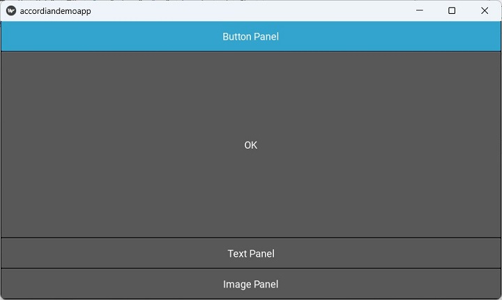
Output
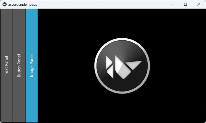
Run the above program and click the Image Panel, to unveil its contents, it being the Kivy logo.
You can further expand the other panels by clicking them.
Example 2 (using "kv" script)
We remove all the statements in build() method, replace it by a pass statement, and then save the following script as accordiondemo.kv file. This time the default orientation of Accordion is changed to vertical.
BoxLayout:
   orientation: "vertical"
   size: root.width, root.height

   Accordion:
      orientation: 'vertical'

      AccordionItem:
         title: "Button Panel"
         Button:
            text: 'OK'

      AccordionItem:
         title: "Text Panel"
         Label:
            text: "Hello World"
            font_size: 32
      AccordionItem:
         title: "Image Panel"
         Image:
            source: 'kivy-logo.png'
Output
The button panel is expanded after running the program −