
Article Categories
- All Categories
-
 Data Structure
-
 Networking
-
 RDBMS
RDBMS
-
 Operating System
-
 Java
Java
-
 MS Excel
-
 iOS
iOS
-
 HTML
HTML
-
 CSS
CSS
-
 Android
-
 Python
-
 C Programming
-
 C++
C++
-
 C#
C#
-
 MongoDB
-
 MySQL
MySQL
-
 Javascript
-
 PHP
PHP
-
 Economics & Finance
Selected Reading
How to set the X-axis labels in histogram using ggplot2 at the center in R?
The boundary argument of geom_histogram function and breaks argument of scale_x_continuous function can help us to set the X-axis labels in histogram using ggplot2 at the center. We need to be careful about choosing the boundary and breaks depending on the scale of the X-axis values. Check out the below example to understand how it works.
Example
Consider the below data frame −
Example
> x<-rpois(20,5)
> df<-data.frame(x)
> df
Output
x
1 5
2 7
3 6
4 4
5 7
6 7
7 10
8 3
9 6
10 6
11 5
12 4
13 4
14 6
15 7
16 4
17 1
18 11
19 6
20 9
Loading ggplot2 package and creating the histogram −
Example
> library(ggplot2)
> ggplot(df,aes(x))+ geom_histogram(binwidth=1)
Output

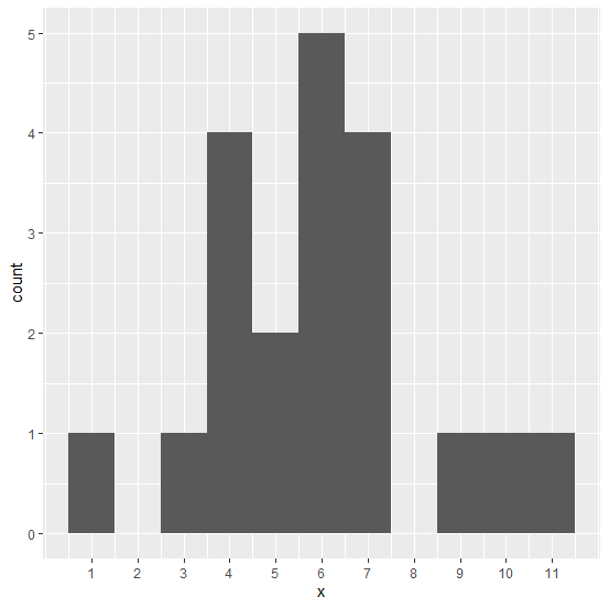
Creating the histogram with X-axis labels at the center −
Example
>ggplot(df,aes(x))+geom_histogram(binwidth=1,boundary=-0.5)+ scale_x_continuous(breaks=1:11)
Output

Updated on: 2026-03-11T22:50:54+05:30
7K+ Views

Advertisements