- Trending Categories
Data Structure
Networking
RDBMS
Operating System
Java
iOS
HTML
CSS
Android
Python
C Programming
C++
C#
MongoDB
MySQL
Javascript
PHP
Physics
Chemistry
Biology
Mathematics
English
Economics
Psychology
Social Studies
Fashion Studies
Legal Studies
- Selected Reading
- UPSC IAS Exams Notes
- Developer's Best Practices
- Questions and Answers
- Effective Resume Writing
- HR Interview Questions
- Computer Glossary
- Who is Who
How to apply manually created x-axis labels in a histogram created by hist function in R?
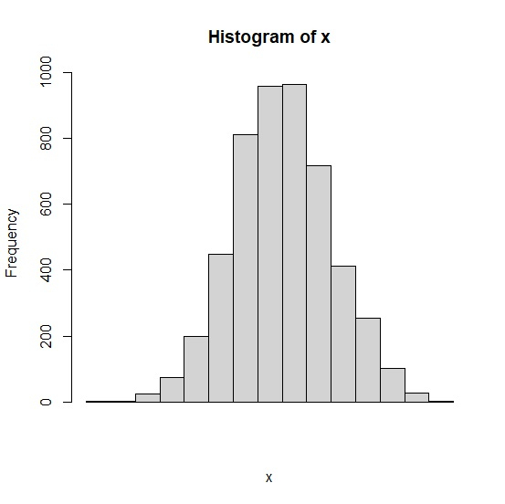
When we generate a histogram in R using hist function, the x-axis labels are automatically generated but we might want to change them to values defined by researchers or by any other authority. Therefore, firstly we need to create the histogram by ignoring the labels and then axis function can be used for new values.
Consider the below vector x and create a histogram of x by ignoring x-axis labels −
Example
set.seed(1999) x<-rnorm(5000,9,1) hist(x,xaxt='n')
Output
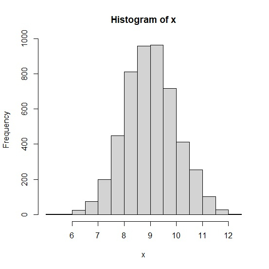
Now adding new values for x-axis labels −
Example
axis(side=1,at=seq(6,12,1),labels=seq(6,12,1))
Output
- Related Articles
- How to represent the mean with vertical line in a histogram created by hist function in R?
- How to change the X-axis labels for boxplots created by using boxplot function in R?
- How to show all X-axis labels in a bar graph created by using barplot function in R?
- How to apply a manually created function to two columns in an R data frame?
- How to reverse the X-axis labels of scatterplot created by using ggplot2 in R?
- How to put labels on a scatterplot that is created plot function in R?
- How to add a mathematical expression in axis label in a plot created by using plot function in R?
- How to set the X-axis labels in histogram using ggplot2 at the center in R?
- How to change the color and size of the axes labels of a plot created by using plot function in R?
- How to display mean inside boxplot created by using boxplot function in R?
- How to create gridlines that matches with Y-axis values in the plot created by using plot function in R?
- How to change the Y axis limit for boxplot created by using ggplot2 in R?
- How to change the gridlines of Y-axis on a chart created by using ggplot2 in R?
- How to use mtext function to create the X-axis labels in base R?
- How to change the background color of a plot created by using plot function in R?

Advertisements