
Article Categories
- All Categories
-
 Data Structure
-
 Networking
-
 RDBMS
RDBMS
-
 Operating System
-
 Java
Java
-
 MS Excel
-
 iOS
iOS
-
 HTML
HTML
-
 CSS
CSS
-
 Android
-
 Python
-
 C Programming
-
 C++
C++
-
 C#
C#
-
 MongoDB
-
 MySQL
MySQL
-
 Javascript
-
 PHP
PHP
-
 Economics & Finance
Selected Reading
How to reverse the X-axis labels of scatterplot created by using ggplot2 in R?
Example
There exists a possibility that one of the variables is recorded in an opposite manner and we want to create a scatterplot using that variable. Therefore, we would need to reverse that variable while plotting. Suppose that variable is an independent variable, hence it will be plotted on X-axis. Thus, to reverse the X-axis labels we can use scale_x_reverse function of ggplot2 package.
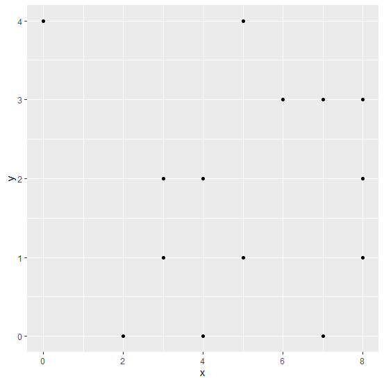
Consider the below data frame −
Example
x<-rpois(20,5)
y<-rpois(20,2)
df<-data.frame(x,y)
df
Output
   x  y
1  5  1
2  7  0
3  5  1
4  7  3
5  3  1
6  3  2
7  0  4
8  8  1
9  7  3
10 8  3
11 3  2
12 5  4
13 8  2
14 2  0
15 3  1
16 6  3
17 4  0
18 4  2
19 3  1
20 8  3
Loading ggplot2 package and creating scatterplot between x and y −
Example
library(ggplot2)
ggplot(df,aes(x,y))+geom_point()
Output
Creating scatterplot between x and y with reversed limits −
Example
ggplot(df,aes(x,y))+geom_point()+scale_x_reverse(lim=c(8,0))
Output


Updated on: 2026-03-11T22:50:51+05:30
1K+ Views

Advertisements