
Article Categories
- All Categories
-
 Data Structure
-
 Networking
-
 RDBMS
RDBMS
-
 Operating System
-
 Java
Java
-
 MS Excel
-
 iOS
iOS
-
 HTML
HTML
-
 CSS
CSS
-
 Android
-
 Python
-
 C Programming
-
 C++
C++
-
 C#
C#
-
 MongoDB
-
 MySQL
MySQL
-
 Javascript
-
 PHP
PHP
-
 Economics & Finance
Selected Reading
How to display the curve on the histogram using ggplot2 in R?
Mostly, we use histogram to understand the distribution of a variable but if we have an overlay line on the histogram that will make the chart smoother, thus understanding the variation will become easy. To display the curve on the histogram using ggplot2, we can make use of geom_density function in which the counts will be multiplied with the binwidth of the histogram so that the density line will be appropriately created.
Example
Consider the below data frame:
> x<-rpois(200,5)
> df<-data.frame(x)
> head(df,20)
Output
   x
1  4
2  5
3  6
4  4
5  9
6  2
7  1
8  5
9  5
10 7
11 6
12 9
13 5
14 2
15 12
16 4
17 8
18 8
19 4
20 3
Loading ggplot2 package and creating a histogram:
Example
> library(ggplot2)
> ggplot(df,aes(x))+geom_histogram(binwidth=1.1)
Output:

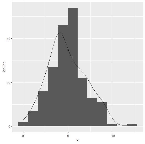
Creating the histogram with curve on the graph:
Example
> ggplot(df,aes(x))+geom_histogram(binwidth=1.1)+geom_density(aes(y=1.1*..count..))
Output:

Updated on: 2026-03-11T22:50:53+05:30
3K+ Views

Advertisements