
Article Categories
- All Categories
-
 Data Structure
-
 Networking
-
 RDBMS
RDBMS
-
 Operating System
-
 Java
Java
-
 MS Excel
-
 iOS
iOS
-
 HTML
HTML
-
 CSS
CSS
-
 Android
-
 Python
-
 C Programming
-
 C++
C++
-
 C#
C#
-
 MongoDB
-
 MySQL
MySQL
-
 Javascript
-
 PHP
PHP
-
 Economics & Finance
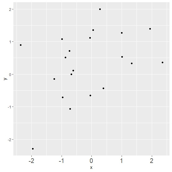
How to increase the X-axis labels font size using ggplot2 in R?
To increase the X-axis labels font size using ggplot2, we can use axis.text.x argument of theme function where we can define the text size for axis element. This might be required when we want viewers to critically examine the X-axis labels and especially in situations when we change the scale for X-axis.
Check out the below given example to understand how it can be done.
Example
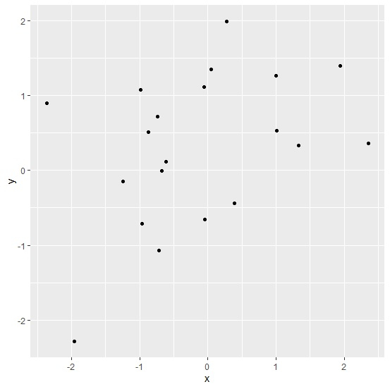
Following snippet creates a sample data frame −
x<-rnorm(20)
y<-rnorm(20)
df<-data.frame(x,y)
df
The following dataframe is created −
        x           y
1  -0.98190157   1.080447960
2   1.00247425   1.268177956
3   1.93521281   1.396761171
4  -0.05125250   1.116289059
5  -0.96090929  -0.710364525
6  -1.24432105  -0.146794806
7  -2.36365700   0.900933342
8  -0.04993840  -0.654018782
9   1.00789255   0.528862194
10 -0.87029207   0.515485209
11 -1.96332523  -2.288145618
12 -0.61780404   0.113034383
13 -0.73750813   0.716358061
14 -0.67379795  -0.002136233
15  0.04409529   1.353033640
16  2.35756367   0.361340419
17  1.33416796   0.331124217
18 -0.71829594  -1.067921280
19  0.38769673  -0.435514111
20  0.27477924   1.996037117
To load ggplot2 package and create point chart between x and y, add the following code to the above snippet −
library(ggplot2)
ggplot(df,aes(x,y))+geom_point()
Output
If you execute all the above given snippets as a single program, it generates the following output −
To create point chart between x and y with X-axis labels of larger size, add the following code to the above snippet −
ggplot(df,aes(x,y))+geom_point()+theme(axis.text.x=element_text(size=15))
Output
If you execute all the above given snippets as a single program, it generates the following output −

34K+ Views
