
Article Categories
- All Categories
-
 Data Structure
-
 Networking
-
 RDBMS
RDBMS
-
 Operating System
-
 Java
Java
-
 MS Excel
-
 iOS
iOS
-
 HTML
HTML
-
 CSS
CSS
-
 Android
-
 Python
-
 C Programming
-
 C++
C++
-
 C#
C#
-
 MongoDB
-
 MySQL
MySQL
-
 Javascript
-
 PHP
PHP
-
 Economics & Finance
Selected Reading
How to set the Y-axis tick marks using ggplot2 in R?
The default value of Y-axis tick marks using ggplot2 are taken by R using the provided data but we can set it by using scale_y_continuous function of ggplot2 package. For example, if we want to have values starting from 1 to 10 with a gap of 1 then we can use scale_y_continuous(breaks=seq(1,10,by=1)).
Example
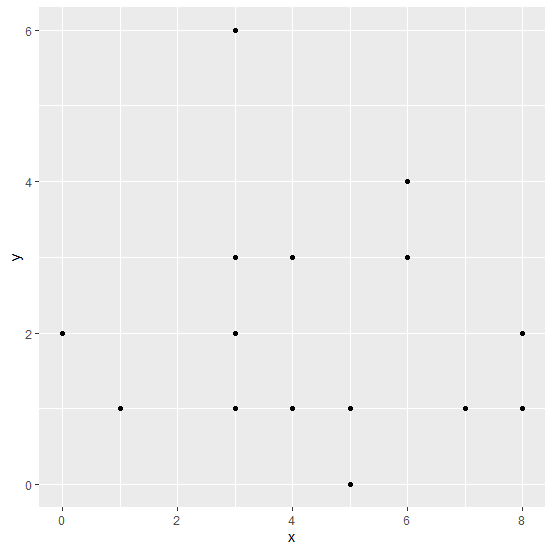
Consider the below data frame:
x<-rpois(20,5)
y<-rpois(20,2)
df<-data.frame(x,y)
df
Output
   x y
1  8 1
2  4 3
3  1 1
4  4 1
5  3 2
6  3 6
7  6 4
8  3 3
9  7 1
10 4 1
11 5 1
12 6 3
13 3 1
14 6 3
15 8 2
16 0 2
17 8 1
18 5 0
19 4 1
20 4 3
Loading ggplot2 package and creating a point chart between x and y −
Example
library(ggplot2)
ggplot(df,aes(x,y))+geom_point()
Output
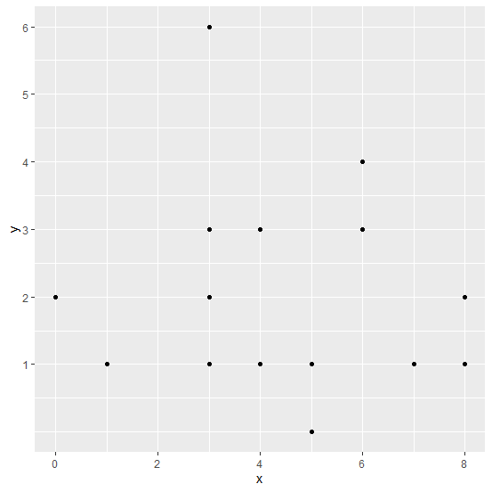
Creating the point chart with Y-axis tick marks with a difference of 1 −
Example
ggplot(df,aes(x,y))+geom_point()+scale_y_continuous(breaks=seq(1,10,by=1))
Output

Updated on: 2026-03-11T22:50:54+05:30
7K+ Views

Advertisements