
Article Categories
- All Categories
-
 Data Structure
-
 Networking
-
 RDBMS
RDBMS
-
 Operating System
-
 Java
Java
-
 MS Excel
-
 iOS
iOS
-
 HTML
HTML
-
 CSS
CSS
-
 Android
-
 Python
-
 C Programming
-
 C++
C++
-
 C#
C#
-
 MongoDB
-
 MySQL
MySQL
-
 Javascript
-
 PHP
PHP
-
 Economics & Finance
Selected Reading
How to X-axis labels to the top of the plot using ggplot2 in R?
Usually, a plot created in R or any of the statistical analysis software have X-axis labels on the bottom side but we might be interested in showing them at the top of the plot. It can be done for any type of two-dimensional plot whether it is a scatterplot, bar plot, etc. This is possible by using scale_x_continuous function of ggplot2 package in R.
Example
set.seed(123)
x<-runif(10,2,3)
y<-rpois(10,2)
df<-data.frame(x,y)
df
Output
   x    y
1 2.287578 5
2 2.788305 2
3 2.408977 3
4 2.883017 2
5 2.940467 0
6 2.045556 4
7 2.528105 1
8 2.892419 0
9 2.551435 1
10 2.456615 5
library(ggplot2)
Example
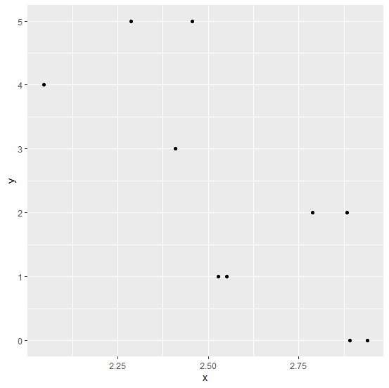
Creating a simple scatterplot −
ggplot(df,aes(x,y))+geom_point()
Output
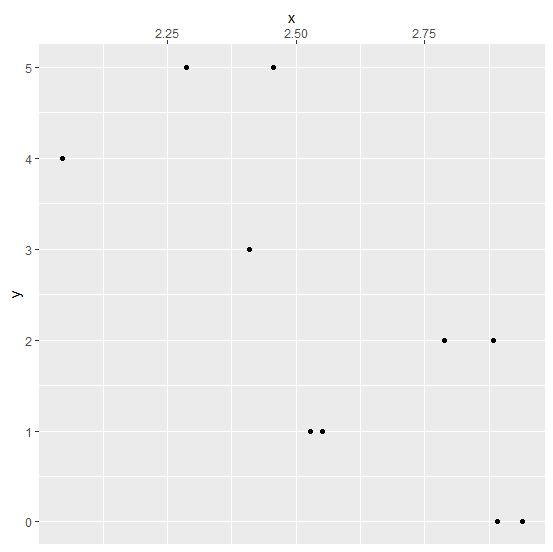
Creating a scatterplot with X-axis labels on the top of the plot −
Example
ggplot(df,aes(x,y))+geom_point()+scale_x_continuous(position="top")
Output

Updated on: 2026-03-11T22:50:51+05:30
4K+ Views

Advertisements