
Article Categories
- All Categories
-
 Data Structure
-
 Networking
-
 RDBMS
RDBMS
-
 Operating System
-
 Java
Java
-
 MS Excel
-
 iOS
iOS
-
 HTML
HTML
-
 CSS
CSS
-
 Android
-
 Python
-
 C Programming
-
 C++
C++
-
 C#
C#
-
 MongoDB
-
 MySQL
MySQL
-
 Javascript
-
 PHP
PHP
-
 Economics & Finance
Selected Reading
How to change the color of X-axis label using ggplot2 in R?
The default color of labels is black but we might want to change that color to something else so that we can get attention of the viewer to the labels if it is needed. To change the color of X-axis label using ggplot2, we can use theme function that has axis.title.x argument which can be used for changing the color of the label values.
Example
Consider the below data frame −
x<−rnorm(20,5,0.25)
y<−rnorm(20,5,0.004)
df<−data.frame(x,y)
df
Output
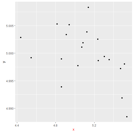
      x       y
1 5.030380 4.997751
2 5.240119 4.998680
3 4.544677 4.999195
4 4.858193 4.998952
5 5.071308 5.001092
6 5.512129 4.998037
7 5.236292 5.002558
8 5.081739 5.001903
9 4.940688 5.005155
10 4.437274 5.002876
11 5.472674 4.997229
12 4.813980 5.005284
13 4.859050 4.993907
14 5.353379 4.998850
15 5.537771 4.988465
16 5.302592 4.999421
17 5.486402 4.991891
18 5.121558 5.003857
19 4.908864 5.003393
20 5.137028 5.008340
Loading ggplot2 package and creating a scatterplot −
Example
library(ggplot2)
ggplot(df,aes(x,y))+geom_point()
Output

Creating the scatterplot with X-axis label in red color −
Example
ggplot(df,aes(x,y))+geom_point()+theme(axis.title.x=element_text(colour="red"))
Output

Updated on: 2026-03-11T22:50:55+05:30
8K+ Views

Advertisements