
Article Categories
- All Categories
-
 Data Structure
-
 Networking
-
 RDBMS
RDBMS
-
 Operating System
-
 Java
Java
-
 MS Excel
-
 iOS
iOS
-
 HTML
HTML
-
 CSS
CSS
-
 Android
-
 Python
-
 C Programming
-
 C++
C++
-
 C#
C#
-
 MongoDB
-
 MySQL
MySQL
-
 Javascript
-
 PHP
PHP
-
 Economics & Finance
Selected Reading
How to represent all values of X-axis or Y-axis on the graph in R using ggplot2 package?
If we have many unique elements or repeated in a column of an R data frame and create a graph using that column, either on X-axis or Y-axis then R automatically choses the axes labels, this might not display all the unique values of the column in the plot. Therefore, we can use scale_x_continuous function or scale_y_continuous function with labels depending on our requirement to display the column values.
Consider the below data frame −
Example
x<-1:10
y<-rpois(10,2)
df<-data.frame(x,y)
df
Output
x y
1 1 1
2 2 1
3 3 5
4 4 3
5 5 3
6 6 0
7 7 2
8 8 5
9 9 2
10 10 4
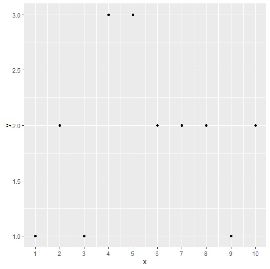
Loading ggplot2 package and creating a point chart between x and y by displaying all values of x axis −
Example
library(ggplot2) ggplot(df,aes(x,y))+geom_point()+scale_x_continuous(labels=as.character(x),breaks=x)
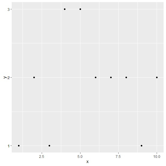
Creating a point chart between x and y by displaying all values of Y axis −
Example
ggplot(df,aes(x,y))+geom_point()+scale_y_continuous(labels=as.character(y),breaks=y)

Updated on: 2026-03-11T22:50:52+05:30
7K+ Views

Advertisements