
Article Categories
- All Categories
-
 Data Structure
-
 Networking
-
 RDBMS
RDBMS
-
 Operating System
-
 Java
Java
-
 MS Excel
-
 iOS
iOS
-
 HTML
HTML
-
 CSS
CSS
-
 Android
-
 Python
-
 C Programming
-
 C++
C++
-
 C#
C#
-
 MongoDB
-
 MySQL
MySQL
-
 Javascript
-
 PHP
PHP
-
 Economics & Finance
Selected Reading
How to change the gridlines of Y-axis on a chart created by using ggplot2 in R?
Normally, the gridlines on a plot created by using ggplot2 package are a little far from each other but sometimes the plot looks better if the gridlines are close to each other, therefore, we might want to do so. This can be done by setting the minor_breaks and breaks using scale_y_continuous if the Y-axis plots a continuous variable.
Example
Consider the below data frame −
> x<-sample(1:100,20)
> y<-sample(1:50,20)
> df<-data.frame(x,y)
> df
Output
   x  y
1 14 16
2 36 1
3 78 18
4 61 6
5 19 11
6 2 40
7 93 23
8 10 13
9 3 21
10 55 31
11 75 28
12 51 33
13 13 12
14 80 37
15 98 49
16 66 39
17 79 10
18 52 38
19 74 47
20 12 9
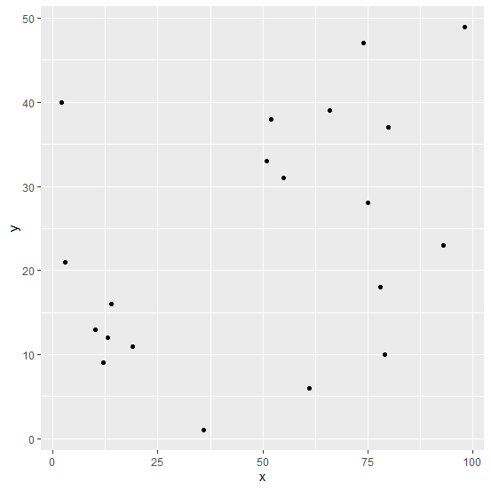
Loading ggplot2 package and creating a scatterplot between x and y −
> library(ggplot2)
> ggplot(df,aes(x,y))+geom_point()
Output
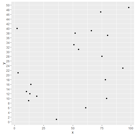
Changing the gridlines in the plot −
> ggplot(df,aes(x,y))+geom_point()+scale_y_continuous(minor_breaks=seq(0,50,2),breaks
=seq(0,50,2))
Output

Updated on: 2026-03-11T22:50:51+05:30
335 Views

Advertisements