
Article Categories
- All Categories
-
 Data Structure
-
 Networking
-
 RDBMS
RDBMS
-
 Operating System
-
 Java
Java
-
 MS Excel
-
 iOS
iOS
-
 HTML
HTML
-
 CSS
CSS
-
 Android
-
 Python
-
 C Programming
-
 C++
C++
-
 C#
C#
-
 MongoDB
-
 MySQL
MySQL
-
 Javascript
-
 PHP
PHP
-
 Economics & Finance
How to change the text size of Y-axis title using ggplot2 in R?
By default, the text size of axes titles are small but if we want to increase that size so that people can easily recognize them then theme function can be used where we can use axis.title.y argument for Y-axis and axis.title.x argument for X-axis with element_text size to larger value.
Check out the Example given below to understand how it can be done.
Example
Following snippet creates a sample data frame −
Country<-c("India","China","UK")
Growth_Rate<-sample(1:5,3)
df<-data.frame(Country,Growth_Rate)
df
The following dataframe is created
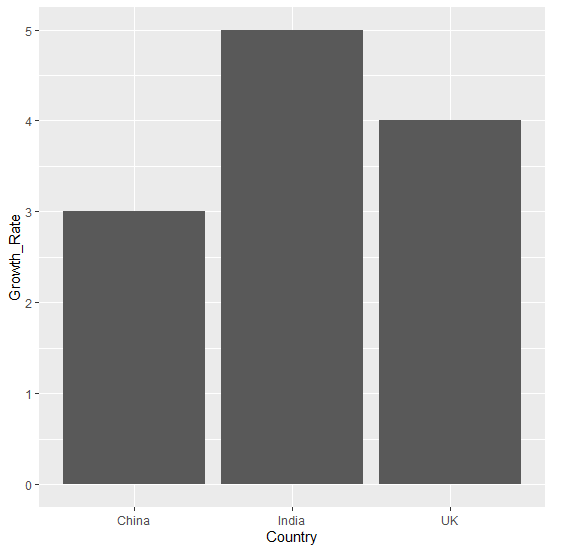
 Country Growth_Rate
1 India         5
2 China         3
3    UK         4
To load ggplot2 package and create bar chart for data in df on the above created data frame, add the following code to the above snippet −
Country<-c("India","China","UK")
Growth_Rate<-sample(1:5,3)
df<-data.frame(Country,Growth_Rate)
library(ggplot2)
ggplot(df,aes(Country,Growth_Rate))+geom_bar(stat="identity")
Output
If you execute all the above given snippets as a single program, it generates the following Output −
To create bar chart for data in df with larger text size of Y-axis title on the above created data frame, add the following code to the above snippet −
Country<-c("India","China","UK")
Growth_Rate<-sample(1:5,3)
df<-data.frame(Country,Growth_Rate)
library(ggplot2)
ggplot(df,aes(Country,Growth_Rate))+geom_bar(stat="identity")+theme(axis.title.
y = element_text(size=18))
Output
If you execute all the above given snippets as a single program, it generates the following Output −


4K+ Views
