
Article Categories
- All Categories
-
 Data Structure
-
 Networking
-
 RDBMS
RDBMS
-
 Operating System
-
 Java
Java
-
 MS Excel
-
 iOS
iOS
-
 HTML
HTML
-
 CSS
CSS
-
 Android
-
 Python
-
 C Programming
-
 C++
C++
-
 C#
C#
-
 MongoDB
-
 MySQL
MySQL
-
 Javascript
-
 PHP
PHP
-
 Economics & Finance
How to increase the length of Y-axis values for ggplot2 graph in R?
To increase the length of Y-axis for ggplot2 graph in R, we can use scale_y_continuous function with limits argument.
For Example, if we have a data frame called df that contains two columns say X and Y and we want to have the length of Y-axis starting from 1 to 10 by using the below mentioned command −
ggplot(df,aes(X,Y))+geom_point()+scale_y_continuous(limits=c(1,10))
Example
Following snippet creates a sample data frame −
x<-rnorm(20)
y<-rnorm(20)
df<-data.frame(x,y)
df
The following dataframe is created
            x           y
 1 -2.01096346  1.24463902
 2  0.39496846  0.99334822
 3 -0.51097047 -1.05482740
 4  0.03373439  1.24457996
 5  1.12358986 -1.78640864
 6 -0.92102967 -0.75407431
 7  0.31621086  1.36239416
 8 -0.09043105 -0.49680298
 9 -0.09693602  0.55751140
10 -1.21945066  2.01970155
11 -0.99525818  0.63536276
12 -0.57271775  1.32510316
13  0.15420177  0.62855015
14 -0.47752137 -0.73269498
15 -1.72463693 -0.46193220
16 -0.33377801  0.01744036
17 0.27385681 -0.88326612
18 0.61387778 0.28415277
19 -1.82064454 -0.73278798
20 2.46056155 1.22580050
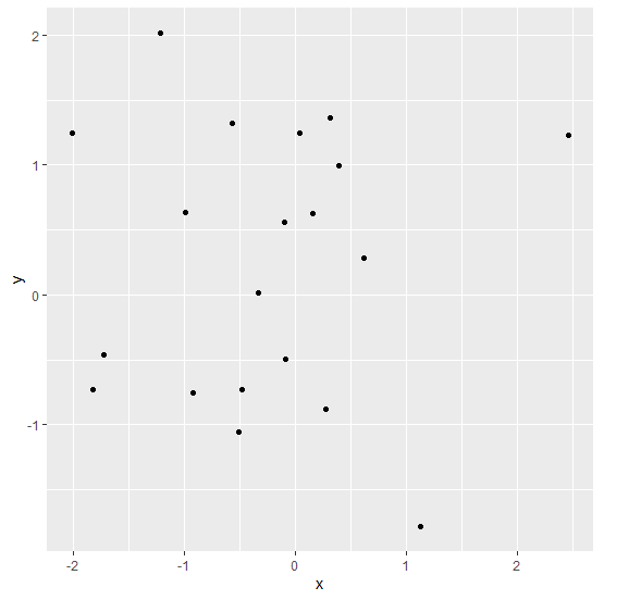
To load ggplot2 package and create scatterplot between x and y on the above created data frame, add the following code to the above snippet −
x<-rnorm(20)
y<-rnorm(20)
df<-data.frame(x,y)
library(ggplot2)
ggplot(df,aes(x,y))+geom_point()
Output
If you execute all the above given snippets as a single program, it generates the following Output −
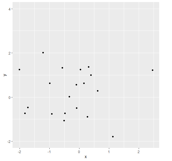
To create scatterplot between x and y with y values starting from -2 and ending at 4 on the above created data frame, add the following code to the above snippet −
x<-rnorm(20)
y<-rnorm(20)
df<-data.frame(x,y)
library(ggplot2)
ggplot(df,aes(x,y))+geom_point()+scale_y_continuous(limits=c(-2,4))
Output
If you execute all the above given snippets as a single program, it generates the following Output −

6K+ Views
